Table of Contents
If you run a website, chances are you’re using popups, and if you aren’t, you should be.
Popups can help you increase conversions on your website and they could become one of the most versatile tools in your web design kit.
What you may not know is how to create outstanding popups that engage your readers and convert them into leads and engaged customers.
In this article, we’ll break down some tips to help you design the best popups that you can. Then we’ll go over 10 examples of popups that get fantastic results, and explain why they work. Let’s get to it!
10 Incredible Popup Examples To Increase Conversions
We’ve rounded up a list of 10 powerful popup examples to cover almost every variation you can imagine. We’ll discuss what makes each so effective, so you can get the inspiration you need for your own projects.
1. Ebook Offer
OptiMonk is a lead generation service, so it stands to reason that its own popup designs should be top-notch. In this case, we have a full-page popup with a clear CTA:
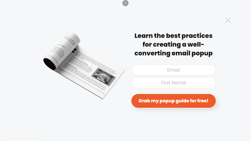
This design works because it’s simple and hard to ignore since it takes up the entire page. That forces you to decide how you want to interact with the element instead of being able to ignore it altogether.
Although that’s an aggressive tactic, you can offset it by offering visitors a freebie, such as an ebook. That’s a time-tested way to get email signups, which makes this an excellent popup example.
2. Customer Signup Menu
A brilliant way to use popups is to include full-blown menus within them. That way you can show visitors options that may not fit within your primary navigation menu, without over cluttering it:
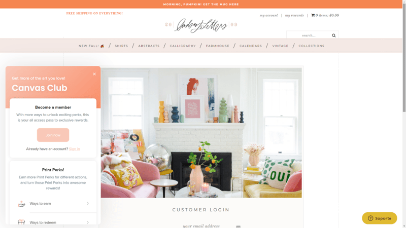
The above example comes from Lindsay Letters, a home decor website. Its popup menu prompts you to sign up to the website and leads you to its rewards pages, which can be an effective way to drum up interest among new visitors.
As you can see, the popup menu uses a similar design aesthetic as the rest of the website. This is key because visitors won’t see it as an element that they can ignore. One aspect that we would change, however, would be to use a different color for the Join now CTA to make it stand out that much more.
3. First-Time Discount Offer
Everyone loves a discount, even for stores they’ve never shopped at before. In fact, offering one-time discount codes to new users can be a fantastic way to get new customers:
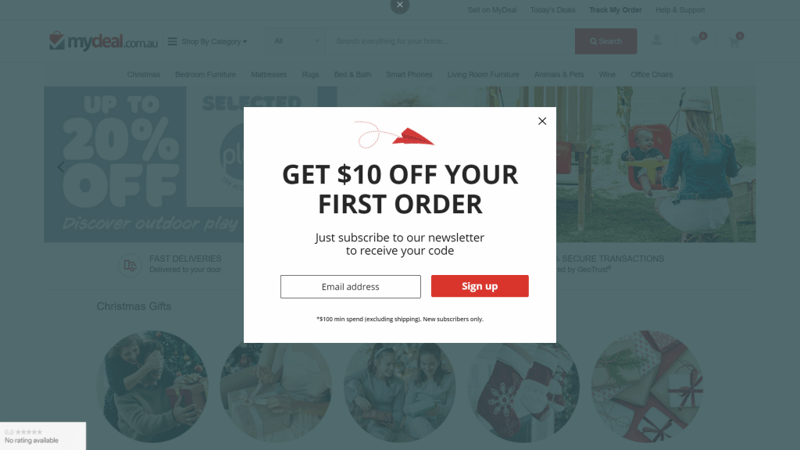
From a design perspective, the above e-commerce popup example is simple yet effective. The offer is laid out clearly and in big bold letters, then followed by a distinct CTA. Moreover, with this type of popup design, you get a chance to sign new visitors up to your email list, then nurture those leads even if they don’t make a purchase right away.
One aspect of this popup that you may want to reconsider for your own site is that it includes the specifics of the discount offer in small letters at the bottom. A lot of visitors might miss that information, and then find out their purchases don’t qualify for a discount. That’s a quick way to anger users, so make sure you display information about any offers in your popups as clearly as possible.
4. Appointment Booking Popups
This particular popup design is one of the most creative we’ve run into so far. It’s from an online shop called TileCloud, which also offers free design consultations:
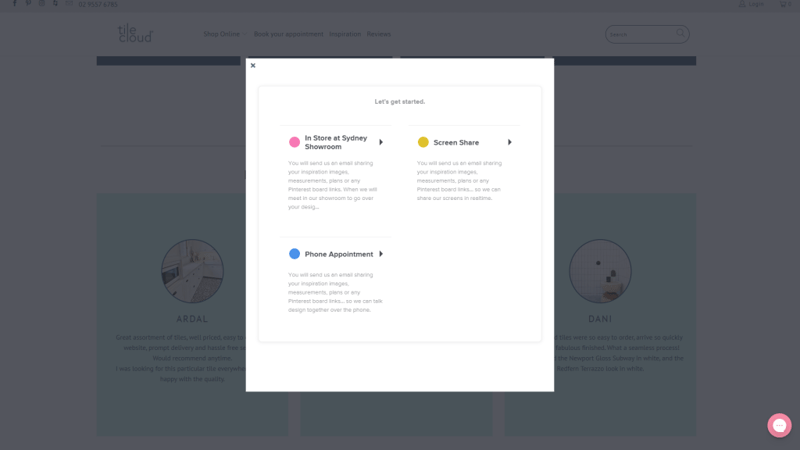
TileCloud uses a simple popup window as an extension of its bookings page. This makes the booking process more interactive, as it enables you to lead visitors step by step until their appointments are set.
For example, if you choose the screen share option, you can select a date for your appointment right away:
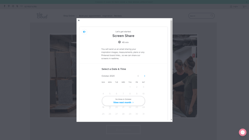
With WordPress, you’d need a booking or calendar plugin to add similar functionality. If you offer appointments online for your services, consider using popups to provide a better booking experience.
5. Simple Email Signup Form
Depending on the power of your brand, you might not need to offer any freebies or discounts for users to want to sign up for your email list. Under Armour happens to be well-known in the market, so it can get away with a more basic email signup popup:
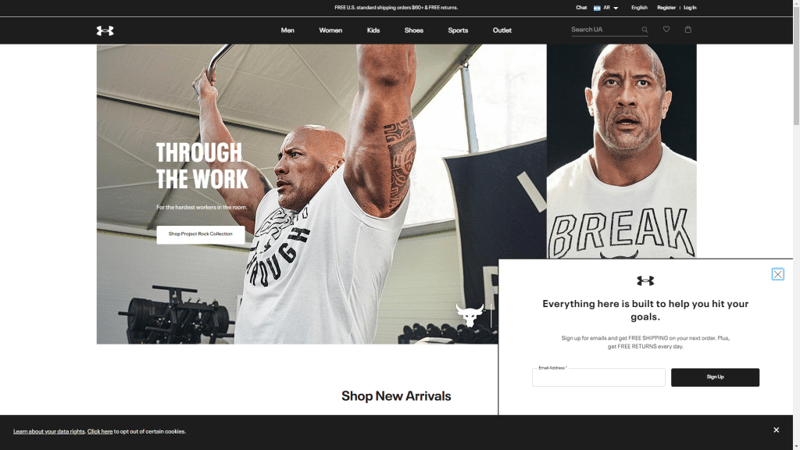
Although the design here is minimal, that works to its advantage. The popup doesn’t detract at all from browsing Under Armour’s website. It includes the brand’s logo and lays out the benefits of signing up for its list.
This popup example demonstrates how sometimes less is more. Plus, with this type of design, you won’t have to worry about overwhelming or irritating visitors.
6. Free Learning Materials
Traditionally, most marketers and website owners offer freebies in exchange for email signups or other types of valuable data. However, Search Engine Journal uses a colorful popup to offer visitors the opportunity to access a valuable learning resource with no strings attached:
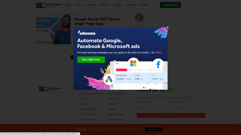
The goal of this approach is to build a rapport with new users. Since they don’t know how valuable your website can be to them yet, they might not want to share their contact information.
By offering a free resource they can access right away, you can begin to build a relationship with your users. In this particular case, the popup design is outstanding, with quality imagery and colors that make it hard to ignore.
This method also works if you want to redirect visitors towards a landing page instead of using a popup for lead collection. With a landing page, you can include a lot more information and potentially increase conversions even further.
7. Popup Contact Form
In some cases, you might not need a full-blown contact page for your website. Often, a simple popup will do the trick, since you can use it to include all the fields that visitors might need to fill out.
56K.Cloud is a consulting agency that uses a gorgeous popup to enable visitors to reach out:
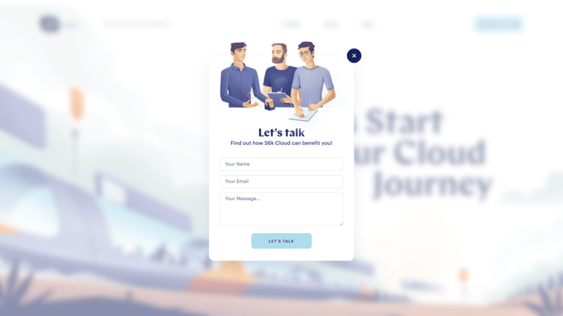
As you can see, this contact form ties in perfectly with the website’s design. Once it appears, it applies a blurring effect to the background that makes for a very nice touch.
8. Blog Redirection Popups
You probably know WP Engine as one of the most popular managed WordPress hosting companies in the field. Beyond that pedigree, WP Engine also uses popups rather creatively:
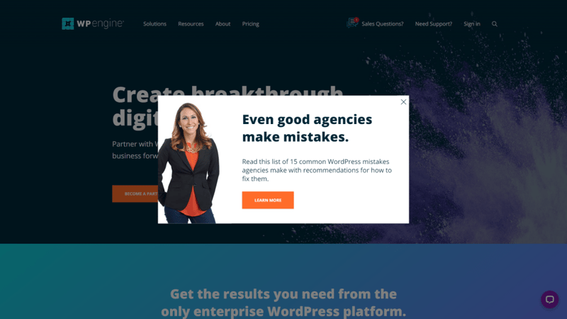
The above popup redirects you to one of the hosting company’s articles. The goal is to provide more reasons why the service can benefit you as a customer.
Instead of offering freebies, you can use popups to give visitors the opportunity to engage with your existing content. It’s an interesting approach, and the popup looks appealing. However, if you want to try this strategy, we’d recommend avoiding generic stock images for your site’s popup.
9. Hard-Sell Popup Design
Usually, we’re not big fans of popups that pack in too much information. However, OptinMonster manages to pull that technique off with this hard-sell of a popup:
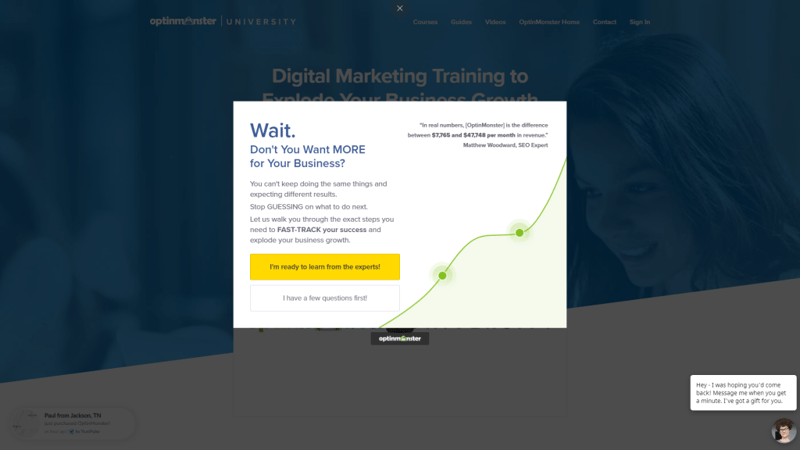
This particular design works precisely because it includes so much specific information, such as numbers and even a quote. More importantly, the text is evenly distributed throughout the popup itself.
One key aspect here is the CTA text. Instead of using a generic CTA, OptinMonster opts for emotionally-charged language. Naturally, most people will want to click on the option that’s more positive, which also stands out visually.
10. Exit-Intent Popups
This last example also comes from OptinMonster. Considering that this company offers a lead-generation suite of tools, it shouldn’t come as a surprise it’s at the top of their popup game. In this case, we have an exit-intent popup:
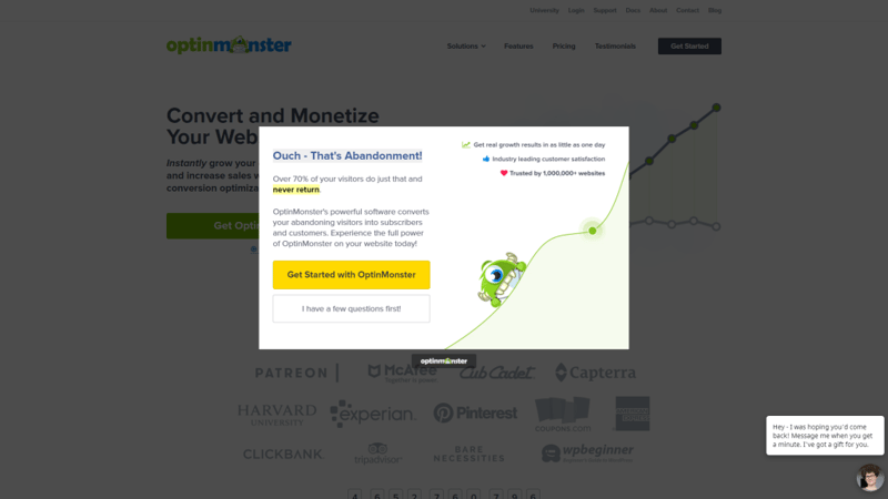
You can think about exit-intent popups as a last-ditch effort to get conversions from visitors who are about to leave. Since you can assume that they might not be interested, exit-intent or abandonment popups can be particularly blunt.
In this example, you’ll see a similar design to our last example, including a positive CTA that stands out and plenty of text and numbers. One notable aspect is that even the rejection button leads visitors to another page, which offers an extra opportunity to convince them.
Key Tips for Popup Designs
Popups are incredibly versatile elements. They can fulfill a lot of roles, ranging from signup to lead capturing forms, login menus, responsive menus, and many other options. However, if you want your popups to lead to more conversions, it’s important to ensure that they integrate well with the rest of your site:
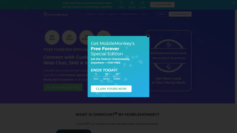
A significant part of that experience comes down to design. With that in mind, here are some design tips to help you create more user-friendly and high-converting popups:
- Use a similar aesthetic as the rest of your site. Popups stand out from other elements by definition. However, to prevent users from perceiving them as annoyances rather than part of your site experience, you’ll need to design the popups to use the same colors, fonts, and overall style as other elements.
- Ensure that your popups are easy to close. Avoiding creating popups that are hard to close. In most cases, this only frustrates visitors and makes it less likely that they’ll want to convert.
- Use Calls to Action (CTAs) that are impossible to ignore. The goal of most popups in modern web design is to help you get more conversions. If you don’t feature your CTA prominently within your popups, you miss out on that opportunity.
- Keep your popups simple. Popups shouldn’t include dozens of fields or long paragraphs of text. They’re a brief stop users make before returning to your real website; you want that stop to be short. The more complex your popups are, the less likely it is that your users will want to engage with them.
There are a lot of considerations when it comes to using popups that go beyond design. As a rule of thumb, we recommend avoiding entry popups, which are those that show up as soon as you load a website.
Entry popups tend to have lower success rates because visitors haven’t had a chance to engage with your content yet. Fortunately, most modern design tools and popup builders give you a lot of control over when and on which pages to display popups.
Build Effective Popups Using Elementor
Although WordPress is incredibly versatile, the Content Management System (CMS) doesn’t include tools to help you design and create popups out of the box. There are a lot of plugins you can use to fill that gap, however, including Elementor.
With Elementor, you get access to a full-blown page and popup builder. You can use dozens of popup templates, or create new designs that work alongside the rest of your Elementor blocks. More importantly, Elementor gives you full control over your popups’ behavior, which lets you create any type of element that you need in order to increase conversions.
Do you have any questions about how to create popups using Elementor? Let’s talk about them in the comments section below!
Looking for fresh content?
By entering your email, you agree to receive Elementor emails, including marketing emails,
and agree to our Terms & Conditions and Privacy Policy.
