Table of Contents
Look, building a WordPress site in 2026 isn’t about slapping a few widgets onto a page. You need speed, accessibility, and a design system that scales without breaking your layout on mobile devices. Elementor currently powers over 21 million websites, which accounts for roughly 13% of all sites globally. But most users only scratch the surface of what the platform actually does.
You’re probably here because you’ve seen the marketing hype. But staring at a blank canvas can feel incredibly overwhelming. I’ve structured development workflows for 183 client projects over the last decade. The difference between a sluggish site and a high-converting machine always comes down to how you set your foundation. We’re going to break down exactly how to build modern, fast web pages step by step. Let’s get to work.
Key Takeaways
- Market dominance – Elementor is the engine behind 13% of all global websites in 2026.
- Performance gains – Migrating to Flexbox Containers improves Largest Contentful Paint (LCP) scores by 15-25%.
- Conversion impact – Custom-designed landing pages convert 160% better than generic theme templates.
- Asset reduction – The CSS-first foundation in Editor V4 reduces total page weight by up to 20%.
- AI efficiency – Over 1.5 million creators actively use in-editor AI and agentic tools like Angie to speed up development.
- Unified ecosystem – The Elementor One subscription consolidates hosting, design, and optimization tools into a single workflow.
Prerequisites for a High-Performance Build
Before you even install the plugin, your environment dictates your success. You can’t run a modern visual editor on a cheap, overloaded shared server from 2015. It just won’t work. The global Content Management System market is projected to hit $27.3 billion by 2028. Standards are rising. You must meet them.
I see beginners make the same mistake constantly. They load up a heavy theme, install thirty random plugins, and then wonder why the editor crashes. Your server needs specific minimums to handle live rendering. If you’re managing a serious business site, you want a managed server setup built for dynamic content.
Here are the absolute baseline technical requirements you need in 2026:
- PHP Version – You need PHP 8.2 or higher. Older versions aren’t actively patched for security and will drastically slow down your backend.
- Memory Limit – Set your WordPress memory limit (`WP_MEMORY_LIMIT`) to at least 512MB in your `wp-config.php` file. Live editing requires RAM.
- Server Level Caching – Use an environment with Redis or Memcached object caching. Elementor Host Cloud uses Google Cloud C2 instances and Cloudflare Enterprise CDN to achieve a 109ms Time to First Byte (TTFB).
- Theme Selection – Install the Hello Theme. It’s a forever-free, blank canvas theme under 30KB. Don’t use heavy commercial themes if you’re building layouts from scratch.
- Database Version – MySQL 8.0+ or MariaDB 10.11+. Complex post meta queries rely on efficient database routing.
- Plugin Base – You need both the free core plugin and Elementor Editor Pro installed to access the full 118+ widget library.
Pro tip: If your host won’t let you increase your memory limit to 512MB, find a new host immediately. You’ll save hours of frustration troubleshooting editor timeout errors.
Initial Configuration and Global Settings
Skipping global settings is the fastest way to ruin your project. If you manually pick colors and fonts for every single heading, you’re doing it wrong. What happens when your client wants to change the primary brand blue six months from now? You don’t want to edit 40 separate pages manually.
Editor V4 relies heavily on a CSS-first foundation. By setting up global variables, you generate cleaner code. You reduce inline styles. You make your site faster. The Site Settings panel is your command center.
Follow these steps to establish your design system:
- Open Site Settings – Click the hamburger menu in the top left corner of the editor panel and select Site Settings.
- Define Global Colors – Assign specific hex codes to Primary, Secondary, Text, and Accent colors. Add custom colors for surface backgrounds and borders. Name them clearly (like “Neutral Gray 800”).
- Set Global Fonts – Define the typography scale for Primary, Secondary, Text, and Accent. Choose your font family, base weight, and rem-based line height.
- Configure Theme Style – Map your HTML tags (H1 through H6, paragraphs, links) directly to the global fonts you just created. This ensures any unstyled text defaults to your brand rules.
- Adjust Layout Defaults – Set your default content width (usually between 1140px and 1280px). Define standard widget spacing to maintain vertical rhythm.
And here’s a crucial accessibility fact. Elementor 3.10+ achieved 100% keyboard navigation support for core widgets. Setting up your global typography correctly ensures screen readers parse your heading hierarchy accurately.
Navigating the Editor Interface
The interface can look like an airplane cockpit the first time you open it. But it’s actually highly logical once you understand the three main zones. The layout is designed to keep your focus on the live canvas while giving you precise control over every HTML element.
I’ve watched hundreds of users struggle because they click randomly instead of using the built-in search features. Don’t scroll endlessly looking for the exact widget you need. Use the keyboard shortcuts. Pressing `Cmd/Ctrl + E` opens the Finder, letting you jump instantly to any page or settings panel on your site.
Here’s how the primary interface components break down in the 2026 version:
| Interface Area | Primary Function | Best Practice Workflow |
|---|---|---|
| Widget Panel | Houses the 118+ elements you drag onto the page. | Use the search bar at the top instead of scrolling. Pin your most-used widgets to the favorites category. |
| Live Canvas | The visual workspace where you build layouts. | Rely on right-click functionality to copy, paste, and duplicate containers quickly. |
| Settings Panel | Controls Content, Style, and Advanced properties for the selected element. | Always apply structural margins in the Advanced tab before adjusting internal padding. |
| Navigator | A floating layer tree showing DOM depth and structure. | Keep it open on a second monitor. Rename containers for complex builds so you don’t get lost. |
| History Tab | Logs every action and saves prior revisions. | Use the Revisions sub-tab to restore the page to exactly how it looked three days ago. |
Pro tip: If you’re building complex overlapping layers with absolute positioning, the Navigator is the only reliable way to select elements hidden behind other `z-index` layers.
Building with Flexbox Containers
If you’re still using the old Sections and Columns model, you’re building legacy websites. Flexbox containers are the standard in 2026. They completely change how the grid operates.
Containers allow you to nest elements infinitely without bloating the HTML structure. Older page builders created massive DOM depth, stacking five invisible wrapper `
Understanding flex properties is non-negotiable. You control exactly how widgets behave inside the box.
Master these core container controls for professional layouts:
- Direction – Choose whether child widgets stack horizontally (Row) or vertically (Column). This is the foundation of responsive design.
- Justify Content – Controls alignment along the primary axis. Use `Space Between` to push two elements to opposite sides of a header.
- Align Items – Controls alignment along the cross axis. Use `Center` to perfectly middle-align an icon next to a line of text.
- Wrap – Determines what happens when widgets exceed the container width. Set it to `Wrap` to force overflowing elements onto a new line (perfect for image galleries).
- Gap – Replaces the old method of adding arbitrary margins. Define a precise 20px gap between all items in the container simultaneously.
- Align Self – Overrides the parent container’s alignment for one specific widget. Great for pushing a single button to the bottom of a pricing card.
Don’t nest containers unnecessarily. If you can achieve the layout using just Flex Direction and Gap, do it. Every extra container adds a node to the browser’s rendering tree.
Adding and Customizing Core Widgets
Widgets are the building blocks of your site. Elementor Pro gives you over 86 advanced widgets, plus the 32 core options. You don’t need all of them. In fact, you’ll build 90% of your site using the same six widgets.
The secret isn’t finding a fancy widget. It’s using basic widgets creatively. A standard heading widget, when combined with custom CSS classes and absolute positioning, looks entirely bespoke.
Essential Content Modules
The Heading, Text Editor, Image, and Button widgets do the heavy lifting. Always map your Headings to the correct HTML tag (`H2`, `H3`) in the Content tab for SEO purposes. For images, use the global Image Optimization feature. It auto-compresses files and serves them in Next-Gen formats like AVIF or WebP, reducing file sizes by up to 60%.
Advanced Pro Widgets
When you need dynamic functionality, the Pro widgets prevent you from installing third-party plugins. Here are the ones that actually move the needle:
- Form Builder – Replaces heavy plugins like Gravity Forms for standard lead capture. Connects natively to email marketing tools and webhooks.
- Loop Grid – Allows you to design exactly how a single blog post looks, then repeats that design across an entire grid of posts automatically.
- Lottie Animations – Embeds lightweight, vector-based JSON animations that scale perfectly without pixelating or slowing down the page.
- Call to Action – Combines an image background, heading, description, and button into one cohesive, interactive card with hover states.
- Table of Contents – Automatically generates jump links based on the heading tags in your article. Critical for long-form SEO content.
- Video Playlist – Keeps users on your domain instead of sending them to YouTube. Great for course creators.
Pro tip: Never apply inline styles to a button. Style the button once in Site Settings, and every button widget you drag onto the canvas will match your brand perfectly.
Generating Content and Styles with AI
Let’s talk about the reality of modern development. AI isn’t replacing web developers, but developers who use AI are absolutely replacing those who don’t. The unified Elementor ecosystem includes multiple tiers of artificial intelligence to speed up the mundane parts of your workflow.
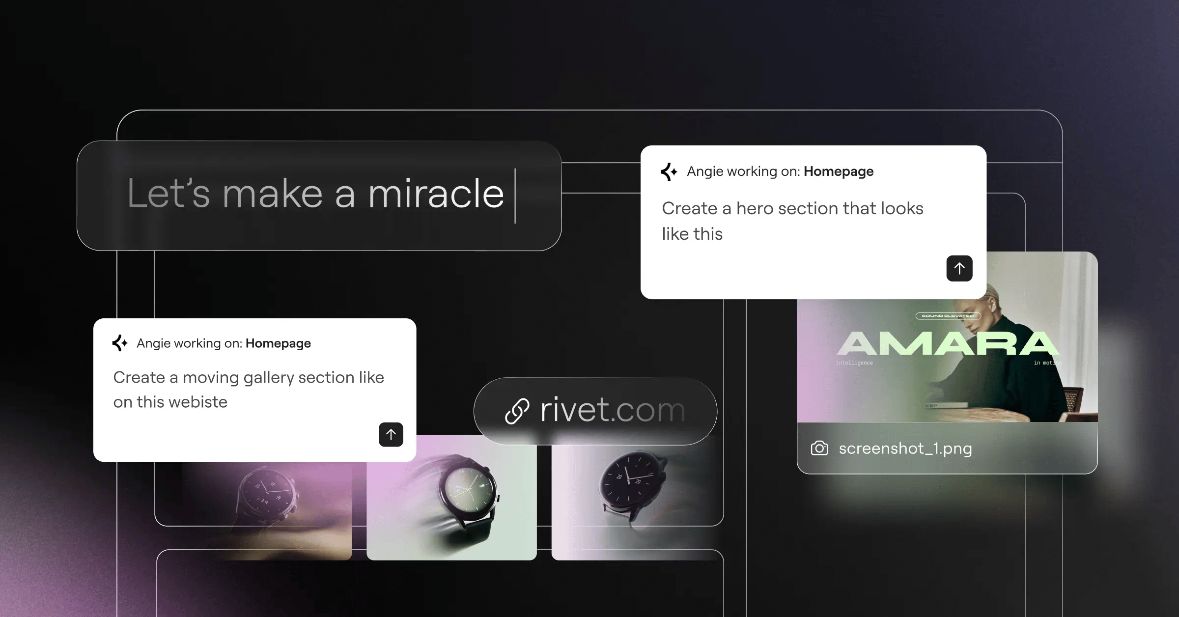
There are two distinct tools you need to understand. The first is Elementor AI, built directly into the editor interface. Over 1.5 million users rely on this for immediate generation. The second is Angie. Angie is an agentic AI operating on the Model Context Protocol (MCP). Instead of just spitting out text, Angie actually takes action. You describe what you need in plain English, and Angie builds production-ready WordPress assets directly in your environment. It’s a massive shift in how we approach no-code development.
Here’s how to integrate these AI tools into your daily build routine:
- Generate Wireframes via Prompt – Use the AI Site Planner before you even open the editor. Describe your business, and it generates a complete sitemap and structural wireframe in under 20 minutes.
- Deploy Agentic Assets – Open Angie and type, “Create a custom post type for Real Estate Listings with custom fields for Price and Square Footage.” Angie executes the complex backend registration instantly.
- Refine Copy In-Editor – Select any text widget. Click the AI sparkle icon. Prompt the assistant to “Make this headline shorter and more persuasive for a local plumbing audience.”
- Generate Custom CSS – Go to the Advanced tab of any widget. Open Custom CSS. Click the AI icon and ask it to “Create a subtle floating animation that activates on hover.” It writes the exact CSS class logic required.
You don’t need to know advanced CSS animation syntax anymore. You just need to know how to ask for it clearly.
Mastering Responsive Design Across Devices
A beautiful desktop site means absolutely nothing if it breaks on an iPhone. Over 55% of global web traffic comes from mobile devices. If you aren’t designing mobile-first, you’re losing money. It’s really that simple.
Elementor handles responsiveness through strict CSS media queries, controlled via breakpoints. The default breakpoints are fine for 2018, but in 2026, we’ve ultra-wide monitors and foldable phones. You need tighter control. You must activate additional custom breakpoints in the Site Settings under Layout.
Configure your responsive logic using these exact targets:
- Mobile Portrait (320px – 767px) – Stack all containers vertically. Set typography to clamp variables so headings don’t break across five lines.
- Tablet Portrait (768px – 1024px) – Use a 2-column grid. Reduce padding. Hide complex background animations that eat up tablet battery life.
- Laptop/Standard Desktop (1025px – 1440px) – This is your primary canvas. use 3-column layouts and full hover interactions.
- Widescreen (1441px+) – Cap your maximum container width at 1440px. Don’t let text lines span 2000 pixels wide; it ruins readability.
Use the Responsive Visibility toggles in the Advanced tab aggressively. Sometimes a hero image that looks great on desktop just takes up too much vertical space on mobile. Don’t try to shrink it. Just hide the desktop image and show a cropped mobile-specific image instead.
Automating Site Architecture with Theme Builder
Creating individual pages is easy. Building a cohesive, automated system is what separates amateurs from professionals. The Theme Builder replaces the traditional WordPress template hierarchy.
Instead of hardcoding a `header.php` file, you design the header visually and tell the system exactly where to display it. You can build a custom product layout for WooCommerce that automatically applies to all 5,000 items in your store. Over 40% of Elementor Pro users rely on this exact functionality to scale e-commerce.
Follow this exact sequence when architecting your site templates:
- Build the Global Header – Navigate to Templates > Theme Builder. Create a new Header. Add your Site Logo widget and Nav Menu widget. Set the display condition to “Entire Site.”
- Construct the Footer – Create a new Footer template. Use a 4-column container. Add your copyright dynamically using the Dynamic Tags feature so the year always updates automatically.
- Design the Single Post Template – Create a layout for your blog articles. Pull in the Post Title, Featured Image, and Post Content widgets dynamically.
- Configure Archive Pages – Build a layout for your category pages using the Archive Posts widget to ensure your loops look consistent.
- Manage Display Conditions – Set priority rules. For example, apply a standard header to the whole site, but exclude it on specific landing pages where you want a minimal, logo-only header.
Dynamic Content is the secret weapon here. Anytime you see the stack-of-coins icon next to a field, you can pull data directly from the WordPress database. You never have to manually type a blog title again.
Building High-Converting E-commerce Stores
WooCommerce is powerful, but out of the box, it looks terrible. The default cart and checkout pages are rigid and notoriously bad for conversion rates. If you want people to pull out their credit cards, you’ve to build trust through precise design.
The Advanced Solo and Advanced plans include full WooCommerce builder capabilities. You completely bypass the restrictive theme files. You own every pixel of the shopping experience.
When customizing your store, prioritize these specific overrides:
- Custom Single Product Pages – Move the Add to Cart button above the fold. Use the Product Images widget to create a sticky gallery on desktop while the details scroll.
- Optimized Checkout Flow – Use the Checkout widget to create a one-page checkout. Remove the distracting sidebar. Enable express payment options directly on the page.
- Dynamic Cart Drawer – Activate the Menu Cart widget in your header. Set it to open an off-canvas drawer so users can review items without leaving the current product page.
- Custom Archive Grids – Design custom product loops that show secondary images on hover and include a quick-add button.
- My Account Customization – Brand the customer portal. Add helpful links to support documentation right inside the dashboard.
Pro tip: Always design empty states. What does the cart look like when a user hasn’t added anything? Add a “Continue Shopping” button that links to your best-selling category.
Performance and SEO Optimization
Speed isn’t a luxury. It’s a ranking factor. A heavy page costs you traffic, conversions, and money. Many people falsely believe page builders are inherently slow. That’s outdated thinking. Bloat comes from bad development practices, not the tools themselves.
If you’re using the Elementor One subscription, performance features like Element Caching and the native Image Optimization are built right in. You don’t need six separate optimization plugins fighting each other in the background. You unify your stack.
“Google’s rendering engine heavily penalizes heavy DOM trees and layout shifts. By using native Flexbox structures and enabling lazy loading for off-screen assets, we consistently see Elementor sites passing Core Web Vitals with flying colors. The code output has fundamentally evolved.”
Itamar Haim, SEO Team Lead at Elementor. A digital strategist merging SEO, AEO/GEO, and web development.
To ensure your site loads under two seconds, implement these strict protocols:
- Enable Font Display Swap – In Site Settings, set font loading to Swap. This ensures text remains visible while custom web fonts download, preventing flash of invisible text (FOIT).
- Activate Lazy Loading – Ensure images and video playlists below the fold are set to lazy load natively.
- Optimize Asset Loading – Turn on the “Improved CSS Loading” and “Improved Asset Loading” toggles in Elementor’s performance settings. This strips unused code from the page.
- Configure SEO Plugins Properly – Ensure your tool (like RankMath or Yoast) integrates fully with Elementor so meta descriptions and schema markup generate accurately from dynamic content.
- Audit Accessibility Scans – Use the native Ally tool to run WCAG checks. It scans for 180+ issues. Fixing contrast ratios and missing alt text directly impacts local SEO rankings.
Never upload a 4MB photograph. Period. Crop it in Photoshop, or let the server-side Image Optimization crush it down to 80KB before it ever touches the browser.
Frequently Asked Questions
Why is my Elementor editor stuck on the loading screen?
This is almost always a memory issue or a fatal plugin conflict. Verify your `WP_MEMORY_LIMIT` is set to 512MB. If that fails, deactivate all third-party add-ons and clear your browser cache to isolate the conflict.
Can I use Elementor without paying for Pro?
Yes, the free core plugin offers 32 basic widgets and standard layout controls. But you won’t have access to the Theme Builder, WooCommerce integration, or advanced forms, which are essential for professional sites.
How does Angie differ from the standard Elementor AI?
Elementor AI lives inside the editor to help generate text, CSS, and images. Angie is a standalone agentic AI that uses MCP to take direct action in WordPress-like creating post types or taxonomy structures from simple text commands.
How do I fix mobile alignment issues?
Switch to the mobile viewport using the responsive mode toggle at the top of the screen. Adjust your flex container direction from row to column, and ensure your width settings are switched from pixels to percentages.
Does the plugin slow down WordPress?
Not if configured correctly. Using Editor V4 with a CSS-first foundation, Flexbox containers, and proper caching keeps your site blazing fast. Most slowdowns come from quality hosting or heavy third-party add-on packs.
What happens if I cancel my subscription?
Your website won’t break. Existing designs remain intact and fully functional. However, you lose access to premium support, software updates, and the ability to drag new Pro widgets onto the canvas.
Can I build my own header without a theme?
Absolutely. That’s exactly what the Theme Builder does. By using the free Hello Theme as a blank base, you construct headers, footers, and archive pages visually without writing a single line of PHP.
How do I improve my PageSpeed Insights score?
Stop using multiple nested containers. Enable Element Caching, compress your images by 60% using the Image Optimization, and host on a high-performance environment like Google Cloud C2 to drop your server response times.
Looking for fresh content?
By entering your email, you agree to receive Elementor emails, including marketing emails,
and agree to our Terms & Conditions and Privacy Policy.


- Prompt your Code & Add Custom Code, HTML, or CSS with ease
- Generate or edit with AI for Tailored Images
- Use Copilot for predictive stylized container layouts

- Prompt your Code & Add Custom Code, HTML, or CSS with ease
- Generate or edit with AI for Tailored Images
- Use Copilot for predictive stylized container layouts
- Craft or Translate Content at Lightning Speed
Top-Performing Website
- Super-Fast Websites
- Enterprise-Grade Security
- Any Site, Every Business
- 24/7 Expert Service

Top-Performing Website
- Super-Fast Websites
- Enterprise-Grade Security
- Any Site, Every Business
- 24/7 Expert Service
- A single, unified experience
- Bank of shared credits across capabilities
- Automatic access to new innovations
- Ensure Reliable Email Delivery for Your Website
- Simple Setup, No SMTP Configuration Needed
- Centralized Email Insights for Better Tracking

- Ensure Reliable Email Delivery for Your Website
- Simple Setup, No SMTP Configuration Needed
- Centralized Email Insights for Better Tracking
- A single, unified experience
- One credit pool across all capabilities
- Every new feature, automatically included

The Future of Web
Creation Inside Your Inbox
By entering your email, you agree to our Terms of Service and Privacy Policy.