Balancing privacy compliance with a good user experience can feel like walking a tightrope. You want to respect your visitors’ privacy, but you still need clean data to grow your business. Make your banner too pushy and your bounce rate climbs. Hide it too well and you risk falling short of global privacy laws. The good news? This balance is easier to strike than it looks, honestly. Smart placement, clean design, and a smooth technical setup keep your opt-in rates high without chasing your audience away.
Key Takeaways
- Placement directly affects user retention. Corner slide-ins and bottom bars offer the best balance of conversions and compliance.
- Center modals bring high opt-in rates but can cause real user frustration and higher bounce rates if the design goes wrong.
- Preventing Cumulative Layout Shift (CLS) matters for your search rankings and for a smooth user experience.
- A native solution keeps your site fast while keeping all compliance data right in your WordPress dashboard.
- Google Consent Mode v2 compliance matters for any site that relies on modern ad tracking and analytics data.
Why Cookie Banner Placement Affects Your Bottom Line in 2026
Every element on your site shapes how a visitor sees your brand, often within milliseconds of landing. A massive box blocking your content right away tends to send people straight to the back button, hurting your bounce rate, conversions, and search engine signals. Getting the placement right is part of your retention strategy too.
Privacy requirements have also gotten stricter. Regulators worldwide penalize businesses that hide opt-out paths or lean on deceptive patterns, so you need clean, consented data for real marketing campaigns. Bury your banner too deep and users might miss it, which keeps your tracking codes from firing. Put it somewhere intuitive and accessible instead, and your tracking stays accurate while users stay happy.
Find a natural spot for your notice and you build trust right away. A clear, well-placed banner tells visitors you respect their privacy, and people who feel respected are far more likely to consent to analytics and marketing cookies. Better experience leads to more trust, and more trust leads straight to better conversions.
Analyzing the Main Banner Placement Positions
No single position works best for every website, but knowing the pros and cons of each layout helps you pick the right one for your audience. Here’s a look at the placement styles you’ll find most often across the web.
Bottom Bar Banner
The bottom bar is one of the most popular choices for modern sites. It stretches across the bottom of the viewport, clear of your header and hero text, letting visitors start reading right away.
Because it’s so non-intrusive, it has a very low impact on bounce rates. The trade-off: some visitors browse your whole site without ever clicking Accept or Decline.
Bottom Corner Slide-In
Often resembling a chat widget, a corner slide-in occupies a small, distinct area of the screen and moves with the user as they scroll. It’s highly visible without feeling aggressive, and works well for SaaS sites, portfolios, and blogs.
The corner box keeps the center of the screen clear, so your call-to-action buttons stay visible, and it can slide in after a short delay to avoid clutter on load.
Top Bar Banner
Placing your banner at the very top guarantees immediate visibility, but this spot can easily conflict with your navigation menu or logo. Style it carelessly and it can push your header down, causing a jarring shift (this one trips up a lot of people).
If you go with a top bar, use a fixed position that doesn’t overlap your main menu, and test carefully so it doesn’t crowd mobile navigation.
Center Modal Pop-Up
A center modal acts as a barrier, appearing in the middle of the screen and often dimming the background. It demands immediate action, and tends to produce some of the highest opt-in rates of any layout.
The downside is real: center modals create real friction and can raise bounce rates, especially among mobile visitors who feel trapped. Make the “Reject All” option just as clear and easy to click as “Accept All.” Equal prominence is what keeps user trust intact.
Full-Screen Barrier
A full-screen takeover blocks visitors from seeing any part of your site until they make a privacy choice. It’s generally reserved for highly regulated industries or sites needing strict age verification. For typical e-commerce or marketing sites, it isn’t a good fit. It hurts the initial experience and can work against your SEO.
Cookie Banner Layout Comparison
Here’s a direct comparison of the key placement styles, to help you visualize how they perform. This table shows how each position affects user behavior and where it works best.
| Placement Position | Opt-in Rate Potential | Bounce Rate Impact | User Experience Friction | Best Suited For |
|---|---|---|---|---|
| Bottom Bar | Medium-High | Very Low | Low | E-commerce, Portfolios, Blogs |
| Bottom Corner Box | Medium | Low | Low | SaaS, Corporate, Service Sites |
| Top Bar | Medium | Low-Medium | Medium | Simple Landing Pages |
| Center Modal | High | High | High | Highly Regulated Industries |
| Full Takeover | Very High | Very High | Extreme | Age-Gated or Private Portals |
Optimizing the Visual Design to Support Conversions
Once you’ve picked the right location, the next step is getting the design right. Your goal is to make the banner look like an intentional, built-in part of your site rather than a generic script bolted on as an afterthought.
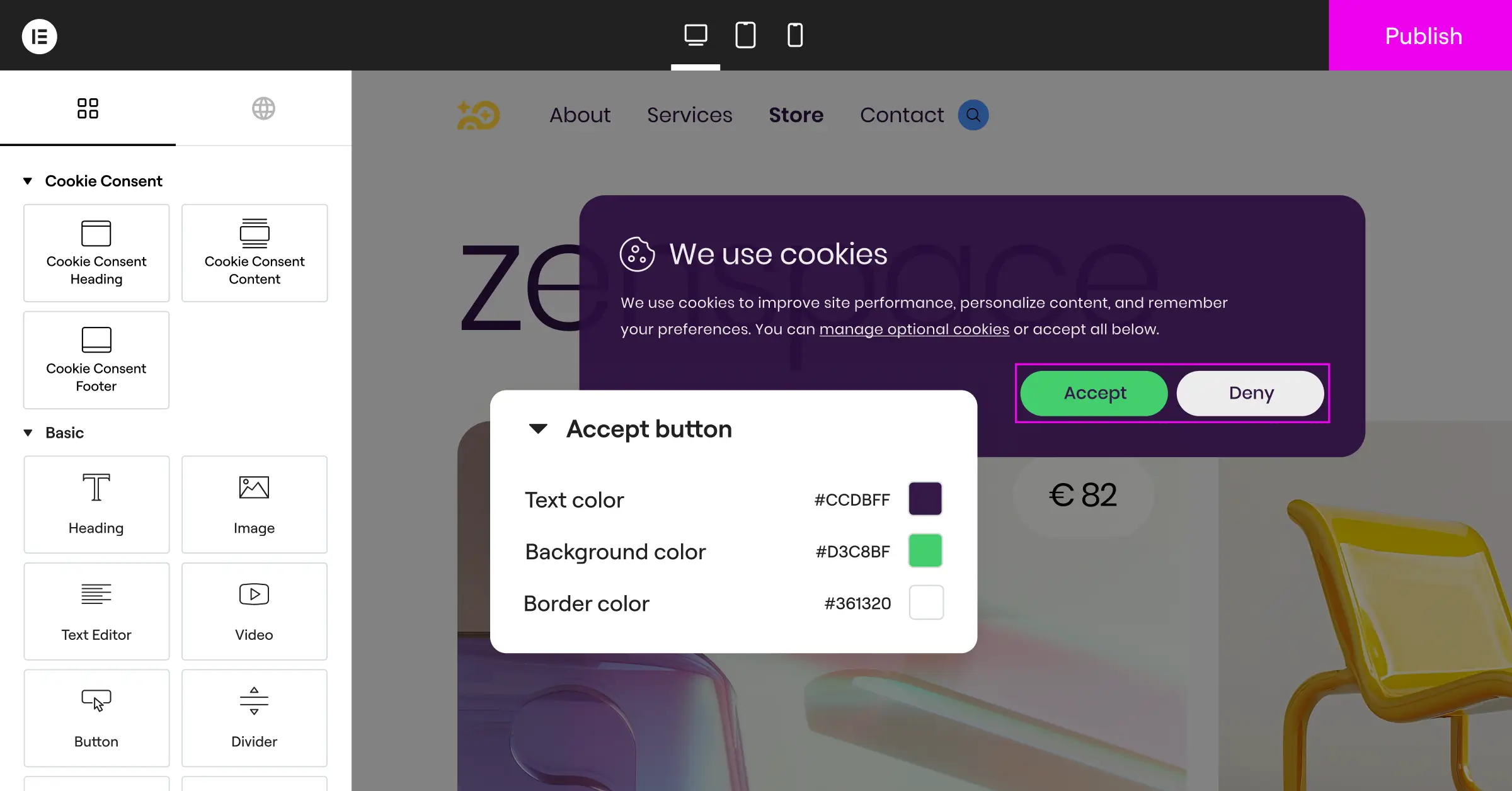
- Matches your brand identity, using your existing color palette, typography, and button styles.
- Establishes clear hierarchy, so your primary action buttons are easy to read and tap on desktop and mobile.
- Avoids deceptive patterns by giving equal visual weight to accepting and declining cookies.
- Keeps text short and jargon-free, explaining exactly why you collect data.
- Adapts to dark mode automatically when your site supports both light and dark themes.
- Separates cookie categories, like marketing and analytics, into simple toggles users can adjust.
When visitors see a polished, transparent banner, their guard drops a little. It signals your brand is professional and honest, which makes them far more comfortable agreeing to your terms.
Technical Implementation: Avoiding CLS and Layout Shifts
One of the most common technical mistakes site owners make is ignoring Cumulative Layout Shift (CLS), the Core Web Vital that measures how much your content jumps around while loading. A slow-loading banner that shoves your footer or header down gets your ranking penalized and causes annoying accidental clicks.
To prevent that shift, reserve space for your banner in your CSS. Position a fixed bottom bar or floating corner box absolutely or fixed, so it hovers cleanly over your content instead of pushing things around. Here’s a simple approach:
/* Example of a fixed bottom banner container that prevents layout shift */
.cookie-consent-banner {
  position: fixed;
  bottom: 0;
  left: 0;
  width: 100%;
  z-index: 9999;
  box-sizing: border-box;
  transform: translateY(0);
  transition: transform 0.3s ease-in-out;
}
You’ll also want your banner scripts to load asynchronously, so your text and interactive elements load first while the banner loads quietly in the background. Block the main thread, though, and your page speed drops, sending visitors away before your site even finishes loading.
The WordPress Native Solution: Elementor Cookie Consent
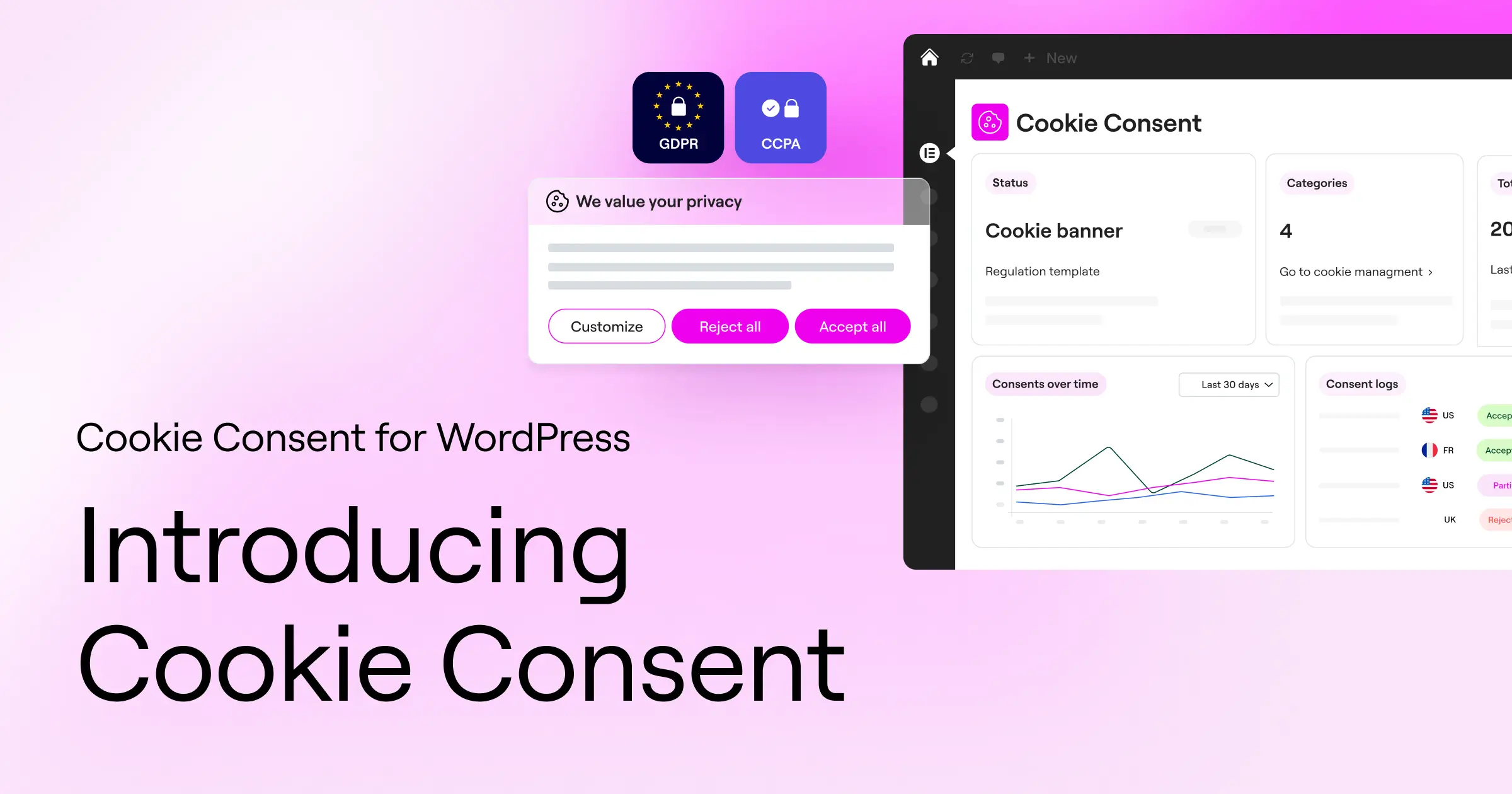
For WordPress site owners, keeping up with compliance without slowing your site down or juggling external dashboards is a real win. That’s where Elementor comes in. The native Cookie Consent capability handles GDPR and CCPA requirements right from your WordPress dashboard, no separate platforms or heavy setup required.
With Elementor’s Cookie Consent tool, you get a quick 3-step setup under five minutes. Built right into your WordPress environment, there’s no copying and pasting code or worrying about compatibility issues. You can scan and categorize your cookies, manage tracking scripts, and keep consent logs for future audits, all in one place.
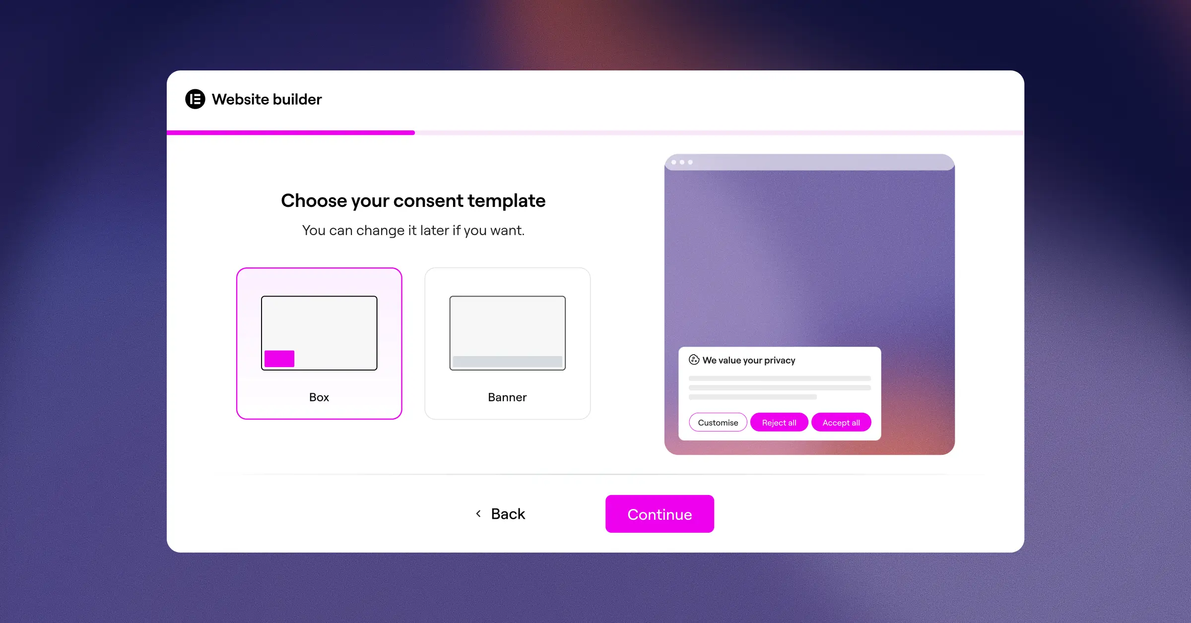
This native integration gives web creators and conversion-focused marketers a few clear advantages:
- Simplifies layout styling, matching your typography and colors to your brand automatically.
- Improves loading speed by cutting out external scripts from third-party servers.
- Saves on maintenance by keeping cookie settings, consent logs, and design in one dashboard.
Instead of connecting external tools like Cookiebot, CookieYes, Complianz, iubenda, or OneTrust to your design, you get one built-in tool that does the job. Geo-targeting shows detailed banners to visitors in regions like the EU or California, keeping things clean elsewhere. And since Cookie Consent is part of Elementor One, you’ve already got it on that plan.
Global Compliance Regulations and Their Placement Impact
Different parts of the world have very different legal requirements for gathering cookie consent, so your banner layout needs to adapt to your visitor’s location. Modern geo-targeting makes it simple to show the right banner automatically.
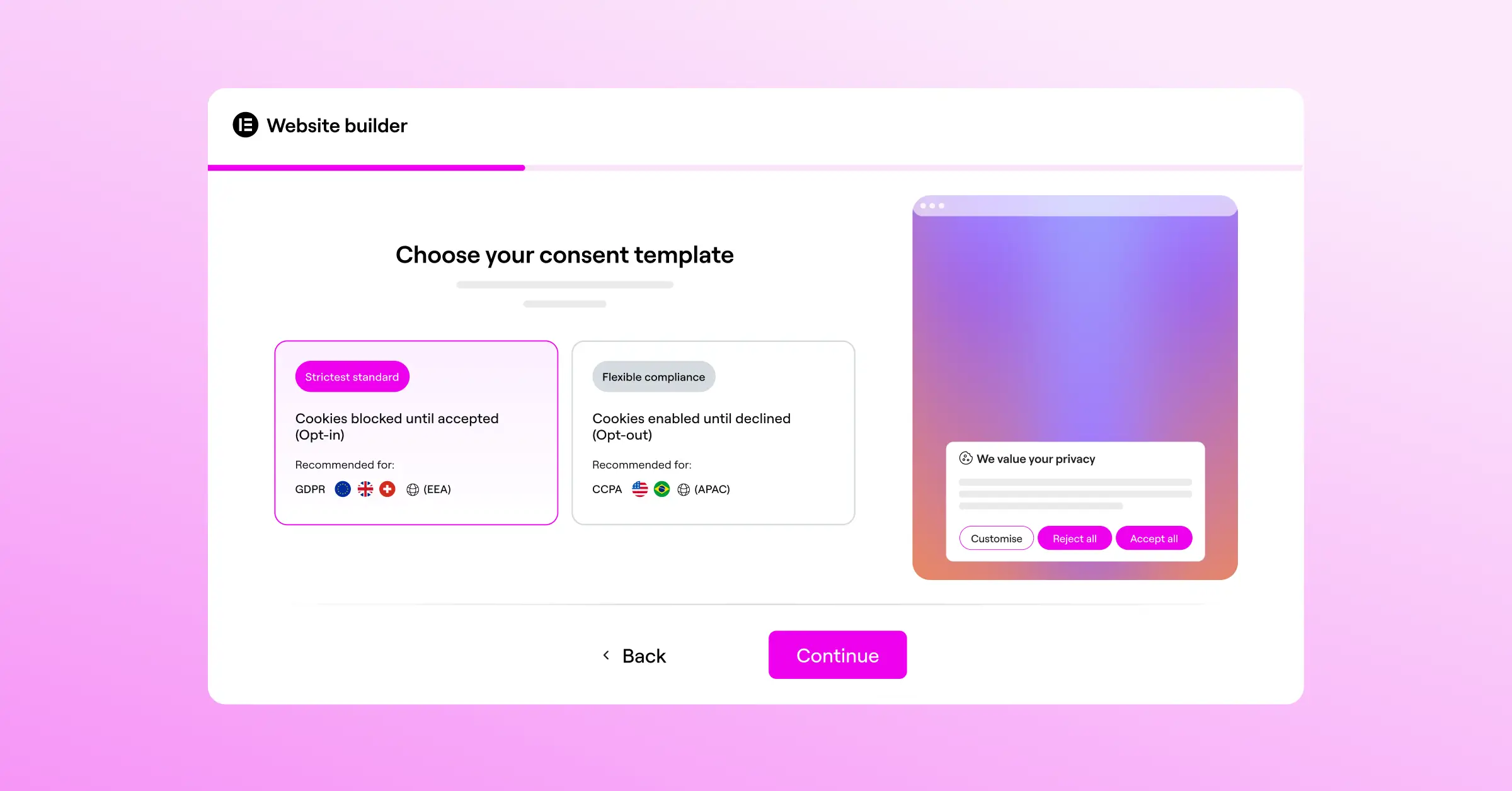
Under the General Data Protection Regulation (GDPR) in Europe, the rules are strict. You can’t pre-check consent boxes or rely on implicit consent, like assuming someone agreed because they scrolled down the page. The “Accept All” and “Reject All” buttons must be equally prominent, and a hard-to-find reject button puts you out of compliance.
The California Consumer Privacy Act (CCPA) and California Privacy Rights Act (CPRA) follow an opt-out model instead. You can often track behavior by default, but you must provide a clear, visible link reading “Do Not Sell or Share My Personal Information,” placed in a bottom bar or footer.
You’ll also want your banner to support Google Consent Mode v2, which passes user choices directly to Google services like Analytics and Ads. When someone declines, those services send non-identifying pings instead of tracking cookies, keeping your conversion modeling intact.
Expert Insights
To put these placement and design choices in context, we asked a compliance specialist for their take on balancing conversion optimization with strict regulatory standards.
“The biggest mistake we see companies make is trying to hide the ‘Decline’ button. Not only does this violate modern GDPR standards, but it also damages your brand’s credibility. When you make consent clear, transparent, and easy to manage, you build a foundation of trust that actually improves long-term customer relationships and conversion rates.”
– Itamar Haim, Web Compliance Specialist
How to Test and Measure Banner Placement Performance
Never rely on pure guesswork here. What works for a B2B SaaS platform might flop for an e-commerce storefront, so run clean A/B tests to find the best setup. Here’s a step-by-step process:
- Establish your baseline metrics before changing anything: current opt-in rate, bounce rate, and conversion rate over a two-week period.
- Formulate a clear hypothesis, for example: “Moving our consent banner from a center modal to a bottom corner box will decrease our bounce rate by 15% while keeping our opt-in rate stable.”
- Set up your testing tool, using a conversion optimization tool or a Google Optimize alternative, to split traffic evenly between Version A and Version B.
- Keep variables isolated. Only change the banner’s placement, keeping text, colors, and cookie options identical, so results reflect position alone.
- Run the test to statistical significance, usually two to three weeks of steady traffic, before making a decision.
- Analyze and implement. If the new placement cuts bounce rate without hurting consented analytics data, make it your permanent version.
Testing regularly keeps your site tuned to changing habits, since visitor preferences around privacy controls keep shifting, and that’s genuinely worth the ongoing effort.
Frequently Asked Questions
Does cookie banner placement affect my SEO rankings?
Yes, banner placement can definitely impact your search engine optimization. If you use a massive center modal or full-screen takeover that blocks your page content as soon as a user arrives, search engines may flag your site for having intrusive interstitials. That can lower your mobile search rankings. To protect your SEO, choose non-intrusive placements like a bottom bar or a corner box that leave your main content accessible.
Should I place my cookie banner at the top or the bottom of the screen?
For most websites, placing the banner at the bottom of the screen is the better option. A bottom bar or corner box is highly visible without interfering with your main header navigation, brand logo, or search bars. Top banners can often conflict with your header design and push key elements out of view, causing layout issues on mobile devices.
Can I hide the decline button to increase my opt-in rates?
No, hiding or obscuring the decline button is both ineffective and illegal under several major privacy laws, including the GDPR. Your opt-in and opt-out options must be equally easy to find and use. Using dark patterns to trick users into accepting cookies can lead to severe fines from privacy regulators and destroys trust with your audience.
What is Google Consent Mode v2 and do I need to support it?
Google Consent Mode v2 is a framework that passes user consent choices directly to Google services like Ads and Analytics. If you serve visitors in the European Economic Area (EEA) and use Google tracking tools, supporting Consent Mode v2 is mandatory. It lets you use conversion modeling to fill in tracking gaps when users decline consent, keeping your marketing data accurate.
How do I prevent my cookie banner from slowing down my WordPress site?
The best way to maintain fast load times is to use a native option like Elementor’s Cookie Consent capability. Native features run directly within your WordPress environment, preventing the delay caused by fetching external scripts. You should also make sure your consent scripts are configured to load asynchronously so they don’t block your page from rendering.
Does a bottom corner box work well on mobile screens?
A bottom corner box works great on desktop, but it needs careful optimization for mobile. On smaller screens, a corner box should automatically expand to a full-width bottom bar or adjust its size so it doesn’t block important interactive buttons. Make sure your banner leaves plenty of room for mobile touch targets.
Should I show my cookie banner to every single website visitor?
You can choose to show it to everyone, but using geo-targeting is often a smarter approach. Geo-targeting lets you display detailed, legally compliant banners to visitors from highly regulated regions (like the EU) while keeping your site clean and distraction-free for visitors in areas with fewer tracking restrictions. It’s a straightforward way to keep your user experience smooth for all audiences.
Can I write my own custom text for my privacy notification?
Yes, and writing in a clear, friendly brand voice is highly recommended. Just make sure your custom text clearly explains what data you collect, why you collect it, and how users can change their choices at any time. Avoid overly complicated legal jargon and keep your language accessible and honest.