Table of Contents
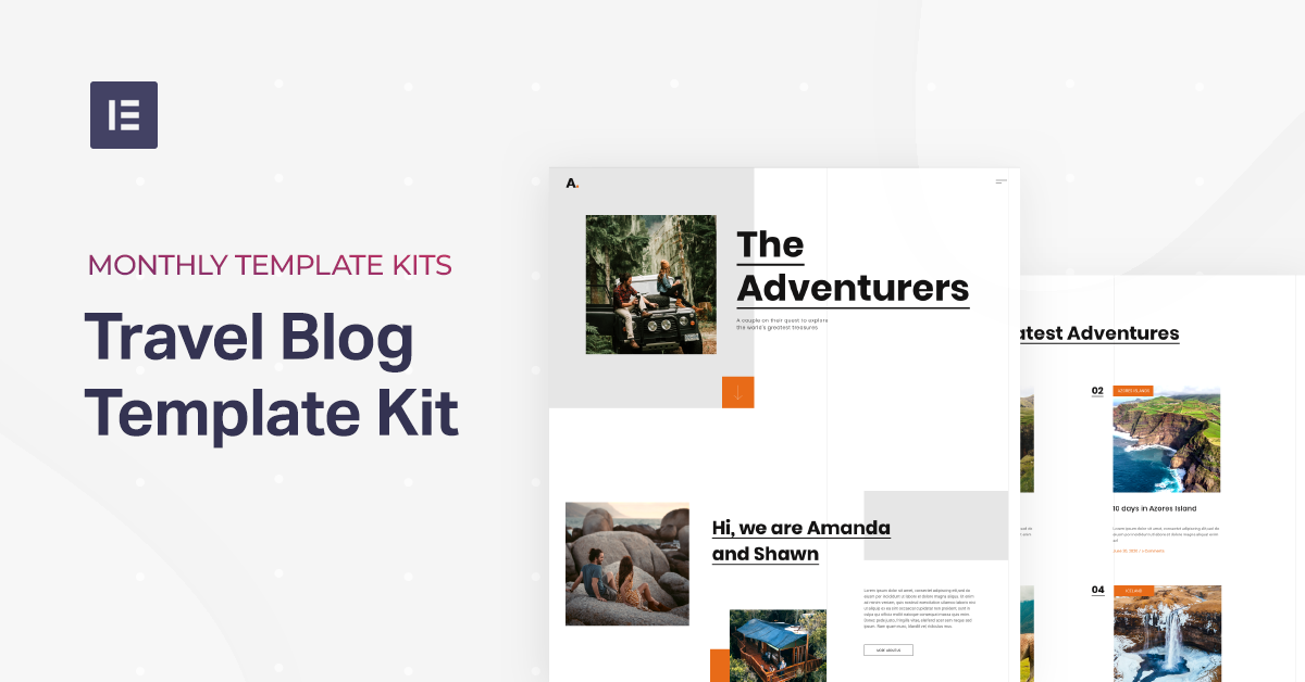
This month, our template kit takes you on a journey through the art of blogging — as our designers have created a bold and bright travel blog template kit for wanderlust enthusiasts. Passionate travelers now have a simple, stylish way to document their journeys around the world.
"Once a year, go someplace you’ve never been before."
Dalai Lama
Our brand new travel blog template kit uses a versatile, sophisticated yet upbeat design scheme for those exploring the world through travel. The kit is a balanced combination between the traditional and the alternative, the familiar and the unknown, all of which come together in a beautiful blog layout.
In the spirit of adventurism and the ambition to embark on new frontiers, we designed the traveler blog with subtle yet unique details: simplistic black on white backgrounds and texts, with orange design assets, light grey gridlines, scattered square shapes, and so on.
The role of the travel blog template kit is to enable travel bloggers, and really bloggers of any discipline — to have an easy yet sophisticated way to jot down their experiences, thoughts and musings. World travel is all about excitement, turning over rocks and new leaves, and simply meeting new horizons that you’ve never seen before. Between all the hustle and bustle, finding time to record your experiences and insights for other travelers can be a big undertaking. And so, when you’re provided with a quick and easy way to write about what you’ve seen and done, you have the opportunity to make the project happen.
Of course, there are so many reasons and experiences that people want to create blogs for, be it cooking blogs, storytelling about your personal artwork, and personal blogs of any sort, you now have a simple recipe to follow in order to create a clean and modern travel blog website.
Homepage: A Friendly Introduction
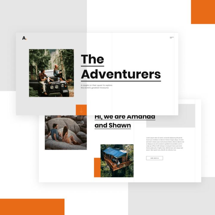
The traveler blog’s homepage is where readers are first introduced to the travelers (blog owners) themselves. For this reason, it’s a top priority for Amanda and Shawn to create a personable, exciting and friendly vibe on their homepage. The use of bright orange accents throughout the page creates an upbeat, welcoming atmosphere evoking happiness and a sense of optimism within readers. The subtle grey lines that proceed vertically down the page represent a chronological timeline that dramatizes the open-ended journey that the travelers are embarking on indefinitely.
The blog’s homepage is a fine example for how complementary the Posts Widget can be when designing a blog archive page. With a neat, classy card layout that uses polished information architecture to distinguish between each post’s title, description and info, the post thumbnails are professional-looking and engaging.
The Homepage is a Page template.
You can download it from Editor > Open Library popup > Pages tab > scroll the page and find it or search for “Travel Blog”.
Road Stories: Tales From Nomad Land
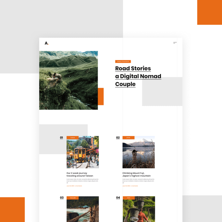
The blog’s Road Stories page is the official post archive page where readers can access the full collection of Amanda and Shawn’s posts — also created with the Posts widget. What’s noteworthy about the Road Stories page is the choice of imagery used for each post thumbnail image. Each photograph focuses exclusively on scenic perspectives of nature, rather than on pictures of the travelers themselves experiencing the excitement of what they’re seeing.
This design choice accounts for the authenticity of the blog content — that it serves to act as an insightful, inspirational guide for travelers and not solely a forum for travelers to talk about what they’ve done and relish in their own experiences.
The Stories page is an Archive Template.
You can download it from WP left panel > Templates > Theme Builder > Add New > Choose “Archive” > Library popup > scroll the page and find it or search for “Travel Blog”.
Single Post: Always Look Ahead
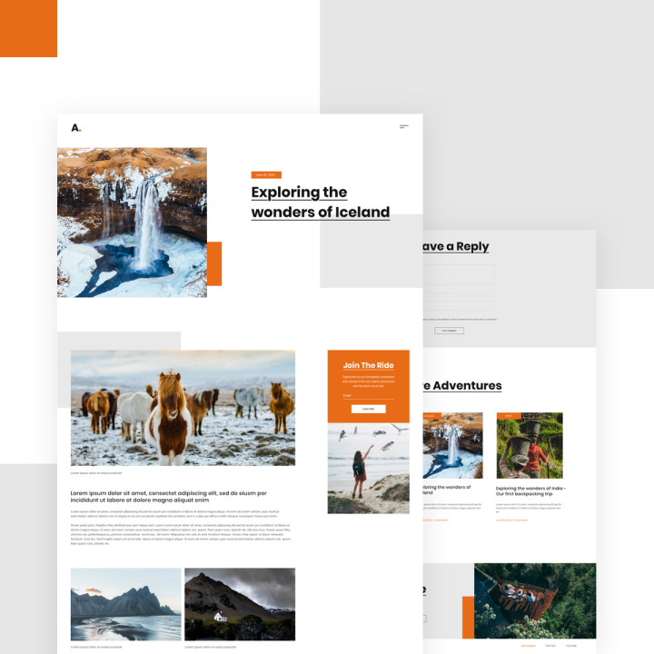
The (individual) Stories page is unique for many reasons, one of which is its layout style — a left-aligned single column of content. Similar to the vertical timeline concept on the homepage, the single column creates a one directional browsing experience, representing how adventurous travelers embark on an open-ended journey and don’t look back. There’s always more to be seen and done.
The Story page is a Single Post Template.
You can download it from WP left panel > Templates > Theme Builder > Add New > Choose “Single Post” > Library popup > scroll the page and find it or search for “Travel Blog”.
Popup Menu: Surrounded by Navigation
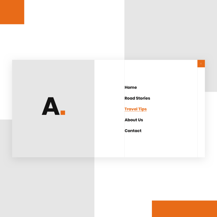
The Popup Menu used in Amanda and Shawn’s blog is a prime example of how captivating a full-screen popup menu can be. Like adventurous travel, full-screen popups are an immersive, all-encompassing experience, as the visitor becomes 100% focused on navigation.
This particular popup menu is created with the Nav Menu Widget, which gives the Elementor user an endless amount of options for how to create a popup menu, be it full-screen or not. The application of the template’s color scheme to the popup menu is coordinated perfectly, with the classy use of black text on white background, with orange accents inserted throughout — in the menu item hover effects and in the logo’s punctuation.
The Popup Menu is a Popup Template.
You can download it from the “Popups” section.
WP left panel > Templates > Popups > Add New > Choose “Popup” > Library Popup > scroll the page and find it or search for “Travel Blog”.
Where Are You Headed To Next?
The design of a blog website gives every web creator an opportunity to be profoundly creative in using their out-of-the-box design skills to create an online publication that tells their individual story.
This template kit is a great place to start for those looking to build their first (or one of their first) blogs, with its simple, versatile layout and engaging design details such as a modern color scheme. The use of orange can be replaced with any color of your choice, as black and white is a color combination that welcomes many to go with it.
When you’re looking to take the next step to build up your brand and online presence, blogs are a great place to start.
We’re excited to see where your new blog will take you!
To see the full Travel Blog Template Kit, check out this demo.
If you have Elementor Pro, all you have to do to enjoy this cutting-edge kit is to go into Elementor, open the Template Library, and search for “Travel Blog”. This kit includes Home, About, Road Stories (Archive), Travel Tips (Archive), Road Stories (Single), Travel Tips (Single), Contact, 404, Popup Menu, Popup, Header, and Footer.
Here’s a short gif showing how to search for the kit:
Which templates would you like to see next? Let us know in the comments below.
Looking for fresh content?
By entering your email, you agree to receive Elementor emails, including marketing emails,
and agree to our Terms & Conditions and Privacy Policy.
