Table of Contents
This guide is here to help you navigate the world of web typography. We will explore 50 of the most effective and modern fonts you can use in 2026. We’ll cover not only a curated list of sans-serifs, serifs, and variable fonts but also the principles behind choosing the best one for your brand. Most importantly, we’ll show you how to take these fonts and implement them beautifully on your website, especially if you’re building with Elementor.
Why Your Website’s Font is a Critical Design Choice
Choosing a font goes far beyond simply picking a style you like. It’s a strategic decision that has a measurable impact on your website’s success. From how users perceive your brand to how likely they are to make a purchase, typography plays a silent but powerful role.
Impact on Brand Perception
Your font is a key part of your brand’s visual identity. It’s a visual tone of voice. A font can communicate whether your brand is sophisticated and traditional, or innovative and futuristic. For instance, a classic serif font might be perfect for a law firm to convey authority and heritage, while a clean, geometric sans-serif might suit a tech startup aiming for a modern, approachable feel.
This first impression is critical, as studies have shown that it takes only about 50 milliseconds for users to form an opinion about your website, and that initial judgment is 94% design-related. A well-chosen font aligns with your logo, color scheme, and imagery to create a cohesive brand identity that builds recognition and trust.
Enhancing Readability and User Experience (UX)
The primary goal of text is to be read. If your font is difficult to decipher, your message is lost. Good typography enhances readability, allowing users to consume your content without friction. Factors like letter spacing (kerning and tracking), line height (leading), and a clear distinction between characters all contribute to a positive reading experience.
Conversely, a font that is too decorative, too small, or poorly spaced can cause eye strain and frustration, leading to higher bounce rates as users give up and leave. Legibility is the foundation of a good user experience; if users can’t read your content, nothing else matters. This is especially true on mobile devices, where smaller screens demand even greater clarity.
Boosting Conversions
A positive user experience directly influences your conversion rates. When users can easily read and navigate your site, they are more likely to stay engaged, trust your brand, and follow your calls-to-action. One case study demonstrated that by simply improving the typography, a company increased its conversion rates by a staggering 133%.
Clear, well-structured typography guides the user’s eye toward important elements like “Buy Now” buttons or contact forms. By making the path to conversion smooth and legible, you remove a significant barrier for potential customers. Clear fonts on buttons, for example, can increase clicks simply because the action required is unambiguous.
What Makes a Font “Modern”?
The term “modern” in typography doesn’t just refer to fonts created recently. In fact, some modern styles have roots in the early 20th century. Instead, “modern” describes a set of characteristics that align with contemporary design principles.
- Clarity and Simplicity: Modern fonts prioritize clean lines and geometric forms. They avoid excessive ornamentation, focusing on legibility and straightforward communication. This minimalist approach ensures the content remains the hero.
- Versatility: A great modern font works well across various sizes and weights. It should be just as clear in a bold headline as it is in smaller body text. This versatility is crucial for creating a cohesive design system that functions across all brand touchpoints.
- Emphasis on Readability: Modern fonts are often designed specifically for digital screens. They feature generous x-heights (the height of lowercase letters) and open apertures to ensure they render sharply on displays of all resolutions, from large monitors to small phones.
- Subtle Personality: While they are simple, the best modern fonts are not boring. They have unique details—a slight curve here, a sharp angle there—that give them character without sacrificing clarity. This allows brands to express a unique identity while maintaining a professional and accessible presentation.
The Top 25 Modern Sans-Serif Fonts for a Clean Look
Sans-serif fonts are the workhorses of the web. Lacking the small decorative strokes (serifs) at the end of their characters, they offer a clean, crisp, and minimalist aesthetic. They are exceptionally versatile and are the go-to choice for user interfaces (UI), body text, and any design aiming for a contemporary, uncluttered feel.
1. Inter
A masterpiece of functional design, Inter was created specifically for computer screens. It’s incredibly readable at all sizes, making it a perfect all-rounder for everything from detailed UI text to bold headlines. Its large font family includes a variable version for ultimate flexibility.
- Best For: UI/UX, Body Text, Headlines
- Source: Google Fonts
2. Manrope
Manrope is a geometric sans-serif that blends a professional tone with a friendly, modern feel. It’s clean, versatile, and excellent for both digital product design and corporate websites that want to appear approachable yet competent.
- Best For: UI/UX, Tech Websites, Headlines
- Source: Google Fonts
3. Satoshi
Satoshi has quickly become a favorite in the design community for its blend of geometric and humanist qualities. It feels both engineered and natural, giving it a unique personality that is modern and highly legible. It’s a great choice for brands that want to feel innovative and human-centric.
- Best For: Digital Products, Startups, Branding
- Source: Fontshare
4. Plus Jakarta Sans
Inspired by the typography of Jakarta’s city branding, this font is clean, geometric, and versatile. It offers a certain sharpness that works wonderfully for headlines, but its excellent readability makes it a solid choice for body text as well.
- Best For: Headlines, Body Text, Corporate Websites
- Source: Google Fonts
5. Geist
Developed by Vercel, Geist is a sans-serif designed for developers and designers. It’s clean, technical, and highly legible, making it perfect for websites focused on technology, software, or design. It has a no-nonsense feel that communicates clarity and precision.
- Best For: Tech Websites, Developer Portfolios, UI/UX
- Source: Vercel’s GitHub
6. Space Grotesk
A proportional take on the classic fixed-width Space Mono, Space Grotesk has a quirky, tech-forward personality. Its unique character shapes make it a standout choice for headlines and branding for companies in the tech or creative space.
- Best For: Headlines, Branding, Tech Startups
- Source: Google Fonts
7. DM Sans
Commissioned by Google from Colophon Foundry, DM Sans is a low-contrast geometric sans-serif designed for smaller text sizes. This makes it an exceptional choice for body copy and UI elements where clarity is paramount.
- Best For: Body Text, UI/UX, Mobile Apps
- Source: Google Fonts
8. Outfit
Outfit is a geometric sans-serif with a clean and professional appearance. It’s a versatile font family that can handle both display and text roles with ease, making it a reliable choice for a wide range of web projects.
- Best For: Corporate Websites, Branding, Headlines
- Source: Google Fonts
9. Urbanist
With a clean and neutral design, Urbanist is a variable sans-serif font that is highly versatile. Its minimalist aesthetic makes it suitable for a wide array of applications, from modern tech sites to elegant lifestyle blogs.
- Best For: UI/UX, Minimalist Designs, Branding
- Source: Google Fonts
10. Sora
Sora is a sans-serif typeface with a geometric structure and a touch of grotesque style. It was designed to excel in screen-based environments, offering great clarity in user interfaces and long-form text.
- Best For: UI/UX, App Design, Long-form Reading
- Source: Google Fonts
11. Cabinet Grotesk
Cabinet Grotesk is a modern sans-serif with a strong personality. Its letterforms have unique quirks that give it a playful yet professional feel, making it a great option for brands that want to stand out.
- Best For: Branding, Headlines, Creative Portfolios
- Source: Fontshare
12. Switzer
A clean and neutral sans-serif, Switzer is designed to be a timeless workhorse. Its balanced proportions and wide range of weights make it incredibly versatile for any project that requires a clear, modern voice.
- Best For: Corporate Websites, UI/UX, Body Text
- Source: Fontshare
13. Poppins
Poppins is one of the most popular geometric sans-serifs for a reason. Its circular shapes and clean lines give it a friendly and approachable feel. It’s a fantastic choice for startups, lifestyle brands, and any site that wants to feel modern and inviting.
- Best For: Headlines, Branding, Startups
- Source: Google Fonts
14. Figtree
Figtree is a clean, minimalist sans-serif with a friendly and simple aesthetic. It was designed with clarity in mind, making it a solid choice for body text and UI elements where readability is key.
- Best For: Body Text, UI/UX, Minimalist Designs
- Source: Google Fonts
15. Lato
Lato is a humanist sans-serif that feels warm and stable. Its semi-rounded details give it a feeling of warmth, while its strong structure provides stability and seriousness. It’s a corporate-friendly font that doesn’t feel cold.
- Best For: Body Text, Corporate Websites, Portfolios
- Source: Google Fonts
16. Montserrat
Inspired by old posters and signs in the Montserrat neighborhood of Buenos Aires, this font has a special place in the hearts of many designers. Its geometric style is clean, modern, and works incredibly well for headlines and short blocks of text.
- Best For: Headlines, Creative Agencies, Landing Pages
- Source: Google Fonts
17. Nunito
Nunito is a well-balanced sans-serif with rounded terminals, which gives it a soft, friendly appearance. It’s an excellent choice for both display and text, making it a versatile option for brands that want to feel welcoming.
- Best For: Branding, UI/UX, Children’s Products
- Source: Google Fonts
18. Rubik
Rubik has slightly rounded corners and a bold presence, making it a great font for headlines that need to be both strong and friendly. Its clean design ensures it remains legible even at smaller sizes.
- Best For: Headlines, Display Text, Tech Websites
- Source: Google Fonts
19. Work Sans
Optimized for on-screen use, Work Sans is a grotesque sans-serif that is well-suited for both headings and body text. Its wider letterforms make it comfortable to read in longer paragraphs.
- Best For: Body Text, Portfolios, Digital Publications
- Source: Google Fonts
20. Public Sans
Based on Libre Franklin, Public Sans is a strong, neutral, and highly readable sans-serif developed by the United States Web Design System. It’s designed for clarity and simplicity, making it a fantastic choice for government, corporate, or informational websites.
- Best For: Body Text, Informational Websites, UI/UX
- Source: Google Fonts
21. General Sans
General Sans is a modern, minimalist sans-serif that is all about clarity and simplicity. Its clean, geometric structure makes it ideal for a wide range of digital and print applications where a neutral yet professional tone is required.
- Best For: UI/UX, Minimalist Designs, Corporate Branding
- Source: Fontshare
22. Epilogue
Epilogue is a clean, variable sans-serif that feels both modern and timeless. It was designed to be a workhorse, performing well in both large display sizes and small text sizes, making it a very practical choice.
- Best For: Body Text, UI/UX, Versatile Branding
- Source: Google Fonts
23. Onest
Onest is a geometric sans-serif that strikes a great balance between neutrality and personality. It’s highly readable, making it suitable for a wide range of applications from user interfaces to corporate branding.
- Best For: UI/UX, Corporate Websites, Body Text
- Source: Google Fonts
24. Be Vietnam Pro
This sans-serif font family was designed with a focus on clarity and readability, especially for tech-focused content. It has a clean, modern look that is both professional and approachable.
- Best For: Tech Startups, UI/UX, Informational Sites
- Source: Google Fonts
25. Red Hat Display
A variable font designed for user interfaces, Red Hat Display is clean, crisp, and highly legible. Its open counters and balanced letterforms make it comfortable to read on screens, perfect for any UI-heavy project.
- Best For: UI/UX, Dashboards, Digital Products
- Source: Google Fonts
The Top 20 Modern Serif Fonts for an Elegant Touch
For years, serifs were seen as a choice for print, not screens. But with high-resolution displays now standard, modern serif fonts are making a major comeback in web design. They can add a touch of elegance, authority, tradition, or sophistication that sans-serifs sometimes lack. They are perfect for headlines, editorial content, and brands that want to convey a sense of trust and refinement.
1. Playfair Display
With its high-contrast letterforms and delicate hairlines, Playfair Display is a transitional serif that exudes elegance and sophistication. It’s perfect for headlines and titles that need to make a statement.
- Best For: Headlines, Luxury Brands, Editorial Design
- Source: Google Fonts
2. Lora
Lora is a well-balanced contemporary serif with roots in calligraphy. It’s a font with moderate contrast that works wonderfully for body text, conveying a sense of artistry and poise.
- Best For: Body Text, Storytelling, Blogs
- Source: Google Fonts
3. Merriweather
Designed specifically for on-screen reading, Merriweather is a highly legible serif that is pleasant to read for long periods. Its sturdy design and generous spacing make it a workhorse for body text.
- Best For: Body Text, News Websites, Digital Publications
- Source: Google Fonts
4. EB Garamond
An open-source revival of the classic Garamond typeface, EB Garamond brings timeless elegance to the web. It’s a fantastic choice for sites that want to evoke a classic, literary, or academic feel.
- Best For: Body Text, Academic Websites, Book Publishers
- Source: Google Fonts
5. Fraunces
Fraunces is a variable serif typeface with a huge range of styles, from weight and softness to Wonk (a measure of its eccentricity). This makes it incredibly versatile, able to convey anything from a classic, formal tone to a quirky, playful one.
- Best For: Headlines, Branding, Creative Projects
- Source: Google Fonts
6. PT Serif
PT Serif is a transitional serif typeface designed for use alongside its sans-serif counterpart, PT Sans. It is highly readable and works well for both headlines and body text, making it a versatile and practical choice for many websites.
- Best For: Body Text, News Sites, Corporate Communications
- Source: Google Fonts
7. Cormorant Garamond
An elegant display serif, Cormorant Garamond is perfect for large headlines where its fine details can shine. It’s a beautiful choice for fashion, luxury, or any brand that wants to project an image of refinement.
- Best For: Headlines, Display Text, Fashion Brands
- Source: Google Fonts
8. Libre Baskerville
A web-optimized version of the classic Baskerville typeface, Libre Baskerville is a great choice for body text. It offers a classic, literary feel and is highly readable on screens.
- Best For: Body Text, Long-form Articles, Publishing
- Source: Google Fonts
9. Spectral
Spectral is a versatile serif typeface commissioned by Google Fonts. It’s designed for screen-first reading and works beautifully for long-form content, offering a clear and pleasant reading experience.
- Best For: Body Text, Digital Publications, Editorial Content
- Source: Google Fonts
10. Zilla Slab
Zilla Slab is a contemporary slab serif from Mozilla. Its smooth curves and friendly feel make it approachable, while its solid structure gives it a sense of reliability. It’s great for headlines and branding.
- Best For: Headlines, Branding, Tech Blogs
- Source: Google Fonts
11. Arvo
Arvo is a geometric slab serif that is clean and highly readable. It has a classic feel but with modern sensibilities, making it a versatile choice for both headings and body text.
- Best For: Headlines, Body Text, Call-to-actions
- Source: Google Fonts
12. Vollkorn
Vollkorn is a sturdy and versatile serif designed for everyday use. It works well for both body text and headlines, bringing a sense of warmth and readability to the page.
- Best For: Body Text, Blogs, Recipe Websites
- Source: Google Fonts
13. Aleo
A contemporary slab serif, Aleo has semi-rounded details and a strong structure, giving it a friendly yet solid personality. It’s designed for optimal legibility, making it a good choice for both web and print.
- Best For: Headlines, Branding, Editorial Use
- Source: Google Fonts
14. Bitter
Designed specifically for comfortable reading on any screen, Bitter is a contemporary slab serif that is highly legible. Its generous x-height makes it particularly clear at text sizes.
- Best For: Body Text, Blogs, News Articles
- Source: Google Fonts
15. Manuale
Manuale is a versatile serif designed for continuous reading on screens. It offers a range of weights and styles, making it adaptable for complex typographic hierarchies in editorial and informational design.
- Best For: Body Text, Editorial Layouts, Informational Sites
- Source: Google Fonts
16. Taviraj
Taviraj is a serif typeface with a Latin and Thai loopless design. Its high contrast and wide proportions give it an airy and elegant feel, making it suitable for fashion, lifestyle, or any design that needs a touch of class.
- Best For: Headlines, Lifestyle Blogs, Magazine-style sites
- Source: Google Fonts
17. Frank Ruhl Libre
A classic Hebrew and Latin serif, Frank Ruhl Libre is well-suited for long-form reading. It has a timeless quality that brings a sense of authority and readability to text-heavy websites.
- Best For: Body Text, News and Editorial Sites, Academic Content
- Source: Google Fonts
18. Bodoni Moda
A modern interpretation of the classic Bodoni, this font is all about high contrast and dramatic flair. Bodoni Moda is a display font that works best for large, impactful headlines in fashion, beauty, or luxury branding.
- Best For: Headlines, Luxury Brands, Fashion Magazines
- Source: Google Fonts
19. Crimson Pro
Crimson Pro is a serif typeface inspired by old-style Garamond-like fonts. It’s designed for book production and long-form reading, offering a beautiful and highly readable experience on screens.
- Best For: Body Text, E-books, Long-form Storytelling
- Source: Google Fonts
20. Domine
Domine is a serif typeface designed for body text. It has a friendly yet assertive look, making it readable and engaging for longer texts on screens. It’s a great choice for blogs and news sites.
- Best For: Body Text, Blogs, News Websites
- Source: Google Fonts
5 Modern Variable Fonts for Ultimate Flexibility
Variable fonts are a game-changer for web design. Instead of needing a separate font file for every weight and style (light, regular, bold, italic, etc.), a single variable font file contains all of that information. This gives you incredible design flexibility and can significantly improve your website’s performance by reducing the number of server requests.
1. Roboto Flex
Taking the classic Roboto to the next level, Roboto Flex is a highly versatile variable font that gives you control over weight, width, slant, and even optical size. It’s an all-in-one solution for any modern UI.
- Best For: UI/UX, Performance-focused sites, Dynamic Typography
- Source: Google Fonts
2. Inter (Variable)
The variable version of Inter allows for fine-tuned control over weight and slant, making it even more powerful for creating precise typographic hierarchies in user interfaces and on websites.
- Best For: UI/UX, Data-rich Interfaces, Design Systems
- Source: Google Fonts
3. Fraunces (Variable)
As mentioned earlier, Fraunces is a “variable font superfamily” with an enormous stylistic range. You can adjust its weight, softness, and “Wonk” axis to create truly unique and expressive typography for headlines and branding.
- Best For: Expressive Headlines, Branding, Creative Portfolios
- Source: Google Fonts
4. Recursive
Recursive is a variable font that lets you smoothly transition between a sans-serif and a mono-spaced style, along with weight and slant. This makes it incredibly fun and versatile for code-related websites, creative portfolios, or any project that wants to blend different typographic styles.
- Best For: Developer Portfolios, Creative Coding, Branding
- Source: Google Fonts
5. Instrument Sans
Instrument Sans is a clean, geometric variable font with a friendly character. Its variable axis allows you to control the weight, making it a flexible and modern choice for both headlines and text.
- Best For: UI/UX, Branding, Minimalist Websites
- Source: Google Fonts
How to Choose the Right Modern Font for Your Website
With so many great options, choosing the right font can feel overwhelming. Here’s a simple framework to guide your decision-making process.
Define Your Brand’s Personality
Before you look at a single font, think about your brand. What message do you want to convey? Are you a playful and creative agency, a serious and trustworthy financial institution, or a warm and welcoming lifestyle blog? Your font choice should be a direct reflection of this personality. Write down a few keywords that describe your brand (e.g., “bold,” “elegant,” “minimalist,” “friendly”) and use them as a filter when Browse fonts.
Prioritize Readability and Accessibility
A beautiful font is useless if it can’t be read. Readability should always be a top priority, especially for body text.
- Size and Weight: For body text, a font size of at least 16px is a good starting point for desktop. Ensure the font you choose comes in several weights (e.g., light, regular, bold). This allows you to create a clear hierarchy without introducing a new font family.
- Contrast: Ensure there is enough contrast between your text color and the background color. The Web Content Accessibility Guidelines (WCAG) recommend a contrast ratio of at least 4.5:1 for normal text. Tools online can help you check your color combinations.
Consider Font Pairing
Most websites use two fonts: one for headlines and another for body text. The key to successful font pairing is to create contrast that is complementary, not conflicting.
- A common and effective strategy is to pair a serif headline font with a sans-serif body font, or vice versa. This creates a clear distinction between different types of content.
- For a safer bet, you can use different weights and styles from the same “superfamily.” For example, use the Bold weight of Inter for headlines and the Regular weight for body text. This ensures perfect harmony.
Test Font Performance
Every font you add to your website is a file that has to be downloaded, which can affect your page load speed. Performance is a critical part of the user experience and also a factor in SEO.
- Use modern font formats like WOFF2, which offers the best compression and is supported by all modern browsers.
- Consider font subsetting. This is a process where you remove unused characters from a font file (like special symbols or entire alphabets for languages you don’t use) to make the file size smaller.
Best Practices for Using Fonts on Your Website
Once you’ve selected your fonts, using them effectively is the next step. Following these best practices will help you create a professional and readable website.
Establish a Clear Visual Hierarchy
Visual hierarchy guides your visitors’ eyes through your content, telling them what’s most important. You can create this hierarchy using:
- Size: Make your main headings (H1) the largest, followed by subheadings (H2, H3), and then body text.
- Weight: Use bolder font weights for headings to make them stand out.
- Style: Use italics sparingly for emphasis on specific words or phrases.
Limit the Number of Fonts
It can be tempting to use many different fonts, but this often leads to a messy and unprofessional design. Stick to a maximum of two or three fonts for your entire website. In many cases, a single, versatile font family (especially a variable font) is all you need. This not only improves visual consistency but also helps with website performance.
Pay Attention to Line Length and Spacing
How you space your text is just as important as the font you choose.
- Line Length (Measure): For optimal readability, the length of a line of text should be between 45 and 75 characters. Lines that are too short break the reader’s rhythm, while lines that are too long make it difficult for their eyes to find the next line.
- Line Height (Leading): The vertical space between lines of text is crucial. A good rule of thumb is to set your line height to about 1.5 times your font size for body text (e.g., for 16px font size, use a 24px line height). This gives the text room to breathe and improves readability.
Ensure Responsiveness
Your website will be viewed on devices of all sizes, from large desktop monitors to small smartphone screens. Your typography must adapt accordingly. What looks great on a desktop might be unreadable on mobile. You’ll need to test and adjust your font sizes for different screen sizes. A professional website builder should offer intuitive controls to manage this.
How to Add and Manage Modern Fonts in Elementor
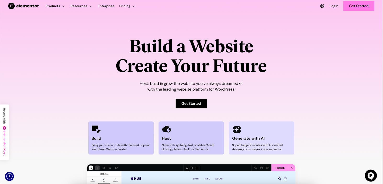
Once you’ve chosen your perfect fonts, the next step is to implement them on your website. If you’re using Elementor, you have a streamlined and powerful way to manage your entire site’s typography from one place.
Using Google Fonts and Other Standard Web Fonts
Elementor comes with a vast library of Google Fonts built right in. You can access them directly from the typography controls in the editor. Simply select any text widget, go to the “Style” tab, and open the typography settings. You’ll find a dropdown menu where you can choose from hundreds of fonts.
Adding Custom Fonts with Elementor Pro
For fonts that aren’t available on Google Fonts, or if you have a license for a premium font, Elementor Pro’s Custom Fonts feature allows you to upload them directly to your site. This ensures your branding remains consistent and unique.
Here is a step-by-step guide:
- Navigate to the Custom Fonts Tool: From your WordPress Dashboard, go to Elementor > Custom Fonts.
- Upload Your Font Files: Click the Add New button. Give your font a name (e.g., “Satoshi”). Now, you can upload your font files. It’s best practice to upload multiple formats for broad browser compatibility, but WOFF2 is the most important for modern browsers due to its superior compression. You can also add WOFF and TTF as fallbacks.
- Assign Weights and Styles: For each font file you upload, you need to tell Elementor its weight (e.g., Normal, Bold, 300, 900) and style (e.g., Normal, Italic). This is crucial for the font to behave correctly when you select “bold” or “italic” in the editor.
- Publish and Use: After you’ve added all the variations, click Publish. Your new custom font will now appear in all of Elementor’s font selection dropdowns, ready to be used anywhere on your site.
Managing Fonts with Global Styles
This is where Elementor truly simplifies typography management. Instead of setting fonts for each heading and paragraph individually, you can use Global Fonts.
You can define your typographic styles once—for body text, links, and all heading levels (H1 to H6). For example, you can set your H1s to be Satoshi Bold at 60px and your body text to be Inter Regular at 18px. These settings are then applied across your entire website. The biggest benefit? If you ever decide to change a font, you only need to update it in one place. Your change will automatically apply everywhere, saving you countless hours of manual work and ensuring perfect consistency.
Fine-Tuning Responsive Typography in Elementor
Elementor’s responsive controls make it straightforward to ensure your typography looks great on any device. Within the typography settings for any element, you’ll see a small icon for desktop, tablet, and mobile. You can click on each icon and set a different font size for that specific view. This gives you precise control over the user experience, ensuring your text is always perfectly readable.
Conclusion
Typography is a fundamental element of design that has the power to define your brand and make or break your website’s user experience. The modern fonts available today—from clean sans-serifs and elegant serifs to flexible variable fonts—provide a vast creative palette for any project.
Choosing the right font is about balancing brand personality with readability and performance. By following the principles of good typography and establishing a clear hierarchy, you can create a website that is not only beautiful but also effective.
With a powerful website builder like Elementor, you have complete creative control to bring your typographic vision to life. Its tools for managing custom fonts, global styles, and responsive settings remove the technical barriers, allowing you to focus on what matters most: creating an exceptional experience for your visitors.
Looking for fresh content?
By entering your email, you agree to receive Elementor emails, including marketing emails,
and agree to our Terms & Conditions and Privacy Policy.

