Table of Contents
Hero banners should be a key part of your home page. Visualizations coupled with enticing content must become the most important 3 seconds of a visitor’s life (excluding when their cat stands up). Banners can contain powerful headlines, awesome imagery, tempting snippets, and a call-to-action, all with the aim of directing the visitor to carry on.
Or you could skip the banner and not bother with the CTA button. That’s great if you want to risk having the viewer leave your site in 0.001 seconds.
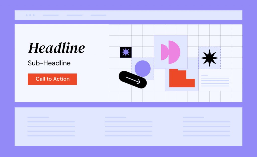
Getting the banner right makes a huge difference in rewarding the visitor for their time. Give them the assurance that they made the right decision to visit. Think of a product’s packaging in a shop; if it conveys what’s irresistibly inside, then you’re more likely to pick it up. Hooking interest is the crux of the banner.
Landing on the domain, Unicorns.com, only to discover a page filled with molten lava GIFs will inevitably lead to disappointment and loss of trust.
Experience brings me to 5 awesome tips that form my checklist when creating an effective hero banner. Dare I miss a step — I think not!
Tip 1: The Ideal Time To Create the Hero Banner
Straight after the header has been forged in stone (or an Elementor Template), I’ll work on the banner. Spending excessive time on this doesn’t bother me because it helps to define the messaging that’ll be carried onwards throughout the site.

If the banner informs the viewer that you’re an award-winning architect, then the next section better back it up, rather than showering the page with images that are unrelated to your content. Would you purchase a product again if the contents didn’t resemble the packaging? Of course not.
The banner allows you to set out the window of what comes next, and it will influence decisions for content and other pages. The hero banner dangled the carrot, and now service is the meal!

This banner demonstrated the client’s use of digital technology without appearing complex or conflicting with the headline’s focus on social media marketing. Rather than a tech-heavy image, we opted for a business using mobile equipment to increase relatability.
Tip 2: Image Sizing and Responsiveness Matters
If you care about user experience, then image sizing and responsiveness are crucial. Depending on your image tool of choice, a landscape layout of at least 1920px x 1080px should be the starting point. Go for the best resolution that you can obtain with your brain locked onto the color scheme for the site. If the website’s color theme is red, then steer away from blue hinted images unless you’re planning on a high-contrast impact. And please, don’t dodge image compression. Always remember to convert PNG to JPG where required or the eventual WebP format.
Setting up the image within the banner is wonderful fun when deciding on scroll versus fixed. Who hasn’t spent time playing around with the options? Though, always be mindful that the wording within and the image should complement one another.
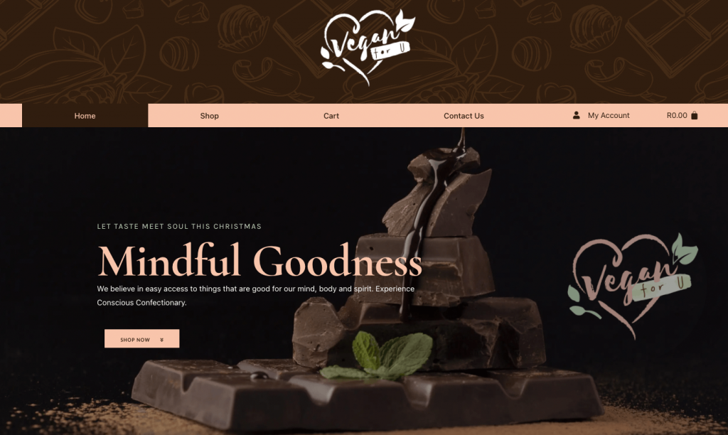
The sublime image resonates with the branding and should tantalize visitors enough to want to dig deeper. No matter how big the screen, the chocolate stands its ground behind the headlines and isn’t fighting for attention.
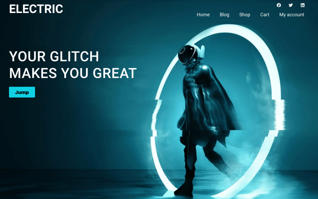
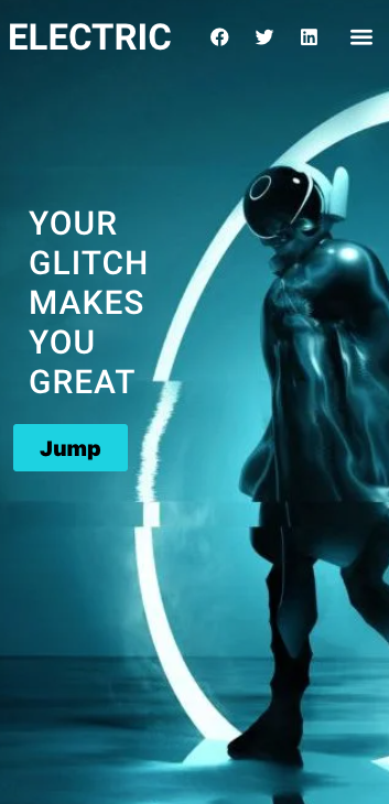
Just because it works for the desktop, it’s easy to shrug your shoulders when the image on the mobile view loses its effect. Don’t worry; Elementor gives the ability to add an alternate image for the mobile version to save you from creating a separate section on mobile.
In the mobile mode, click on the section’s background image, and add in an appropriately sized image. My quick tip is to add a copy of the original image and then resize with WordPress’ scaling and cropping to obtain the portrait layout.
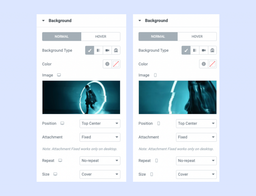
The background image for the mobile view is an alternate size of 400px x 700px compared to the desktop image of 1920px x 1080px, allowing better presentation with the headlines. Responsiveness should always include font sizes too, and I recommend using REM instead of Pixels for sizing to make the banner’s contents more accessible. Below is the final result based on the alternate images.
Tip 3: Sliders and Carousels Should Be Seen Below the Fold Rather Than on the Banner
[Drumroll] This argument rages on, though I’m a firm believer that the age of sliders, prominent a decade ago, is not recommended for the hero banner.
[Fights off the onslaught] Hold on, sliders can still be applied elsewhere on the home page, especially below the fold (that’s the bottom of the page before you scroll downwards on your device). Sliders cause loading delays of your page, and even if it’s super-quick to load, the viewer may have to watch many slides to get the full message. You could lose their interest before they hit the barn-storming climax, let alone did you have enough powerful phrases and images to maintain the momentum?

Did we need three slides to simply state that ‘We’ll show you how to dance in 3 easy steps’? And imagine the viewer seeing Slide 2 before Slide 1; well, in that case, the order is all messed up.
We worked on a site where the images were so varied in color and quality that the 12-slides specified drove me crazy. Just because twenty-other sites do it doesn’t mean you need to follow that path. If the evidence is strong, then go ahead, but be mindful of the lag it’ll add to speed.
I challenge you to check the scores with the slider above the fold and below, and the difference will be stark. The same applies to video backgrounds or animated GIFs where lazy loading has been applied to all images; you’ll see drops in the % score.
Tip 4: The Importance of Page Speed and the 3-Second Conversion
Not optimizing images hurts the loading of the home page leading to a drop in the page speed score, and ultimately if the visitor remains on the site. Home pages with a heavy-duty banner, sliders galore, and several font families increase the likelihood of breaching the 3-second rule.
Ambiguous commentary impacts on conversion too. When the banner doesn’t fit the reason that led the viewer to your site, then the trust equation is wiped out. Choose your wording carefully. Keep it to the point. Entice their interest to go further.
Google understands human impatience, hence the rise of the Core Web Vitals. I can’t help but test page scores regularly as I build sections. Optimizing images, ensuring that fonts are preloaded, and not throwing a ton of text may prevent visitors from jumping ship upon arrival.
Time and again, I’ll see punches in the air because sites are hitting 98+ % for the desktop score, though you want to do all that you can to hit 90+ % for the mobile as 70% of viewers are coming from such devices.
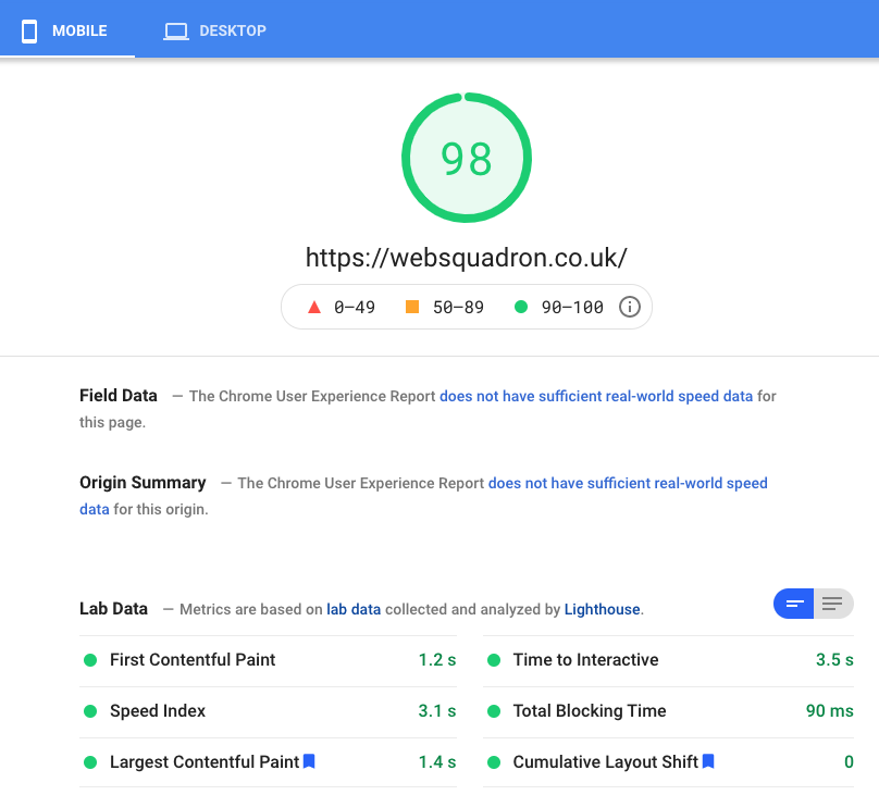
What happens above the fold will significantly impact the score, and that’s why I advise on sliders/carousels being deployed below the fold. If the banner’s full headline requires the viewer to scroll down, then you’re asking a lot.
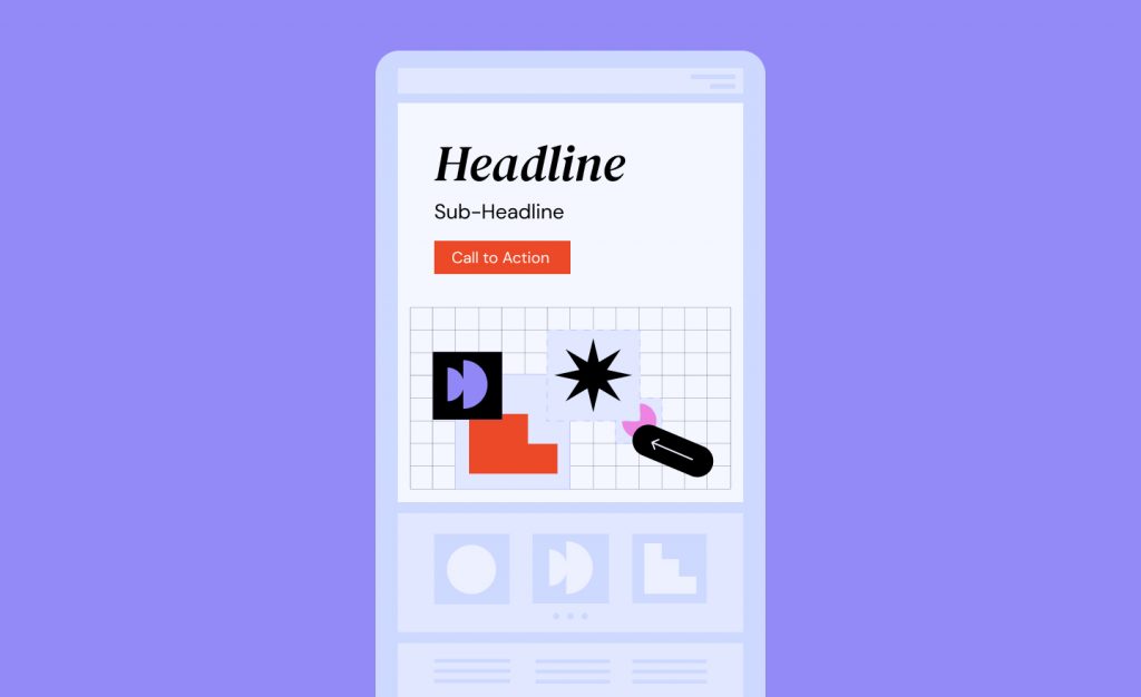
To round off conversion, the call-to-action button is often confused as simply a ‘contact me’ or ‘see more’ link, when in fact it can provide a message to convert the viewer. Rather than stating ‘see more’, spin it to be a more active invite such as, ‘Find the best design for you.
Tip 5: Implement SEO Keywords and craft a powerful headline
Making the banner’s headlines relevant for search engines and linking to the basis of the website is massively important. Keywords form a major part of SEO. Headlines without keywords are on par with a car without wheels (which is fine if you’ve converted it into a unique garden studio).
In the vital first 3-seconds, upon arrival at your website, visitors will take note of the headline. Punchy and emotive words that demonstrate a solution or empathize with a problem can hook the viewer. Depending on the domain, or the promise made in the Google snippet, the headline better repay visitors for clicking to reach your site.
There is a danger with headlines becoming diluted and losing impact when forcing in keywords. Thus watch out for text sounding unnatural in delivery. Say it aloud and revisit if the words are not hitting you.
A common trick is to add power words coupled with numbers leading to a promise that can only be met if they keep reading on. Single sentences of less than 10 words are stronger than a lengthy paragraph. Great examples are news sites where conversion rates are high.
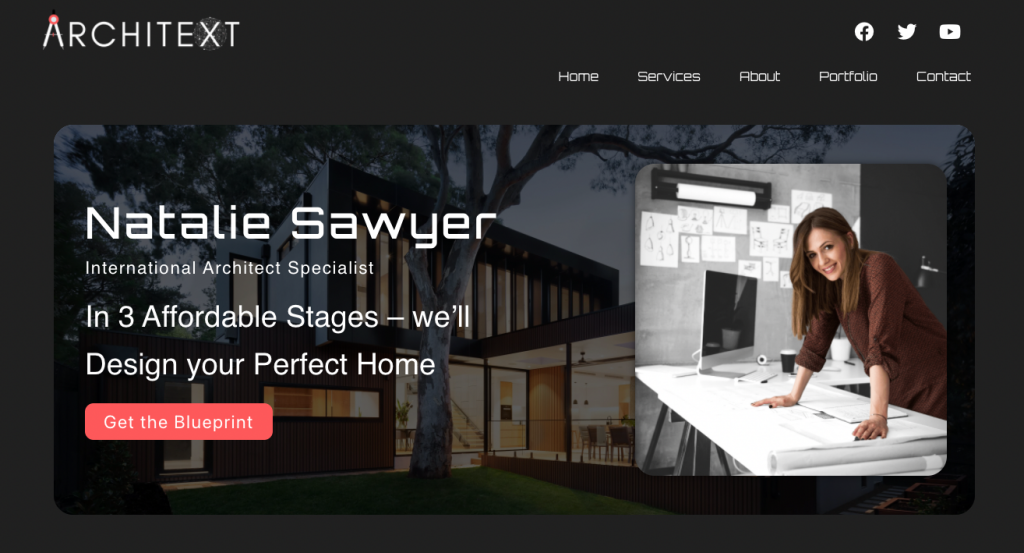
Although the keyword ‘architect’ is only present in the sub-header, the headline text of ‘In 3 affordable stages – we’ll design your perfect home’ aimed to give an appealing guarantee of what to expect by continuing.
Try to define what makes you different from the competition. Resist fancy words because no one wants to open a dictionary to understand the context and avoid overused cliché slogans.
The call-to-action of ‘get the blueprint’ should prompt the viewer to do just that after they’ve been hooked by the words ‘affordable’ and ‘perfect home.’ Tug the heartstrings without sounding like an overplayed record.
Keep Your Hero Section Fresh and Inviting
When a hero banner possesses enough imagination and thoughtful wording to stop the viewer from closing the window, then you’re on the right path. Always keep them simple and ensure the message clearly directs further action. And never be afraid of changing them regularly, at least every two months. Otherwise, the repeat visitors will lose the initial pull. Surely as the basis of the website changes, so should the banner.
Want to talk about hero banner design with Imran? Click here to learn more about the various design services that he offers.
Looking for fresh content?
By entering your email, you agree to receive Elementor emails, including marketing emails,
and agree to our Terms & Conditions and Privacy Policy.
