Table of Contents
Elementor AI: A Game-Changer for Web Designers and Developers
One of the most remarkable aspects of Elementor 3.13 Beta is the introduction of Elementor AI. This innovative feature takes web design to a whole new level by automating several aspects of the design process, making it faster and more efficient. Discover the numerous ways Elementor AI revolutionizes website creation.
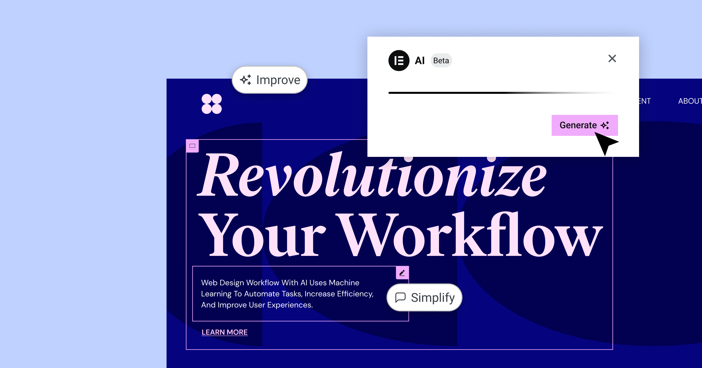
Content Generation Made Easy
Elementor AI simplifies content creation by generating text for headers, introductory paragraphs, and other elements of your website. All you need to do is provide a prompt, and the AI will generate relevant, engaging content that you can use as-is or further tweak to your liking. This not only saves time but also makes the content creation process more enjoyable.
Custom CSS with a Few Clicks
Creating custom CSS has never been easier, thanks to Elementor AI. Whether you want to add animations, visual effects, or other styles to your website, Elementor AI can generate the necessary CSS code for you. Simply select a suggested prompt or provide your own, and the AI will generate the code, which you can then insert into the Custom CSS section of the Elementor editor. No more spending hours writing complex code—Elementor AI has got you covered.
HTML Code Generation for Interactive Elements
Elementor AI can also generate HTML code for interactive buttons, widgets, and other elements on your website. This not only saves time but also provides a solid starting point for further customization. In his demonstration, Ashley showed how Elementor AI generated an interactive button with a hover effect using a custom prompt.
Code Snippets Made Easy with “Write Me Code”
Elementor AI’s “Write Me Code” feature simplifies the process of generating custom code snippets. Ashley’s presentation showcased this capability using Facebook Pixel integration as an example. By inputting your Facebook Pixel ID in the prompt, Elementor AI rapidly creates the accurate embed code for your website, ensuring precision and efficiency in your marketing efforts.
For more examples and in-depth information, be sure to watch Ashley’s full presentation.
CSS Grids: Streamlined Layouts for Your Website
The Elementor 3.13 Beta introduces support for CSS Grids, making it easier than ever to create grid-based layouts for your website. In the demonstration, it was shown how the CSS Grid option can be used to build intricate designs with greater ease and flexibility.
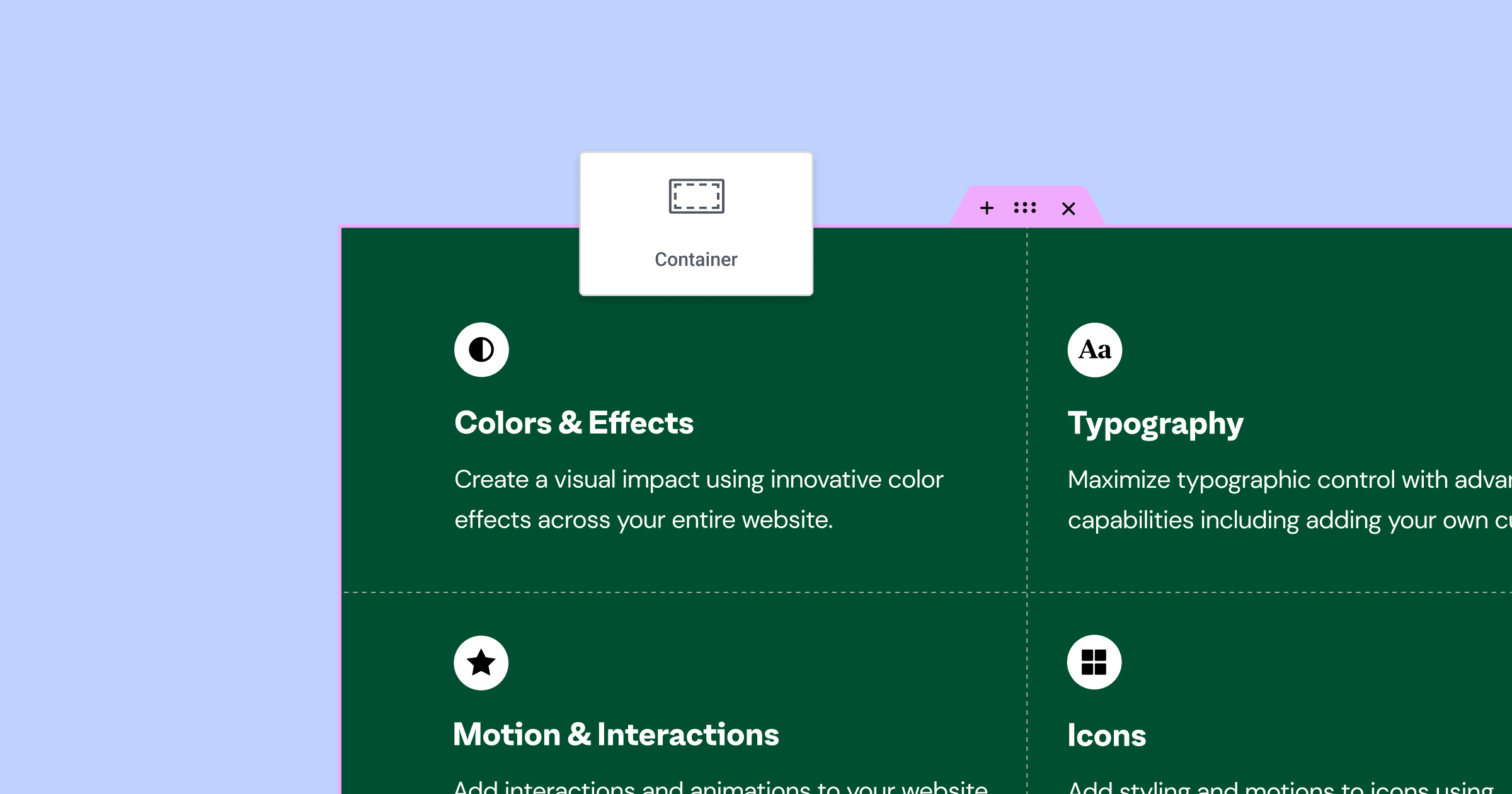
Getting Started with CSS Grids
Elementor’s new grid layout feature allows users to choose between flexbox or grid-based designs when building their pages. To access the grid options, simply click the “+” icon in the Elementor content editor and select “Grid” from the list of available layouts. Users can then pick from a variety of predefined grid examples, making it easy to get started.
Customizing Your Grid Layout
Once a grid layout is chosen, users can adjust its properties in the layout tab on the left-hand side of the editor. For example, users can change the number of columns and rows, the gap between grid items, and the unit of measurement for the grid (e.g., fractional units, percentages, or pixels). This provides a high level of control when designing your website.
AutoFlow and Justify Items
The AutoFlow setting allows users to define the order in which grid items are displayed, either in rows (left to right) or columns (top to bottom). Additionally, the Justify Items and Align Items options provide further control over the positioning of grid items within their respective cells.
Combining Flexbox and CSS Grid
Users can also combine the power of flexbox and CSS Grid by inserting a flexbox container within the CSS Grid layout. This enables the addition of multiple widgets within a single grid item, expanding the design possibilities even further.
Don’t forget to check out Ashley’s full presentation for a comprehensive understanding and additional examples.
Menu Improvements
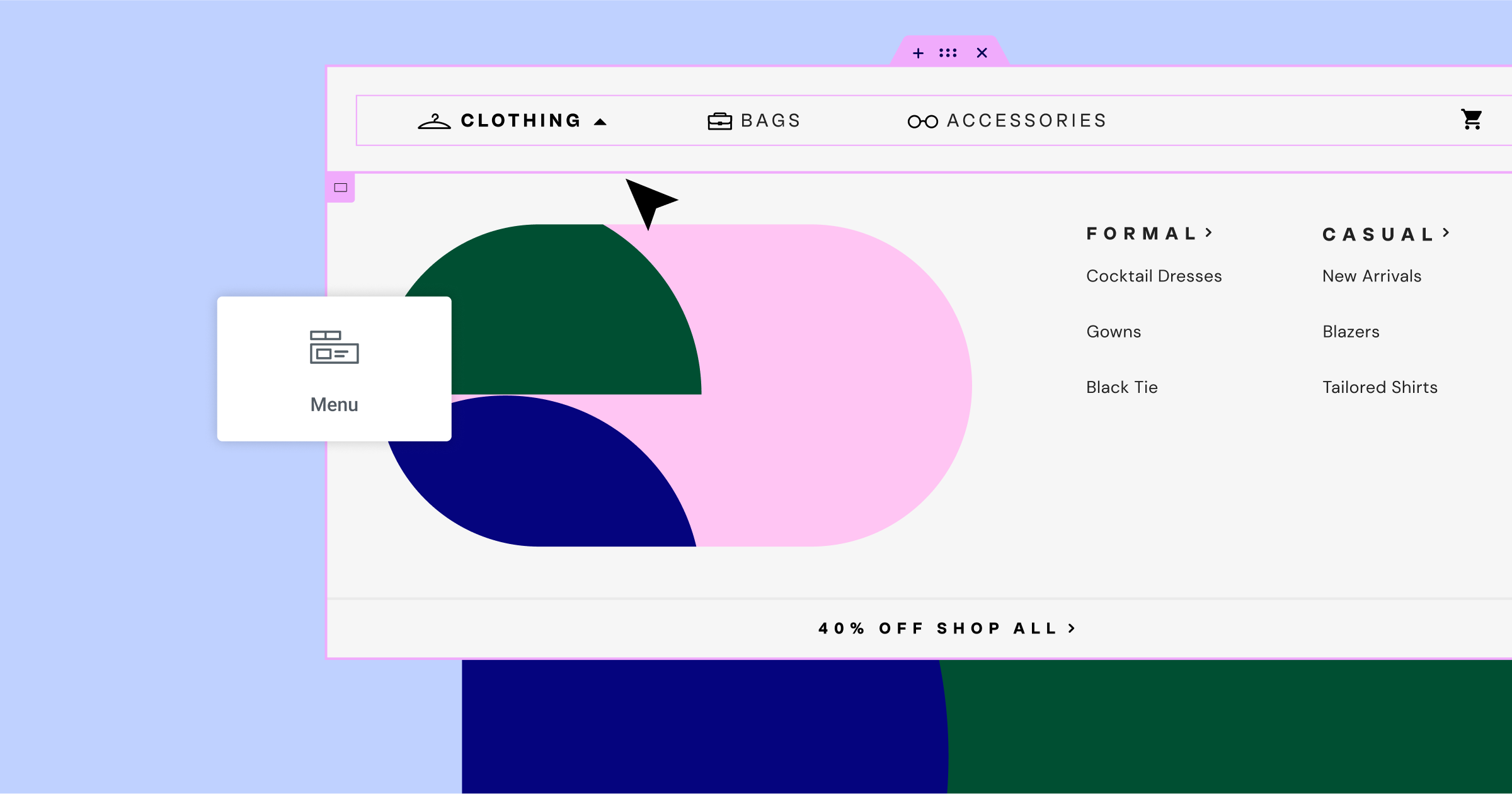
Several enhancements have been made to the menu widget, improving its overall functionality and design options. During the presentation, it was shown that one of the previously reported issues was with the active state not being applied when using anchor links. This issue has been resolved, ensuring that the active state is applied when navigating to a specific section on a one-page website.
To demonstrate this improvement, Ashley created a simple page with a menu widget containing three items configured with anchor links. Each item in the menu corresponds to a full-height section with an assigned ID that matches the menu item. When hovering over a menu item, it turns blue and remains blue when active. As you navigate through the sections, the active state works as expected, giving a seamless user experience.
Another exciting addition to the menu widget is the ability to add custom icons for both normal and active states. You can upload your own SVG icons or choose from the extensive Elementor icon library. For example, you can assign an empty circle icon for the normal state and a circle with a checkmark for the active state. When navigating through the sections, the icons will switch accordingly, enhancing the menu’s visual appeal and functionality.
Watch Ashley’s complete presentation for further insights and examples.
Interface Improvements
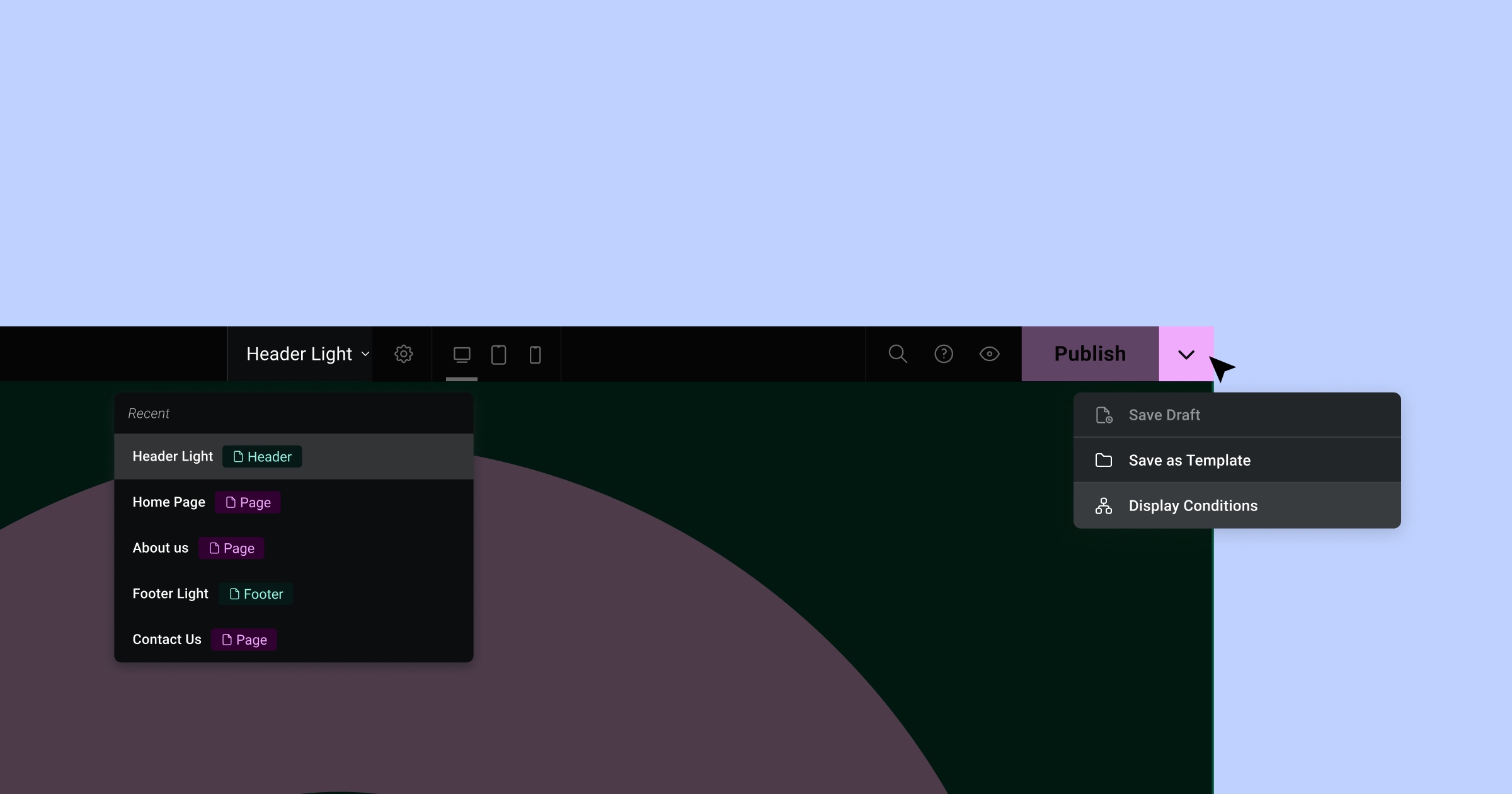
Ashley introduces the latest updates to the interface, highlighting the new top bar, which has been completely rebuilt in React. Now in phase two, the top bar comes with some exciting new features that will help streamline your workflow and boost your productivity.
Firstly, the dropdown menu now includes options to save your draft, save as a template, and display conditions when you open up any template file, such as a header. These options will make it easier for you to work quickly and efficiently within the platform.
Another valuable addition to the top bar is the page navigation feature. By clicking on the dropdown arrow, you can access the five most recent items you’ve been working on, including both pages and templates. This convenient feature will save you time as you switch between different pages and templates during your design process.
Jumping back to a previously worked on page or template is now just a single click away, further enhancing the platform’s capabilities.
Excerpts in Loops
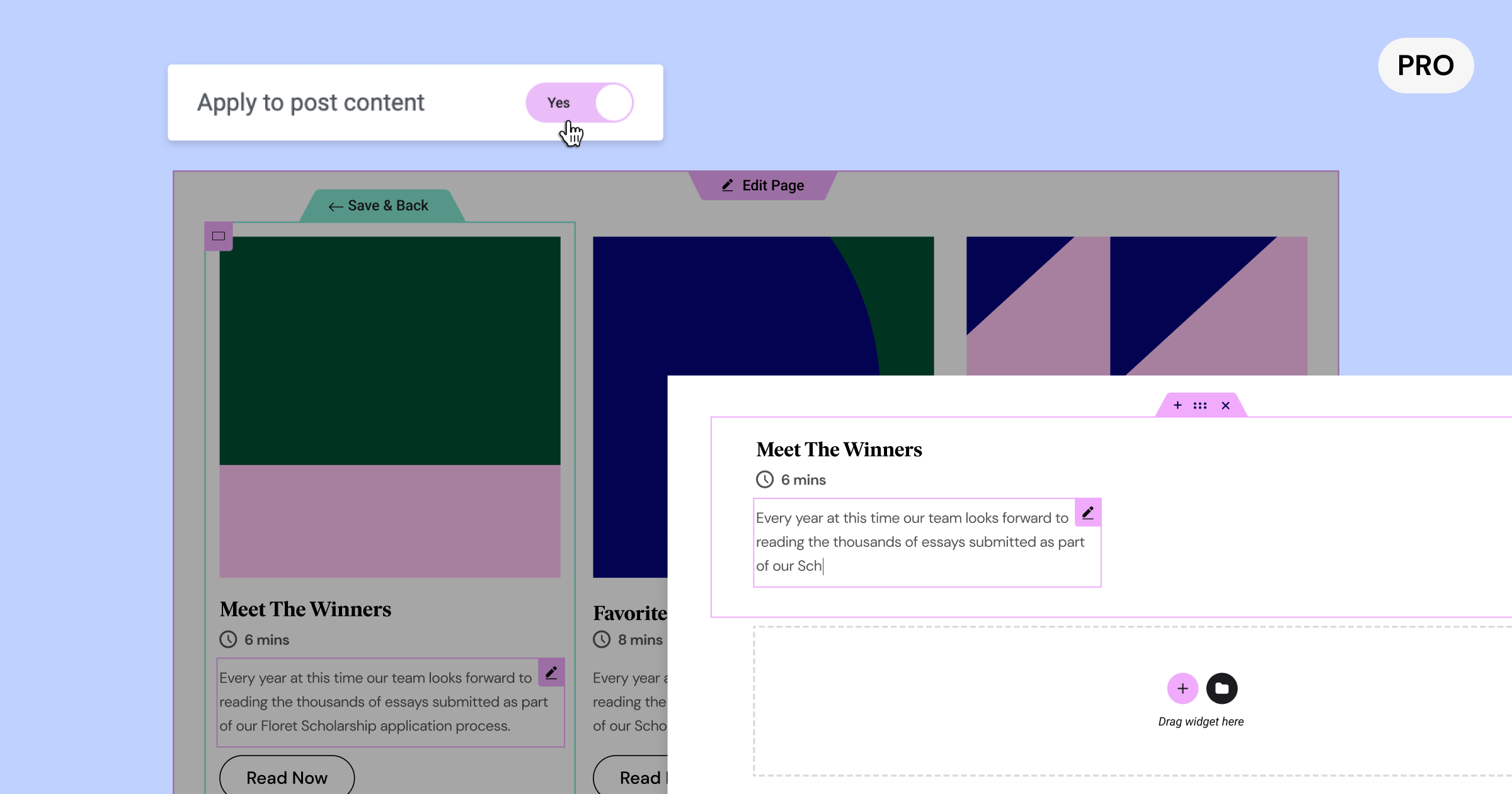
Next, Ashley delved into the topic of excerpts in loops, focusing on how to improve the way your blog posts are displayed on your homepage. Utilizing a loop grid, he demonstrated how to feature a blog post’s image, title, excerpt, and a “read more” button.
To understand where the excerpt content comes from, Ashley takes us through the process of locating and editing a post’s excerpt in the WordPress dashboard. Often overlooked and hidden, the excerpt can be found by selecting the post in the top right-hand corner and scrolling down to the excerpt section. Editing the excerpt allows you to control the information displayed on your homepage’s loop grid.
However, instead of using a manually entered excerpt, you may want to pull information directly from the post content itself. To achieve this, ensure the excerpt field in your WordPress post is empty, then head back to the Elementor editor. Select the wrench icon within the excerpt widget and enable “apply to post content.” This will populate the excerpt widget with the entire post content.
To control the amount of content displayed, use the word count setting to define the length of the excerpt. Additionally, you can customize the text before and after the excerpt in the advanced settings, such as adding an ellipsis at the end.
These improvements to excerpts in loops provide greater flexibility and control over your blog post displays, enhancing the overall experience for both you and your readers.
Color Picker Updates
Discussing the improvements to Elementor’s color picker, Ashley demonstrated how the changes offer more versatility in handling various color formats. To showcase the update, Ashley selected a heading widget and navigated to the style settings. In the color picker, users can now choose from hexadecimal, RGBA, and HSLA formats. These options cater to different preferences and design tools, enabling users to paste values directly into the Elementor editor. With automatic value conversion, there’s no need for external tools like Photoshop or online converters, simplifying the design process.
Favorites Panel
The introduction of the Favorites Panel to Elementor was another feature Ashley highlighted. This panel provides easy access to your most commonly used widgets, allowing you to work more efficiently.
In the past, the Favorites Panel was an experiment that could be turned on or off. Now, it is integrated as part of the product. While not everyone may use the Favorites Panel, it can be extremely helpful for those who do. To access it, right-click on a widget and choose “Add to Favorites.”
Upon adding a widget to the Favorites Panel, the panel will become visible at the top of the Elements Panel. You can add as many widgets as you like, and the panel will expand to accommodate your selections. If you change your mind and remove all favorites, the panel will disappear.
This user-friendly addition to Elementor allows you to quickly access your most-used widgets, streamlining your workflow and enhancing your overall design experience.
Performance Improvements
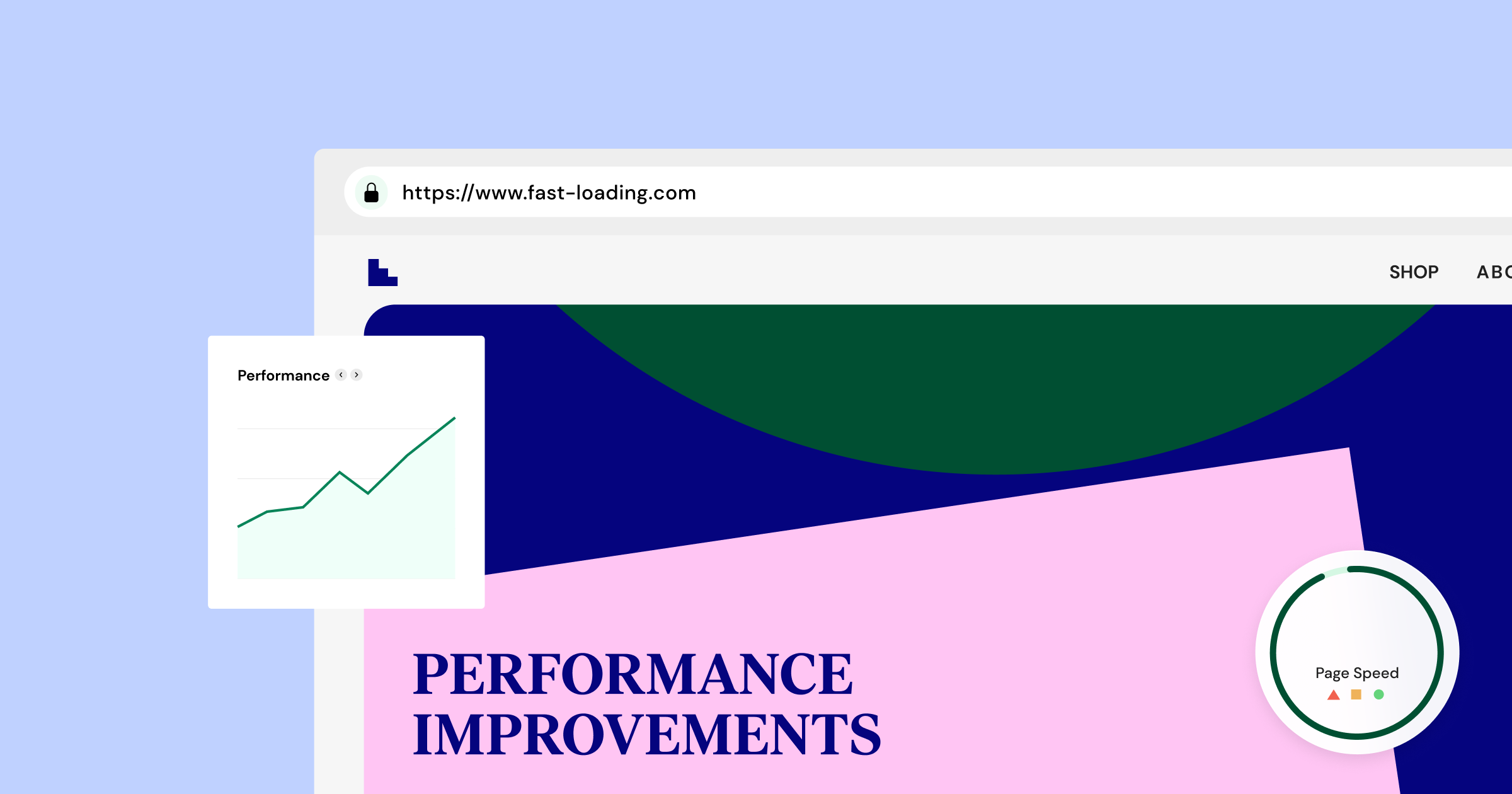
Lastly, Ashley shifted the focus to performance improvements in Elementor. The development team continuously works hard to enhance the product’s performance, and this time around, they have concentrated on the inner pages of Elementor.
Lazy load support has been added to three widgets: Author Box, Post Info, and Price List. These widgets utilize images in different ways, such as profile pictures or separate images. This new support helps improve page loading times and overall performance.
Another significant change is the removal of the lazy load background image experiment from the header template. Since the header is typically above the fold, it’s essential for the background image to load instantly for the user, rather than lazily.
In addition to these performance improvements, numerous accessibility enhancements have been made. There are too many to list in this blog post, but you can check out the official GitHub post to explore the details.
Closing Thoughts
As we wrap up, it’s evident that Elementor 3.13 Beta offers a range of powerful features and enhancements poised to transform the way designers and developers approach web design. With Elementor AI, CSS Grid support, menu improvements, interface upgrades, and numerous performance optimizations, this beta version sets the stage for creating exceptional websites more efficiently than ever before. Don’t miss Ashley Whitehair’s in-depth live demonstration to fully grasp the potential of this latest release. For those interested in trying the beta, proceed with caution, as beta versions may still have unresolved issues. Alternatively, you can look forward to the upcoming stable release of Elementor 3.13 and get ready to unleash your creativity and redefine the boundaries of web design.
Looking for fresh content?
By entering your email, you agree to receive Elementor emails, including marketing emails,
and agree to our Terms & Conditions and Privacy Policy.


