Table of Contents
In this ultimate guide, we’ll dive deep into the world of CSS borders. We’ll begin with the basics, exploring the fundamental properties that control their width, style, and color. Then, we’ll unlock advanced techniques like rounded corners, image borders, gradients, and shadows. You’ll learn how to make borders responsive, integrate them seamlessly with user interactions, and, importantly, optimize their performance for lightning-fast websites.
Mastering CSS Border Basics
The border Property
The CSS border property is a powerful tool for customizing the appearance of borders around elements on your website. Think of it as a three-in-one solution:
- border-width: This determines how thick or thin your border will be. You can choose from pre-defined options like thin, medium, and thick or specify an exact size in pixels for precise control.
- border-style: This defines the visual style of your border. You have a wide variety of options, including solid (a continuous line), dotted, dashed, double (two parallel lines), and more. Each style offers a unique way to delineate spaces and guide the user’s eye.
- border-color: This sets the color of your border. You can use simple color names like red or blue or get more specific with color codes (like hexadecimal values) for virtually unlimited possibilities.
Combining these three properties can create countless border variations. In the next few sections, we’ll explore each of these properties in detail.
border-width
The border-width property dictates the thickness of your borders. There are several ways to express border widths in CSS:
Pixels (px): This provides the most granular control, allowing you to specify the exact width in pixels. For example, border-width: 5px would create a border 5 pixels wide.
Predefined Keywords: CSS offers keywords for common border thicknesses:
- thin: A thin, delicate border
- medium: The default border width, if none is specified
- thick: A bolder, more prominent border
Relative Units: You can use relative units like em or rem. These scales are based on the element’s font size, which is useful for creating borders that adapt to different screen sizes and font settings.
Design Considerations
When choosing border widths, consider the overall aesthetic you want to achieve:
- Thin borders create a subtle and refined look, and they are often used for minimalist designs or to separate content blocks subtly.
- Thick borders demand attention and can be used to highlight important elements or add visual weight.
- Varying border widths can establish a visual hierarchy and create a sense of rhythm within your design.
border-style
The border-style property unlocks a wide array of visual possibilities for your borders. Let’s explore the most common styles:
- solid: The classic, continuous line. It’s versatile and widely used for various design purposes.
- dotted: A series of dots, perfect for subtle separators or playful, decorative touches.
- dashed: A series of short lines with gaps in between, often used to suggest a division or temporary state.
- double: Two parallel lines with space between them, adding emphasis and a sense of strength.
- groove: Creates a 3D-like effect with a raised center and lowered edges, as if the border is carved into the surface.
- ridge: The opposite of the groove, with a lowered center and raised edges, making the border appear to stand out.
- inset: Creates an embossed look as if the border is pressed into the element.
- outset: The opposite of inset, making the border appear raised from the surface.
- none: Removes any visible border, often used to reset styles on certain elements.
- hidden: Similar to none visually, but still affects the layout by taking up space (useful in specific layout scenarios).
Design Tips
- Use dotted and dashed styles sparingly to avoid a cluttered appearance.
- Groove, ridge, inset, and outset provide dimensionality but should be used with consideration for accessibility (adequate color contrast is essential).
- Experiment with combining different border-style values on individual sides of an element for unique and eye-catching effects!
border-color
The border-color property lets you infuse your borders with a splash of color or keep them seamlessly integrated with your design scheme. CSS offers several ways to specify colors:
- Color Names: You have access to a wide range of predefined color names, such as red, blue, green, yellow, and many more.
- Hexadecimal Values: These six-digit codes (e.g., #FF0000 for red) provide precise color control and open up millions of color possibilities.
- RGB/RGBA Values: Red, Green, and Blue values offer another way to define color. RGB values like rgb (255, 0, 0) represent red. RGBA adds an alpha channel for transparency (e.g., rgba(255, 0, 0, 0.5) for a semi-transparent red).
- HSL/HSLA Values: Hue, Saturation, and Lightness offer a more intuitive color model. HSLA includes an alpha channel for transparency.
Transparency
The border-color property, in conjunction with RGBA or HSLA values, allows you to create semi-transparent or fully transparent borders. This can be used for subtle overlays, frosted glass effects, and other sophisticated design techniques.
Matching Colors to Your Design
Carefully consider how your border colors interact with the overall color scheme of your website:
- Complementary colors (opposite on the color wheel) can create a vibrant and dynamic contrast.
- Analogous colors (next to each other on the color wheel) offer a harmonious and cohesive look.
- Use your website’s background color for borders to create a seamless, integrated effect.
Individual Border Control
border-top, border-right, border-bottom, border-left
While the shorthand border property offers efficiency, sometimes you need precise control over individual sides of an element’s border. This is where the following properties shine:
- border-top: Controls the style, width, and color of the top border.
- border-right: Controls the style, width, and color of the right border.
- border-bottom: Controls the style, width, and color of the bottom border.
- border-left: Controls the style, width, and color of the left border.
Why Use Individual Border Properties?
- Unique Designs: Create borders with distinct styles on each side, such as a dashed top border and a solid bottom border.
- Visual Emphasis: Draw attention to specific sides of an element by varying the border width or color.
- Corrective Styling: Sometimes, inherited CSS styles from a website theme might create unintended borders. Individual border properties help override these styles on specific sides.
Combining Styles and Widths
Think of CSS borders as a toolbox where you can mix and match styles and thicknesses. Let’s look at how you can achieve some creative effects:
Example 1: Two-toned border
Imagine a box with a thin blue border on three sides (top, right, and left). Now, you can make the bottom border stand out by making it orange and slightly thicker. This creates a visually interesting contrast and draws the eye downwards.
Example 2: Highlighting one side
Picture a simple box with a subtle gray border. To emphasize the left side, you could transform that border into a bold, red line. This technique instantly attracts attention and guides the user’s focus, making it perfect for things like navigation menus or important buttons.
Tips:
- Be bold and play around with different combinations of border widths, styles, and colors! Even subtle variations on opposite sides of a box can add a sense of depth and dimension.
Advanced Border Techniques
border-radius
Rounded corners are a staple in modern web design, adding a touch of softness and sophistication. The border-radius property is your key to achieving this effect.
Here’s how it works:
- Controlling Radius: You can set the curve of each corner individually. For example, border-radius: 10px 5px 20px 3px; sets the top-left corner radius to 10 pixels, the top-right to 5 pixels, etc., moving clockwise. You can also specify values in percentages for radii that scale with the element’s size.
- Fully Circular Borders: To create a perfectly round border (or turn an image into a circle), set all corner radius values the same, and ideally, make this radius half of the element’s width and height.
Design Applications:
- Softening Sharp Edges: Rounded corners can make boxes and buttons appear friendlier and more approachable.
- Circular Profile Images: The border-radius property is essential for creating circular avatars.
- Organic Shapes: Combining different radii on individual corners allows you to create unique, organic shapes.
border-image
The border-image property opens the door to incredible design possibilities, allowing you to replace traditional solid, dashed, or dotted borders with actual images. Here’s what you need to know:
- border-image-source: Specify the image file you want to use as your border.
- border-image-slice: This is where the magic happens! You define how the image is sliced into nine sections: four corners, four side pieces, and a centerpiece. The image’s corners will fill your element’s corners, sides will be stretched or repeated along the edges, and the center can be displayed or left transparent.
- border-image-repeat: Determines how the side and center pieces are repeated (or not). You can use stretch (a single image stretches to fit), repeat (the image repeats along the edge), round (the image repeats but is scaled to fit evenly without gaps), or space (the image repeats and can have gaps if it doesn’t fit evenly).
Creative Possibilities
- Decorative Frames: Use images with intricate patterns or textures to create beautiful, eye-catching elements.
- Themed Borders: Incorporate graphics that align with your website’s aesthetic for a cohesive look.
- Special Effects: Carefully design your border image to create borders that appear textured, embossed, or with unique cutouts.
Note: When using a border image, it’s crucial to have a thoughtfully designed image that works well when sliced and repeated. Consider creating custom border images using tools like Adobe Photoshop or Illustrator.
Multi-Layered Borders
While the border shorthand property is incredibly useful, it only allows you to set a single border style. To create the effect of multiple, layered borders, you can get creative by combining the border-style properties (border-top-style, border-right-style, etc.) with different widths and colors.
How it Works:
- Base Layer: Start with a solid border as your foundation, set with the border shorthand or individual border properties.
- Additional Layers: Add more layers by selectively using individual border styles on specific sides of the element. For example, on top of your base border, you could add a double-line border on the left and a dashed border on the right.
- Control the Look: Carefully choose colors and widths to ensure each layer is visible and complements the overall design.
Example:
Imagine a box with a wide, black border as its base. You then overlay a thinner, white dashed border inside the black one and a subtle orange double border along the bottom. This creates a visually interesting, multi-dimensional effect.
Design Considerations
- Complexity: Be mindful of overusing layered borders. Use them strategically to highlight important elements.
- Color Contrast: Ensure each layer is clearly distinguishable by using contrasting colors.
Gradients and Shadows
Introduce gradients and shadows to elevate your borders. These techniques can add depth, dimension, and a touch of realism to your design.
- Gradients with CSS: CSS allows you to create both linear gradients (smooth transitions between colors in a single direction) and radial gradients (colors transitioning outwards from a central point). Incorporate these gradients into your borders for captivating effects. Gradients work by transitioning between a defined set of colors along a specific direction or radially from a center point.
- Box Shadows (box-shadow): The box-shadow property lets you simulate a shadow behind your element’s border. You control the shadow’s offset (how far from the element it appears), blur radius (how soft or diffused it looks), spread (how far the shadow extends beyond the element), and color.
Design Applications
- Subtle Depth: Use soft box shadows to make elements appear slightly raised from the page.
- 3D Effects: Create realistic-looking buttons or containers by combining box shadows with gradients.
- Colorful Gradients: Use vibrant gradients with transparent stops (color values with reduced opacity) to create layered effects within the border itself.
Important Note: Gradients and shadows can impact website performance if overused or designed with complex effects. Use them carefully to ensure optimal loading speeds (which we’ll discuss in the performance section of this guide).
Borders and User Experience
Hover Effects with :hover
The :hover pseudo-class in CSS lets you add special effects that activate when a user’s mouse hovers over an element. This is an excellent opportunity to enhance borders and provide visual feedback.
Common Hover Effects for Borders:
- Changing Color: This is a simple yet effective way to signal interactivity. When hovering, add a brighter or contrasting color.
- Increasing Width: Make the border slightly thicker on hover to emphasize the element.
- Changing Style: Switch from a solid border to a dashed or dotted one for a playful touch.
- Adding Shadows: Introduce a box shadow on hover to make the element appear to rise from the page.
Design Tips
- Speed: Hover effects should be quick and responsive to avoid feeling laggy.
- Subtlety: Avoid overly jarring or dramatic effects; subtle changes often provide the best feedback.
Accessibility
When designing with borders, it’s crucial to consider users with visual impairments or those who rely on assistive technologies. Here are key accessibility considerations:
- Color Contrast: Ensure sufficient contrast between the border color and the element’s background. Aim for a contrast ratio that meets Web Content Accessibility Guidelines (WCAG) standards. Several online tools can help you check contrast ratios.
- Focus Indicators: If you rely on border changes for hover states, include clear focus indicators (like an outline or color change) for users navigating with the keyboard. This ensures a visibly interactive experience for all.
- Visual Cues: Never use borders alone to convey meaning. Always provide additional cues, such as text labels, icons, or changes in background color, for clarity.
- Avoid Reliance on ‘Outset’ and ‘Inset’ styles: These styles can be difficult to visually distinguish for some users, especially when color contrast could be better.
Remember: Accessible design benefits everyone! By prioritizing accessibility, you create a more inclusive and enjoyable experience for all users.
Responsive Borders
With users accessing websites from desktops, tablets, and smartphones, your borders must adapt gracefully to different screen sizes and resolutions. Here’s how to ensure responsiveness:
- Relative Units: For border width, use relative units like percentages (%) or viewport-based units (vw, vh). These will automatically scale as the screen size changes, ensuring the border maintains its visual impact.
- Media Queries: These powerful CSS tools allow you to specify different border styles for different screen size ranges. You can create simplified border designs for small screens or more elaborate borders when the screen provides additional space.
- Fluid Design: Consider making border widths proportional to your website’s overall layout using techniques like calc() in CSS. This creates a sense of unity and visual balance regardless of the device.
Design Considerations
- Mobile Users: Be mindful of thick borders on small screens; they can consume valuable space. Opt for thinner, more subtle borders on mobile devices.
- Consistency: Strive to maintain the overall feel of your border designs across devices while making necessary adjustments for readability and visual appeal.
Performance Matters: Best Practices for Optimized Borders
File Size and Image Borders
When using border images, it’s crucial to pay attention to image optimization:
- Image Format: Based on the complexity of the image, choose the right file format (JPEG, PNG, SVG, WebP). Generally, simpler graphics work well as PNGs or SVGs, while photographs are better suited to JPEG or WebP.
- Compression: You can compress your images without sacrificing noticeable quality. Many online and desktop tools exist for image compression.
- Image Dimensions: Ensure the dimensions of your border image match the expected display size to avoid loading larger files unnecessarily.
Note: When designing image borders, consider using vector graphics (SVG) whenever possible. These scale to any size with no loss of quality and often have smaller file sizes.
Elementor Image Optimizer can significantly streamline image optimization, ensuring your beautiful borders don’t weigh down your pages.
Hardware Acceleration
Modern browsers can leverage the power of your computer’s graphics processing unit (GPU) to render certain visual effects, including some types of borders. This can lead to smoother animations and faster loading times.
- Which Properties Benefit: Simple border styles with transitions or animations are generally more likely to be hardware accelerated. Complex effects, like large box shadows or intricate image borders, may not see substantial benefits or could even hinder performance in some cases.
- Forcing Hardware Acceleration: While browsers have their logic for determining what to accelerate, CSS properties like transform and opacity sometimes trigger hardware acceleration. Use these strategically but with caution, as they can have unintended consequences if overused.
Important: Hardware acceleration is a complex topic, and its benefits can vary across different browsers and devices. It’s essential to test performance thoroughly when using advanced border effects.
Minimizing Repaints
Whenever you change the border style, width, or color of an element, the browser has to recalculate the layout and repaint the affected area of the screen. Excessive repaints can lead to performance issues, especially with animations or hover effects.
Tips for Performance
- Batch Changes: To minimize the number of repaints, group your border-style updates rather than making changes individually.
- Transform Over Layout Properties: If you’re animating borders, use CSS transform properties (for example, transform: scale() to change size) whenever possible. These properties tend to be more efficient than changing properties that affect the layout of other elements (like width, height, or margin).
- Avoid Repaints on Hover: Be mindful of the complexity of your hover effects. To reduce repaints, stick to simple transformations or color changes.
Remember: While optimizing borders for repaints is important, keep your CSS simple in the process! Prioritize clear and maintainable code, with performance optimizations as a secondary consideration where possible.
Choosing the Right Tools for Border Creation
The Power of Website Builders
Modern website builders make the process of designing visually appealing websites accessible to everyone, regardless of coding experience. These tools streamline CSS, including border styling, with intuitive interfaces and a focus on ease of use.
How Website Builders Simplify Borders:
- Visual Controls: Forget lines of CSS code! Sliders, color pickers, and dropdown menus allow you to experiment with and visualize changes to border thickness, style, and color in real-time.
- Presets and Templates: Many website builders offer a library of border presets and design templates that incorporate borders creatively, giving you a great starting point.
Responsive Design Made Easy: Website builders often automatically adapt your border styles for different screen sizes, ensuring your website looks its best on any device.
Note: Elementor Website Builder is an incredibly powerful choice. It offers deep customization options while prioritizing a user-friendly experience.
Visual Design Interfaces
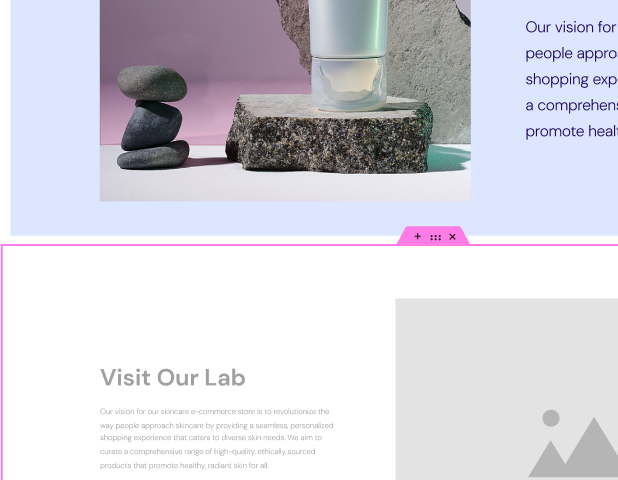
Website builders typically provide visual interfaces focused on drag-and-drop interactions and customization panels. This approach gives you immediate control and feedback when working with borders:
- Drag-and-Drop Resizing: Easily adjust border widths by clicking and dragging directly on the element. This intuitive method eliminates guesswork and lets you dial in the perfect thickness visually.
- Live Previews: As you manipulate borders with sliders, color pickers, and style selectors, the website builder updates the design in real time, providing a clear representation of how your changes will look.
- Contextual Controls: Website builders often display border controls that are directly relevant to the element you’ve selected. This keeps your workspace clean and focused on the task at hand.
The Benefits
- Faster Workflow: Visual design interfaces significantly accelerate the process of creating and customizing borders.
- Experimentation: The ease of making changes encourages you to try out different border styles and discover what looks best without needing to dive into code.
- User-Friendly for Non-Coders: These interfaces make complex CSS properties approachable to anyone, unlocking a vast world of design possibilities.
Theme Builder
Elementor’s Theme Builder is a game-changer, giving you control over the look and feel of your entire website’s elements, including borders.
How it Works
- Global Styling: Establish site-wide defaults for borders, ensuring consistency across all pages and sections.
- Dynamic Content Integration: Elementor allows you to incorporate dynamic content into your border designs, opening up creative possibilities for displaying data from your website in visually unique ways.
- Template Creation: Design templates with border styles that automatically apply to specific areas of your website (e.g., blog posts, headers, footers).
Benefits of Border Design
- Efficiency: You can make changes to borders across your entire website in a few clicks instead of manually editing each element.
- Cohesion: Achieve a polished and unified design with consistent border styles that complement your overall brand aesthetic.
With Elementor, border design becomes an integral part of your overall website creation workflow. Let’s wrap up by exploring how Elementor, coupled with cutting-edge AI design advancements, shapes the future of border creation.
Elementor and the Future of CSS Borders
Seamless Workflow
Elementor’s intuitive drag-and-drop interface, combined with its robust controls over border properties, provides an ideal foundation for harnessing the power of CSS borders. Regardless of your technical skill level, Elementor empowers you to:
- Experiment Freely: The ease with which you can visually adjust border styles fosters creative experimentation and encourages bold design choices.
- Design with Confidence: Real-time previews and contextual controls within Elementor’s visual interface give you confidence that your border styling perfectly aligns with your vision.
- Focus on the Big Picture: By streamlining the technical aspects of CSS borders, you can dedicate more energy to your website’s overall design and user experience.
Performance-First Approach
Elementor Hosting, built on Google Cloud Platform’s infrastructure, along with Cloudflare’s Enterprise CDN and automatic optimizations, lays the groundwork for websites with lightning-fast border rendering. This strong foundation eliminates performance bottlenecks often associated with visual design elements like borders.
- Optimized for Speed: Elementor Hosting prioritizes fast loading times, ensuring your beautiful borders don’t compromise the user experience.
- Global Distribution: Cloudflare’s network delivers your content—including borders—to users from locations around the world, ensuring a consistently snappy experience.
Anticipating Trends with Elementor AI Website Builder
Artificial intelligence has the potential to transform the way we design websites, and Elementor AI Website Builder is poised to be at the forefront of this innovation. Let’s imagine the possibilities with AI-assisted border creation:
- Smart Suggestions: The AI could analyze your website’s content, color palette, and overall design style. It could suggest border styles that complement your existing aesthetic, streamline user experiences, and even align with emerging design trends.
- Generative Design: Imagine an AI tool that generates unique and unexpected border designs based on a few keywords or a sample image you provide. This could open up incredible opportunities for exploration and truly one-of-a-kind looks.
- User Behavior Analysis: What if an AI could track how users interact with different border styles on your website? This data could help determine which styles enhance navigation, emphasize calls to action, and provide the most enjoyable user experience.
Even with advanced AI tools, it’s essential to maintain human oversight and creative control. Think of AI as a powerful design assistant, not a replacement for your design intuition.
Conclusion
Borders on a website can have a big impact on the overall experience. They can guide users, separate content, and add visual emphasis. It’s important to use borders with purpose and consider accessibility and performance. Website builders like Elementor make it easy to incorporate CSS borders into web design. AI technologies are also likely to play a role in the future of borders, providing new tools and insights for designers.
Looking for fresh content?
By entering your email, you agree to receive Elementor emails, including marketing emails,
and agree to our Terms & Conditions and Privacy Policy.
