
This guide explores 26 standout ecommerce websites that are setting the standard for design and user experience. We will dissect what makes each of them effective, from their captivating visuals and seamless navigation to their innovative features and compelling brand storytelling. Whether you are launching a new online store or looking to revamp an existing one, these examples offer a wealth of inspiration and actionable insights to help you create a powerful and profitable online presence.
Key Takeaways
- Minimalism and Clean Design: Many top ecommerce sites use a minimalist aesthetic with clean layouts, ample white space, and high-quality imagery to keep the focus on the products and create a sophisticated, uncluttered shopping experience.
- Immersive Product Storytelling: Leading brands go beyond simple product descriptions. They use a combination of stunning photography, engaging video, and compelling copy to tell a story around their products, helping customers visualize them in their own lives.
- Personalization and AI: The use of AI-powered tools for personalized recommendations, virtual try-ons, and customized shopping journeys is becoming a key differentiator, creating a more engaging and relevant experience for each user.
- Seamless Mobile-First Experience: With a majority of online traffic coming from mobile devices, a responsive, fast, and intuitive mobile design is non-negotiable for ecommerce success.
- Microinteractions and Animation: Subtle animations, hover effects, and other microinteractions can significantly enhance the user experience by providing visual feedback, guiding users, and adding a touch of personality to the site.
- Headless Commerce for Flexibility: Brands are increasingly adopting headless architecture to gain greater creative control over the front-end user experience while leveraging robust back-end platforms, allowing for unique and highly customized storefronts.
- Building with the Right Tools: To achieve these sophisticated designs, creators often rely on powerful platforms. Using a flexible tool like the Elementor WooCommerce builder allows for complete design control over every part of an online store, from product pages to the checkout process, without needing to write code.
1. Apple
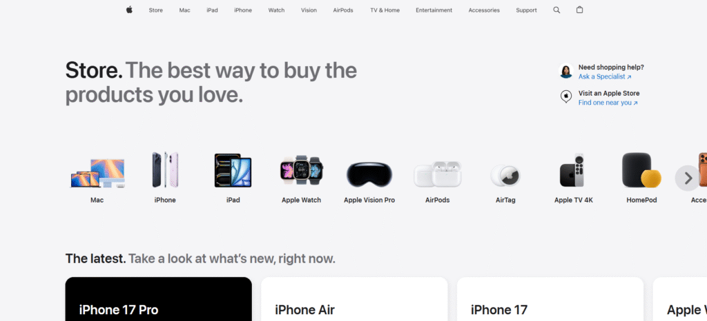
Apple’s website is the gold standard for product-focused minimalism. Its design philosophy centers on putting the product front and center, using large, stunningly detailed images and ample white space to create a sense of premium quality and focus.
What Makes It Great:
- Heroic Product Imagery: The homepage is dominated by a single, powerful hero image of the latest product. There are no distracting elements. The image itself tells a story of innovation and design excellence.
- Streamlined Navigation: The navigation bar is incredibly simple, with just a few key categories. This makes it effortless for users to find what they’re looking for without feeling overwhelmed.
- Interactive Product Pages: When you explore a product like the iPhone, the page becomes an interactive experience. As you scroll, animations reveal different features, and videos demonstrate the product in action. This is far more engaging than a static list of specs.
- Consistent Branding: The typography, color palette (primarily black, white, and gray), and overall aesthetic are consistent across the entire site, reinforcing Apple’s clean, modern, and sophisticated brand identity.
2. Allbirds
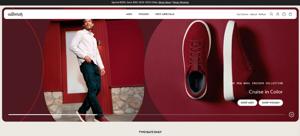
Allbirds has built a powerful brand around sustainability and comfort, and its website perfectly reflects these values. The design is clean, earthy, and focused on transparently communicating the product’s materials and benefits.
What Makes It Great:
- Natural Color Palette: The site uses a muted, natural color palette with lots of greens, grays, and creams. This visually connects the brand to its eco-friendly mission.
- Emphasis on Materials: Allbirds doesn’t just sell shoes. it sells a story about sustainable materials like merino wool and eucalyptus tree fibers. The product pages feature detailed sections explaining where these materials come from and why they are better for the planet.
- Lifestyle Photography: The photography shows people in everyday, relatable situations, reinforcing the brand’s focus on comfort and versatility. It helps customers imagine themselves wearing the shoes.
- Simple and Clear Value Propositions: The messaging is straightforward. “The World’s Most Comfortable Shoes” is a clear, confident statement that is supported by customer reviews and detailed product information.
3. Glossier
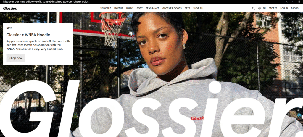
Glossier’s website feels less like a traditional ecommerce store and more like a beauty community. The design is minimalist, playful, and heavily focused on user-generated content, making the shopping experience feel personal and authentic.
What Makes It Great:
- User-Generated Content (UGC): Glossier brilliantly integrates customer photos throughout its product pages. Seeing the products on real people with different skin tones and types builds trust and helps shoppers make informed decisions.
- Soft and Approachable Aesthetic: The site uses a soft pink and white color palette, rounded fonts, and a conversational tone of voice. This creates a friendly and welcoming atmosphere that resonates with its target audience.
- Minimalist Product Pages: Product pages are clean and uncluttered. They feature a simple product gallery, a concise description, and a prominent “Add to Bag” button. The focus remains on the product and the UGC.
- Interactive Elements: Small, playful animations and microinteractions, like a shopping bag that wiggles when you add an item, make the user experience more delightful and engaging.
4. Nike
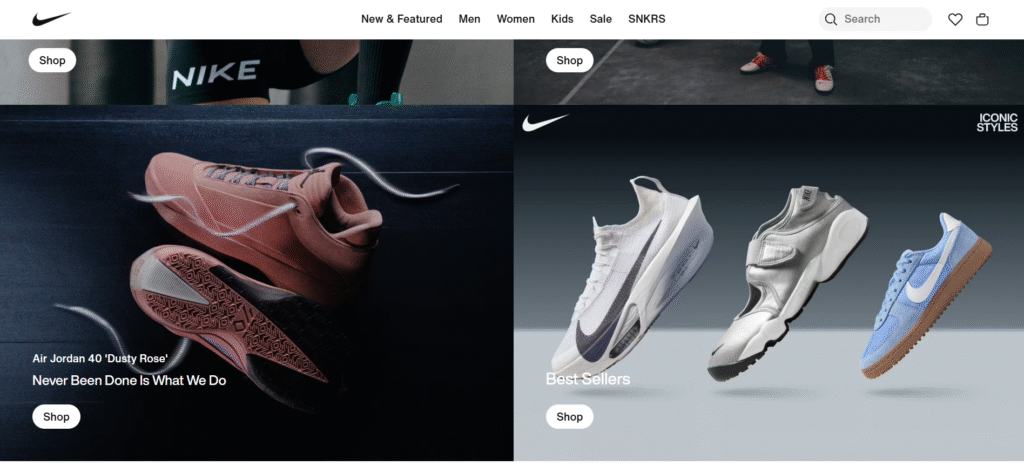
Nike’s website is a masterclass in dynamic, high-energy branding. It’s not just a place to buy sportswear. it’s a platform that inspires action and tells compelling stories of athletes.
What Makes It Great:
- Powerful Video Content: Nike uses video extensively, from full-screen background videos on the homepage to short clips on product pages. This creates a sense of movement, energy, and athleticism that is core to the brand.
- Bold Typography and Imagery: The site uses large, bold typography and dramatic, high-contrast photography. This creates a visually impactful experience that is both modern and powerful.
- Personalization: The “Nike By You” feature allows customers to customize their own shoes, creating a unique and personal connection to the product. The site also provides personalized recommendations based on browsing history.
- Storytelling: Nike’s website is filled with stories of athletes and innovation. This content marketing approach builds an emotional connection with the audience, making the brand about more than just products.
5. Burrow
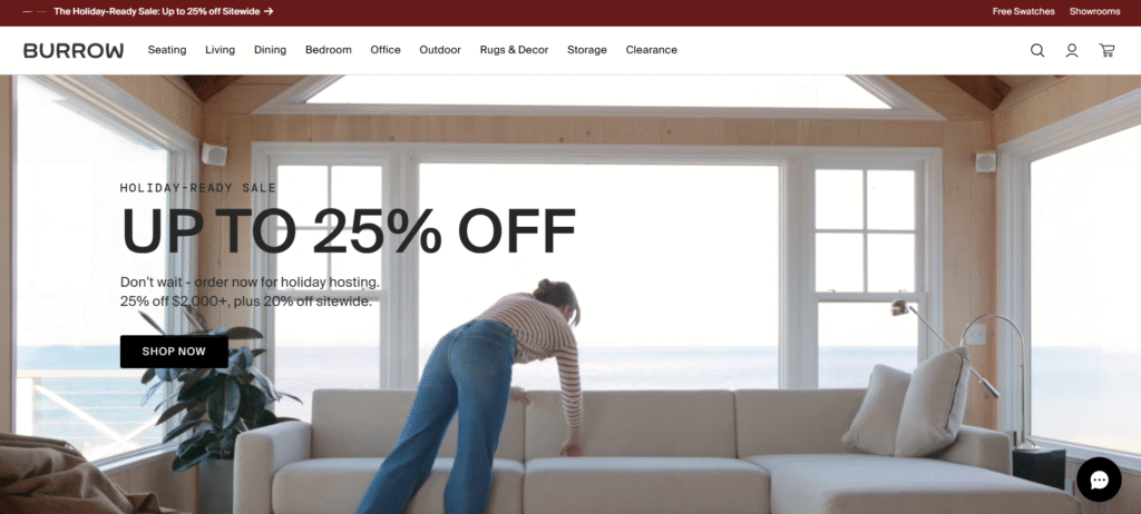
Burrow sells modular furniture, and its website is expertly designed to make a potentially complex product easy to understand and purchase. The user experience is built around customization and clear communication.
What Makes It Great:
- Interactive Product Configurator: The product pages feature a brilliant 3D configurator that allows you to customize the sofa’s color, leg finish, arm style, and chaise orientation in real-time. This is a powerful tool that helps users build their perfect piece of furniture.
- Clean, Grid-Based Layout: The site uses a structured, grid-based layout that is easy to navigate. This is particularly effective for showcasing different product collections and categories in an organized way.
- Informative and Transparent: Burrow provides a wealth of information about its products, from assembly instructions and dimensions to materials and care guides. This transparency builds trust and helps customers feel confident in their purchase.
- Lifestyle Context: The photography shows the furniture in beautifully styled, real-life living spaces. This helps customers visualize how the pieces would look in their own homes.
6. Patagonia
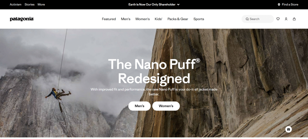
Patagonia is a brand driven by its environmental mission, and its website is a powerful reflection of that commitment. It seamlessly blends commerce with activism, creating a platform that is as much about education as it is about sales.
What Makes It Great:
- Mission-Driven Content: The homepage often features environmental campaigns and stories rather than products. This immediately communicates the brand’s priorities and attracts customers who share those values.
- Authentic, Rugged Aesthetic: The design is clean but has a rugged, outdoorsy feel. The photography features real people in wild, natural landscapes, reinforcing the brand’s connection to adventure and environmentalism.
- Worn Wear Program: The site prominently features “Worn Wear,” its platform for buying and selling used Patagonia gear. This is a tangible demonstration of its commitment to sustainability and reducing consumption.
- Detailed Product Information: Patagonia provides in-depth information about the materials and supply chain for each product, offering a level of transparency that is rare in the apparel industry.
7. Aēsop
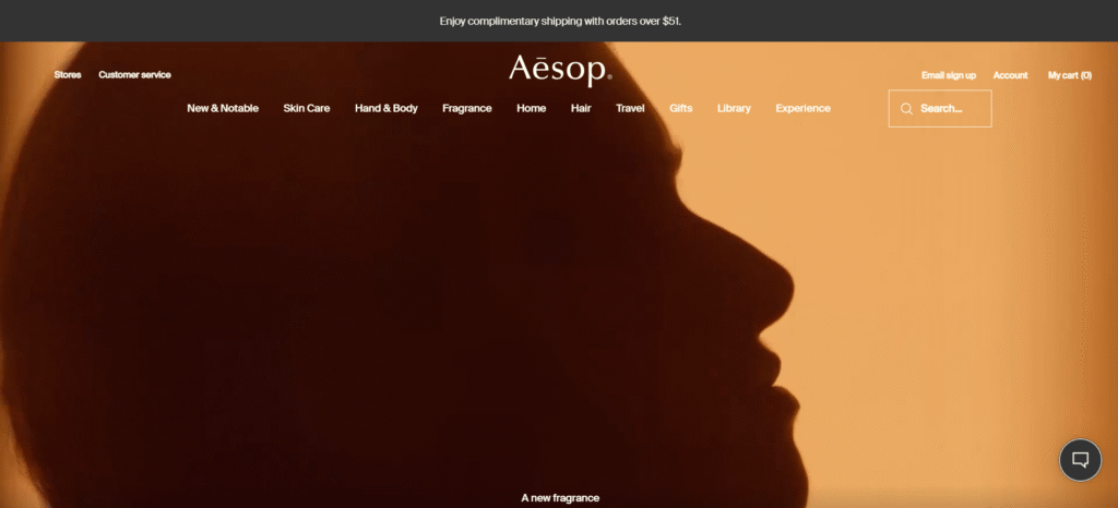
Aēsop’s website is a study in sophisticated, elegant design. It evokes the feeling of a calm, luxurious apothecary, with a focus on aesthetics, detail, and a refined user experience.
What Makes It Great:
- Asymmetrical Layouts: The site often uses asymmetrical layouts, which creates a more dynamic and visually interesting experience than a standard grid. It feels more like a high-end magazine than a typical ecommerce site.
- Subtle Animations: Aēsop uses very subtle, elegant animations. For example, images may fade in gently as you scroll. These small details contribute to a polished and premium feel.
- Beautiful Typography: The typography is a key element of the design. Aēsop uses a mix of serif and sans-serif fonts that are both classic and modern, adding to the site’s sophisticated aesthetic.
- Focus on the Sensory: The product descriptions are incredibly evocative, focusing on the scent, texture, and feeling of the products. This helps to create a sensory experience online.
8. Away
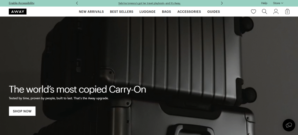
Away has disrupted the luggage industry with its direct-to-consumer model and strong brand identity. Its website is clean, modern, and designed to make the process of buying luggage simple and enjoyable.
What Makes It Great:
- Modular Design: The site uses a block-based, modular design that is visually clean and easy to scan. Each block highlights a specific product feature or brand story.
- Clear Value Propositions: Away clearly communicates its key selling points, such as the durable materials, thoughtful features (like a built-in battery), and lifetime warranty.
- Social Proof: The site effectively uses quotes from major publications and customer reviews to build credibility and trust.
- Contextual Upselling: On the product page, Away suggests complementary products like packing cubes or a matching tote bag in a way that feels helpful rather than pushy.
9. MeUndies
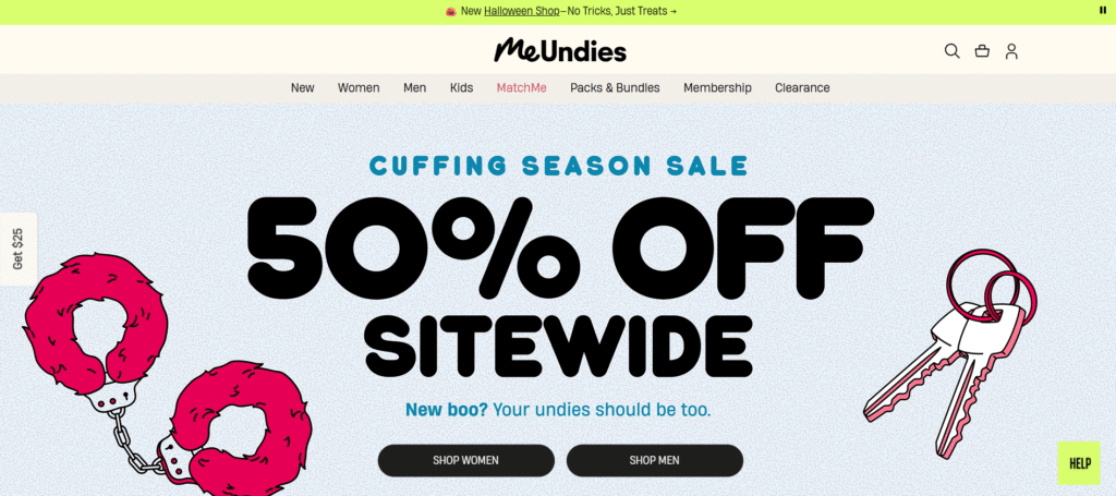
MeUndies sells underwear and loungewear with a focus on fun, comfort, and self-expression. Its website is vibrant, playful, and full of personality, creating a brand experience that is anything but boring.
What Makes It Great:
- Bold and Colorful Design: The site is bursting with color and bold patterns, reflecting the brand’s product designs. It immediately communicates a sense of fun and energy.
- Inclusive Imagery: The photography features a diverse range of models with different body types, ethnicities, and ages. This makes the brand feel inclusive and relatable.
- Membership Model: MeUndies has a successful membership program that is a central part of its business. The website does an excellent job of explaining the benefits of membership and making it easy to sign up.
- Conversational Tone: The copy is playful, witty, and full of personality. It feels like you’re talking to a friend, which helps to build a strong brand-customer relationship.
10. Warby Parker
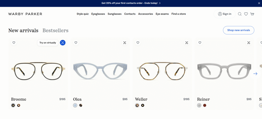
Warby Parker revolutionized the eyewear industry with its home try-on program and affordable, stylish glasses. Its website is designed to make the process of buying glasses online as easy and risk-free as possible.
What Makes It Great:
- Virtual Try-On: The site’s virtual try-on feature is a game-changer. Using a customer’s webcam, it realistically shows how different frames will look on their face. This removes a major barrier to buying glasses online.
- Clean and Intuitive Interface: The website is incredibly easy to navigate. The filtering options are robust, allowing users to narrow down the selection by frame shape, color, material, and width.
- Educational Content: Warby Parker provides helpful guides on topics like how to find your frame size and understand your prescription. This educational content empowers customers and builds trust.
- Home Try-On Program: The website clearly explains the free home try-on program, which is a key part of its value proposition. The process for ordering a try-on kit is simple and straightforward.
11. Everlane
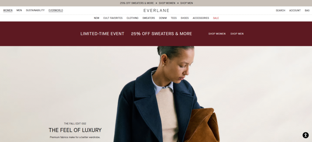
Everlane is built on the concept of “Radical Transparency,” and its website is a direct reflection of this ethos. The design is minimalist and information-rich, focusing on educating the consumer about the cost and craftsmanship behind each product.
What Makes It Great:
- Transparent Pricing: On each product page, Everlane includes a breakdown of the true cost to make the item, including materials, labor, and transportation. This transparency is a core part of its brand identity and builds immense trust.
- Minimalist Aesthetic: The website design is incredibly clean and minimalist. This allows the high-quality product photography and the detailed cost information to stand out.
- Focus on Quality and Craftsmanship: The product descriptions and photography highlight the quality of the materials and the details of the construction. This positions Everlane as a source for timeless, well-made wardrobe staples.
- “Choose What You Pay” Events: Everlane periodically runs “Choose What You Pay” events, where customers can select from a few different price points for sale items. The website clearly explains what each price point covers, further reinforcing its commitment to transparency.
12. Bonobos
Bonobos started with a simple mission: to make better-fitting men’s pants. Its website is stylish, easy to navigate, and focused on helping men find the perfect fit.
What Makes It Great:
- Fit-Focused Navigation: The navigation and filtering options are heavily focused on fit. Customers can filter by waist size, length, and fit type (e.g., slim, athletic, straight) to quickly find what they need.
- Helpful Guides and Content: Bonobos provides a wealth of content aimed at helping men with their style, from fit guides for different body types to articles on how to wear certain items.
- Clean and Sophisticated Design: The website has a polished, modern aesthetic that appeals to its target audience. The use of a clean layout and high-quality photography creates a premium feel.
- Guideshop Integration: Bonobos has physical “Guideshop” locations where customers can get fitted in person. The website does a great job of integrating the online and offline experience, allowing users to easily book appointments.
13. Casper
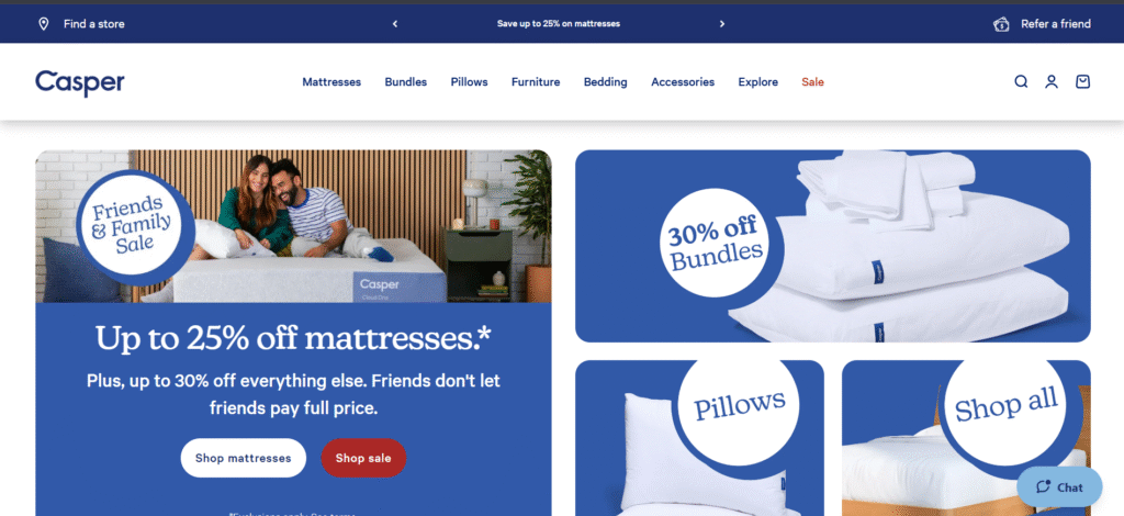
Casper disrupted the mattress industry with its “bed-in-a-box” concept and a focus on creating a simple, hassle-free shopping experience. Its website is clean, reassuring, and designed to answer every possible customer question.
What Makes It Great:
- Benefit-Oriented Copy: The copy focuses on the benefits of a good night’s sleep rather than just the technical specifications of the mattress. It speaks to the customer’s desires for comfort, rest, and well-being.
- Social Proof and Reviews: Casper prominently displays customer reviews, awards from reputable publications, and testimonials. This is crucial for building trust when selling a high-consideration item like a mattress online.
- Clear and Simple Product Comparison: The website makes it very easy to compare the different mattress models, with a clear chart that highlights the key features of each.
- Risk-Free Trial: Casper’s 100-night risk-free trial is a key part of its value proposition. The website communicates this offer clearly and reassuringly throughout the buying process.
14. Frank Body
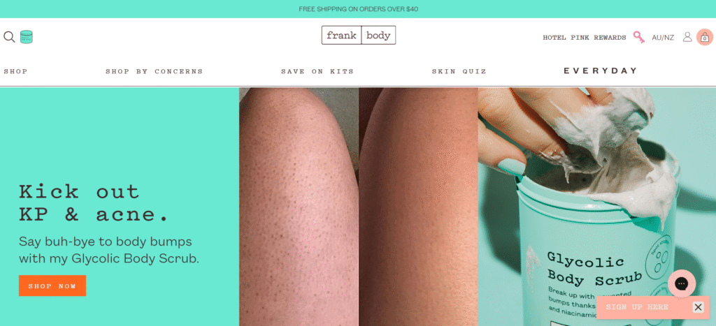
Frank Body sells coffee-based skincare with a cheeky, irreverent brand personality. The website is bold, fun, and highly engaging, creating a memorable experience that stands out in the crowded beauty market.
What Makes It Great:
- Unique Brand Voice: The copy is written from the perspective of “Frank,” a character who is direct, funny, and a little bit flirty. This consistent and unique brand voice is a major differentiator.
- User-Generated Content: The site is filled with photos of real customers covered in the coffee scrub, which they call the “#thefrankeffect.” This creates a strong sense of community and provides powerful social proof.
- Bold and Pink Design: The design is unapologetically bold, with a lot of pink, strong typography, and a playful layout. It perfectly matches the brand’s energetic and fun personality.
- Interactive Quizzes: Frank Body uses quizzes to help customers find the right products for their skin type. This is a fun and engaging way to provide personalized recommendations.
15. Hims
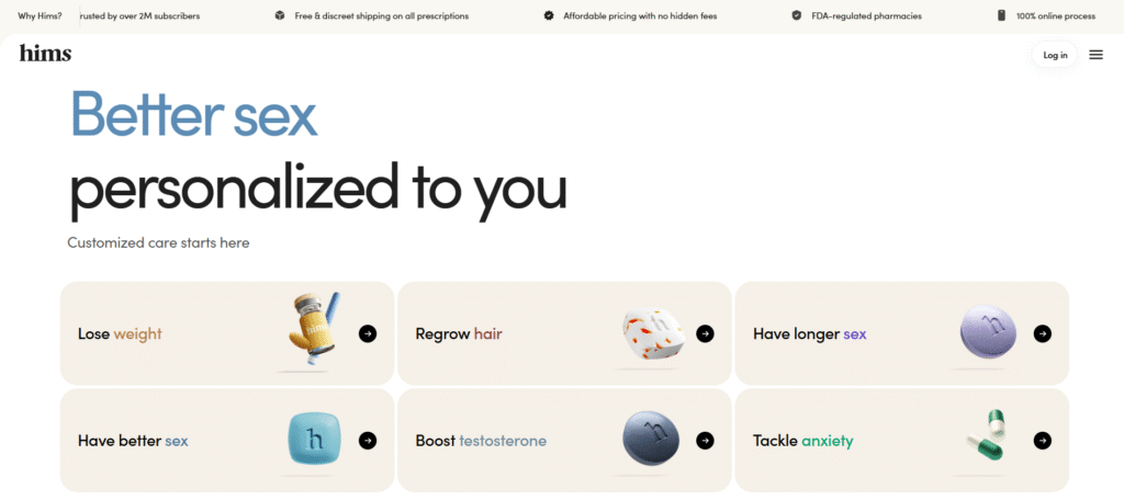
Hims addresses men’s wellness and personal care topics that are often considered taboo, such as hair loss and erectile dysfunction. The website is designed to be discreet, educational, and trustworthy, creating a safe and comfortable space for men to seek solutions.
What Makes It Great:
- Modern and Discreet Design: The design is clean, modern, and masculine, using a muted color palette and simple iconography. It feels more like a tech startup than a pharmaceutical company, which helps to destigmatize the products.
- Educational Approach: The website is rich with easy-to-understand information about the conditions it treats. This educational content helps to build trust and empower the customer.
- Simple and Clear Process: Hims clearly outlines the process of getting a prescription online, from the initial consultation to the discreet delivery of the product. This transparency helps to alleviate any concerns the customer might have.
- Telehealth Integration: The core of the Hims model is its telehealth platform. The website seamlessly integrates this service, making it easy for users to connect with a doctor and get a prescription.
16. Mejuri
Mejuri has carved out a niche in the jewelry market with its focus on “fine jewelry for every day.” The brand’s website is elegant, minimalist, and designed to feel like a modern, accessible luxury brand.
What Makes It Great:
- High-Quality, Detailed Photography: The product photography is exceptional. It includes close-up shots that show the detail and craftsmanship of each piece, as well as photos of the jewelry on models to show scale and how it can be styled.
- “The Drop” Model: Mejuri releases new, limited-edition pieces every Monday, which they call “The Drop.” This creates a sense of excitement and urgency, encouraging customers to visit the site frequently.
- Styling and Layering Inspiration: The website provides a lot of content on how to style and layer different pieces of jewelry. This is helpful for customers and also encourages them to buy multiple items.
- Elegant and Minimalist UI: The user interface is clean, sophisticated, and easy to navigate. The focus is always on the beautiful product imagery.
17. Outdoor Voices
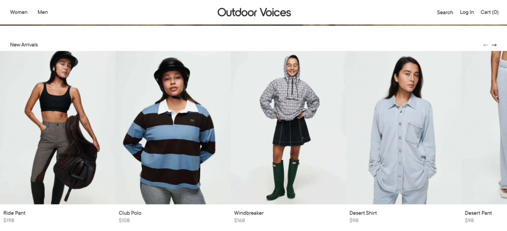
Outdoor Voices has built a strong community around its mission of “Doing Things” and making fitness fun and accessible. The brand’s website is colorful, energetic, and reflects this inclusive and active ethos.
What Makes It Great:
- Community-Focused Imagery: The photography features a diverse group of people of all shapes, sizes, and fitness levels being active and having fun. It’s relatable and inspiring, and it reinforces the brand’s community-oriented mission.
- Bold Use of Color: The website uses a vibrant and playful color palette. This distinguishes it from more traditional, performance-focused athletic brands and aligns with its fun, recreational positioning.
- OV Kits: Outdoor Voices offers “OV Kits,” which are curated outfits for different activities at a bundled price. The website makes it easy and fun to build a kit, which is a great way to increase the average order value.
- Engaging Copy: The copy is upbeat, encouraging, and uses the brand’s signature hashtag, #DoingThings. This creates a consistent and recognizable brand voice.
18. Fenty Beauty
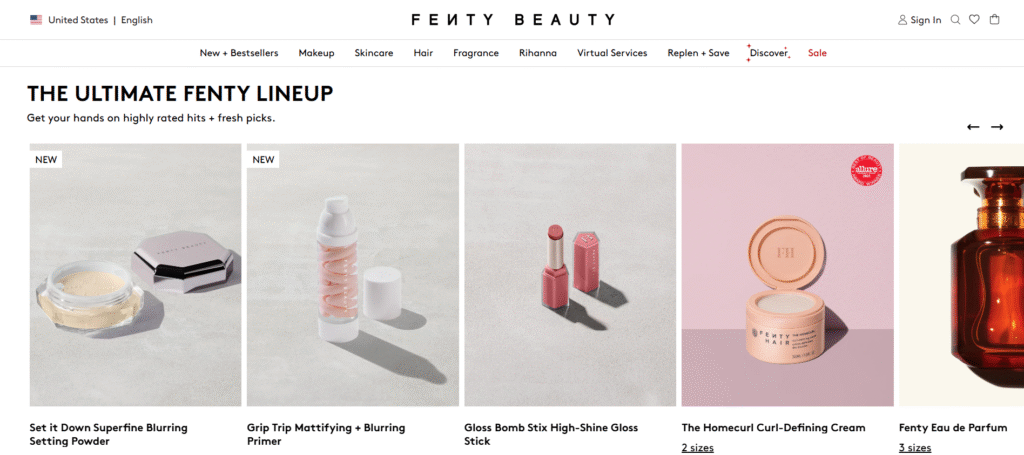
Launched by Rihanna, Fenty Beauty disrupted the cosmetics industry with its commitment to inclusivity, particularly its wide range of foundation shades. The website is bold, modern, and visually stunning, reflecting the brand’s groundbreaking approach.
What Makes It Great:
- Inclusive Shade Range Display: Fenty’s foundation page is a masterclass in showcasing inclusivity. It features a grid of all the shades on a diverse range of skin tones, making it easy for everyone to find their match.
- “Shade Finder” Tool: The website includes a sophisticated “Shade Finder” quiz that helps users determine their perfect foundation shade. This is a critical tool for selling foundation online.
- Bold and Edgy Aesthetic: The design is modern and edgy, with sharp lines, high-contrast imagery, and a confident tone. It perfectly captures Rihanna’s personal style and the brand’s bold identity.
- Video Tutorials: The site features numerous video tutorials showing how to use the products. These are often led by Rihanna herself or other makeup artists, adding value and star power.
19. Harry’s
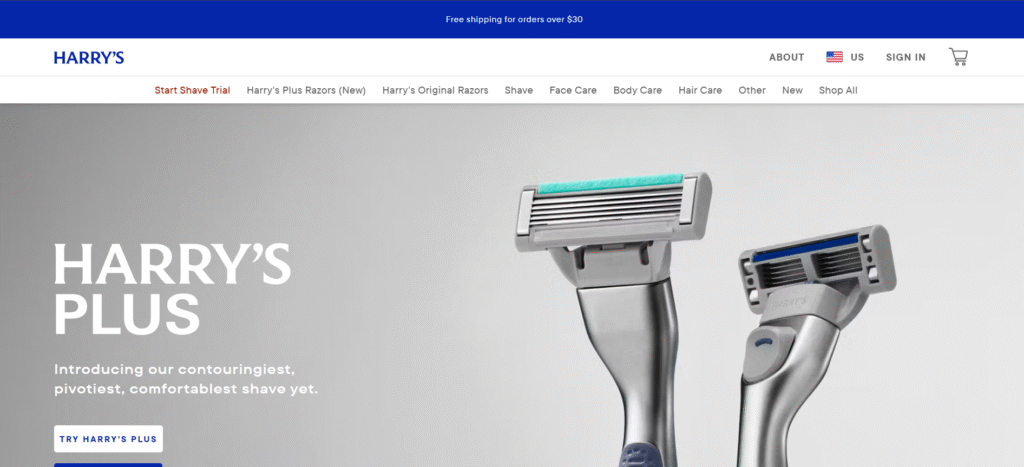
Harry’s offers a simple, high-quality, and affordable alternative to mainstream shaving brands. Its website is clean, straightforward, and designed to communicate value and quality.
What Makes It Great:
- Simple and Clear Value Proposition: The website’s messaging is focused on a few key points: sharp blades, a fair price, and a simple, enjoyable shaving experience.
- Clean and Masculine Design: The design is minimalist and masculine, using a clean layout, strong typography, and a muted color palette. It’s sophisticated without being pretentious.
- Subscription Model: Harry’s has a popular subscription model for blade refills. The website makes it incredibly easy to sign up and manage your subscription, which is key to its success.
- Focus on Design and Craftsmanship: Even though the products are affordable, the website highlights the thoughtful design and German engineering behind the blades. This helps to position the brand as a high-quality option.
20. Staud
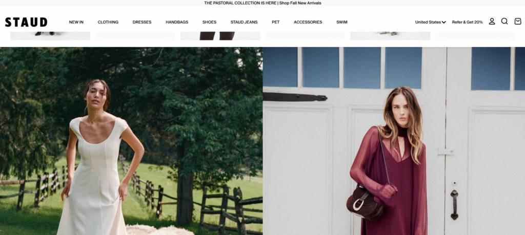
Staud is a fashion brand known for its vintage-inspired yet modern designs. The website has a unique, editorial feel that sets it apart from more conventional ecommerce sites.
What Makes It Great:
- Editorial-Style Layouts: The site often uses full-bleed images and creative layouts that feel more like a high-fashion magazine than an online store. This creates a strong sense of brand identity and aesthetic.
- Playful and Creative Photography: The product photography is often quirky and playful, featuring interesting props and unexpected settings. This gives the brand a distinct personality.
- Unique Navigation: Staud sometimes experiments with unconventional navigation, which can make the site feel more like an exploration. While this can be a risk, it works for Staud because it aligns with their creative and fashion-forward brand.
- Shop the Look: Staud makes it easy to “Shop the Look” from their editorial photoshoots, which is a great way to increase average order value and provide styling inspiration.
21. Magic Spoon
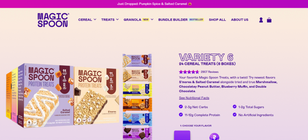
Magic Spoon has reimagined breakfast cereal for adults, offering a high-protein, low-carb version of classic childhood favorites. The website is a perfect blend of nostalgic fun and modern health-consciousness.
What Makes It Great:
- Vibrant, Retro-Inspired Design: The website uses bright colors, playful illustrations, and a retro font that immediately evokes a sense of childhood nostalgia. It makes the brand feel fun and approachable.
- Clear Nutritional Information: While the design is playful, the website is also very clear about the product’s health benefits. It uses simple graphics and charts to compare the nutritional information of Magic Spoon to traditional cereal.
- Engaging Animations and Microinteractions: The site is full of small, delightful animations. For example, the cereal box characters might wink or move as you scroll. These details make the user experience more engaging.
- Social Proof and Media Mentions: Magic Spoon prominently displays quotes from major media outlets and positive customer reviews. This helps to build credibility for a new and innovative product.
22. Seed
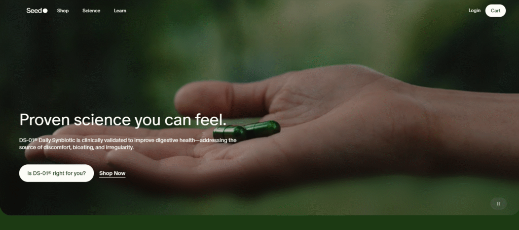
Seed sells probiotics and focuses heavily on the science behind its products. The website is designed to be both aesthetically beautiful and scientifically credible, a difficult balance that it achieves brilliantly.
What Makes It Great:
- Scientific and Educational Focus: The website is a deep resource of information about the microbiome and the science of probiotics. This educational approach positions Seed as an authority in its field.
- Elegant and Minimalist Design: The design is incredibly clean and sophisticated, using a simple color palette, beautiful typography, and microscopic imagery of bacteria. It makes the science feel beautiful and accessible.
- Interactive Elements: The site uses interactive diagrams and animations to explain complex scientific concepts in a simple and engaging way.
- Sustainable Packaging: Seed’s commitment to sustainability is a key part of its brand, and the website highlights its innovative, eco-friendly packaging.
23. Athletic Greens
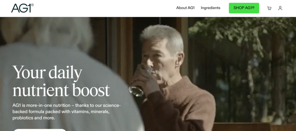
Athletic Greens (AG1) sells a single, comprehensive nutritional supplement. The website is designed to be highly persuasive and informative, building a strong case for the value of its all-in-one product.
What Makes It Great:
- Long-Form Landing Page: The primary product page is a long-form landing page that systematically addresses every potential customer question and objection. It covers the ingredients, the benefits, the science, and customer testimonials.
- Strong Use of Social Proof: The page is packed with testimonials from athletes, health experts, and everyday customers. It also features logos from major publications where the product has been featured.
- Benefit-Driven Headlines: The copy is broken up with clear, benefit-driven headlines that make it easy to scan and understand the key selling points.
- Clear Call-to-Action: Despite the amount of information, the call-to-action (to subscribe) is always clear and accessible.
24. Omsom
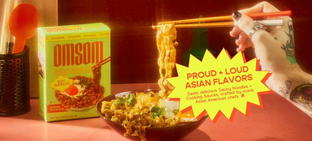
Omsom sells “starters” for specific Asian dishes, which are pre-packaged sauce and seasoning packets. The brand is all about bold, authentic flavors, and its website is a vibrant and energetic reflection of this.
What Makes It Great:
- Loud and Proud Design: The website is anything but minimalist. It uses bright, bold colors, loud typography, and a high-energy layout. It’s an assault on the senses in the best way possible and perfectly matches the brand’s bold flavors.
- Focus on Founders and Story: Omsom is founded by two Vietnamese-American sisters, and their story and personality are front and center on the website. This makes the brand feel personal and authentic.
- Mouth-Watering Food Photography: The photography of the finished dishes is vibrant, messy, and incredibly appetizing. It makes you want to immediately cook and eat the food.
- Collaborations with Chefs: The brand collaborates with renowned chefs to create its starters, and the website highlights these collaborations, which adds a layer of culinary credibility.
25. Starface
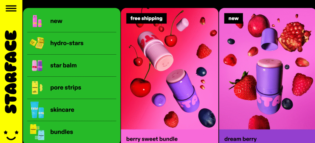
Starface has made acne care fun with its star-shaped hydrocolloid pimple patches. The website is bright, playful, and has a Gen Z-friendly aesthetic that turns a typically negative experience (getting a pimple) into a moment of self-expression.
What Makes It Great:
- Y2K-Inspired Aesthetic: The website has a fun, nostalgic, Y2K-inspired design, with bright primary colors, chunky fonts, and playful animations. It’s a perfect match for its target audience.
- Positive and Inclusive Messaging: Starface’s messaging is all about destigmatizing acne and promoting skin positivity. The website is a judgment-free zone that feels welcoming and inclusive.
- Focus on a Single Hero Product: The brand’s hero product, the Hydro-Star pimple patch, is the clear focus of the website. This simplicity makes the brand easy to understand and remember.
- Engaging and Shareable Content: The website and its associated social media are full of fun, shareable content, like photos of celebrities and influencers wearing the star patches.
26. Graza
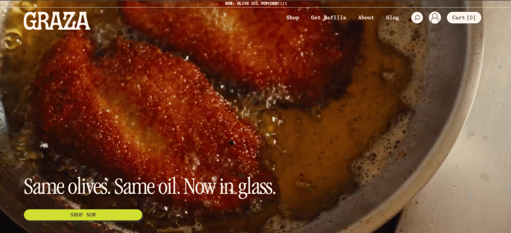
Graza sells high-quality, fresh olive oil in fun, squeezable bottles. The brand aims to make great olive oil less intimidating and more accessible, and its website design perfectly captures this mission.
What Makes It Great:
- Fun and Approachable Design: The website uses a playful, illustration-heavy design with a bright green and off-white color palette. It feels fun and modern, and it immediately sets the brand apart from traditional, stuffy olive oil brands.
- Clear Product Differentiation: Graza sells two types of olive oil: “Sizzle” for cooking and “Drizzle” for finishing. The website does an excellent job of clearly explaining the difference and the use case for each, using simple language and fun icons.
- Educational but Not Pretentious: The site provides educational content about olive oil, such as how it’s made and what to look for, but it does so in a way that is easy to understand and free of jargon.
- Focus on the Squeeze Bottle: The unique, squeezable bottle is a key differentiator for Graza, and the website’s photography and copy constantly highlight this feature, emphasizing its convenience and fun factor.
Expert Insights
As the ecommerce landscape evolves, so do the strategies for success. According to web creation expert Itamar Haim, “In 2026, the most successful online stores will be those that master the art of experiential commerce. It’s no longer enough to just have great products. Brands need to create an immersive digital environment that tells a story, engages the senses, and builds a genuine community. This means investing in high-quality visual content, interactive features, and personalization that makes every visitor feel seen and understood.”
This focus on experience is evident in the examples above. The best brands are using their websites not just as a sales channel, but as a powerful tool for brand building and customer relationship management. To bring these kinds of rich experiences to life, many businesses are turning to powerful and flexible web creation platforms. Building your store with a comprehensive tool like Elementor provides the design flexibility needed to create these custom, engaging experiences without being limited by rigid templates. It empowers creators to build a site that truly reflects their brand’s unique story and vision.
For those looking to get started, leveraging an AI website builder can be a game-changer. These tools can help generate a professional foundation, which you can then customize to fit your specific brand needs, significantly speeding up the development process.
Frequently Asked Questions (FAQ)
1. What are the key elements of a good ecommerce website design?
A good ecommerce website design should be visually appealing, easy to navigate, mobile-friendly, and focused on providing an excellent user experience. Key elements include high-quality product images and videos, clear and concise product descriptions, intuitive navigation and search functionality, a simple and secure checkout process, and prominent customer reviews and social proof.
2. Why is mobile-first design so important for ecommerce?
Mobile-first design is critical because a majority of online traffic and a significant portion of sales now come from mobile devices. A mobile-first approach ensures that your website looks and functions perfectly on smaller screens, providing a seamless and user-friendly experience for mobile shoppers. This leads to higher engagement, lower bounce rates, and increased conversions.
3. How can I use storytelling on my ecommerce site?
Storytelling can be woven into your site through an engaging “About Us” page that shares your brand’s mission and values, product descriptions that evoke emotion and describe the benefits in a compelling way, blog posts that provide value and context around your products, and customer testimonials that share real-life stories. High-quality lifestyle photography and video are also powerful storytelling tools.
4. What is the role of user-generated content (UGC) in ecommerce?
User-generated content, such as customer reviews, photos, and videos, is incredibly valuable for building trust and social proof. It provides authentic, unbiased opinions that shoppers trust more than traditional advertising. Displaying UGC on your product pages can significantly increase conversion rates by helping shoppers feel more confident in their purchasing decisions.
5. How can I improve my website’s conversion rate?
To improve your conversion rate, focus on optimizing the user experience. This includes simplifying the checkout process, ensuring fast page load speeds, using high-quality product imagery, writing persuasive product copy, displaying customer reviews and trust badges, and having a clear call-to-action on every page. A/B testing different elements of your site can also help you identify what works best for your audience.
6. What is headless commerce, and should I consider it?
Headless commerce is an architecture where the front-end presentation layer (the “head,” or the website/app) is decoupled from the back-end ecommerce functionality (the commerce platform). This gives brands incredible flexibility and creative control over the user experience. You should consider it if you want to create a highly customized, unique storefront, or if you need to deliver content to multiple channels (like a website, mobile app, and smart mirror) from a single back-end.
7. How important is website speed for an ecommerce store?
Website speed is extremely important. Slow-loading pages can lead to high bounce rates, lower conversion rates, and even lower search engine rankings. Customers expect a fast and seamless experience, and even a one-second delay in page load time can significantly impact your sales. Optimizing images, using a good hosting provider, and minimizing heavy scripts are crucial for maintaining a fast site. Consider specialized solutions like ecommerce hosting that are optimized for online stores.
8. What are some key design trends for ecommerce in 2026?
Key trends include minimalism and clean design, dark mode options, immersive 3D and AR product visualizations, microinteractions and subtle animations to enhance UX, a greater emphasis on sustainability and ethical practices in branding, and hyper-personalization powered by AI.
9. How can I make my product pages more effective?
Make your product pages more effective by including multiple high-resolution images and a product video, writing detailed and benefit-focused descriptions, prominently displaying the price and a clear “Add to Cart” button, showing customer reviews and ratings, providing detailed specifications and sizing information, and clearly stating your shipping and return policies.
10. What’s the best way to get started if I have no design experience?
If you have no design experience, using a website builder with a drag-and-drop interface is the best way to start. Platforms like WordPress combined with a builder like Elementor offer pre-designed templates and website kits that you can customize. You can also use AI-powered tools like the AI Site Planner to generate a structure and wireframe, giving you a professional starting point.


