Table of Contents
This reality has given rise to the mobile-first design philosophy. This approach prioritizes the design and development for mobile screens first before scaling up to larger devices like tablets and desktops. It forces creators to focus on the essential content and functionality, resulting in a cleaner, faster, and more user-centric experience for everyone. A truly effective mobile website is a blend of art and science. It combines intuitive navigation, lightning-fast load times, and a visually engaging interface that feels natural to the touch.
Key Takeaways
- Mobile-First is Non-Negotiable: Designing for mobile devices first is the current standard for web design. This approach ensures that the core user experience is optimized for the majority of users, leading to better engagement and conversion rates.
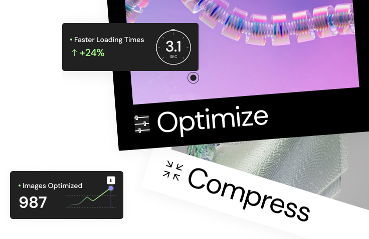
- Speed is Paramount: Mobile users are impatient. A slow-loading site is one of the biggest deterrents to a positive mobile experience. Optimizing images, leveraging browser caching, and minimizing code are crucial steps. Tools like the Elementor Image Optimizer can be instrumental in this process.
- Simplicity Wins: The limited screen real estate on mobile devices demands a minimalist approach. Cluttered layouts, confusing navigation, and excessive text will overwhelm users. Prioritize essential content and create a clear visual hierarchy.
- Thumb-Friendly Design is Crucial: Designers must consider how users physically hold and interact with their phones. Placing key navigation elements and call-to-action buttons within easy reach of the thumb improves usability and user satisfaction.
- Seamless Navigation is Key: A mobile site should be effortless to navigate. Features like a sticky header with a clear hamburger menu, intuitive icons, and a logical information architecture are essential for helping users find what they need without frustration.
- Visuals and Interactivity Drive Engagement: High-quality images, clean typography, and subtle animations can make a mobile site feel polished and engaging. The goal is to create an experience that is not only functional but also enjoyable to use.
17 Examples of Exceptional Mobile Website Design
Studying the best is a great way to understand what works. Let’s dive into 17 examples of websites that have mastered the art of mobile design, breaking down exactly what makes them so effective.
1. Apple: The Masterclass in Minimalism
It should come as no surprise that Apple, a company renowned for its product design, also excels in its digital presentation. The mobile version of Apple.com is a study in clean aesthetics and effortless navigation.
What Makes It Great:
- Product-Centric Visuals: Apple’s mobile site uses large, stunning product images as the centerpiece of its design. The visuals are so crisp and compelling that they immediately draw the user in, requiring minimal text to convey value.
- Generous White Space: The design isn’t afraid of empty space. This “white space” prevents the layout from feeling cramped and helps to guide the user’s eye toward the most important elements, like the “Buy Now” buttons.
- Intuitive Card-Based Layout: The homepage is structured as a series of full-width cards, each dedicated to a specific product or announcement. Users can simply scroll vertically to explore the latest offerings in a fluid, story-like manner.
- Streamlined Navigation: The main navigation is tucked away in a clean, unobtrusive hamburger menu, but key links like “Store,” “Mac,” and “iPhone” are also presented in a sleek, scrollable horizontal menu at the top, offering multiple paths for exploration.
2. The New York Times: Content Clarity on the Go
For a content-heavy site like The New York Times, the primary challenge is presenting a vast amount of information without overwhelming the user. Their mobile site handles this with remarkable elegance.
What Makes It Great:
- Impeccable Typography: The site uses a clear, legible serif font for headlines and a clean sans-serif for body text. The font sizes and spacing are optimized for reading on a small screen, making it easy to consume long articles.
- Strong Visual Hierarchy: The most important story of the moment is given the most visual weight with a large headline and a prominent image. As you scroll, the hierarchy becomes clear, with other sections and articles logically organized.
- “Continue Reading” Functionality: To keep the homepage scannable, articles are presented with a headline and a brief summary, followed by a “Continue Reading” link. This allows users to quickly scan the news without being bogged down by long blocks of text.
- Sticky Navigation and Search: A slim, sticky header at the top of the screen provides persistent access to the search function and the main menu, allowing users to change sections or search for a specific topic at any point.
3. Airbnb: User-Focused and Action-Oriented
Airbnb’s mobile website is designed with one primary goal in mind: to help users find and book a place to stay as quickly and easily as possible. Every element is geared toward this action.
What Makes It Great:
- Prominent Search Bar: The first thing you see on the Airbnb mobile homepage is a large, impossible-to-miss search bar prompting you to enter your destination, dates, and number of guests. It immediately funnels users into the booking process.
- Icon-Based Navigation: The site uses universally understood icons for key categories like “Cabins,” “Beachfront,” and “Amazing pools.” This visual approach is faster to process than text and transcends language barriers.
- Map and List View Toggle: When browsing listings, users can easily switch between a map view and a list view. This dual functionality caters to different user preferences—some prefer to see listings geographically, while others prefer to scroll through photos.
- Thumb-Friendly CTA Buttons: Key buttons like “Search,” “Reserve,” and “Contact Host” are large, brightly colored, and placed at the bottom of the screen, well within the natural arc of the thumb.
4. Mailchimp: Playful Design with a Purpose
Mailchimp has built a brand around being friendly and approachable, and their mobile website perfectly reflects this personality. It uses playful illustrations and a conversational tone to make a potentially dry subject (email marketing) feel engaging.
What Makes It Great:
- Consistent Brand Identity: The signature yellow color and quirky illustrations are used consistently throughout the mobile site, creating a cohesive and memorable brand experience.
- Simplified Forms: The sign-up and login forms are a model of simplicity. They only ask for the absolute essential information and use large, easy-to-tap input fields.
- Clear Call-to-Actions: Buttons like “Sign Up Free” and “Pick a Plan” are clearly differentiated by color and placement, guiding new and existing users to the right place.
- Benefit-Oriented Headlines: The copy is concise and focuses on the user’s goals. Headlines like “Get down to business and grow your sales” immediately communicate the value proposition.
5. Nike: Immersive and Visually Driven
Nike’s mobile site feels less like a traditional ecommerce store and more like an immersive brand experience. It uses bold visuals, video, and slick animations to capture the energy of the brand.
What Makes It Great:
- Full-Screen Video: The homepage often features a full-screen, auto-playing video that showcases athletes in action. This immediately creates a dynamic and exciting atmosphere.
- Bold Typography: Nike uses large, impactful typography that is both a design element and a messaging tool. It grabs attention and reinforces the brand’s confident attitude.
- Seamless Shopping Experience: Despite the heavy focus on branding, the path to purchase is very clear. A sticky “Shop” button is always present, and product pages feature high-quality imagery from multiple angles. For those looking to build similar shopping experiences, the Elementor WooCommerce builder offers powerful tools for customizing product pages.
- Personalization: The site does an excellent job of recommending products based on the user’s browsing history, creating a more personalized and relevant shopping experience.
6. Dropbox: The Power of Simplicity
Dropbox sells a digital product, so its mobile website focuses on clearly communicating its features and benefits through a clean, uncluttered interface.
What Makes It Great:
- Clear Value Proposition: The headline on the homepage, “Focus on the work that matters,” immediately tells the user what Dropbox helps them achieve. The supporting text is brief and easy to understand.
- Simple, Iconographic Illustrations: The site uses simple line-art illustrations to visually represent complex features like cloud storage and file sharing. These visuals are easy to grasp and load quickly.
- Contrasting CTA Buttons: The primary call-to-action, “Try Dropbox for free,” is presented in a bright blue button that stands out against the white background, drawing the user’s eye and encouraging clicks.
- Accordion Menus for FAQs: To avoid long pages of text, the FAQ section uses an accordion-style layout. Users can tap on a question to reveal the answer, keeping the page tidy and allowing users to focus only on the information they need.
7. Etsy: Connecting Users with Unique Products
Etsy’s mobile site is designed to facilitate discovery. It needs to help millions of users browse a massive inventory of unique, handmade items from individual sellers.
What Makes It Great:
- Powerful Search and Filtering: The search bar is front and center, but the real power lies in the filtering options. Users can filter results by price, color, shipping location, and even customer ratings, making it easy to narrow down the vast selection.
- Image-Grid Layout: Product listings are displayed in a clean, image-focused grid. This allows users to quickly scan dozens of items at a glance, relying on visuals to catch their interest.
- User-Generated Content: Customer reviews and photos are prominently featured on product pages. This social proof is incredibly important for a marketplace like Etsy, as it builds trust between buyers and sellers.
- Easy “Favorite” Functionality: A simple heart icon on each product image allows users to save items to a “Favorites” list with a single tap. This encourages browsing and return visits.
8. Slack: Getting Straight to the Point
Slack’s mobile website is a masterclass in direct communication. It knows its audience is likely busy professionals, so it cuts right to the chase, explaining what the product does and why it’s valuable.
What Makes It Great:
- Benefit-Driven Copy: The copy is short, sharp, and focused on outcomes. Phrases like “Move faster with your tools in one place” and “Simplify teamwork for everyone” quickly convey the benefits.
- Animated GIFs for Demonstration: Instead of static screenshots, Slack uses short, looping GIFs to demonstrate how the software works. This is a brilliant way to show the product in action without forcing users to watch a full video.
- Logical Content Flow: The homepage guides the user on a logical journey. It starts with the main value proposition, then moves to key features, then social proof (logos of well-known customers), and finally, a clear call-to-action.
- Dual CTAs: The site offers two clear paths: “Try for Free” and “Talk to Sales.” This caters to both individual users who want to sign up immediately and larger organizations that have a more complex procurement process.
9. Headspace: Creating a Calm Digital Environment
Headspace is an app for meditation and mindfulness, and its mobile website does a fantastic job of extending that calm, serene feeling to the web.
What Makes It Great:
- Soothing Color Palette: The use of soft blues, oranges, and off-whites creates a calming and inviting visual experience. The colors are consistent with the app’s branding.
- Charming Illustrations: The site is filled with friendly, cartoon-like illustrations that give the brand a warm and accessible personality. They make the topic of meditation feel less intimidating.
- Clear Path to the App: The website’s primary goal is to drive app downloads. Call-to-actions like “Try Headspace for free” are prominent and lead directly to the App Store or Google Play Store.
- Content Marketing Integration: The site features a rich blog with articles on topics like stress, sleep, and focus. This provides real value to users and establishes Headspace as an authority in the wellness space.
10. Typeform: Interactive and Engaging
Typeform is a tool for creating beautiful, conversational forms and surveys. Their own mobile website is a perfect demonstration of their product’s philosophy, using an interactive and engaging approach.
What Makes It Great:
- Conversational Interface: The design often mimics a chat interface, asking questions and presenting information in a one-at-a-time, conversational flow. It feels personal and interactive.
- Subtle Animations: As you scroll, elements subtly fade in or slide into place. These micro-interactions make the site feel alive and responsive, guiding the user’s attention without being distracting.
- Focus on One Thing at a Time: Each section of the homepage is designed to fill the screen, focusing the user’s attention on a single message or feature before they scroll to the next. This prevents cognitive overload.
- Live Demo Integration: The site often embeds a simple, interactive Typeform directly on the page, allowing users to experience the product firsthand without having to sign up.
11. Warby Parker: Simplifying the Online Eyewear Experience
Buying glasses online can be tricky, but Warby Parker’s mobile site breaks down the process into simple, manageable steps.
What Makes It Great:
- Clear, Step-by-Step Process: The site guides users through the process of choosing frames, selecting lenses, and entering their prescription with a clear, numbered progression.
- Virtual Try-On Feature: This is the star of the show. Using the phone’s camera, the site allows users to see how different frames will look on their face in real-time. This feature directly addresses the biggest hesitation customers have about buying glasses online.
- Clean Product Pages: Each pair of glasses is shown from multiple angles on a clean white background. Key information like dimensions, material, and price is clearly displayed and easy to read.
- Excellent Customer Support Access: A sticky “Help” button is always visible, providing quick access to a live chat, phone number, and FAQ section. This reassures users that help is available if they get stuck.
As web creation expert Itamar Haim notes, “The best mobile experiences are those that anticipate the user’s needs and remove friction. Warby Parker’s virtual try-on is a perfect example. It doesn’t just replicate the in-store experience; in many ways, it improves upon it by offering endless options from the comfort of your home.”
12. Stripe: Making the Complex Seem Simple
Stripe provides complex financial infrastructure for businesses, but its mobile website is a model of clarity and simplicity.
What Makes It Great:
- Layered Information: The site starts with high-level, easy-to-understand statements about what Stripe does. For users who want more detail, there are clear links to dive deeper into specific products and documentation. This caters to both technical and non-technical audiences.
- Dynamic Visuals: The site uses beautiful, abstract animations and gradients that make the brand feel modern and tech-forward. These visuals are aesthetically pleasing and help to break up the text.
- Developer-First Mentality: While the design is clean and accessible, it doesn’t shy away from its developer-centric audience. Code snippets are beautifully formatted and easy to copy, and the navigation provides a clear path to the API documentation.
- Trust Signals: The homepage prominently features the logos of major companies that use Stripe, such as Amazon, Google, and Shopify. This is a powerful form of social proof that builds immediate credibility. For businesses looking to build similarly trustworthy and robust websites, using a comprehensive platform like the Elementor Website Builder is a great starting point.
13. National Geographic: Bringing Storytelling to the Small Screen
National Geographic’s mobile website is all about immersive storytelling. It uses breathtaking photography and compelling narratives to draw users into its world.
What Makes It Great:
- Hero Photography: The site leads with stunning, full-screen images that are the hallmark of the National Geographic brand. The quality of the photography alone is enough to make users want to explore further.
- Magazine-Style Layouts: The article pages are designed to feel like a high-end magazine. They combine beautiful imagery with elegant typography and pull quotes to create a rich and engaging reading experience.
- Infinite Scroll for Discovery: On category pages, the site uses an infinite scroll feature, allowing users to seamlessly browse a continuous stream of articles and photos without having to click “Next Page.”
- Unobtrusive Subscription Prompts: The calls-to-action to subscribe are designed to be visible but not annoying. They often appear as a slim banner at the bottom of the screen or at the end of an article, respecting the user’s reading experience.
14. Allbirds: A Focus on Product and Sustainability
Allbirds has built a loyal following by focusing on comfortable, sustainable footwear. Their mobile site reflects this ethos with a clean, honest, and product-focused design.
What Makes It Great:
- High-Quality Product Photography: The shoes are the hero. They are shown from every conceivable angle, both on their own and on models, so customers know exactly what they’re getting.
- Transparency in Materials: The site does an excellent job of explaining the sustainable materials used in its products, like merino wool and eucalyptus tree fiber. This transparency builds trust and appeals to a core value of their target audience.
- Simple Color Palette: The design uses a muted, natural color palette of grays, whites, and blacks, which allows the colorful products to stand out.
- Reviews with Sizing Feedback: Customer reviews are incredibly helpful, as they often include feedback on whether a particular style runs large or small. This user-generated data helps new customers choose the right size and reduces returns.
15. The Verge: Bold, Unapologetic Design
The Verge is a technology news site with a strong, distinctive personality. Its mobile design is bold, colorful, and unapologetically modern, perfectly matching its editorial voice.
What Makes It Great:
- Unique Grid System: The homepage uses an unconventional, overlapping grid system that gives it a dynamic, almost chaotic feel. It’s visually exciting and sets it apart from more traditional news layouts.
- Vibrant Color Scheme: The site uses a bright, angular color palette that feels energetic and futuristic. Each story is color-coded by category, which helps with navigation.
- Custom Typography: The Verge uses a custom, angular font for its headlines that is a core part of its brand identity. It’s distinctive and instantly recognizable.
- “TL;DR” Summaries: For longer articles, the site sometimes includes a “Too Long; Didn’t Read” summary box at the top, giving time-crunched readers the key takeaways in a few bullet points.
16. GOV.UK: A Masterpiece of Accessibility and Usability
While a government website might not seem like a likely candidate for a “best design” list, the UK’s primary government portal, GOV.UK, is widely regarded as a triumph of user-centered design.
What Makes It Great:
- Task-Oriented Design: The homepage is not a PR tool; it’s a utility. It focuses entirely on what users are there to do, with clear links to tasks like “Renew a passport” or “Pay a fine.” The entire site structure is built around user needs. Creating an accessible site is easier than ever with dedicated tools like Ally by Elementor.
- Simple, Clear Language: The site avoids bureaucratic jargon at all costs. The language is simple, direct, and easy for everyone to understand, regardless of their reading level.
- Extreme Accessibility: The site was built to the highest accessibility standards (WCAG 2.1 AAA). It works perfectly with screen readers, has high-contrast colors, and uses clear, logical headings. It’s a website for everyone.
- Focused User Journeys: Once a user starts a task, the interface strips away all distractions. The focus is entirely on completing the task at hand, with clear, step-by-step instructions.
17. Everlane: Radical Transparency in Your Pocket
Everlane’s brand is built on the concept of “radical transparency,” and its mobile site brings this principle to life by showing customers exactly what they are paying for.
What Makes It Great:
- Cost Breakdown: On every product page, there is a simple infographic that breaks down the cost of making that item—materials, labor, transport—and compares it to the cost of traditional retail. This is a powerful trust-builder.
- Clean, Minimalist Aesthetic: The design is incredibly clean and minimalist, reflecting the brand’s focus on timeless, simple basics. The lack of clutter puts the focus squarely on the products and their quality.
- Storytelling about Factories: The site features pages dedicated to the factories where the clothes are made, complete with photos and stories. This humanizes the production process and reinforces the brand’s commitment to ethical manufacturing.
- “Choose What You Pay” Events: During sales, Everlane sometimes uses a “Choose What You Pay” model, offering three different price points and explaining what each price covers. This is a unique and transparent way to handle sales that aligns perfectly with their brand.
Frequently Asked Questions (FAQ)
1. What is the most important element of mobile website design? While many elements are crucial, speed is arguably the most important. If a mobile site takes too long to load (more than 3 seconds), a significant percentage of users will abandon it before they even see the design. All other design considerations are irrelevant if the user doesn’t stick around.
2. What is “responsive design”? Responsive design is an approach where a website’s layout and content automatically adjust to fit the screen size of the device it’s being viewed on. It uses a flexible grid system and media queries to ensure a consistent and usable experience on desktops, tablets, and smartphones. This is the standard for modern web development.
3. How can I make my mobile navigation more user-friendly? Simplify it. Use a standard hamburger icon to house your main menu. Prioritize the most important links and consider using a “sticky” header that stays visible as the user scrolls. Also, ensure all buttons and links are large enough to be easily tapped with a thumb without accidentally hitting something else.
4. Should I have a separate mobile website (https://www.google.com/search?q=m.domain.com)? No, this is an outdated practice. A separate mobile site creates duplicate content (which is bad for SEO) and requires you to maintain two different versions of your site. The modern, preferred approach is to use a single, responsive design that serves all devices. All Elementor themes are built with responsiveness as a core principle.
5. How does mobile design affect SEO? Google uses “mobile-first indexing,” which means it primarily uses the mobile version of your content for indexing and ranking. A poor mobile experience—slow load times, hard-to-read text, faulty navigation—will directly harm your search engine rankings. A fast, user-friendly mobile site is essential for good SEO.
6. What are some common mistakes to avoid in mobile design? The biggest mistakes include: using small, hard-to-read fonts; placing buttons and links too close together; using pop-ups that are difficult to close on a small screen; having a slow-loading site due to unoptimized images; and creating layouts that require horizontal scrolling.
7. How much text is too much for a mobile site? There’s no hard rule, but mobile users tend to scan rather than read in-depth. Break up long blocks of text with headings, subheadings, bullet points, and images. Use accordion menus for dense information like FAQs. The goal is to make the content easily digestible. For content generation, tools like Elementor AI can help create concise and mobile-friendly copy.
8. What is the “thumb zone”? The “thumb zone” refers to the area of a smartphone screen that is most easily reached by the user’s thumb when holding the device with one hand. Placing primary navigation elements and important call-to-action buttons within this zone (typically the bottom and middle of the screen) significantly improves one-handed usability.
9. How do I test my website’s mobile-friendliness? You can use Google’s free Mobile-Friendly Test tool. Simply enter your website’s URL, and it will analyze your site and tell you if it meets Google’s standards for mobile usability. Additionally, all modern web browsers (like Chrome and Firefox) have built-in developer tools that allow you to simulate how your site will look on various mobile devices.
10. Can I build a professional, mobile-friendly website myself? Absolutely. Modern website-building platforms are designed for this very purpose. A platform like Elementor for WordPress provides a visual, drag-and-drop interface and responsive controls that allow you to design a fully functional and mobile-optimized website without needing to write a single line of code.
Looking for fresh content?
By entering your email, you agree to receive Elementor emails, including marketing emails,
and agree to our Terms & Conditions and Privacy Policy.

