Table of Contents
This guide will walk you through the best website layout ideas to get you started. We will explore timeless principles and modern approaches, providing the inspiration and practical knowledge you need to create a visually stunning and highly effective website. Whether you are a small business owner, a seasoned designer, or just starting, you will find valuable insights to elevate your web creation projects.
Key Takeaways
- Structure is Everything: A well-defined layout, whether it’s a classic Z-pattern, a clean grid, or an immersive full-screen design, is crucial for guiding user attention and improving navigation.
- Content-First Approach: The best layouts are built around the content. Understand your message and goals first, then choose a layout that presents your information in the most effective and engaging way.
- Visual Hierarchy Matters: Use size, color, contrast, and placement to create a clear visual hierarchy. This tells users what is most important on the page and directs their focus to key calls-to-action.
- Embrace Asymmetry and White Space: Don’t be afraid to break the grid. Asymmetrical layouts can create dynamic, visually interesting designs. Effective use of white space prevents a cluttered look and improves readability.
- Mobile-First is Non-Negotiable: With the majority of web traffic coming from mobile devices, your layout must be fully responsive. Designing for the smallest screen first ensures a seamless experience for all users.
- Tools Make It Possible: Modern website builders provide the flexibility to bring these ideas to life without needing to write code. With features like a drag-and-drop editor, pre-designed templates, and advanced layout controls, you can create professional, custom designs efficiently.
The Psychology Behind Effective Website Layouts
Before diving into specific layout ideas, it is essential to understand the psychological principles that make a design work. How users perceive and interact with your website is not random. It is influenced by established patterns of visual processing. By understanding these concepts, you can create layouts that feel intuitive and guide users naturally.
Visual Hierarchy: Guiding the User’s Eye
Visual hierarchy is the arrangement of elements to show their order of importance. Our brains are wired to look for patterns and prioritize information. A strong visual hierarchy uses cues like size, color, contrast, and placement to signal what to look at first, second, and third.
- Size and Scale: Larger elements naturally draw more attention. Your most important message, like a headline or a key image, should be the most prominent.
- Color and Contrast: Bright, bold colors stand out against muted backgrounds. High contrast between an element and its surroundings makes it pop. Use this to draw attention to buttons and calls-to-action (CTAs).
- Whitespace (Negative Space): The empty space around elements is just as important as the elements themselves. Ample whitespace makes a design feel clean and uncluttered, allowing key elements to breathe and stand out.
As web design expert Itamar Haim puts it, “An effective layout isn’t just about what you put on the page, but also about what you leave out. Whitespace is an active element that directs focus and improves comprehension. It’s the silent partner to your content.”
Common Scanning Patterns: F-Pattern and Z-Pattern
Years of eye-tracking studies have revealed that users tend to scan web pages in predictable patterns. Two of the most common are the F-Pattern and the Z-Pattern.
The F-Pattern Layout
The F-Pattern is most common on text-heavy pages like blog posts and search results. A user’s eye moves in a pattern that resembles the letter ‘F’:
- Across the Top: They start by reading horizontally across the top of the page.
- Down and Across: Next, they move down the page a bit and read across again, though usually not as far as the first time.
- Vertical Scan: Finally, they scan down the left side of the page, looking for keywords or points of interest in the initial sentences of paragraphs or bullet points.
How to Apply It:
- Place your most important information at the top of the page.
- Use clear, scannable headings and subheadings.
- Start paragraphs and bullet points with attention-grabbing keywords.
- Position your main CTA or navigation on the left side where the user’s vertical scan occurs.
The Z-Pattern Layout
The Z-Pattern applies to pages that are less text-heavy and more focused on a few key elements. The eye follows a path resembling the letter ‘Z’:
- Top-Left to Top-Right: The user starts at the top-left, scans across the top to the top-right.
- Diagonal Scan to Bottom-Left: Their gaze then shoots down and to the left, diagonally across the page.
- Bottom-Left to Bottom-Right: Finally, they scan across the bottom of the page.
How to Apply It:
- Place your logo in the top-left corner.
- Put a secondary CTA or key navigation link in the top-right.
- Use the diagonal path for compelling imagery or a directional cue that guides the eye downwards.
- Position your primary CTA in the bottom-right corner, where the user’s journey naturally concludes.
This pattern is incredibly effective for landing pages and homepages where you want to guide the user through a simple, linear flow toward a specific action.
1. The Single Column Layout: Simplicity and Focus
The single-column layout is one of the most straightforward and effective designs, especially for mobile-first experiences. It presents content in a single, vertical column, creating a clear and linear reading path.
Why It Works
This layout removes complexity and distraction. Users simply scroll down to consume content in the order you have presented it. This makes it an excellent choice for storytelling, long-form content, and any scenario where you want to guide the user through a specific narrative without interruption. It is also inherently mobile-friendly, as the single column naturally adapts to narrow screens.
Best Use Cases
- Blog Posts and Articles: For text-heavy content, a single column is the gold standard for readability.
- Landing Pages: When you have a single, focused goal, this layout keeps the user on a direct path to your CTA.
- Portfolio Case Studies: It allows you to tell the story of a project from beginning to end in a logical sequence.
Design Tips
- Break Up Text: Use images, quotes, and varied typography to keep the scroll engaging.
- Sticky Navigation: For longer pages, a “sticky” header that stays at the top of the screen can provide easy access to navigation without forcing the user to scroll all the way back up.
- Clear Sections: Use background colors, horizontal lines, or full-width images to visually separate different sections of the page.
With a tool like the Elementor Website Builder, creating a single-column layout is simple. You can drag and drop widgets for text, images, and videos into a single column and use the advanced styling options to create visual separation and interest.
2. The Split-Screen Layout: Presenting Duality
The split-screen layout divides the screen into two vertical panels. This design is perfect for presenting two distinct but equally important pieces of content side-by-side.
Why It Works
A split-screen layout immediately gives the user a choice, encouraging them to engage with the content that is most relevant to them. It is a powerful visual tool for highlighting duality, showing two sides of a story, or catering to two different user personas. The strong vertical line creates a sense of balance and order, even when the content within each panel is different.
Best Use Cases
- Offering Two Distinct Options: For example, a clothing store could use it to direct users to “Shop Men” or “Shop Women”.
- Showcasing Product and Description: One side can feature a stunning product image while the other provides detailed text and a “Buy Now” button.
- Visual and Textual Content: Ideal for combining a powerful image or video with compelling copy.
- Agency or Portfolio Sites: One panel could be for “Designers” and the other for “Developers”, guiding potential clients or recruits.
Design Tips
- Maintain Visual Balance: While the content can differ, ensure the visual weight of both panels feels balanced. You can achieve this through color, typography, and image selection.
- Clear CTAs: Each panel should have its own clear call-to-action to guide the user’s next step.
- Responsive Considerations: On mobile, the two columns will need to stack vertically. Decide which panel should appear first on smaller screens. Typically, the more important or visually compelling panel goes on top.
This layout can be a great way for designers to showcase their ability to balance different types of content effectively.
3. The Grid Layout: Order and Organization
The grid layout, often associated with the “card” design pattern, arranges content into a series of columns and rows. It is an incredibly versatile and organized way to display a large amount of content in a digestible format.
Why It Works
Grids bring a sense of order and rhythm to a page. They allow users to quickly scan and compare multiple items at once. The card-based approach is particularly effective because each card acts as a self-contained package of information, usually with an image, a title, and a brief description, that links to a more detailed page. This modularity makes grid layouts highly adaptable and easy to manage.
Best Use Cases
- eCommerce Product Listings: The classic use case. Grids allow shoppers to browse and compare dozens of products on a single page.
- Portfolios and Galleries: Perfect for showcasing a collection of visual work, from photography to graphic design projects.
- News and Magazine Sites: A grid can display headlines and featured images for multiple articles, giving readers a broad overview of the latest content.
- Feature Listings: For software or service websites, a grid can neatly present different features or pricing plans.
Design Tips
- Consistent Sizing: Maintain consistent sizing and spacing for your grid items to create a clean, organized look.
- Vary the Grid (Masonry Layout): For a more dynamic feel, a masonry grid (like Pinterest) uses items of varying heights, fitting them together like puzzle pieces. This eliminates awkward gaps and creates a more organic flow.
- Hover Effects: Add interactive hover effects to the cards. This could reveal more information, show a secondary image, or display a CTA button, adding a layer of engagement.
The Elementor WooCommerce Builder provides powerful widgets for creating custom product grids, allowing you to control everything from the number of columns to the information displayed on each product card.
For a deeper dive into creating effective grids and layouts, this video offers some great visual examples: https://www.youtube.com/watch?v=QKd7d6LueH4
4. Asymmetrical Layouts: Breaking the Grid with Purpose
While grids provide order, sometimes breaking that order is exactly what a design needs. An asymmetrical layout deliberately avoids a perfectly balanced, mirrored structure. Instead, it creates balance dynamically by arranging elements of different sizes and visual weights across the page.
Why It Works
Asymmetry is visually engaging and dynamic. It creates tension and interest, drawing the user’s eye across the page in a more active way. A well-executed asymmetrical layout feels modern, energetic, and artistic. It requires a good understanding of visual weight and balance to ensure the design does not feel chaotic or lopsided.
Best Use Cases
- Creative Portfolios: Perfect for artists, designers, and agencies who want to convey a sense of creativity and originality.
- Fashion and Lifestyle Brands: Asymmetry can create a high-fashion, editorial feel.
- Marketing and Campaign Sites: When you want to make a bold statement and stand out from the crowd.
Design Tips
- Balance with Visual Weight: Balance a large, heavy element (like a big image) with several smaller elements on the other side of the page.
- Use Whitespace Strategically: Asymmetry relies heavily on negative space to create balance and guide the eye.
- Connect Elements with Flow: Use overlapping elements, connecting lines, or color to create a sense of flow and prevent the layout from feeling disjointed.
- Anchor with a Grid: Often, the most successful asymmetrical layouts are still built on an underlying grid. The asymmetry comes from how elements are placed within that grid structure, not from a complete absence of structure.
5. The Full-Screen Hero Layout: Immersive and Impactful
This layout immediately immerses the visitor in a large, high-quality image or video that takes up the entire screen. The navigation and text are overlaid on top of this visual, creating a dramatic and cinematic first impression.
Why It Works
A full-screen hero layout is all about making an instant emotional connection. It is bold, confident, and focuses the user’s attention on a single, powerful message. By minimizing distractions, it can be incredibly effective at communicating a brand’s identity or the core value proposition of a product in a single glance.
Best Use Cases
- Portfolio Websites: A great way to showcase your best work right from the start.
- Product Landing Pages: A stunning, full-screen image or video of your product in action can be highly persuasive.
- Travel and Hospitality: Perfect for showcasing beautiful destinations or luxurious hotel interiors.
- Event and Conference Websites: A dynamic video of a past event can generate excitement and drive registrations.
Design Tips
- High-Quality Visuals are a Must: This layout lives or dies by the quality of its background image or video. Use professional, high-resolution assets. The Elementor Image Optimizer can help ensure your stunning visuals are compressed for fast loading times.
- Ensure Text Readability: The text overlaid on the image must be easy to read. Use high-contrast colors, drop shadows, or a subtle overlay to ensure legibility.
- Clear CTA: The primary call-to-action should be front and center, inviting the user to take the next step (e.g., “View Our Work,” “Shop Now,” “Book Your Stay”).
- Provide a Scroll Cue: Since the initial view fills the screen, include a subtle visual cue, like a downward-pointing arrow, to let users know there is more content below the fold.
6. The Card-Based Layout: Modular and Flexible
While often used within a grid, the card layout concept is a powerful idea in its own right. A “card” is a self-contained rectangle of content that groups related information together. Think of a playing card: it has a distinct purpose and contains all the necessary information for its function.
Why It Works
Cards are incredibly intuitive and easy to scan. They break down complex information into bite-sized, digestible chunks. This modularity makes them perfect for responsive design, as cards can be easily rearranged (e.g., from a three-column grid on desktop to a single column on mobile) without losing their meaning.
Best Use Cases
- Social Media Feeds: Facebook, Twitter, and Pinterest are all prime examples of card-based design.
- Dashboards and User Interfaces: Cards can be used to display different widgets of information, such as user stats, recent activity, or notifications.
- Blog Homepages: Each card can represent a different blog post, with a featured image, title, and excerpt.
- eCommerce: As mentioned before, product listings are a natural fit for cards.
Design Tips
- Establish a Clear Hierarchy Within the Card: Each card should have its own internal visual hierarchy. A large image, a bold title, and smaller descriptive text create a clear structure.
- Keep It Consistent: All cards in a set should follow the same basic layout and structure for a cohesive user experience.
- Use Subtle Animation: Adding a slight lift or shadow on hover can make the cards feel more interactive and clickable.
The Elementor Loop Builder is a game-changer for creating custom card layouts. It allows you to design the template for a single item (like a blog post card or a product card) and then have that design repeat automatically for all items in your listing.
7. The Featured Image Layout: A Bold Visual Statement
This layout is dominated by a large, high-impact image that takes up a significant portion of the screen, often at the top of the page. The rest of the content is arranged around or below this hero image.
Why It Works
Humans are visual creatures. A powerful image can convey emotion and information far more quickly than text. The featured image layout leverages this by using a single, compelling visual to grab the user’s attention and set the tone for the rest of the page. It acts as a visual anchor, drawing the user in before they even read a single word.
Best Use Cases
- News Articles and Blog Posts: An engaging featured image can entice users to click and read the full story.
- Product Pages: A high-quality, detailed shot of the product can be the most persuasive element on the page.
- Landing Pages for a Single Offer: A visual that represents the benefit of the offer can be incredibly effective.
Design Tips
- Choose a Relevant and High-Quality Image: The image must be directly related to the content and be of professional quality.
- Consider Text Wrapping: You can wrap text around the image for a more integrated, magazine-like feel.
- Let the Image Guide the Color Palette: Use colors from the featured image in your headings, buttons, and other design elements to create a harmonious and professional look.
- Optimize for Speed: Large images can slow down your site. Use tools to compress and optimize your images for the web without sacrificing quality.
8. The Magazine Layout: Dynamic and Content-Rich
Inspired by print magazines, this layout uses a more complex, multi-column grid to present a variety of content types. It often combines different story formats, image sizes, and typographic styles on a single page.
Why It Works
The magazine layout is excellent for content-heavy websites that need to display many articles or stories at once without looking monotonous. It creates a high-information-density design that encourages exploration and discovery. The varied grid structure keeps the page visually interesting and allows you to give more prominence to featured or important content.
Best Use Cases
- Online News Portals: Think of the homepages of sites like The New York Times or BBC News.
- Content-Rich Blogs and Digital Magazines: For sites that publish a high volume of articles on various topics.
- Large eCommerce Stores: A magazine-style homepage can showcase different product categories, special promotions, and lifestyle content all at once.
Design Tips
- Establish a Clear Grid System: A strong, underlying grid is essential to prevent a magazine layout from looking chaotic. A 12-column grid is a common and flexible choice.
- Create a Typographic Hierarchy: Use a clear and consistent system of headings, subheadings, and body text to create order and guide the reader.
- Use Whitespace Effectively: With so much content on the page, whitespace is crucial for preventing a cluttered feel and creating clear separation between different stories.
- Balance is Key: Distribute visual elements like images and headlines across the page to create a sense of balance.
Bringing It All Together with the Right Tools
Having great website layout ideas is the first step. The next is bringing them to life. In the past, creating complex, custom layouts required deep knowledge of HTML and CSS. Today, tools like Elementor have democratized web design, giving everyone the power to create professional, pixel-perfect websites.
The Power of a Visual Builder
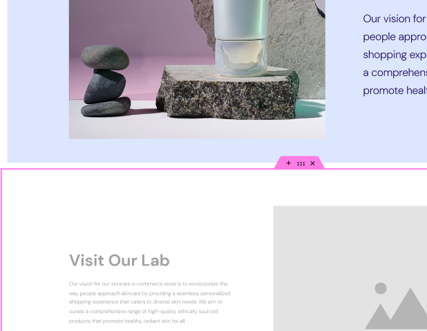
A drag-and-drop website builder allows you to see your design take shape in real-time. You can add elements, adjust spacing, and experiment with different layouts without writing a single line of code. This visual approach accelerates the creative process and makes it easy to iterate on your ideas.
Essential Features for Layout Design
When choosing a website creation tool, look for features that give you complete control over your layout:
- Flexbox and Grid Containers: These are the modern CSS technologies that power flexible and responsive layouts. A good builder will give you intuitive controls for them.
- Pre-designed Templates and Kits: A high-quality template library can be an incredible starting point. You can import a professionally designed layout and then customize it to fit your brand and content.
- Responsive Controls: The ability to customize your layout for desktop, tablet, and mobile is essential. You should be able to change column widths, hide elements, and adjust spacing for each device.
- AI-Powered Tools: The future of web creation involves artificial intelligence. Tools like the Elementor AI Site Planner can generate an entire website structure and wireframe from a simple text prompt, giving you a massive head start on your layout. Elementor AI can then help you generate the text and images to populate that layout.
The Importance of a Solid Foundation
Your layout is only as good as the platform it is built on. Using a reliable, high-performance foundation is critical.
- WordPress: The world’s most popular content management system, WordPress, provides unmatched flexibility and extensibility.
- Optimized Hosting: The speed and security of your website are paramount. A managed solution like Elementor Hosting is specifically optimized for performance, ensuring your beautiful layouts load quickly and are protected from threats.
Frequently Asked Questions (FAQ)
1. What is the most important element of a website layout? While every element plays a role, visual hierarchy is arguably the most important. It’s the principle that guides users’ attention and makes the page understandable. Without a clear hierarchy, even a visually beautiful layout will be confusing and ineffective.
2. How do I choose the right layout for my website? Start with your content and your goals. Ask yourself: What is the main message I want to communicate? What is the primary action I want users to take? If you have a single, focused goal, a single-column or full-screen hero layout might be best. If you need to display many items, a grid or magazine layout is more appropriate.
3. What is the difference between a symmetrical and an asymmetrical layout? A symmetrical layout has a balanced, mirrored structure, where elements on one side of a central axis are mirrored on the other. It feels stable and orderly. An asymmetrical layout is balanced dynamically, using elements of different visual weights to create equilibrium. It feels more modern, dynamic, and visually interesting.
4. How can I make my layout mobile-friendly? Use a responsive design approach. This means your layout should automatically adapt to different screen sizes. Key practices include using a flexible grid, making images and media scalable, and ensuring text is readable and buttons are easily tappable on small screens. Tools like Elementor provide built-in responsive controls to simplify this process.
5. Is it better to use a pre-made template or design a layout from scratch? It depends on your skill level, time, and goals. Pre-made templates are a fantastic way to get started quickly with a professional design. Designing from scratch offers complete creative freedom but requires a better understanding of design principles. A good approach is to start with a template and then customize it heavily to make it your own.
6. What is “above the fold” and is it still important? “Above the fold” refers to the portion of a webpage that is visible without scrolling. While users are now very accustomed to scrolling, this area is still critical. It’s your first impression. You should place your most compelling headline, value proposition, and primary call-to-action above the fold to grab attention immediately and encourage users to scroll down for more.
7. How does whitespace affect my website layout? Whitespace (or negative space) is the empty space around design elements. It’s crucial for a good layout. It reduces clutter, improves readability by separating blocks of text, creates focus by isolating important elements (like a CTA button), and can convey a sense of elegance and sophistication.
8. Can I combine different layout ideas on one website? Absolutely! The most effective websites often use a combination of layouts. You might use a full-screen hero layout on your homepage, a split-screen layout on your “About Us” page to feature the founders, and a single-column layout for your blog posts. The key is to choose the layout that best serves the content and purpose of each specific page.
9. How can AI help me with my website layout? AI is revolutionizing web design. Tools like the Elementor AI Website Builder can generate a complete, structured website with a logical layout based on a simple description of your business. This saves hours of work in the initial planning and wireframing stages, allowing you to focus on refining the design and content.
10. Where can I find inspiration for website layouts? There are many great resources. Websites like Awwwards, Dribbble, and Behance showcase work from top designers. It is also helpful to look at the websites of leading brands in your industry. Pay attention to how they structure information, guide users, and create their user experience. The Elementor Template Library also features hundreds of professionally designed websites and pages that you can explore for inspiration.
Looking for fresh content?
By entering your email, you agree to receive Elementor emails, including marketing emails,
and agree to our Terms & Conditions and Privacy Policy.
