Table of Contents
To 3D or not to 3D? That is a question that we need to ask ourselves.
3D technology and design have become well-established parts of our lives. It’s in movies, games, TV shows, smartphones, printers, AR, and VR.
But, does it have a place in web design? And if so, to what extent? Would we create a website, completely in 3D? Probably not.
For starters, most websites shouldn’t feel like immersive worlds you can get lost in. If the goal is to get visitors to take action, then you need to design straightforward journeys for them.
There’s also the matter of performance. Your TV might not get overloaded by 3D, but it can take its toll on web hosting — especially if the 3D renderings are generated by an external plugin or API. And every fraction of a second counts when it comes to your visitors, according to recent data.
But that doesn’t mean that 3D has no place in web design. In fact, there’s a lot that can be done with 3D and a ton of different directions to go with it.
Let’s take a look at what kinds of 3D are best suited for the web, how to work with them, and then look at 10 awesome examples of websites that use 3D today.
Table Of Contents
What Is 3D in Web Design?
All 3D web design means is that we’re placing objects along the x-axis, y-axis, and z-axis.
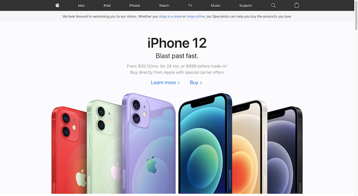
The most common interpretation of 3D design is what we see on the Apple website:

The iPhone 12 styles in this hero image exist in three dimensions. There’s no movement to the graphics and, yet, we can still see that they have depth.
That said, the hero image on Richard Sancho’s website is also what 3D web design looks like:

There are no visible 3D objects. However, it’s clear that the floating (and interactive) color orbs behind the text are moving around on a different plane (or planes).
So, unlike 2D web design where you make your designs and objects wider or taller, 3D web design allows you to add depth to them as well as to move them backward and forwards.
The History of 3D Web Design
In the 1950s and ‘60s, there were a number of computer programs developed with the ability to do 3D computer modeling. Ivan Sutherland’s Robot Draftsman software, also known as Sketchpad, was the first one to ever use a graphical user interface (GUI) and it led the way for computer-aided design (CAD).
Although CAD is mostly used today to create 3D renderings of things like buildings, products, and other physical objects, it’s easy to see how those earlier technologies paved the way for modern 3D web design.
Now, one of the reasons why we haven’t seen 3D dominate lists of web design trends is because it hasn’t always been that easy to create.
1994 — Virtual Reality Markup Language (VRML) is introduced
VRML entered the picture in the very early days of the Internet. It’s a file format also referred to as a “world” (.wrl) that allows designers to create 3D objects and scenes.
1997 — Flash enters the picture
In order to enable Flash 3D graphics and animations on a website, a developer had to get a Flash software license, code it with ActionScript and then embed it onto the website. It took a lot of work and it also took a serious toll on website loading times, especially during the dial-up days.
2001 — X3D becomes the successor to VRML
Today, X3D is a royalty-free open standard maintained by the Web3D Consortium. It can be used for a variety of 3D applications: CAD, geospatial visualization, human animation, AR, VR, 3D printing, medical training, and, of course, web design. What’s more, it’s not dependent on a plugin to run in the browser.
2010 — Skeuomorphism rises in popularity
Skeuomorphism was a design trend used to make interfaces and/or their elements look like the real objects they were based on. This trend didn’t last long as it didn’t provide many additional benefits other than to look cool. As a result, flat design dominated web design trends for the next few years.
2011 — WebGL gets introduced
WebGL is a royalty-free API that enables designers and developers to create 3D graphics that work in most modern web browsers. The only issue with WebGL is that it’s difficult to use. You have to use JavaScript, Java, or Objective C along with GLSL to program your 3D graphics.
2012 — The NYT Snow Fall article is published
Parallax web design had long been in use in video game design. However, it wasn’t until 2012 when the New York Times published its multimedia Snow Fall article that we really started to see the faux 3D scrolling effect take hold on the web.
2014 — Google develops its Material Design system
Material Design was created for a number of reasons. One of its biggest contributions to web design, however, was that it brought depth and tactility to the page, which helped improve usability. While the design system had its problems, it left a lasting impression on the world of web design and bits of it can still be seen today in flat design 2.0’s layering and shading.
2021 — Pick your poison
There are a number of apps available today that enable web designers to create custom and complex 3D designs:
There are also a variety of AR and VR technologies that you can use to create 3D renderings for those specific use cases.
If you’re not trying to create entire 3D worlds, consider using Elementor’s Style tools to add depth to your website components and Motion Effects to bring your designs to life.
The Benefits of 3D in Web Design
Design trends come and go. So, you’ve got to ask yourself – is 3D a design technique or trend worth investing in?
Here are some reasons why you may want to start using it in your work:
It Stands Out From Flat Design
When the majority of websites are flat, a website with 3D features will instantly stand out.
Just make sure it’s done in good taste and in line with web design principles. If the 3D scenes or objects are meaningless and used only as a ploy to capture attention, they’ll make your website stand out — only for the wrong reasons.
You Can Create More Engaging Interfaces
There are different ways in which you can use 3D in web design. For example:
- To create an immersive world visitors experience when they first enter the site
- To bring your most important graphics to life
- To provide visitors with more elaborate walk-throughs or 360-degree product views
By moving the right elements in your web design to a third plane, you’ll create a more engaging experience for your visitors.
By Tapping Into Visitors’ Senses, You Tap Into Their Emotions
Our senses are closely tied to our emotions and the sense of touch is no different. While visitors obviously can’t physically touch a 3D website, it nevertheless provides a sense of tactility that a flat design cannot.
Because touch often helps people feel more connected to others and deepens their experiences with the world, we can hypothesize that interacting with 3D elements on a website might also bring visitors closer to the brand. Even if that’s not the case, the tactile nature of the design will leave a lasting impression on them.
It Can Improve Your Conversion Rate Optimization
3D web design has a ton of practical applications. For instance, you can add 3D renderings of products, properties, and events to a website.
We already know how difficult it can be for consumers to buy certain high-ticket items online without seeing them in person first. By adding lifelike renderings of them to the website, you can help make their decision-making process go much more quickly and smoothly. And with more confident and satisfied shoppers, you’re likely to get more conversions from it.
10 Amazing Examples of 3D in Web Design
Even if 3D design isn’t everywhere on the web right now, it’s definitely a worthwhile trend if you find the right way to execute it for your client’s website.
If you’re looking for some inspiration, check out the following creative examples of 3D in web design. When you’re done, head over to our animated website roundup. Not all of the examples there use 3D, but the ones that do are not to be missed!
1. Robert Bürgel
This is the second time we’ve featured Robert Bürgel’s graphic design agency on this blog. The first time it appeared was on our list of the best portfolio websites. This time it’s because of the original hero image on the home page.
The black banner has cutouts that spell out Robert’s name. These letters are only revealed when the neon fish swim behind them in the background. It gives the hero image a feeling like you’re looking at a fishbowl and it’s a design you’re not soon to forget.
2. Flux Academy
Flux Academy is a place where web designers go to learn how to design and perfect their skills through coursework. While the home page has a number of 3D graphics on it, it’s the first one that’s the most interesting.
As the visitor scrolls down the page, the floating design-related icons all fall downwards into the statue’s head. It’s a really neat metaphor for what the company is all about.
What’s also noteworthy about this example is that the 3D graphics are relatively simple. Flat icons. A statue. Illustrated orbs and faces. This just goes to show you that with the right shading and motion effects, you can pull off a very interesting 3D experience.
3. Dasher & Crank

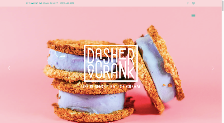
It’s not just creative agencies that can use 3D. Just take a look at this hero image on the Dasher & Crank website.
Many times on restaurant websites, you see their dishes and items photographed from above, giving them a flat look. Even the ones seen from the side often don’t have a tangible realism to them because they’re photographed within the context of someone’s hands, a plate, or the restaurant backdrop.
But with the solid pink background here, the ice cream cookie sandwiches stand out beautifully as 3D objects — making them look good enough to reach out and bite into.
4. Contra “The State of Independence 2021”
Think about the last time you sat down to read a report or ebook online. It can be painful trying to slog through paragraph after paragraph trying to find the data that’s most relevant to you. Plus, a lot of them are saved as PDFs, which can be hit-or-miss.
But Contra’s The State of Independence 2021 report is a great example of how 3D can transform the reading and educational experience if you use just enough of it.
There are small doses of 3D objects — like blobs and coins — throughout. However, the majority of the 3D renderings are used to represent the data visualizations and freelancer quotes throughout the report.
5. Samsung
Apple isn’t the only smartphone company using 3D to shine a spotlight on its products. Samsung’s landing page for the Galaxy Z Fold brings the product to life from the very second someone enters the site.
Notice how the graphic on the initial loading page is a rotating 3D illustration of the phone. When they get inside the site, visitors will see the actual phone from every angle as well as how it looks as it flips open and closed.
For customers wondering what a folding smartphone would look like, they won’t need to go to the store to find out as the 3D renderings do a splendid job of representing them.
6. The Museum of the World
The British Museum has partnered with Google Cultural Institute to create this microsite for The Museum of the World. It was designed using WebGL by WEIR+WONG and is a truly unique way to visually design a timeline and to place a lot of data within it.
The museum still has its regular website where visitors can learn more about their collections and exhibits. However, rather than show off the items from their collections on the website, this 3D timeline places them within the category and timeframe from which they come.
Rather than leave visitors to passively follow along on a timeline or to glance through your inventory, a 3D representation like this turns it into a more active experience.
7. KITKAT Chocolatory
The KITKAT Chocolatory is a fun and immersive 3D website. And it’s totally unlike KITKAT’s other websites. Why is that? Well, this isn’t a site for people who want to learn more about the KITKAT brand and its products.
Brazilian customers who love KITKAT products are invited to explore and order the newest chocolates from the candy company. They can also customize the packaging of their products with their own personal photos.
A brand and experience like this are deserving of a unique 3D world.
8. Capsul’in Zero Impact
It’s obvious right from the very start that we’re supposed to follow the illustration and hand-drawn sketch of the coffee capsule as it falls down the Capsul’in Zero Impact website. It’s a brilliant 3D depiction created by the designers at Index.
We first see it as an illustrated coffee capsule. Not soon after, the designer strips it of its markings and eventually dissects each of its distinct parts. Rather than use the 3D capsule as some gimmicky design choice, the look of it changes as the product’s story and specifications are revealed throughout the page.
9. TAG Heuer
TAG Heuer is a brand known for its stylish timepieces. While there are lots of ways to make a website feel classy and elegant, nothing beats showing off your products in all their splendor in 3D. And that’s what TAG Heuer does here.
In these photos, we see the beautiful timepieces framed against stark white and black backgrounds. In some cases, it’s just a photo of the watch. In others, there’s a slight parallax effect at play. There are also instances where we see the watch in motion, like when the clasp opens and closes.
This isn’t a 3D technique that can only be used by luxury brands. Smaller brands can use 3D product visuals to more effectively sell their products online, too.
10. Mazda
What Mazda has done here is a lot like what ecommerce companies do when changing product photo colors based on the customer selections. That said, Mazda doesn’t just enable customers to see their customizations on a 2D model.
This 3D rendering lets customers move around the outside of the vehicle as well as swivel around the interior to get a closer look at the model as well as how their color choices affect it.
Anytime you have a site that’s selling an expensive product or even just one where the customer really needs to try it out before buying, a 3D shopping tool like this would be a huge asset.
Use 3D Web Design Wisely To Dazzle Your Visitors
It doesn’t matter how large or small your 3D designs are. The most important thing to remember when using 3D in web design is that it improves the experience. You want visitors to be wowed by what they’ve seen and not wondering why they spent minutes watching the 3D animation only to realize the important stuff was inside the website.
Also, be mindful of how 3D affects the performance of your websites. If visitors have to wait more than a few seconds just for the website to load all of your 3D work, they might never get to see it.
That said, we’ve seen some amazing examples of 3D web design here today. Draw some inspiration from what they’ve done and you should be able to come up with something really great for your clients, and useful and entertaining for their visitors.
Looking for fresh content?
By entering your email, you agree to receive Elementor emails, including marketing emails,
and agree to our Terms & Conditions and Privacy Policy.


