Learn to avoid common mistakes and improve your workflow in Elementor
In this Monday Masterclass, you’ll find out about the most common mistakes users make:
– Using incompatible themes
– Adding spacers and columns for positioning and styling
– Placing inner-sections instead of columns
– Editing your website without clearing cache
– Not optimizing images
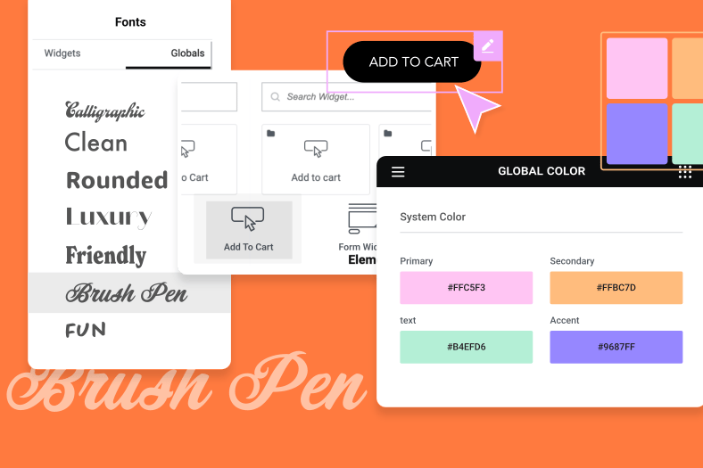
– Not setting default colors
Read the full post and find out how to solve these common mistakes.
Elementor has always been a leader in
terms of user experience and ease of use
but no matter what we do there will
always be a learning curve to get past
the same as with every new software or
hardware we use now to help you get off
to a rockin start we’ve decided to list
the most common mistakes people make in
Elementor and the solutions to those
mistakes
now if you find you’ve been making some
of these mistakes well don’t beat
yourself up about it
mastering any tool or task means that
there’s always a little more to learn
and the idea is to keep an open mind if
you intend on honing your skills I for
example recently learned that command
shift T opens the last window I closed
on Chrome just think of all those tabs
and interesting articles that I’ve lost
over the years anyway before I make a
mistake and forget the point of this
masterclass let’s go over the common
mistakes and their solutions so that we
can elevate our elemental skills to the
next level
let’s start with the first common
mistake in elemental using an
incompatible theme every once in a while
we’ll hear from a user who can’t
understand why they can’t edit
everything on the page or they’re having
problems with the title or header not
being able to adjust the space above or
beneath them
there are several solutions to this
recurring problem the simplest is to
change our theme to something similar
that is compatible the best place to
find WordPress compliant themes is on
their repository we can also shortcut
this process even further by checking
out the lists of themes that work best
with elemental where we’ll find links to
themes like Astra and ocean WP of course
we’ll be including a link to these lists
in the show’s description below but
perhaps the best solution is to use the
hello theme and the theme builder the
same way that we did in a previous
masterclass and by doing this we
customize everything to work and appear
exactly as we need it to we’ll be
posting a link to that episode in the
show notes too but if you don’t want to
miss out on another masterclass you
should definitely click the subscribe
button and tap that Bell for more
insight and inspiration on WordPress
design and marketing the next common
mistake we’ve come across common mistake
number two is using columns and spacer
widgets to position elements now we’ve
come across many users that have been
positioning and aligning their elements
using extra columns and the spacer
widget from day one not only is this
unnecessary but it’s also detrimental to
your page because using empty content
elements to arrange your layout gives
search engines the wrong impression
resulting in a lower ranking for your
site the solution is simple every single
element and widget in Elementor has
margin padding and Zed index parameters
in the advanced tabs many even have
additional alignment and positioning
options in the widget content and style
tabs doing this also allows you to
copy/paste the spacing when using the
paste style option
brilliant I hear you say wonderful but
how come you have a spacer widget the
space widget in Elementor is a leftover
or relic from the very first versions of
elemental back when both we and our
users felt that it would be helpful as
the software evolved we realized that
expanding the possibilities of the
widgets themselves was a far better way
to go we may remove it in future
versions of Elementor and we may not if
you use the space widget often and find
it useful please let us know in the
comments below and don’t forget to
include examples and just a quick
reminder the margin value defines the
space outside the widget frame and the
padding value defines the space inside
the frame between the frame and the
element get used to using padding and
margins after all that’s what they were
designed for and remember
habits are meant to be broken even the
good ones
hobbits on the other hand are not meant
to be broken
especially not the good ones but that’s
neither here nor there while we’re on
the subject of columns it’s time to
mention another common column mistake at
number three we have incorrect use of
the intersection widget or what some
users call the column widget as you know
the best way to add a fresh new section
is to click on the add new section
button unfortunately some people have
gotten into a habit of missing the
option of assigning a number of columns
for that section in favor of dragging in
an inner section widget when setting up
a fresh section the best practice is
indeed through using the add section
button then selecting the number of
columns we want this not only keeps
everything nice and uniform throughout
our section but it allows us to have
things independent like animated
backgrounds or foregrounds while keeping
the mark-up light the inner section
widget was designed to allow users to
create a distinction within a somewhat
uniform section
moving on to common mistake number four
editing your website without disabling
or clearing your cache first websites
are constantly undergoing alterations
and updates it’s something that we take
as a given and we found that far too
often users will spend hours making
changes to their site at the back end
only to find that this has made
absolutely no difference to the site at
the front end where it is live the
caching for our sites is designed to
reside at the front end and reciprocate
the requests for content that come from
the people visiting our website a cache
holds content data with a popular demand
at the ready and this helps cut down the
download time most commonly we have the
browser cache but we also have a cache
plug-in and a website cache on the host
server unless we let the system know
that we are making changes these caches
will continue to send out the content we
defined in the first place
refreshing the page in the browser will
clear the browser cache and you can do
this by pressing command R on the Mac or
ctrl f5 on a PC you can also go into the
browser settings and find the delete
cache option another way of doing this
is to add a question mark after the URL
in the address line followed by some
gibberish and this forces the browser to
search for this information and in doing
so reloads a fresh version of the page
now some users use cache plugins like WP
rocket or WP fastest cache that perform
the data caching outside the browser to
help load the page faster here we
suggest that you disable the cache
plug-in on the WordPress dashboard
before starting to edit or make changes
to your site if you’ve forgotten to do
this just use the options in the plug-in
settings to clear the cache occasionally
the caching on the hosting server needs
refreshing too we can verify that this
is causing the problems if the page
fails to reload after clicking the
Update button in the elements or editor
if so on the WordPress dashboard
we’ll go to element or tools
and in the general tab click on the
regenerate CSS button and then save the
next common mistake number five is using
the wrong sized images we found that
there is no shortage of users who upload
images that are far too small or too big
for the place they’ve allocated on the
page and then fumble with the image
widget settings to force the image to
fit this is also true of users who
upload images of varying sizes to things
like image galleries or carousels and
find that they have the same difficulty
regular master class viewers will know
and no doubt agree that planning is the
key to working correctly and saving time
in the process planning the sizes and
dimensions of each photo and preparing
our images in advance using design tools
such as sketch or Photoshop or even
online sites like pixel art or tiny PNG
will save you a great deal of time and
hassle while you’re working out the
image dimensions we should also work on
the file size high resolution images
that slow down our page load time will
result in large numbers of visitors
bouncing off of your site this is
something we’ve also mentioned in our
recent masterclass on translating our
designs to WordPress using Elementor and
another thing we coincidentally
mentioned in that same master class made
it to this week’s list and that mistake
number six is not setting default colors
there are many options in elemental that
are designed precisely to make our lives
far easier and setting your default
colors the primary colors of your design
will again save you a great deal of time
as well as ensure that your car scheme
will remain consistent across your whole
website the best practice would be to do
this at the beginning of our page build
once we’ve got our first blank page
opened in Elementor we’ll click on the
menu or hamburger icon and select the
default colors option we’ll click on one
of the colors and select our new color
from our palette we can also dial in or
paste the hex color code and then click
apply and we can
also do the same with the default colors
in the color picker while some of these
mistakes might seem insignificant you’d
be amazed how proper use of elements or
immediately shows tremendous improvement
in the websites that you produce now if
you feel that we’ve missed any common
mistakes that should be mentioned or if
you’ve come across common errors that
you or your clients have made using
Elementor please share them with us in
the comments below we hope that you have
found this inspiring interesting and
helpful and if it has you definitely
want to click the subscribe button and
tap that bell to be sure that you don’t
miss out on a master class like this one
as always we appreciate any comments and
criticism you may have and any advice
you could suggest for other users
after all our goal is to be the best at
helping others excel at their craft
thanks for watching
[Music]


