Overview
Transcript
Overview
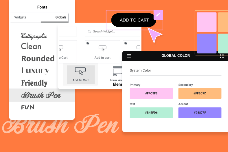
In this Monday Masterclass we look at fonts, and get firsthand insight and advice from lead designer Hadas Golzaker as she takes us through the process she followed when deciding on fonts for the design of the recently published Showcase Madness page
This episode covers a lot of valuable web-building information for all levels looking to learn: How to choose the right font for our design What to consider when selecting a font Font Does & Don’ts: What a font must achieve and what we must avoid How to upload custom fonts and variations to Elementor How to customize fonts in Elementor Read more about using custom fonts on WordPress website, to include Adobe Fonts, in the in-depth post featured in this edition of Elementor’s Online Magazine:
Transcript
this week we thought we would take the
concept behind when they master class
one step further and instead of taking a
practical look at a subject or issue
that concerns wordpress web builders
this Monday master class we’re taking
you the viewers behind the scenes for an
up close and personal look and how our
top designers approach and solve real
issues so this week we’re going to be
talking about choosing a font how to
choose a font what is it about a font
that makes that specific font better
than all others for a certain design and
to help us with that we have our very
own head that’s called soccer one of our
lead designers here at elemental and
she’s going to tell us on talk us
through her thought process that she
uses and she used when she chose a
certain font for her design on elemental
showcase madness now for me fonts and
I’m short for many others front of a bit
of a weakness we there are so many of
them I have like hundreds on my system
more than the cloud and it’s like going
into an ice cream parlor there’s so many
flavors but you can only choose one and
it has to be the best and you can only
have that one because you can’t fit into
your shirts as it is Simon
so that aside Waterstreet you’ve got a
design where do you start thinking about
the font where does it start to enter
the design process okay so this year we
decided to go on madrina and the thing
the abstracts are that is so famous
about and so we decided to go on
abstract shapes so I started looking for
a form that is like kind of look like
the shape that we already have then you
can see the circles you can see the
square is the triangles so I search for
something that has these pointy sharp
angles or curly like you can see in the
D here or the SS that continue date the
idea that we aim to that was the main
point here so I started looking for
something that is a steady
on the Mondrian theme and I had tons of
fonts that I picked like I don’t know I
think it was like 50 mm-hmm and then I
start like illuminated eliminated
eliminating it’s a process of
elimination
yeah so I start looking at the shapes
and the curves the weight the the space
between the lines if you can read it of
course
oh yeah minor thing yeah all those stuff
that you need to see in a font and then
I decided on one font and that’s one of
the interesting things that I notice is
when you talk about curls and curves
you’re not necessarily talking about
what we’re used to seeing in some fonts
where we like all those nice little
twirls of a line you actually talk it’s
much more geometric that’s what you’re
using yeah an example yeah and also
think that you’ve got this this boldness
like the bold shapes and boundary and
that design you didn’t mention something
that’s very interesting about
readability which is very important but
sometimes the phone can look great but
when you’re I suppose when you when
you’re dealing with many people around
the world not everyone is you know a
native English speaker you have to be
careful with fonts that’s you know a
very squiggly and they look nice but
they’re not as readable for most people
yeah do you have trouble like that
sometimes yeah I have I actually Howard
deal with it is to keep like three
people that some of them are native
speakers and sound them are like some
other language and let them read it okay
if they can’t read it it’s fine that’s a
good idea so okay so you got your phones
and where does it start
working with the design you start
dealing with it once you’ve kind of got
a wireframe where do you start dealing
with the font actually it goes together
with the design I haven’t decided after
so we’re starting with that with an idea
so this year it was a one-round theme
and we started making a mood board oh
okay just take images text whatever that
connects to the idea and
start searching for the line that you
want to do wanna build in this case we
had the the basic line of the wire
friend that we want to show the the
websites we know we know that we have
text there we have headlines so we have
the basic wireframe that we want to
choose okay but then we have the design
that connects to it then the mood boards
goes in this is it oh do you always use
a mood board like say for instance you
for lack of time we got a very short
schedule
do you still fit that in yes always it’s
I think it’s like the basic for design
if you want something to be really
inspired and you want to be something
else not copying something you have that
you such that you show it’s already
three so yeah mood board is a really
easy and good way to start because then
you have tons of ideas just from images
or text or even just like dueling stuff
okay all right so that’s great so so
you’ve got your font and you’ve decided
on it and it looks great on the
wireframe you design whatever use if
you’re using sketch and then what what
do you do next what’s the next thing you
do so the next step will be to upload it
to an amount or mhm let me show how we
get it on there I’m going to element or
then to custom fonts
I’m clicking add new mm-hmm giving it a
name let’s say new font and I’m adding a
variation so we have different kinds of
files here mm-hmm I’m gonna choose the
TTF file okay
upload and I’m gonna upload the library
I have three phones here just drag them
to drag and drop
start with the light select and here I
can choose the weight and the style real
so in the weight I’m going to choose 100
this is the light version and style
normal and add another variation again
picking the phone that I want I’m gonna
choose the regular link this time the
way it will be normal Einstein normal
and another one for their vault upload
a black version yeah and changing it to
ball and at the end I’m gonna publish it
okay now all these variations today they
don’t fit into elemental the way that
you would have heading one two and three
or paragraph four things like that these
are variations that you can use within
those yeah I’m picking their variations
I can also choose like instead of 100 I
can choose whatever I want and this is
how it shows yeah what’s great about it
is you’ve got the the example of
Elementor is making that line there yeah
and you’ve got the example of what the
what the text would look like with that
specific variation concede here also in
the regular okay so I have the fonts
going to pages mmm I have a page with
them on they must have got class font
I’m gonna edit with mm-hmm
okay so you can see here that form that
we already have and I’m gonna change I’m
gonna click on an edit button yeah going
to style and understand on typography
you want to choose the family under
custom font I can see the font that I
already wrote in person yeah and here
you can see it I can change the size I
can change the weight hm-hm I have the
bald and I have the lightweight I can
change the line height or the letter
spacing so you still got elementals
basic yeah attributes for typography
style transform way everything works the
same and you have the font that you
uploaded yourself okay so here’s a
question you’ve got you’re able to
create variations but you’re also able
to change those variations once you’re
in a mentor editor why would you do that
why would you not just upload the font
as it is and then instead of having the
variations what do you get from the
variations is saving you time this is
what’s happening that’s the way element
works because you need to pick the
perfect weight for their phone because
this is how Google reads it okay so you
have the head the h1 h2 whatever it’s a
different weight you can change it as
you upload it mmm so this domain so this
way it stays the way that you want to
run within Google what I’m choosing it
yeah okay so that’s great so okay so say
for instance you’ve got all of this
about
what do you do with the rest of the
content you’ve got that’s the heading
what do you do with all the text and
things like that you borrow that and
then change it you create a new
variation what’s your method
it depends on the page actually in this
example I had only the headlines changed
so we have that there the regular font
for the for the body text it says just a
default yeah just a default that we
picked of course and then only the
headlines that’s the one that I changed
like let’s change it again hmm so I
change it to bold person example and
that’s that’s the only thing that we
changed here but it gave it a character
yeah so it’s a minor thing that gives so
so much difference so it’s really
meaningful I think like just from
changing that now you’re already somehow
so they’re connecting between this page
this example of the page and taking it
out of the the feel of the Mondrian
designer you’ve got that is interesting
mm-hmm you can see it here also this is
without the change yeah cool so okay do
you rely on certain fonts do you go into
a bank to go to websites where do you
get these funds what what’s your library
where’d you go okay so I think I’m gonna
recommend first of all to go to Google
or Typekit okay because these are
approved funds that typographers saw and
approve them so Google for Google and
Typekit okay for Adobe yes so these are
like the first thing I’m gonna check
because I know they are good and the
lines will be fine and there’s there’s
not gonna be any trouble with the
browsers and whatever and the weight
will be fine performances whatever and
but there are so all kinds of website
that you can choose marvelous phones
like I don’t know font squirrel 1001
phone whatever just tons of fonts you
can just search it in Google but then
you need to check the performances and
you need to check the weight and you
have to check everything so when you go
to a company that already did that for
you so it is there for you to pick
because just pick it and place it that’s
it
don’t need to check in everything yeah
but if you go to a company that doesn’t
have an improvement from typographers
it’s a bit it’s a bit too risky I guess
but uh but I’m not gonna eliminate it
okay let’s say for instance I can
totally understand that I mean it’s a
great tip and when you think about it to
rely on fonts that both Google and Adobe
have already vetted and they use
themselves and they’ll be perfect for
the platforms that we use
speaking of tips this will be a
fantastic moment to ask you someone
who’s been doing this for a lot longer
than I have so what advice or tips would
you give people when they set out to
decide on fonts okay first of all mood
board again okay choose three words that
describe the idea or the emotion that
you want to pass it on to your users
death that will be the main points that
you wanna you want to search for the
mood board let’s say that I want to pass
happiness and childhood and I don’t know
joyful whatever so I’m not gonna face
cream ice cream ice cream yeah so I’m
not gonna pick probably I don’t know
active core test that it’s been and
really high tech II kind of fond I Paul
gonna choose something that’s a bit more
happy mate maybe a little bit more
circle kind of fond something that’s a
bit more childish there’s some things
that we can imagine if I’m saying a word
because if I’m saying
ice cream for example you have a
specific idea of an ice cream it’s not
something that it’s square right okay
something that it’s circle it’s the same
form for fonts basically the same so
you’re basically you’re taking
attributes of a font the same way you
take an attribute of an element and an
icon or something like that and you’re
looking at it from a graphic point of
view I would say even geometric you know
is it circular is it round
is it’s always like if I’m saying I
don’t know a Mona a woman four versus
men your example a man will be usual
usually okay yeah something I need
support a bit more square okay okay and
a woman have curves so it’s something
that it’s not graphic it’s not geometric
but it’s an idea it’s a it’s a vision
that you can see okay like a plant okay
yeah what do you use to make these mood
boards do you use things like Pinterest
things like that what do you use yeah
you can use everything and use Pinterest
you can use three bull you can use just
Google Google Images will be perfect for
that behinds also it’s a good place but
I think also the world you know just go
around see places look for images even
Instagram will be a good idea for that
and you just like starts up a folder
just yeah yeah just put a folder with
just throw stuff in it put it on or
PowerPoint whatever just like simple
thing and see what do you want you can
see there okay really easy there that’s
cool okay so is there any more advice or
tips you want to share I mean I like you
mood I’m gonna share all the secrets but
ya know I think just have fun like if
you if it’s something that’s hard and
you don’t have fun with it so it’s not
worth it I mean I guess you’re in the
wrong way yeah suppose it’s a very good
point but speaking of having fun where
does your intuition come into this like
how much of the intuition plays into it
um it’s something that it goes with with
the years you know because I think in
the beginning I wasn’t that good in
picking fonts because I know it’s a
really difficult difficult area and
people are scared of it and it’s okay I
can understand it I was scared but if
you’re trying to do it one time after
the end the other then you start being
good at it just it just like that it’s
like bicycles is there anywhere you you
can recommend someone can start learning
how to pick fonts better um you can
search for
and google you can see a font parrying
you can read about the font as well
there’s a lot of places that that show
something according to the font like
they’re showing the phone and say this
is a phone that is it’s good for our
high tech whatever so you can see it
according to an images like you can put
an image of a high tech something and
put the font on it and see if it fits
hmm that’s that’s it that’s actually a
good a good idea we’ll put a link to
that in the in the show notes of this
video so first of all thank you very
very much and great word with the
showcase – we’ve had a lot of people
talking about that and it’s really
really good so
hadass thank you very very much and we
look forward to seeing you again on the
master car sometime thank you this week
we looked into fonts what we need them
to do and the role that they play within
the design and functionality of our
websites we also saw how to install and
customize them for WordPress websites
using elemental and as always if you
have any advice tips or insight that
could help other users please share it
in the comments below and if you have
any criticisms we are equally interested
in your thoughts and this is because we
consider you the viewers and community
members to be a valid part of the
journey that we set out on with each
Monday master class and if you’ve
enjoyed our new documentary style of the
Monday masterclass and you’d like to see
more make sure that you click on the
subscribe button and tap that Bell so
that you don’t miss out on our next
monday master class after all our goal
is to be the best of helping others
excel in their craft thanks for watching
Cheers
