In this tips & tricks tutorial we are going to learn how to apply a subtle but effective exit effect to our text when the user scrolls down the page.
The tutorial will cover:
✔︎ Using the heading widget
✔︎ Using the animated headline widget
✔︎ Configuring scrolling effects
✔︎ Using the navigator
✔︎ And much more!
Helpful links:
Flashing images tutorial
How to configure global fonts & colors
Hey there, it’s Ash from Elementor.
In this tips & tricks tutorial we’re going to apply this subtle but effective exit effect to our text when the user scrolls down the page.
We’ll be using the design from our ‘Flashing Images’ tutorial, to view this video check out the link in the description below.
To get started, let’s first open up the navigation and lock it to the side of our screen.
We’ll hide the flashing images, so that we can focus on the text.
Let’s delete the headings we’ve previously created, and start from scratch to fully understand how to create this effect.
Add in a new one column section first…and then apply some padding.
Drop in the heading widget…and then update the name of this widget within the navigation by double clicking it…and also the section itself. Doing so will enable us to navigate with ease through this task.
OK, let now set up our heading which will provide a great starting point for the remainder of our titles.
Update the title itself…and then align to the center.
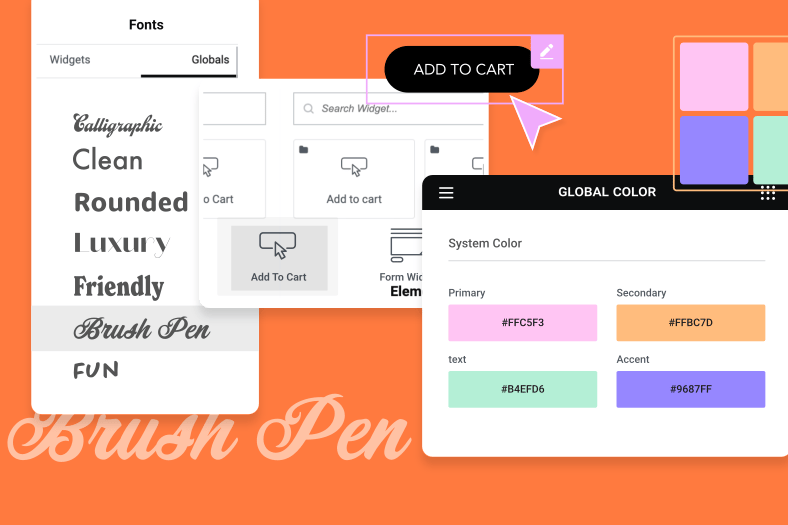
Open the style tab…and as you can see, our title in being styled by our global settings which we’ve previously set up. If you would like to learn more about setting your global typography and colors, check out the link below.
In the advanced tab next, we’ll set the z-index to 1, which will ensure this text appears above our flashing images, when we switch them back on.
Now open up the motion effects tab and enable scrolling effects. Before we configure this, please note you are able to specify which devices these effects apply to and also where the effects are relative to. We’ll leave them all as default for our design, but be sure to experiment to find the right combination for your needs.
With the scrolling effects switched on we’ll enable vertical scroll…amend the speed to give a slight acceleration to our text…and then the viewport. By setting our percentages like this, we ensure that the effect will take place in a short period of time just before we exit the viewport.
Now enable scale…and again configure the speed…and the viewport. Feel free to adjust these values according to your requirements, just make sure they are at least above 60% to take effect on scroll exit.
With the first title created, let’s right click it and duplicate.
Update the name within the navigator first…and then the title itself.
In the style tab, we’ll set the global typography.
Duplicate the second title…update the name in the navigator…the title itself…change the style…and this time in the advanced tab, we’ll adjust the margin to better position this title.
The next heading is slightly different, because we’re going to use the animated headline widget. This is perfect when you want to apply different text styles in one heading.
Let’s drop this in…and then amend the name of this widget.
We’ll first open the style tab to make some adjustments, so that we’re able to see our changes in real time.
Set the color…and width for the shape. Then for the headline, the color…and typography. Finally the color and typography for the animated text.
Now switch back to the content tab and set the shape…remove the before text…add in the text for highlighted text…the text for after text…and switch the loop off.
Finally now in the advanced tab…we’ll adjust the margin…add a z-index…and switch on the scrolling effects.
Just like before we’ll enable the vertical scroll…set the speed…and the viewport. Then enable the scale as well…set the speed…and the viewport.
OK, great! This is really coming together now.
For the remaining headings we’ll selectively duplicate the ones which are most similar to ensure the most efficiency.
Let’s duplicate the ‘comfortable’ heading…reposition..and rename…then update in the content tab.
Next, duplicate the ‘fashionable’ heading. Then rename…and reposition just like before.
Duplicate the last heading…update the navigator name…and the title. This time we’ll amend the typography using the global styles…and then add in some margin to position this correctly.
One last one now. Duplicate the ‘clothing’ heading…update the name and reposition. Now update the title…and the typography.
To finish our design, we just need to add in our button.
Drop in the button widget…amend the text…and then the alignment.
Within the style tab we’ll set the font…font size…line height…text color…button color…the text hover color…the button hover color…hover animation…border type…border width…border color…and padding.
Then in the advanced tab adjust the padding…and set the z-index to 1 to match the headings.
Let’s now save our changes and preview what we’ve created.
And there we have it, a simple solution to creating an effective text exit animation when a user scrolls down a page.
These effects can be applied to a variety of designs, and work well when combined with additional scrolling effects.
Be sure to experiment and share your creations with us.
Thank you for watching, like and subscribe for more tips and tricks tutorials and let us know in the comments below, what you’d like to see in upcoming videos.


