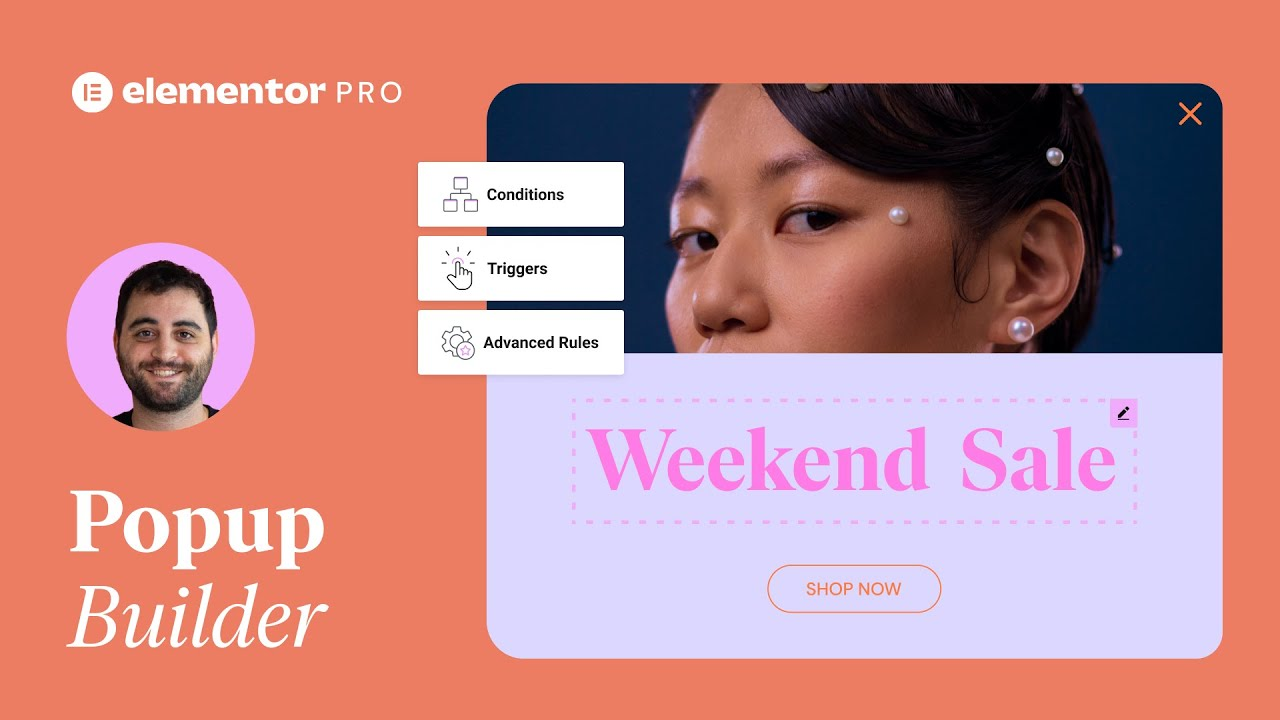
Learn how to use the Popup Builder to add customized, engaging popups to your website. In this tutorial, we’ll create a “Today’s specials” popup, that you can use for any type of product you have! You’ll learn how to:
00:00 – ✔︎ Create and design popups
07:45 – ✔︎ Set conditions and triggers for your popups
08:50 – ✔︎ Trigger a popup from a button
09:25 – ✔︎ Trigger a popup when a user is leaving your website
10:25 – ✔︎ And much more!
Hey there. It’s Aviva from Elementor. In this tutorial, I’ll show you how to use the Elementor popup builder.
A popular marketing strategy, popups can be used to grow email lists, promote special offers, and guide visitors to perform important actions on a website.
By using Elementor to design your Popups, you will have full control over your designs…keeping them consistent with the rest of your website.
In this tutorial, we’ll use Elementor to design two popups for this restaurant website, and go over different ways to trigger and display them.
OK! Let’s start by creating our first Popup, for the Daily Specials, which our visitors will see upon arriving at the home page. From any page on your website, type Command or Control + E to open the Elementor Finder, and begin typing Add New Popup. Hold down Command or Control and Click to open in a new tab.
Type in a name for your Popup, and click Create Template. This will open the template library, to the Popus tab.
Here you can choose from a selection of ready to use Popup templates. To use any one, just click insert. For this tutorial, we’ll create our own from scratch, so just click X to exit the Library.
First we’ll adjust the popup settings, so click the bottom left gear icon, and under Layout, click VW for viewport width, and set it to 90, so the popup takes up 90% of the page’s width.
Under Position, you can select from several different horizontal and vertical alignments, like this. I’ll leave everything centered.
Below that are options to hide and show the overlay, and we have the same options for the close button.
Here have numerous Entrance and Exit Animations to choose from. I’ll set the entrance to Fade In and exit to Fade out… and change the animation duration to 0.7 for a subtle animation effect. Go ahead and play around with the animation effects and duration, till you find the settings that best suit your site.
Below Layout are the General settings, similar to any Page’s settings, and Preview Settings, which are useful for previewing popups that have Dynamic content displayed. We’re not using any dynamic content for this popup, so we’ll leave it unselected.
Now click the Style tab. You can change the popup’s background, if desired. You can add a border… or change the border radius, to round the corners, like this, as well as add a box shadow to your popup.
For the overlay, click the color picker, and drag the opacity down a bit.
For the close button, you have options to change the X’s position, color and background color, as well as the size. Let’s make this one a bit larger.
In the Advanced tab, we have a number of popup behavior options. We’ll select disable Page scrolling to keep the page below the popup from scrolling…and losing the visitor’s place on the page.
Great, now we’re ready to design our popup! Click on the plus icon to create a new column, and select the single column structure.
Go to widgets…and drag in a Heading. Add some text…align it to the center. In Style, change the typography. I’ll use a Global font style here. If you’re not yet familiar with Global styles, I encourage you to take a few minutes to check our Global Colors and Fonts tutorial.
Click to add another section, this time with three columns. Drag it below the first section.
Drag an image widget into the first column. Click to choose an image and insert it. In Style, change the size.
Drag in another Heading widget…add text…and align it to the center. In Style, adjust the typography.
Now drag in the text editor widget…and type in a description. In Style, align it to the center…and change the text color to match the heading.
Drag in another image widget…choose an image…and insert it. Go to style, and adjust the max width.
Select the column, and in Advanced, add 10% padding. Right click on the column, and duplicate it two times. You can also use Command or Control D, if you prefer. Go ahead and delete the empty columns.
Select the first image in the second column and replace it with a new image. Select the Heading, update the text…and in Style, change the text color. We’ll do the same for the text editor.
Select the image below, and replace it with an appropriate image.
Move over to the third column, and replace the images and update the text and colors there as well.
Things are looking a little tight around the popup, so head back over to the Popup settings, Advanced tab…and unlink the padding and add some space all around…to give the popup a little breathing room around the edges.
The daily specials look good enough to eat! So let’s give our visitors a way to order and link the popup to the Menu page.
Add a new Section with one column…drag it down…and drag a button widget into the section.
Type in your call to action, and link it to the destination page, by typing in that page’s name and selecting it when it displays.
Align the button to the center.
Now let’s Style it. Update the typography. I’ll use a custom style here. Change the text color, and for the background color, drag the opacity slider down to zero to make it transparent.
Add a solid border..width of one pixel and give it a color.
Unlink the padding, and add some padding all around, to increase the button size, and make it easier to click.
Select the hover option and update the text color…and background color. [on hover] Nice!
When designing popups, it’s important to evaluate whether or not they should be displayed on mobile. Since it’s quite common to order food from a mobile phone, I definitely want it to display. So let’s make sure it’s mobile ready. Click the responsive mode and mobile icon to check it out. Hide the panel to preview.
Notice that the close button remains visible while you scroll. [scroll down] Looks good!
Time to Publish…and add conditions. Now we need to select where we want our popup to display. Since we only want it to display on the home page, select Include …Singular (for a single page)… and Front Page.
Next we need to choose what will trigger this popup to display. We’ll set it to open on Page Load, within 10 seconds of reaching the home page.
We don’t want to annoy the visitor by having it appear too many times, so in Advanced rules, set it to: Show up to 2 times.
By default, popups are enabled on all devices. As we said before, we want this popup to display on mobile, but if you do want to hide it on certain devices, enable this option and remove the ones you don’t want it to display on.
For an in depth explanation of Conditions, Triggers, and Advanced Rules, check out our dedicated video, here.
Click Save & Close…and our first popup is ready.
Ok, so let’s say the customer already closed the popup, but now decide they want to get it back…We can have the popup triggered by clicking a button.
Go back to the Homepage, and select the button you’d like to link to the popup we just created.
Under Link, click the dynamic tabs…and select Popup. Click the wrench, and under popup, begin typing the name of the popup. Click to select it. Popups activated by buttons… don’t use Conditions and Triggers, so we’re all set.
Click Update to save changes. Great!
Ok, let’s move on to our second Popup. For this popup, we’ll be offering a discount up on placing an order, triggered by the visitor’s intent to leave the website.
Type Command or Control + E to open the Elementor Finder, and begin typing Add New Popup. Hold down Command or Control and Click to open in a new tab.
Type in a name for your Popup, and click Create Template.
I’ve already created a template for this Popup, so I’ll click the My Templates tab…find it…and Insert it into the popup.
Ok, since I used a template, the design is ready, and it’s time to Publish. click Publish…Add condition…Include Entire Site, and for Trigger…switch On Page Exit Intent to YES. We don’t need any advanced rules, so just click Save and Close, and it’s done.
Time to check it all out. Let’s preview the homepage, as a potential customer might. The popup opens a few seconds after the page loads… and let’s say I decide.. I’m not ready to order yet.., so I close it out. I scroll a bit, and then decide I want to take a second look, so I click the button to see them again. The specials look great, but…I’m still not quite convinced. I close it once more, and decide to move on, but…as I’m exiting the site, wow, a 20% discount offer appears. Ok, I’m sold!
Now that we’ve built a few popups, let’s take a look at some other types of popups in action.
As you can see, these popupus are designed to be minimal and so they don’t overwhelm visitors with too much information. Some other things to keep in mind when designing popups, are to make sure they’re mobile friendly, keep the number of popups to a minimum, and only include useful information.
Great, so now that you know how to build popups with Elementor, go ahead and create them for your own site, using your own combinations of conditions and triggers to fit your site’s and visitors’ needs.
For more inspiration and step by step popup tutorials…check out our Popups playlist. (link to in description).
Thanks for watching. For more tutorials, subscribe to our Youtube channel.
