The Infinite Loop option loops the slides infinitely.
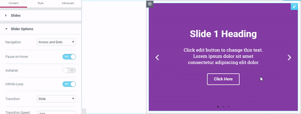
When turning Infinite Loop off, you can only slide left or right, according to the number of slides.
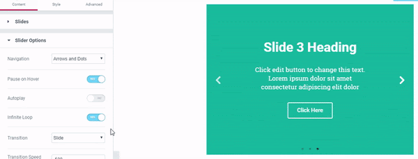
The Infinite Loop option loops the slides infinitely.
When turning Infinite Loop off, you can only slide left or right, according to the number of slides.
Notifications