👉 Responsive design
Responsive editing entails editing an element so that the design is suitable for different screen sizes. In Elementor Editor V4 Responsive editing is clear and straightforward and all element options can be customized for different screen sizes.
To edit an element for device:
- Select the element you want to edit.
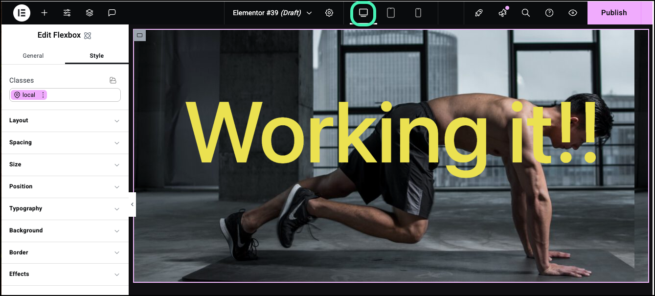
In this example, we’re viewing the page as it would look on a desktop. - In the top bar, click the device you want to edit for.NoteYou can edit any of the options under the Style tab while in responsive mode.
In this case we’ll switch to the setting for mobiles. - Edit the options.
In this case, we’ll change the background image and decrease the text font size.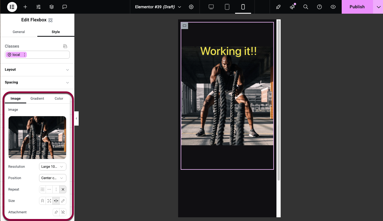
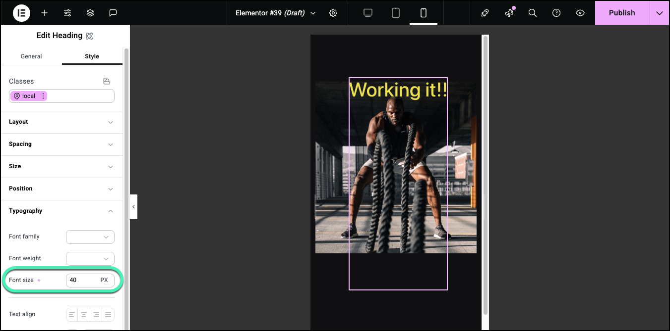
You see the page as it appears on mobile devices.NoteResponsive settings are inherited by default from larger screens to smaller screens. For example, if you use a 24 point font for a heading on desktop computers, tablets will also use a 24 point font unless you use responsive editing to change the size for tablets. And if you change it to a 12 point font for tablets, mobiles will use this 12 point font unless you change it. The exception is widescreens, which do not affect any other settings.
Hide an element on mobile devices
In many designs, an element that works well for one screen size may not be a good fit for another. For instance, a large image may look great on desktops and tablets but break the design on mobiles. In these cases, you can use the Style tab to hide an element on selected screen sizes.
To hide an element on selected screen size:
- Add an element to a page.

For this example, we’ll use an image.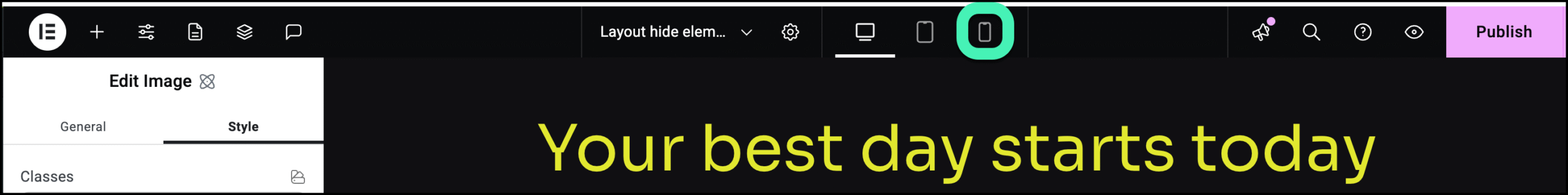
- Click the mobile icon on the top bar.
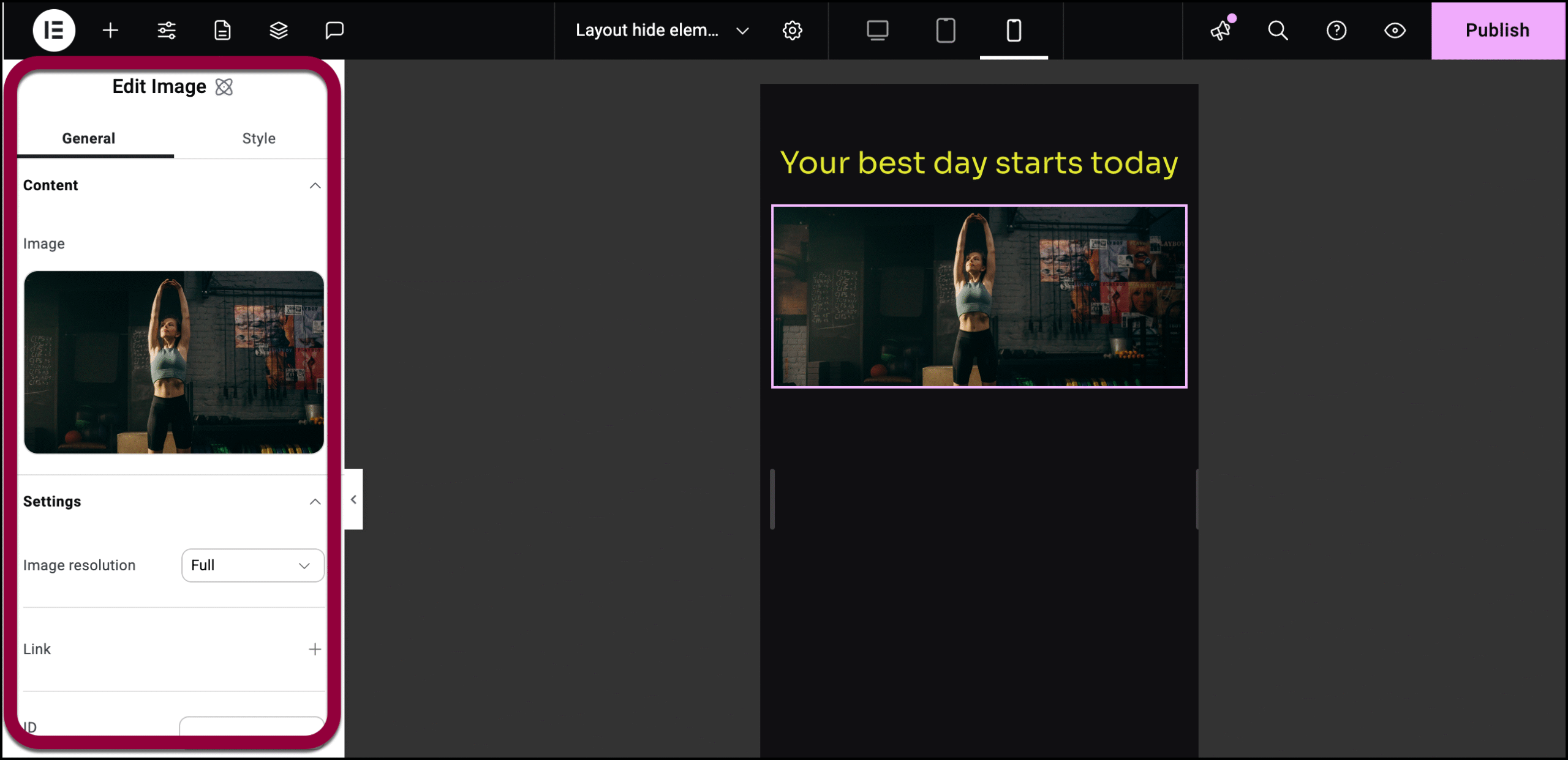
- Select the Image element. The options appear in the left-hand panel.
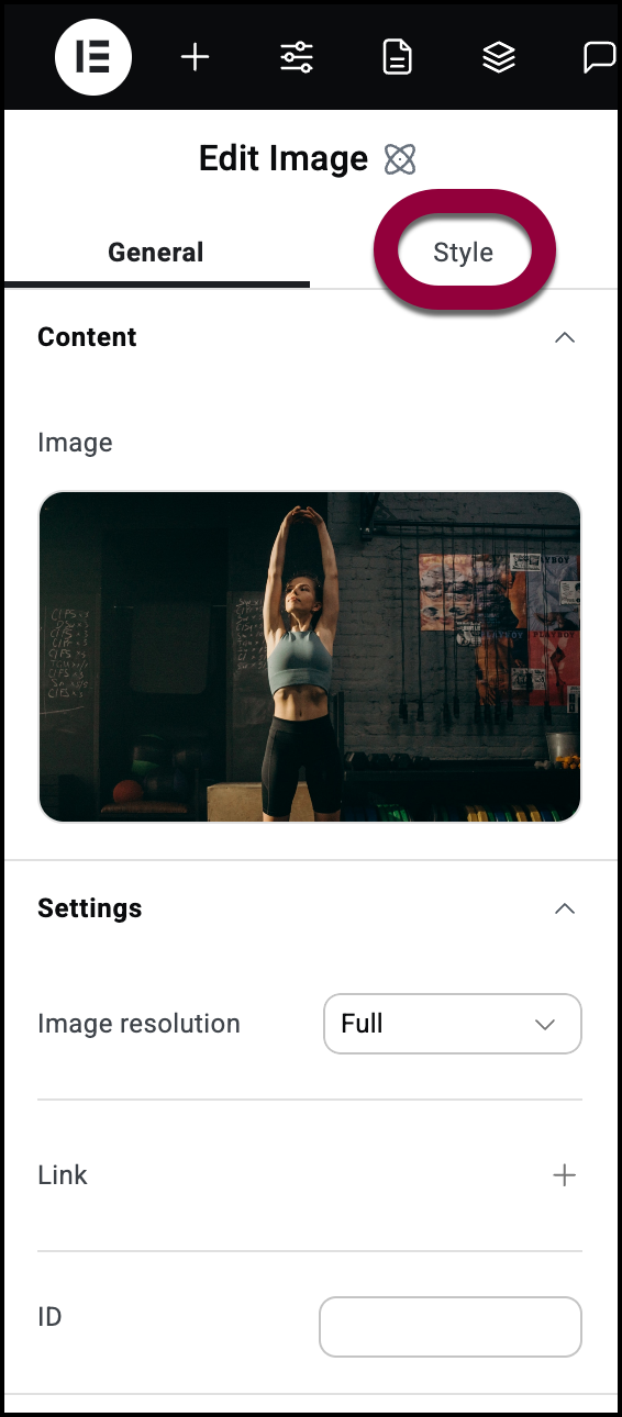
- Click the Style tab.
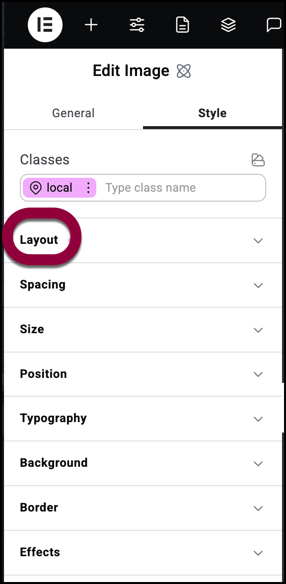
- Open the Layout section.
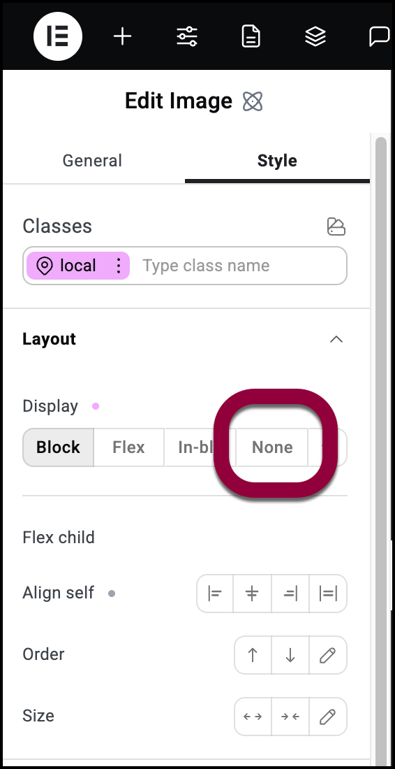
- Select None.
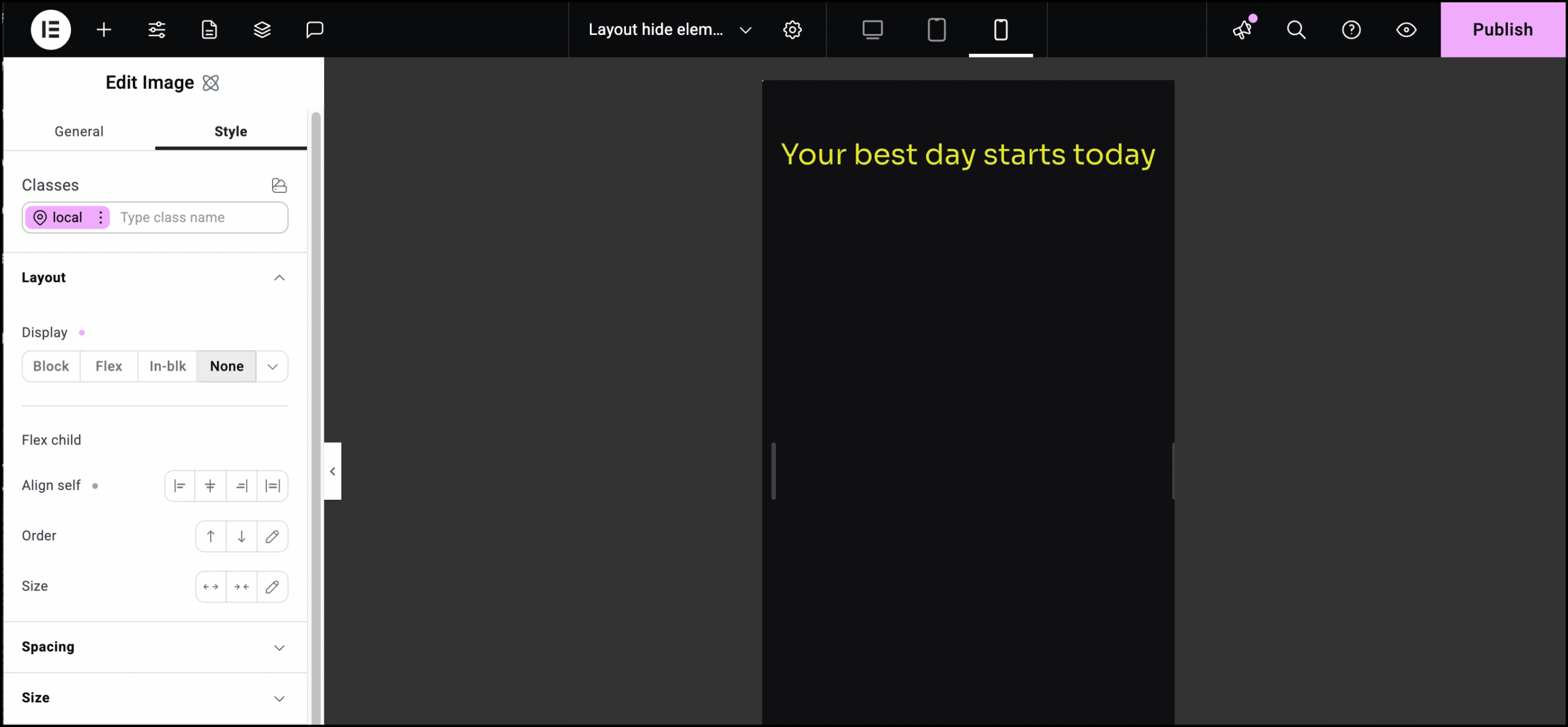
The image no longer shows up on mobile screen sizes.TipYou can still access the Image element using the Structure window. Fore details, see Use page structure to navigate your page.
Inherited values and responsive editing
Responsive settings are inherited by default from larger screens to smaller screens. For example, if you use a 24 point font for a heading on desktop computers, tablets will also use a 24 point font unless you use responsive editing to change the size for tablets.
When settings are inherited from a larger screen size, these values will appear muted, so you know they are inherited.
For example, below is an image of Heading element that set to 70 PX on desktop, as seen on the right, a setting that is inherited by the table screen size, as seen on the left:
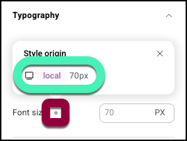
Notice that the 70 PX in the tablet setting is muted.
Clicking the gray dot by Font size shows where this value is inherited from:
Inherited values applies to most element settings.

