Add the widget

Add the widget to the canvas
- In Elementor Editor, click +.
All available widgets are displayed. - Click or drag the widget to the canvas. For more information, see Add elements to a page.
What is the Price Table widget?
The Price Table widget helps you create neat and stylish pricing tables to display various pricing plans or packages. Within these tables, you can detail different features, pricing options, and descriptions, making it easy for visitors to compare and choose the option that best suits their needs.
Further, this widget offers various customization options, allowing you to adjust the layout, colors, fonts, and other design elements to match your website’s style and branding.
Common use case
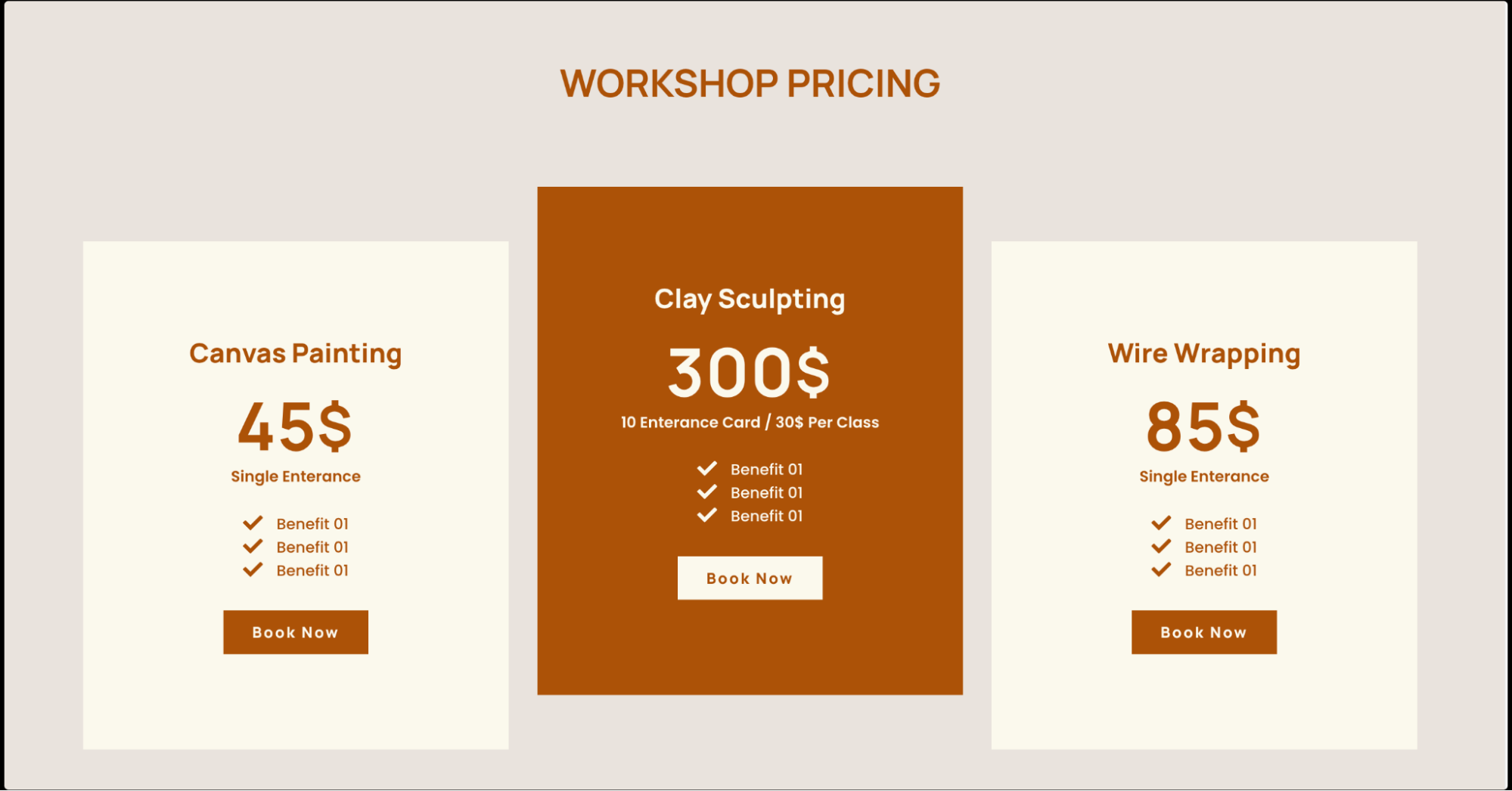
Kiara is building a website for an art and craft studio that offers various workshops. To help potential customers understand the different workshop options and their associated costs, Kiara decided to showcase a price table.
They created a dedicated pricing page on the website titled Workshop Pricing. On the page, they first created a 3-container layout and added the Price Table widget in each container.
In the Price Table, Kiara listed the names of each workshop and its features and benefits. Next, they included the prices for each workshop. To make it easy for visitors to take action, Kiara also added a Book Now button below each pricing option. This button links directly to the studio’s booking page, where customers can sign up for their preferred workshop.
Additional use cases
- Display subscription plans for a software service.
- List different levels of membership for a gym or fitness center.
- Showcase pricing options for a photography package.
- Present pricing tiers for a web hosting service.
- Highlight pricing options for online courses or educational programs.
Add a Price Table widget: Step-by-step
- Add the Price Table widget to the canvas. For details, see Add elements to a page.
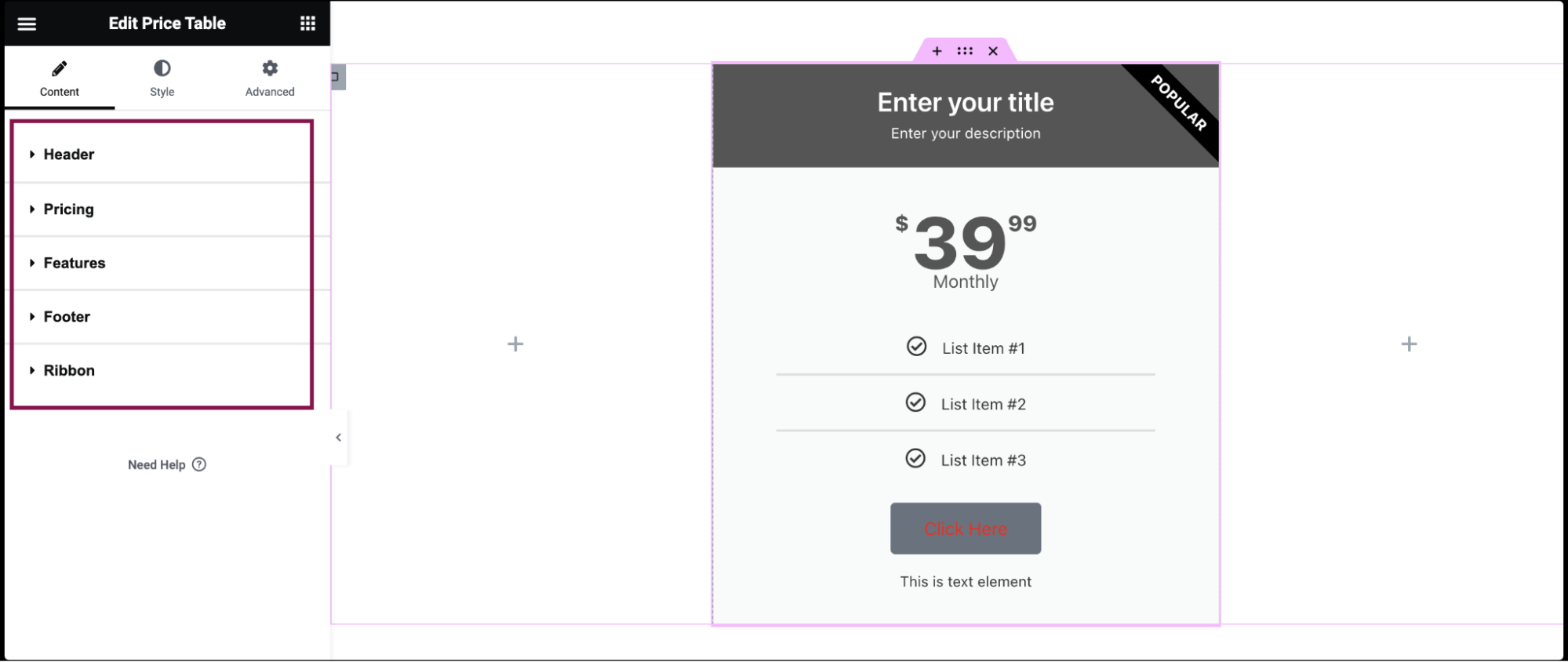
- In the Content tab, you’ll find five sections: Header, Pricing, Features, Footer, and Ribbon, each with its own set of customization settings.
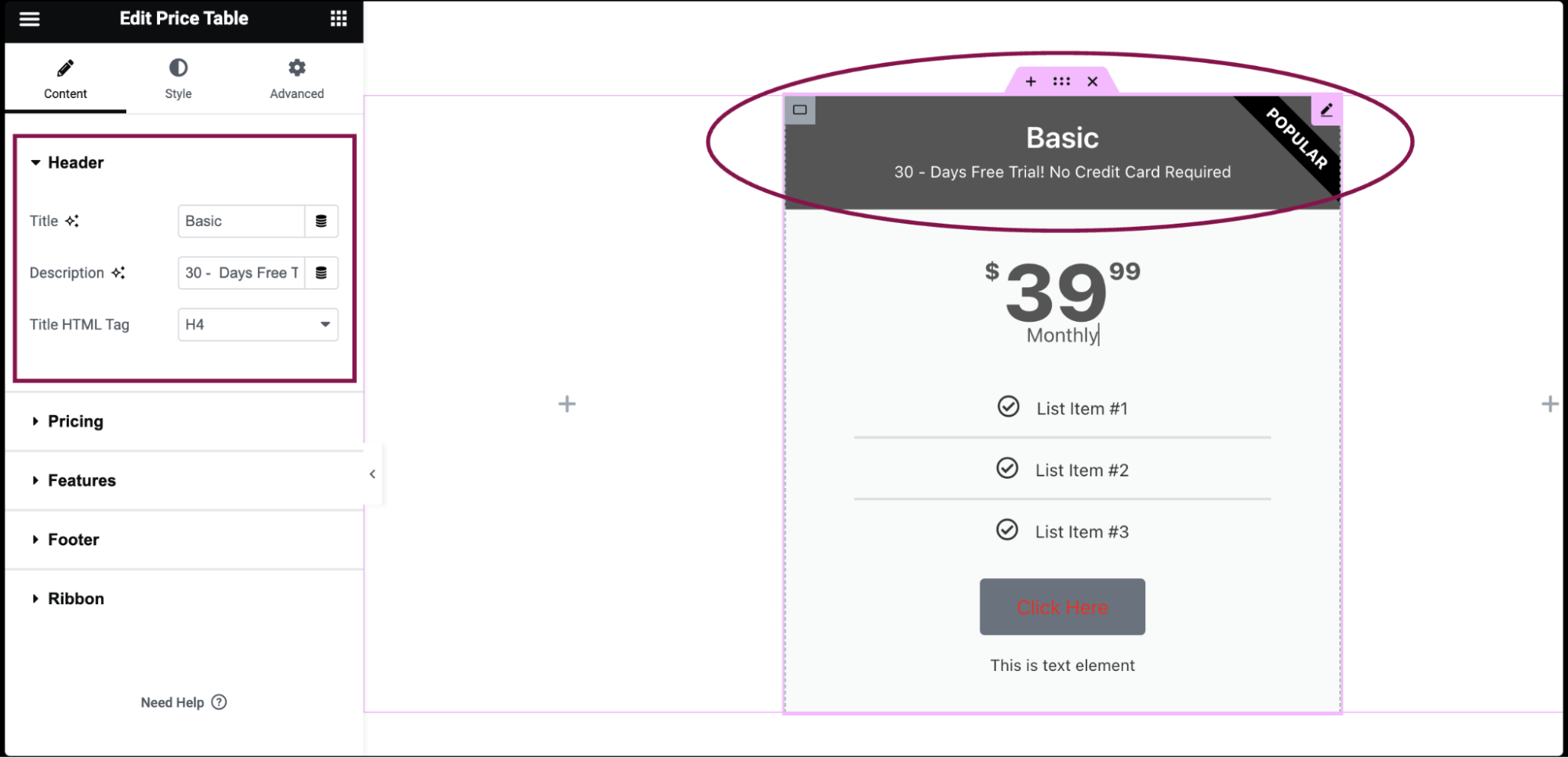
- Under the Header section:
- In the Title field, add the main title of your pricing plan, such as basic, standard, or premium.
- In the Description field, add additional information or a brief description of the pricing plan.
- In the Title HTML Tag, choose the HTML tag for the title from H2 – H6.
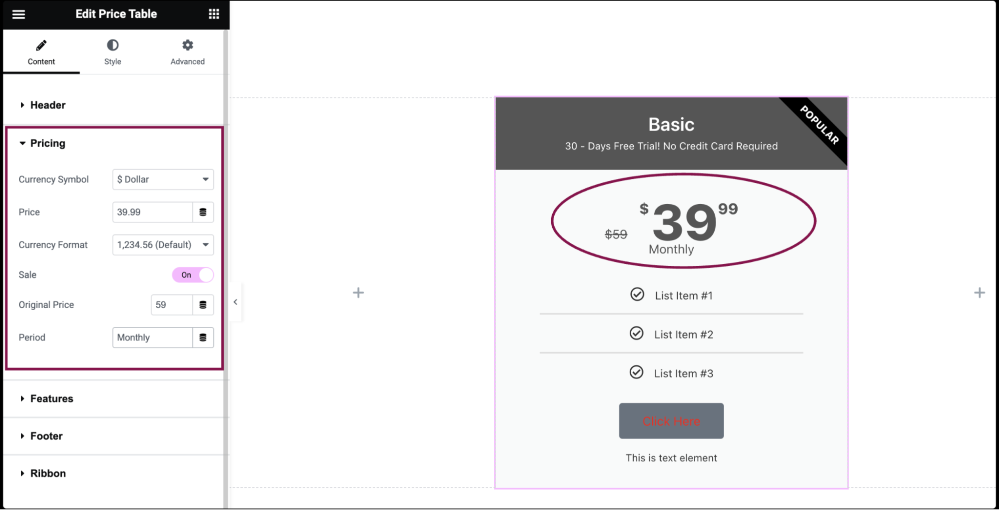
- Under the Pricing section:
- In the Currency Symbol, select the currency symbol you want to use (e.g., $, €, £), or set a custom symbol if needed.
- In the Price field, enter the exact pricing for the pricing plan, including any decimal points.
- In the Currency Format field, choose the format for displaying large numbers, such as adding commas for thousands.
- Slide the Sale button Yes to display the original price with a strikethrough and the discounted sale price.
- In the Period field, specify the period of time for each payment (e.g., per month, per year).
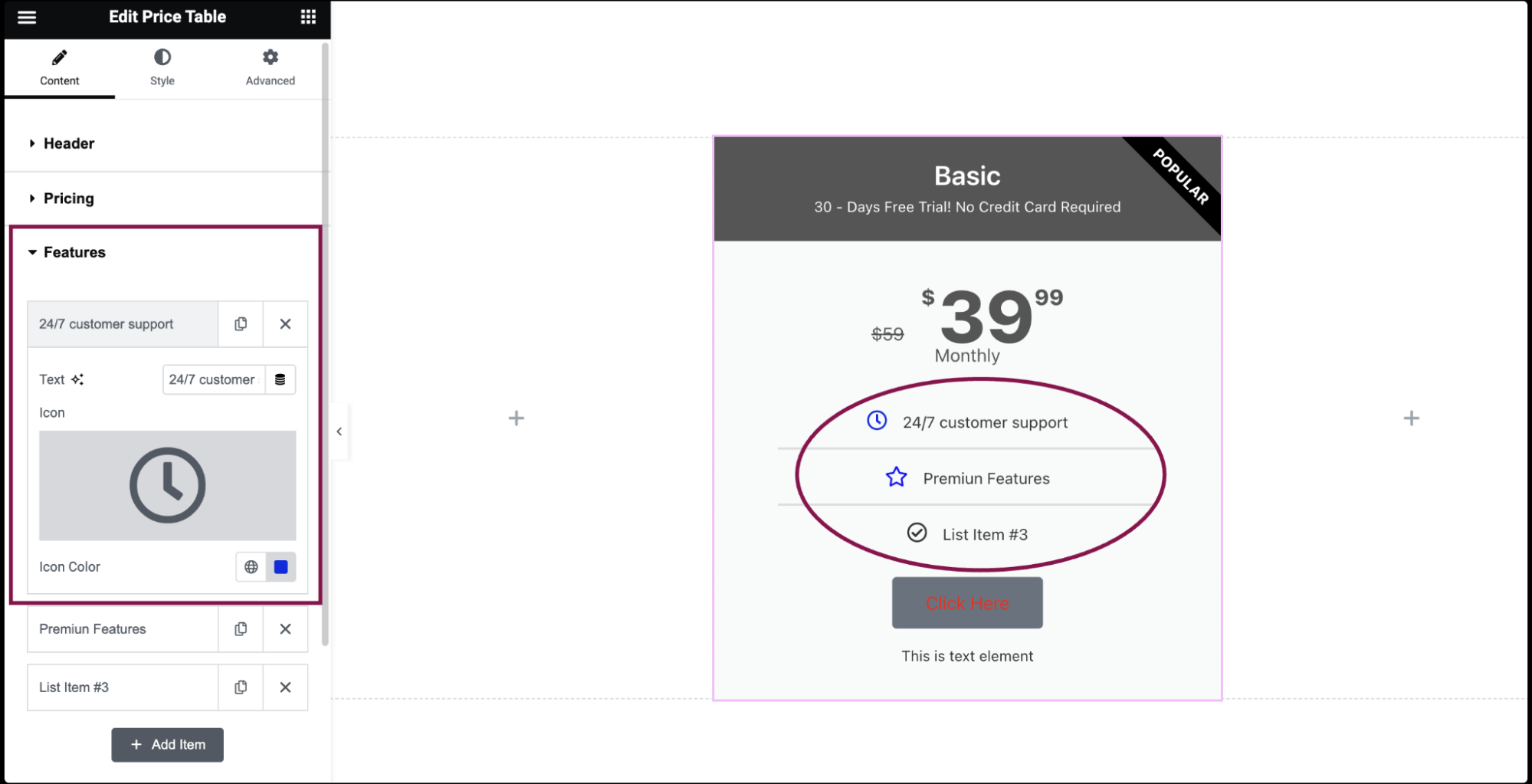
- Under the Features section, you’ll find a predefined list of features:
- Drag and drop them to change their order.
- Click on the Add Item button to add another item to the list.
- To duplicate or delete items, click on the item’s Duplicate or Delete
 icon.
icon. - Click on each item to customize their content and settings.
- In the Text field, describe the feature (e.g., 24/7 customer support).
- In the Icon field, select an icon to represent the feature. You can choose an icon from the Icon Library or upload an SVG. For more details, see Enable SVG Support in Elementor.
- In the Icon Color field, choose the color of the icon.
- Under the Footer section:
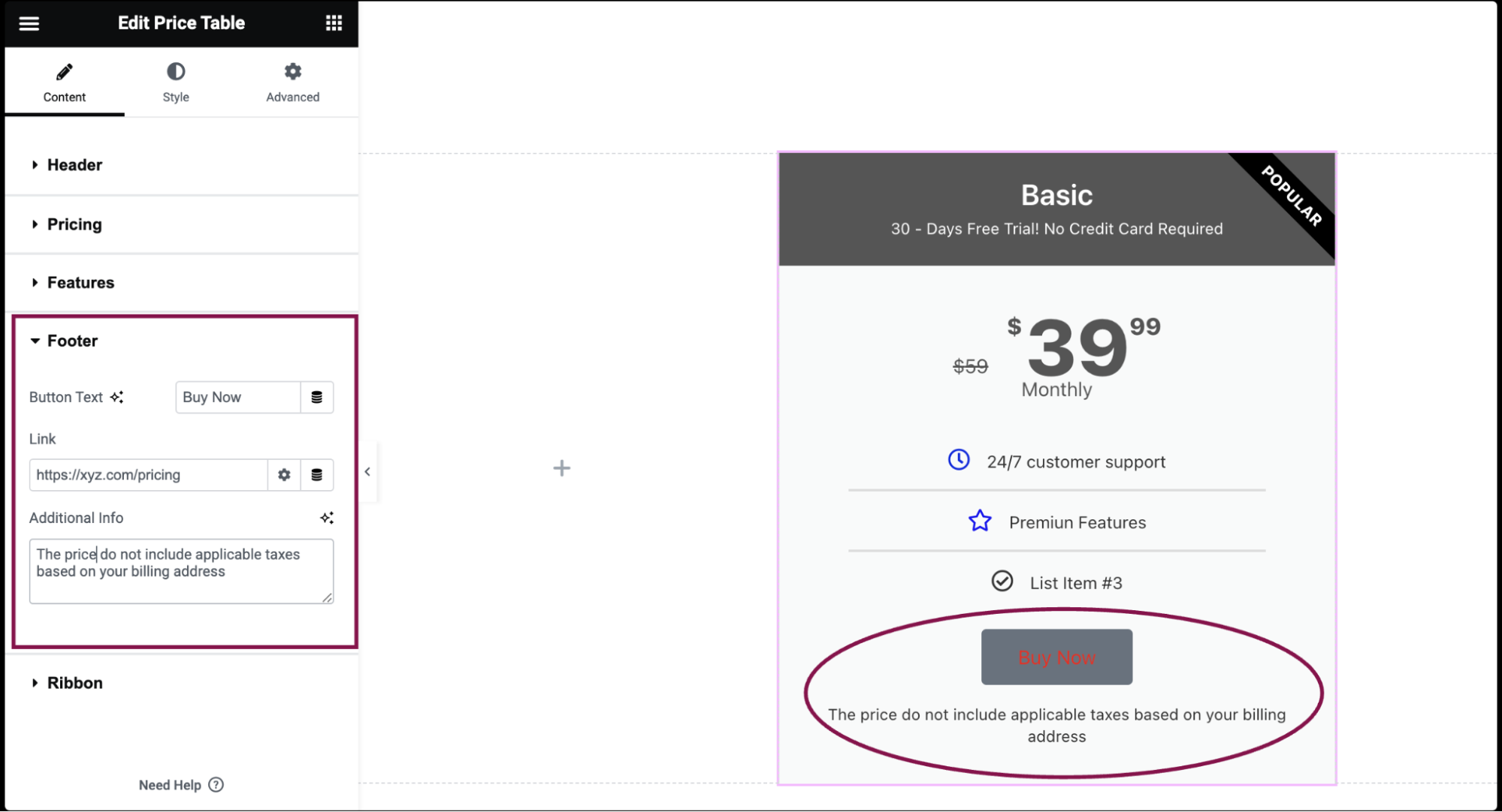
- In the Button Text field, specify the text to display on the button, such as Buy Now.
- In the Link field, enter the URL the button should link to, generally a signup page or a checkout page. Click the ⚙️ to set the link to either open in a new window or to add rel=nofollow to the link.
- In the Additional Info field, include any extra information or disclaimers below the button.
- Under the Ribbon section:
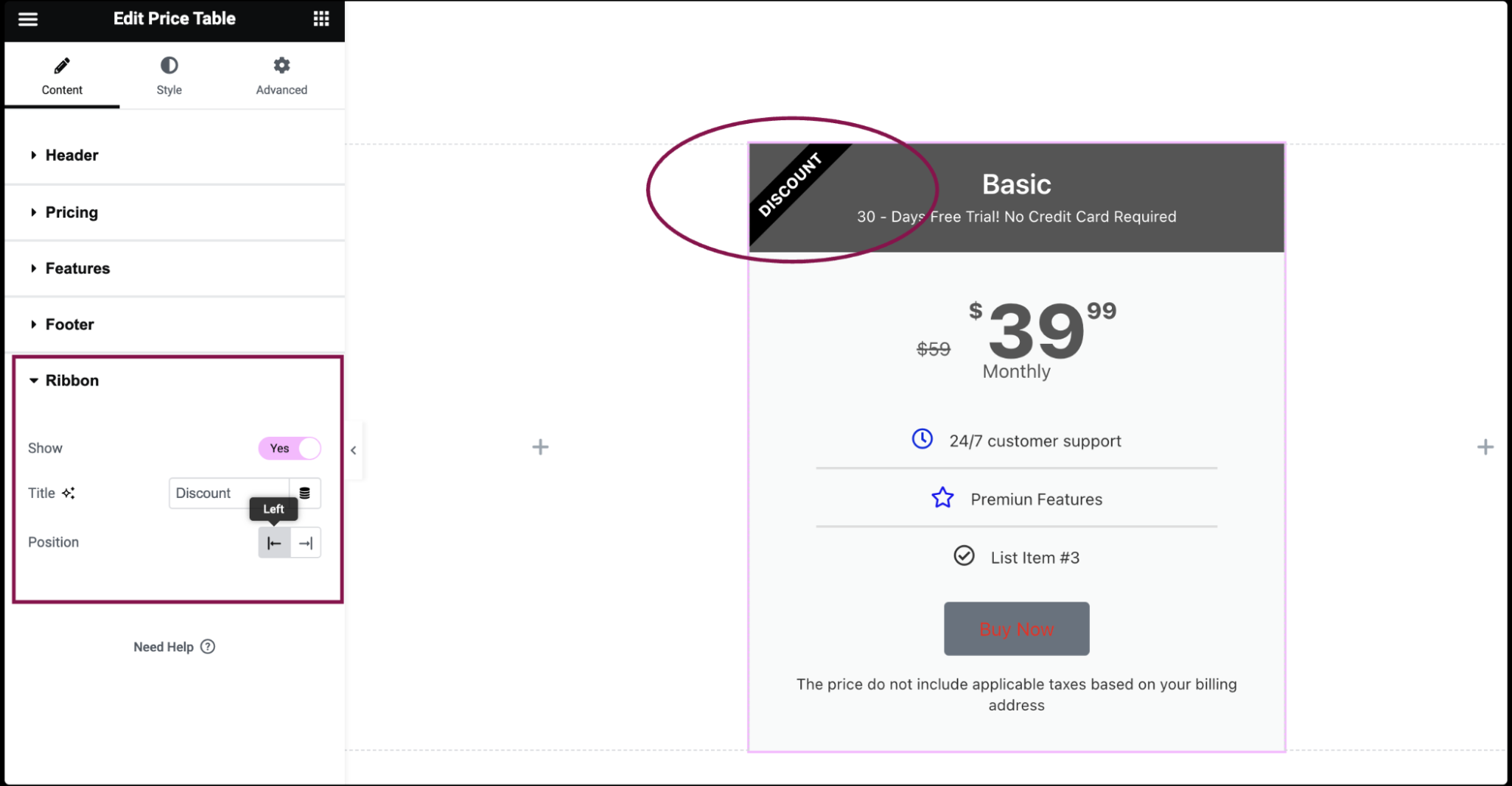
- Slide the Show button Yes to display or hide a ribbon element on the pricing table.
- In the Title field, input the text to be displayed on the ribbon.
- In the Position field, choose the position of the ribbon: top left or top right corner of the pricing table.
Settings for the Price Table Widget
You can customize your widgets using content, style, and other advanced parameters, offering you great flexibility in tailoring them to your needs. Click the tabs below to see all the settings available for this widget.
Content tab
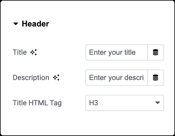
Title
Enter the title of the price plan.
Description
Add a brief description of the pricing plan.
Title HTML Tag
Set the Header’s Title tag, choosing from H2 – H6.
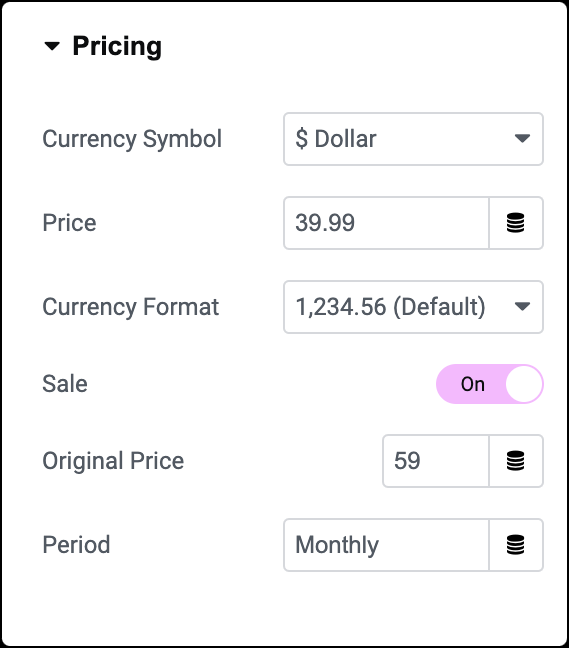
Currency Symbol
Select the currency symbol or set a custom symbol if needed.
Price
Set the exact pricing of your product or service, including cents.
Currency Format
Choose the thousands separator format.
Sale
Display the original price with a strikethrough and the new sale price.
Period
Enter the period of time for each payment.
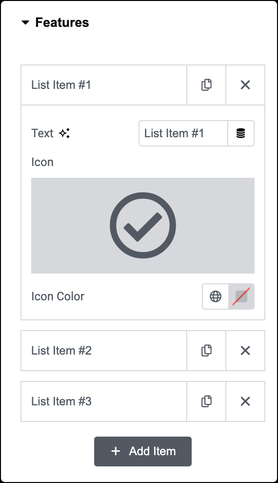
List Item
A list of all the features you are offering.
- Drag and drop them to change their order.
- Click on the Add Item button to add another item to the list.
- To duplicate or delete items, click on the item’s Duplicate or Delete
 icon.
icon. - Click on each item to customize their content and settings.
Text
Enter the description of the feature.
Icon
Select an icon to represent the feature.
Icon Color
Choose a color for the icon.
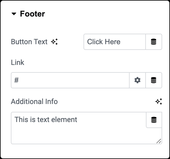
Button Text
Specify the text to display on the button.
Link
Enter the URL the button should link to. Click the ⚙️ to set the link to either open in a new window or to add rel=nofollow to the link.
Additional Info
Include a line of additional info below the button.
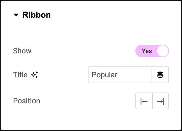
Show
Show or hide a corner ribbon.
Title
Enter the text to be displayed on the ribbon.
Position
Choose the position of the ribbon: top left or top right.
Style tab
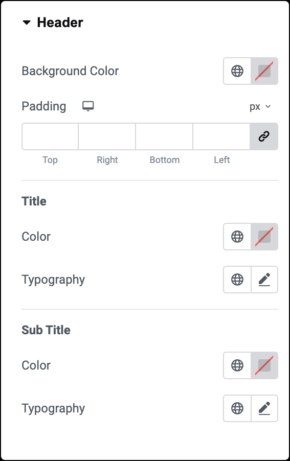
Background Color
Select the background color for the header area.
Padding
Adjust the padding of the header area.
Title
- Color: Set the color of the main title text.
- Typography: Define the typography options for the main title, including font style, size, weight, and more. Learn more about Typography.
Sub title
- Color: Set the color of the subtitle text.
- Typography: Define the typography options for the subtitle, such as font style, size, weight, and more. Learn more about Typography.

Background Color
Choose a background color for the pricing area.
Padding
Adjust the padding of the pricing area.
Color
Customize the color of the price text.
Typography
Set the typography options for the price text, including font style, size, weight, and more. Learn more about Typography.
Currency Symbol
- Size: Change the size of the currency symbol.
- Position: Determine whether the currency symbol appears to the left or right of the price.
- Vertical Position: Specify the vertical alignment of the currency symbol.
Fractional Part
- Size: Adjust the size of the fractional part.
- Vertical Position: Determine the vertical alignment of the fractional part.
Original Price
- Color: Set the color of the original price text.
- Typography: Define the typography options for the original price text. Learn more about Typography.
- Vertical Position: Specify the vertical alignment of the original price.
Period
- Color: Set the color of the period text.
- Typography: Define the typography options for the period text. Learn more about Typography.
- Position: Specify whether the period text appears below or beside the price.
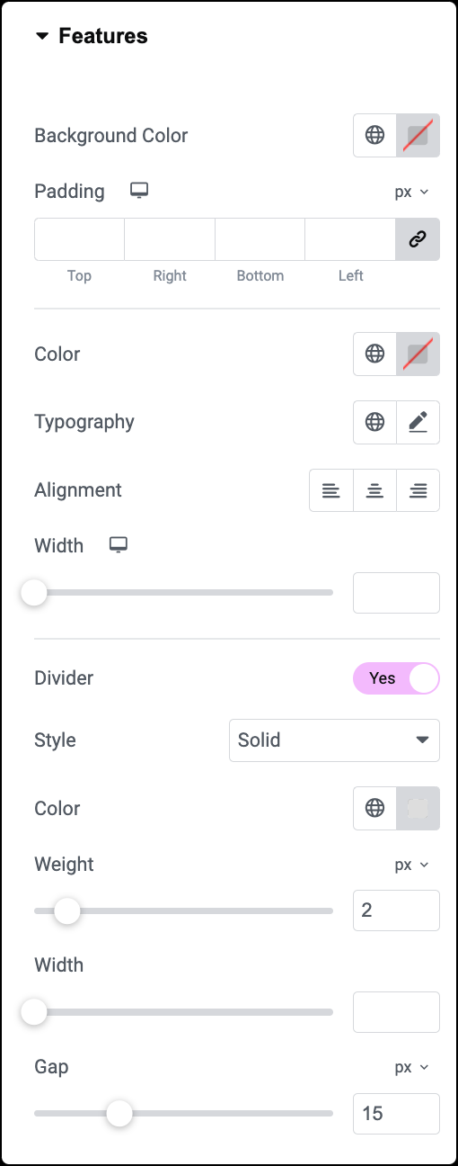
Background Color
Select the background color for the features list.
Padding
Adjust the padding of the features list.
Color
Customize the color of the text within the features list.
Typography
Set the typography options for the text within the features list, including font style, size, weight, and more. Learn more about Typography.
Alignment
Align the text within the features list to the right, left, or center.
Width
Adjust the width of the features list.
Divider
- Style: Choose from various styles for the divider line, such as solid, dotted, double, or dashed.
- Color: Set the color of the divider.
- Weight: Adjust the thickness or weight of the divider.
- Width: Specify the width of the divider.
- Gap: Set the distance between the divider line and the features list content.

Background Color
Choose a background color for the footer area of the pricing table.
Padding
Adjust the padding of the footer area to control the space between the content and the edges of the footer.
Button
This section provides options for customizing the appearance of the button within the footer.
Size
Choose from button sizes, from extra small to extra large.
Normal
- Text Color: Set the color of the button text.
- Typography: Set the font style, size, and other typography options for the button text. Learn more about Typography.
- Background Type: Choose the background type for the button.
- Color: Choose button color.
- Border Type: Select the border type, from none, solid, double, dotted, dashed, or grooved.
- Border Radius: Set the border radius of the button to control corner roundness.
- Text Padding: Set the distance between the button text and the border.
Hover
- Text Color: Set the color of the button text when hovered over by the mouse cursor.
- Background Type: Choose the background type for the button on hover.
- Color: Set the background color of the button on hover.
- Border Color: Specify the color of the button border on hover.
- Animation: Add animation effects to the button when hovered over.
Additional Info
- Color: Choose the color of the additional info text.
- Typography: Set the font style, size, and other typography options for the additional info. Learn more about Typography.
- Margin: Adjust the space around the additional info text.
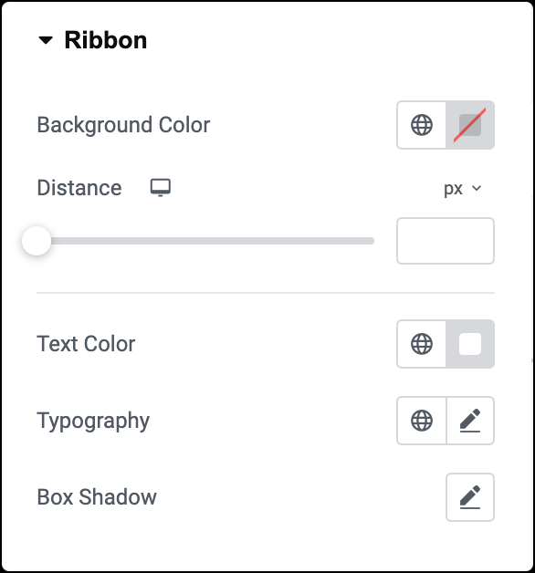
Background Color
Choose the background color for the ribbon.
Distance
Use a slider to control the distance between the ribbon and the corner of the pricing table.
Text Color
Set the color of the text displayed on the ribbon.
Typography
Customize the font style, size, and other typography options for the text displayed on the ribbon. Learn more about Typography.
Box Shadow
Add a box shadow effect to the ribbon.
Advanced tab
The Advanced tab provides options to control price table position, adjust spacing, add custom code, and more.
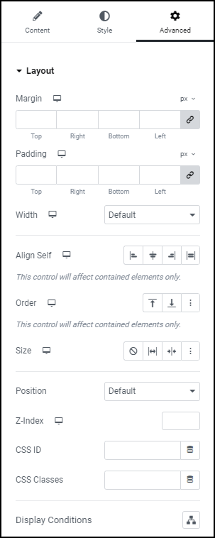
Advanced
Learn more about the Advanced tab settings.

