help center

On this page

WordPress Menu widget

Last Update: March 7, 2024

Add the widget

WordPress Menu widget
  1. In Elementor Editor, click +.
    All available widgets are displayed.
  2. Click or drag the widget to the canvas. For more information, see Add elements to a page.

What is the WordPress Menu widget?

The WordPress Menu widget allows you to use the menus you’ve already created within your WordPress website. For more information, see WordPress Menu User Guide.

You can customize the appearance of your menus and create beautiful, responsive, and user-friendly navigation menus. The styling options includes adjusting fonts, colors, sizes, alignment, spacing, background styles, and more. You can also choose from different menu layouts and styles to match the design aesthetics of your website.

Note
Check out the Elementor Menu widget for a more streamlined way to create menus and mega menus. For more details, see Menu widget.

Common use case

Ema is a head designer for a website design agency. She’s working on a client project for a local restaurant that wants to revamp its online presence. They want a modern, visually appealing website that prominently showcases their menu, location, and contact information.

Ema uses the menu widget to create a sleek and intuitive navigation menu for the restaurant’s website. First, Ema creates a main navigation menu that includes links to the restaurant’s menu, about page, location, and contact information. 

To enhance user experience, Ema adds a dropdown menu feature to the main navigation, allowing visitors to easily access subpages such as the menu categories (e.g., appetizers, entrees, desserts).

For mobile responsiveness, Ema configures the menu widget to display a hamburger menu icon on smaller screens. When clicked, the hamburger menu expands to reveal the full navigation menu, ensuring seamless navigation on mobile devices.

WordPress Menu widget 16

Additional use cases

  • Designing a professional menu structure for a corporate website featuring sections like About Us, Services, Our Team, and Contact.
  • Creating a menu for a nonprofit organization’s website featuring sections like Mission, Programs, Events, and Donate.
  • Building a menu for a fitness website highlighting Cases, Trainers, Membership Options, and Class Schedules.
  • Structuring a menu for a technology review site showcasing categories like Smartphones, Laptops, Gadgets, and Reviews.

Add a WordPress Menu widget: Step-by-step

  1. Add the WordPress Menu widget to the canvas. For details, see Add elements to a page.
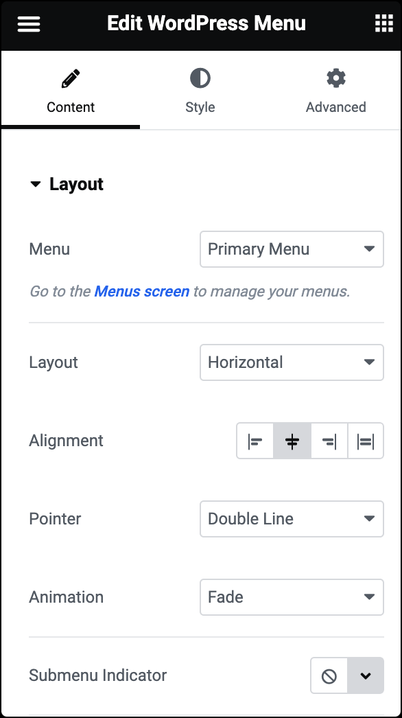
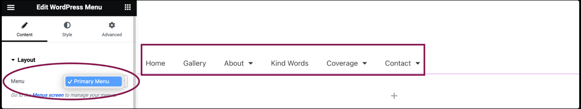
  2. In the Content tab, under the Layout section, use the Menu field to select a menu you’ve previously set up in your WordPress dashboard under Appearance > Menus.
    WordPress Menu widget 14
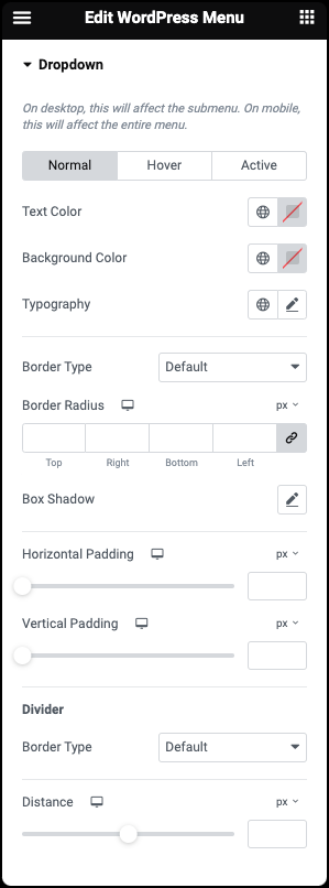
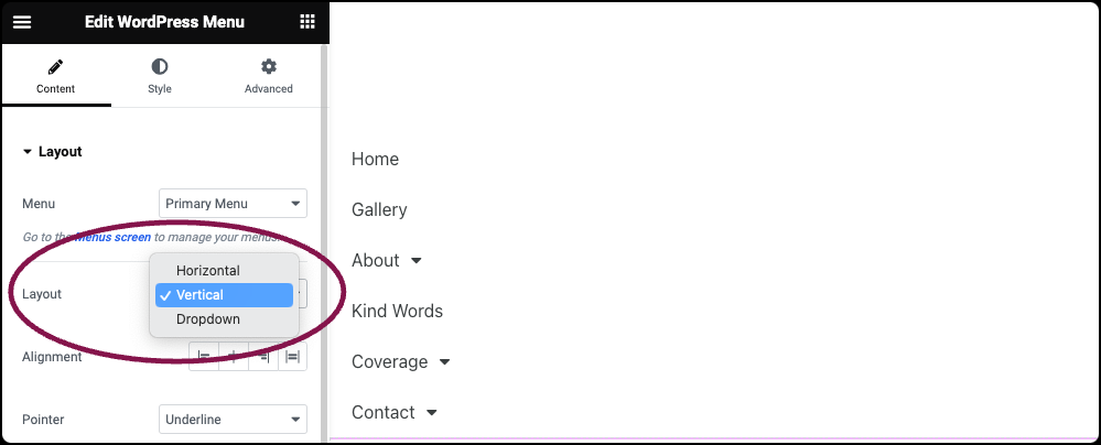
  3. In the Layout field, choose between different layout options for your menu, such as horizontal, vertical, or dropdown.
    WordPress Menu widget 9
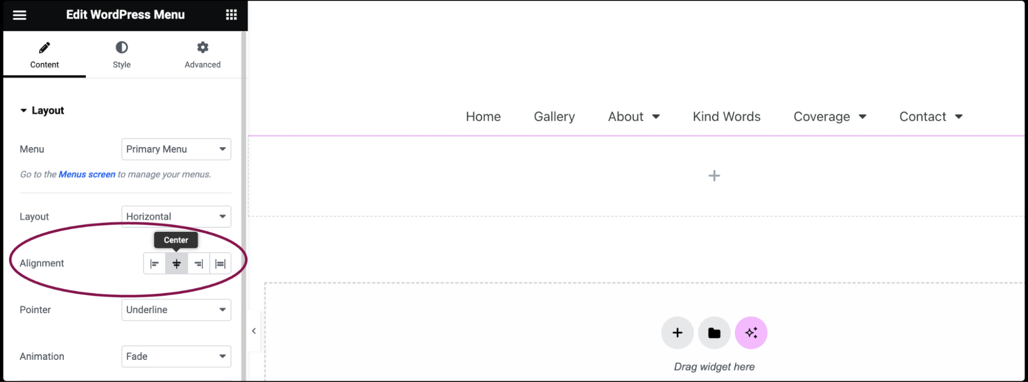
  4. In the Alignment Field, set the alignment of your menu items, choosing between left, center, right, or justified.
    WordPress Menu widget 15
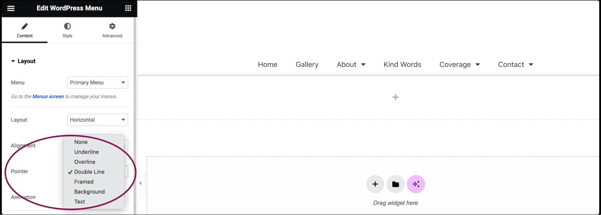
  5. In the Pointer field, select a style for the pointer that appears when you hover over menu items, such as underline, double line, framed, etc.
    WordPress Menu widget 13
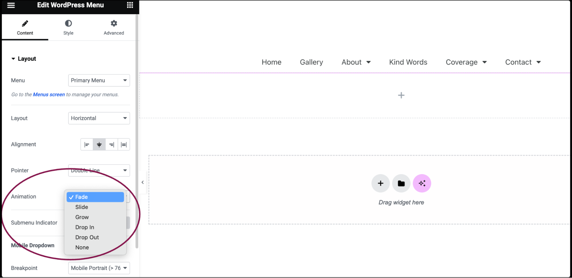
    1. If a pointer style is selected, pick an animation effect for when the pointer appears, such as fade, slide, grow, etc.
      WordPress Menu widget 7
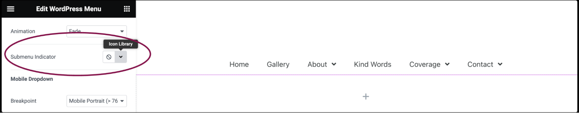
  6. In the Submenu Indicator field, choose an icon to indicate items that have submenu items, like classic, chevron, angle, etc.
    WordPress Menu widget 3
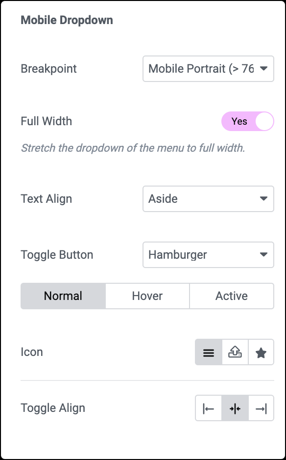
  7. Under the Mobile Dropdown sub-section, use the options to customize the appearance of the menu on mobile devices.
    WordPress Menu widget 1
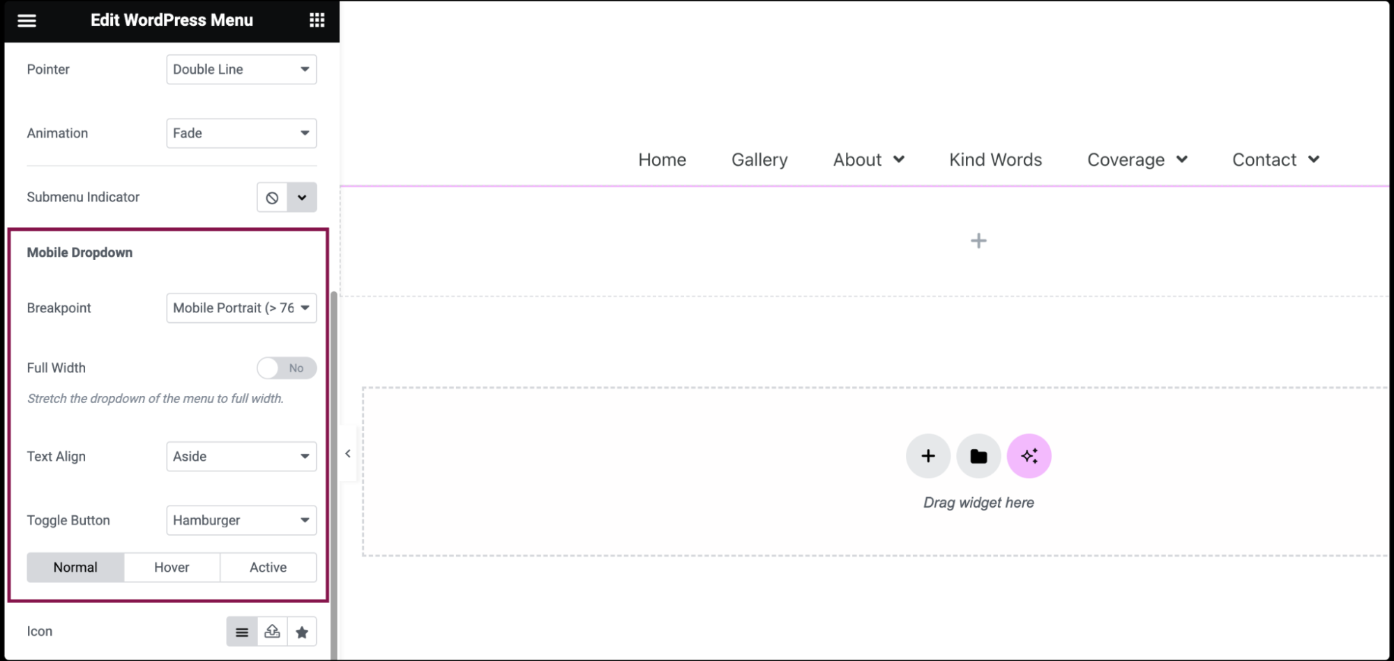
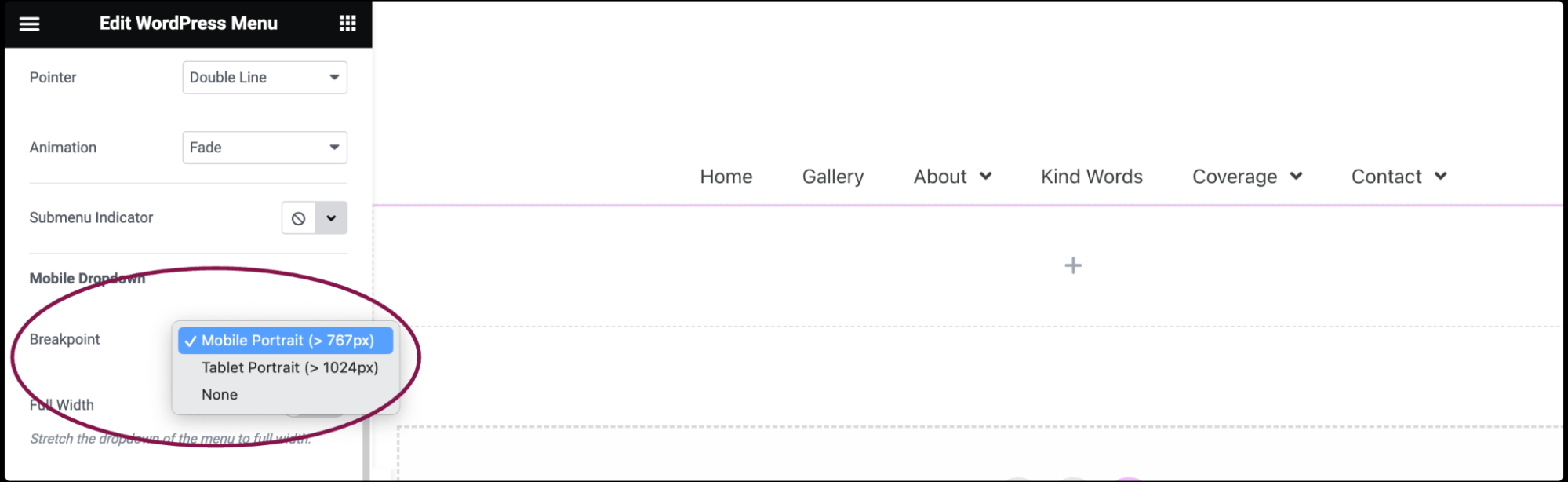
  8. In the Breakpoint field, select at which point the mobile dropdown menu kicks in, either on Mobile, Tablet, or None.
    WordPress Menu widget 17
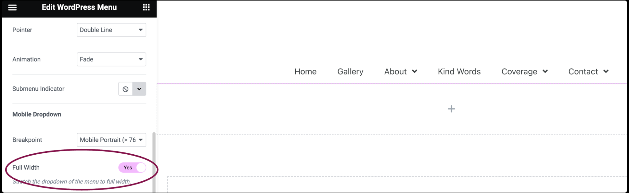
  9. In the Full Width field, decide if the mobile dropdown menu spans the full width of the device by selecting Yes or No.
    WordPress Menu widget 5
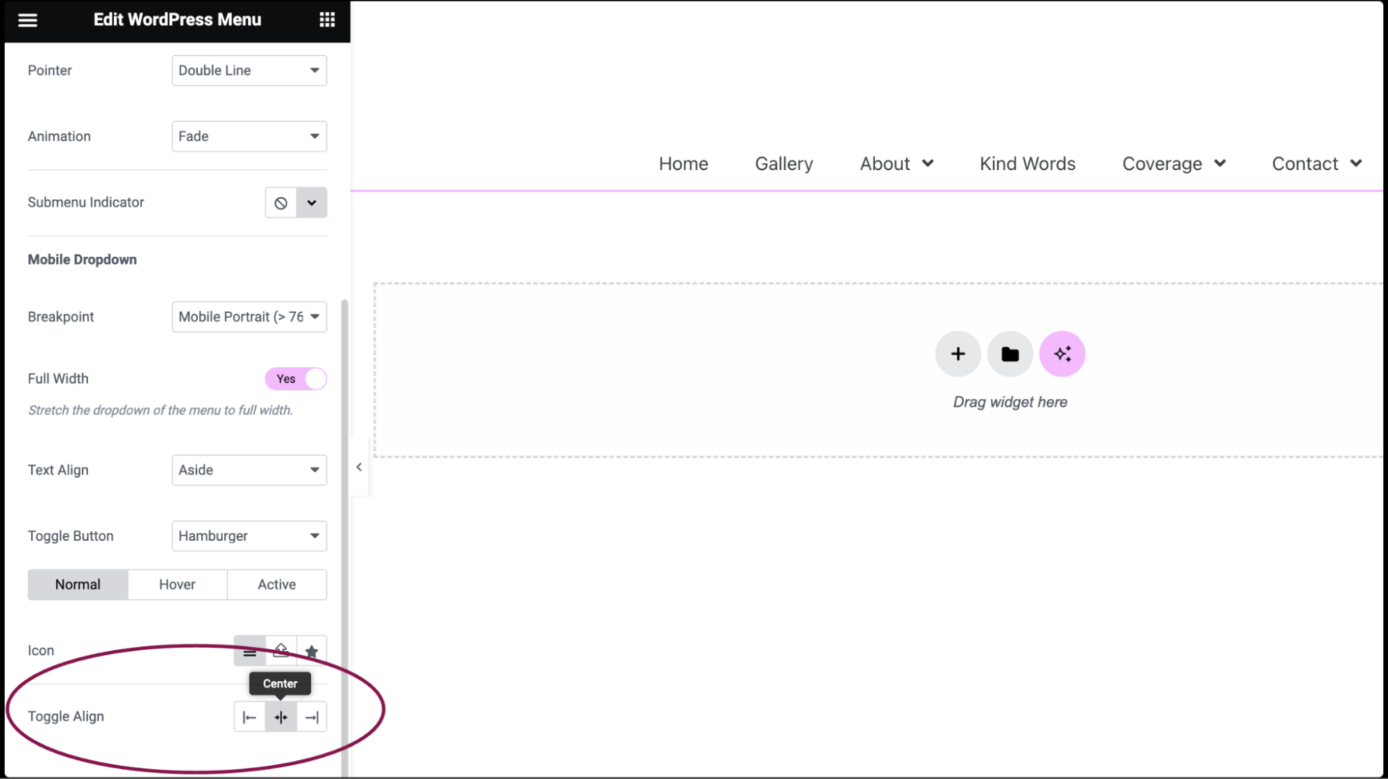
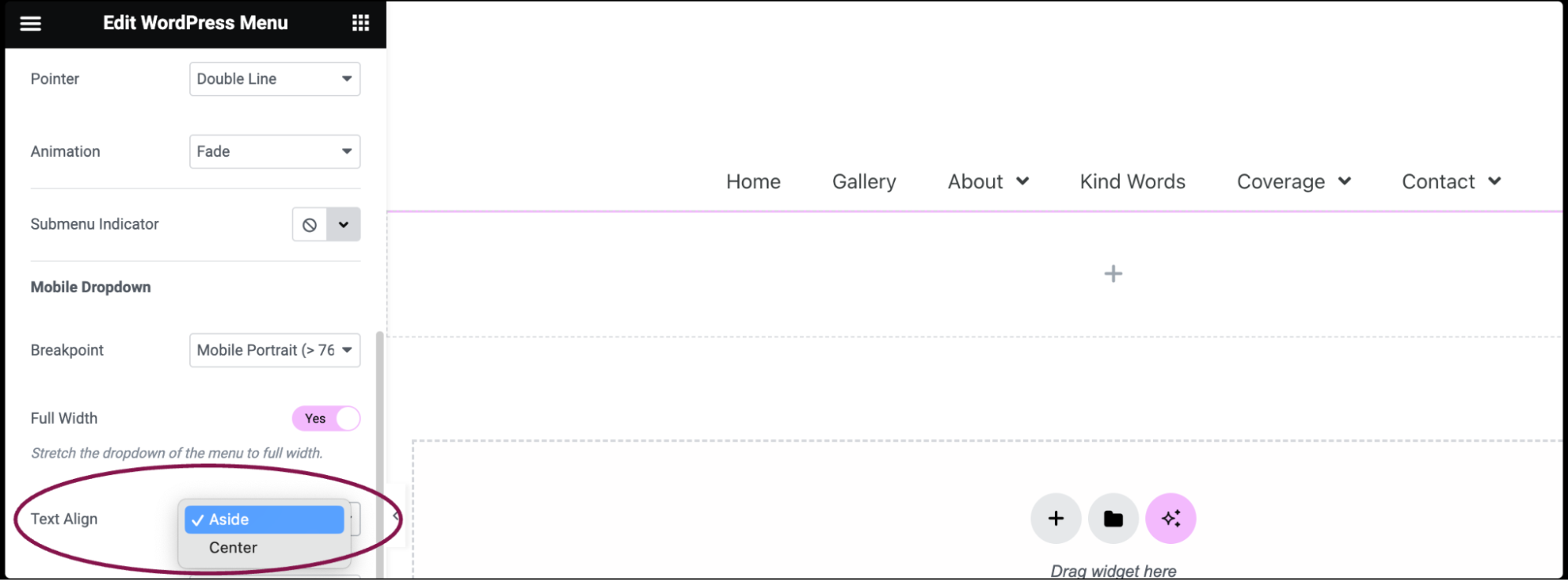
  10. In the Text Align field, choose whether the mobile menu items are displayed on the left, or in the center, by selecting either Aside or Center.
    WordPress Menu widget 8
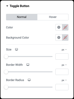
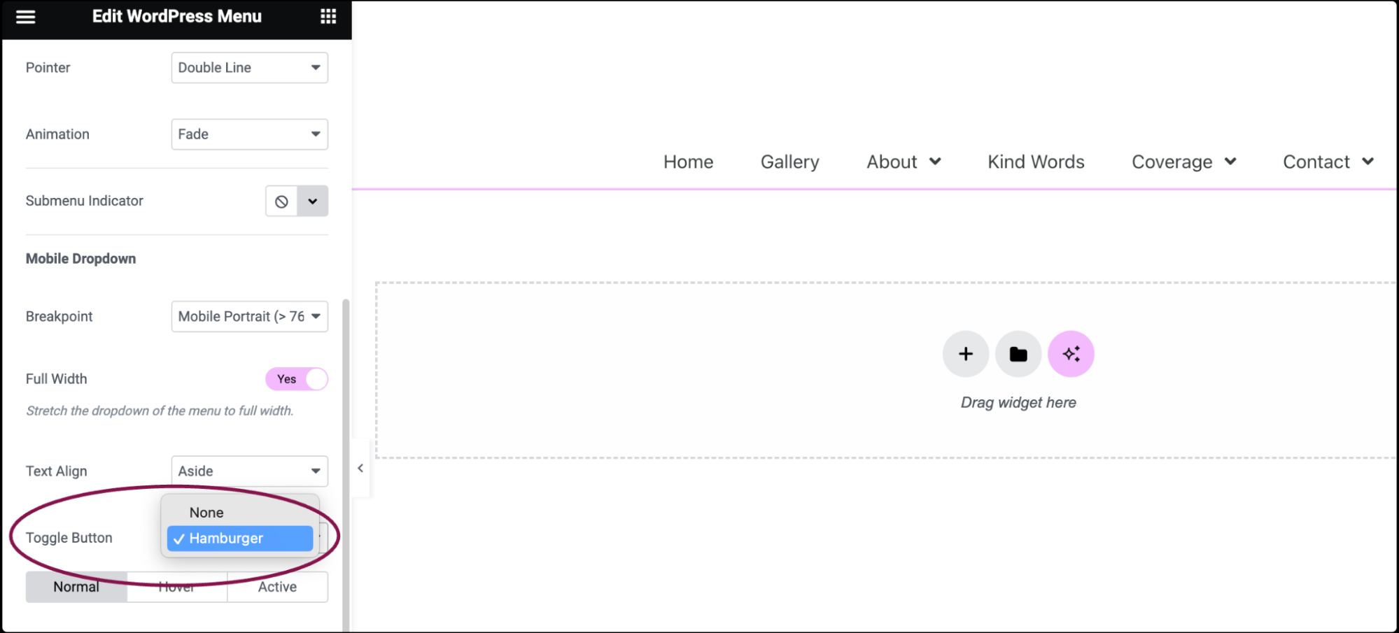
  11. In the Toggle Button field, choose to show the Hamburger icon as the toggle button or not.
    WordPress Menu widget 10
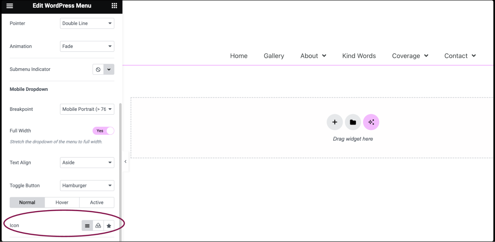
  12. In the Icon field, set icons for different states (normal, hover, active) of the menu items. You can choose from default icons, upload custom ones, or upload an SVG. For more details, see Enable SVG Support in Elementor.
    WordPress Menu widget 11
  13. In the Toggle Align field, choose the alignment of the toggle button (hamburger icon) on the left, center, or right of the screen.
    WordPress Menu widget 6

Settings for the WordPress Menu Widget

You can customize your widgets using content, style, and other advanced parameters, offering you great flexibility in tailoring them to your needs. Click the tabs below to see all the settings available for this widget.

Content tab

WordPress Menu widget 18

Select a menu you’ve previously set up via Appearance > Menus

Choose a Horizontal, Vertical, or Dropdown layout

Set the menu item alignment, either Left, Center, Right, or Justified

Select a pointer, either None, Underline, Double Line, Framed, Background, or Text

Choose the pointer animation, either Fade, Slide, Grow, Drop In, Drop Out, or None

Choose the icon that indicates an item has submenu items, either None, Classic, Chevron, Angle, or Plus

WordPress Menu widget 19

Select at which point the mobile dropdown menu kicks in, either on Mobile, Tablet or None

Select whether the mobile dropdown spans full width of the device, either Yes or No

Choose whether the mobile menu items are displayed on the left, or in the center, by selecting either Aside or Center

Show the Hamburger icon as the toggle button or not

This may be set for the Normal, Hover, and Active states. You may use the default icons, or custom ones by clicking the appropriate icon. 

Choose from the icon library or upload your own SVG. For more details, see Enable SVG Support in Elementor.

Show the toggle button on the Left, Center, or Right of the screen

Style tab

WordPress Menu widget 20 WordPress Menu widget 18

Set the typography options for the menu item text. For more details, see Typography.

Choose the color of the menu item text

Choose the color of the pointer’s hover or active states. The normal state uses the color set as the accent color in the Global Colors settings.

Toggle the option to enable or disable the divider between menu items

  • Style: From the dropdown menu, select between solid, double, dotted, dashed, or grooved
  • Width: Use the slider or enter the value in the field in PX
  • Height: Use the slider or enter the value in the field in PX or %
  • Color: From the color picker, choose the color for your divider


Set the width of the pointer

Use the slider or enter the value in the field in PX to set the horizontal padding around the text of the menu items

Use the slider or enter the value in the field in PX to set the vertical padding around the text of the menu items

Use the slider or enter the value in the field in PX to set the space between each menu items

WordPress Menu widget 2

Choose the color of the menu item text

Choose the background color of the menu items

Set the typography options for the menu items. For more details, see Typography.

Select a border type around the dropdown menu, choosing either None, Solid, Double, Dotted, Dashed, or Groove

Set the border radius to control corner roundness. For more details, see Border radius tools.

Click the 🖋️ icon to add a shadow to the dropdown items. Learn more about shadows.

Set the horizontal padding around the text of the menu items

Set the vertical padding around the text of the menu items

  • Border Type: Select a border type for the divider, choosing either None, Solid, Double, Dotted, Dashed, or Groove
  • Border Color: If divider border is chosen, choose the color of the divider border
  • Border Width: If divider border is chosen, set the width of the divider border
  • Distance: Set the amount of space between the toggle and the dropdown menu
WordPress Menu widget 4

Choose the color of the toggle button icon independently for both the normal and hover states

Choose the background color of the toggle button for both the normal and hover states

Set the size of the toggle button for both the normal and hover states

Set the width of the border around the toggle button for both the normal and hover states

Set the border radius of the toggle button for both the normal and hover states

Note
The toggle button refers to the hamburger menu icon.

Advanced tab

The Advanced tab provides options to control menu position, adjust spacing, add custom code, and more.

WordPress Menu widget 12

Learn more about the Advanced tab settings.

Have more questions? We’re more than happy to assist.

Link is copied to clipboard!
On this page

Is this article helpful?

Share this article