help center

Search
Close this search box.
On this page

Add a Floating Button to your site

Last Update: August 27, 2024

What is a Floating Button?

A Floating Button, sometimes called “Floating Action Button” (FAB), is a website user interface that appears to hover over the site’s pages.

Usually it is anchored to a corner or edge of the interface.  Here are some key characteristics and uses:

  1. Prominent Placement: A floating button is placed above the main content and remains visible as users scroll through the page. This makes it easily accessible for users.

  2. Important Action: The button is typically used for an important  action such as contacting a salesperson or other staff member. 

  3. Material Design: Popularized by Google’s Material Design guidelines, the floating button often features animations and a visually appealing design.

  4. Icons: The button usually contains an icon that represents its function, such as a plus sign for adding a new item or a pencil for editing.

  5. Interactive: Floating buttons can have various states like default, pressed, focused, and disabled, with corresponding visual feedback to indicate interactivity.

To access and add Floating Buttons:

Floating buttons are templates, not widgets or other elements. Floating buttons are added from WP Admin, not from the Elementor Editor. For details see below, Creating a Floating Button: Step-by-Step.

See all the options available with Floating Buttons.  

Common use case

Jan has opened a new flower shop. To make sure they don’t miss out on any potential sales, they add a Floating Button that allows users to contact a representative from anywhere on the site.

Example

17 The Page Add a Floating Button to your site 145

Additional use cases

  • Creating New Content: In email or note-taking apps, a floating button might be used to create a new email or note.
  • Navigation: In some interfaces, a floating button can be used to quickly navigate to a specific part of the app.
  • Action Trigger: In task management apps, a floating button might be used to add a new task.

Adding a Floating Button: Step-by-step

In the example below, we’ll create a Floating Button that will allow users to open a chat with a customer representative. This Floating Button uses an Elementor Floating Button templates. 

Warning
Floating Buttons must use a predesigned template. While you can customize this template, you cannot create a new template from scratch.

Create the template

Floating buttons are based on templates, therefore you must create a template before adding a Floating Button. 

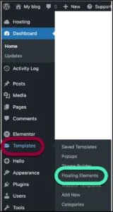
  1. From WP Admin, navigate to Templates>Floating Buttons.
    Click Floating elements Add a Floating Button to your site 147
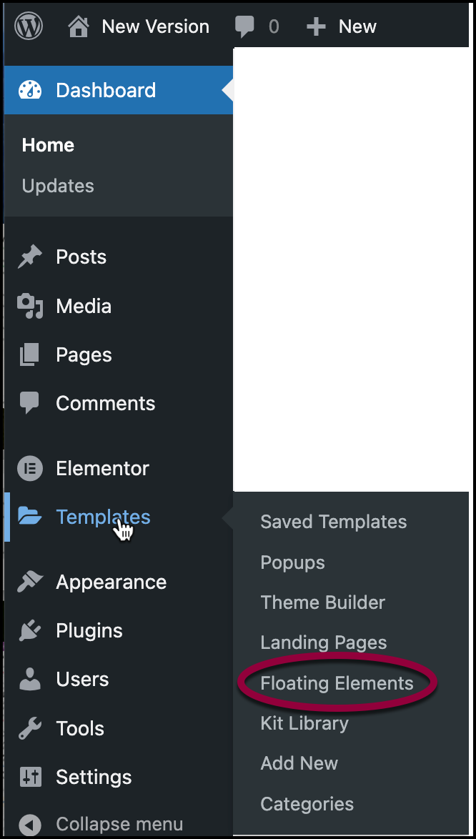
    The create Floating Element pane opens up on the right.
    Note
    After you create your first floating element, you can create more elements by going to WP Admin and clicking Templates>Add New

    Click Add Floating Element Add a Floating Button to your site 149
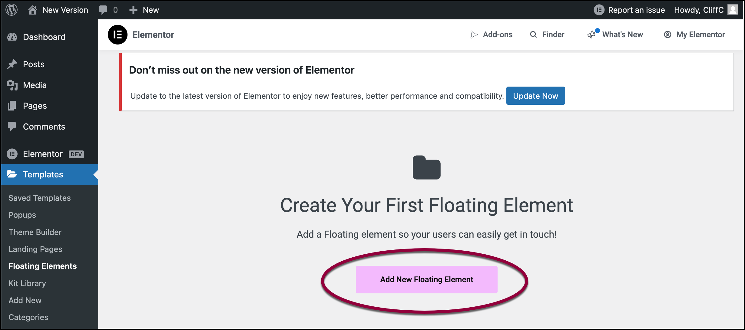
  2. Click Add New Floating Element.3 The template library Add a Floating Button to your site 151
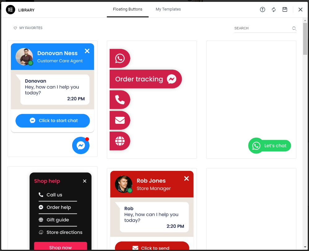
    The Template Library opens to the Floating Buttons section. You must select one of these templates in order to create a Floating Button.
    4 Select a template Add a Floating Button to your site 153
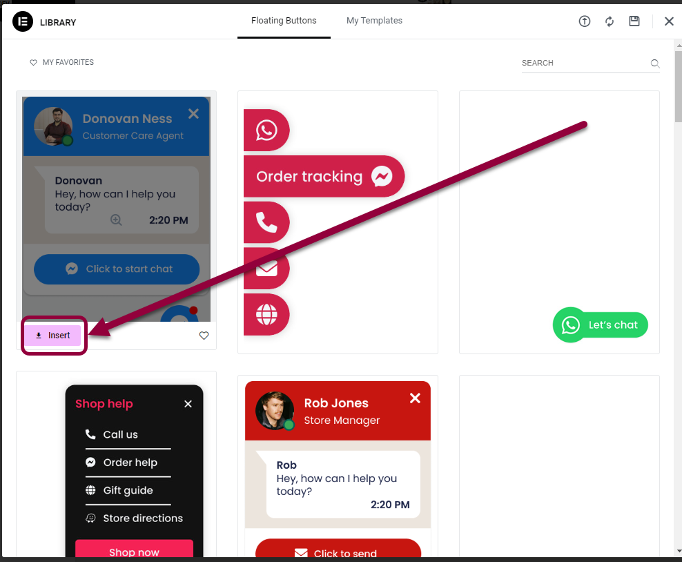
  3. Select a Floating Button template by hovering over it and clicking Insert.
  4. The template appears in the canvas of the Elementor Editor.
    Note
    When visitors view the site, the will only see the messenger icon. When they click the icon. the entire Floating Button will appear.

Editing the Floating Button

The Panel offers a number of options, depending on which template you choose. In this example, we’ll change the name of the agent as well as the shape and position of the Floating Button.

  1. In the panel, In the Username field, enter the username of whoever will be answering the chats.
    5 enter username Add a Floating Button to your site 155
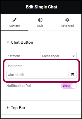
    This way, when visitors send a chat request, it will go the agent’s account.

    For details about finding usernames for social media apps, see How can I create smart links from my widgets?
    6 open the top bar field Add a Floating Button to your site 157
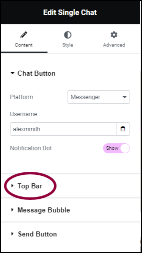
  2. Open the Top Bar field.
    7 Enter alex Smith Add a Floating Button to your site 159
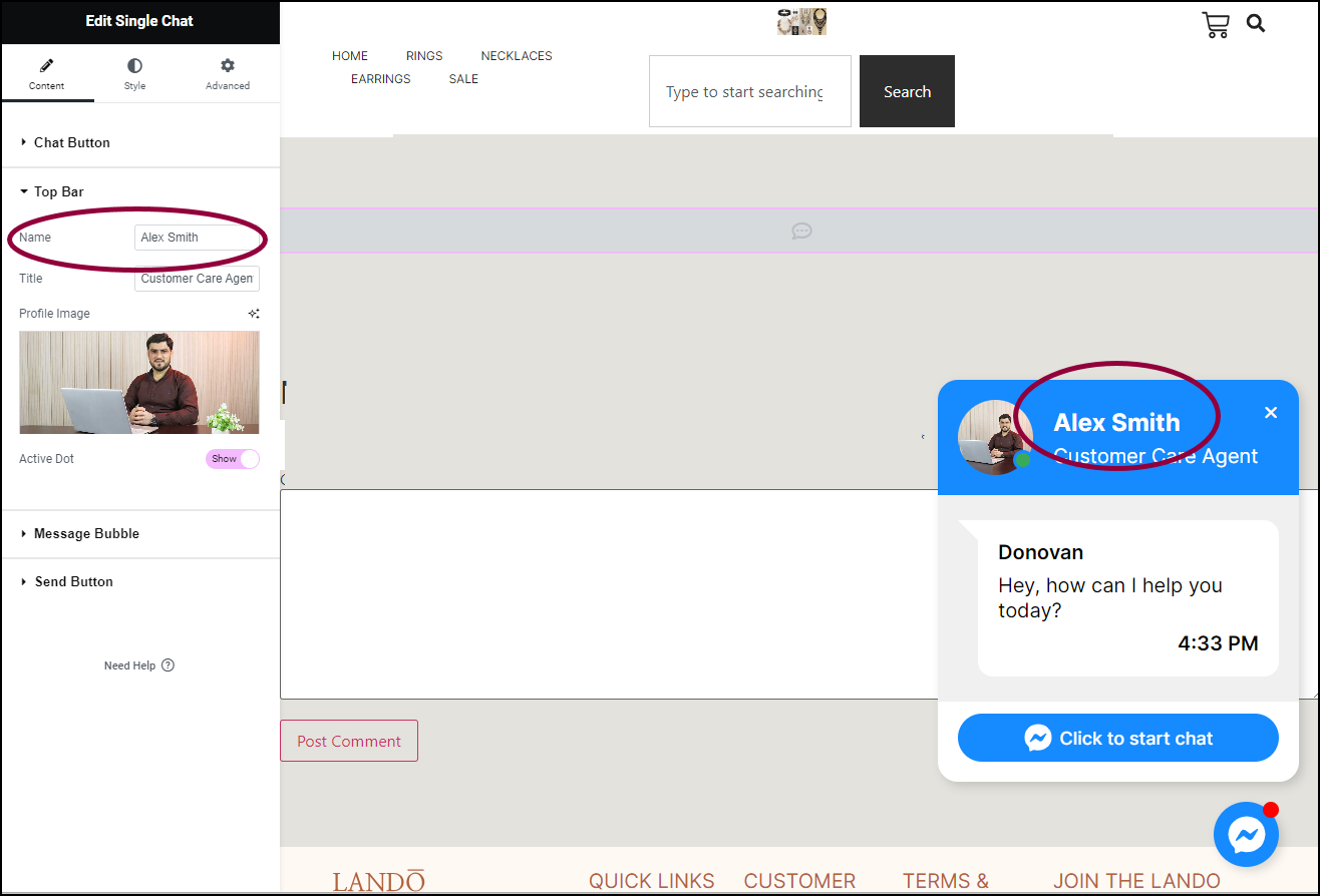
  3. In the Name field, enter Alex Smith.
    9 Open the Message Bubble field Add a Floating Button to your site 161
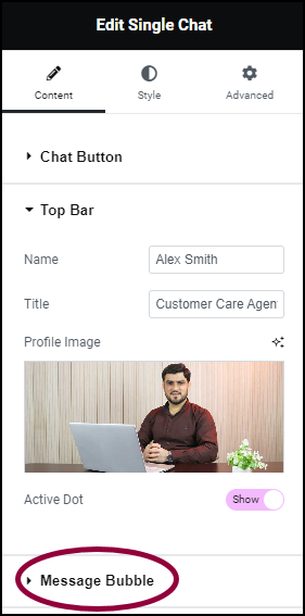
  4. Open the Message Bubble field.
    10a Change Name Add a Floating Button to your site 163
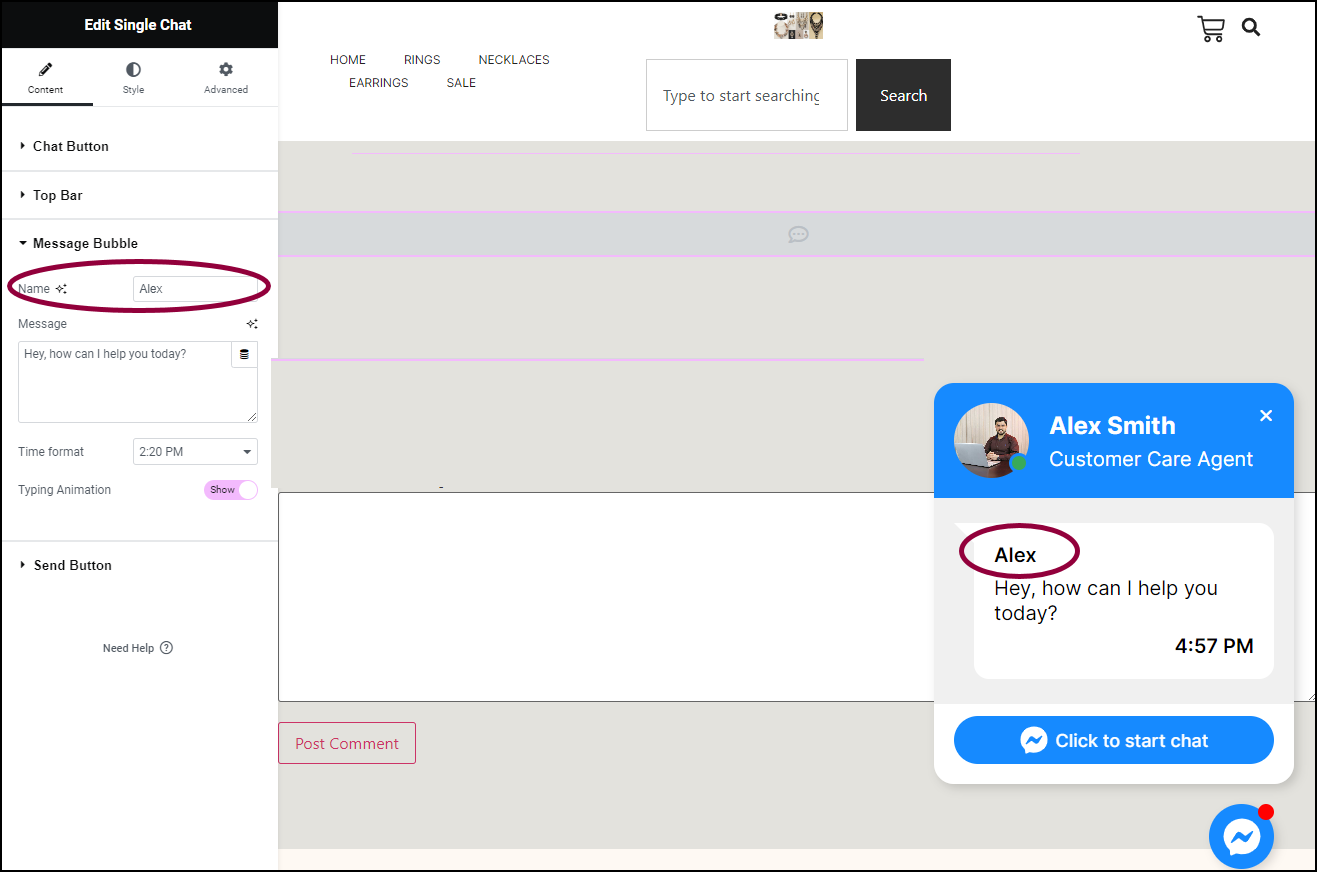
  5. In the Name text box, enter Alex.
    8 Click the Style tab Add a Floating Button to your site 165
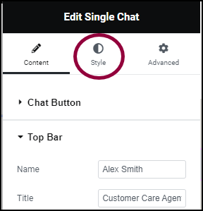
  6. Click the Style tab.
    11 Open chat Box Field Add a Floating Button to your site 167
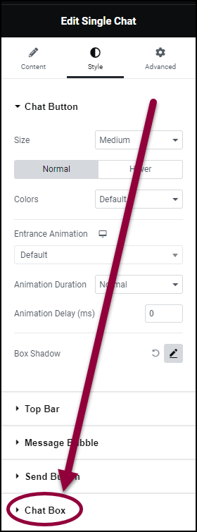
  7. Open the Chat Box field to change the shape of the chat box.
    12 Round the corners Add a Floating Button to your site 169
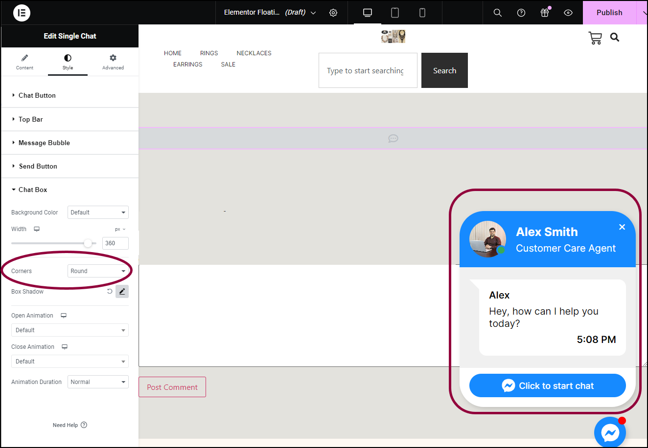
  8. Use the Corners dropdown menu to select Round.
    13 Click the Advance tab Add a Floating Button to your site 171
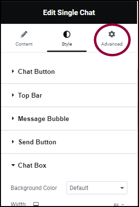
  9. Click the Advanced tab to change placement of the Floating Button.
    14 Change the positioning Add a Floating Button to your site 173
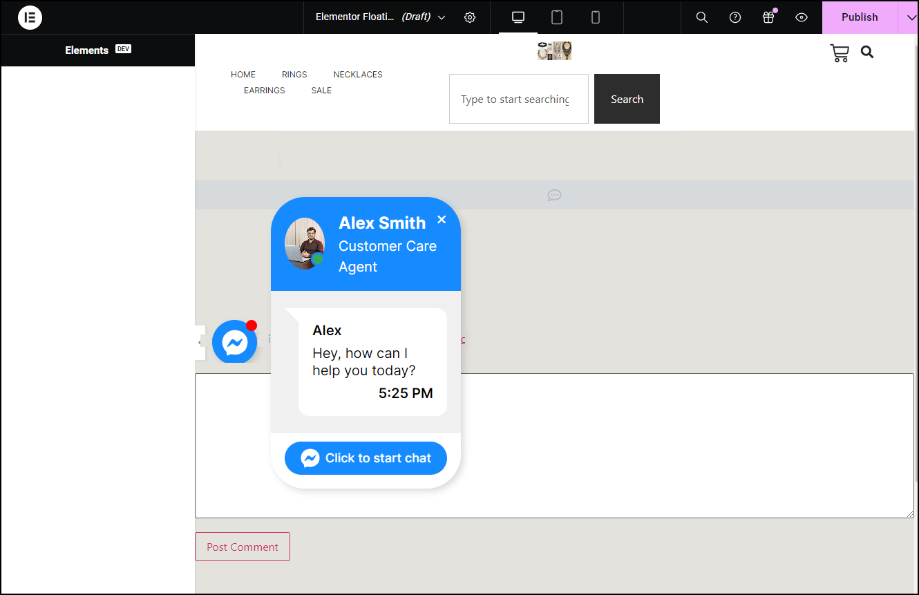
  10. Change the Horizontal Position to Left and the Vertical Position to Center.
    15 Click Piblish Add a Floating Button to your site 175
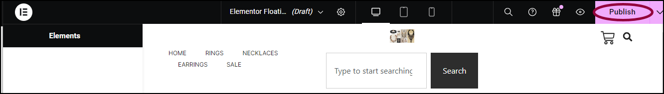
  11. In the upper-right corner, click Publish.
    16 Where do you want button to appear Add a Floating Button to your site 177
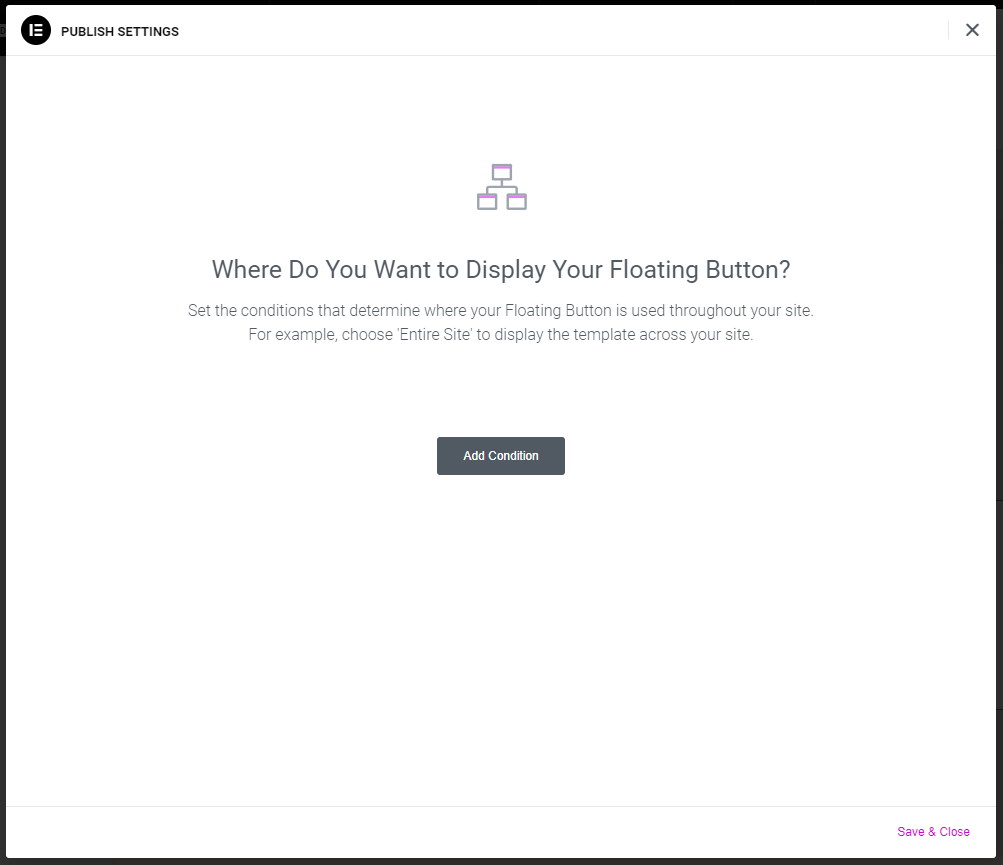
  12. (For Elementor Pro users only) Set conditions for the Floating Button to appear. This way you can control where in your site it appears. For more details, see Set display conditions for global templates.

    In this case, we’ll have the Floating Button appear on all the site’s pages.
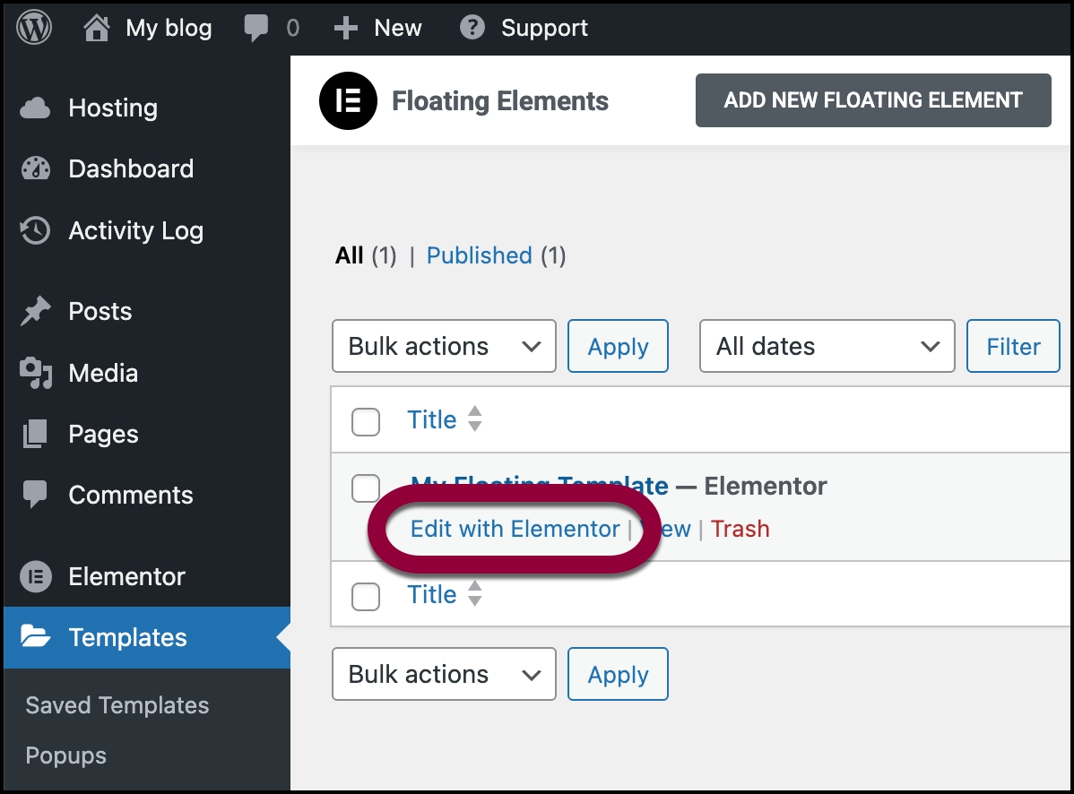
    17 The Page Add a Floating Button to your site 179

Floating Button Options

Below are the most common options you’ll find in a Floating Button template. There are a wide range of Floating Button templates so some may have different options or layout. 

What it does

The chat button is a icon that appears on the webpage. Visitors activate the Floating button by clicking this icon.

Content tab

Platform: Choose the app you want to use:

  • WhatsApp: Use the Number field to add the WhatsApp number you want to use
  • Messenger: Use the Username field to enter the username you want to use.
  • Email: Fill in the following fields:
    • Email: The address where you want the message sent
    • (Optional) Subject: A default subject line
    • (Optional) Message: Default content for the email.</li>
  • SMS: Use the Number field to enter the number where the SMS will be sent.
  • Viber: You need to enter the Number you want Viber to use, Use the dropdown menu to choose whether the Viber communications will be via Contact or Chat. For a website, Chat is probably the better option.
  • Skype: You need to enter the Username you want to use.

Notification dot: Toggle to Yes to have a red dot appear when a message is waiting for the visitor.

Style tab

  • Size: Select a size for the chat button. Choices include: Small, Medium, Large.
  • Normal/Hover: You can create separate settings for how the button will appear by default – the Normal settings- and how it will appear when users mouse over it – the Hover settings.
  • Colors: Chat buttons come in default colors, which are usually associated with the specific brand. For instance, the WhatsApp button comes in green. Use the dropdown menu to select Custom if you want to use a custom color for the button.
  • Entrance Animation: Instead of having the chat button appear on each page, you can select an animated entrance. An animated entrance can help draw attention to the chat button. If you decide to use an Entrance animation, you will also be able to choose:
    • Animation Duration
    • Animation Delay
  • Box Shadow: Give the chat button more depth with a box shadow.

What it does

The top bar contains information about the person the visitor will be communicating with.

Content tab

  • Name: The name of the agent the visitor will be communicating with.
  • Title: The title of the agent the visitor will be communicating with.
  • Profile Image: 
  • Profile Image: An image of the agent the visitor will be communicating with.
  • Active dot: When toggled to Show, will display in indicator when the visitor is communicating with the agent.  

Style tab

Profile image

  • Size: Select a size for the image. Choices include: Small, Medium, Large.

Colors: Use the dropdown menu to select Custom if you would like to change the default colors of the Name and Position appearing in the Top Bar.

Name

Title

What it does

The Message Bubble generally appears in the middle of the Floating button and contains a default message or greeting.  

Content tab

  • Name: Use the name field to enter the name of the agent the visitor will be communicating with. Message bubbles usually use a less formal name than the Top Bar. For instance, if the agent’s name in the Top Bar is Thomas Smith, the name in the Message Bubble may be Tom.
  • Message: The default message will see when they activate a Floating button.
  • Time Format: Message Bubble usually display the current time. Use the dropdown to choose between using the 12 and 24-hour formats. 
  • Typing Animation: Set the toggle to Hide if you do not want an animation to indicate the agent is typing a response. 

Style tab

Colors: Use the dropdown menu to select Custom if you would like to change the default colors of the Name, Message, and Time appearing in the Message Bubble.

Name

Message

What it does

The Send Button is basically a call to action. Clicking this button begins an action such as starting a chat or sending an email.   

Content tab

  • Text: Use this field to enter the text that will appear on the button.

Style tab

Typography: Determine the text size and font of the text on the button. For details, see Typography.

  • Normal/HoverYou can create separate settings for how the button will appear by default – the Normal settings- and how it will appear when users mouse over it – the Hover settings.
  • Colors: The Send Button comes in a default color, which is  usually associated with the specific brand. For instance, the WhatsApp button comes in green. Use the dropdown menu to select Custom if you want to use a custom color for the chat button.

What it does

Chat Box refers to the Floating button once it is open. You can use the Style tab to customize the look and fee of the Chat box.

Style tab

  • Color: The Chat Box Button comes in a default background color, which is  usually associated with the specific brand. For instance, the WhatsApp button comes in green. Use the dropdown menu to select Custom if you want to use a custom color for the background. Keep in mind that different elements of a Floating Button may have their own color which overrides this background color. For details, see Choose a color or Use global fonts and colors.
  • Width: Use the slider to adjust the width of the Chat Box. 
  • Corners: Use the dropdown menu to select a style:
    • Round: Buttons appear with a smooth corner.
    • Rounded: Buttons appear with evenly curved edges.
    • Sharp: Rectangular buttons.
  • Box Shadow: Give your Chat Box depth by adding shadow. For details, see, What is Shadow?
  • Open Animation: 
  • Open Animation: Instead of having the chat box simply appear when the chat button is clicked, you can add an animation effect.  entrance. If you decide to use an Open animation, you will also be able to choose an Animation Duration.

What it does

Layout determines where the Floating button is located. 

Advanced tab

  • Horizontal Position : Click one of the icons to place the Floating Button on the right, left or center of the screen. 
  • Offset: Create a buffer area between the Floating Button and the edge of the screen. For instance, if you position the Floating Button on the right-hand side of the screen and then create a 50 px offset, the button will be located 50 pixels to the left of the screen’s right edge.
  • Vertical: Click one of teh icons to locate the button on the top, bottom or center of the screen
  • Offset: Create a buffer area between the Floating Button and the edge of the screen. For instance, if you position the Floating Button on the bottom of the screen and then create a 50 px offset, the button will be located 50 pixels from the bottom of the screen.

Have more questions? We’re more than happy to assist.

Link is copied to clipboard!
On this page

Is this article helpful?

Share this article