In this example, we’ll show you how to build a header for your websites. We’ll use four different widgets to best demonstrate how to create headers that work across all devices without having to duplicate and hide elements.
In the example, we’ll be using some advanced properties of containers. To learn more about containers, check out How do I learn about flexbox containers for a list of resources about containers.
In this example, we won’t go into detail about the widgets we use but there are links to detailed articles about how to use these widgets.
Create a Header template
Begin by creating a new Header template in the Theme Builder. For details, see Create or edit your Header.
Add content to your header
While there are no rules for what should be found in a header, in this example we’ll add four common elements to the header:
- Site Logo
- Menu
- Search
- Social Icons
Create a container
Containers hold the elements that make up the header. We’ll create one container which will hold the header’s elements.
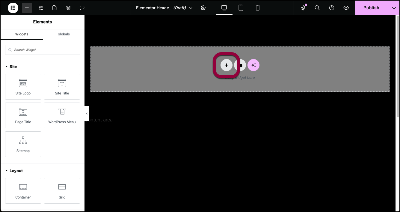
- On the canvas, click the plus icon.
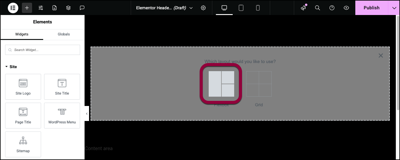
- Select Flexbox.
- Select the one container design set to rows.
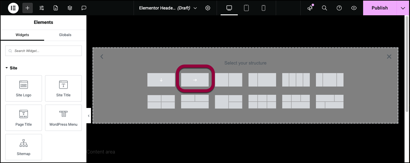
- Containers can be set to display elements either horizontally or vertically.
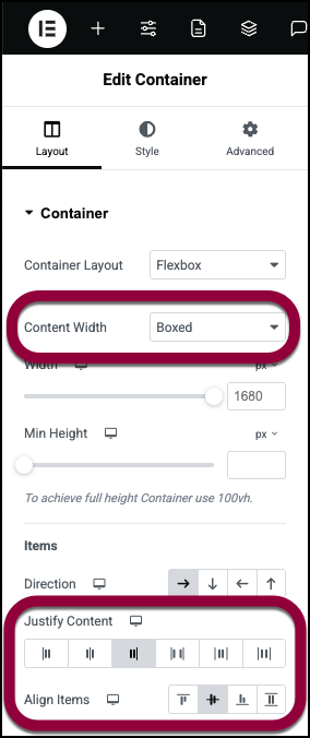
- In the panel, set the following properties for the container:
- Content Width: Boxed
- Justify Content: End
- Align Items: Center
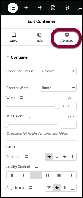
- Click the Advanced tab.
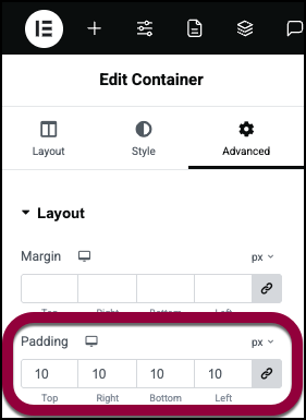
- Add 10 PX padding to all sides of the container.
- Click the plus icon in the top bar to access the elements.
- Drag the Social icons widget to the container. Learn more about the Social icons widget.
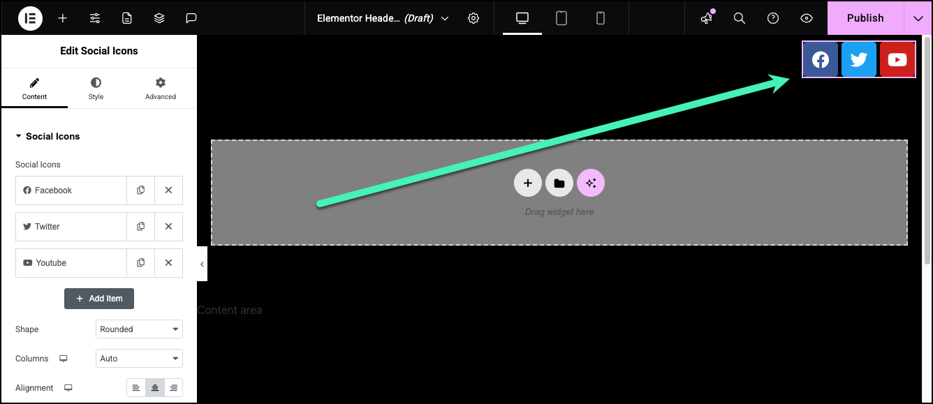
Because we set Justify Content to End, the widget aligns to the right.
The header is a good place to add a search function. While there’s plenty of space in the header to add a search widget for people visiting the site from a PC, it will be too big for mobile devices. Instead, we’ll add a search icon to the header and users clicking the icon will open up a search screen. For details, see Off-Canvas widget. - Click the plus sign in the top bar.
- Drag an icon to the canvas to the left of the social icons and set the icon to a search icon. You can also change the size so it suits your design. For details, see Icon widget.
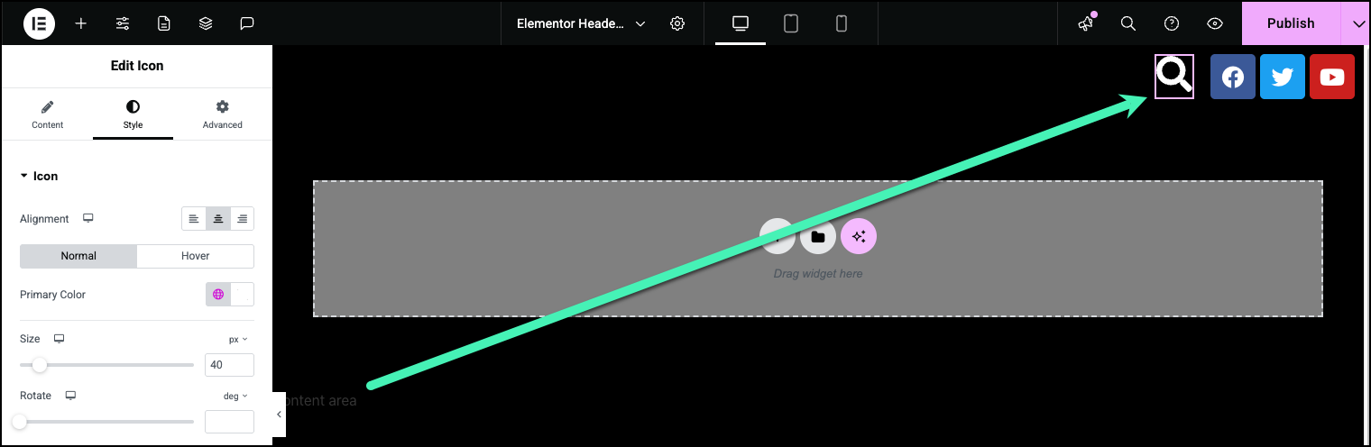
- Set up this icon so that clicking it will open the Off-canvas search widget. Learn more about the Off-canvas and Search widgets.
- Click the plus sign in the top bar.
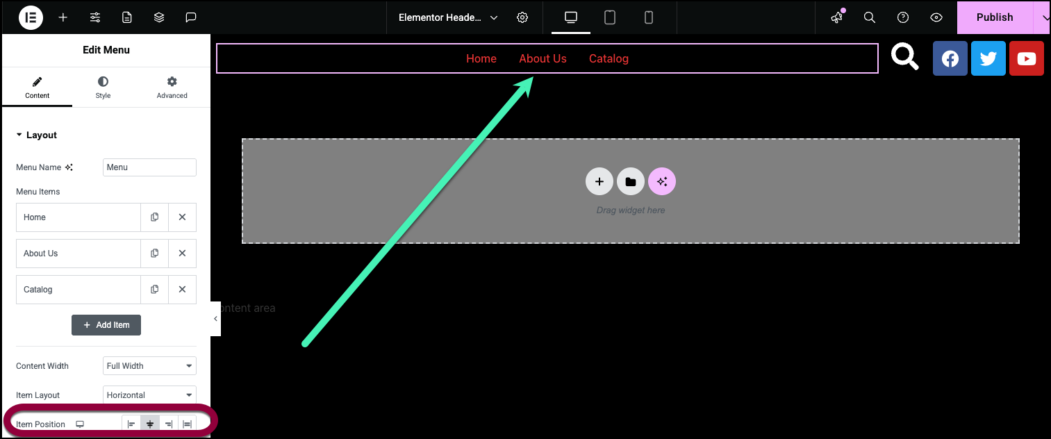
- Drag a Menu widget to the container to the left of the search bar and set the Item Position to center. For details, see Menu widget.
- Click the plus sign in the top bar.
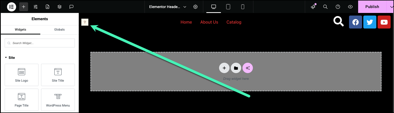
- Add the Site Logo widget to the container to the left of the menu. Adjust the size to suit your design. For details, see Site Logo widget.
Now let’s check to see how the header will look on other screen sizes. - Click the tablet icon.
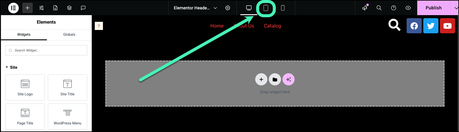
Notice that the menu icon is replaced by a hamburger icon. This icon is controlled by the settings of the menu widget.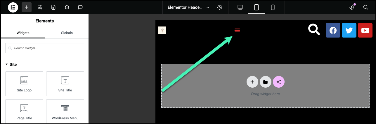
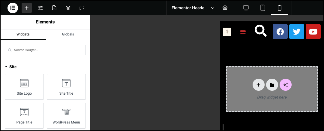
- Click the mobile icon to see how the header will look on mobile devices.