Table of Contents
Skeuomorphism wasn’t some short-lived fad in web design. When it was first introduced in software UIs and, later, in apps and on websites, it served a practical purpose.
Skeuomorphism bridged the divide between physical and digital.
Today, skeuomorphism has been mostly phased out by flat and minimalist design trends. Not only that, but some designers have outright proclaimed it to be dead.
But why is it that skeuomorphism has faced so much scorn?
To understand what happened to skeuomorphism and why it is we shouldn’t be so quick to toss it aside, we’re going to examine what skeuomorphism is, what are its greatest strengths, how it is relevant today, and more. In addition, we’ll discuss the best practices for using skeuomorphism in UX design.
What Is Skeuomorphism?
Skeuomorphism is a design technique in which UI elements look and sometimes act like their real-world counterparts. In some cases, the skeuomorph object is one we no longer use.
The term “skeuomorph” is derived from Greek:
skeuos (σκεῦος) = container or tool
morphḗ (μορφή) = shape
It was invented by Dr. Henry Colley March in 1889. Originally, a skeuomorph referred to a physical object that had ornamental designs or features that were no longer relevant or necessary. Like a clay pot that had shapes carved into it to make it look like a woven basket.
A good example of a skeuomorph that we’re all familiar with today is Burger King’s Impossible Whopper:
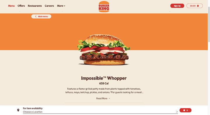
Consumers are all familiar with what a beef patty looks like — especially one of Burger King’s flame-grilled patties. The Impossible patty, despite not containing any meat, looks exactly like a beef patty.
Why do Impossible and/or Burger King do this? Part of the reason why skeuomorphs are useful is that the familiarity in design makes it easy for people to transition from the old way of doing things to the new way.
Skeuomorphs can also be useful for nostalgia reasons. For instance, many camera phones still make a “click” noise when someone snaps a picture, despite there being no need for that sound.
Skeuomorphs have also played a role in digital design over the years. While they’re not as prevalent today, you can still catch glimpses of them from time to time.
For example, the Trash icon found in the Mac dock is a skeuomorph:

Most of the other icons are flat and look more like digital logos than physical objects. This is the biggest distinction between skeuomorphism and other digital design trends and techniques.
The History of Skeuomorphism
When and where exactly have we used skeuomorphism in UX design? Let’s take a look:
The First Wave
In the early days of software development, skeuomorphism played an important role in onboarding users to a new way of working.
Take Microsoft’s suite of applications. It wasn’t necessarily the act of writing, performing calculations or creating presentations digitally that created an obstacle for consumers, professionals and students.
It was the other functions they had to think about that weren’t really relevant before. Like having to “Save” their work, “Cut” text or to “Paint” a format.
While this video depicts what the Microsoft Word toolbar looks like today, we still see remnants of Microsoft’s skeuomorphic icons of the past:

Microsoft didn’t use unrecognizable icons for these main functions because they would’ve only worsened the users’ learning curve. Instead, it took real-world objects that users were familiar with (e.g. the floppy disc for “Save”, scissors for “Cut” and paintbrush for “Format Painter”) and turned them into action buttons.
The Second Wave
The next time skeuomorphism made a big splash was in the late 2000s and early 2010s. This was around the time when the mobile touchscreen rose to prominence and designers had a need for easing users’ transition from old to new.
Apple was largely responsible for the rise of skeuomorphism this time around.
Back in 2010, this is what the Apple home screen looked like:
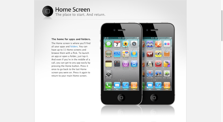
For starters, the app icons looked like clickable buttons sticking out from the background. Secondly, many of the app icon designs were skeuomorphic in nature. For example:
- Camera used a picture of a camera’s lens
- YouTube had a graphic of an old TV
- Notes was a yellow legal notepad
While they weren’t the most exciting or creative of designs, these skeuomorphic icons made the apps and, more importantly, their purposes instantly recognizable to users.
Apple wasn’t the only company using skeuomorphism in UX design. Nor was it only present on smartphone screens. Apps and websites alike adopted skeuomorphism.
Back in 2014, Artifact Coffee’s website used a popular form of skeuomorphism:
The hero image uses a realistic background and interactive physical objects. It’s a really neat skeuomorphic design and was likely going to leave a strong impression on anyone who visited the site.
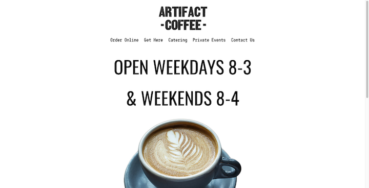
Based on what we know about today’s consumers, though, this kind of skeuomorphism just isn’t efficient in terms of the user experience. That’s why it’s not surprising to see that Artifact Coffee’s home page now looks like this:
Most designers ran away from skeuomorphism in the early to mid-2010s. But there wasn’t just one design trend that took its place.
The Skeuomorphism Backlash Era
Flat design was next on the docket. It was a very extreme response to the realism and nostalgia of skeuomorphism.
While it received a positive response at the time, it didn’t take long before designers began to notice UX-related issues. Namely that, without layers or distinctively clickable UI elements, flat designs weren’t as easy to interact with.
Google’s Material Design got its time in the spotlight next. In part, the design system was built to solve some of flat design’s usability issues. By making digital designs act more like objects (specifically, paper) in the real world, designers could increase user click confidence.
Material had its faults as well. Mainly, the strict design system led to a deluge of Google lookalikes apps and websites. And because everything started to look the same, brands and the experiences associated with them lost what made them so special.
Since then, designers have more or less worked out the kinks with flat and Material and now use a combination of the two called flat design 2.0. It’s flat and colorful, but with UI elements that look clickable.
The Third Wave
While flat UIs have reigned supreme for almost a decade now, skeuomorphism is still kicking around.
Around 2020, we started to hear murmurings of a new design trend called neomorphism. Think of it as Material Design meets skeuomorphism.
We don’t see much of this trend on websites, though it’s gained some traction in mobile app design. You can see a bunch of examples of it on Dribbble:
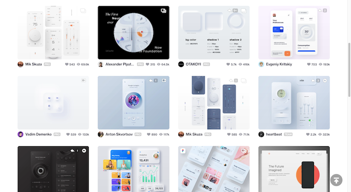
Neomorphism has a very distinct look.
Unlike skeuomorphism which uses everyday objects to design more recognizable icons and interfaces, neomorphism doesn’t do that.
Instead, it uses recognizable interface elements that we’re familiar with from the physical and digital worlds — like thermostat dials, TV remotes, and dashboard toggles. And it includes their likenesses within digital designs as raised or depressed elements, giving the UI a more soft and touchable feel.
If you want to see how this looks on a website, check out the button design and functionality on the Decimal site:
This isn’t just an animation that inverts the colors of the button. It looks as though the button is being depressed when the user engages with it.
Common Criticisms and Drawbacks of Skeuomorphism in UX Design
Before we take a look at more examples, let’s run through some of the reasons why designers have been so eager to move away from skeuomorphism and to run towards minimalist design:
1. Skeuomorphic backgrounds and details tend to leave little room for white space and end up cluttering the UI.
2. Outdated designs and layouts can compromise readability, navigability and usability.
3. Users no longer need everything spelled out for them so skeuomorphic design can come off seeming condescending and unprofessional.
4. Skeuomorphic designs have an expiration date, especially if they represent physical devices that younger generations won’t recognize.
5. It’s very difficult to scale skeuomorphism because of how much custom detail is involved.
6. Graphics and interfaces containing more details tend to be larger in size, which can put pressure on website loading speeds.
Benefits and Uses of Skeuomorphic Design Today
Skeuomorphism isn’t all bad. Here are some reasons why designers still use it today:
1. There are certain skeuomorphic icons that have become part of our digital lexicon — like the shopping cart and trash can — and we’d hurt the UX if we tried to replace them.
2. Retro skeuomorphic UI design can instantly convey a lot about a brand’s personality as well as to set a more lighthearted tone.
3. The idea of the skeuomorph has been around for over 100 years and has adapted to the digital world. There’s no reason why we can’t modernize skeuomorphism to fit our needs today either. Just look at neomorphism.
4. Skeuomorphism can be useful on very niche websites where the learning curve needs to be reduced as much as possible. Like sites built for the elderly or for second-language learners.
5. Skeuomorphism can be a serious competitive advantage if it helps a brand get more attention than its competitors who all use the same sort of flat design.
6. Designers don’t just have to use skeuomorphism to design interfaces. They can use them to design interactions, which can make a website more engaging and memorable.
Examples of Skeuomorphism in UX Design
Neomorphism isn’t the only way in which designers use skeuomorphism today. Let’s take a look at some websites that utilize skeuomorphism in a variety of ways:
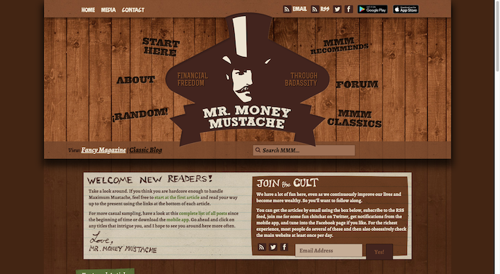
Mr. Money Mustache
Mr. Money Mustache is a financial independence blog with a whole lot of personality. As such, it’s no surprise to see the designer play around with skeuomorphism in the form of a retro wood panel background.
The Urban Village Project
When a person scrolls down a web page, they generally know what to expect. With a skeuomorphism twist like the one on The Urban Village Project site, designers can add a surprising detail to the scrolling experience. The scroll still takes the visitor vertically down the page. However, each block moves the same way a card might.
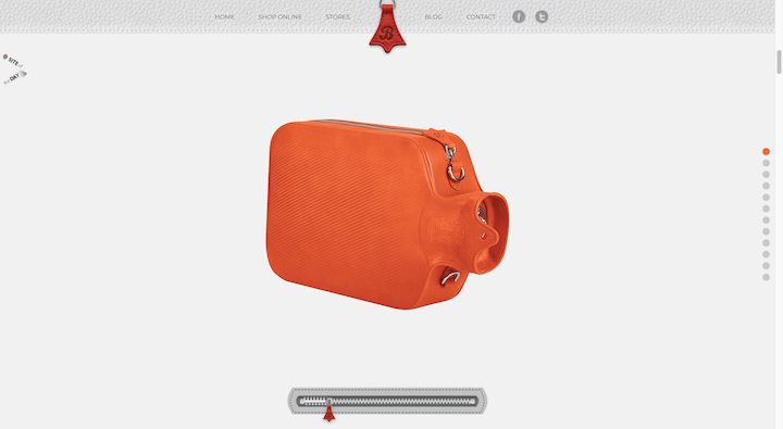
Bagigia
The Bagigia website has a couple of skeuomorphic elements. The first one visitors will notice is the leather background in the navigation. The second is the zipper at the bottom of the page. Whether the visitor uses their mouse to unzip it, or they scroll downwards, it exposes more angles as well as the interior of the bag as they do.
NestBloom
NestBloom is an interesting example of skeuomorphism. This one has less to do with designing interactive elements to look like real-world counterparts and more about designing the elements’ interactions to act like them. We see this happen twice — with the unwrapping and the stirring — and both meant to educate and engage the user.
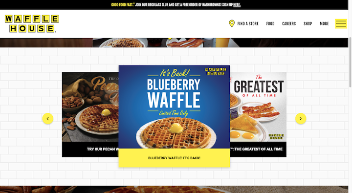
Waffle House
This is the website for the Waffle House chain. While most of the site is covered with photos of its signature breakfast food, this one section contains a noteworthy skeuomorph. While the designer could’ve just used a white background, the white tile creates a recognizable atmosphere for this well-loved establishment.
King Arthur Baking Company / Macy’s
When we think of skeuomorphic icons, it’s easy to think of app icons we used to see on our smartphones. But website icons can be skeuomorphic without going as far with the realism.
Take the example of King Arthur Baking Company. Here is what the website header for this ecommerce site looks like:

The shopping cart icon on the far right of the screen actually looks like a shopping cart. It may be two-dimensional and it might not have every detail filled in, but it’s still recognizable.
Now contrast that with Macy’s shopping cart icon:

Macy’s uses a custom shopping cart icon, which isn’t all that uncommon these days. While Macy’s can get away with using a custom icon, smaller and newer ecommerce companies would benefit more from using the more recognizable skeuomorphic icon instead.
Is Skeuomorphism Still Relevant?
The answer to this question is “Yes, but…”.
There are just as many criticisms of skeuomorphism as there are benefits. However, many of these criticisms were made in the earlier part of the 2010s when flat and minimalist design began to overtake the reign of skeuomorphism in UX design.
Just like any viable design trend, designers can still use skeuomorphism. The key is to modernize it.
We’ve already seen some ways to do this:
- Neomorphic touchable buttons
- Interactive skeuomorphic animations
- Texturized product backgrounds
- Navigation icons
And for websites and brands that are on the quirkier side, the old-school skeuomorphic background could be useful so long as it’s done within reason.
Another thing to keep in mind is that technology changes rapidly. Even though we don’t need much help getting Internet users acquainted with smartphone touchscreens, you never know what big transition is on the horizon. Remembering the value of skeuomorphism as an instructional design element will be an asset when the time comes.
Skeuomorphism: Best Practices for UX Design
If you’re thinking about infusing skeuomorphism into your user experience, here are some best practices to keep in mind:
1. Start With Good Design
Website design principles should form the foundation of anything you design. In order for a website to be effective, you have to understand how your visitors’ eyes and minds are going to interpret and approach what you create.
2. Keep Your Skeuomorphic Design as Simple as Possible
One of the biggest reasons why people hated skeuomorphism is because of how complex it made things. By scaling it back (like the shopping cart example), you can still leverage the benefits of skeuomorphism without suffering the consequences of its drawbacks.
3. Be Stingy With Your Skeuomorphs
You can leave a lasting impression on website visitors with a well-timed and well-designed skeuomorph. So, unless you’re designing a site for a really quirky or retro company, minimize your skeuomorphism for maximum impact.
4. Use Evergreen Skeuomorph Designs
Take the example of the “Save” button in Microsoft Word. A YouGov study found that nearly two-thirds of students don’t know what a floppy disk is. By using an obsolete object as a digital skeuomorph, you’ll put the user experience at risk. Instead, try to stick with evergreen skeuomorphs as well as ones that are universally recognized.
5. Make Your Skeuomorphs Serve a Function
Unless you’re designing a retro website, decorative skeuomorphs will most likely end up being a distraction. Instead, apply skeuomorphism to areas of your site where you want high levels of engagement and action to take place.
Conclusion
It’s easy to write off skeuomorphism as an outdated design technique when we look back at its former lives in software development and mobile app design.
But skeuomorphism wasn’t some pointless trend of the past. It served a practical purpose — to transition users from the physical world to the digital.
Even if we’re fully entrenched in the digital world now, we’ll always have a need for skeuomorphism. It might not be the main way in which we design websites, but it’s still useful when used correctly and strategically.
Looking for fresh content?
By entering your email, you agree to receive Elementor emails, including marketing emails,
and agree to our Terms & Conditions and Privacy Policy.
