Hi, dear Elementors,
What a great list we have this month! Our site collection includes a successful international startup, a leading architectural firm, a dreamy villa on a Greek island, an exceptional law firm, a renowned luxury wood flooring manufacturer, as well as many talented web designers!
Let’s check them out.
10
NBC Polska
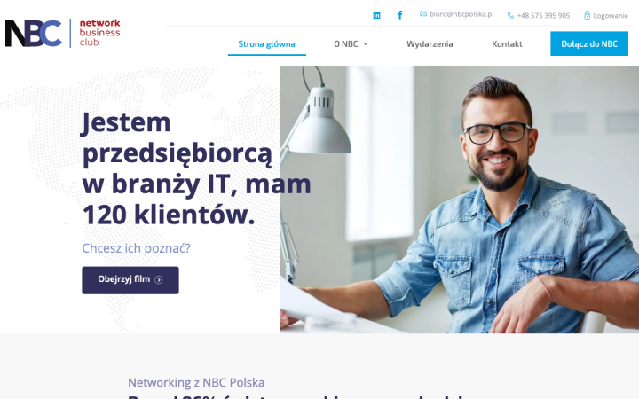
Network Business Club Poland is an organization founded in 2018 by enthusiasts of the evolution of entrepreneurship, in Poland. NBC’s goal is to connect entrepreneurs from all over the country and support the development of their business by sharing knowledge and recommending clients.
NBC’s designer used cold colors as well as sans-serif fonts, typically associated with the corporate world. The use of flat icons also reinforces the high-tech look.
The use of very bright ambiance photos, depicting smiling and successful-looking people, conveys the message that they mean business. The site’s grid is divided into two columns, within which there is another division, based on the content the designer wants to display, creating a stable composition. The dotted world map appearing in the hero section’s background reflects a message of networking around the world.
Design & Development: Damian Urbaniec
Theme: Hello
Plugins: Advanced Custom Fields, Contact Form 7, Elementor Button Extended, GA Google Analytics, LiteSpeed Cache, NBC Events (custom made plugin for /wydarzenia page), Regenerate Thumbnails, Post SMTP, Official Facebook Pixel, Orphans, WebP Express, WP Retina 2x, WPS Hide Login, Disable Comments, Yoast SEO, Password Protected
09
Travel & Transport
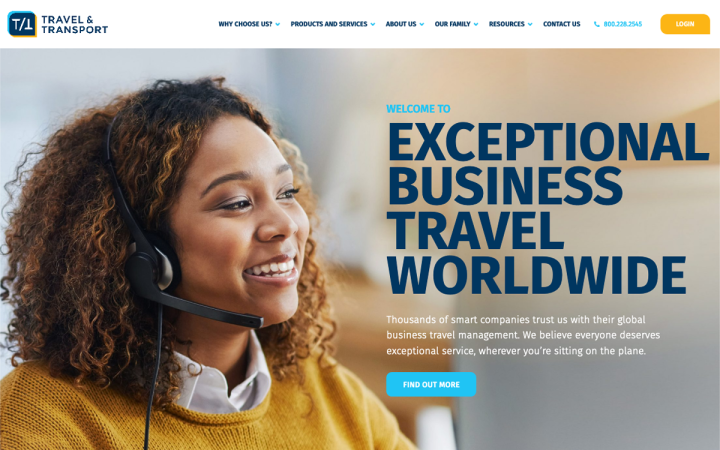
Travel and Transport is the world’s largest, 100% employee-owned, global travel management company. With $35 billion in buying power, their clients rely on them for exceptional service and cutting-edge tech, but more importantly, they trust their people.
Their website brings a modern, fresh outlook to corporate travel. The use of strong blues and yellows, as well as colorful illustrations, gives the site a friendly and warm feel. However, it still manages to maintain a professional and clean space. The images have been carefully chosen to represent the client’s most important asset – people.
The icons, or should we say illustrations, are worthy of attention — custom made especially for the site, and vibrant! Their combination with oblique shape dividers and the precise composition and clear editing create a site that on one hand, transmits professionalism and quality, but on the other hand, retains warmth and amiability.
Design & Development: Something Familiar
Theme: Hello
Plugins: Elementor Supercat, ElementsKit, GeoTargetingWP, Gravity Forms, Gravity Forms Styler, Yoast SEO, Hubspot, Ele Custom Skin, Essential Addons for Elementor, Weglot
08
Domčine Laskonky
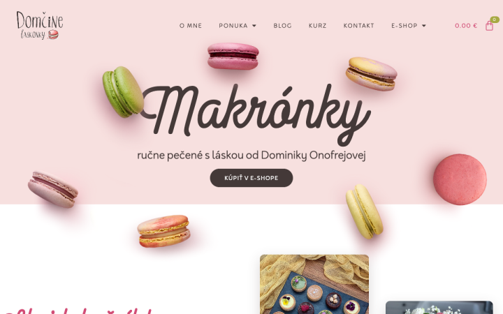
Dominika’s site is simple yet accurately designed. The bright pastel colors come from the world of colorful macaroons and blend together beautifully. The handwritten and sans-serif font is reminiscent of European bakeries and patisseries, implying a high sense of tradition and quality. The images are appetizing but also functional in that their positioning connects between the various sections.
Design & Development: Marek Hrebik
Theme: Hello
Plugins: Advanced Order Export For WooCommerce, Epic News Elements, Facebook for WooCommerce, GDPR Cookie Consent, Jetpack od WordPress, Loco Translate, Mailchimp for WooCommerce, Really Simple SSL, Redirection, SVG Support, WooCommerce, WordPress Importer, WP Fastest Cache, Yoast SEO
07
Kallisto Villa
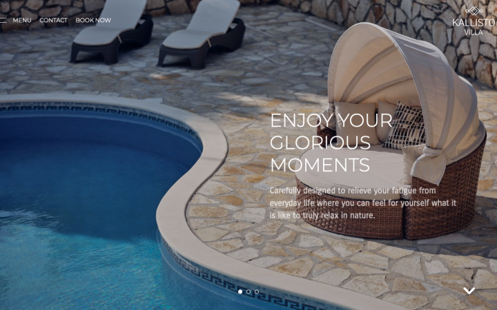
Villa Kallisto is a luxurious holiday villa located on the island of Zakynthos, Greece. Built in 2016, from locally quarried stone, it combines lots of typically local characteristics with modern amenities and appliances.
Kallisto’s site designer chose to use white and cream colors for the layout, providing a stage for the beautiful, colorful images. The slim and modern font conveys luxury and also allows us to concentrate on the images. The cool navigation menu adds interest for the site visitors.
Design & Development: Gigi
Theme: Hoteller
Plugins: Contact Form 7, Elementor Google Map Extended, GDPR Cookie Compliance,
HBook, Hoteller Theme Elements for Elementor, Menu Icons, Polylang, WP Fastest Cache
06
Sharon Segal and the Quest for Employment
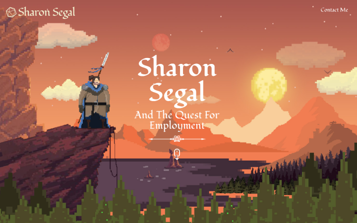
Sharon Segal is a graphic designer, animator and front-end developer from Israel. He created a website as a sort of humorous business card that he can attach to his resume. This is the first WordPress website he has ever built, which also means that this is the first time he has ever used Elementor Pro.
Sharon has indeed designed a highly creative resume site, one of the best we’ve seen. Probably growing up in the ’90s playing Sierra’s famous Quest games, Sharon created a journey through which we get to know him and his skills. Each scene, or stage of the journey, combines the copy with the scene it describes. The font he chose is calligraphic and precisely matches the theme of Sharon’s website. The entire design is a brilliant homage to the pixel art that characterized the classic video games of the 1990s.
Design & Development: Sharon Segal
Theme: OceanWP
05
By George Legal
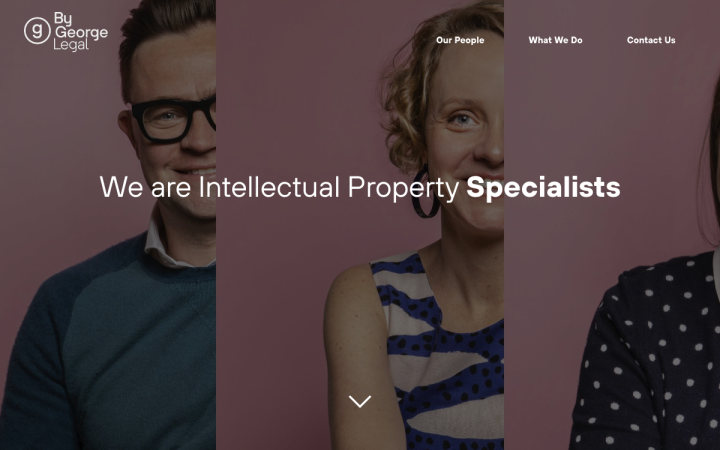
By George is a small independent legal practice from Australia, specializing in intellectual property with a particular passion for creative industries. The business centers on the personality and expertise of the owners George and Joel.
Their creative and digital team has created a new brand identity, focusing on the intersection of the business’s bubbly personality and expertise in intellectual property. The visual language they have formed showcases the industries of their clients including publishing, fashion, and television.
In fact, they speak the language of the audience they are addressing — a trendy, fun, colorful and joyful design that goes against the traditional conventions of designs for law firms. The designer used flat icons that seem to have been created specifically for the site and speak in the same language. The hover effect on the partners’ portrait images adds some extra moxie and creates a lighthearted and welcoming atmosphere. The testimonial section shows quotes on alternating colored backgrounds, which also adds vibrance to the design.
Design & Development: Your Creative
Theme: Astra
Plugins: The Plus Addons for Elementor Page Builder, Yoast SEO, Smush
04
Weldon
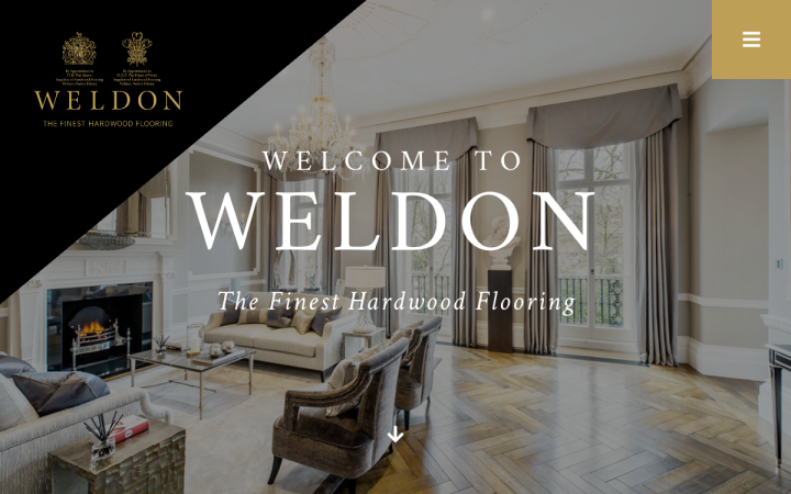
Weldon is a leading and respected British company, crafting fine parquetry, marquetry, antique and boarded floors for elegant private residences, historic public buildings, and Royal Palaces across the British Isles, Europe, and the Middle East.
Their website properly conveys prestige and even nobility, very suitably for its customers — an aristocratic and affluent audience, with a very specific and a taste for high-quality. This can be seen in the dark and gold colors that make the site very dramatic and prestigious or the classic and conservative serif fonts. The superb and professional images were carefully selected, illustrating the process of crafting a wooden floor, from the design stage to execution.
Design & Development: We Are Hype
Theme: Astra
Plugins: Essential Addons for Elementor, Elementor Extras, Powerpack for Elementor, Ultimate Addons for Elementor,
03
Hello Hudson
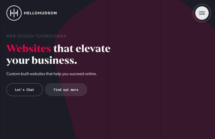
Hello Hudson is a small, creative agency based in Toowoomba, Australia. They exist to craft websites and brands that help elevate businesses, big and small. Big believers in fostering lasting client-relationships, they offer ongoing support for business marketing, communication, and advertising, taking the worry out of working online.
When designing their new website, the guys at Hello Hudson kept a simple, uncluttered design while integrating different elements and motion effects. The spectacular menu with a colorful animation effect simulates opening and closing the menu. The menu’s hamburger icon also has two different animation effects that attract the visitors’ attention, almost “forcing” them to click the button.
The dark color palette incorporates a bright red with the text and illustrations to highlight the messages. The headlines seem to be drawn from the world of comic-books. There is a nice linear design throughout the site, apparent in the mockups for project displays, icons, and the logo. The images have been darkened in keeping with the dramatic look, and help to shift the focus on the projects.
Design & Development: Ryan Hudson
Theme: Page Builder Framework
Plugins: ACF Pro, AnyWhere Elementor Pro, Cookie and Consent Solution for the GDPR & ePrivacy, CSS Hero, Dynamic Content for Elementor, Elementor Extras,
Favicon, Google Analytics for WordPress, Google Reviews Widget, Gravity Forms,
Imagify, Post Types Order, PowerPack Lite for Elementor, Premium Addons for Elementor, Premium Addons Pro, Rank Math SEO, Search & Replace, Simple 301 Redirects, UpdraftPlus – Backup/Restore, URL Shortener, Wordfence Security, WP Rocket
02
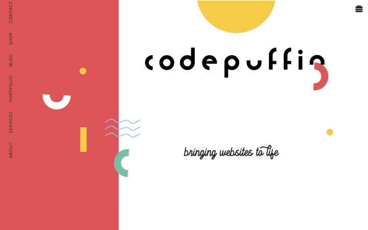
Amy Nortje is a South-African creative WordPress web developer, working with goal-driven brand strategists to bring website designs to life.
Her website is an excellent example of a fun and colorful site; fresh and trendy, designed following the latest fashion. The copy — as well as the decision to have the menu icon look like an actual hamburger! — maintain this amusing attitude with eye-catching messages in a cool, hip language, entertaining and effective.
The color palette is based on primary colors, together with turquoise, producing an air of joy and happiness. The floating slogan perfectly corresponds with the geometric shapes around it. The images are asymmetrical and playful and full of charm.
Design & Development: The Bash Design Studio
Theme: Hello
Plugins: All In One SEO Pack, All-in-One WP Migration, All-in-One WP Migration Unlimited Extension, Imagify, Smash Balloon Instagram Feed, W3 Total Cache
01
OOW Berlin
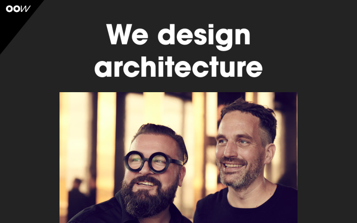
OOW is a Berlin-based architecture firm with a highly focused approach to design, attitude & vision. It’s a “people” business.
The logo is based on the frame design of a pair of glasses sported by one of the partners. As such, it welcomes visitors and brings a smile to their faces. The studio photos of the two partners were carefully executed to showcase the great work relationship that clearly thrives between them. The logo and the glasses themselves are well-connected with the modern rounded sans-serif font chosen by the designer.
The homepage includes a number of selected projects, with different motion effects, creating an interesting transition between the projects.
The office employees also get their focus, which gives us a sense of family and attention to every single employee. The navigation menu is simple and efficient. Accessing it is done by clicking a small triangle in the top left corner — a hint to the triangular or square ruler, so common in the world of architecture.
Unsurprisingly, this site shows no lack of thought and creativity in the project pages. Investing effort in the design of a homepage, then hardly any effort in the rest of the site’s pages, is a mistake that many designers unfortunately make.
Design: Now Standard — Creative Solutions by Jeff Britto & Nina Ritter
Development: Julia Marquardt
Theme: Hello
Plugins: Compress JPEG & PNG images, Duplicate Post, GDPR Cookie Consent Banner, Redirection, Site Kit by Google, Style Kits for Elementor, ranslatePress – Automatic User Language, Detection Add-on, TranslatePress – Multilingual, Wordfence Security, WP Bodymovin
Think your Elementor-based website or landing page should be featured in our next Top 10 Websites column? Give it a shot!
