Our fourth showcase of the year highlights the best of modern web design trends, unique combinations of age-old techniques, and new takes on classic elements worth taking note of. This month’s websites include technology organizations, an industrial construction company, a real estate firm, branding and design studios, an educational venture, an established business consultancy, and a Mediterranean island’s best-kept secret.
See the best use of Lottie animations, carefully study scroll and hover effects, be inspired by clever color combinations, take note of new ways to display key information, pay attention to subtle design tweaks, and learn to play with the power of customization using global styling, plus much more.
Come see April’s awesome array of websites!
10
Lumenvox
by Solid Digital
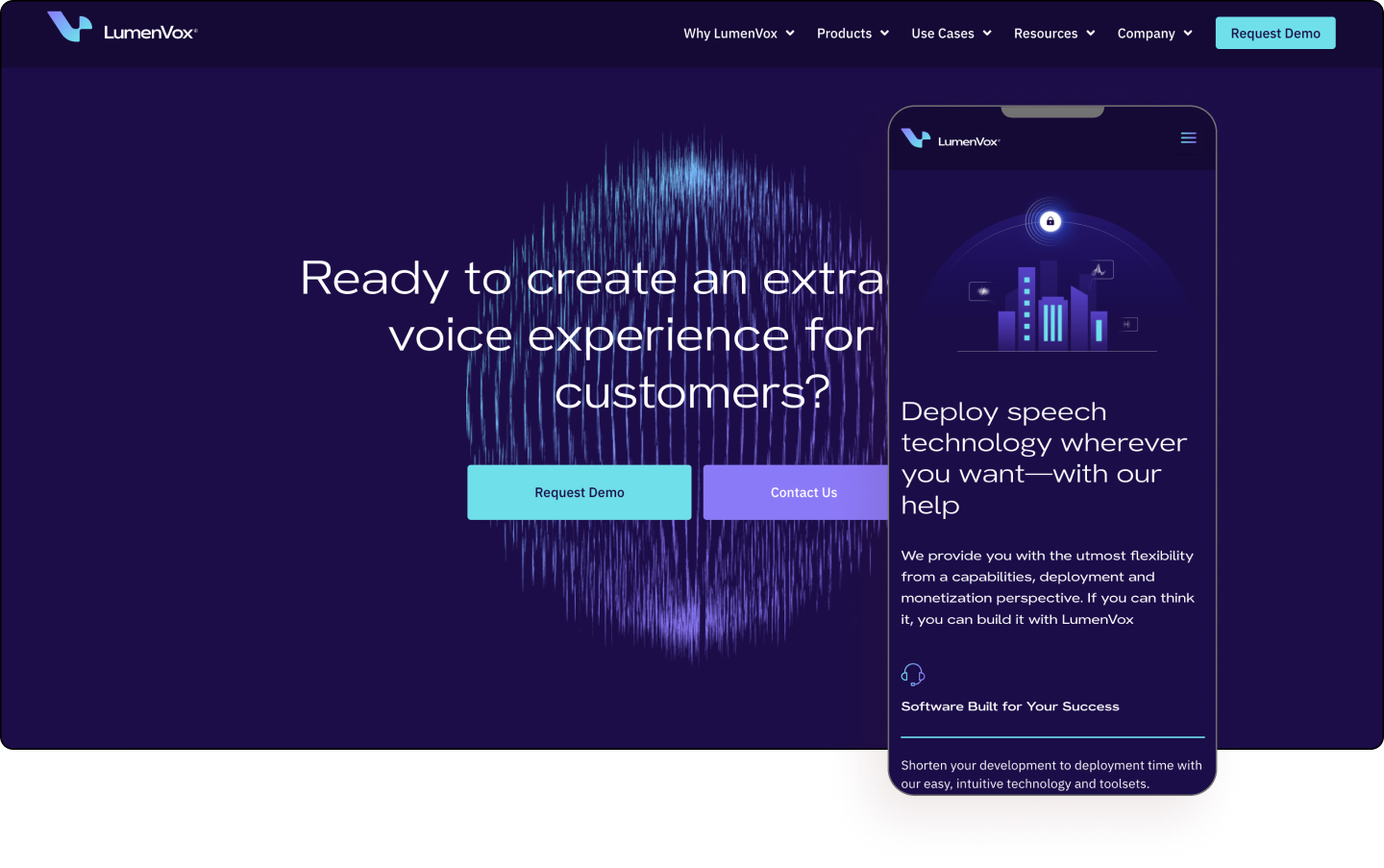
LumenVox transforms customer engagement with AI-driven speech recognition and voice authentication technology. Its flexible, affordable technology enables its users to effortlessly build secure self-service and customer-agent interactions. While its full suite of speech and voice authentication technology, helps its users establish strong customer relations with speed and safety.
The combination of blue diamond and dark indigo colors creates a glowing environment evoking a futuristic vibe. The gradient color style similarly causes a neon effect used throughout the website including its illustrations, and vibrant hero. The is a clear and unified brand in terms of language, colors, and images.
The use of Lottie animations creates a lively atmosphere on a number of product pages. Likewise, the use of lines that resemble a circuit board is used to convey a high technology ambiance. The sans serif font adds to the overall futuristic look of the website as does the use of white space.
LumenVox is a luminescent ray of web design that glows and dazzles.
Design: Curtis Renkiewicz and Barbara Morrigan – Solid Digital
Development: Dan Wright and Libertad Madrigal
Theme: Hello
Plugins: Elementor, Elementor Pro, ElementsKit Lite, JetElements, JetEngine, JetMenu, JetSmartFilters, JetBlocks, JetPopup, JetTabs
09
Off-Site Systems
by LBD Studio
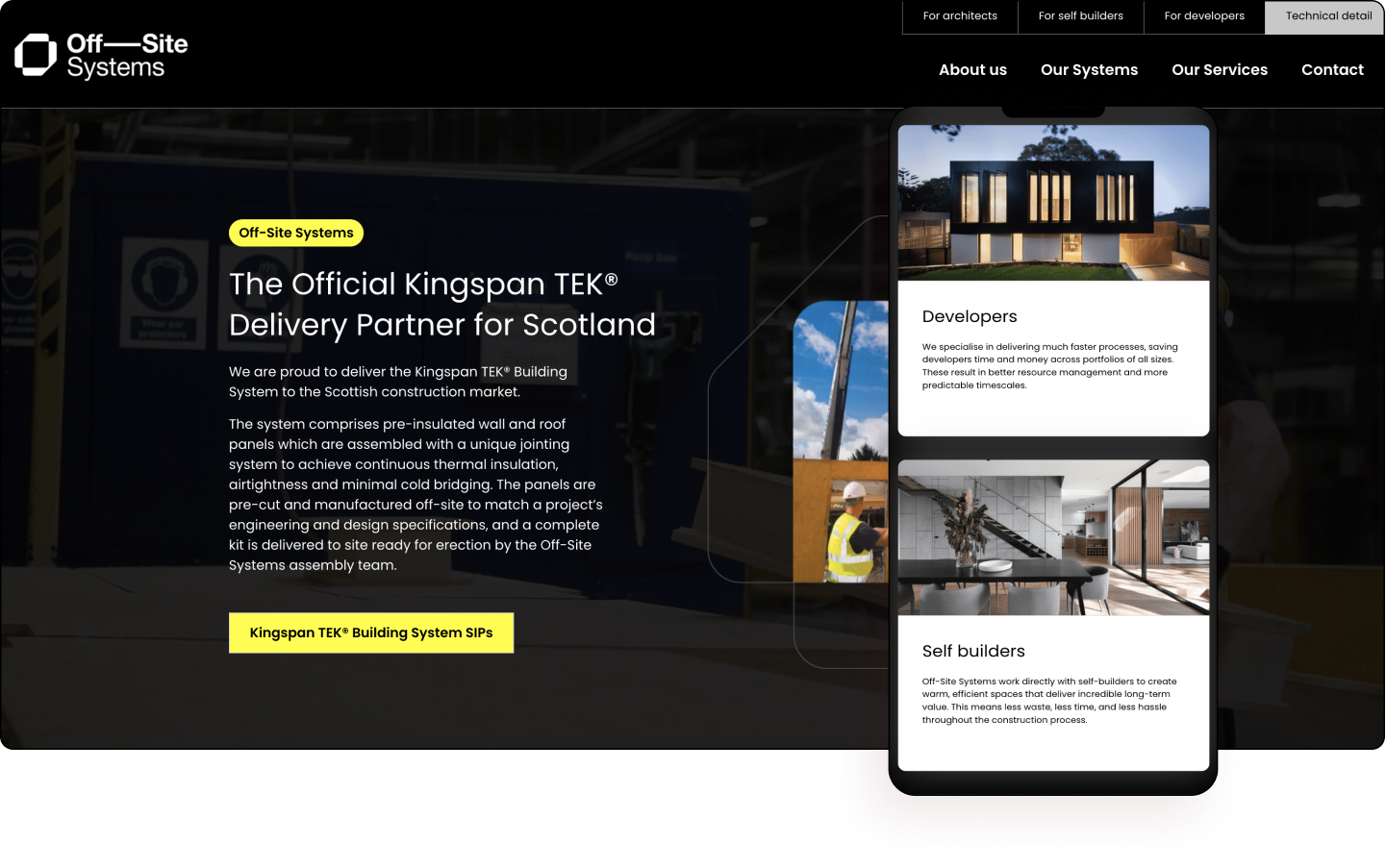
Off-Site Systems offers innovative alternatives to traditional construction techniques. With years of combined experience in the construction, technology, design, and fire protection industries, it directly addresses the growing need for energy-efficient construction systems. All of its systems are designed to dramatically minimize waste, time, and cost while improving standards and making its clients’ lives easier.
One of the most impressive features of the website is its incredible performance speed which only helps to highlight the cutting-edge offerings of the organization. The website’s colors, pages, and copy only continue to highlight this messaging. Cutting through the static layout are subtle motion backgrounds viewable on all the hero videos.
The use of black and yellow often signifies danger, however, here it’s used to mix high-end technology with sparks of creativity. So much so, the use of yellow draws viewer attention to titles and calls-to-actions effectively, as is the clear menu speaking to different target audiences, and subtle scrolling animations.
Upon closer inspection it is clear that the logo is used in various image masks, expertly framing hero images. Equally, there’s a clever use of modern keyword-style tags which summarize the technical specs. Also noticeable are hotspots that showcase product features as well as clever scrolling effects to highlight product features. The key benefits are nicely displayed as “tabs” akin to social media and keyword tags which work to quickly summarize the product’s strongest points.
Off-Site Systems is slightly off-center which makes its target audience do a double-take.
Design & Development: Liam Bonar – LBD Studio
Theme: Hello
Plugins: Elementor Pro, Imagify, WP Rocket, Autoptimize
08
Xania Real Estate
by sofresh
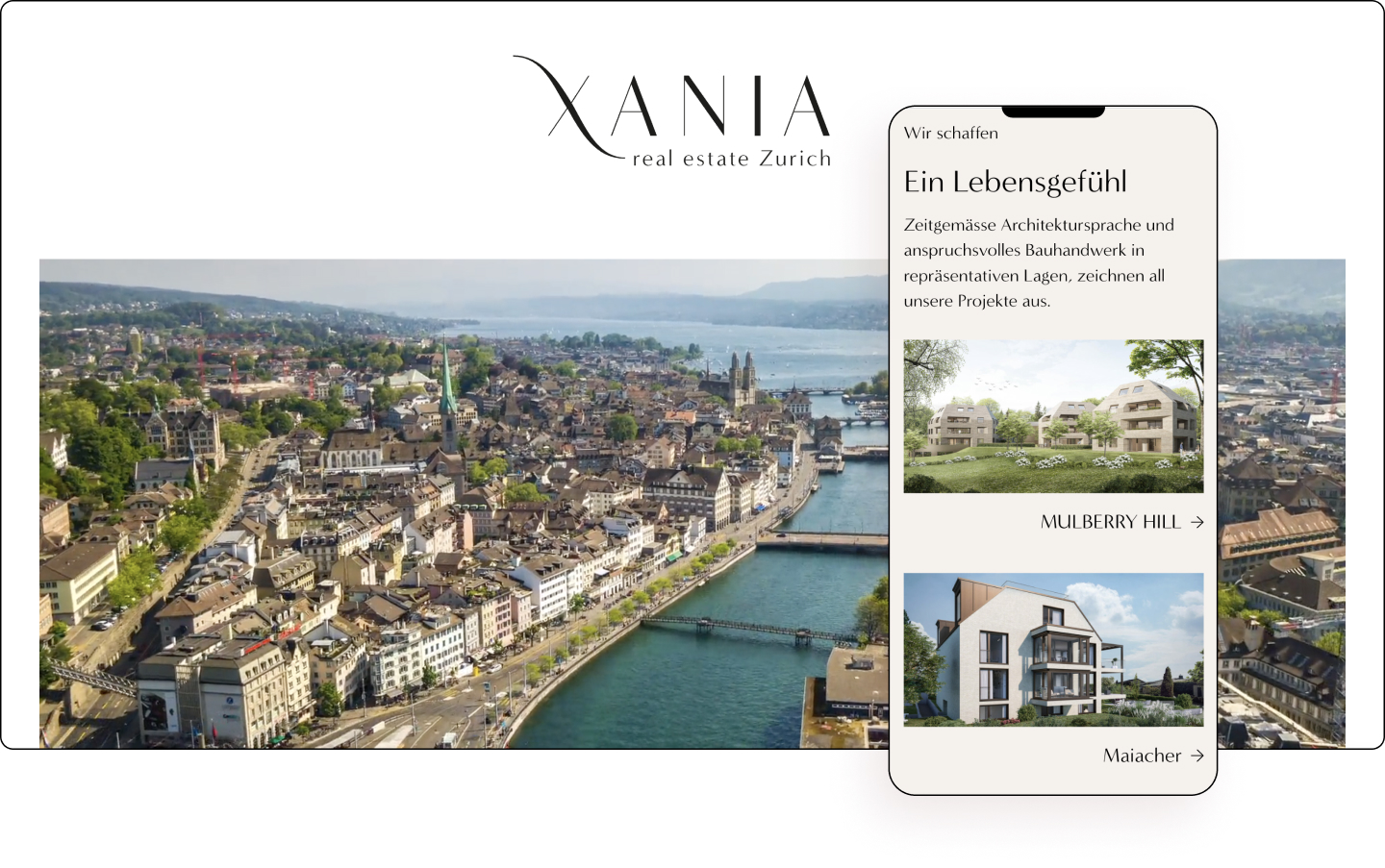
All of XANIA’s projects are characterized by contemporary architectural language and sophisticated construction work in prestigious locations. Their modern and luxurious housing projects promise an extra-class living experience. This creates not only high-quality residential property in Zurich but first and foremost a sense of life.
A modern, minimalistic, somewhat maverick take on real estate is what this website is all about. Using scrollytelling to expert effect, the organization employs up-to-date and contemporary elements to present its breathtaking properties. The copy is short, snappy, and clearly speaks to its homeowner audience.
The logo is used creatively throughout the website, sometimes acting as an arrow, at other times appearing as a compass. There are also full-width panoramic images of each of the locations showcasing each of the properties’ surroundings.
The use of the full-width video in the hero is a fantastic way to draw the viewer in, particularly using a bird’s eye view angle which paints a picture of grandeur. With large typography, sans serif fonts, and white space, the website is a fine example of utilizing modern web design to appeal to a modern audience.
XANIA Real Estate is as picturesque as the Swiss landscape it sits proudly on.
Design: Adriana Ortner – sofresh digital
Development: Robert Kurzmann
Theme: Hello
Plugins: Elementor Pro, Complianz Cookie Consent, MouseWheel Smooth Scroll, Rank Math SEO Pro, United Elements for Elementor, Woody Code Snippets, WP Rocket
07
Eatyjet
by Avocado
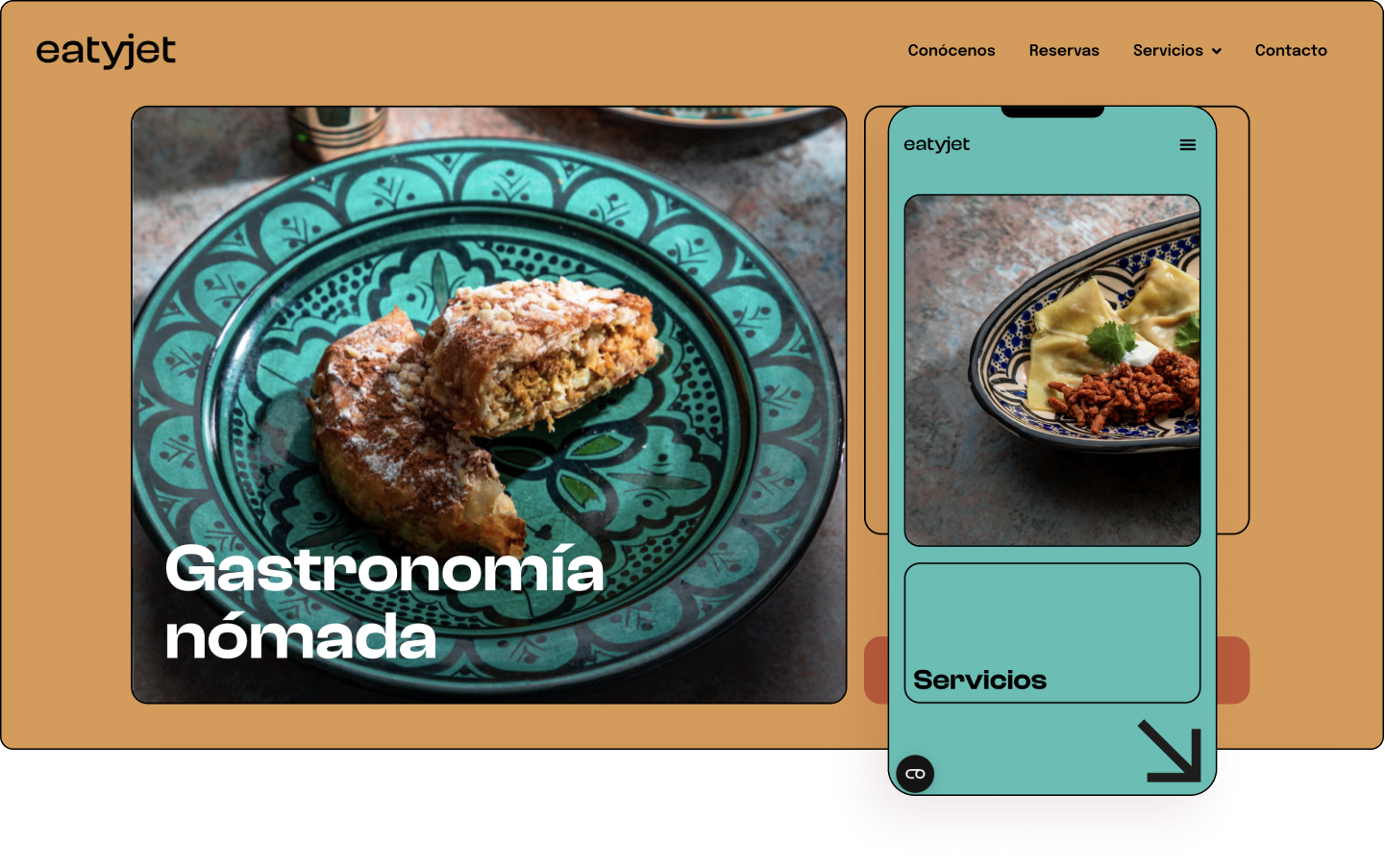
Eatyjet was born out of a series of catastrophic misfortunes: A pandemic, curfews, hotel closures, and a long desire to catch the first plane to Greenland and hike through the fjords. Thus began the idea to start creating trips through a box. The project arose with the clear idea of living the culture of every corner of the world through its food — tastes, smells, sounds, sensations, and memories.
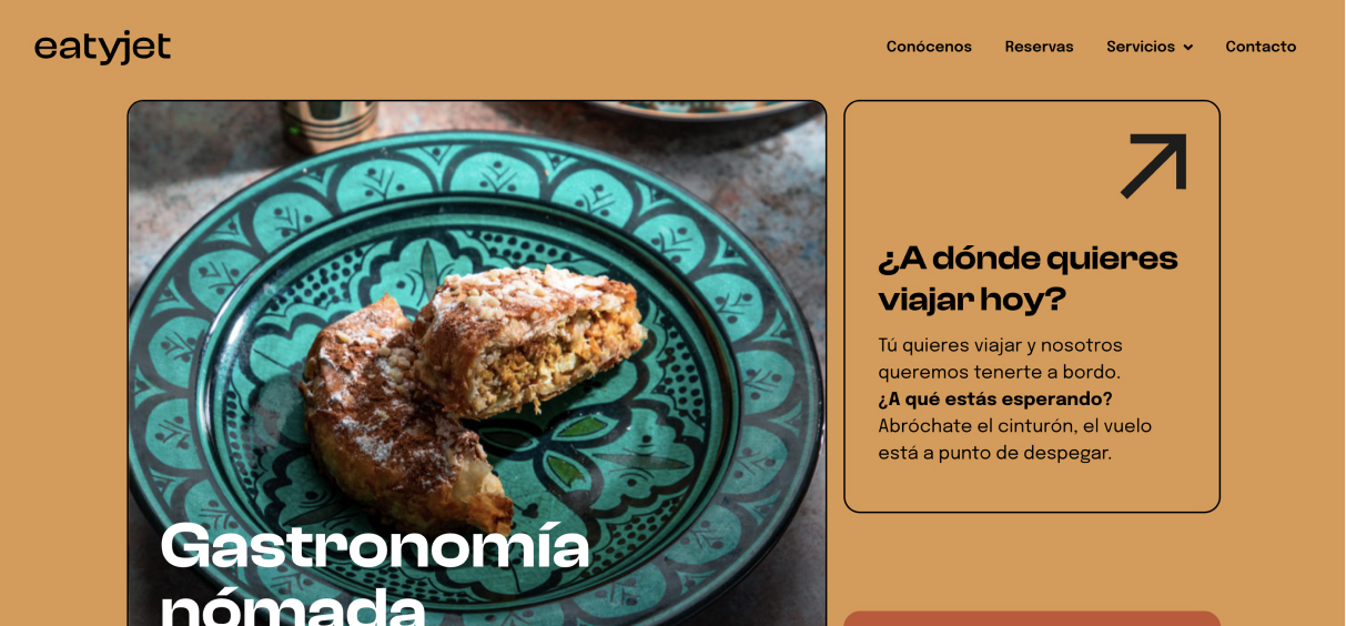
Employing a variety of modern trends such as flat design, bright colors, and big typography, the website targets a young tech-savvy audience. With blank backgrounds that give room to breathe, arrows that make navigation easier, and transparent text, Eatyjet evokes a contemporary look and feel throughout its pages.
A nice touch is the subtle changes in the background colors — the homepage employs bright faded orange color, the bookings page uses a burning sand color, the about us page utilizes a chestnut red color, and the bookings page is painted in a macaw blue-green color, while finally the contact page is canvassed in a dusky blue color.
The vertical and somewhat random image dimensions are framed as mobile phone images, perhaps hinting at the “Instagrammable” nature of its delicacies. The use of hover effects and sticky menus meanwhile makes for easier navigation as does its Instagram page which follows the same brand language, making for a cross-platform digital experience.
Eatyjet is a delicious canopy of flavors that combines for a mouthwatering user experience.
Design & Development: Avocado
Theme: Hello
Plugins: Advanced Custom Fields, Cookiebot, Elementor, Elementor Pro, Sticky Header Effects for Elementor, Yoast SEO, WP-Optimize, iThemes Security
06
MSZ Lab
by Matteo Pranzini
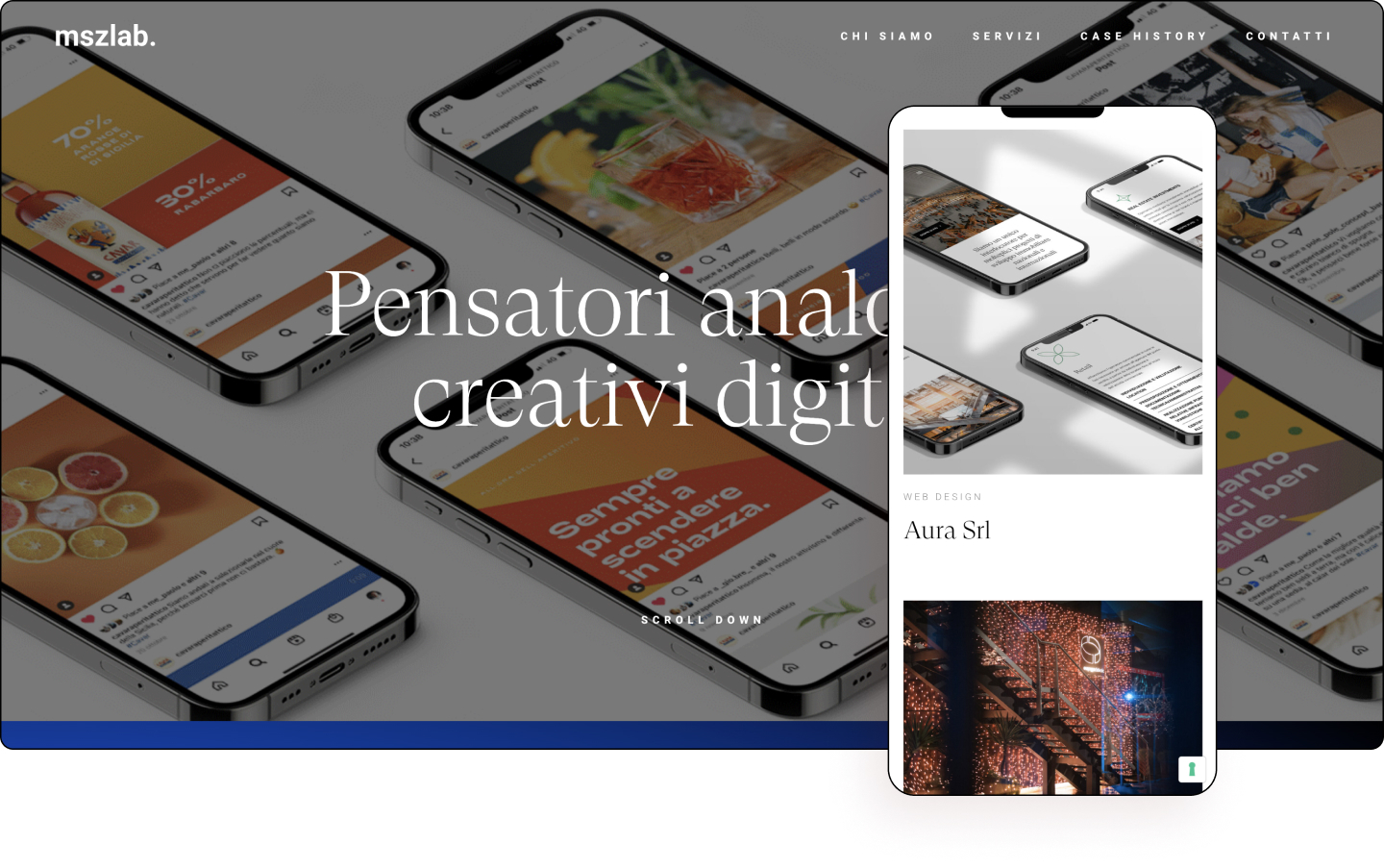
MSZ Lab is a branding agency composed of professionals who share a passion, curiosity, knowledge, and focus for customer service. The team originally met and learned and shared their experiences in event organization, marketing, copywriting, design, project management, and web development. They believe that if security is our strength, their strength is the group. Building a digital future that has real and lasting human connections at its center is their driving force.
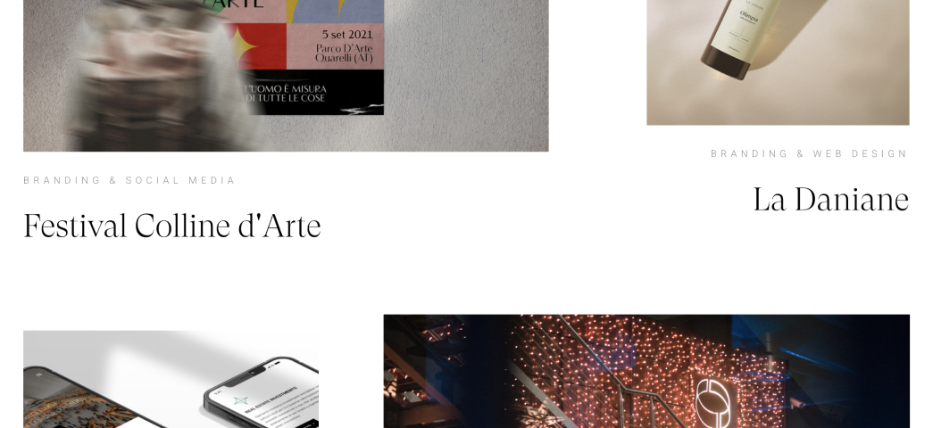
“Pleasant” is the word that comes to mind when navigating Mszlab’s exquisite website. A gorgeous expression of witty creativity with millennial undertones. The about us section for example employs emoji and a short snappy timeline that presents the company’s history in a digestible format.
An elegant serif font is used to display its message, while a contemporary full-width hero combined with a slideshow of images gives a taste of the company’s services. Colorful mages are gorgeously laid out on a white canvas which never feels overwhelming.
None of the pages feels too long, with information always within reach. The overall ambiance of the website feels light and smooth which helps create a somewhat transcendental feeling.
Mszlab is a masterstroke of branding that delicately positions itself as the benchmark of web design balance.
Design & Development: Matteo Pranzini
Theme: Hello
Plugins: Elementor, Elementor Pro, UpdraftPlus – Backup/Ripristino, Premium Addons for Elementor, Facebook for WordPress, Cookie and Consent Solution for the GDPR & ePrivacy
05
Grupo Criativo
by Gabriel Dutra
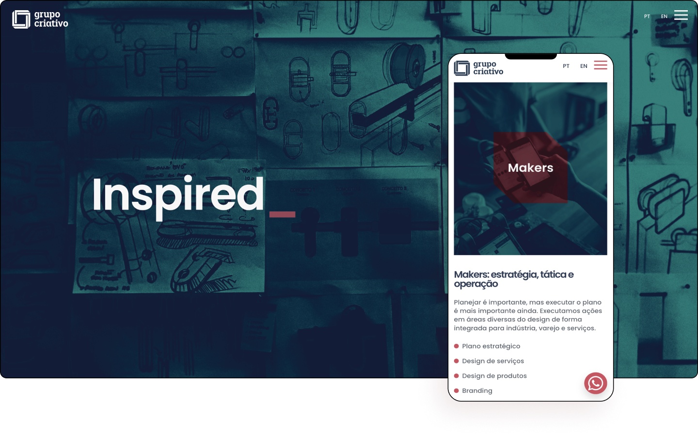
Grupo Criativo is a design and branding agency that believes there is no design without a complete view of the value cycle of the product. They view designers as the catalysts for changes, both for stakeholders and shareholders and any changes must encompass people, processes, and consistent deliverables.
This is a very positive website that uses corner frames as a motif throughout its pages. The case study inner pages are highly detailed and informative and loaded with imagery. Each page demonstrates the diversity of the projects the agency is involved in. Furthermore, the website is multilingual, appealing to international clientele.
The homepage utilizes a filtered green overlay, and Lottie animations are showcased by a red dot that morphs into various shapes. In fact, the color red is used to maximum effect as CTAs that are displayed right throughout the website.
The full-width website design is a nice contemporary touch as is the animated headline on internal pages, and the punchy copy, while the moving text on the services page is an engaging way to quickly reiterate the company’s services quickly.
Grupo Creativo is a website that subtly displays its finest points by optimizing minimalism to tell its detailed story.
Design & Development: Gabriel Dutra
Theme: Hello
Plugins: Black Widgets, Honeypot for Contact Form 7, Modernaweb Plugin, WP ULike, MouseWheel SmElementor PRO, Custom post type UI, Premium Addons, Qi Addons, Wordfence Security, WebP Express, Polylang, Yoast SEO
04
Escuela21
by Banuka Studio
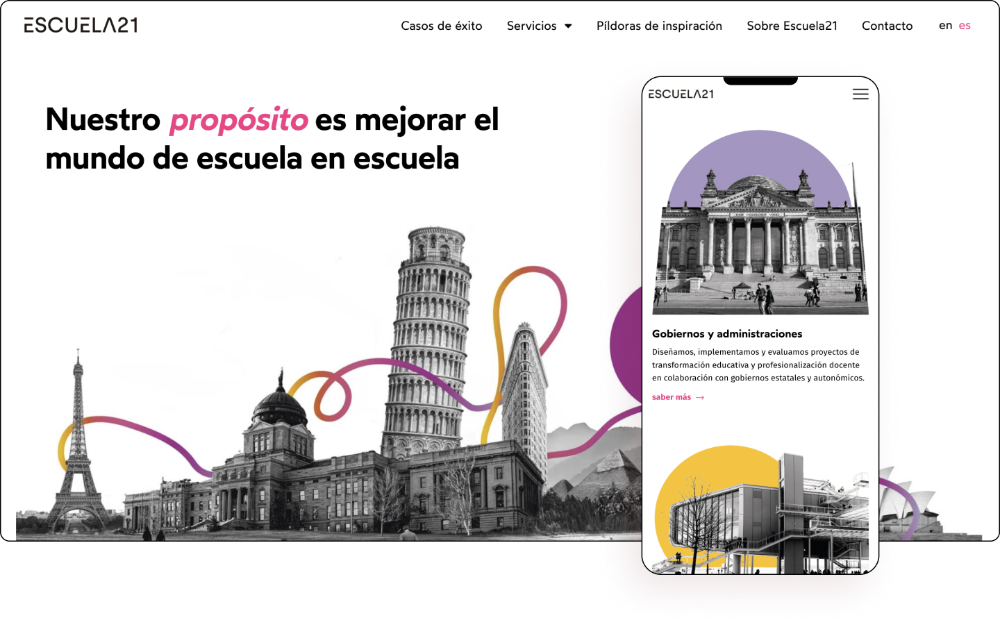
Escuela21 works together with organizations that can impart an inclusive, innovative, and quality education as a driving force for social progress and well-being. Through their comprehensive support and transformation program, they offer school and speech center services and support needed for its potential educational project to reach its full potential.
The website follows a clear typography hierarchy and custom styles for both colors and forms. Employing a minimalist design, and generous whitespace without overwhelming cluttering the page with too many texts or elements, Escuela 21 targets a knowledgeable audience.
The use of famous landmarks and monuments from around the world with a zine design ties them all together, which feels like a global link that brings the world together. In fact, the website is populated with positive images with each organizational page under services having its own dedicated color theme.
The use of famous clientele displayed as trust badges is a nice touch, as are the detailed case studies directly below it. The modern sans serif font and large whitespace is contemporary and stays true to their 21st-century message.
Escuela21 powers its way forward with bursts of color and clever uses of modern elements that help share its inspiring mission.
Design & Development: David Fernández Graña – Banuka Studio
Theme: Hello
Plugins: Clear Cache for Me, Crocoblock, Polylang, Rank Math SEO, WP-Sweep, PublishPress Capabilities, GDPR Cookie Consent, Elementor Pro
03
Wolves Art
by Fanny Péneau
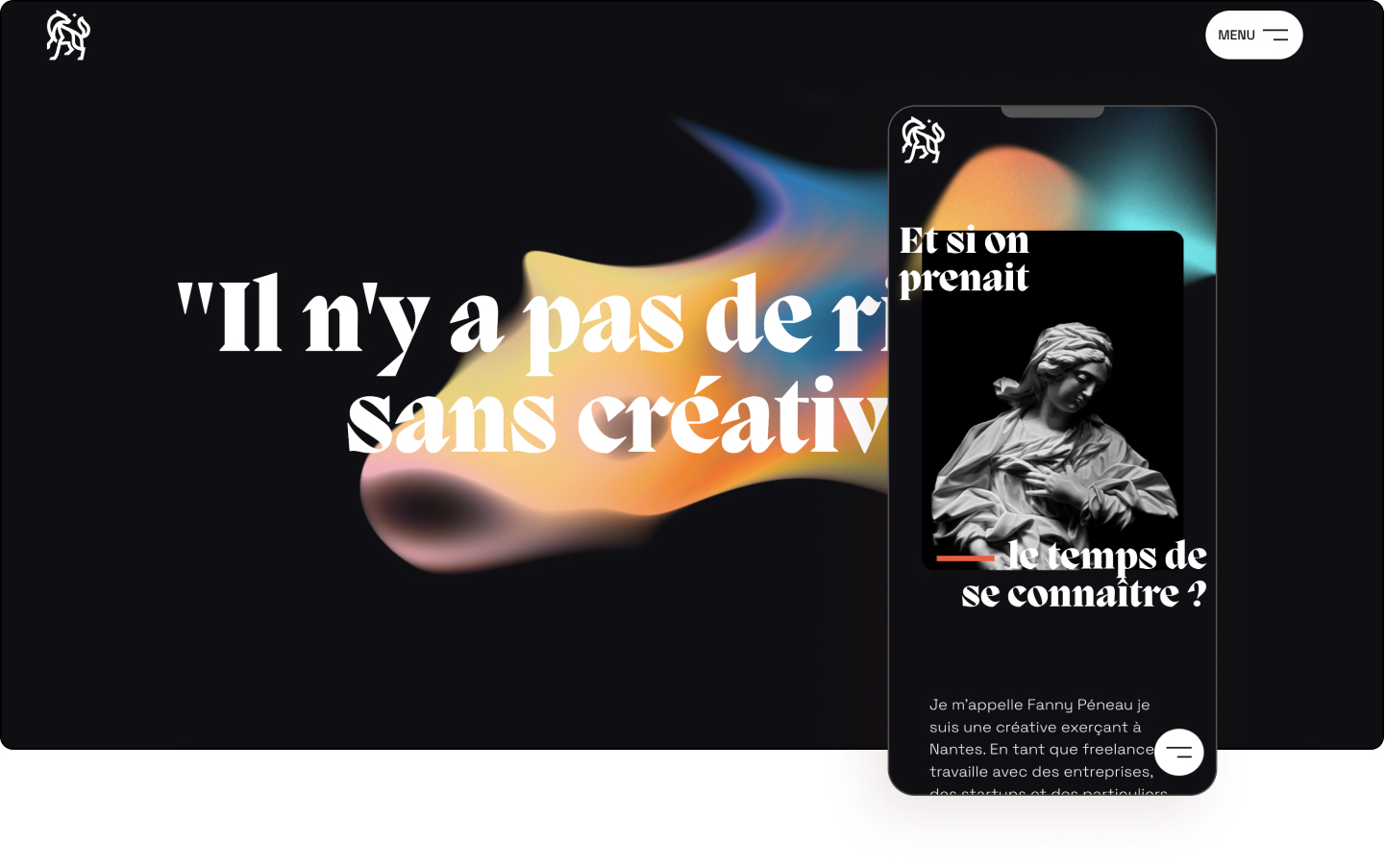
Wolves Art showcases the impressive portfolio of Fanny Péneau, a creative designer and art director in Nantes, who works with businesses, startups, and individuals. Péneau covers various areas ranging from the creation of a graphic chart to the design of web interfaces through illustration. Her goal is to translate her clients’ universe into engaging images. She is driven to create endlessly using her imagination and audacity.
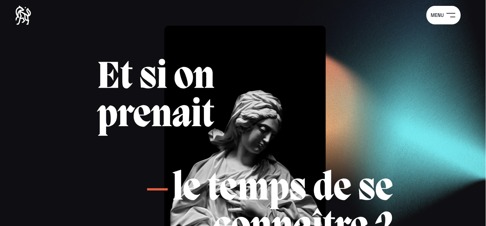
One of the most striking elements of this website is its unique typography which feels both functionally modern and classically elegant at the same time. The menu too feels different with the entire color scheme inverting when hovering over the contact menu.
The black background evokes a prestigious, high-end look and feel that also helps bring the colors to life. There is a series of hover effects visible such as a special custom cursor over images.
Also visible is scrolling and zoom effects, along with typography which is clearly inspired by the logo itself. In fact, the logo itself reflects detailed calligraphy. There are also a series of hover effects employed throughout the website which keep it interactive.
Wolves Art is loaded full of character and terrific elements which puts it into a lone pack all on its own.
Design: Fanny Péneau
Development: Fanny Péneau, Ronan Hello
Theme: Hello
Plugins: Yoast, ACF, Ele custom skin, Wp super cache, Site kit, Secupress
02
Visit Guía de Isora
by Travel Productions
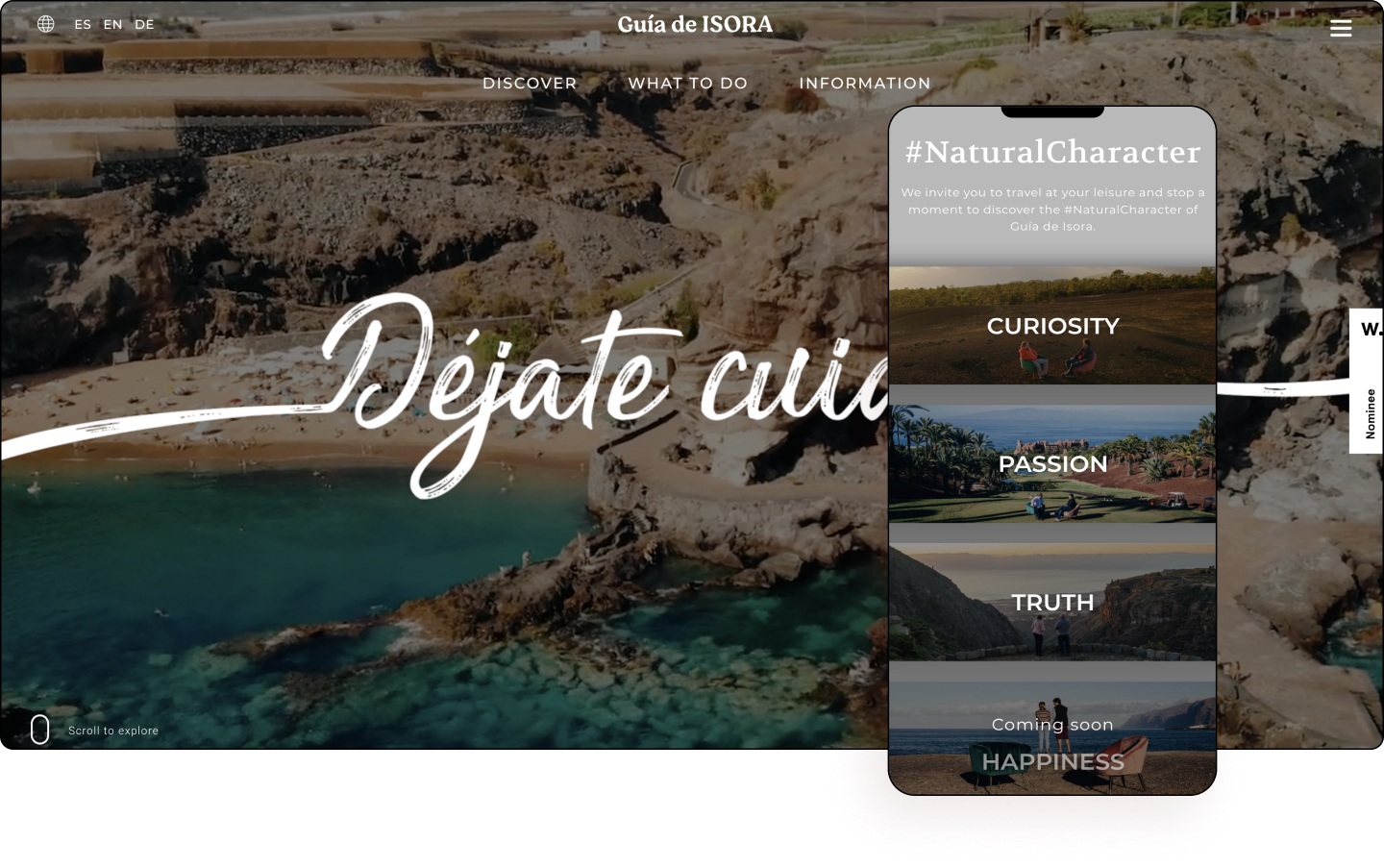
Guía de Isora offers countless experiences for you to enjoy. The municipality of Guía de Isora is located southwest of the island of Tenerife. It is one of the five biggest municipalities in Tenerife and is composed of 17 towns and villages that are spread out from the coast to the high midlands. There are options to suit all tastes, so you can choose according to your preference to make your visit unforgettable.
A sunny welcome is what visitors receive on the website and the island for which the website was built. Built for tourists, the full-width video offers panoramic views of activities that can be achieved on the Mediterranean Spanish island. The clever handwritten slogan is a nice touch as it creates a personal connection, making for an inviting feeling.
The next section offers a topographical birds-eye view of the island through the clouds along with a CTA offering more information about the destination. The Lottie hamburger too invites the viewer almost like a call. The footer in contrast acts like the sea taking with it the sea’s color.
There are numerous animations and interactive features used throughout the website. The discover page employs modern keyword-style tags which is a unique way to display key information, perhaps inspired by social media or SEO tags. This is an effective way to quickly present the destination’s highlights.
Guía de Isora is a bright beam of sunlight that beautifully captures this warm, inviting island that has opened its captivating doors to the world.
Design: Jose Toste – Travel Productions
Development: Ania Kawachi
Theme: Hello
Plugins: JetElements, Polylang, The Events Calendar Pro, WordFence, WP Rocket, Yoast SEO Premium, Simple Custom CSS, and JS
01
Resilience Development Company
by The Collective
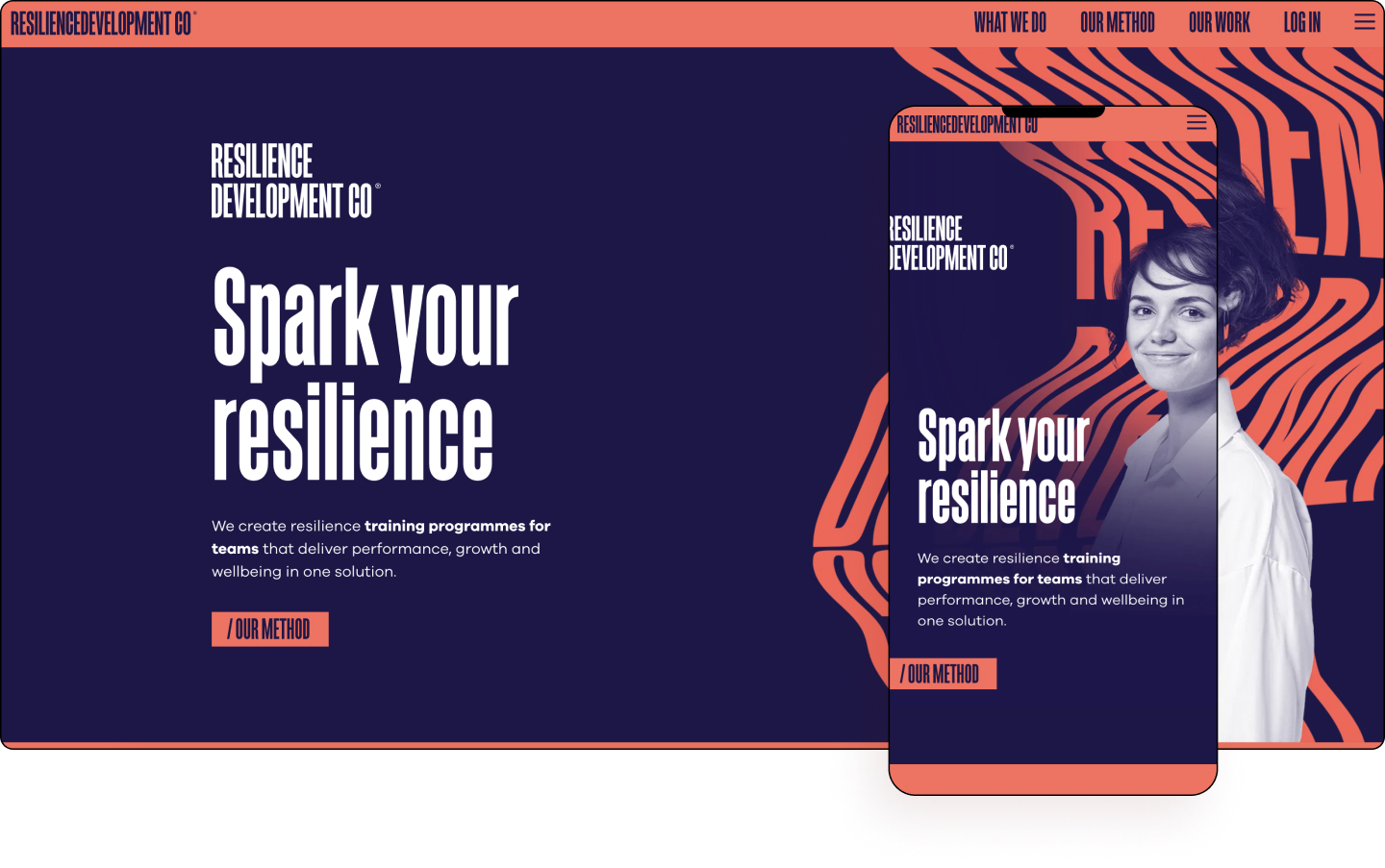
Resilience Development Company is a purpose-driven, independently owned training, coaching, and consultancy on a mission to transform lives and workplaces. Their coaching and training programs transform the way people live, work and feel with science-backed skills and immersive training experiences that unleash potential. They provide an award-winning solution to the big problems of stress, loss of purpose, and productivity that change and growth brings.
It might require a few takes, but the website only really uses two colors — dark indigo and bittersweet orange — in various combinations, interspersed with the odd white text. The choice of images is intelligent as are the filters used to seamlessly integrate with its color scheme.
Matching the website’s modern vibe, the typography is big, bold, and effective. The copy tells a cohesive story with a unified language as does the website’s textual hierarchy that equally stands up in an easily digestible layout.
The copy is smart and engaging such as the “Yes? Let’s Talk” and “No? Let’s Talk” which indicates the company is ready to talk to you no matter what you think or where you are on the buyer’s journey.
The display of prizes and a reputable list of clients too is a nice way to utilize social proof very high on the page which keeps viewers engaged and adds credibility early. The CTAs too are smartly done as they are stylized as a URL extension.
Resilience Development Company flexes its strong bicolored arms to hold up a website that is as strongly messaged as it is solidly designed.
Design: Incaloop
Development: Brian Mann – The Collective
Theme: Hello
Plugins: JetElements, Polylang, The Events Calendar Pro, WordFence, WP Rocket, Yoast SEO Premium, Simple Custom CSS, and JS.
