Table of Contents
10 Best Responsive Website Builders in 2026
Mobile devices generate 58.67% of global website traffic in 2026, and 94% of a user’s first impression comes down to layout responsiveness. Google moved to mobile-first indexing in 2023, so a desktop-only site barely matters now, and a broken mobile layout can sink your rankings fast.
You need pixel-perfect control at every breakpoint, not an old template that stacks blocks. Look for CSS grid, fluid typography, and smart scaling that won’t hurt your core web vitals.
Key Takeaways
- Mobile-first is mandatory – Nearly 60% of traffic comes from phones; desktop-only design is dead.
- Performance matters most – 40% of sites fail mobile interaction metrics.
- AI is changing the workflow – Angie now builds production-ready assets from a conversation.
- Flexbox rules everything – Simple block-stacking doesn’t work for complex layouts anymore.
- Speed equals money – A 1-second load converts 3x higher than a 5-second load.
- Pricing varies wildly – From $19/year for landing pages to $400+/year for agencies.
Selection Criteria for Responsive Design in 2026
Every builder claims perfect mobile design, but the code often tells a messier story. WordPress powers 43.5% of all websites, though a random theme won’t guarantee a responsive result. Here’s what we looked for:
- Custom Breakpoint Control – Rules for ultrawide monitors and narrow folding phones.
- Fluid Typography Options – Text that scales smoothly via clamp functions.
- Native CSS Grid and Flexbox – Modern layout support built into the visual editor.
- Asset Optimization – Images served automatically in modern formats like WebP or AVIF.
- Clean HTML Output – No content wrapped in 15 div layers to center a button.
1. Elementor Editor Pro
Elementor commands 9.5% of all websites globally, the standard for responsive WordPress design. You work directly with Flexbox Containers and native CSS grid, and it compiles to clean, optimized code.
Responsive design in 2026 isn’t about screen sizes anymore. It’s about container queries and AI-driven fluid typography adapting to user environments before the page even fully paints.
Itamar Haim, SEO Team Lead at Elementor. A digital strategist merging SEO, AEO/GEO, and web development.
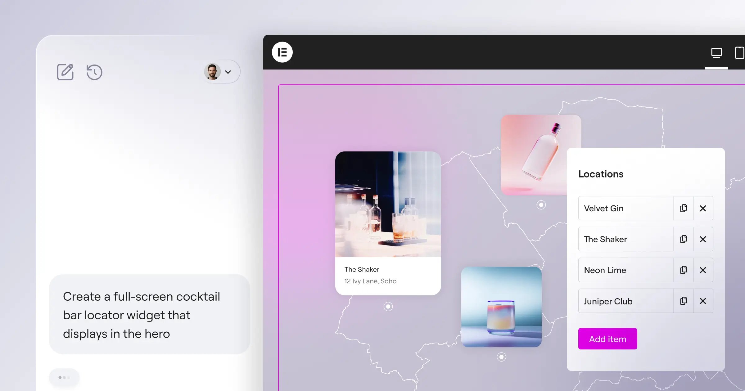
For complex builds, bring in AI website generation tools like Angie, a native agentic AI for WordPress on the Model Context Protocol. Give it plain instructions and it builds production-ready assets in your environment, saving 11 hours per project.
Key Features
- Controls up to 7 custom breakpoints per device.
- Aligns space with Flexbox Containers, no media queries.
- Applies responsive rules globally to headers and footers.
- Adapts custom-field content to your mobile design.
- Hides heavy videos or widgets from mobile to save bandwidth.
Pricing
Plans start at $60/year for the Essential tier (1 site); agencies get $444/year for unlimited sites.
Pros
- Unmatched visual control over CSS properties.
- Massive third-party ecosystem for custom widgets.
- Native WooCommerce integration for stores.
- Frequent updates track web standards.
Cons
- Requires a self-hosted WordPress install.
- Options can overwhelm beginners.
- Needs a basic grasp of layout principles.
Verdict: Best pick for pros and agencies who need full control over every pixel.
2. Wix Studio
Freelancers need animated, responsive sites without weeks of custom JavaScript, and Wix Studio’s fluid workspace delivers. Its AI turns a desktop hero into tablet and mobile layouts in one click, accurate about 85% of the time.
Key Features
- Analyzes desktop designs, generates proportional mobile layouts.
- Sets breakpoints per section, not page-wide.
- Accepts custom CSS globally or per element.
- Crops and resizes gallery images by screen width.
Pricing
Wix Studio starts at $17/month, scaling to $159/month for bigger plans.
Pros
- Smooth design-to-publish workflow.
- Built-in client handover tools.
- Hosting, security, and updates fully managed.
- The AI layout assistant works well.
Cons
- Costs more than Wix’s consumer builder.
- Exporting your site away from Wix is hard.
- Database structures can get messy.
Verdict: Ideal for designers who want a premium SaaS experience without managing servers.
3. Squarespace
Visual impact drives sales for creatives and small businesses, and Squarespace’s Fluid Engine changed how it handles responsive design. It builds a separate mobile grid, letting you reorder or resize elements without touching desktop.
Key Features
- Aligns elements to a grid with the Fluid Engine.
- Edits mobile layouts independently of desktop.
- Generates multiple image sizes per device width.
- Scales headings gracefully across 4 viewport widths.
Pricing
Plans range from $16/month for personal sites to $52/month for commerce setups.
Pros
- Beautiful templates out of the box.
- Easy learning curve for new users.
- Rock-solid infrastructure, zero maintenance.
- Excellent tools for selling digital products.
Cons
- No custom breakpoints between tablet and mobile.
- Speed can suffer with high-res galleries.
- Limited third-party plugin integrations.
Verdict: Perfect for photographers and small businesses wanting a high-end look with minimal friction.
4. Webflow
Webflow bridges front-end development and visual design, exposing every CSS property in a panel like a real code editor. That frustrates beginners who just want to drag a button, but for developers it’s real freedom.
Key Features
- Grants full CSS access: flexbox, grid, and z-index.
- Adds as many custom breakpoints as you need.
- Disables scroll-triggered interactions on low-power mobile devices.
- Exports clean HTML, CSS, and JS to host anywhere.
Pricing
The basic plan runs $14/month; the CMS plan most need sits at $23/month.
Pros
- Unmatched flexibility for custom layouts.
- Clean, semantic code output.
- Powerful CMS for dynamic content.
- Strong hosting infrastructure built on AWS.
Cons
- The steepest learning curve on this list.
- Pricing scales up quickly with traffic and CMS items.
- E-commerce feels rigid next to dedicated store builders.
Verdict: Still the gold standard for developers who understand CSS.
5. Framer
Framer grew from a prototyping tool into a full website builder, and it feels instantly familiar if you’ve used Figma. Its “Stacks” system mirrors CSS flexbox, so a desktop color change ripples across mobile variants instantly.
Key Features
- Turns Figma designs into functional HTML you paste in.
- Groups elements into stacks that adjust by screen width.
- Runs physics-based scroll animations, smooth on older phones.
- Builds one component with a reusable mobile variant sitewide.
Pricing
Framer starts at just $15/month, scaling to $30/month for Pro features.
Pros
- Fastest design-to-live workflow around.
- Animation engine that doesn’t hurt performance.
- Familiar right away for UI/UX pros.
- Excellent built-in speed optimization tools.
Cons
- CMS still fairly basic next to Webflow.
- Native form capabilities quite limited.
- Not suited to complex apps or membership sites.
Verdict: Best for startups and designers who need a strong landing-page first impression.
6. Shopify
A broken mobile checkout costs sales directly, and Shopify is built around how differently mobile shoppers behave. Its Online Store 2.0 architecture loads themes dynamically, serving only the code each device needs.
Key Features
- Adds and edits responsive sections on any page.
- Runs a battle-tested checkout that adapts to any screen.
- Sets focal points so key image areas stay visible cropped.
- Injects third-party app code without breaking your theme.
Pricing
The Basic plan costs $39/month; Advanced jumps to $399/month for high-volume merchants.
Pros
- Holds up during massive traffic spikes.
- Highest-converting mobile checkout in the industry.
- Huge library of vetted, responsive themes.
- Handles inventory and payments smoothly.
Cons
- Needs their proprietary Liquid language for customization.
- Apps for basic features add to monthly cost.
- Blog and content features feel like an afterthought.
Verdict: Selling physical products at real scale? Shopify is the clear choice.
7. Hostinger Website Builder
Exactly 40% of websites fail the Interaction to Next Paint (INP) metric on mobile from bulky code, and Hostinger fixes that with light infrastructure and an AI-driven builder for beginners. Answer a few questions and its AI builds a mobile-ready layout in about 45 seconds.
Key Features
- Generates a full responsive site from a description.
- Snaps elements into clean, stacked mobile positions automatically.
- Predicts where mobile visitors will tap for CTA placement.
- Caches pages automatically for fast loads on cellular.
Pricing
Hostinger bundles the builder with hosting starting at just competitive ratesnth.
Pros
- Very affordable for small projects.
- Fastest setup on this list.
- Incredibly fast loading times globally.
- Helpful AI tools for initial text and images.
Cons
- Can’t build complex, custom layouts easily.
- Smaller template library than legacy competitors.
- E-commerce meant only for very small stores.
Verdict: Great fit for budget-conscious users, freelancers, and local businesses.
8. Duda
Agencies can’t spend 47 hours tweaking breakpoints across 15 client sites a month, and Portent data shows sites loading in 1 second convert 3x higher than sites taking 5 seconds. Duda optimizes images, minifies CSS, and defers JavaScript automatically for every device.
Key Features
- Connects a spreadsheet to generate hundreds of local pages.
- Builds custom components with the Widget Builder, reused sitewide.
- Targets Google’s Core Web Vitals natively on mobile.
- Sends clients one link to comment on each device view.
Pricing
Plans range from $19/month for basic access up to $149/month for agencies.
Pros
- Strong built-in SEO tools and schema.
- Smooth client management and billing.
- Consistent 90+ scores on PageSpeed Insights.
- Strong API for site automation.
Cons
- Pricing isn’t friendly for single-site owners.
- Visual editor feels dated next to Framer.
- Limited native integrations outside the agency toolset.
Verdict: The go-to for agencies managing 10 to 500 client sites.
9. Dorik
The website builder market is set to hit $3.5 billion by 2030, and Dorik captures a share with a white-label CMS on AWS hosting for people tired of $30-a-month Webflow blogs. Drag pre-built UI blocks for granular CSS control.
Key Features
- Accesses 80+ pre-coded sections that handle mobile stacking.
- Builds custom collections for blogs that adapt their grid.
- Updates your brand color or heading size across 50 pages.
- Serves site files through a global CDN on AWS.
Pricing
Dorik starts at $15/month, scaling to $48/month for agencies.
Pros
- Exceptional value for the feature set.
- Intuitive interface balancing speed and control.
- Generous bandwidth and CMS item limits.
- Fast, helpful customer support.
Cons
- Template library still growing versus Wix.
- Third-party app integrations currently limited.
- Animation capabilities not as advanced as Framer.
Verdict: A genuinely strong Webflow alternative without the steep learning curve.
10. Carrd
Since 73.1% of web designers point to non-responsive design as the top reason visitors bounce, a lead-capture page had better look flawless on an iPhone, and Carrd is the undisputed king of the one-page site. Its codebase is so light that sites load instantly on 5G.
Key Features
- Strips unnecessary JavaScript for fast, raw HTML and CSS.
- Stacks elements into a clean vertical column automatically.
- Connects natively to Mailchimp, ConvertKit, or Zapier.
- Drops in custom code or payment buttons safely.
Pricing
Carrd’s Pro Standard plan costs just $19/year, not per month.
Pros
- Cheapest option on the market today.
- Fast learning curve; launch in 20 minutes.
- Perfect performance scores across testing tools.
- Great for testing startup ideas quickly.
Cons
- Strictly limited to single-page websites.
- Can’t build complex navigation structures.
- E-commerce limited to simple checkout links.
Verdict: Best for personal profiles, newsletters, and lead capture where speed matters.
Comparison Summary: 2026 Responsive Builder Matrix
Here’s how each builder stacks up.
| Builder | Starting Price | Best User Fit | Responsive Control Level |
|---|---|---|---|
| Elementor Editor Pro | $60/year | WordPress Pros & Agencies | High (Pixel-Perfect CSS Grid) |
| Wix Studio | $17/month | Freelance Designers | High (AI-Assisted Breakpoints) |
| Squarespace | $16/month | Creatives & Local Shops | Medium (Fluid Engine Grid) |
| Webflow | $23/month | Front-End Developers | Extreme (Full CSS Access) |
| Framer | $15/month | UI/UX Designers | High (Component Stacks) |
| Shopify | $39/month | E-Commerce Brands | Medium (Theme Dependent) |
| Hostinger | competitive ratesnth | Beginners & Budgets | Low (Automated AI Grids) |
| Duda | $19/month | High-Volume Agencies | High (Global Component Rules) |
| Dorik | $15/month | No-Code Enthusiasts | High (Custom CSS Classes) |
| Carrd | $19/year | Solo Creators | Low (Auto-Stacking Single Page) |
Final Recommendation: Which Builder Should You Choose?
Fixing a broken site later costs too much. Based on modern web architecture today, here’s how we’d segment the decision.
For WordPress Professionals: Elementor Editor Pro is the standard, with full CSS flexbox control plus the WordPress plugin ecosystem, and Angie future-proofs your workflow with real AI.
For Visual Designers: Go with Framer. If you know Figma, you’ll be building animated, production-ready sites by tomorrow afternoon.
For Traditional Developers: Webflow respects your DOM and CSS knowledge without hiding how the code works.
For Pure Beginners: Stick to Squarespace or Hostinger. Both guardrail you against wrecking your mobile layout, so you’ll still launch quickly.
Frequently Asked Questions
What is a responsive website builder?
A platform that automatically adjusts your layout, images, and typography to the device viewing it, giving every visitor a solid experience.
Why is mobile-first indexing important?
Google ranks your site mainly on its mobile version, so a broken mobile layout can drop your rankings fast.
What are custom breakpoints?
Specific pixel widths where your layout changes. Custom breakpoints set the exact point a sidebar drops below the content.
Do I need to know CSS to build a responsive site?
Not anymore. Webflow expects some CSS knowledge, but Squarespace and Hostinger use visual grids or AI to handle coding.
How does flexbox improve mobile design?
Flexbox lets elements inside a container align, shrink, or grow to fill space, so nothing overlaps as a screen shrinks.
Can AI actually build responsive layouts?
Yes. Wix Studio works out mobile spacing from your desktop design, and Angie can generate WordPress assets from a text prompt.
Is a dedicated mobile site better than a responsive one?
No. Running an m-dot site alongside a desktop site creates duplicate content and doubles maintenance work.
Looking for fresh content?
By entering your email, you agree to receive Elementor emails, including marketing emails,
and agree to our Terms & Conditions and Privacy Policy.