As a Software-as-a-Service (SaaS) company, we are always preoccupied with increasing conversions.
We were getting excellent traffic numbers, but our website conversions were dismally low.
Why? And how do we fix it?
In this article, we will show how a website redesign + content update with Elementor helped us fix our site issues and increase website conversions by almost 700%.
What Is NinjaOutreach Anyway?
NinjaOutreach is a lead generation database & email outreach automation software for businesses who may need to do the following:
- Find leads to promote a product
Find leads for link building - Find guest post opportunities
- Find leads for content promotion
- Find blogger or social media influencer leads to spread brand awareness
So if you need, say, 5K link building leads, you can use NinjaOutreach to locate those leads. You can then reuse or create dynamic email templates and auto-send these messages to reach your leads.
Identifying Our Website Conversion Problem
Now for a SaaS website with a DA of 50+, 300+ keywords ranking #1 on Google globally, and over 180K monthly visitors, we thought we were doing pretty well.
That is until we looked at our measly website conversion rates.
According to our Google Analytics data for the 90-day period of Feb – Apr 2018, the conversion rate for all our website pages is an abysmal 0.73%.
(For this article, we use the term website conversions to mean how well the website convinces a visitor to complete a CTA. This excludes trial-to-paid, email-to-paid, or other conversion channels.)
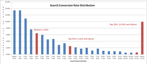
Now according to WordStream’s Larry Kim, a good conversion rate (from organic search to goal completion) should be somewhere between 2% to 5%.
Meanwhile, MarketingSherpa also did a study on average website conversions by industry.
And below, you can see that the average website conversions for SaaS companies are pegged at 7%.
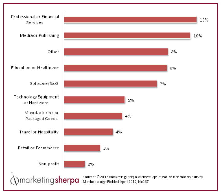
Whatever way you look at it, our website conversion number is way below any of these industry standards.
So what gives?
Diagnosing Our Website’s Problem
After digging around, we discovered the top reasons why our website wasn’t converting as well as it should, such as:
- Low site loading speed and responsiveness (especially for mobile) which led to:
- High bounce rate (People left the site quickly)
- Low avg. time on page (People didn’t stay on our site long)
- Low page interactions per session (People read less of our content)
- Broken site design (Our text hierarchies, margins, etc. were broken)
- Outdated web content
- Overly-Busy Homepage design
- Too few targeted landing pages
- Bad blog content readability due to poor design
Discovering Our Page Speed and Responsiveness Issues
Google has confirmed that page speed, especially on mobile, is a crucial ranking factor.
According to Google’s recent research, your website’s bounce rate begins to progressively increase the higher your page loading time is.
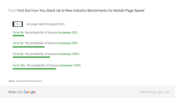
Unfortunately, the page loading speed for both desktop and mobile versions of our Homepage was way over 6 seconds.
In some cases, these numbers even reached higher than 10 and 20 seconds.
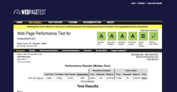
Other numbers in our Analytics didn’t look good either:
- Our bounce rate was a whopping 77.71%
- Our average session duration is only a little over 1.5 mins
- We got a rounded off average of only one-page interaction per user session
Here’s our 3-month Google Analytics data from February 1st to April 30th, 2018.
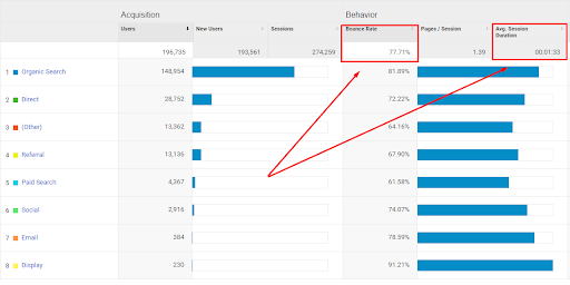
So apparently, based on Google (and every other SEO’s) benchmarks, our website was in a bad place.
How Site Speed Affects Time on Page and in Turn Affects Conversions
Site speed has a significant effect on whether someone remains on your site to read your content, or whether they bail and go somewhere else, ask yourself: “If it takes over 10 seconds to load a blog post, are you willing to wait?”
Truth is, online readers just tend to close slow-loading pages and move on to find something else. And that affects your time on the page. If a user didn’t stay to read your content, you have no chance at all of convincing them to complete your CTA.
Fewer eyes on your content means fewer opportunities for conversions.
And this was true of our case at the time.
Solving Our Page Speed and Responsiveness Issues
Once we identified our top site issues, our developers came up with solutions to boost our page loading speeds.
- Change our hosting to Kinsta.
- Delete unnecessary plugins that we were using.
- Switch from Apache to NGINX.
- Implement file compression site-wide.
- Enable Google’s automated PageSpeed optimizer on our server.
- Optimize code. (CSS, JavaScript, and HTML pulls, redundancies, redirects, etc.)
- Use a more responsive WordPress page builder to redesign our landing pages and content.
After these steps were done, our page loading speed improved dramatically, going from 6+ to 1.9 seconds!

Of course, we’re aware that a 1-second and lower page loading speed is ideal, but going from 6+ to less than 2 seconds, made us quite pleased.
Since solutions 1 to 6 are not web-design related, we will not go in-depth on those items.
But the 7th step is, so that’s the strategy we will describe in-depth in this article.
Now, overhauling a website and all of its content is not a quick job, even with a team to do it. So to accomplish this monumental task, our front-end development manager, Basilis Kanonidis, recommended Elementor.
How We Used Elementor to Overhaul Our Website
Overhauling an entire website is never an easy job.
Apart from that, we also wanted to get all the functionalities we needed from one multipurpose tool. A Swiss army knife of sorts.
But what single tool could help us get rid of a ton of redundant plug-ins and code, let us manage our website, create styled content, trackable landing pages, CTA buttons, forms, and more?
We found the answer: Elementor, the all-in-one website builder.
Our dev, Basilis, has had a lot of experience working with various WordPress site builders and Elementor was his top recommendation. (In fact, he bought their unlimited license!)
When it came to choosing a new theme, his first choice (also based on the projects he’s done), was OceanWP. It has all the functionalities we needed, it’s lightweight, responsive, SEO-ready, and worked smoothly with Elementor.
Also, we used the Elementor add-ons from CrocoBlock.
We used JetBlog for displaying our content, and JetPopup for our lead generation popups.
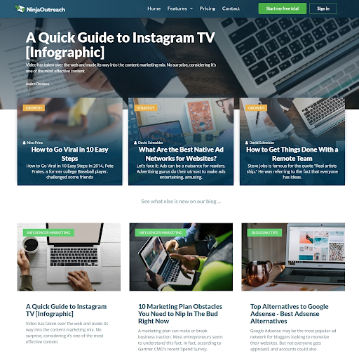
Before Elementor, this is how our blog page looked:
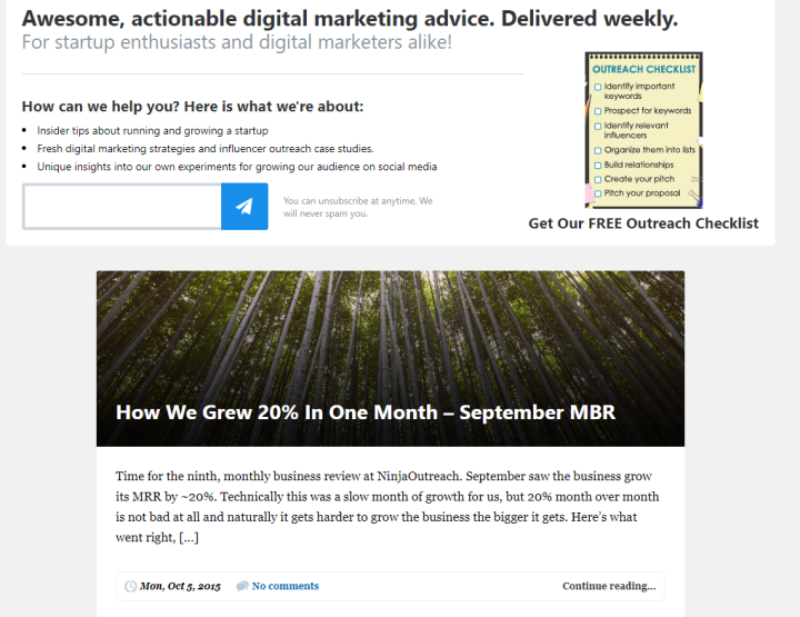
After overhauling our site with Elementor, this is how it looked:
Also, we were able to decrease our number of plug-ins from 30 to 12.
With these updates, we were able to:
- Follow modern web standards
- Optimize web performance
- Use lighter and less HTML and CSS
- Get built-in responsiveness for various mobile and device platforms
And, as a result of this:
- Our website loading speed on desktop went from 12 secs to 2 secs
- Our mobile loading speed went from 20 secs to 4 secs on 3g
All in all, these results improved our performance on Google’s SERPs, especially after we significantly improved our mobile-friendly signals.
How We Used Elementor to Redesign Our Homepage
This was how our homepage used to look:
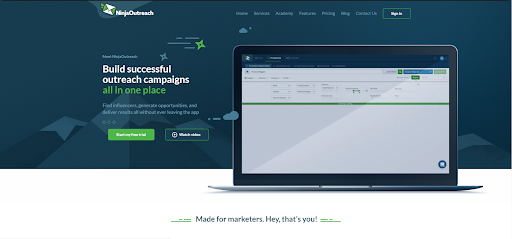
Personally, I loved it. Sleek, professional, and it had a live carousel and everything.
Unfortunately, this old landing page wasn’t converting.
In other words, most of the conversions we were getting weren’t coming from our Homepage, which shouldn’t be the case. (In fact, the conversions coming from this page were so low we don’t even want to share it!)
There were two factors that contributed to this page’s low conversions:
- The page loading speed was too slow
- Some design elements didn’t make it easy for users to convert
After switching, we were able to fix #1.
And with Elementor, it would now be much easier to solve #2.
(Note that before we switched to Elementor, the complexity of doing changes and running A/B tests on that page didn’t allow us to test further designs efficiently.)
We decided to scrap the entire page and create a whole new homepage with Elementor.
Doing a Quick Homepage A/B Test With Elementor
Here’s our A version, with a dark background using our brand colors:
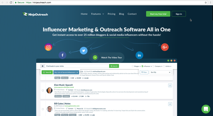
As you can see, our UX/UI designer, Monika R., decided to eliminate the double-column style of the original Homepage.
We also ditched the live carousel, which displayed 4 different combinations of copy and images every few seconds, which could have made it difficult for readers to process our message instantly.
Instead, we recreated our homepage into a relatively simple layout with minimal visual effects. We displayed our content in a single column. The new design focused on one main headline and sub-headline text that are larger and centered.
Compared to the original landing page, the screenshot of our app’s interface is bigger, and we used a static image instead of video, which we used on the previous design.
This change also reduced the page’s loading time significantly.
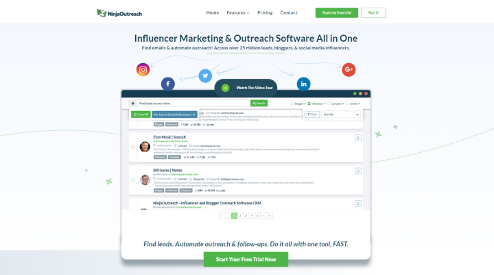
What you see above is a B version with a lighter background.
In just a few minutes, our dev Basilis was able to create this B version and subsequently launch an A/B test with Elementor.
The results?
- Both versions converted significantly more than the original landing page.
- The version with the light background converted 2.4% more than the dark one.
The best thing? It didn’t take us months to find this all out.
How We Used Elementor to Create Targeted Landing Pages
According to stats from Hubspot, the more landing pages you make, the more conversions you get.
Just creating over 10 landing pages could get you 55% more leads!
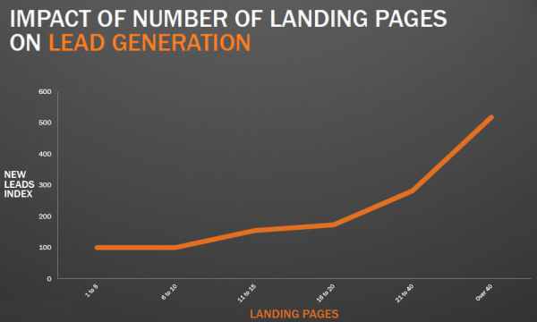
The idea behind this is, because we could create more landing pages, we could optimize these for different keywords and customers. Hence, we have more conversion opportunities.
So, we created a ton of new landing pages focused on the most common problems of our target users.
1. How We Used Elementor to Modernize an Old Landing Page
Below is a screenshot of what our Find Business Leads Landing Page looked like before:
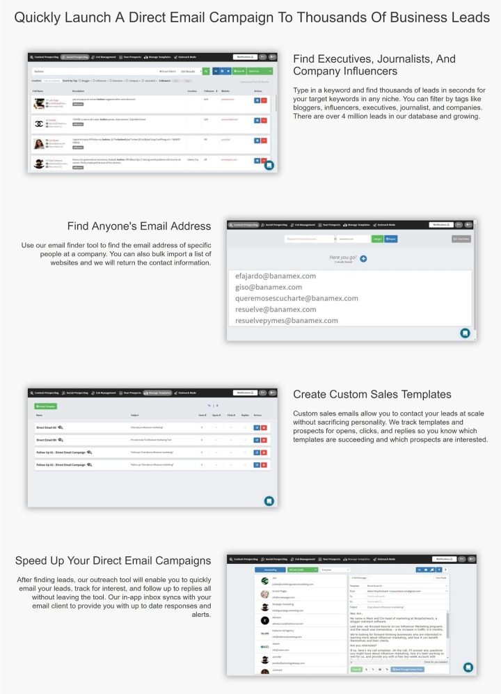
It looks so dated.
So, I updated the copy and Monika worked on the design. Then, Basilis quickly published these using Elementor widgets for icon boxes, sections, and CTAs.
And this is what it looks like now:
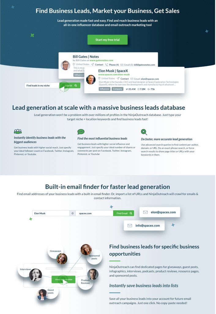
How did this modernized landing page fare?
In terms of conversions, the Elementor redesign took this landing page from #8 to #3!
2. How We Used Elementor to Create a New Landing Page in Record Time
For Black Friday, it took Basilis only 30 minutes to launch our new Black Friday NinjaOutreach page.
Without a site builder, he would have needed at least 5 hours. But with Elementor, he was able to launch this web page in significantly less time.
Results?
Our updated 2018 Black Friday sales performed 120% better than the one we ran previously.
3. How Elementor Enabled Us to Design Pages With Minimal Developer Help
One of our most complex pages was actually edited live by me.
Now, I know my HTML and CSS basics, but I’m certainly far from being a developer.
However, since Elementor was so easy to use, I was able to change CTAs, rearrange whole sections, and even add new ones by reusing elements we’d already created before with Elementor.
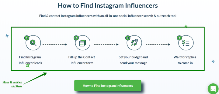
In our link building landing page, for example, we needed to add a “How It Works Section,” like the one on our How to find Instagram influencers page:
So, here’s what I did:
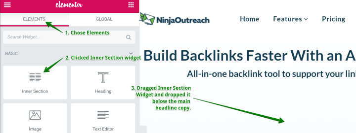
- I clicked Edit with Elementor > Elements
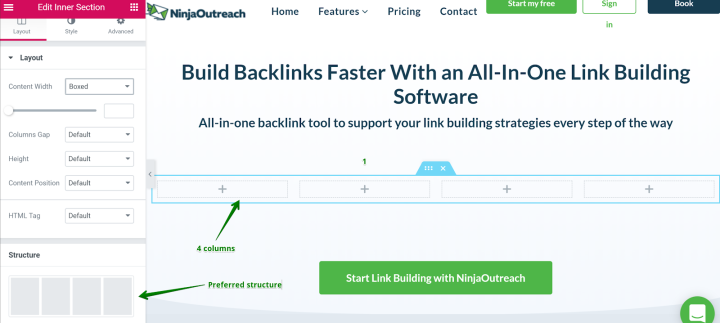
2. I looked for the Inner section widget, clicked, then dragged and dropped that into my preferred position, which is directly below the headline copy.
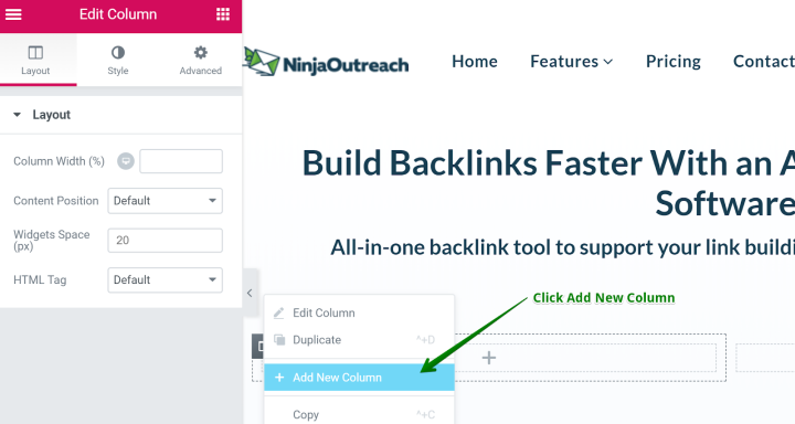
3. Since the inner section widget came with its default 2 columns (and I needed 4), I simply hovered over the edit column button and made a right click to open edit options.
4. In the edit options, I clicked on Add New Column. I repeated this process until I got the 4 columns I needed in that section.
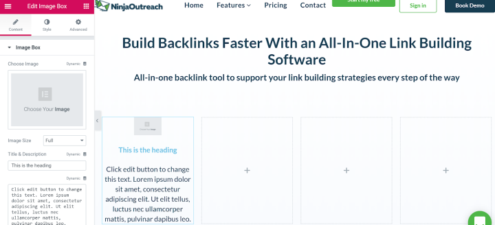
5. I looked for the Image box widget, then dragged and dropped that inside my preferred column.
6. Since we already used the icons I needed in the Instagram landing page I shared above, I just added those same images from our Media Library. Then, I just used different text related to the link-building process.
7. After repeating this process to complete 4 columns, I also did the following to add white space to what was then a fairly cluttered page:
- Shortened copy and bullet points as much as possible
- Repositioned sections via simple drag-and-drop
- Added spacer widgets
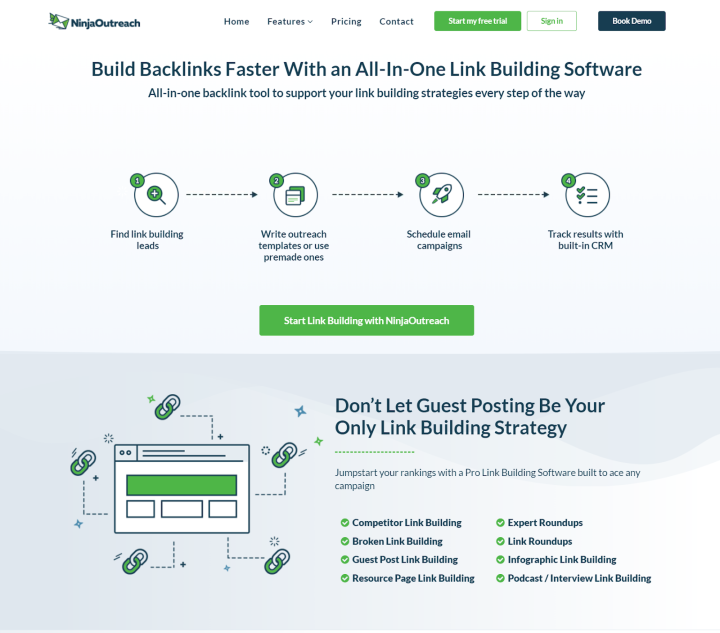
Below is what it looked like after:
I completed all this, without any developer help, in less than 25 minutes.
Even better, it’s now our #1 page for traffic and conversions.
How We Used Elementor to Create Targeted Content
Finally, we embarked upon one of our most significant content projects yet.
We wanted to create interactive content to target leads interested in testing our Instagram search feature.
So, we published parts of our Instagram influencers database on the website.
Without Elementor, doing something like this would have taken enormous resources in terms of manpower and hours.
But by using Elementor’s custom widgets, our dev team was able to complete the project in just one week.
Without getting too technical, Basilis and the rest of the dev team created custom Elementor widgets that generated the categories, locations, and profiles of the Instagram influencers from our internal database.
The data of each influencer profile was pooled via our NinjaOutreach social API and auto-populated on virtual pages created on the fly.
Imagine creating hundreds of thousands of pages of informative content automatically.
The results?
This influencer page project contributed a total of 300K traffic to our website to date since it launched.
Thanks to the flexibility of the Elementor builder, our dev team was able to create those pages quickly, reducing the development time by 80%.
Results
So what were the key advantages we got from all that work we did on redesigning and relaunching the site via Elementor?
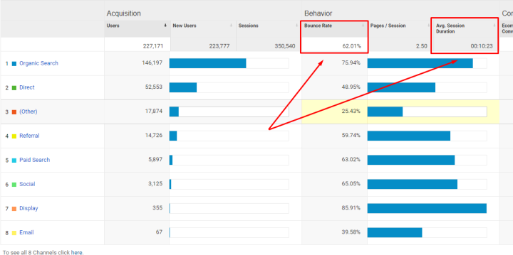
- Traffic increased by over 2K from 19.7K to 22.7K (more users visit us)
- Bounce rate went down more than 10% from 77.71% to 62.01% (fewer users bailed)
- Average session duration increased from 1:33 to 10:23 (users remained longer on our site)
- The number of pages per session rose from 1.39 to 2.50 (users viewed more of our content)
These are our stats for the 90-day period (June to August) post of our site overhaul with Elementor.
And how did all these improvements affect our conversions?
Well, our conversions went from 0.73% up to 5.8%, an increase of roughly 695%, or nearly 700%!
The bonus? With Elementor built into our website, it was much easier to make edits on our pages.
QAs and content creators can make simple updates to pages easily, and we could assign small tasks to our VAs, all of which gave our developers more time to focus on higher-level tasks.
Key Takeaways
After all that work, our word of advice to anyone planning to attempt any sort of big-ticket optimizations to their website and content would be: Get a site builder.
And don’t get just any old site builder, but one that’s flexible enough to let you execute custom operations that fit your particular needs.
A complete website and content overhaul was a monumental undertaking, for sure.
It would have been easy to get buried under the weight of it all and lose track of our primary goal — which was to get more conversions.
But because of Elementor, we were able to complete our project significantly faster, even with such a lean workforce.
And with an almost 700% increase in conversions to show for it, I can confidently say that our team is delighted with the results.
