Table of Contents
Elementor and Elementor Pro 3.10 include new design capabilities that will unlock a whole new world of creativity when it comes to designing your websites with Nested Elements, and introduces a new custom unit in sizing controls that will enable you to reach a higher level of accuracy when it comes to designing your websites. These versions also include a new container-based library, and performance improvements.
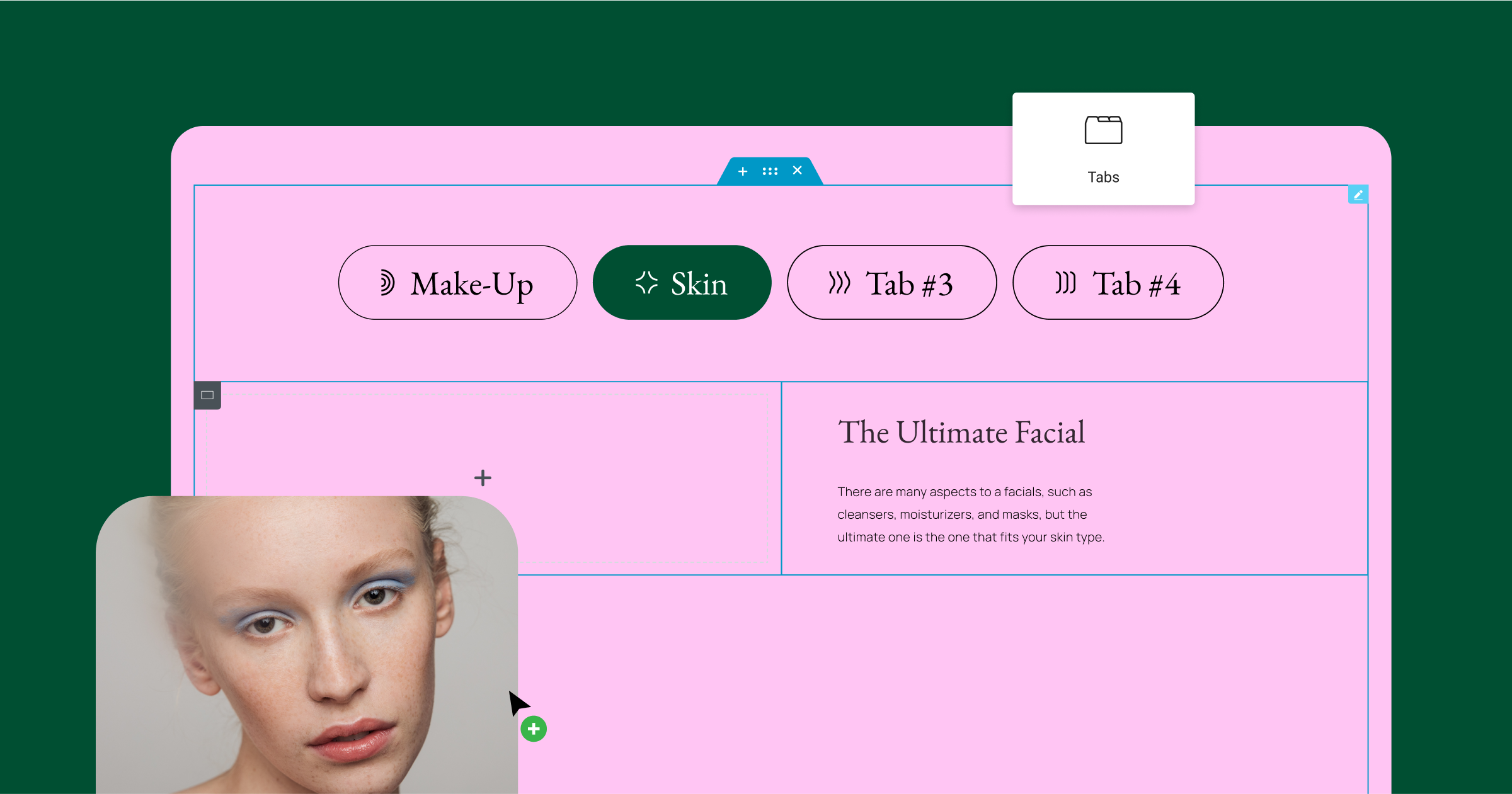
New Nested Elements That will Elevate Your Website’s Design
Nested Elements unlocks an entirely new way to conceptualize the design of your website. With Nested Elements, you can place any element inside another, by leveraging the power of Flexbox Containers. Similar to how you can place one Container inside another, and nest them infinitely, with Nested Elements, you can place any element (widget or container), inside another.
As Flexbox Containers are officially stable, over the upcoming releases, we will be introducing the Nesting capability into a number of existing widgets, such as the Carousel, Accordion, Tabs, and more. We will also be introducing entirely new Nested widgets, such as the Mega Menu.
Introducing the Renewed Tabs Widget – The first Elementor nested widget, unlocking design flexibility
With the new Tabs widget, you will be able to unleash your design creativity and reach a high level of sophistication. The new Tabs widget, is container-based and includes three main improvements, compared to the original Tabs widget:
- Tabs and Titles – Using the new Tabs widget, you will be able to adjust the layout and positioning of the tabs to determine where they are located in relation to the tab’s content – on top, bottom, or one of its sides. Additionally, you will have more styling options, including the ability to add icons to the tab title.
- New Content Area – With the power of Flexbox Containers, the content area of each Tab will become a main container, in which you can place any element, adjust its layout and present any content you’d like – just like the blank canvas of the Editor.
- New Responsive Setting – To improve the design and user experience per device size, you can choose the breakpoint at which the Tab will automatically be displayed as an Accordion. That means that you don’t have to create different content for each device, which also improves performance.
As the Tabs widget is container-based, to use it on your website you will need to ensure that the Flexbox Container, and Nested Elements experiments are activated. Once activated, the new Tabs widget will automatically replace the existing one in the widget panel (this will not affect the design of existing tabs on your website).
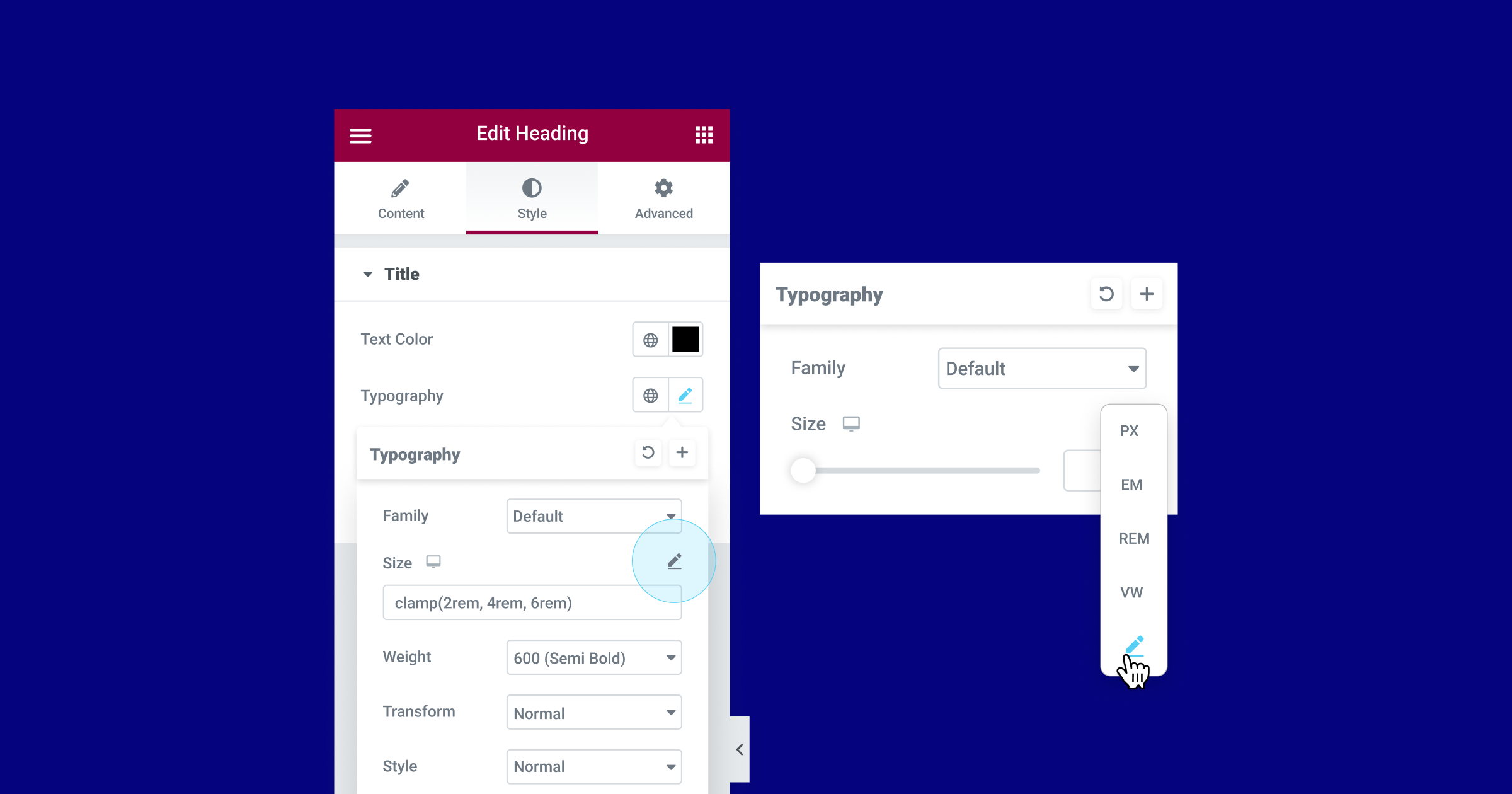
New Custom Units – Choose any Unit you Want, Including CSS Math Functions
Numeric controls in the Editor are getting an upgrade, and you can now choose any unit you want, mix numeric units, and run CSS function calculations within them. Many elements in the Editor include options for sizing, such as padding and margins, font size, and more. Using these sizing units wisely can have a positive impact on design accuracy and website responsiveness.
Previously, if you were adjusting the padding or margins, for example, you would have to choose one of the following unit types: PX, EM, REM, %, or VW. With this update, you will also be able to choose the custom option, to be more specific with your unit choices. For example, you could choose the PX for the sides, and % for the top and bottom. Additionally, with this update, the unit labels have been moved into a drop-down list, to accommodate the new custom option.
Choosing the Custom option will also allow you to run calculations for the measurement of a value within the value input field, that way, you can achieve greater design accuracy and responsive support.
For example, when choosing the custom option in the typography size controls, you will be able to use the `clamp()` CSS function to adjust your typography size to different device sizes, or the `calc()` CSS function to calculate and set a value that mixes units, and more.
As part of this version, the following sizing controls will get custom options:
- Containers, Sections, and Columns – everywhere possible, including custom width, border, etc.
- Typography controls – line height, letter spacing, and word spacing.
Additional areas will be updated in the future as well.
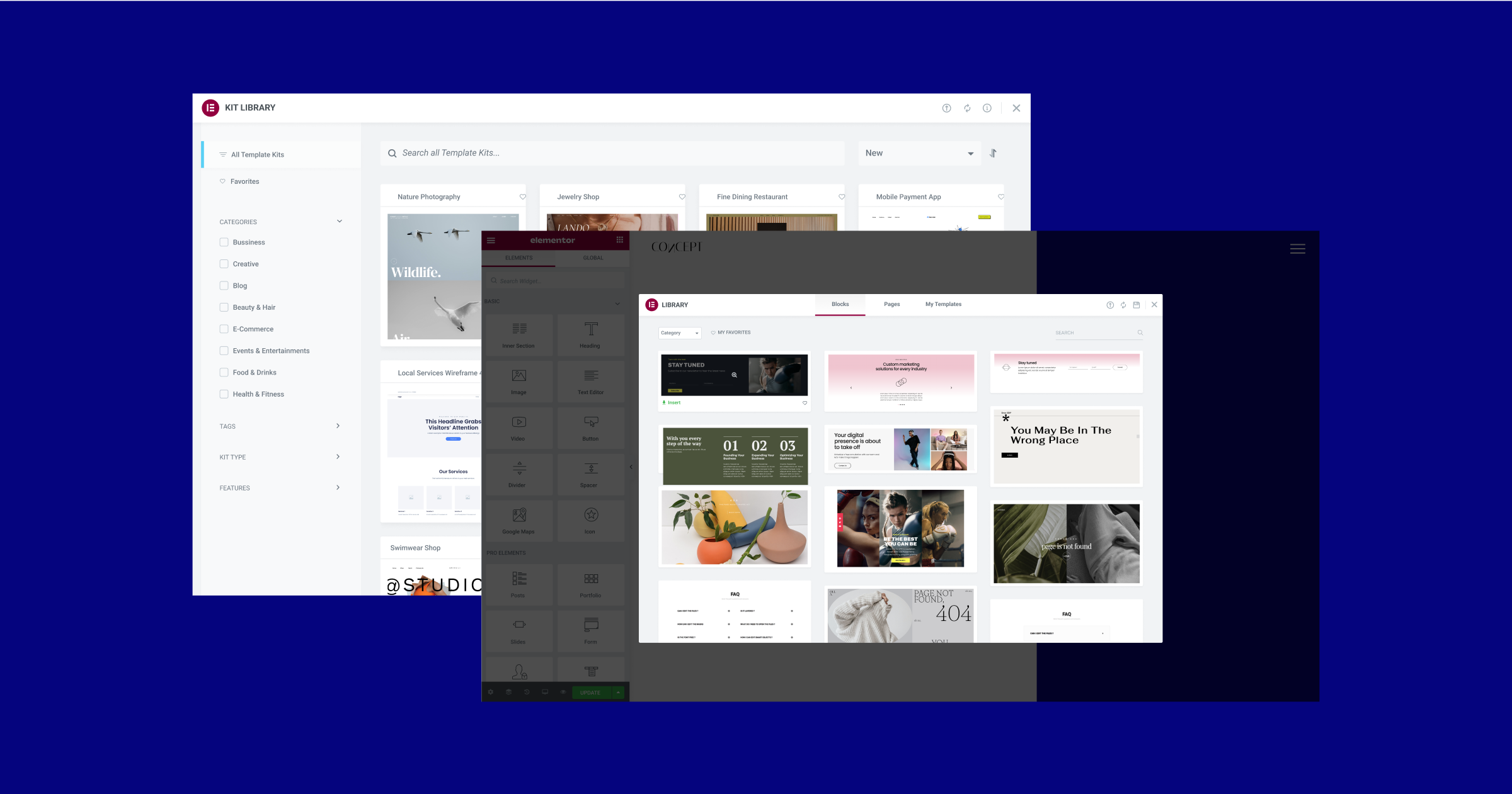
Container-Based Full Website Kits, Templates and Blocks
With Flexbox Containers marked as beta, making it stable and ready to use, it was important to provide you with container-based full website kits and templates. Over the last few weeks, the Library team has worked to create a complete container-based library, so you can kick-start your website creation and design process, when enabling the Flexbox Container experiment, using the most up-to-date design trends.
Now, when you activate the Flexbox Container experiment on your website, you will have an entirely new kit and template library. The updates also include dozens of the most popular full website kits and page templates that have been converted from the section-based layout to Flexbox Containers, as well as brand-new Website Kits and page Templates.
With the new library, there are two additional noteworthy updates. The first is that we introduced a few mini-shops, a one-page full website kit for ecommerce websites including PayPal and Stripe buttons for payment collection. The second is that all the previous Blocks (such as Contact, 404, etc.) have been replaced with completely new designs.
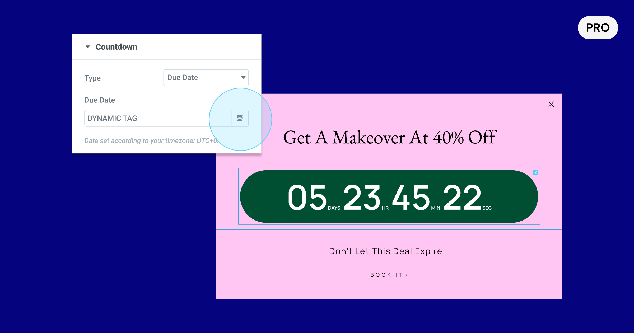
[Pro] Dynamic Due Date in Countdown Widget
The Countdown Widget, a great tool for creating FOMO and boosting conversion, now has a dynamic tag control in the due date. With this update, you will be able to use native WordPress custom fields, as well as custom fields from ACF, and PODS to dynamically populate the due date, on each page.
With the new dynamic tag controls, you will be able to use the Countdown widget in the Single Post template, for example, and add a custom field in WordPress to each of your posts that includes the due date you want to include in each post. This will also enable you to deliver a website to a client, while allowing them to update the due date in WordPress, without sending them to the Editor, where they may alter your design.
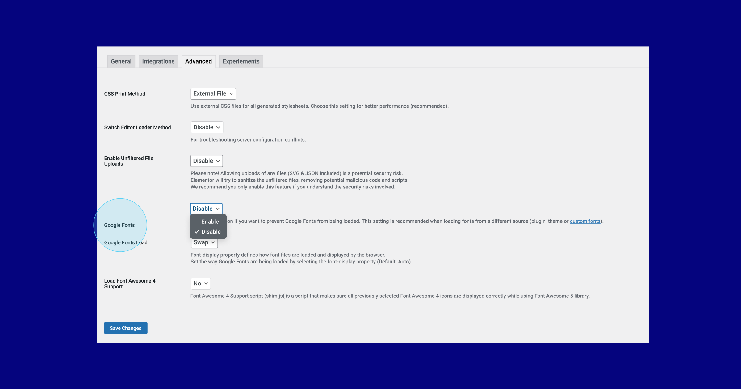
New: Disable Google Fonts Entirely
Google fonts, a popular online font library, enables you to use a variety of fonts on your website. However, in recent events Google Fonts has been found in some instances to be in violation of GDPR and privacy regulations.
To eliminate this risk, Elementor allows you to remove all Google fonts from your website. When disabling Google fonts, you will no longer be able to use the online Google font library in the Editor, which will reduce the number of fonts available to you in the Editor to 7 fonts. If you’ve already used a Google font on your website, but choose to disable Google fonts with this update, all fonts on your website will default to one of the available fonts on your website. To continue using your favorite fonts, you can upload locally hosted fonts into Elementor using the Custom Fonts feature, available to Elementor Pro users.
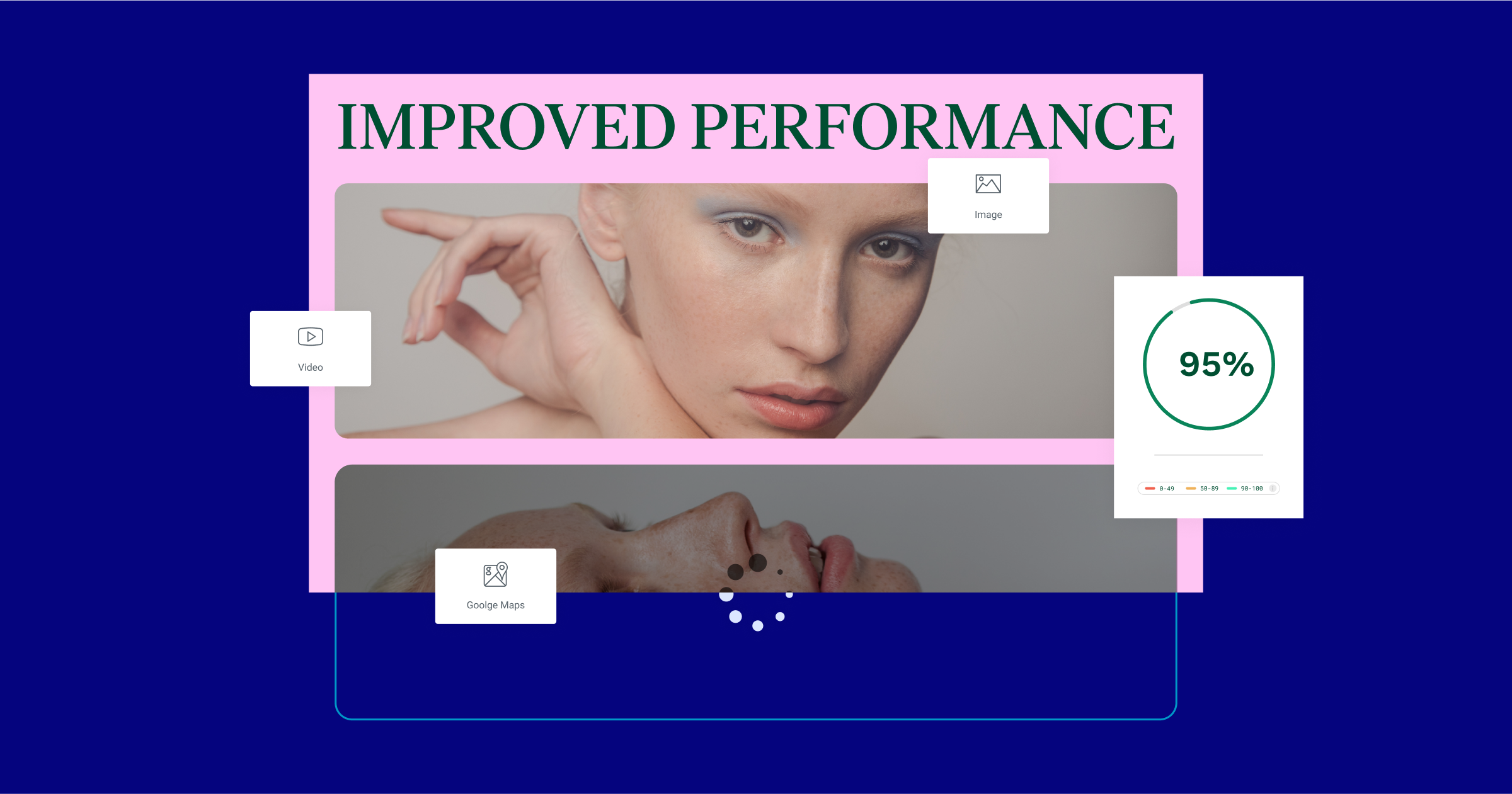
Performance and Accessibility Improvements
In Elementor 3.10, we continue to introduce performance and accessibility improvements. This update includes three new performance improvement updates and two accessibility improvement updates.
Lazy Load Google Maps
Elementor’s Google Maps widget enables you to place a map anywhere on your website, the perfect widget to use when you want to share a specific location with your website visitors. With this update, you will be able to lazy load Google Map iframes, which speeds up the initial page load.
Lazy Loading Images with Custom Sizes
The size of the image you use can have a significant impact on the performance of your website. In previous updates, we added the ability to lazy load nearly every image uploaded to the media library. With Elementor 3.10, you will also be able to lazy load Custom Sized images.
Controlling Self-Hosted Videos Preload
Similar to images, videos also have an effect on the speed and performance of your website, with Self-Hosted videos generally having more of an impact than videos hosted on YouTube for example, that applies optimization techniques. With this update instead of loading self-hosted videos during the initial page load, you can choose whether you want to preload the video, the metadata of the video, or to not preload any of its content before the visitor hits play.
Accessibility Improvements for Page Navigation
The Block Quote widget and Post Comments widget, two Elementor Pro widgets, received markup updates to make them even more accessible for people with disabilities who use assistive technologies to navigate through the page.
Enjoy More Design Options, More Responsiveness and Better Performance
Elementor 3.10 unlocks a variety of new design opportunities for you to use on your website. The introduction of the new Tabs widget, the first update leveraging the Nested Elements capability will enable you to create highly advanced and creative layouts using all of Elementor’s widgets, in a familiar drag and drop fashion. As you enable Flexbox Containers to use this new widget, you will also be exposed to an entirely new Container-based kit and template library, to jumpstart your creative process.
Be sure to try Elementor 3.10 out and let us know what you think in the comments below.
Looking for fresh content?
By entering your email, you agree to receive Elementor emails, including marketing emails,
and agree to our Terms & Conditions and Privacy Policy.


