Table of Contents
Why Mobile-First Design Is Mandatory in 2026
Mobile traffic isn’t an afterthought anymore. As of late 2024, mobile devices account for 58.67% of total global website traffic, and if you’re still designing for desktop first, you’re building for a shrinking audience. Google agrees: since July 2019, it’s used mobile-first indexing for every new website, so your mobile layout is the only version that counts for rankings.
Your users are just as unforgiving. 57% of internet users won’t recommend a business with a poorly designed mobile website. So you need a mobile first website builder that gets touch targets, viewport control, and fast asset delivery right. Here’s what gets this right in 2026.
Key Takeaways
- Core Web Vitals decide the outcome: 40% of mobile websites fail the Largest Contentful Paint (LCP) metric.
- Speed equals revenue: a 1-second delay in mobile load time can cut conversions by up to 20%.
- Mobile now drives e-commerce: 71% of Shopify orders are processed via mobile devices.
- Container-based layouts have won. Flexbox and CSS Grid have replaced rigid section-column structures.
- AI is changing production. Tools like Elementor’s Angie now generate production-ready assets through simple conversation.
- Abandonment happens fast: 53% of mobile users abandon a site that takes longer than 3 seconds to load.
1. Elementor Editor Pro
Elementor has grown from a simple page builder into a container-first, CSS-driven platform. Editor V4 (Atomic) is built on CSS classes and variables, so you’re shaping the actual DOM structure, not just tweaking margins, with up to seven custom breakpoints for anything from a tablet to an ultra-wide desktop or an older phone.
Core Mobile Features
- Builds flexbox and grid containers for precise alignment control on overlapping mobile elements.
- Hides heavy background videos on mobile to save bandwidth.
- Pulls custom fields directly into mobile-optimized templates.
- Caches elements to render widgets faster on weak mobile connections.
- Scales font sizes automatically based on viewport width (vw).
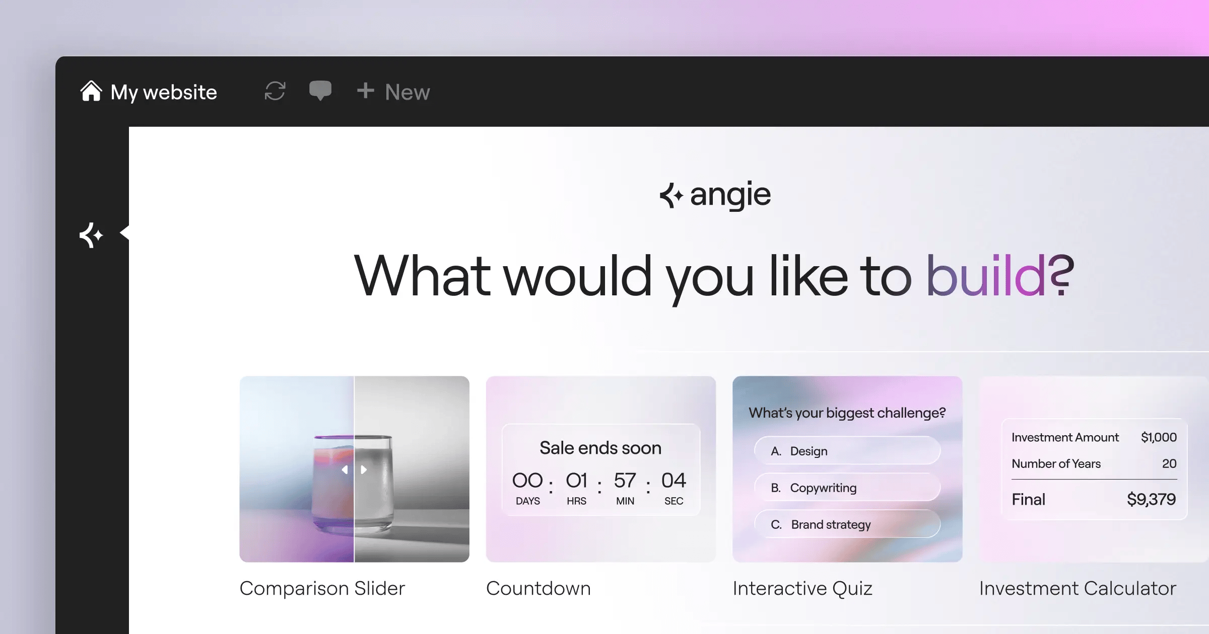
Elementor’s ecosystem also includes Angie, an agentic AI for WordPress that goes beyond text generation: give it natural language commands, and it creates production-ready WordPress assets in your environment.
When you build mobile first, you aren’t just shrinking a desktop layout, you’re changing the DOM priority. Faster DOM rendering on 4G is the single biggest SEO advantage you can give yourself.
Itamar Haim, SEO Team Lead at Elementor. A digital strategist merging SEO, AEO/GEO, and web development.
Pricing and Verdict
The Essential plan starts at $60/year for a single site, and the full Elementor One subscription runs $168/year with priority support, image optimization, and the AI Site Planner.
Pros
- Delivers unmatched design flexibility for complex mobile grids.
- Ships with a massive ecosystem of mobile-optimized widgets.
- Outputs CSS-first code via Editor V4.
- Speeds up mobile asset generation with native AI.
Cons
- Requires a separate WordPress hosting environment.
- Overwhelms some beginners with the sheer number of layout options.
The learning curve is steeper than a basic drag-and-drop tool, but for pixel-perfect control across an iPhone 15 or a Galaxy S24, it’s your top option.
2. Wix
Wix leans on AI to build mobile-responsive structures instantly, with a dedicated Mobile Editor view for adjusting the layout independently: hide elements, resize text, and change button colors just for phone users.
Building a Mobile View in Wix
- Generate the initial site structure using Wix ADI (Artificial Design Intelligence).
- Toggle to the Mobile Editor on the top navigation bar.
- Use the Quick Action Bar to add mobile-only contact buttons.
- Adjust the mobile menu to a full-screen overlay.
- Publish and manage edits through the Wix Owner app.
Wix’s Light plan starts at $17/month, and the Core plan runs $29/month. It’s genuinely easy to use, no coding needed.
But performance can suffer if you overload the page with heavy animations, and you can’t easily swap templates once the site’s live.
3. Squarespace
Squarespace practically invented the modern aesthetic template, and its Fluid Engine grid system brought a big jump in mobile customization. You drag and drop elements onto a flexible grid, then rearrange those blocks independently in mobile view.
Key Aesthetic Features
- Scales and crops images automatically for mobile screens.
- Adjusts padding around text blocks for phone views.
- Builds clean, one-page checkout experiences for touch.
- Creates swipeable galleries that feel native on iOS.
The Personal plan starts at $16/month billed annually, and Business sits at $23/month. It’s a strong pick for photographers, artists, and boutique shops.
But technical SEO folks often find Squarespace limiting: there’s no deep server access or granular schema markup control, and it’s a closed ecosystem.
4. Duda
Duda is a white-label platform built for web design agencies, focused on client management and bulk site creation. It powers over 1 million active websites, and 70% of its agency partners prioritize mobile-first design.
How Duda Handles Device Rules
Duda lets you set personalization triggers by device, so you’re not just changing the design, you’re changing the content.
- Detects the visitor’s device type (mobile or desktop).
- Triggers a “Click-to-Call” button only for mobile visitors.
- Swaps a heavy background video for a compressed WebP image.
- Injects a mobile-specific promo banner during business hours.
Pricing starts at $19/month, with strong Core Web Vitals performance out of the box since Duda handles caching, minification, and CDN delivery automatically.
The catch is cost scaling. A single-site owner ends up paying for agency-level features they’ll never touch.
5. Webflow
Webflow is a visual development platform, translating your canvas actions into clean, semantic HTML, CSS, and JavaScript. You start styling at the base breakpoint, and your CSS cascades down to tablet and mobile.
Technical Advantages
- Outputs clean code with zero bloat, for fast mobile loads.
- Builds custom scroll animations for touch devices.
- Targets exact pixel widths for specific hardware form factors.
- Binds custom data to mobile-friendly repeating lists.
Basic site plans start at $14/month billed annually, and CMS capability runs $23/month.
But the learning curve is steep. If you don’t know CSS cascading, or absolute versus relative positioning, you can break your mobile layout fast.
6. Carrd
Carrd does one thing well: single-page, fully responsive sites for a landing page, a newsletter signup, or a link-in-bio page. The interface is stark and minimal, and the code is so light that Carrd sites load almost instantly on mobile.
Why Simple Wins on Mobile
Complex navigation menus can ruin a mobile experience, and Carrd forces you to simplify into a single scrolling column.
- Keeps the DOM ultra-lightweight, for instant rendering.
- Runs fixed backgrounds with smooth parallax that doesn’t jitter.
- Connects directly to Mailchimp or ConvertKit, no heavy iframes.
- Supports custom domains on very cheap premium tiers.
Carrd is the most affordable option around, with the Pro Standard plan at just $19/year, yes, per year.
You can’t build a full e-commerce store or a multi-author blog here. It’s strictly for micro-sites.
7. Shopify
If you’re selling physical products, mobile is your main revenue source, with mobile commerce sales projected to reach $710 billion by the end of 2025, 44% of total e-commerce. Shopify’s checkout flow cuts friction on small touchscreens, and Shop Pay lets shoppers check out with a single tap.
The Mobile E-commerce Funnel
- Taps an Instagram ad and lands on a mobile-optimized product page.
- Keeps the “Sticky Add to Cart” button visible while shoppers scroll reviews.
- Slides the cart drawer out natively, with no full page reload.
- Authenticates via biometric login through Shop Pay (Face ID or fingerprint).
- Wraps up the transaction in under 10 seconds.
Basic plans start at $39/month, plus premium apps for things like reviews or upsells.
If retail is your core business, it’s hard to justify anything else. Mobile conversion rates are just too strong to ignore.
8. Framer
Framer bridges high-fidelity design prototyping and web publishing, treating the web like an interactive canvas. Copy a frame from Figma into Framer, and it becomes a working layout instantly.
Design-Led Features
- Fades, scales, and rotates elements as the user swipes down the screen.
- Delivers smooth motion transitions between page states.
- Translates Figma designs to code more accurately than most tools.
- Creates different states (hover, pressed) for mobile buttons.
Framer’s Mini plan starts at competitive ratesnth for simple sites, and the Basic plan for personal sites runs $15/month.
But the CMS isn’t as strong as Webflow or WordPress. It’s clearly built for marketing pages, not large content archives.
9. Hostinger Website Builder
Hostinger pairs its hosting with a proprietary, AI-driven builder built for speed and tight budgets, including an AI Heatmap tool that predicts where a mobile user’s eyes will land, so you can place CTA buttons where they’ll get seen.
Budget Allocation Benefits
With Hostinger, you’re not paying separate fees for hosting, SSL certificates, and premium builder plugins. It’s all bundled together.
- Optimizes speed at the server level for this specific builder.
- Compresses large uploads into mobile-friendly formats automatically.
- Generates localized copy instantly for your mobile pages.
- Includes a free domain for the first year.
Pricing is aggressively low, starting at just competitive ratesnth. You get what you pay for.
You won’t find deep CSS controls or custom database queries here. It’s a simple, fast tool for simple, fast websites.
10. Universe
Universe flips the concept upside down: it’s a website builder built entirely for an iPhone or iPad, no desktop browser needed. You build by dragging blocks onto a rigid grid with your thumb, and if a design doesn’t fit that grid, you can’t build it.
Mobile-Native Creation Workflow
- Download the Universe app from the iOS App Store.
- Pick a custom domain right inside the app.
- Drag photo, text, and payment blocks onto the canvas.
- Connect Apple Pay for instant commerce.
- Publish the site, even from a train seat.
There’s a free version, and the Pro tier starts at $9.99/month with advanced commerce features and custom domain mapping.
This isn’t built for enterprise companies. It’s for solo creators, independent artists, and mobile-first entrepreneurs running their business from their phone.
Comparison Summary & Final Recommendation
Choosing the right mobile-first builder comes down to your technical skill and business goals. Here’s how these platforms stack up in 2026.
| Platform | Starting Price | Best Use Case | Mobile Setup Difficulty |
|---|---|---|---|
| Elementor Editor Pro | $60/year | Custom WordPress Sites | Moderate |
| Wix | $17/month | Small Local Businesses | Very Easy |
| Squarespace | $16/month | Visual Portfolios | Easy |
| Duda | $19/month | Design Agencies | Moderate |
| Webflow | $14/month | Tech-Savvy Startups | Hard |
| Carrd | $19/year | Single Landing Pages | Very Easy |
| Shopify | $39/month | Mobile E-commerce | Moderate |
| Framer | competitive ratesnth | Design Prototypes | Moderate |
| Hostinger | competitive ratesnth | Extreme Budgets | Easy |
| Universe | $9.99/month | Mobile-Only Creators | Very Easy |
For a serious, scalable presence, Elementor Editor Pro offers the highest ceiling: its CSS-first, container-based architecture helps your mobile sites pass Core Web Vitals, and tools like Angie handle the tedious parts of asset creation.
If you’re strictly selling physical products, pay the premium for Shopify, and if you just need a link-in-bio page fast, a $19 Carrd subscription will do the job.
Frequently Asked Questions
What exactly does “mobile-first” mean in 2026?
It means starting with the smallest screen, focusing on essential content, then building up as the screen widens, the opposite of shrinking a desktop site to fit a phone.
Do I really need a separate mobile editor?
Yes, auto-responsive layouts make assumptions that don’t always hold, and a dedicated mobile editor lets you adjust padding, font size, and visual hierarchy for a 6-inch screen.
How do Core Web Vitals impact my mobile site?
Google uses Core Web Vitals as a ranking signal for speed, interactivity, and visual stability on mobile. A Largest Contentful Paint (LCP) over 2.5 seconds will hurt your rankings.
Can I build a mobile app using these website builders?
No, these tools build progressive web apps (PWAs) or responsive sites, not native iOS or Android apps. PWAs save to a phone’s home screen and work like native apps, without App Store fees.
Is WordPress good for mobile-first design?
WordPress itself is just a CMS. Your mobile experience depends on the theme and builder you use, and a modern container-based builder like Elementor outputs clean, mobile-first HTML and CSS.
What is the difference between responsive and mobile-first?
Responsive design scales a desktop site down to fit smaller screens. Mobile-first design builds the core architecture for mobile with lightweight code, then scales up for desktop, so it’s usually faster.
Why are mobile conversion rates usually lower than desktop?
It usually comes down to friction: small touch targets, complex forms, and slow load times frustrate people on phones. Payment options like Shop Pay or Apple Pay lift conversion by cutting that friction.
How do I test my mobile website’s speed?
Don’t just eyeball it on your phone. Use Google’s PageSpeed Insights tool instead, which gives you a mobile score based on real-world Chrome data and flags the exact rendering bottlenecks to fix.
Does AI actually help with mobile web design?
Yes, tools like Elementor’s Angie generate mobile-optimized assets on command, and AI can predict user heatmaps, compress images for 4G, and generate localized copy that fits tight mobile containers.
Which builder is the most affordable?
Carrd is the cheapest at $19 a year for Pro features, though Hostinger offers strong value at competitive rates too, since it bundles hosting and domain registration into the builder cost.
Looking for fresh content?
By entering your email, you agree to receive Elementor emails, including marketing emails,
and agree to our Terms & Conditions and Privacy Policy.


