Table of Contents
Look, building a website used to require writing thousands of lines of complicated code. Now you just grab a box with your mouse and drop it onto a blank canvas. But mastering a modern builder takes much more than just dropping elements randomly across your screen.
You’re reading this because you want total control over your design without learning advanced programming. That’s exactly what we’re covering today. I’ve broken down the exact workflow professionals use in 2026 to turn a blank page into a fast, accessible, and high-converting website.
Key Takeaways
- Over 21 million websites currently rely on visual drag and drop platforms.
- Proper site architecture planning saves an average of 47 hours during the development process.
- You’ll need a fast host achieving at least a 109ms TTFB (Time to First Byte) for optimal builder performance.
- Modern builders use CSS variables to change brand colors across 100+ pages instantly.
- Responsive design isn’t optional since mobile traffic dominates 2026 internet usage.
- Using automated tools can reduce your image file sizes by up to 60 percent before publishing.
- Accessibility scanners can identify over 180 WCAG issues directly inside your editor.
The Prerequisites for Building Your First Site
Before you ever touch a visual layout tool, you need the right technical foundation. Skipping this step guarantees major headaches later. Honestly, this is the part nobody tells you about.
You can’t just open a web browser and start designing in thin air. You need a dedicated environment where your files live and your builder operates. Professional web developers always secure these core components first.
Here’s what you absolutely must have ready:
- A registered domain name – This is your digital address. Keep it short, memorable, and directly related to your brand.
- High-performance hosting – Your builder needs server resources to run smoothly. Look for managed cloud solutions offering strong uptime guarantees.
- A Content Management System (CMS) – WordPress remains the industry standard, powering a massive portion of the internet in 2026.
- A lightweight base theme – Heavy themes conflict with builders. You want a blank canvas. The Hello Theme is perfect for this, weighing in at under 30KB.
- Your visual builder plugin – This is the software that transforms the standard CMS backend into a live design environment.
- A structured brand folder – Gather your high-resolution logos, specific hex color codes, and licensed typography before you start.
Once you’ve secured these items, your environment is prepped. Don’t rush this setup phase. A strong foundation prevents layout bugs and performance bottlenecks when your site grows.
Step 1: Mapping Your Site Architecture
Never start dragging widgets onto a page without a blueprint. You’ll end up with a confusing mess. And your visitors won’t know where to click.
Site architecture is just a fancy term for your website’s map. It determines how pages link together and how users find information. Think of it like a grocery store layout. You put the milk in the back so people walk past other items, but you put the signs up high so they don’t get lost.
You need to list every single page your business requires. Then, define the primary goal for each page. Let’s look at a standard business structure.
| Page Name | Primary Goal | Required Elements |
|---|---|---|
| Homepage | Direct traffic to specific services | Hero section, service grid, trust badges |
| About Us | Build trust and show expertise | Team photos, company timeline, core values |
| Services | Explain offerings clearly | Pricing tables, feature lists, FAQ toggle |
| Contact | Generate qualified leads | Smart form, embedded map, operating hours |
| Blog Archive | Drive organic search traffic | Post grid, category filters, email opt-in |
Some creators use the AI Site Planner to generate complete sitemaps and wireframes in under 20 minutes. It’s incredibly efficient for visual thinkers. Over 130,000 active users rely on automated planning tools before designing.
Your site structure dictates your technical SEO foundation. If search engine crawlers can’t logically follow your internal links, all your beautiful design work is effectively invisible to the market.
Itamar Haim, SEO Team Lead at Elementor. A digital strategist merging SEO, AEO/GEO, and web development.
Keep your navigation hierarchy shallow. Users shouldn’t click more than three times to reach any important content.
Step 2: Setting Up the WordPress Foundation
Now we actually install the software. You’re building a house, and this is pouring the concrete. If you mess this up, the walls won’t stand straight.
WordPress is incredibly flexible, but its default block editor doesn’t give you pixel-perfect control. That’s why we install a dedicated builder on top of it. You need admin access to your WordPress dashboard to complete this phase.
- Clean your installation – Delete all default posts, dummy comments, and pre-installed plugins you don’t recognize. Clutter slows down your database.
- Adjust your permalinks – Go to Settings > Permalinks. Select the “Post name” option. This ensures your URLs look like yoursite.com/about instead of yoursite.com/?p=123.
- Install your base theme – Navigate to Appearance > Themes > Add New. Search for a bare-bones theme designed for builders. Activate it immediately.
- Upload the builder plugin – Go to Plugins > Add New. Upload your visual editor’s zip file. If you’re using a professional tier, ensure you activate your license key to unlock the premium modules.
- Configure site settings – Enter your official site title and tagline in the general settings area. Double-check your timezone so scheduled posts publish correctly.
- Create blank pages – Go to Pages > Add New. Create empty pages for Home, About, and Contact. You won’t add content yet. Just publish them so they exist in your database.
After these six steps, your environment is officially ready for design work. You’ve removed the variables that cause conflicts.
Step 3: Mastering the Drag and Drop Interface
Opening a visual editor for the first time feels overwhelming. There’s a giant blank area on the right and a massive panel of tools on the left. Don’t panic.
Every professional tool follows a similar layout logic. You’re working with a hierarchy of containers. You can’t just throw a button into the void. It needs a home. Understanding this nested structure is the secret to clean web design.
Think of it like a set of Russian nesting dolls. The outer doll holds the middle doll, which holds the smallest doll.
- The Canvas – This is the large visual area where your site actually appears. It updates in real-time. What you see here’s exactly what your visitors will see.
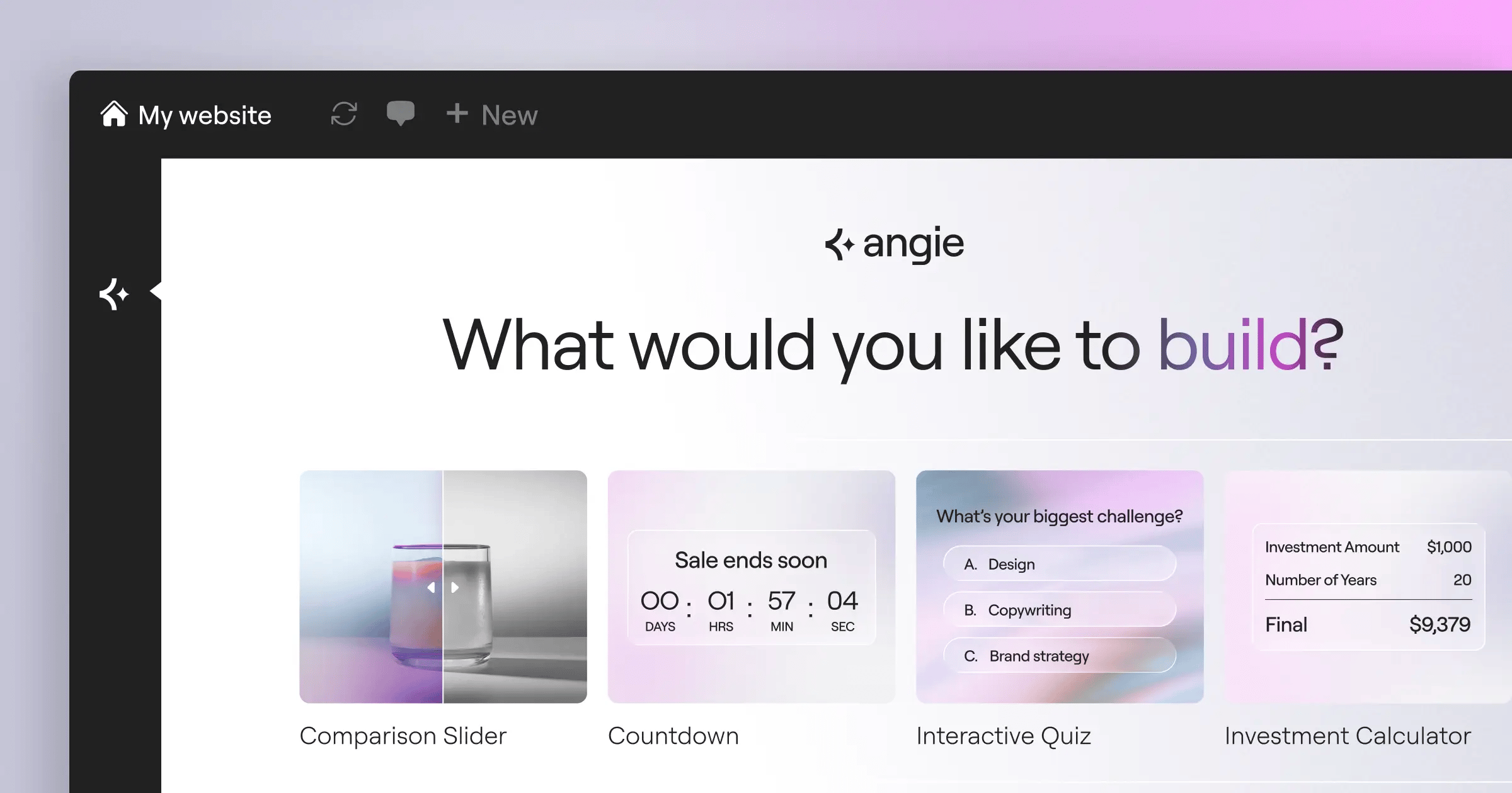
- The Widget Panel – Usually located on the left side. This menu contains all your building blocks. Text, images, videos, buttons, and forms live here. Tools like Elementor Editor Pro give you access to 118+ widgets out of the box.
- Sections/Containers – These are the largest structural elements. They span the width of your screen. They hold everything else together.
- Columns – These sit inside your sections. They divide your horizontal space. If you want a picture next to a paragraph, you need a two-column layout.
- Widgets – These are the actual functional elements. You drop a widget inside a column. The widget is the button, the headline, or the image.
To build a layout, you click the plus icon on the canvas. You select a container structure. Then you click and drag a widget from the side panel directly into that container. You release your mouse button, and the element appears instantly.
Once you drop an element, the side panel changes. It now shows the specific settings for that exact widget. This is where you change the text, adjust the size, or add a link.
Step 4: Creating Global Design Systems
Amateurs change colors one button at a time. Professionals set up a system once and never think about it again. This is how you build sites fast.
A global design system centralizes your style choices. If your client suddenly wants the brand color changed from blue to purple, you shouldn’t have to edit 50 individual pages. You change it in one central menu, and the entire website updates automatically.
This works using CSS variables. In 2026, modern platforms use an atomic CSS foundation. This means the underlying code is extremely clean, making global changes instantaneous.
Here’s how to structure your global settings:
- Define your primary brand colors – Open your global site settings. Input the exact hex code for your primary color, secondary color, text color, and background color. Give them clear names.
- Set up typography scales – Choose a clear sans-serif font for your body text. Pick a bolder font for your headings. Set the exact sizes for H1 through H6 tags. Ensure your H1 is massive and your body text is readable.
- Configure global buttons – Design your standard button once. Set the padding, the hover animation, and the border radius. Now, every time you drag a new button onto the canvas, it automatically inherits this perfect design.
- Establish layout widths – Tell the builder exactly how wide your main content area should be. A standard width of 1140px or 1200px works perfectly for modern desktop monitors.
By enforcing these rules, your site stays consistent. Consistency builds trust. Visitors notice when an H2 heading on the contact page is slightly smaller than the H2 on the homepage.
Step 5: Building Core Pages and Templates
You’ve got your foundation. You’ve got your global styles. Now you actually build the visible parts of the website.
Start with the elements that appear on every single page. You don’t want to rebuild your navigation menu 15 times. You build it once as a template and assign it to the entire site.
The Theme Builder is your best friend here. It allows you to design the structural shell of your website. You’ll create a custom header containing your logo and navigation. Then you’ll create a custom footer with your copyright info and legal internal links.
Once the shell exists, you move to the specific pages. Let’s break down a high-converting homepage structure.
- The Hero Section – The very top of the page. You need a massive headline explaining exactly what you do. Add a short subheadline and a clear Call to Action (CTA) button. Use a high-quality background image with a dark overlay so the text remains readable.
- The Social Proof Strip – Right beneath the hero. Add five grayscale logos of companies you’ve worked with. People trust brands they recognize.
- The Problem/Solution Area – A two-column layout. On the left, describe the exact pain point your customer faces. On the right, explain how your service fixes it.
- The Service Grid – Use a three-column container. Drop an icon box widget into each column. Briefly list your three main services.
- The Final Push – At the very bottom, right before the footer. A dark container with one last, massive button asking the user to contact you.
Remember to use ample white space. Don’t cram widgets directly against each other. Add at least 60px of padding to the top and bottom of every major section. Your design needs room to breathe.
Step 6: Optimizing for Mobile Devices
Designing exclusively on a large desktop monitor is a massive mistake. Over half of your traffic will view your site on a six-inch glass rectangle.
If your text is too small, or your buttons are too close together, mobile users will bounce immediately. Modern builders give you responsive controls per breakpoint. A breakpoint is just a specific screen width where the design automatically changes to fit the device.
You must actively toggle to the mobile view inside your editor and fix layout issues. The software tries its best to stack elements automatically, but it isn’t perfect.
Pay close attention to these common mobile design failures:
- Reverse column stacking – On desktop, you might have text on the left and an image on the right. On mobile, they stack. Sometimes the image drops below the text, breaking the visual flow. You need to use the “reverse columns” toggle in your responsive settings.
- Massive typography – An 80px headline looks amazing on a 27-inch monitor. It takes up the entire screen on a phone. Scale your mobile H1 down to 36px or 40px.
- Hidden navigation elements – Ensure your desktop menu collapses into a clean “hamburger” icon on mobile. Test the dropdown to verify the links are easy to tap with a thumb.
- Excessive padding – That 100px of white space you added on desktop? It pushes your content completely off the mobile screen. Reduce mobile section padding to 30px or 40px.
- Horizontal scrolling – If an image or table is wider than the phone screen, it breaks the layout and causes annoying side-to-side scrolling. Ensure all elements are set to a maximum width of 100%.
Test your site on actual physical phones before launching. The editor’s mobile preview is highly accurate, but nothing replaces testing on real hardware.
Step 7: Advanced Features and Dynamic Content
Once you’ve mastered static layouts, you’re ready for dynamic content. This is what separates basic brochures from powerful web applications.
Dynamic content means the widget pulls information directly from the database automatically. You design the layout once, and WordPress fills in the blanks. If you’re building a real estate site, you don’t manually design a new page for every house. You create one Single Post Template.
You tell the headline widget to dynamically pull the “Property Title.” You tell the image widget to dynamically pull the “Featured Image.” When you publish 50 new property listings in the backend, the builder generates 50 perfectly designed pages instantly.
This workflow applies to complex web publishing environments too. You can build customized archive grids that automatically update whenever you publish a new blog post.
- Create custom fields – Use a plugin to add extra data fields to your WordPress posts (like Price, Location, or Author Bio).
- Design the template – Open your visual editor and create a new template for that specific post type.
- Connect the dynamic tags – Instead of typing text into the widget, click the dynamic database icon. Select the specific custom field you created.
- Set display conditions – Tell the builder exactly where this template should apply. (e.g., “Apply this design only to posts in the News category”).
You can also introduce interactive elements. Add a Popup Builder to trigger lead capture forms when a user tries to leave the page. Add sticky headers that remain visible as the user scrolls down. Just don’t overdo the animations. Keep slide-ins and fade-ins subtle and fast.
Step 8: Publishing and Performance Checks
You’ve finished the design. It looks great on your laptop. But you aren’t done yet. Publishing an unoptimized site ruins your search rankings and frustrates users.
A fast website requires aggressive optimization. Large image files are the number one cause of slow loading times. You can’t upload a 4MB photograph straight from your camera. It will take 10 seconds to load on a 4G connection.
You need a strict pre-launch checklist to guarantee peak performance.
- Compress all media – Use an Image Optimization to automatically convert your JPEGs to next-gen formats like WebP or AVIF. This routinely provides up to a 60 percent file size reduction without visible quality loss.
- Enable advanced caching – Caching saves a static version of your site so the server doesn’t have to rebuild it for every single visitor. Turn on Element Caching if your platform supports it.
- Run accessibility scans – Ensure your site works for visually impaired users. Tools like Ally can automatically scan your layouts for over 180 WCAG issues, like poor color contrast or missing alt text.
- Test form delivery – Fill out your own contact form. Ensure the notification email actually arrives in your inbox. Use a reliable Email Deliverability or transactional email service to prevent leads from hitting the spam folder.
- Verify SEO metadata – Check that every page has a unique title tag and meta description. This is what shows up in Google search results.
Launch day is just the beginning. The beauty of a visual platform is how quickly you can iterate. Watch your analytics. If a button isn’t getting clicked, just open the editor, change the color, and hit update. You control the entire platform now.
Frequently Asked Questions
Can I switch templates after I’ve started building?
Yes, but it isn’t always perfectly clean. If you apply a new full-site kit, it might overwrite your global colors and typography settings. Always back up your database before applying massive structural templates to an existing site.
Do these builders slow down my website’s loading speed?
They don’t have to. Older visual tools generated heavy code. Modern platforms from 2026 output extremely clean HTML and CSS. If your site is slow, you’re likely using massive uncompressed images or terrible budget hosting.
How do I fix a layout that looks broken on tablets?
Tablet traffic is tricky. Open your responsive mode and select the tablet icon. Adjust your column widths specifically for that breakpoint. Often, switching a three-column desktop layout to a two-column tablet layout fixes overlapping issues instantly.
What happens if I deactivate the builder plugin?
Your design will break. The builder generates the visual structure. If you turn it off, WordPress falls back to displaying raw text and basic images. You must keep the software active to maintain your complex layouts.
Do I still need to learn HTML and CSS?
You don’t absolutely need it, but it helps tremendously. Understanding basic CSS concepts like padding, margin, and flexbox makes using the visual controls much more intuitive. You’ll build faster when you understand the logic behind the buttons.
Can I reuse a specific section I designed on another page?
Absolutely. You can save any container as a global widget or a reusable block. When you drop that saved block onto a new page, it looks exactly the same. It’s a massive time saver for things like call-to-action banners.
Why aren’t my custom fonts displaying correctly?
Usually, it’s a caching issue. Clear your browser cache and your server cache. If they still don’t load, verify you’ve properly uploaded the WOFF or WOFF2 font files into your global typography settings, rather than relying on external script calls.
Can I build an online store using this method?
Yes, visual editors integrate deeply with eCommerce plugins like WooCommerce. You can use the drag and drop interface to design custom product pages, shopping carts, and dynamic checkout experiences without writing PHP.
Looking for fresh content?
By entering your email, you agree to receive Elementor emails, including marketing emails,
and agree to our Terms & Conditions and Privacy Policy.


