Table of Contents
No website design is complete without a header and a footer. It’s not an exaggeration to say that they play a major role in providing a great user experience by allowing for better navigation throughout the website. Not only that, but they are essential tools for promoting the website’s brand and they are great for placing CTAs.
In the past, tasks like removing the space between the header and the body in WordPress required going into the PHP files of the theme. Now, this task has become much simpler with Elementor’s Theme Builder.
Let’s take a deeper look into how Elementor Theme Builder gives you a powerful way to edit your site’s header and footer, visually designing it however you like.
What Is a Header?
A website header is the top area of your webpage. Usually, the header is consistent throughout your site. However, there are also websites that have different headers for different sections of the website.
The first impression your users will get of your website — whether they’ve reached your homepage, about page, or any other individual post — is through your header design. And, if designed well, it will draw the user’s attention and serve as a hook for them to keep scrolling and read on.
The header can also play an important role in promoting your business’ brand identity
by incorporating elements like the company logo, typography, colors, and the overall brand language.
Headers also contain functional options like site navigation, site search, a shopping cart (for sales sites), call to action (CTA) buttons, and other functions that enhance the user experience and increase conversion rates.
What Is a Footer?
A footer is an area located at the bottom of a webpage. Like headers, they typically appear consistently throughout the website, on all pages and posts.
Footers often receive fairly marginal attention, which is really a wasted potential since the footer repeats itself on every page of the site. They are just as important as the headers.
Your footer design, depending on the settings you choose, can display useful and important information, such as newsletter registration, copyright information, terms of use and privacy, a sitemap, contact information, maps, website navigation, and much more.
How To Edit Your WordPress Header in Elementor
Edit your header and footer easily by following these steps:
- Go to WordPress Dashboard > Templates > ThemeBuilder
- Click Add New Template and choose Header (or Footer)
- Name your header template and click Create Header (or Footer)
- Now you’ll be able to either choose a premade header (or footer) template or create one from scratch.
- Once you have made the needed changes to the header (or footer) design, click publish, and choose where to publish the header (or footer). The default is entire site.
- That’s it! You can now see your handcrafted header (or footer) live on your site.
You can also check out these video guides for how to create a header and how to create a footer.
Now, let’s take a look at some beautiful examples of headers and footers.
Additional Resources
Be sure to check out our other WordPress tutorials to see what you can accomplish using Elementor:
5 Website Header Examples
1. The Best Header for Navigation

This page header is suitable for sites with more complex navigation. It has a top bar and another central navigation menu. It also includes a search function, for more direct navigation. As a bonus, you can see the business’ logo on the left, together with the business’ colors. This classic, business-like header gives the impression of professionalism.
2. The Mobile-Friendly Header

The header section has a ‘hidden’ navigation in the Hamburger, and on the other side, the contact details and location are highlighted with large icons. It also has a top bar with social network buttons. Take note of how slim and minimalistic the header is, allowing for certain information to stand out. Furthermore, this minimalism plays an important role when it comes to mobile browsing since, with just a few tweaks, you can make this header look amazing on the mobile screen.
3. The Artistic Header

In this design, you can see an example of an unconventional use case – navigation not via the traditional menu, but rather using an icon with a link. This can be used on sites with a small number of pages or those that have internal navigation on long landing pages. There is also the use of a ship in the header, that looks sort of like waves, and the overall header size is bigger, to make it stand out more.
4. The Enchanting Header

This is another example of the creative use of the header. Here, you can see a large background image area used to extend a full-screen-width making this look like one, continuous image, without breaking the atmosphere of the page.
5. The Minimalist Header

The design shows uses of bright orange colors set upon a dark grey background. It gives the impression of cleanliness and order. If you wanted to switch the colors around or use gradients instead, it will take you only a few seconds to achieve the desired result.
Sticky Header for WordPress
In addition to the regular header that goes aways when you scroll down, you can create a sticky header that stays throughout the whole of the user’s visit to your website.
Sticky headers are great for bringing more focus to navigational links in menus and helping visitors more easily navigate through the main pages of your WordPress website — be it the homepage, archive or single posts and regardless of how far they scrolled through the page.
It’s not only for navigational purposes though – They can also considerably improve SEO and increase conversion rates, simply by adding the right call-to-action to either the fixed-top of the page.
How To Build Custom WordPress Header Templates for Different Pages
Want to designate different headers and footers to different pages of your WordPress site?
You can accomplish this goal in no time. All it takes is creating different header and footer templates, and assigning the proper conditions for each template, attributing the headers and footers to the relevant pages of your site — like the homepage, for example. Check out this video guide to learn more.
5 Website Footer Examples
1. The Extra Long Footer
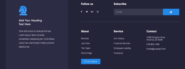
This footer design puts an emphasis on design with complex navigation. On the left side, it has a column with a logo and details, and on the right, there’s a navigator, contact, newsletter, and social buttons.
What’s key to emphasize here is that even when the footer contains numerous features it does not appear overloaded, because there is a clear design division in the regions.
Watch the video tutorial.
2. The Mobile-Friendly Footer
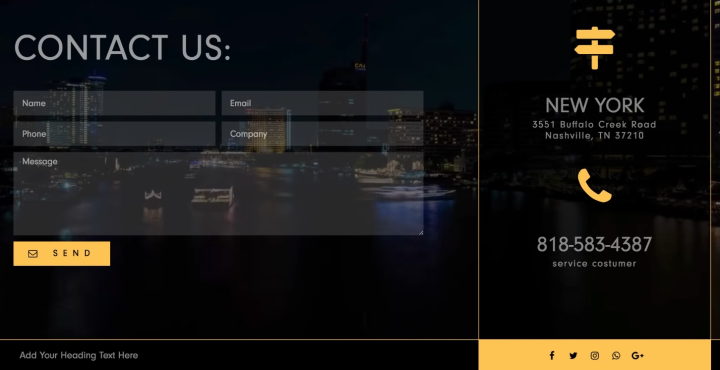
The footer’s substantial size is eye-catching, its large area is filled with a video form background form and with a contact form. Again, the contact information and location are positioned in a place that really stands out.
When designing a header or a footer, don’t forget to take mobile devices into consideration, and understand how the design may differ on them.
Watch the video tutorial.
3. The Artistic Footer
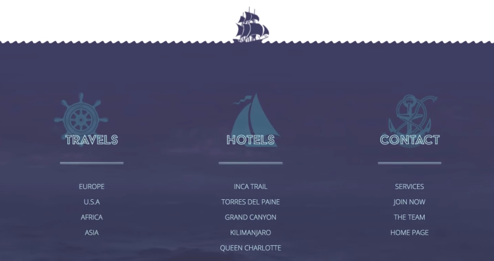
The footer has a large area with a video background and complex navigation. An image was also added in a separate area and attached it to the center to get a suitable design effect.
Watch the video tutorial.
4. The Enchanting Footer

The footer has a large image above the navigation area, with the bottom area being the background color of the image, containing basic navigation in several columns, a contact form, and more.
Watch the video tutorial.
5. The Minimalist’s Footer
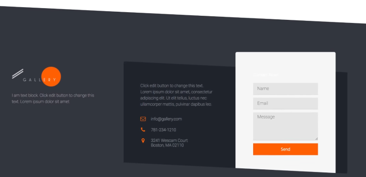
The simple footer offers little in terms of information, however, it takes a large space and implements uneven geometrical shapes to enforce the sense of artistic freedom and a connection to abstract art.
Watch the video tutorial.
100% Responsive and Mobile-Friendly Headers & Footers
Design a responsive header and footer for WordPress by previewing them in Elementor’s mobile view. You can differentiate between different column structures and widths for different devices, and create headers and footers that look perfect on every device.
Header and Footer control makes Elementor’s mobile menu builder more relevant than ever. The menu automatically turns into a mobile hamburger menu, so you don’t have to do any customizations on your own.
While you can customize any header and footer for mobile devices, sometimes designers prefer to design two separate sections, showing one on desktops and the other on mobile. This can be easily done with a simple hide/show click, available under the advanced tab of the section.
Create Amazing Headers and Footers With Elementor
With Elementor Theme Builder, we solved a huge problem known by every WordPress user.
Never again will you have to wait for the developer to change your header.php file, switch to another theme just to move a header logo, or work hard to customize the CSS header and footer elements of your site. Elementor Pro makes header and footer design quick and super-simple.
Finally, your website vision can truly come to life. Join Pro today, and gain complete control over your entire website design.
Looking for fresh content?
By entering your email, you agree to receive Elementor emails, including marketing emails,
and agree to our Terms & Conditions and Privacy Policy.
