Table of Contents
Frequently Asked Questions (FAQ) pages are incredibly common on business websites and they aim to answer some of your visitors’ most pressing questions. They can save time, increase conversions by providing instant answers and improve the user’s experience overall.
However, a poorly-designed page, or one that doesn’t address common concerns, is not helpful. Ideally, your FAQ page will be easy to navigate so that users can find the information they need quickly. To achieve this, you’ll want to study examples of excellent FAQ pages from around the web, and then implement the techniques they employ.
In this article, we’ll talk about why FAQ pages are so useful and how to design one when creating your website. Then we’ll show you ten powerful FAQ page examples. Let’s get to it!
Table of Contents
Why You Need an FAQ Page on Your Website
If you run an online business, you probably deal with a constant barrage of customer inquiries. You likely have users asking questions about your services, prices, shipments, technical issues, and so on.
To build goodwill and trust, you need to answer each question. However, once you’ve been in business long enough, you’ll notice that a lot of users keep asking the same questions over and over. That’s where the FAQ page comes in handy.
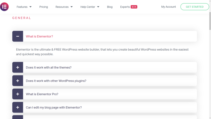
An FAQ page – as its name implies – is a compilation of common inquiries alongside short answers:
By compiling all of this information on one page, you kill several birds with one stone. Some of the most significant benefits of adding an FAQ page on your website include:
- It can reduce the number of emails, calls, or tickets that you have to address.
- Users will be able to find the information they need quickly, instead of having to wait for a response from you.
- Your team will be able to focus on other tasks, instead of dealing with questions all day long.
- As it grows, you get the opportunity to target keywords that you might not be able to address with the rest of your content.
Overall, an FAQ page doesn’t just make your users’ lives easier; it can also help lower your workload and attract more traffic.
How To Create an FAQ Page (5 Key Tips)
Although FAQ pages tend to be relatively simple, there are a few things you’ll have to consider when building one. Before we look at some design examples, let’s talk about some tips to keep in mind when creating an FAQ page.
1. Decide What Questions To Include
The core of an FAQ page is, of course, its questions and answers. You don’t have to answer every single potential question that customers might have, but it’s smart to focus on the most common inquiries.
For example, if you have a website for a plugin, some sections you could include in an FAQ page would be:
- What does the plugin do?
- Does it work with other popular tools and themes?
- What is the difference between the plugin’s free and premium versions (if there are any)?
- How can I get started using the plugin?
As a rule of thumb, the questions that you should cover on this page are relatively low level and ones that can be answered briefly. Keeping the content concise can make the page easier to navigate.
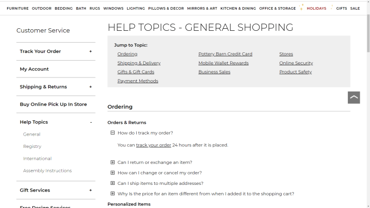
One design choice that a lot of FAQ pages adopt, which we encourage, is the use of ‘accordions’. You can have a list of questions that enables users to expand each element, in order to see the answers they’re looking for:
For more complex or specific questions, you can create a knowledge base that provides in-depth answers and information.
2. Categorize Your FAQs
Once you have a list of the questions you want to answer, we recommend breaking them down into categories. For example, you could have a general questions section, another for technical issues, and a third that deals with billing.
The larger your FAQ page becomes, the more necessary categories will be. We suggest using subheadings to make it easier for users to find the questions they’re looking for. Moreover, this element can help clarify what type of content users will find in each category.
At some point, you may end up answering so many questions that it warrants creating an FAQ page for each category. If you reach that stage, it can be helpful to rename your main FAQ page to something else, such as Help Center, to avoid confusion.
3. Create a Hierarchy for Your FAQ Page
FAQ pages are incredibly important and can make your users’ lives easier as well as your own. However, it’s not all that common to include a link to your FAQ page within the primary navigation menu.
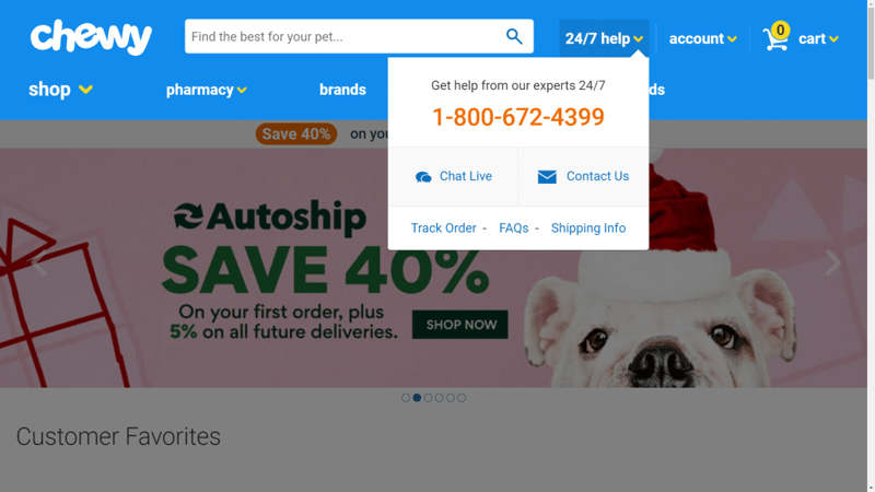
Instead, many businesses link to it within a broader submenu that covers all support-related pages:
Another popular option is to link to your FAQ page in your site’s footer. Many websites with complex hierarchies (i.e., lots of pages) use their footers to include all the links the primary menus can’t contain:
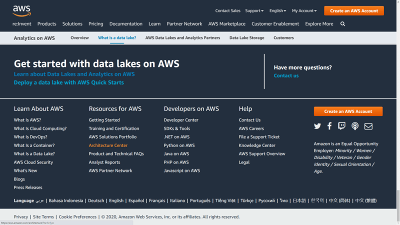
If your website includes more than one support-related page, we recommend bundling them together under a Support or Help category. That way, users will know what pages they need to reach to get the answers they want.
4. Update Your FAQ Page Frequently
The questions that users ask now about your business, products, and services may not be the same ones they’ll have in a few months or years. As your company evolves, your FAQ page should too.
In a nutshell, this means keeping an eye out for new, yet common questions that users have, so you can find opportunities to expand your FAQ page. Keep in mind, though – not all questions deserve a spot on that page.
If you’re only getting a particular question once per year, then it’s probably not worth it to update your FAQ page. However, if your product or business undergoes major changes, that’s a good reason to review this page’s content.
5. Choose a Clear Design for Your FAQ Page
Naturally, not all FAQ pages adhere to the same style. However, as far as web design goes, there are some common themes. Typically, you want the design to be as straightforward as possible so that it is easy to navigate and doesn’t distract from the answers.
You might consider incorporating Calls to Action (CTAs) on the page whenever possible. After all, some people will visit that page before they decide to use your services. If your answers are convincing enough, they can help you increase conversions.
To get a better idea of how you might design an FAQ page, it helps to look at real-world examples. In the next section, we’ll take a look at some and discuss why they work so well.
10 Examples of Effective FAQ Pages
Although FAQ pages aren’t usually flashy, there’s still a lot you can learn by checking out how other companies approach theirs. Here are ten FAQ page examples from some well-known brands.
1. Amazon Web Services (AWS)
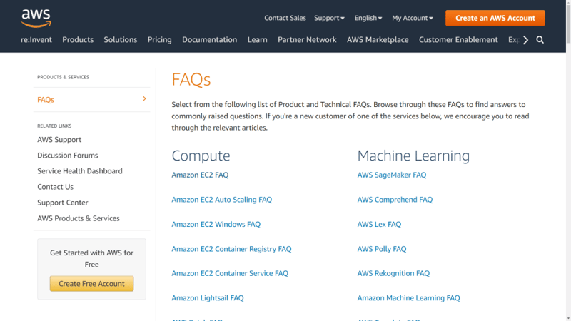
FAQ pages don’t get much more complex than this one from Amazon Web Services (AWS). Considering the sheer wealth of services the company offers, it’s only logical that it can’t fit all the most common questions onto one page.
What AWS does is use its primary FAQ page to link to individual pages for each of its services. Those individual FAQ pages are concise and to the point, and they highlight questions in a bold font, which is a smart design choice:
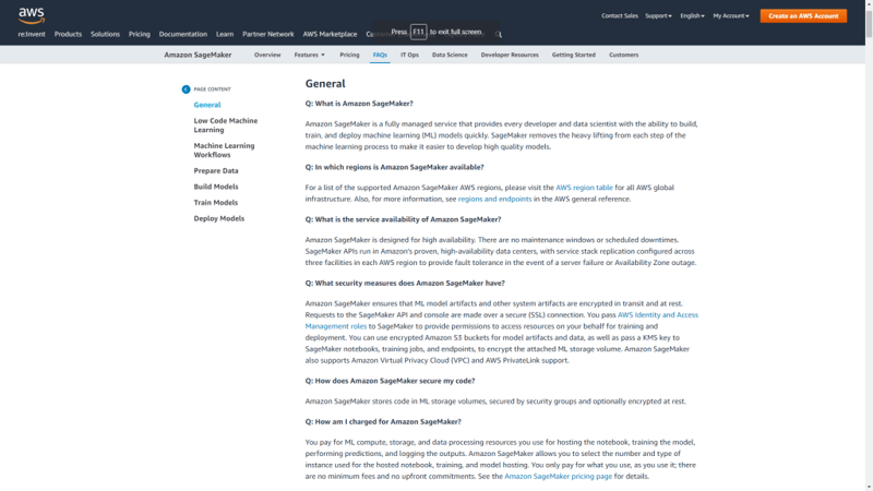
Additionally, AWS includes a table of contents that you can use to navigate categories within its FAQ pages. If your page includes multiple sections, using a table can make it much easier for customers to find the information they need.
2. Netflix
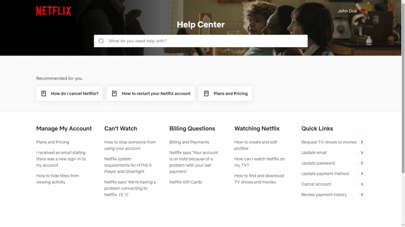
Netflix’s help center page is simple from a design standpoint, but it remains one of our favorite examples thanks to how intuitive it is. One key aspect is that the search bar is front and center on the page, rather than hidden within the navigation menu as it is on many other sites.
This design choice encourages users to use the search feature, instead of crawling through multiple categories and pages to find the answers they need. To make life even easier, Netflix includes a short roundup of questions that it ‘recommends’ to you based on the most common queries users have.
3. SoundCloud
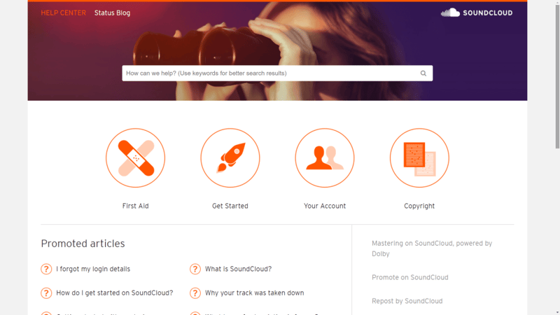
SoundCloud’s FAQ page uses a similar approach to Netflix. There is a search bar at the top of the page, so you can forego browsing categories and look up the answers you need immediately.
If you look closely, you’ll notice that the search bar encourages you to use keywords to find answers. It’s a simple addition, but it can make a significant difference in how users interact with the element.
Moving on, SoundCloud uses icons to help you differentiate between its top question categories. The idea is that if you don’t want to use the search feature, you can quickly jump to the question category you’re looking for.
There is also a list of Promoted articles or top questions that should address some of the most popular inquiries visitors might have. All in all, this FAQ page is a solid example of an effective hierarchy.
4. Lego
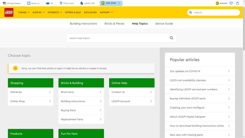
It shouldn’t come as a surprise that Lego’s FAQ page is a lot more colorful than the other examples we’ve shown you so far. Lego uses its trademark bright colors to help you differentiate between the question categories, which makes the page easier to navigate.
There is also a sidebar that links to some of the most popular articles and questions, which helps to cover even more ground. For specific question pages, Lego happens to include several of the features we’ve highlighted on other websites, such as Contact Us sections and polls on how informative the answers are:
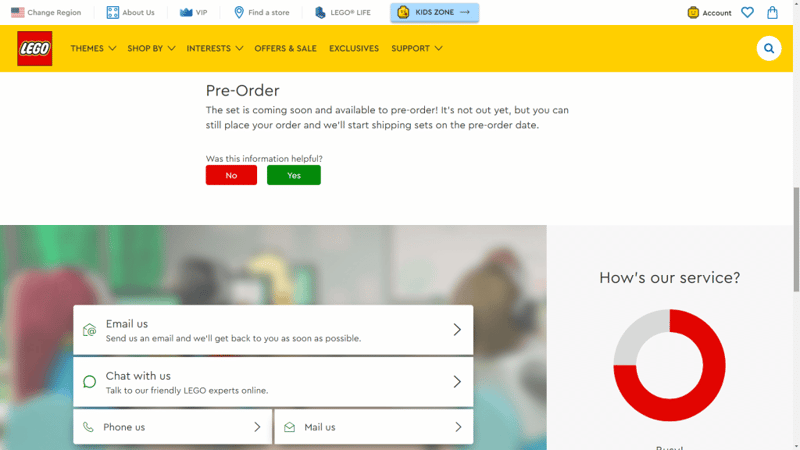
Although the design here is a bit eclectic, it’s a strong example of how you can combine features to make FAQ pages even more effective.
5. Reddit Help
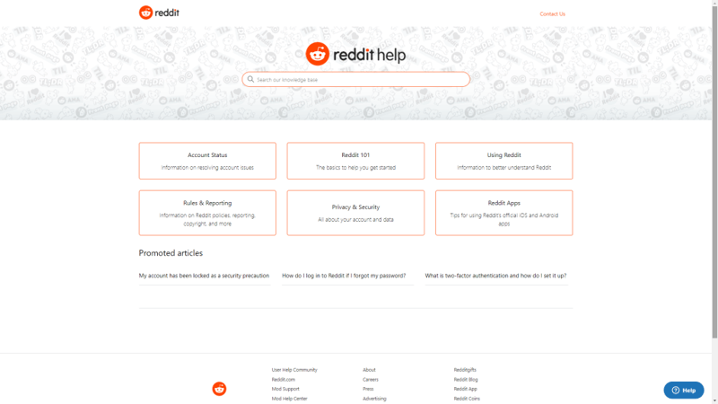
Reddit is one the most popular social media platforms on the web, so it shouldn’t come as a surprise that it offers a comprehensive FAQ page for its users.
This FAQ page is easy to navigate because it breaks down its content into categories. Moreover, category names are more descriptive than what you usually find in FAQ sections. Instead of Getting Started, you have Reddit 101, to give one example.
Ideally, your FAQ page should use the same terminology as the rest of your website does, so it’s easier for your users to search through. As far as design goes, Reddit’s FAQ is all too straightforward, but that’s not necessarily a bad thing:
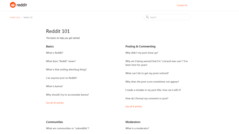
With a FAQ page as comprehensive as this one, ease of use trumps stylish design. As long as the page is easy to navigate and it doesn’t detract from the rest of your website, it should do its job.
6. Google Drive
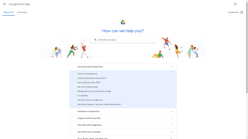
Any online tech service worth its salt requires an extensive FAQ page. Google Drive is no exception, but it does buck design trends by including all of its most asked questions under an accordion.
You can click on any element within the accordion to expand it, and you’ll see all of the questions it contains. Clicking on those questions will send you to expertly-formatted answer pages. Notice that Google Drive uses both subheadings and tabs to help you navigate the contents of each answer:
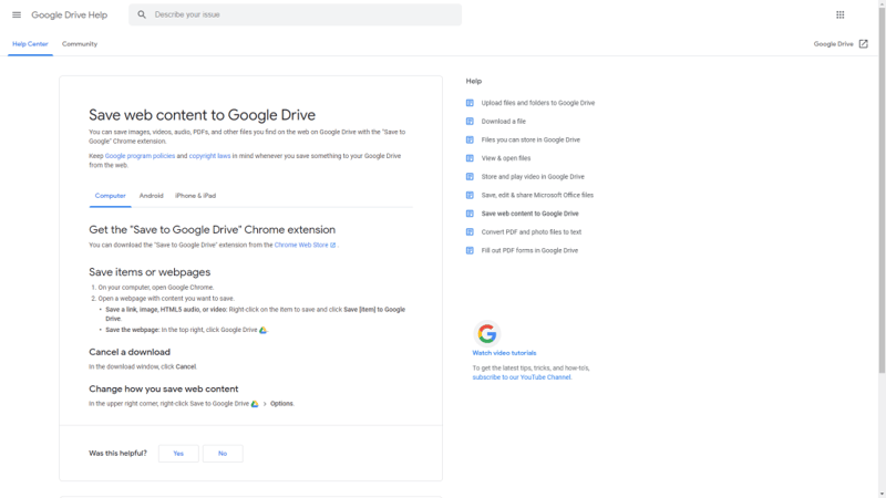
One mistake that a lot of FAQ pages make is failing to add any formatting to their answers. Every answer is an opportunity for users to find that content via search engines, and even if that weren’t the case, the content should still be structured for ease of reading.
Another smart move on Google Drive’s part is to include related questions in a menu to the right of the main answer, so you can jump between pages without returning to the main FAQ.
7. Newegg
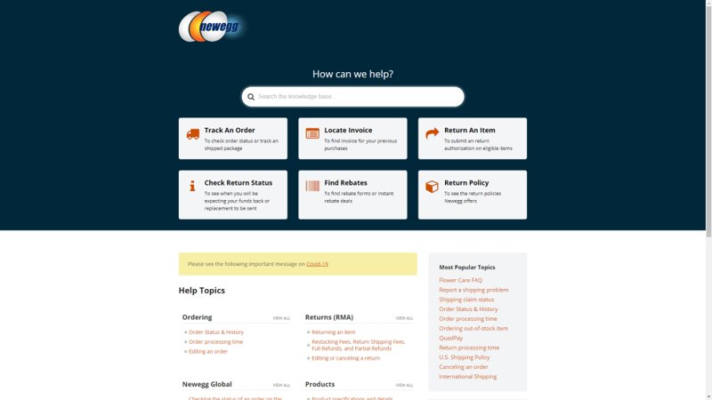
E-commerce stores require some of the most comprehensive FAQ pages that you’ll find online. As your store grows, so should your FAQ page, because your customers will have plenty of questions to ask.
Newegg’s FAQ page is a perfect example of that in action. It includes hundreds of responses spread out across over ten categories. However, to make navigation easier, it highlights the most common question categories at the top of the page, right below the search bar.
The goal here is that if you don’t know precisely what you’re looking for, one of those sections should contain the answer that you need. If it doesn’t, then you can move on to the rest of the FAQ sections.
8. LinkedIn
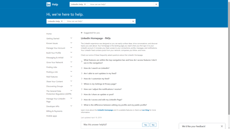
Millions of people use LinkedIn for networking and job prospecting. With so many users and such high stakes, it stands to reason that LinkedIn needs a FAQ page that covers pretty much anything users might be looking for.
To solve this problem, LinkedIn uses a very straightforward approach for its FAQ page. The main page includes an accordion menu to the left that spans over a dozen categories. Each of those categories, in turn, has its own page including links to related articles.
As you can see, LinkedIn’s FAQ design is sparse. However, that’s not a bad thing considering who its intended audience is. Since a lot of users might not be very tech-savvy, it’s important that LinkedIn tailors its FAQ page so it’s as straightforward as possible.
9. Target
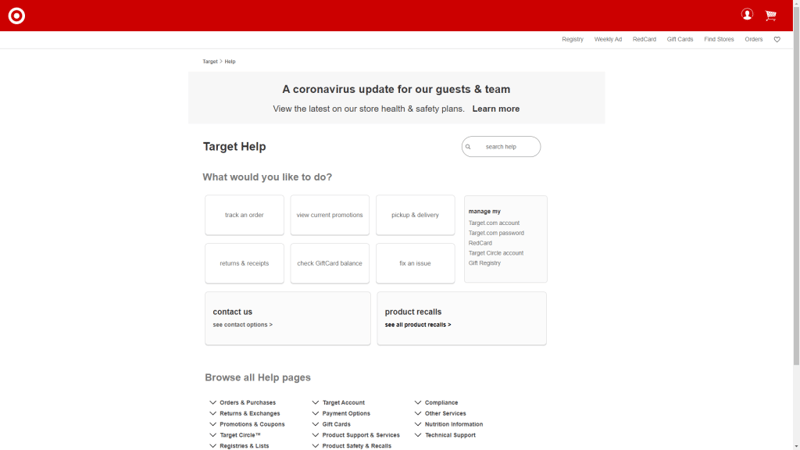
Target uses one of the simplest approaches to FAQ page design that we’ve seen so far. The page uses a CTA to prompt you to decide what you’re having problems with. Once you make a section, Target leads you to another page asking what your specific problem is.
For example, here’s what you’ll see if you want to read more about returns and receipts:
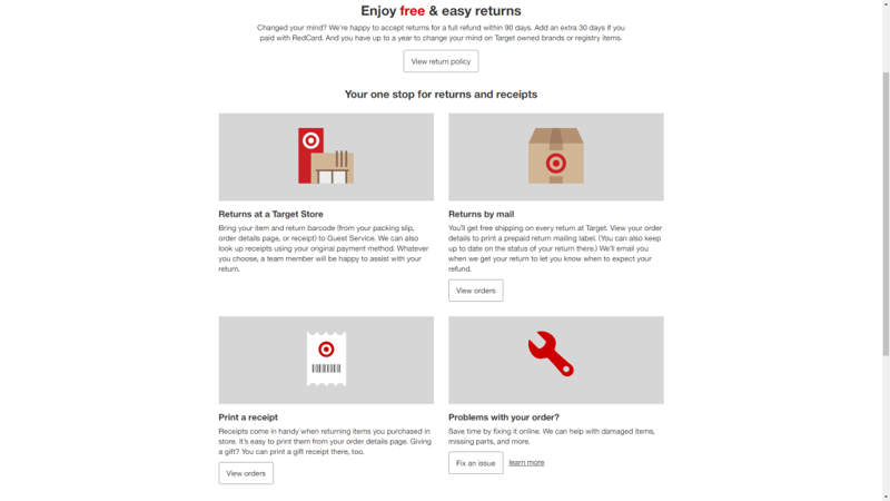
Each problem includes a brief description to help you identify your issue, and then leads you to a solution.
In essence, Target takes the traditional FAQ approach of including a list of questions and shakes it up. Instead, you ask customers specific questions to help lead them to the answers they need.
10. USPS
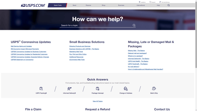
If there’s one service that needs a FAQ page, it’s USPS. With so many people depending on this company to receive their mail and packages, it has to deal with a massive amount of support requests and phone calls.
The great thing about a comprehensive FAQ page is that it can help reduce support requests via other channels, thus making your job easier. This particular page opens with three sections covering the most common questions USPS customers look for, then moves on to a ‘Quick Answers’ section (which double as the FAQ’s categories).
Clicking on any of those categories leads you to a list of its specific questions. At every turn, you can still use the FAQ’s search feature, which is something all help sections should seek to emulate.
Design an Effective FAQ Page Using Elementor
By now, you hopefully have a pretty good idea of what makes for an effective FAQ page. If you manage to answer users’ questions and make it easy for them to find the information they need, you can consider your page a success.
Moreover, when it comes to FAQ pages, remember to combine both functionality and style. That means opting for designs that don’t distract from the text, and prioritizing features such as search bars to help users find answers faster.
Do you have any questions about how to create an FAQ page? Ask away in the comments section below!
Looking for fresh content?
By entering your email, you agree to receive Elementor emails, including marketing emails,
and agree to our Terms & Conditions and Privacy Policy.
