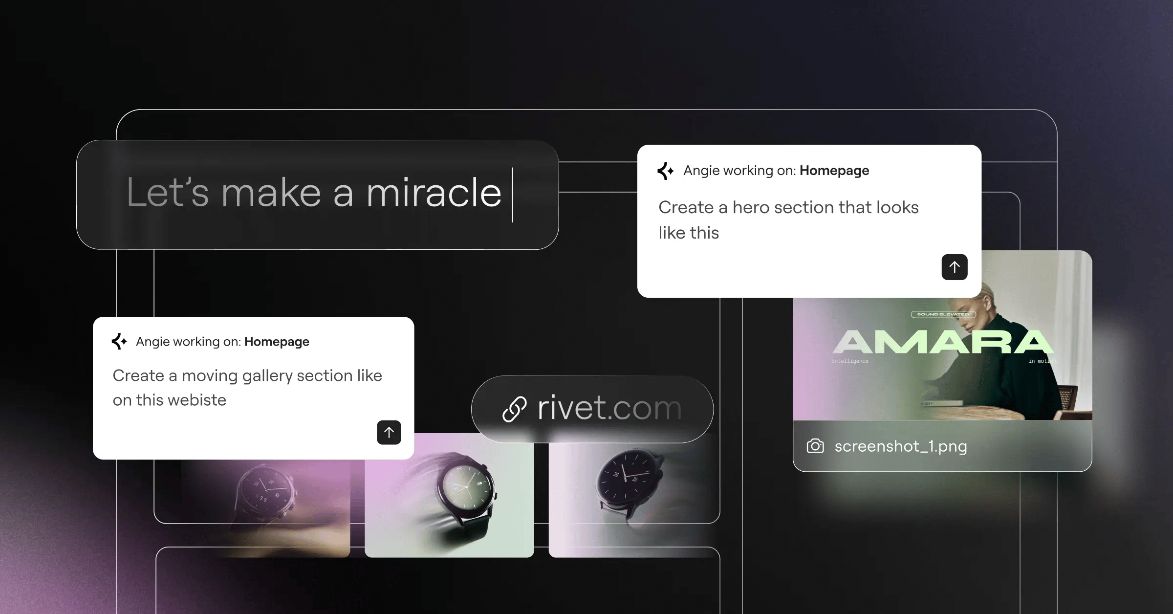
Building a website used to mean wrestling with HTML and hoping your CSS didn’t collapse. That’s changed: you can now design a professional site visually, in real time, without touching code. If you’ve rearranged slides in a presentation, you already have the instincts for it.
Key Takeaways
- Visual builders let you design a site in real time without writing code.
- They use sections, columns, and widgets to organize your layout on a canvas.
- Most builders generate clean, responsive code for you automatically.
- You can customize colors, fonts, and dynamic elements from simple panels.
- Self-hosted WordPress builders offer the best mix of design freedom and ownership.
What Is a Drag-and-Drop Website Builder?
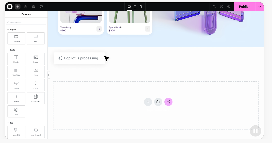
A drag-and-drop website builder lets you build pages by placing elements like images, headings, and buttons onto a canvas instead of writing code. This is what’s called WYSIWYG: what you see is what your visitors get.
Building a site used to mean learning HTML, CSS, and JavaScript, where one typo could break the layout. Visual builders act as the interpreter, so you don’t need to be a developer to launch something polished.
How Do Visual Website Builders Work?
Modern web design follows a structured hierarchy: sections, columns, and widgets keep everything organized so your page holds up on a phone screen too.
Think of your page like a house: sections are rooms, columns are walls, and widgets are the furniture inside. Add a section, pick a column count, then drag in widgets like text and buttons.
Behind the interface sits the CSS box model, hidden settings for margin, padding, and borders, turned into simple sliders you drag to add space around any element.
The Core Elements of Visual Web Creation
Most visual editors share the same building blocks, from basic copy to interactive elements, and knowing how they fit together is the key to solid layouts.
Here are the primary components you’ll work with:
- Builds your page’s structural layout using sections and containers.
- Places titles, text, and image boxes where they belong.
- Controls the alignment, sizing, and spacing of every element.
- Adjusts margin and padding through drag handles or numeric inputs.
- Optimizes the layout into clean rows and columns.
- Previews the finished design across desktop, tablet, and mobile instantly.
Global styling means setting your brand colors and fonts once; the editor applies them everywhere.
- Saves time by updating brand colors across every page.
- Maintains a consistent look by enforcing typography rules throughout.
- Reduces code clutter by reusing the same global styles everywhere.
- Simplifies rebranding by letting you change your colors in one place.
Responsive design comes built in: switch device views with a click to adjust fonts, hide elements, or rearrange columns for mobile.
- Adapts your layout dynamically to fit any screen size.
- Scales images and text to stay readable on smaller displays.
- Displays specific blocks on mobile only, hiding them on desktop.
- Formats column stack order for a logical mobile reading flow.
Interactive elements make pages feel alive and, used well, can genuinely lift your conversions.
- Connects forms directly to your email marketing software.
- Triggers entrance animations as users scroll down the page.
- Displays multiple images in an interactive slider or carousel.
- Pulls dynamic blog feeds directly onto your homepage automatically.
Why You Should Choose the Elementor Website Builder
If you’re building on WordPress, the Elementor website builder is the professional standard for visual creation, giving you complete design freedom in one live workspace instead of juggling separate themes and editors.
The core editor comes loaded with over 100 widgets, from headings and text to forms and dynamic feeds, plus responsive editing across up to 7 device breakpoints.
Design is where Elementor stands out. Global colors and fonts mean one panel update refreshes your whole site instantly, and for advanced work there are motion effects, CSS transforms, and a template library with hundreds of designer-made kits.
Beyond design, the builder folds in a form builder, popup creators, and built-in Image Optimization to keep pages fast. A Cookie Consent tool handles consent banners, Web Accessibility helps you detect potential issues, and built-in AI can help you draft copy, sketch image and logo concepts, and lay out sections.
Here’s what the platform can do for you:
- Arranges content visually on your canvas using a live editor.
- Drafts custom copy and image concepts using integrated AI tools.
- Customizes headers, footers, archive templates, and single post layouts visually.
- Improves site performance by consolidating form tools into one system.
- Speeds up your pages with built-in image optimization and performance controls.
- Assists in identifying potential accessibility issues with the Web Accessibility tool.
- Manages legal compliance via a visual cookie consent banner builder.
Because Elementor runs on self-hosted WordPress, you keep full ownership: use any WordPress plugin, launch a store with WooCommerce, or pick any host you like. The Elementor features page shows how it pairs easy editing with the full power of WordPress.
Comparing Popular Visual Builders in 2026
As you plan your project, you’ll run into several visual building options: hosted platforms that bundle software and hosting together, or visual editors built to run on open platforms like WordPress. Here’s how the top builders compare in 2026:
| Platform Name | Setup Type | Key Strengths | Best For |
|---|---|---|---|
| Elementor Website Builder | Self-hosted WordPress | Visual design freedom, extensive templates, dynamic templates, built-in AI and accessibility tools. | Web creators, freelancers, agencies, and business owners wanting complete control. |
| Wix | Hosted Platform | Freeform visual positioning, fast setup, and an all-in-one platform design. | Beginners and small business owners looking for an all-inclusive setup. |
| Squarespace | Hosted Platform | Structured layouts, clean typography, elegant templates, and integrated store tools. | Creatives, photographers, and small shops needing polished, visual portfolios. |
| Webflow | Hosted Platform | Direct control over CSS properties, visual database building, and advanced animations. | Professional designers and agencies comfortable with visual front-end code. |
| WordPress.com | Hosted WordPress | Managed hosting, block-based site building, and easy content management. | Bloggers and growing businesses wanting a managed WordPress environment. |
Choosing between them comes down to how much control you want. Hosted platforms are quick to launch but can limit exporting data or custom code, while WordPress-based options give you more flexibility to switch hosts and customize freely.
Step-by-Step: How to Build Your First Page
Building your first visual page is more approachable than it looks. Let’s walk through it step by step: don’t worry about the technical side, just focus on the design flow.
- Set up your platform. Install WordPress, then add your visual builder.
- Create a new page. From your dashboard, add a new page and open the editor.
- Set your layout structure. Add a section and pick a column count, like two columns for text and an image.
- Drag in your widgets. A Heading in one column, Text below it, and an Image in the other.
- Upload your media. Click the image block, upload a photo, and adjust its size.
- Style your typography. Open the heading’s style tab and apply your brand colors and fonts.
- Add your call to action. Drag in a button, style it to stand out, and add your link.
- Check your mobile preview. Click responsive mode to confirm it looks clean on phones.
- Publish your design. Review spacing and alignment, then click Publish to go live.
Once you’ve got the rhythm, you’ll move faster and build with a lot more confidence.
Crucial Tips for Designing a Professional Website
Anyone can drag a widget onto a page, but making it look polished takes a bit of strategy, not a design degree.
- Embrace white space. Give headings and blocks room to breathe; crowding makes pages feel cluttered.
- Stick to a simple palette. One dominant color, one secondary, and one bright accent for buttons and links.
- Create a clear font hierarchy. Bold for headings, legible for body text.
- Use high-quality imagery. Skip generic stock photos for sharp, on-brand images.
- Focus on navigation. Keep menus clean and put call-to-action buttons in predictable spots.
Good design is often invisible: it quietly guides your visitor’s eyes from your message to your call to action.
Common Pitfalls to Avoid When Using Visual Builders
Visual builders are a huge help, but it’s easy to make mistakes if you use every feature in the panel. Keeping your layout clean and fast matters most.
- Uploading heavy, unoptimized images. Large camera files slow your site, so crop and optimize before adding them.
- Using too many distracting animations. Spinning text and bouncing buttons pull focus from your message.
- Ignoring mobile layout adjustments. Always check your phone view; a desktop layout can wrap awkwardly on mobile.
- Using inconsistent global styles. Changing fonts or spacing on every page makes a site feel disconnected.
- Creating overly nested layouts. Avoid columns inside columns inside columns; complex structures are harder to edit.
Keeping layouts simple and relying on global styles helps you sidestep these mistakes, so your site stays fast, professional, and easy to manage as you grow.
The Future of Visual Web Development
Visual web design keeps evolving, and 2026’s builders are smarter than ever, with AI woven directly into the editing workflow to help shape layouts, tighten performance, and build more accessible pages.
“The evolution of visual builders has bridged the gap between complex code and pure creative expression. Today, creators can focus entirely on user experience and design while the editor handles the technical heavy lifting under the hood.” Itamar Haim, Web Development Specialist
As browsers get faster and standards mature, the gap between visual editing and hand-written code keeps closing, and visual design is now the default workflow for agencies and developers, not just beginners.
Related: Elementor pricing.
Frequently Asked Questions
Are drag-and-drop website builders search engine friendly?
Yes. Modern visual editors generate clean, well-structured HTML that search engines crawl easily. Add alt text to images, use proper headings, and optimize assets before upload.
Do I need to know how to code to use a visual builder?
No. Visual builders let you handle layout, styling, and design through a drag-and-drop editor. A little HTML and CSS helps for custom tweaks, but it’s not required.
Can I turn my visual website into an online store?
Yes. On WordPress with a builder like Elementor, install the WooCommerce plugin to manage products, payments, and shipping, then design your product pages visually.
Will a visual website builder slow down my website load speed?
Not if it’s built well. Modern editors load only the code each page needs; actual speed depends more on hosting and image sizes, so optimize images and use built-in performance controls.
What is the difference between hosted and self-hosted builders?
Hosted builders bundle hosting, editor, and support into one closed platform. Self-hosted builders run on an open system like WordPress, so you keep full ownership of your files.
Is it possible to migrate my site to another platform later?
Migrating away from a closed, hosted builder is tricky since proprietary layouts don’t export easily. Build on an open platform like WordPress instead, and you can export content whenever you like.
Can I build a fully responsive website for mobile phones?
Yes. Responsive design is core to every modern editor. Switch to a phone or tablet preview to see how your site looks, and customize mobile padding, fonts, or column order.
Can I write my own code inside a visual builder if I want to?
Yes. Modern builders support custom code if you want personal touches: drag an HTML widget onto your canvas, paste in tracking scripts, or write custom CSS into element panels.


