Mastering margins means gaining control over the following:
- User Experience: Well-placed margins guide the eye and create a sense of order, preventing your design from feeling cramped or overwhelming.
- Responsiveness: Margins play a crucial role in ensuring your website adapts seamlessly to different screens – desktops, tablets, and phones alike.
- Professionalism: A polished website with consistent spacing is instantly recognizable, signaling attention to detail.
Whether you’re a web design veteran or new to CSS, Elementor offers powerful tools to simplify and streamline your margin styling and layout workflow.
Understanding Margin Fundamentals
What Are Margins in CSS?
Margins create invisible space around your website elements. Think of a picture frame: the photo is your content, and the frame around it is the margin.
Margins keep elements like paragraphs, images, headers, and sections from bumping up against each other, ensuring your website design has room to breathe. They’re fundamental to achieving a polished and professional layout.
With Elementor, you have incredible control over margins. You can visually adjust the size of the space around your elements, making those design tweaks a breeze. But before we get into the how-tos, let’s dig a little deeper into the nitty-gritty of margins.
Margin vs. Padding
Now, margins might seem similar to their cousin, padding, but there’s a big distinction:
- Margins are the transparent space outside your element’s border.
- Padding is the space within the element’s border.
Imagine an envelope. The margin is the space between the envelope and other letters in the mailbox. The padding is the space between the address on the letter and the edges of the envelope. Mastering both margins and padding gives you precise control over the layout of your website.
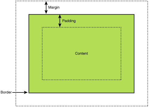
The CSS Box Model and Margins
The CSS Box Model is like a blueprint for how elements are built on a webpage. It has three key layers:
- Content: The actual text, images, or videos within the element.
- Padding: The space inside the border, as we learned.
- Margin: The transparent space outside the border.
Understanding this helps you visualize how margins interact with other layout elements. When working with elements in Elementor, you can often see visual representations of the box model, making it super intuitive to play with margins alongside other properties.
Margin Properties
Now, let’s break down how you actually control margins in CSS. You’ve got four main properties at your disposal:
- margin-top: Sets the space above the element.
- margin-right: Sets the space to the right of the element.
- margin-bottom: Sets the space below the element.
- margin-left: Sets the space to the left of the element.
Here’s where Elementor makes life so much easier – instead of writing out individual margin properties, you often have visual sliders or input boxes to adjust each direction independently. This lets you see the results immediately, making it so much faster to get that perfect layout.
Let’s move on to something that saves you a bunch of typing – shorthand!
Shorthand Syntax
The margin property is shorthand for setting all four sides at once. Here’s the order of values and what they control:
- One value: Applies the same margin to all four sides (e.g., margin: 20px;)
- Two values: The first value sets the top and bottom margins, the second the left and right (e.g., margin: 10px 30px;)
- Three values: The first value is the top margin, the second is for the left and right, and the third is for the bottom (e.g., margin: 20px 15px 10px;)
- Four values: Clockwise from top: top, right, bottom, left (e.g., margin: 10px 20px 30px 15px;)
Shorthand saves you a ton of code, making your CSS cleaner and leaner. And guess what? Elementor understands this shorthand! It’s often the default way to tweak margins in the visual editor.
Units of Measurement
CSS gives you tons of flexibility in how you express your margin sizes. Here are the most common units you’ll use:
- Pixels (px): The most straightforward unit, pixels offer fixed-size margins. Want a margin exactly 20 pixels wide? Go for it!
- Percentages (%): This is where things get responsive! Percentage margins are based on the width of the element’s parent container. So, margin-left: 10%; creates a left margin 10% as wide as the element it’s within.
- em: This unit is relative to the font size of the element. An em value of 1 would be equal to the current font size. This is handy for spacing that scales nicely with text.
- rem: Similar to em, but relative to the root element’s font size. This offers consistency if you need margins to scale across your whole website layout.
- Viewport units (vh, vw): These are based on the browser window’s size. 1vh equals 1% of the viewport height. This is great for full-screen effects.
Elementor usually lets you select your preferred unit from a dropdown menu when styling margins. This visual approach helps even if you need to become more familiar with the different units of measurement.
Common Margin Use Cases
Spacing Elements
One of the most fundamental uses of margins is to create consistent spacing between various elements on your website. For example, use a margin at the bottom to give your paragraphs some breathing room or add space between images in a gallery for a clean layout. Evenly spaced-elements make your website look organized and professional.
Elementor simplifies this immensely. You can often adjust spacing directly on the visual canvas or use precise margin controls to get the exact pixel values you desire.
Centering with margin: auto
Want to center a block of content horizontally? That’s where margin: auto comes to the rescue! Here’s how it works:
- You give an element a fixed width (e.g., width: 500px;)
- Set the left and right margins to auto.
The browser then calculates equal amounts of space on both sides, pushing your element right into the middle. This technique works for centering images, text blocks, and even whole sections of your layout.
But what about centering vertically? That’s a bit trickier with pure CSS, but Elementor’s visual controls often provide dedicated centering options to save you time!
Creating Layout Grids
Grids are the backbone of many web designs. Margins play a critical role in defining the columns and gutters (the spaces between columns) of your grid system.
For instance, you might have a 12-column grid where each column has a percentage-based width and a fixed margin-right to create spacing between columns.
Elementor often has pre-built grid and column structures, making this layout fundamental and super easy to implement visually. However, understanding the underlying CSS margin principles will help you customize and troubleshoot your layouts effectively.
Overlapping Effects
Negative margins are your ticket to creating eye-catching overlapping effects in your web designs. By giving an element a negative margin (e.g., margin-top: -20px;), you essentially pull it upwards, causing it to overlap with the element above it.
This technique can be used to add depth to your layouts, create layered image compositions, or have sections partially cover each other for a dynamic appearance.
Elementor may not always give you visual negative margin controls, but you can input negative values directly. This gives you the freedom to experiment and achieve those unique layout effects.
Image and Text Alignment
Margins are your best friend when it comes to fine-tuning how images align with surrounding text. For example, let’s say you want to wrap text around a left-aligned image. Give the image a margin-right to push the text away, while a bit of margin-bottom adds space below to prevent the text from bumping up against the image’s bottom edge.
Vertical alignment is also possible. For example, if you want to center a small icon vertically next to a block of text, setting the icon’s margin-top and margin-bottom to auto can help achieve that centered look.
Margins in Different Contexts
Margin Collapsing
Buckle up because margin collapsing is one of those CSS behaviors that can trip you up if you’re not prepared. Here’s the gist:
- The Basic Idea: In certain situations, adjacent vertical margins (think top and bottom) can “collapse” into a single margin. The collapsed margin ends up being as big as the larger of the two original margins.
- Common Scenario: If you have two sibling elements (like paragraphs), both with top and bottom margins, the bottom margin of the top element and the top margin of the bottom element may collapse.
This might seem strange, but it’s designed to prevent overly large gaps in specific scenarios. Understanding margin collapsing helps you debug layouts where your spacing seems off unexpectedly.
How to Work with Margin Collapsing
Now, you have several ways to deal with collapsing margins:
- Embrace it: If the collapsing behavior gives you the desired spacing, awesome!
- Prevent it: Adding even the tiniest bit of padding or border to an element stops its margins from collapsing with those of its neighbors.
- Overflow: Setting overflow: auto on a parent element can sometimes prevent collapsing.
Elementor’s visual controls often try to handle margin collapsing behind the scenes. However, there might be times when you want to override it – knowing the CSS tricks will come in handy!
Margins and Block vs. Inline Elements
Web content elements generally fall into two categories:
- Block-level elements: These naturally take up the full available width, starting on a new line (e.g., paragraphs, headings, divs).
- Inline elements: These exist within a line of text and only take up as much width as they need (e.g., links, images by default).
Why does this matter for margins? Here’s the deal:
- Block-level elements: Top and bottom margins work as you’d expect.
- Inline elements: Traditional top and bottom margins have little to no effect. But you can still control their horizontal spacing with left and right margins.
Knowing this distinction helps avoid getting frustrated when the margins you set on inline elements seem to disappear! Elementor will adjust its controls based on the type of element you’re styling, making this more intuitive to manage.
Margins within Flexbox
Flexbox is a powerful CSS layout mode that gives you incredible control over how elements arrange themselves within a container. Margins play nicely with Flexbox, but it’s worth understanding some key concepts:
- Flex Direction: By default, flex items line up in a row (flex-direction: row). When that’s the case, horizontal margins (left and right) control spacing between the items as you’d expect. You can change the flex-direction to the column, and then it’s the vertical margins (top and bottom) that control spacing.
- Justify-content: This property controls how items are spaced along the main axis of your flex container. You can use justify-content: space-between to spread items out evenly or justify-content: center to center them within the container. Margins will work in conjunction with this spacing.
- Align-items: This property aligns items along the cross-axis (the axis perpendicular to the main axis). For example, in a row-based Flexbox layout, align-items: center would center items vertically. This can interact with vertical margins in interesting ways.
Elementor’s Flexbox controls are often very visual—you can drag and drop to rearrange items, adjust spacing, and align things visually. This makes experimenting with margins a seamless experience, even if you’re not a CSS guru.
Margins within Grid
CSS Grid is another fantastic layout tool that works beautifully with margins. Here’s the gist:
- Grid Columns & Gutters: When you define your grid, you can use margins to create the gutters (spacing) between columns. Similarly, margins can control the spacing between rows.
- Grid Items: You can use margins directly on grid items to add space around them within their grid cell. However, any margin that extends beyond the grid cell’s edge will effectively be clipped.
Elementor can visually create grids and adjust gutter sizes without having to write the CSS margin properties yourself. However, knowing these concepts helps you fine-tune your grid layouts and understand how Elementor is translating your visual choices into code.
Responsive Design with Margins
Percentage-Based Margins
Percentage-based margins give you fluid layouts that adapt to different screen sizes. Remember, margin percentages are calculated based on the width of the element’s containing block.
Here’s why this is awesome: if a container gets smaller, the percentage-based margins will shrink in proportion, keeping your design from breaking on smaller viewports.
There’s a caveat: if margins are based on an element’s width, and that element’s width is also percentage-based… things can get a bit unpredictable. It’s good practice to make sure at least one element in the chain has a predictable width for percentage margins to reference.
Media Queries for Margin Adjustments
Media queries are your best friends when it comes to fine-tuning margins across different screen sizes or device types. Here’s a quick refresher:
- You define breakpoints (e.g., @media (max-width: 768px) – this targets screen widths smaller than 768 pixels).
- Inside the media query, you write CSS rules that apply only when that breakpoint is active.
You have a three-column layout that looks great on desktops. On smaller screens, you might use a media query to reduce the margins between columns or even change the layout using Flexbox or Grid properties to make things stack nicely.
Elementor gives you a fantastic visual way to manage this: you often have responsive controls (Desktop, Tablet, Mobile) to tweak margins for each specific view size. This saves you from manually writing lots of media queries!
Elementor’s Responsive Controls
Elementor puts a strong emphasis on making responsive design a breeze. Many margin controls will be visually responsive by default. You’ll see icons for desktop, tablet, and mobile views, allowing you to modify values and instantly see how your design adapts.
This simplifies crafting layouts that look amazing on all devices. Of course, you can always explore custom CSS and media queries through Elementor’s settings if you need extra fine-grained control!
Advanced Margin Techniques
Logical Margin Properties
If you’re familiar with the traditional margin-top, margin-right, etc., get ready for their more logically-minded siblings:
- margin-block-start: Equivalent to margin-top in left-to-right writing systems but adapts to languages with different writing directions.
- margin-block-end: Equivalent to margin-bottom in left-to-right writing systems.
- margin-inline-start: Think margin-left in left-to-right writing systems.
- margin-inline-end: Think margin-right in left-to-right writing systems.
Why the change? These logical properties promote internationalization and accessibility. Your margins automatically adapt based on language and text flow without requiring you to change your CSS every time.
Elementor may or may not expose these logical properties directly in its visual interface. However, knowing they exist (and how they translate to traditional properties) gives you a better understanding of the CSS it may be generating under the hood.
Debugging Margin Issues
Even seasoned web developers sometimes need help with weird margin problems. This is where your browser’s developer tools shine bright!
- Inspect Element: Right-click on an element and select “Inspect” (the wording might vary slightly between browsers). This will open up your developer tools.
- The Box Model View: The panel usually contains a visual representation of the box model, including the margin area (often highlighted in a distinct color).
- Inspecting Styles: You can see all the CSS rules affecting that element, including how margins are being calculated and potentially even spots where margin collapsing might be happening unexpectedly.
Using these tools is a skill in itself, but mastering them gives you X-ray vision into your layouts! Even within Elementor, having this knowledge helps you identify issues Elementor might be introducing and work around them effectively.
Browser Compatibility and Quirks
Sadly, not all browsers render margins identically. While the differences are much smaller than in the wild old days of the web, there might be times you need to tweak margins for specific browsers.
Numerous resources can help identify known compatibility issues. For bleeding-edge functionality, using browser prefixes for experimental margin features (e.g.,—webkit-margin-start) may occasionally be necessary.
Optimizing Margins with Elementor
Elementor’s Intuitive Margin Controls
One of the joys of using Elementor is its user-friendly interface for styling margins. Instead of digging through lines of CSS code, you often have options like:
- Visual Sliders: Drag sliders to tweak margins on each side of an element, and you’ll see the results live in your design.
- Linked/Unlinked Values: Control whether all margin sides change in unison or adjust them individually.
- Units Toggle: Switch between pixels, percentages, em, and other units with a quick dropdown selection.
This approach makes experimenting with margins fast and intuitive, especially for those without deep CSS knowledge.
Theme Builder Integration
Elementor’s Theme Builder allows you to set global margin styles throughout your website, which can be immensely valuable for ensuring consistency.
For example, within the Theme Builder, define a default spacing for all your paragraphs or headings. Changes here will cascade through your site, saving you the hassle of tweaking margins on individual pages. Of course, you can always override those defaults with Elementor when needed for specific elements.
Margin Best Practices for Elementor
Let’s wrap up this section with some tips that get the most out of margins within the Elementor ecosystem:
- Embrace Visual Controls: When possible, use Elementor’s sliders, toggles, and responsive controls for margin adjustments. It’s faster than hand-coding CSS and less prone to mistakes.
- Theme Builder Power: Use the Theme Builder to establish spacing guidelines and create site-wide consistency.
- Avoid Excessive Overrides: While individual element overrides are useful, only a few can make your CSS bloated. Try achieving the desired layouts with more general styling through the Theme Builder.
- Preview Performance: Elementor’s Preview mode gives you a sense of how your margins impact real-world loading speeds.
Additional Considerations
Margins and Accessibility
It’s crucial to remember that only some website visitors experience layouts in the same way. Here’s how margins tie into web accessibility:
- Sufficient Whitespace: Ensure enough spacing around text elements for readability. This is especially important for users with visual impairments or cognitive disabilities.
- Focus States: When a user navigates your website using a keyboard, elements in focus should have a visual indicator (often an outline). Use margins to make sure this outline doesn’t overlap content awkwardly.
- Screen Readers: Screen reader software helps users with visual impairments navigate websites. Well-structured layouts with appropriate spacing between elements make the content easier for screen readers to parse and present in a logical order.
Elementor provides some accessibility features, but it’s your responsibility as the designer to use margins responsibly! Keep sufficient whitespace and make sure your design doesn’t break when a browser’s default focus styles are applied.
Margin Resets
Browsers have default stylesheets that include basic margins and padding values for many elements. Sometimes, these defaults can interfere with the styling you want to achieve. Here’s where a “margin reset” might be useful:
- What it does: A CSS reset is a set of rules that overrides browser defaults, giving you a cleaner slate. Some resets target margins specifically, removing them from various elements like headings or lists.
- Pros: It can help achieve consistency across browsers if their default margins vary too much.
- Cons: Often heavy-handed, as you may need to add back margins you do want.
Elementor, with its theme building and global settings, lessens the need for manual margin resets. Still, knowing the concept is valuable, especially if you troubleshoot strange margin behavior caused by a reset included elsewhere in your stylesheets.
The Future of Margins in CSS
While margins are a core CSS concept that isn’t going away anytime soon, there might be interesting developments on the horizon:
- Container Queries: This much-anticipated CSS feature (still under development) would allow you to style elements based on the size of their parent container, not just the overall viewport. This could create powerful new ways to work with margins at a component level.
- Logical Properties Gaining Ground: As browsers continue to improve, expect to see a stronger adoption of margin-block and margin-inline properties, which will promote internationalization and flexibility in layout design.
- Gap Property: Used in Flexbox (the gap between flex items) and Grid (row-gap, column-gap), the gap property streamlines spacing. It could influence how we think about traditional margins in certain scenarios.
It’s impossible to predict the exact future, but staying aware of these features indicates the continued focus on powerful and intuitive layout controls in CSS. Elementor, being actively maintained, will likely keep pace with new developments, making your margin styling even more powerful as these features become mainstream.
Conclusion
Throughout this in-depth exploration, we’ve discovered the essential role margins play in crafting polished and responsive web designs. From the fundamentals of the box model to advanced techniques like logical properties, you’re now equipped with the knowledge to use margins with precision and confidence.
Whether you’re a seasoned web developer or just starting, understanding margins opens a world of possibilities:
- Achieve cleaner layouts: Mastering margins allows you to create structured, visually pleasing designs that are easy for your visitors to navigate.
- Boost responsiveness: By strategically using percentage-based margins and media queries, you can ensure your layouts look fantastic on screens of all sizes.
- Enhance accessibility: Using margins responsibly contributes to a more inclusive web experience for all users.
Remember, Elementor provides a user-friendly and powerful toolkit for working with margins. Its visual interface, theme-building capabilities, and optimized hosting environment make it easier than ever to achieve the layouts you envision.


