
1. FloraChic
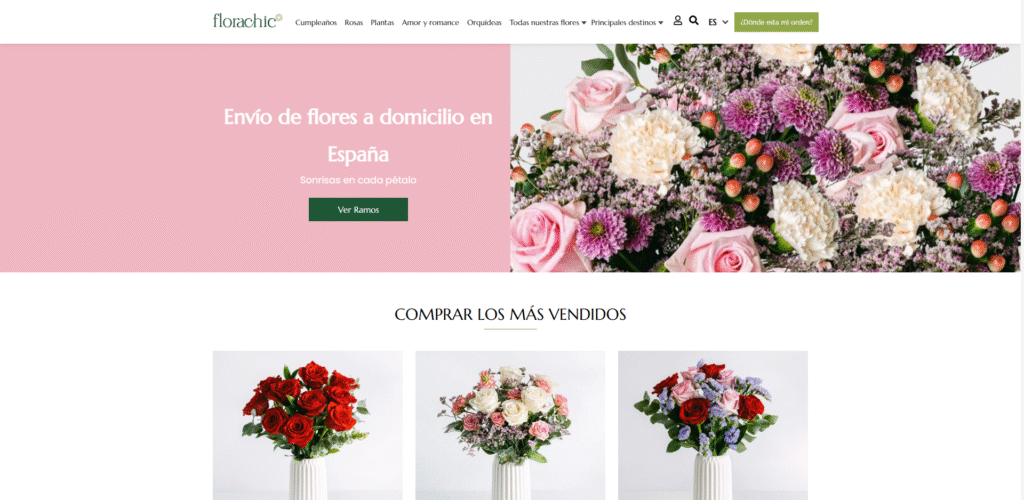
What They Do: Flora Chic is a high-end online florist that creates stylish, modern floral arrangements. They use WooCommerce for their core e-commerce functionality, Elementor Pro for sophisticated page design, and WPML to cater to a multilingual audience, allowing them to serve a broader customer base.
Why It Works: The website is a masterclass in visual commerce. For a product like flowers, photography is everything, and Flora Chic uses stunning, high-resolution images that make their bouquets look irresistible. The design is clean, elegant, and uses plenty of white space, which makes the vibrant colors of the flowers pop. The user experience is seamless, featuring a prominent date picker in the ordering process—a crucial feature for a florist—and clear categorization for different occasions. By using WPML, they effectively remove language barriers, creating a welcoming experience for all visitors.
Elementor in Action: Elementor Pro is instrumental in creating such a visually-driven site. The Gallery and Image Carousel widgets are perfect for showcasing beautiful arrangements. The powerful Form widget is customized to include a date picker field for scheduling deliveries. Crucially, Elementor’s deep integration with WPML means that every part of the design, from headlines to button text, can be easily translated, maintaining a consistent and professional brand identity across all languages.
2. Offerman Woodshop
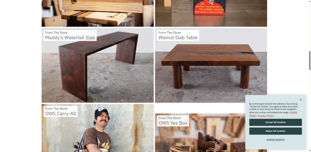
What They Do: Offerman Woodshop, famously associated with actor Nick Offerman, is a collective of woodworkers in Los Angeles. They sell handcrafted items ranging from cutting boards and furniture to custom-built canoes and ukuleles, all with a distinct, rustic charm.
Why It Works: The website’s design perfectly mirrors the brand’s ethos: authentic, high-quality, and a little bit quirky. The earthy color palette, personal tone of voice, and high-quality imagery of the workshop create a strong sense of place and personality. The navigation is straightforward, guiding users to “Goods for Sale” or to learn more about the team. Their product pages are a masterclass in storytelling, detailing the wood used and the story behind the item. This isn’t just a store; it’s an invitation into their world.
Elementor in Action: A similar immersive, story-driven layout can be achieved with Elementor. Using a combination of the Image Carousel widget for workshop photos, the Text Editor for detailed narratives, and the Products widget to display goods, you can create product pages that go beyond simple specs and build a real connection with customers.
3. Allbirds
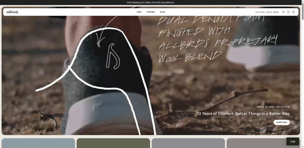
What They Do: While Allbirds has a massive global presence, their online store is a prime example of clean, effective e-commerce. They sell eco-friendly footwear and apparel, emphasizing sustainable materials and simple, comfortable designs.
Why It Works: Allbirds’ website is the epitome of minimalist design. It uses a clean, neutral color scheme and beautiful, high-resolution product photography to let the products speak for themselves. The user experience is incredibly smooth, with a simple navigation menu and a streamlined checkout process. They effectively use video to showcase their products in action and explain their commitment to sustainability. The site is fast, responsive, and makes finding and buying the right pair of shoes an absolute breeze.
Elementor in Action: Elementor’s full-width sections and clean column layouts are perfect for replicating this minimalist aesthetic. The Video widget can be used to embed background videos on the homepage, while the Flip Box widget could creatively showcase the sustainable materials used in their products.
4. Root Science
What They Do: Root Science is a boutique skincare brand that offers a range of natural, plant-based products. Their focus is on high-performance, organic ingredients.
Why It Works: The Root Science website exudes elegance and sophistication. It uses a soft color palette, refined typography, and stunning product photography to create a premium feel. The homepage immediately builds trust by highlighting their “Certified Vegan & Cruelty-Free” status. Product pages are incredibly detailed, listing key ingredients, their benefits, and full ingredient lists. They also feature customer reviews prominently, which is a powerful form of social proof.
Elementor in Action: To create a similar look, you could use Elementor’s Global Styles to set a consistent, elegant color and typography scheme. The Testimonial Carousel widget is ideal for showcasing customer reviews, and the Price List widget can be customized to elegantly display product details and pricing.
5. The Cool Hunter
What They Do: The Cool Hunter is a global creative agency, journal, and store. Their WooCommerce shop features a curated selection of unique and hard-to-find items, from art and design objects to travel accessories.
Why It Works: This site is all about discovery and inspiration. It breaks the mold of a traditional e-commerce grid with a dynamic, magazine-style layout. The use of bold typography and large, impactful images creates a visually rich experience. The store feels less like a catalog and more like a curated gallery. This approach perfectly aligns with their brand, which is focused on being a tastemaker and authority on “cool.”
Elementor in Action: Elementor’s flexibility shines here. You could use the Posts widget in a creative way, pulling WooCommerce products instead of blog posts, and customizing the layout to create a masonry or collage-style grid. Combining this with parallax scrolling effects for background images would enhance the dynamic, editorial feel.
6. Sodashi
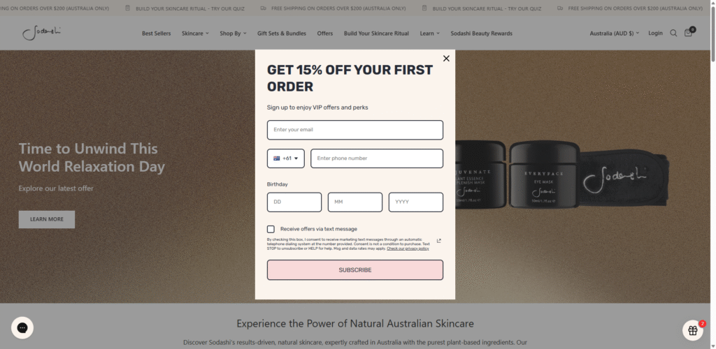
What They Do: Sodashi is an Australian luxury skincare and spa brand that uses ethically sourced, natural ingredients. Their products are used in high-end spas worldwide.
Why It Works: The Sodashi website is a case study in creating a serene and luxurious online experience. The use of ample white space, delicate fonts, and soft, natural imagery evokes the feeling of a spa. The navigation is clear, with a “Shop by Concern” feature that helps users find the right products for their specific needs—a brilliant example of customer-centric design. The checkout process is simple and elegant, reinforcing the premium nature of the brand.
Elementor in Action: The “Shop by Concern” feature could be built using a series of styled Icon Box widgets. Each icon would represent a different skin concern (e.g., aging, dryness) and link directly to a filtered product archive page. Elementor’s Theme Builder allows you to design these archive pages to maintain a consistent, branded look.
7. Joco Cups
What They Do: JOCO creates reusable coffee cups and bottles that are stylish, eco-friendly, and designed to enhance the drinking experience.
Why It Works: JOCO’s website is vibrant and energetic. It uses bold colors, playful animations, and a confident tone of voice to appeal to a modern, environmentally conscious audience. A key feature is their “Build Your Own” cup tool, which is a fantastic example of product personalization. It’s interactive, fun to use, and allows customers to create a product that feels uniquely theirs. This level of engagement is a powerful way to increase conversions.
Elementor in Action: While a custom product builder often requires a dedicated plugin, you can create a highly interactive page with Elementor. Using the Slides widget, you could create a step-by-step guide to “building a cup,” with each slide showcasing different color or component options. Popups could be used to display more detailed information about each choice.
8. Magna-Tiles
What They Do: Magna-Tiles are a popular brand of magnetic building toys for children, designed to encourage unstructured, imaginative play.
Why It Works: The website is playful, colorful, and instantly appeals to its target audience (parents and educators). It uses bright colors, fun fonts, and lots of images and videos of kids playing with the toys. The site effectively communicates the educational benefits of the product without feeling overly academic. They also have a great “Inspiration” section with blog posts and play ideas, which adds value beyond just selling the product.
Elementor in Action: The Lottie widget is perfect for adding the kind of fun, lightweight animations seen on the Magna-Tiles site. You could also use the Image Hotspot widget to create an interactive “Play Ideas” section, where users can hover over different parts of a play scene to see which Magna-Tiles sets were used.
9. Nighthawks
What They Do: Based in Japan, NIGHTHAWKS is a progressive retailer that sells high-end, avant-garde fashion and accessories from a curated selection of designers.
Why It Works: The NIGHTHAWKS website is bold, minimalist, and confident. It uses a dark theme with stark, high-contrast photography to create a moody and exclusive atmosphere. The unconventional layout and typography choices reinforce their cutting-edge brand identity. This site proves that you don’t need to follow a standard e-commerce template to be successful. By creating a unique and memorable experience, they attract a specific type of fashion-forward customer.
Elementor in Action: Elementor’s ability to create custom layouts with overlapping elements and negative space would be key to achieving this look. You could use the Motion Effects settings to create subtle animations on scroll, and the Custom CSS feature gives you the freedom to implement unique typography styles that break the grid.
10. Elecbrakes
What They Do: Elecbrakes is an Australian company that has developed an innovative electric brake controller for trailers. Their product is a modern solution to an old problem.
Why It Works: This website does an excellent job of explaining a technical product in a simple and compelling way. It uses clear diagrams, videos, and a well-structured FAQ section to answer potential customer questions. The design is clean and professional, building trust and credibility. They have a prominent “How It Works” section that walks users through the technology step-by-step, which is crucial for a product that requires customer education.
Elementor in Action: The Flip Box or Animated Headline widgets could be used to create engaging, interactive diagrams that explain the product’s features. A well-designed FAQ page can be built using the Toggle widget, allowing users to easily find answers without being overwhelmed by a wall of text.
11. Wild Souls
What They Do: Wild Souls is a Greek brand that produces a range of all-natural nut butters and other healthy food products.
Why It Works: The website is a feast for the eyes. It uses rich, delicious-looking photography and a warm, earthy color palette to make the products look irresistible. The homepage features a stunning full-screen video that immediately draws you in. They also do a great job of sharing their brand story and their commitment to pure, simple ingredients. The product pages are clean, with clear nutritional information and serving suggestions.
Elementor in Action: The Video Playlist widget could be used to create a “Recipes” section, showcasing different ways to use their products. You could also use the Media Carousel widget to create a beautiful, full-width hero section that cycles through high-quality images or videos.
12. Minipop
What They Do: Minipop is a children’s clothing and lifestyle store that stocks a curated collection of independent, design-led brands from around the world.
Why It Works: The site feels like a high-end boutique. The design is clean, modern, and stylish, with a soft color palette and beautiful lifestyle photography. The navigation is well-organized, allowing shoppers to browse by brand, age, or clothing type. They also have a “Gift” section with curated gift guides, which is a smart way to simplify the shopping process for customers buying for others.
Elementor in Action: You could create curated gift guides using Elementor’s Loop Builder. This powerful feature allows you to design a custom template for a single product listing and then apply it to a grid, letting you create unique, visually appealing product showcases for different categories like “Gifts for Newborns” or “Gifts Under €50.”
13. Sawmill Designs
What They Do: Sawmill Designs specializes in reclaimed wood products, including fireplace mantels, floating shelves, and box beams. They focus on craftsmanship and the unique character of reclaimed materials.
Why It Works: The website successfully conveys a sense of authenticity and craftsmanship. It opens with a professional video that tells the story of the brand and shows the team at work. The site is rich with high-quality images that showcase the texture and detail of the wood. A key feature is their “Design Your Own Mantel” tool, which guides customers through the process of selecting a style, wood type, and finish.
Elementor in Action: A multi-step form, created with the Form widget, could guide users through a “Design Your Own” process. Each step would present different options with images and descriptions. The results could then be sent to the sales team for a custom quote, creating a seamless lead generation process.
14. House of Malt
What They Do: House of Malt is a UK-based online retailer of fine whiskies and other spirits, catering to both connoisseurs and those new to the world of spirits.
Why It Works: This site looks and feels like a premium, specialist retailer. The dark, sophisticated design, combined with elegant typography, creates an exclusive atmosphere. They have an excellent filtering system that allows users to shop by region, brand, price, or type of spirit, making it easy to navigate their extensive catalog. Product pages feature detailed tasting notes, distillery information, and customer reviews, providing all the information a discerning buyer needs.
Elementor in Action: The WooCommerce Products widget in Elementor Pro has advanced filtering capabilities. You can set up a sidebar with various filter widgets (Filter by Price, Active Filters, etc.) to allow users to easily narrow down their search, creating a powerful and user-friendly shopping experience for a large inventory.
15. Daelmans Stroopwafels
What They Do: This is the official online store for the famous Dutch stroopwafels. They sell their classic caramel waffles and related merchandise directly to consumers.
Why It Works: The design is simple, cheerful, and focuses entirely on the deliciousness of the product. The site uses mouth-watering photography and a bright, inviting color scheme. The user journey is incredibly straightforward: you see the stroopwafels, you want the stroopwafels, and it’s extremely easy to buy the stroopwafels. It’s a perfect example of how a simple, product-focused design can be highly effective.
Elementor in Action: For a product-focused site like this, the Hotspot widget could be used on a lifestyle image to tag different products. When a user hovers over a hotspot on a tin of stroopwafels, a small popup could appear with the product name, price, and a direct “Add to Cart” button.
16. Bluecrate
What They Do: Bluecrate is a gift shop that specializes in funny, quirky, and personalized items. Their product range is eclectic, from custom-printed socks to novelty mugs.
Why It Works: The website is fun and engaging. It uses bright colors, a playful tone of voice, and lots of user-generated content (photos of customers with their products) to create a sense of community and fun. The personalization options are front and center, making it easy for users to upload photos and create their own unique gifts. This focus on user-generated content and personalization is a powerful driver of sales.
Elementor in Action: You could create a dynamic gallery of user-generated content using the Loop Grid and the Dynamic Content feature. By pulling in images from a specific hashtag on social media (with the help of a third-party plugin), you can create an ever-changing wall of social proof that builds trust and shows off your products in the real world.
17. Henry J. Socks
What They Do: Henry J. Socks is a subscription-based business that delivers high-quality, colorful socks to its members each month.
Why It Works: The site does a fantastic job of selling a subscription service. The value proposition is communicated clearly on the homepage: “Dashing socks delivered to your door.” The “How It Works” section is simple and visual, breaking the process down into three easy steps. The design is clean and classic, with a touch of British charm that aligns perfectly with the brand name.
Elementor in Action: The Icon List widget is perfect for creating a simple, three-step “How It Works” section. You can use custom icons and clear, concise text to explain the subscription process visually, making it easy for potential customers to understand and sign up.
18. Nutribullet
What They Do: Nutribullet is a well-known global brand that sells personal blenders and other kitchen appliances.
Why It Works: For a large, established brand, the Nutribullet website is impressively clean and focused. It uses a modular, card-based design that is easy to scan and navigate. The site is packed with social proof, including “As Seen In” media logos and customer testimonials. They also have a robust “Recipes” section, which adds significant value for their customers and helps with SEO. The site is fast, professional, and does an excellent job of guiding users to the right product for their needs.
Elementor in Action: The card-based design can be easily replicated using Elementor’s Container element. You can create a container for each “card,” style it with a border and box shadow, and then populate it with an image, headline, and button. This approach gives you full control over the layout and ensures it’s fully responsive.
Key Takeaways for Building a High-Converting Store
Analyzing these diverse examples reveals several common threads that contribute to their success. Keep these principles in mind when building your own WooCommerce store:
- Strong Brand Identity: The best stores have a clear personality that is reflected in their design, copy, and photography. They don’t just sell products; they sell a story and an experience.
- High-Quality Visuals: Professional photography and videography are non-negotiable. Customers can’t touch your products, so you need to show them in the best possible light from every angle.
- Intuitive Navigation: If users can’t find what they’re looking for, they’ll leave. A logical menu structure, clear categories, and powerful search/filtering capabilities are essential, especially for large inventories.
- Mobile-First Design: A significant portion of online shopping happens on mobile devices. Your store must be fully responsive and offer a seamless experience on any screen size.
- Social Proof and Trust Signals: Customer reviews, testimonials, media mentions, and security badges are crucial for building trust and encouraging new customers to make a purchase.
- Focus on the User Experience (UX): From a fast-loading homepage to a frictionless checkout process, every step of the customer journey should be as smooth and easy as possible.
- Content Adds Value: A blog, recipe section, or inspiration gallery can do more than just improve SEO. It can establish your authority, build a community, and give customers a reason to keep coming back.
Frequently Asked Questions (FAQs)
Q: Why should I choose WooCommerce for my online store? A: WooCommerce offers an unparalleled combination of flexibility, scalability, and ownership. Because it’s open-source and built on WordPress, you have complete control over the design and functionality of your store. You can add unlimited products, choose from thousands of themes and plugins (including powerful tools like Elementor), and you’re not locked into a proprietary platform’s fee structure.
Q: Do I need to be a developer to build a store like the ones listed? A: Not necessarily. The combination of WordPress, WooCommerce, and a page builder like Elementor empowers you to create a highly professional and custom store without writing a single line of code. Elementor’s drag-and-drop interface and WooCommerce-specific widgets let you visually design everything from your homepage to your product and checkout pages.
Q: How much does it cost to build a WooCommerce store? A: The cost can vary widely. The core WooCommerce plugin is free. Your main expenses will be web hosting (essential for any website), a domain name, and potentially a premium theme or plugins. While you can start on a modest budget, investing in quality hosting and select premium tools can significantly impact your store’s performance and capabilities.
Q: What is the most important element of a successful WooCommerce store? A: While all the elements discussed are important, a seamless User Experience (UX) is arguably the most critical. This encompasses everything from site speed and mobile design to easy navigation and a simple checkout. If your store is difficult or frustrating to use, even the best products and marketing won’t save it.
Q: How can I improve the SEO of my WooCommerce store? A: Start with the fundamentals: use a good SEO plugin (like Yoast or Rank Math) to manage titles and meta descriptions, write unique and descriptive product descriptions, optimize your images with alt text, and ensure your site is fast and mobile-friendly. Additionally, creating valuable content, like a blog or detailed buying guides, can attract organic traffic and establish your expertise.


