Getting your website compliant with privacy laws doesn’t mean tanking your conversion rates. You’ve probably seen those giant pop-ups that hijack the screen and send visitors clicking away before they’ve read a word. The good news is that in 2026, finding the sweet spot between compliance and user experience is genuinely within reach. Place your consent banner thoughtfully, style it to match your brand, and you can keep visitors happy while staying on the right side of the law. Here’s how to get there.
Key Takeaways
- Native tools win, using a WordPress-native solution prevents speed lag and keeps design control in your hands.
- Bottom banners rule mobile, footer-placed banners protect the mobile user experience and keep bounce rates low.
- Geo-targeting saves conversions, show strict compliance banners only to visitors in regions that legally require them.
- Avoid dark patterns, clear, honest design builds long-term user trust and prevents legal trouble.
- Consent Mode v2 is vital, keep your analytics accurate by choosing a tool that supports modern tracking standards.
1. Use a Native WordPress Tool Like Cookie Consent for Perfect Layout Control
Keeping your site fast means staying away from heavy external scripts that delay page loading. Many banner systems make the browser fetch code from a third-party server first, and that slow round-trip causes a layout shift, where content jumps around while the page loads. Visitors hate that, and search engines aren’t fond of it either: a banner that triggers Cumulative Layout Shift can quietly hurt your rankings.
A WordPress-native capability keeps your site speed high and your design fully integrated. The native Cookie Consent tool from Elementor lives right inside your WordPress dashboard, so there’s no external account and no embed code to copy. You can adjust styling, colors, and layout in the same place you build your site, for a banner that feels like part of your design rather than something bolted on.
Here’s what a solid native cookie consent tool does for you:
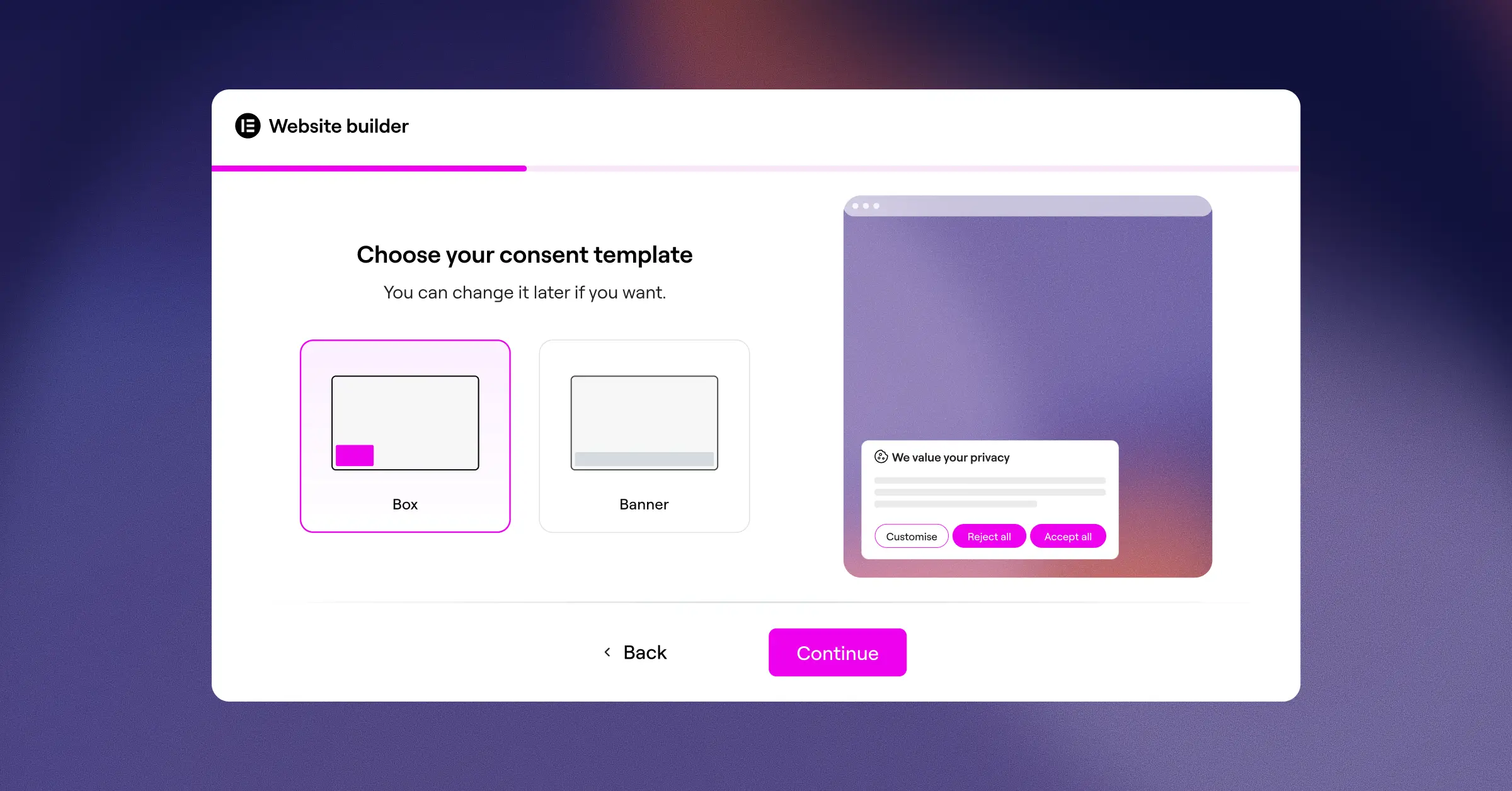
- Tracks user choices without loading heavy external scripts.
- Builds custom designs that match your site branding.
- Connects smoothly with Google Consent Mode v2 to protect your tracking.
- Pulls exact consent logs to help you stay audit-ready.
- Scans your website cookies automatically to keep your lists clean.
- Simplifies compliance with both GDPR and CCPA requirements.
2. Place the Banner at the Bottom of the Screen (Footer Position)
When visitors land on your site, they want to see your headline and main call to action first. A banner that pops up at the top pushes your header down and hides your logo, which is why a bottom-aligned footer banner tends to work best for conversions: it stays out of the way while still being easy to spot.
A footer banner also feels less intrusive because it follows the natural top-to-bottom flow of the eye. By the time a visitor glances down, they’ve already taken in your main message and are more willing to engage with the consent options in front of them. And on mobile, it fits naturally without blocking navigation or key content.
A few simple layout tips for footer banners:
- Use a subtle background color that contrasts gently with your page footer but doesn’t clash.
- Keep the banner height minimal so it doesn’t take up more than about twenty percent of the screen.
- Include a clear close button for users who’d like to review their options later.
3. Implement Geo-Targeting to Limit Banner Exposure
One of the biggest mistakes site owners make is showing a strict, multi-button consent banner to every visitor, no matter where they’re from. Someone from a region with relaxed privacy laws doesn’t need a complex consent flow, and that extra friction only lowers your signup rates.
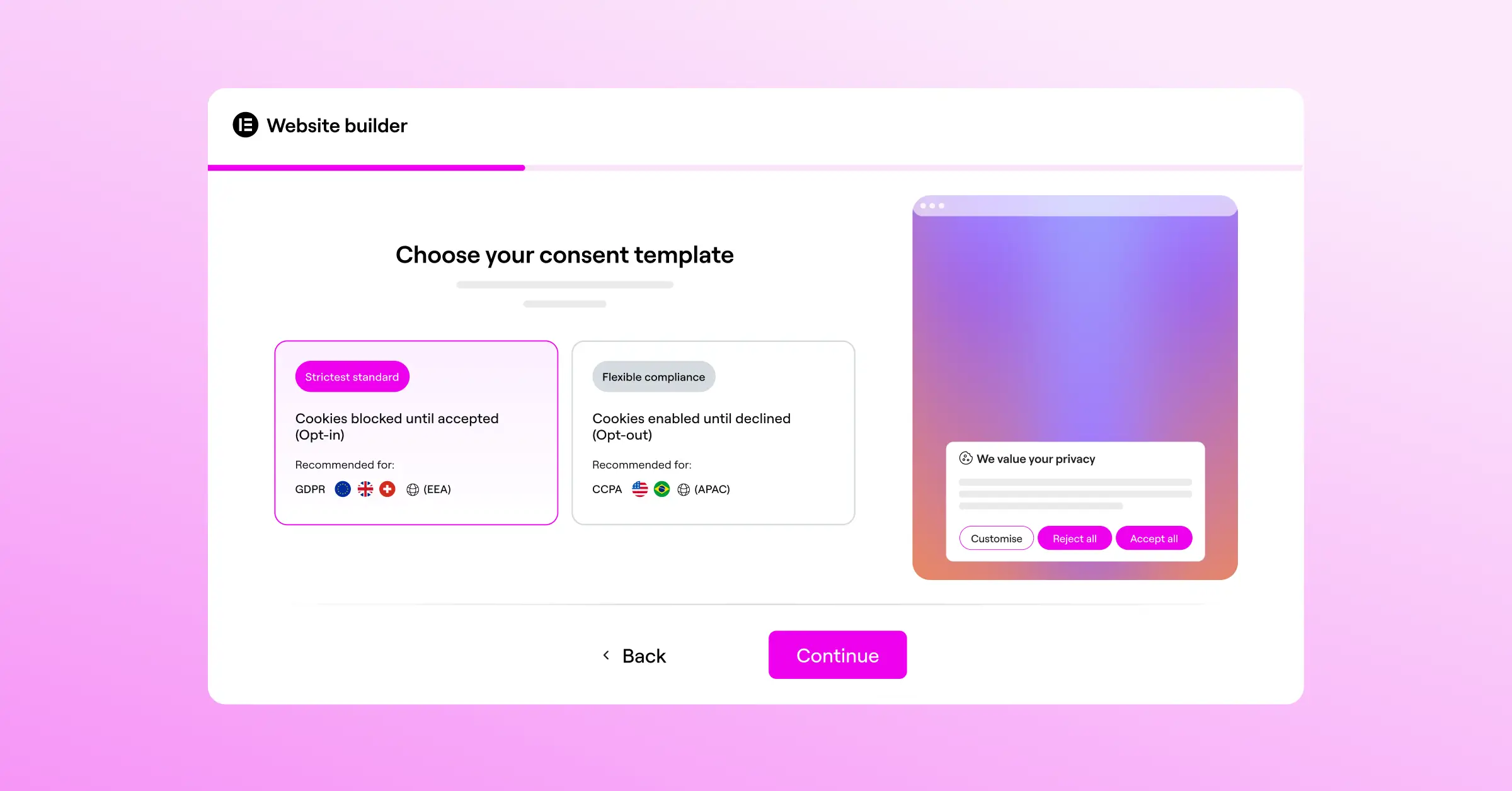
Geo-targeting makes this easy to solve. It lets you show different banners (or none at all) based on where your visitor is located: a fully compliant GDPR banner for the EU, a CCPA-compliant notice for California, and a lighter touch for everyone else.
This targeted approach helps protect conversions by:
- Reducing friction for visitors who don’t require strict opt-in prompts.
- Keeping you legally covered exactly where it matters.
- Improving global opt-in rates by showing relevant, region-specific language.
- Keeping your layout clean for the majority of your traffic.
4. Design a Subtle Corner Slide-In (Toast Style) for Desktop Users
For desktop visitors, a corner slide-in, often called a toast notification, is a great alternative to a full bottom bar. It usually sits in the bottom-left or bottom-right corner, and since desktop monitors have plenty of space, your main content stays completely readable. It’s present and clear, but doesn’t demand attention the way a full-width popup does.
This style works well because it mirrors notification patterns web users already know, like chat widgets. It feels like a natural part of browsing rather than a roadblock, leaving the screen’s center clear so visitors can explore your products and offers without distraction.
To make your corner slide-ins convert better, keep these in mind:
- Place the banner on the left side if your primary chat widget lives on the right.
- Use a soft entrance animation like a gentle fade-in rather than an abrupt pop.
- Write clear, direct microcopy so users understand their choices at a glance.
5. Avoid Full-Screen Cookie Walls Unless Legally Required
A cookie wall is a banner that blocks the entire page until the visitor makes a choice. It might sound like a way to drive higher opt-in rates, but it almost always backfires: most users will simply close the tab and find another site, which spikes your bounce rate and hurts your rankings.
In many jurisdictions, including the European Union, strict cookie walls are actually illegal because consent must be freely given. A user shouldn’t have to hand over their data just to read a blog post. Instead, use a soft consent model that lets visitors scroll and read your public content while the banner stays visible but out of the way. If you do use a modal, make sure it’s easy to dismiss and doesn’t lock users out entirely.
6. Create High-Contrast, Honest Call-to-Action Buttons
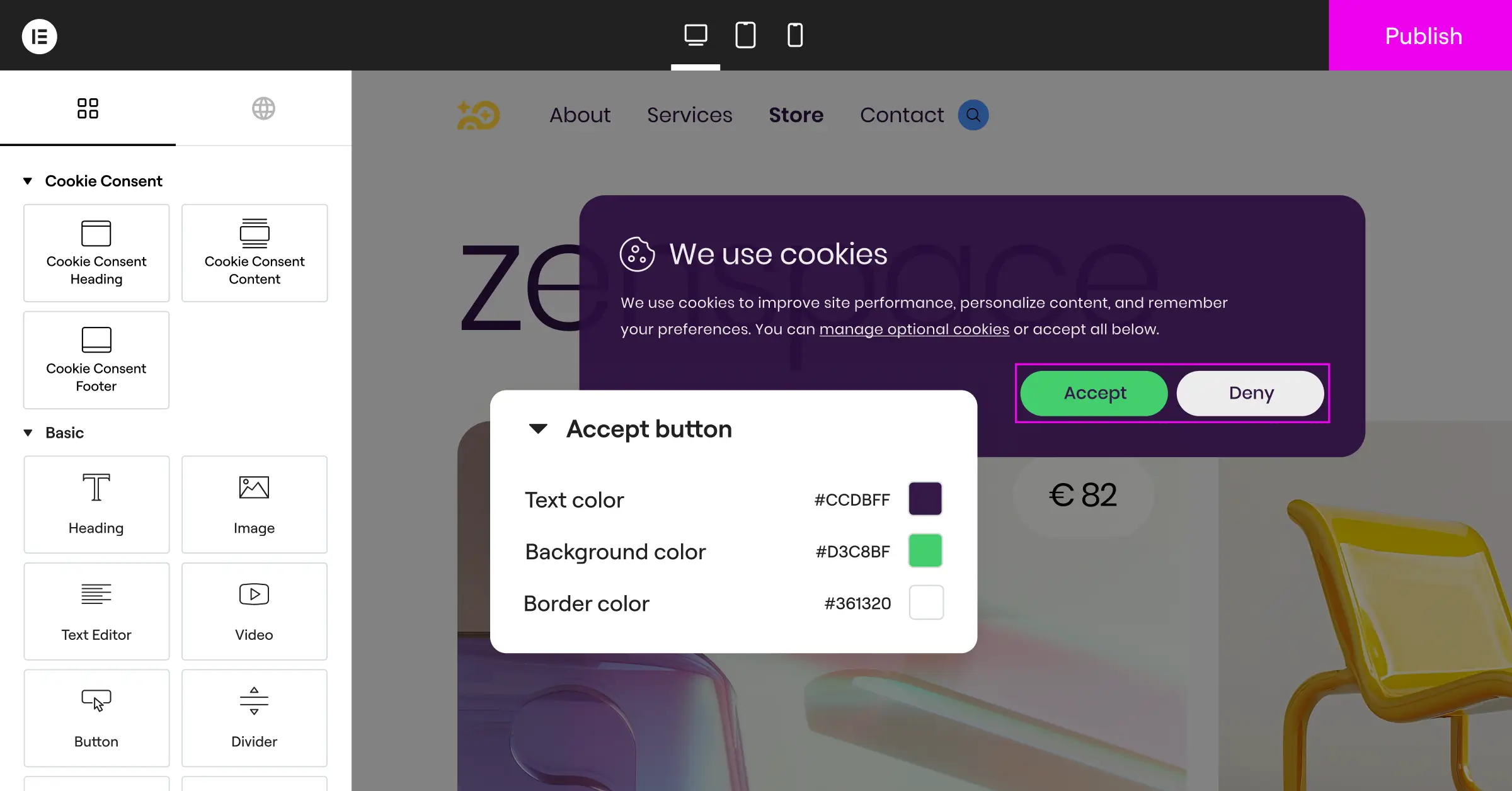
Some sites make “Accept All” a bright, eye-catching green button and “Reject All” a tiny, faint grey link that’s easy to miss. This is a dark pattern, and regulators actively fine sites that use it. Beyond the legal risk, it damages trust: manipulated visitors are far less likely to buy from you or sign up for anything.
When users feel respected, they’re more comfortable sharing their data. Your button design should be clean, clear, and give both options equal prominence (not just good ethics, it’s a legal requirement in many regions), which makes your site feel more professional and trustworthy.
Here’s how to style your buttons well:
- Use identical shapes and sizes for both the accept and reject buttons.
- Provide clear contrast against the banner background so both options are easy to read.
- Keep button text straightforward, using plain terms like “Accept All” and “Reject All” instead of confusing double-negatives.
“The best cookie banner is one that respects the user’s focus. When you force a massive pop-up in front of valuable content, you aren’t just hurting conversion rates, you’re also building immediate friction. Keeping the consent mechanism light, native, and fast is the key to balancing compliance with a healthy business.”
Itamar Haim, Web Compliance Specialist
7. Optimize Your Mobile Touch Targets
Mobile traffic makes up more than half of all web visits. If your cookie banner buttons are too small or packed too closely together, mobile users will struggle to tap them accurately, leading to accidental clicks and quick exits. When designing a mobile-friendly banner, think about thumb placement: the bottom third of the screen is the easiest zone to reach, one more reason footer placement works so well on mobile.
Making your banner simple, clean, and thumb-friendly goes a long way. When a visitor can tap their preferred choice with a single thumb movement, they’re back to browsing in seconds. Less friction, more engagement.
A few guidelines to keep your mobile layout accessible:
- Keep buttons at least 48 pixels tall to meet standard touch target guidelines.
- Add enough spacing between buttons to prevent accidental taps.
- Stack buttons vertically on small screens instead of squishing them side by side.
8. Use Google Consent Mode v2 to Recover Lost Tracking Data
When visitors decline your cookie banner, you traditionally lose all tracking data for their session, making it hard to measure ad performance or know which pages drive conversions. That’s where Google Consent Mode v2 comes in: a framework that lets your website communicate consent choices directly to Google tags, so those tags can adjust their behavior.
By using a compliance tool that supports Consent Mode v2, like the native cookie consent feature from Elementor, you can send anonymous, cookieless signals to Google. You recover a good share of your analytics data while fully honoring privacy choices, giving you the insights to optimize campaigns without cutting corners on compliance.
Behind the scenes, this system helps you:
- Reconstruct user journeys in Google Analytics 4 without relying on personal data.
- Maintain accurate conversion tracking for your Google Ads campaigns.
- Respect legal requirements without going completely blind on your metrics.
- Adjust tag behavior automatically based on real-time consent states.
9. Provide a Persistent Consent Trigger Widget
Consent isn’t a one-time decision. Under modern privacy laws, users must be able to change their minds or withdraw consent just as easily as they gave it. If there’s no obvious way to revisit that choice, you could run into compliance issues. The cleanest fix is a small, floating trigger widget that stays visible at all times.
It’s usually a tiny shield or lock icon sitting quietly in the corner, small enough to stay out of the way but always there when needed. One click reopens the consent panel so visitors can update their preferences, a simple touch that shows you respect their privacy and give them full control.
10. Run A/B Tests on Banner Styling and Microcopy
Every audience is different. What works for a technical software site might not land the same way for a local bakery or a creative portfolio, which is why you shouldn’t rely on default settings alone. Testing different copy, colors, and placements is the best way to know what resonates with your visitors. Sometimes a small wording tweak leads to a surprisingly meaningful uptick in opt-in rates.
Run simple split tests and watch your bounce rates and opt-in analytics to see which version performs better. Over time, you’ll find the configuration that balances compliance and engagement without sacrificing either.
A quick guide on what to test first:
- Test a friendly, warm tone against a more formal, legalistic style to see which connects better with your audience.
- Compare a simple banner that just mentions cookies against one that explains the benefits of personalized content.
- Try different button placements to see whether “Accept All” on the right or the left gets a better response from your visitors.
Factual Comparison of Leading Compliance Solutions
To help you pick the right fit, here’s an overview of some of the most widely used tools available today. First, there’s the built-in Cookie Consent capability from Elementor, built to manage GDPR and CCPA compliance directly from your WordPress dashboard, with no external accounts required.
Other established options in the compliance field include:
- Cookiebot, a cloud-based consent management platform that offers automatic cookie scanning and compliance widgets.
- CookieYes, a web-based tool that provides customizable consent banners and consent logging for various platforms.
- Complianz, a privacy suite built for WordPress that configures banners through a wizard-driven setup.
- iubenda, a compliance tool that generates privacy policies and manages cookie consent across web and mobile apps.
- OneTrust, an enterprise-level privacy and risk management platform built for large organizations with complex compliance needs.
| Tool Name | Platform Style | Dashboard Location | Google Consent Mode v2 Support | Design Customization |
|---|---|---|---|---|
| Cookie Consent | Native WordPress | WordPress Dashboard | Fully Supported | Direct Editor Integration |
| Cookiebot | Cloud SaaS | External Dashboard | Supported | CSS & Custom Template |
| CookieYes | Cloud SaaS | External Dashboard | Supported | Web App Editor |
| Complianz | WordPress Plugin | WordPress Dashboard | Supported | Plugin Settings Panel |
| iubenda | Cloud SaaS | External Dashboard | Supported | Web App Generator |
Frequently Asked Questions
Where is the best place to put a cookie banner for conversions?
The bottom of the screen (footer position) is generally the best choice. It keeps your header navigation and main call-to-action fully visible, so users engage with your content first, and it’s naturally responsive on mobile.
Do cookie banners hurt website SEO?
They can, if they’re poorly coded or cause layout shifts. A slow external script that triggers Cumulative Layout Shift (CLS) may get your rankings penalized. A native WordPress tool like Elementor’s Cookie Consent keeps your site fast and stable, protecting your standing in search results.
Is a full-screen cookie wall legal under GDPR?
In most European countries, strict cookie walls are considered illegal because they force consent. GDPR requires that consent be freely given, so users should still access basic content even if they decline tracking. A non-intrusive bottom bar or corner toast is a much safer approach.
What is Google Consent Mode v2 and do I need it?
Google Consent Mode v2 is a framework that adjusts how Google tags behave based on a user’s consent. If you serve visitors in the EU or UK and use Google Analytics or Ads, it’s now required. A compliance tool that supports it, like the cookie consent capability from Elementor, helps you configure this correctly so you don’t lose important tracking data.
How can I make my cookie banner match my brand design?
With a native WordPress tool that offers full design integration, you can edit colors, fonts, margins, and button shapes right in your visual editor, much simpler than writing custom CSS for a third-party tool, and it keeps your user experience consistent site-wide.
What is geo-targeting in cookie consent?
Geo-targeting is a smart feature that detects where a visitor is located and displays the appropriate cookie notice for their region. That means you only show strict GDPR banners to EU visitors, keeping the browsing experience clean and frictionless for everyone else.
Can users change their minds after accepting cookies?
Yes, and privacy laws require that revoking consent be just as easy as giving it. A small, persistent trigger icon (like a shield or lock) in the corner solves this neatly. Clicking it reopens the consent banner so visitors can update their preferences anytime.
How long does it take to set up a native cookie consent tool?
With a native tool, setup usually takes under five minutes. Because it runs inside your WordPress dashboard, you skip external accounts, domain verification, and copied code snippets. Just run a quick scan, pick a template, customize the styling, and publish.