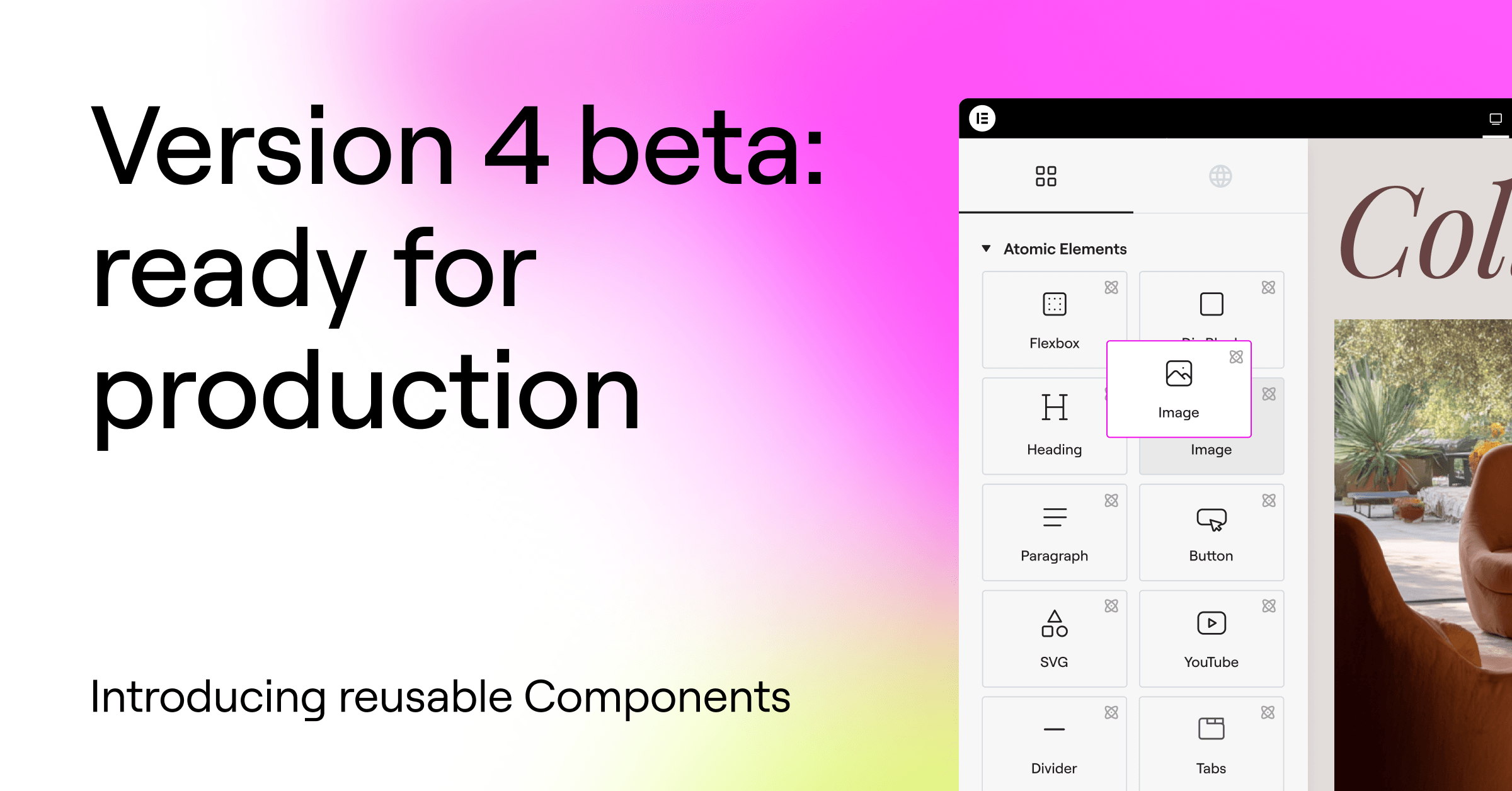
The alpha phase is complete. Version 4 is now in beta, and the atomic foundation is ready to be used on real sites!
This is the final step before the official release of version 4.0, activating the new features automatically on new sites, and becoming the default editing experience in Elementor.
This is not a one-off! More features will continuously be released, and all the existing features aren’t going anywhere. New features work alongside existing ones, allowing you to use version 4 and version 3 together on the same pages and sites.
Available to all Elementor users: Free, Pro, and One.
The atomic power of version 4
Version 4 introduces a new architectural foundation that separates structure, styling, and content more clearly, enabling more predictable layouts, safer reuse, and better collaboration across teams.
Follow these next steps to activate version 4 features now:
- Update to the latest Elementor version (currently 3.35)
- Go to Elementor → Editor → Settings → Version 4
- Click activate
This is the last big step before moving to version 4.0 and activating atomic features by default on new sites. Important to note that existing sites and features aren’t going anywhere. New features will continue to live alongside existing ones and you’ll be able to use version 4 and version 3 together.
Components: build once, reuse everywhere
Introducing Components, a primary building block of version 4 and a major step toward a more scalable, production-ready editing experience.
Components let you create reusable layout sections that stay synchronized across your site, while still allowing controlled per-instance customization. They are designed for real projects, real workflows, and real teams – not just isolated pages.
This version positions Components as a core capability of version 4, and a key part of the upcoming shift.
Create reusable layout blocks with full site sync
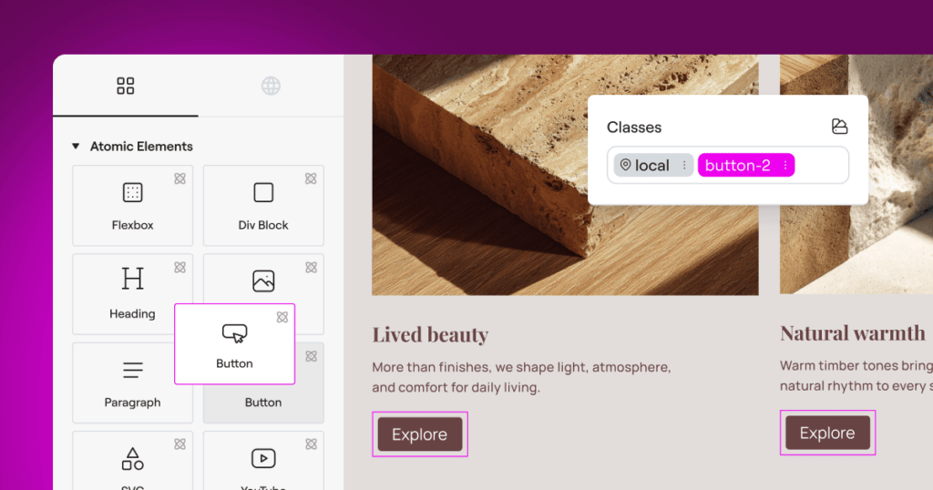
You can turn any container into a Component and give it a clear, reusable identity. Components appear in a dedicated Components tab, next to the Elements tab and can be added to the canvas just like native elements.
When a Component is edited, all instances update automatically across the site. Structure and styling stay in sync, making Components ideal for shared sections such as banners, CTAs, feature grids, headers, and repeated layout patterns that need to remain consistent over time.
Control variation with Component properties
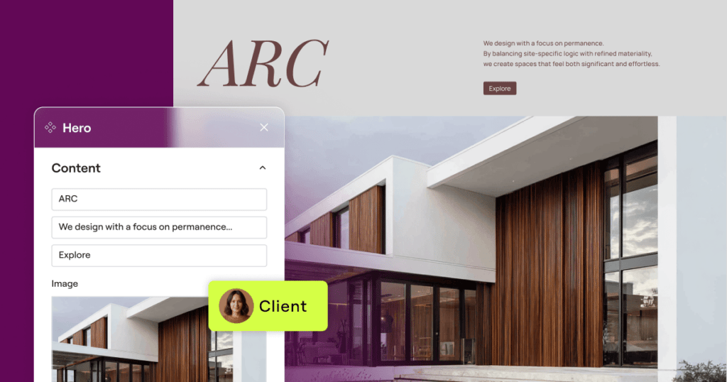
Components also support Component properties for content, allowing you to expose specific parts of a Component’s content for per-instance editing.
As the admin, you decide which content properties can be customized: text input, media, links and HTML tags. Editors can adjust only those exposed properties, while the layout and structure remain protected and globally synced.
This balance between consistency and flexibility makes Components especially useful for professional workflows, team collaboration, and client handoff.
A core capability of version 4
Components are built specifically for version 4 and reflect its direction as a system designed for larger, more structured projects:
- Layout-level reuse instead of widget-level globals
- Clear separation between structure, styling, and editable content
- Central management for scalable site building
Together with Variables, Classes, and the new styling architecture, Components introduce a more systematic way to build and maintain websites as projects grow in size and complexity.
Inline Editing: edit text directly on the canvas
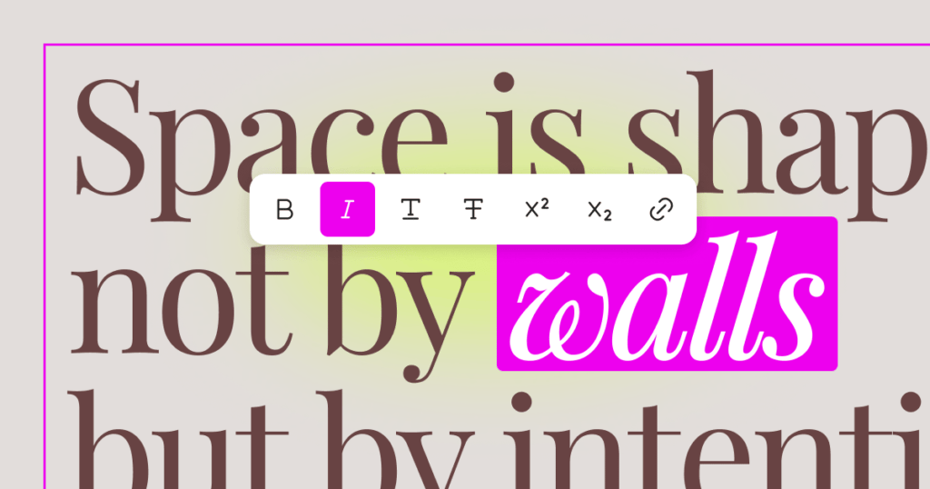
Introducing Inline Editing for Atomic Heading and Paragraph Elements, allowing you to edit text directly on the canvas without shifting focus to the panel.
When you click on an Atomic (version 4 elements) Heading or Paragraph, the text becomes editable directly on the canvas. Changes are applied instantly and stay fully synchronized with the panel inputs. This makes quick copy updates, layout reviews, and content refinements faster and more intuitive, especially when working across multiple sections or pages.
Formatting options appear as a floating toolbar near the selected text, giving you quick access to common inline actions directly on the canvas.
The toolbar is contextual, so it appears only when text is selected, stays within viewport boundaries, and supports keyboard shortcuts for faster editing. All formatting is applied visually, without exposing raw HTML or requiring code-level interaction.
How to activate these new features
Update to the latest Elementor version (now 3.35).
Go to WordPress > Elementor > Editor > Settings > Version 4 > Activate.


