What you really need to know to build more inclusive websites
Most web creators want the same thing: sites that look great, perform well, and reach as many people as possible. But here’s the catch: if your site isn’t accessible, a big portion of your audience is left out before they even get to experience it.
Accessibility isn’t about red tape, extra work, or checking off compliance boxes. It’s about making sure everyone, no matter their ability, device, or situation, can interact with your content. And far from limiting creativity, accessibility often makes websites cleaner, easier to use, and more impactful.
So why do so many people still hesitate?
Web creators take pause because accessibility is clouded by misconceptions. From fears that it’s too expensive to worries that it will compromise design, to the belief that it’s just not worth the effort, misinformation keeps accessibility on the back burner for too many web creators.
In this article, we’ll cut through the noise and debunk 10 of the biggest myths holding web creators back. Let’s set the record straight so you can focus on building sites that are inclusive, effective, and built for everyone.
Make your site more accessible with Ally
Myth #1: “Accessibility only affects a small group of people”
The Truth:
Imagine you’re in line at a café. Most people are scrolling on their phones—shopping, reading, maybe talking to ChatGPT. Now think about this: at least one person in that line likely can’t fully access the site they’re browsing. Whether it’s because the text is too small, the colors don’t contrast, or the site isn’t compatible with their assistive technology, they’re missing out.
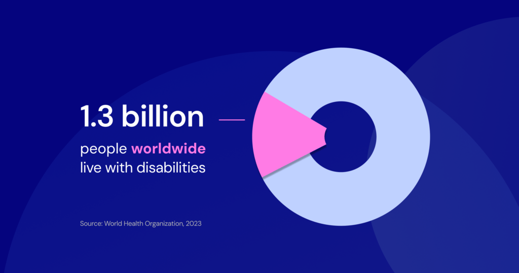
And they’re far from alone. The World Health Organization estimates 1.3 billion people worldwide (1 in 6) live with some form of disability. In the U.S., it’s nearly 1 in 4 adults.
This includes visual, auditory, motor, and cognitive disabilities. Add to that people with temporary impairments (a broken arm), situational barriers (glare on your phone screen), or age-related changes, and accessibility suddenly touches everyone.
The Takeaway: Accessibility doesn’t just affect a “small group,” it impacts millions. Designing inclusively helps make sure your site can be used by everyone, in every situation.
Myth #2: “Accessibility is only for people with disabilities”
The Truth:
Ever tried to read your phone in bright sunlight and struggled to see the screen? Or watched a video in a noisy café without captions? Maybe you’ve tried to fill out a form but the buttons were so small it felt impossible to click. These are all examples of situational accessibility barriers, and they affect everyone at some point, not just people with permanent disabilities.
Accessibility features like larger text, captions, clear buttons, or keyboard navigation don’t just support people with disabilities, they make sites more usable for all of us, in all kinds of everyday contexts.
The Takeaway:
Accessibility isn’t just for people with disabilities. It’s about building sites that are comfortable, usable, and adaptable for everyone.
Myth #3: “Accessibility is only for blind users”
The Truth:
This is one of the most persistent misconceptions. While screen readers are essential for blind users, accessibility extends far beyond vision loss.
Think about someone who has trouble hearing, trying to watch a video without captions, or a person with arthritis struggling to hit a tiny button, or a student with dyslexia, overwhelmed by dense paragraphs. Accessibility is about all of them, not just blindness.
- Hearing disabilities: From mild hearing loss to profound deafness, millions rely on captions, transcripts, and adjustable media players. Without these accommodations, video and audio content becomes entirely unusable.
- Motor challenges: Conditions like tremors, paralysis, missing limbs, or limited dexterity can make using a mouse difficult. Features like keyboard navigation, larger click targets, and voice controls are steps you can take to create more equitable access.
- Cognitive and learning differences: People with dyslexia, ADHD, or autism may struggle with dense text, inconsistent layouts, or flashing content. Clear language, predictable navigation, and the ability to disable motion help enormously.
- Visual differences beyond blindness: Low vision and color blindness are far more common than total blindness. The WHO estimates 2.2 billion people worldwide live with vision impairments. Features like scalable text, adjustable contrast, and, of course, screen reader compatibility address these needs.
As we mentioned earlier, accessibility also benefits temporary and situational barriers – like a broken wrist, fatigue, or trying to navigate a site in bright sunlight. As the global population ages, age-related hearing, vision, and mobility issues become more prevalent, making accessible design even more essential.
The Takeaway:
Accessibility is not “for blind users only.” It’s about creating digital experiences that work for the full spectrum of human needs, ensuring everyone can use your site with ease.
Make your site more accessible with Ally
Myth #4: “Accessibility will compromise my website’s design”
The Truth
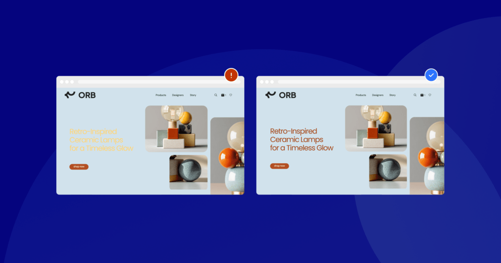
There’s a lingering belief that accessible websites are clunky, boring, stripped-down, or just plain unattractive. The reality? Accessibility and beautiful design go hand in hand.
High-contrast palettes don’t mean ugly colors or clashing combinations – they mean legible and polished choices. Clearer typography improves aesthetics and readability, and streamlined navigation leads to modern, intuitive layouts. Many award-winning websites prove that the most inclusive websites are also the most elegant.
As WebAIM notes, accessible websites often feature cleaner code and simpler user flows, which benefit all visitors and even improve performance.
The Takeaway
Accessibility doesn’t limit creativity. It elevates it. Accessible sites are cleaner, more usable, and more impactful, without sacrificing design quality.
Myth #5: “Accessibility is only for large businesses or government websites”
The Truth
Accessibility is a responsibility for every website, no matter its size. Small businesses are not immune. In fact, lawsuits under the Americans with Disabilities Act (ADA) have disproportionately affected small and mid-sized companies. According to UsableNet’s 2024 report, over 4,000 ADA web accessibility lawsuits were filed in U.S. federal court, with 77% targeting eCommerce sites, and 67% targeting businesses with less than 25M in revenue.
Beyond the legal risk, ignoring accessibility means excluding potential customers. In a competitive online market, even small barriers can mean lost revenue.
The Takeaway
Accessibility isn’t just a legal requirement for governments or enterprises, but a business necessity for everyone. Making your site inclusive helps protect you legally, but more importantly, it shows respect for your audience.
Myth #6: “Overlays or plugins are enough to make my site accessible”
The Truth
Overlays (sometimes called “accessibility widgets”) are often marketed as instant fixes. Drop in a line of code, and your site is “compliant.” But the reality is very different.
Overlays don’t fix core accessibility issues like missing alt text, poor heading structure, or unlabeled forms. Many users report overlays actually interfere with assistive technology. And critically: using an overlay doesn’t protect you legally. In fact, businesses have faced lawsuits even after installing them because they provided a false sense of compliance.
Accessibility expert Adrian Roselli likens relying on overlays to putting a band-aid on a broken leg, sharing that real accessibility requires building inclusivity into the foundations of design and code.
The Takeaway
Overlays aren’t a shortcut. True accessibility comes from building inclusivity into your site from the start, not patching it on afterward.
Myth #7: “Accessibility is too expensive to implement”
The Truth
Many creators assume accessibility is a huge financial burden. But the cost of inaccessibility is far higher. Retrofitting a site is more expensive than building accessibly from the beginning. And ignoring accessibility risks costly lawsuits, lost customers, and missed SEO opportunities.
The good news? Many accessibility improvements, like adding alt text, ensuring sufficient contrast, or using semantic HTML, are simple, affordable, or even free. Plus, organizations focusing on accessibility often see long-term savings and better customer retention by avoiding redesigns and improving overall user experience.
The Takeaway
Accessibility isn’t an expense, it’s an investment. Done early, it’s cost-effective, risk-reducing, and revenue-boosting.
Make your site more accessible with Ally
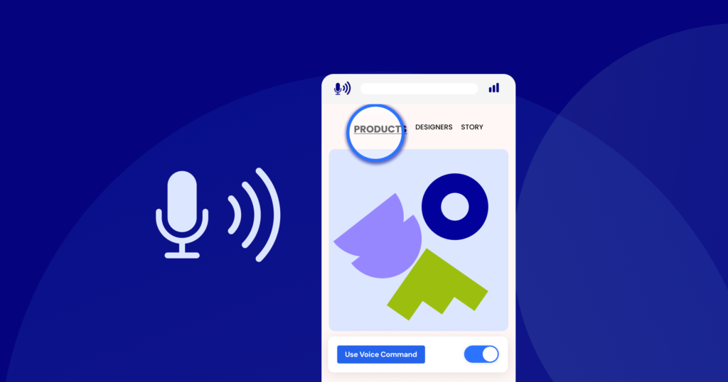
Myth #8: “I don’t need to worry about accessibility for mobile users”
The Truth
With over 62% of global web traffic coming from mobile devices, mobile accessibility isn’t optional. Many people with disabilities rely on built-in mobile features like voice commands, screen magnifiers, or system-wide text scaling. If your site isn’t responsive and accessible on mobile, you’re excluding a majority of users.
Google has also made mobile-friendliness and usability a key ranking factor, meaning inaccessible mobile experiences can hurt your search visibility.
The Takeaway
Accessibility must extend to every device. A site that isn’t accessible on mobile isn’t truly accessible at all.
Myth #9: “If my site meets WCAG, it’s fully accessible”
The Truth
The Web Content Accessibility Guidelines (WCAG) are an essential benchmark, but compliance alone doesn’t guarantee usability. According to Deque, automated tests can only detect about 20-30% of accessibility issues. Real-world problems, like confusing navigation or unclear instructions, often surface only when testing with users who rely on assistive technology.
Accessibility is not a one-time checklist. It’s an ongoing process of testing, feedback, and continuous improvement.
The Takeaway
WCAG compliance is a starting line, not the finish line. True accessibility comes from continuous improvement and user-centered design.
Myth #10. “Accessibility is just about text and images”
The Truth
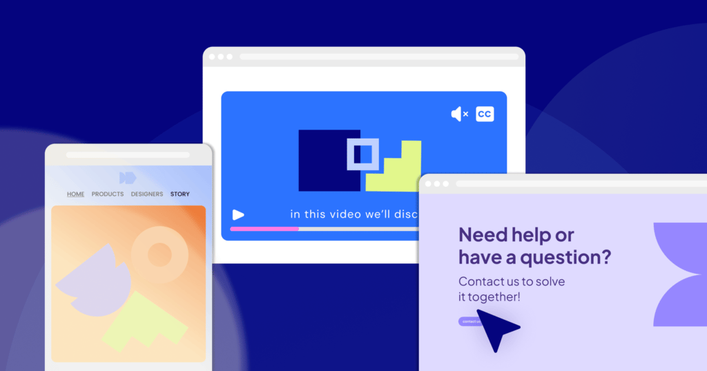
Accessible content is critical, but it goes beyond words and pictures. Forms, videos, buttons, and interactive elements all require thoughtful design.
- Forms need clear labels, error messages, and logical tab order
- Videos need captions, transcripts, and controllable playback
- Buttons and links must be large enough to click and properly described
Accessibility covers every interaction on your site. If users can’t fill out a form, buy a product, or watch your video, they’re excluded.
The Takeaway
Accessibility is holistic. It’s about making every element of your site usable, not just text and images.
Final Thoughts
Accessibility isn’t a box to check or a legal hurdle to clear, it’s a mindset. When you strip away the myths, accessibility stops feeling like a burden and starts looking like what it really is: an opportunity.
An opportunity to reach more people, improve performance. And to create digital experiences where no one gets left behind.
So the truth? Accessibility isn’t extra work. It’s about making the web what it was always meant to be: for everyone.
👉 Accessibility becomes clearer when you see it on your own site. Run a free scan with Ally by Elementor to uncover opportunities for improvement.


