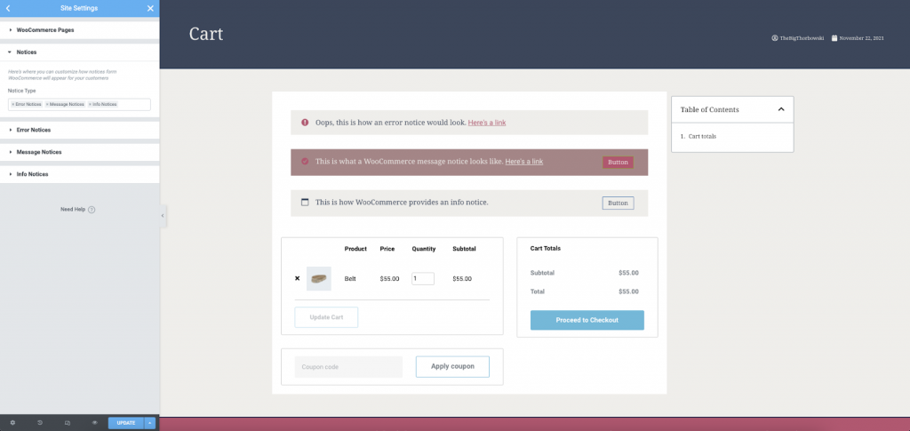
The notices that WooCommerce displays when products are added to cart, warnings, and information can be styled using the Site Setting tools. To find these settings, navigate to Site Settings > WooCommerce.
Note
You must have WooCommerce installed in order to use its features, including products and WooCommerce widgets.
It is recommended to be editing a WooCommerce based page, or Theme Builder template when customizing your notices. You may also edit a page where the WooCommerce Notice Widget has been placed.
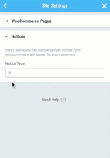
Add Notice Types
Navigate to Site Settings > WooCommerce > Notices. From there, click the + icon in the Notice Type field. You may then add the notices you wish to style. A sample notice for the selected type will be displayed in the main editor.
Styling Options
Error Notice Styles
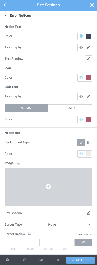
Notice Text
- Color: From the color picker, choose the color for your notice text.
- Typography: From the pencil icon, click to open the font option panel to choose the family, weight, transform, style, decoration, line height, and letter spacing options
- Text Shadow: Click the pencil icon to open the shadow properties options.
Icon
- Color: From the color picker, choose the color for your Icon.
Link Text
- Typography: From the pencil icon, click to open the font option panel to choose the family, weight, transform, style, decoration, line height, and letter spacing options
- Color: From the color picker, choose the color for your link text. This may be set for normal and hover states.
Notice Box
- Background Color: From the color picker, choose the background color for your notice box.
- Image: Add a background image if desired by clicking the option and adding/selecting the image from your media library
- Box Shadow: Click the pencil icon to set the color and shadow options
- Border type: From the dropdown menu select between solid, double, dotted, dashed, or grooved
- Width (border): Enter a chosen value in the fields based on px, em, or %
- Color (border): From the color picker, choose the background color for your border
- Border Radius: Enter a chosen value in the fields based on px, em, or %
Message Notice Styles
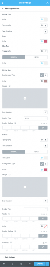
Notice Text
- Color: From the color picker, choose the color for your notice text.
- Typography: From the pencil icon, click to open the font option panel to choose the family, weight, transform, style, decoration, line height, and letter spacing options
- Text Shadow: Click the pencil icon to open the shadow properties options.
Icon
- Color: From the color picker, choose the color for your Icon.
Link Text
- Typography: From the pencil icon, click to open the font option panel to choose the family, weight, transform, style, decoration, line height, and letter spacing options
- Color: From the color picker, choose the color for your link text. This may be set for normal and hover states.
Notice Box
- Background Color: From the color picker, choose the background color for your notice box.
- Image: Add a background image if desired by clicking the option and adding/selecting the image from your media library
- Box Shadow: Click the pencil icon to set the color and shadow options
- Border type: From the dropdown menu select between solid, double, dotted, dashed, or grooved
- Width (border): Enter a chosen value in the fields based on px, em, or %
- Color (border): From the color picker, choose the background color for your border
- Border Radius: Enter a chosen value in the fields based on px, em, or %
Buttons
- Typography: From the pencil icon, click to open the font option panel to choose the family, weight, transform, style, decoration, line height, and letter spacing options
- Color (Text): From the color picker, choose the color for your button text.
- Background Type: Use the icons to choose between a solid or gradient background
- Color (background): From the color picker, select the color(s) for the field
- Image: Click to select or upload an image to the media library to use as the background image of your button
- Box Shadow: Click the pencil icon to open the shadow properties options.
Borders
- Border type: From the dropdown menu select between solid, double, dotted, dashed, or grooved
- Width (border): Enter a chosen value in the fields based on px, em, or %
- Color (border): From the color picker, choose the background color for your border
- Border Radius: Enter a chosen value in the fields based on px, em, or %
- Padding: Enter a chosen value in the fields based on px, em, or %
Info Notice Styles
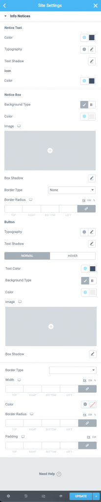
Notice Text
- Color: From the color picker, choose the color for your notice text.
- Typography: From the pencil icon, click to open the font option panel to choose the family, weight, transform, style, decoration, line height, and letter spacing options
- Text Shadow: Click the pencil icon to open the shadow properties options.
Icon
- Color: From the color picker, choose the color for your Icon.
Notice Box
- Background Color: From the color picker, choose the background color for your notice box.
- Image: Add a background image if desired by clicking the option and adding/selecting the image from your media library
- Box Shadow: Click the pencil icon to set the color and shadow options
- Border type: From the dropdown menu select between solid, double, dotted, dashed, or grooved
- Width (border): Enter a chosen value in the fields based on px, em, or %
- Color (border): From the color picker, choose the background color for your border
- Border Radius: Enter a chosen value in the fields based on px, em, or %
Buttons
- Typography: From the pencil icon, click to open the font option panel to choose the family, weight, transform, style, decoration, line height, and letter spacing options
- Color (Text): From the color picker, choose the color for your button text.
- Background Type: Use the icons to choose between a solid or gradient background
- Color (background): From the color picker, select the color(s) for the field
- Image: Click to select or upload an image to the media library to use as the background image of your button
- Box Shadow: Click the pencil icon to open the shadow properties options.
Borders
- Border type: From the dropdown menu select between solid, double, dotted, dashed, or grooved
- Width (border): Enter a chosen value in the fields based on px, em, or %
- Color (border): From the color picker, choose the background color for your border
- Border Radius: Enter a chosen value in the fields based on px, em, or %
- Padding: Enter a chosen value in the fields based on px, em, or %

