There are a number of issues that can occur with websites when visitors are using mobile devices. Below are some of the most common.
Elements disappear on mobiles or tablet
Elements hidden by design
Creators often have the option of hiding elements from view when the site is viewed from a mobile or table.
To check to see if an elements is set to be hidden on mobiles and/or tablets:
For most elements:
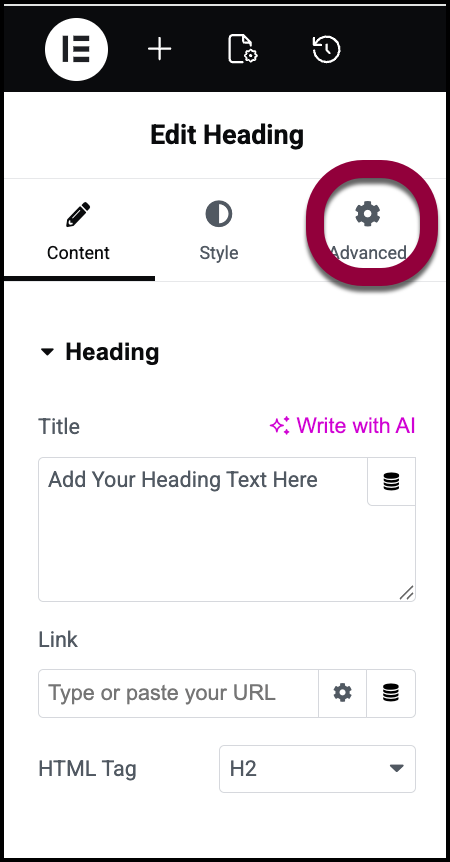
- Open the page in the Elementor Editor.
- Select the element.
- In the panel, click the Advanced tab.
- Open the Responsive section.
- Check the Hide On toggles to see what devices the element is hidden on.
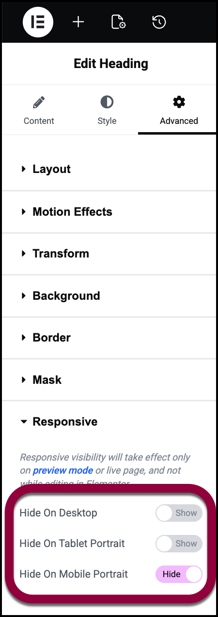 NoteIf you added custom breakpoints, you may see more toggles.
Elements hidden by custom CSS
Check your custom CSS for any issues.
To check you custom CSS:
- Open the page in the Elementor Editor.
- Select the element.
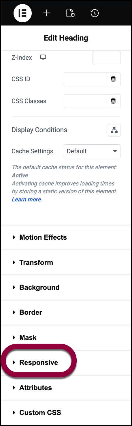
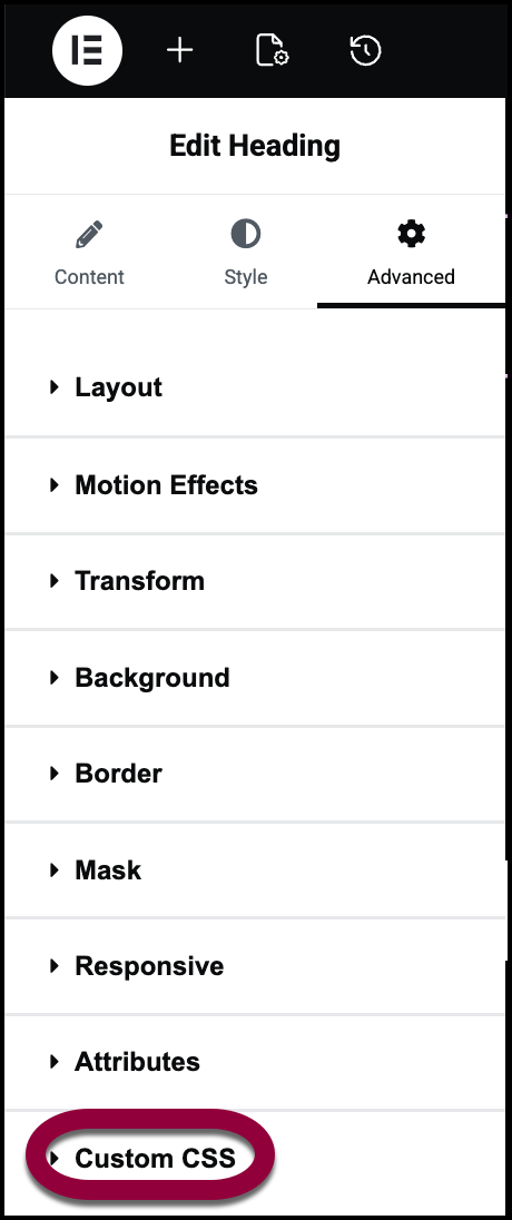
- Click the Advanced tab.
- Open the Custom CSS section.
Element Settings
Some widget settings like Width zero or Opacity zero or Display Condition for widget or container.
To check the settings:
- Open the page in the Elementor Editor.
- Select the element.
- Click the Advanced tab.
- In the Layout section, make sure margins are set to the device type with the issue.
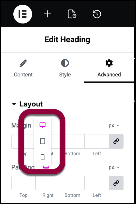
- Check for any margins set to zero.
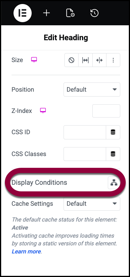
- Scroll down to Display Conditions and make sure there are no conditions stopping the element from displaying. For details, see Show and hide elements on a page.
Third-party plugins
Third-party plugins or themes can affect the styling of mobile and tablet.
- Try turning off all plugins except for Elementor and Elementor Pro to see if that solves the issue. Then turn them back on one at a time to identify which is causing the issue. For details, see here.
- To see if your theme is causing the issue, try switching to the Hello theme. For details, see here.
Changes do not look the same as the editor on mobile or tablet
Third-party plugins
Third-party plugins or themes can affect the styling of mobile and tablet.
- Try turning off all plugins except for Elementor and Elementor Pro to see if that solves the issue. Then turn them back on one at a time to identify which is causing the issue. For details, see here.
- To see if your theme is causing the issue, try switching to the Hello theme. For details, see here.
Device issues
Sometimes iOS specific devices show issues and different behaviour when checking the same page on Android and iOS and these need to be tested further. Consult the community to find others who have faced similar issues.
Background Video not autoplaying or audio not playing automatically and the video is mute
Browsers have specific policies while on mobile mode to not autoplay videos and to not autoplay videos with audio. These policies are managed by the browsers themselves thus it can be an issue when trying to view the site from mobile.
Note: iOS Power Saver Mode stops the autoplay of videos on mobile phones. So disabling it autoplays the video.
Breakpoint setting
Elementor allows you to set custom breakpoints for mobiles and tablets. However, if you set the breakpoints too low, this can interfere with the layout on the frontend. If you’re experiencing issues, try setting larger breakpoints to see if that solves the issue. For details, see Add and customize breakpoints.
Remember breakpoints are determined by pixel measurements, not by device. So if you created a breakpoint for tablets that starts at 756px, if you have a laptop that is 756px wide, it will display the page as it would be displayed on a tablet.NoteWidescreen breakpoint
Widescreen breakpoint can be confusing as they often cannot be seen on the frontend as the screen resolution is too small. To check your screen resolution you can use tools like https://www.whatismyscreenresolution.org/ to check your screen resolution.

