Encourage users to engage with your content and to continue to keep reading as they’ll know exactly how much is left. Full style customization is available for the Progress Indicator and Tracker Background.
Adding A Progress Tracker
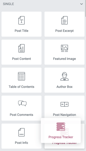
From the widget panel drag a progress widget to your page or Single Post template to the desired location. You may also use positioning and sticky effects from the Advanced Tab.
Content Controls
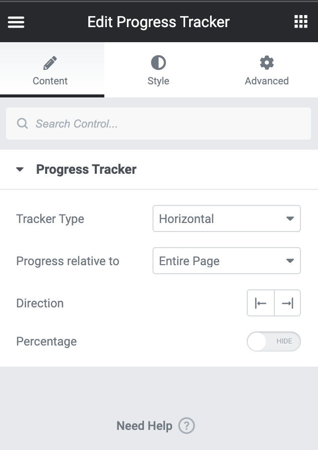
- Tracker Type: From the dropdown menu select between Horizontal, or Circular
- Progress Relative To: Select between Entire Page, Post Content, or Selector from the dropdown menu
- If selector is chosen, provide the #id or .class you wish to track the progress of in the field
- Direction: Select the appropriate alignment icon
- Percentage: Use the toggle to choose to hide/show the percentage text of the progress
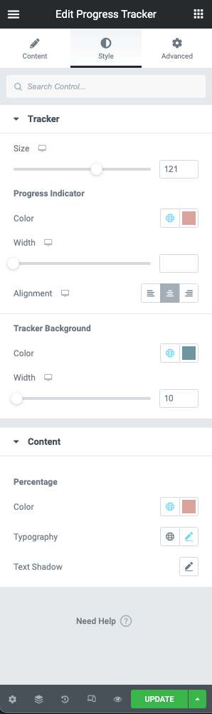
Style Controls
Tracker
- Size: Use the slider control or manually enter the value desired
Progress Indicator
- Color: Use the color picker to set the progress indicator color
- Width: Use the slider control or manually enter the width for the progress indicator (PX)
- Alignment: Use the appropriate icon to set the alignment of the progress indicator
Tracker Background
- Color: Use the color picker to set the tracker background color
- Width: Use the slider control or manually enter the width for the tracker background (PX)
Content
Percentage
- Color: Use the color picker to set the percentage text color
- Typography: Use the typography settings for family, size, weight, and decoration values
- Text Shadow: apply a text shadow to the percentage using the controls