Styling elements in the Elementor Editor V4 is built around the idea of classes. For more information about classes in V4, see Classes in Elementor.
Working with classes has many advantages, especially the opportunity to reuse elements, making your work faster and more efficient. However, using classes can, at times, mean that you are adding conflicting styles to an element. For example, a paragraph element may have a class that sets the text color to green and another class that sets the text color to red. How does the Editor determine which color to use?
Prioritizing classes and identifying conflicts
In the following example we’ll use two classes:
- Red_text: This class is set to turn the text red.
- Green_text: This class is set to turn the text green.
To learn how to create classes, see Classes in Elementor.
To demonstrate class priority and conflict identification, let’s create a sample element.
- Add a Paragraph element to the canvas.
Since we haven’t styled the paragraph, it will use the default text color – black.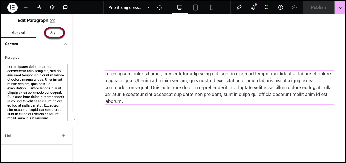
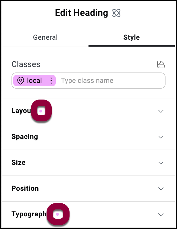
- Click the Style tab.
The top of the Style tab has the Classes text box. The Classes text box contains the names of all the classes that apply to the element. Right now, the only class that applies to the element is Local.
Local is a special class. Every element has a local class that applies only to that element. At this point, we haven’t added any styles to the local class so the Paragraph element is using the default settings.
Now let’s add some color to the text.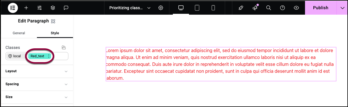
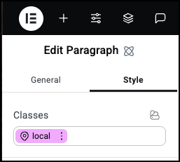
- In the Classes text box, add the class Red_text.
The text turns red because it uses the color set by the Red_text class.
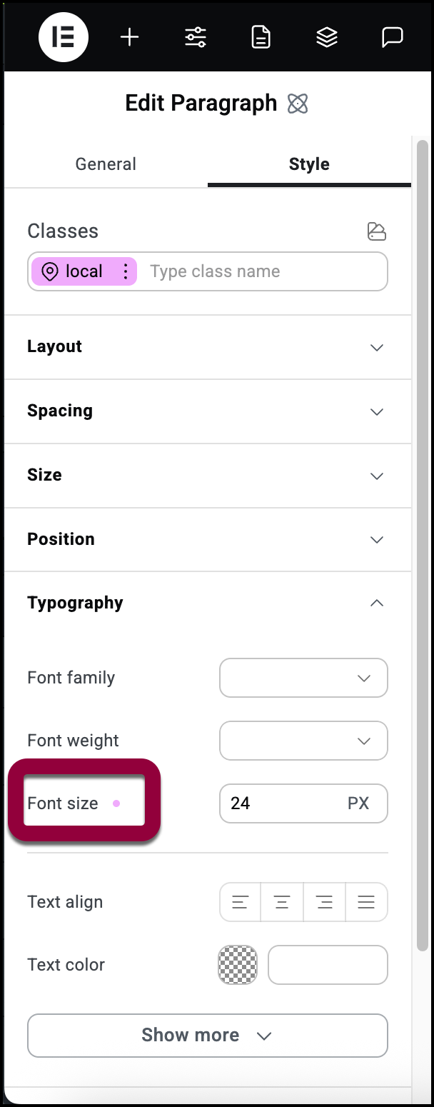
Now, let’s look at indicators. Indicators show you what settings are being used for your element.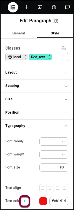
- Open the Typography field and look at the Text color setting. The indicator dot is green showing that this is the setting that will be used.
Now go to the local class and look at the Typography setting.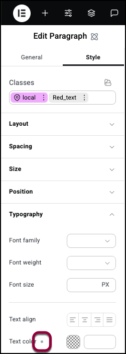
There is a gray dot by Text Color. That shows this element contains a different class that sets the text color.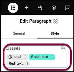
- We’ll go back to the Classes text box and add the class Green_text.
Notice that despite the fact that we added the Green_text class after the Red_text class, it shifts to the left of the Red_class. Classes to the left always take priority over the classes to the right. This means that local class will always take the highest priority as it is always the leftmost class.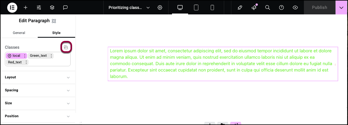
To understand why, click the Class Manager icon to open the Class Manager. For details, see The Elementor Editor Class Manager. 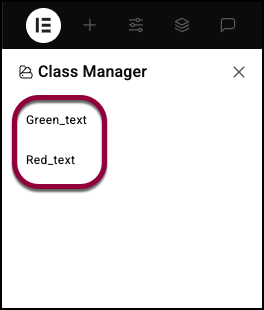
Notice that Green_text is above Red_text, meaning it has priority over Red_text. Any element with both Green_text and Red_text will adopt the Green_text settings.
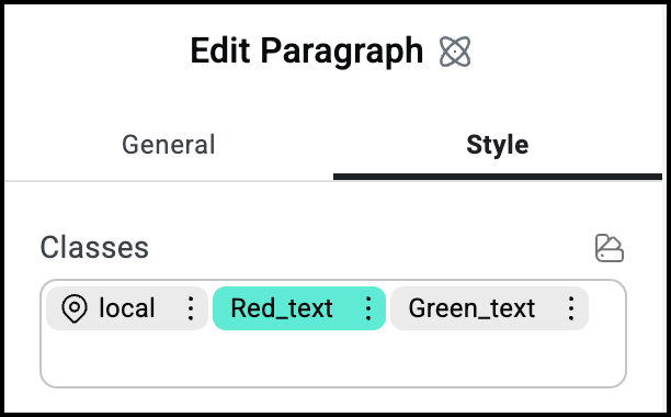
If we look at the Typography settings for each class we”ll see:
- In the Red_text class there is an orange dot by Text color
. This shows that there is another class overriding the setting for this class.
- In the Green_text class there is a green dot by Text color
. This shows that this is the color used in this element.
- In the local class there is a gray dot by Text color
. This shows that this element has another class determining this setting but it doesn’t clash with this class.
Finally, let’s see what happens when we edit the local class.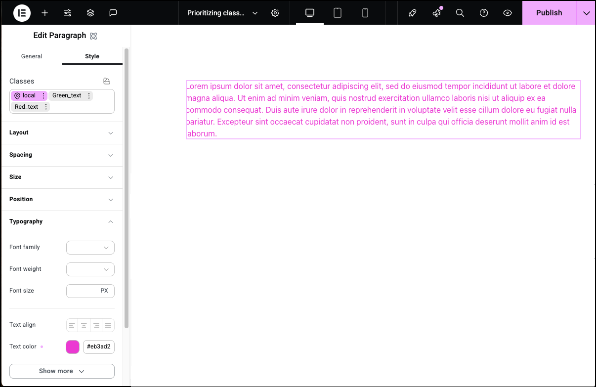
- In Typography, change the Text color.
The text changes to that color because the local class always takes the highest priority. The indicator next to Text color turns pink, indicating that this color is local and has the top priority.
Below is a chart of indicators and what they mean:
| Indicator | What it means |
| Pink | Value set by the local class. Can never be overridden. |
| Green | This setting is currently determined by this class. This can be changed by rearranging the class priorities. |
| Gray | This setting is currently determined by another class. |
| Orange | This setting is currently determined by a different class. This can be changed by rearranging the class priorities or can be overridden by the local class. |
Identify which class is being used
The indicators explained above show you where there are conflicts but can also provide more exact information. Click on an indicator, and a popup explains exactly what style it’s using and what style(s) it is ignoring.
We’ll use the classes in the example above to see how it works.
- Drag a Paragraph element onto the canvas.
- Create the Red_text and Green_text classes as mentioned above.
This is what the Classes field should look like.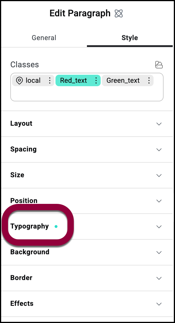
- In the panel, open the Typography field.The indicator next to the word Typography shows that there is some conflict in the typography fields.Note
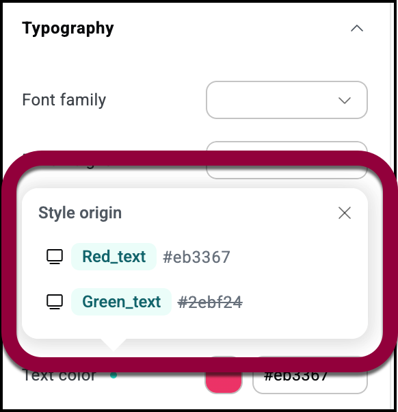
A popup shows the name of the conflicting classes. The properties of the class not being used are struck through.
The editor’s responsive editing capabilities allow you to set different classes for different size screens. As an example, we’ll set different font sizes for desktops and mobiles.
- Add a Paragraph element to the canvas and enter some text.
- Open the Typography field.
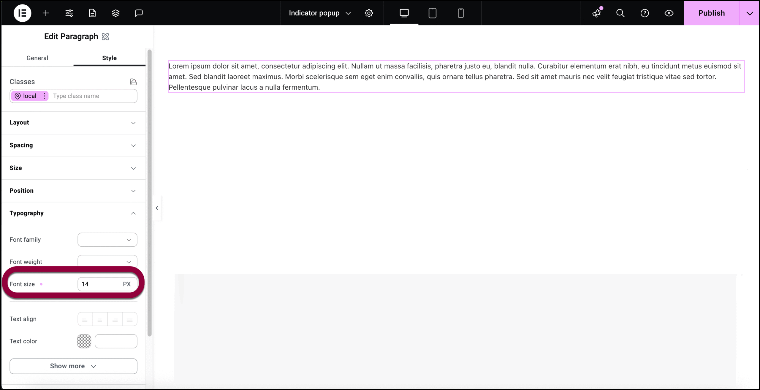
- In the Font size counter, enter 14.
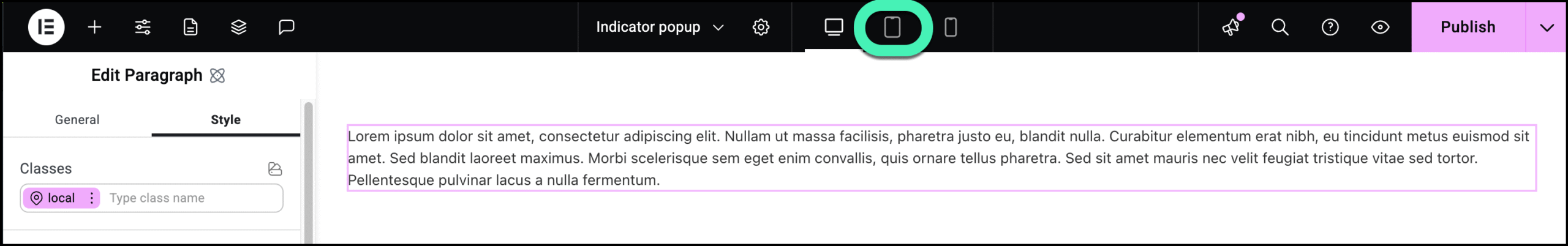
- Click the mobile icon.
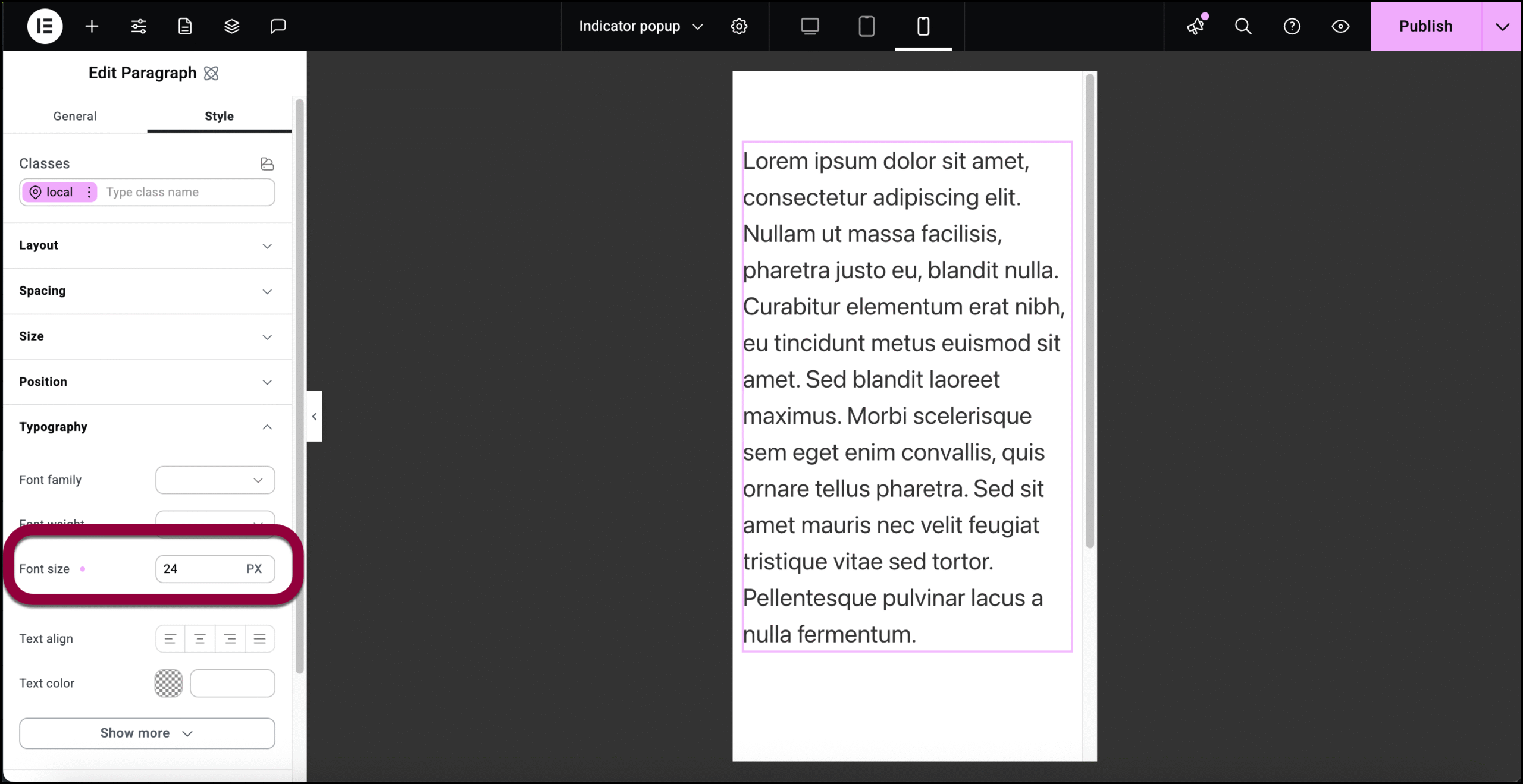
- Open the Typography field and set the text size to 24.
- Click the indicator by Font Size.
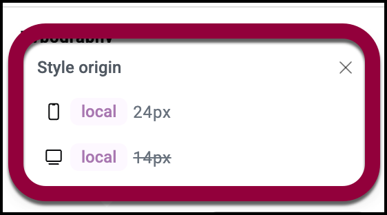
- The popup shows which font size is used for mobile and which for desktops. Since we’re in mobile mode, the desktop property is struck through.