The Elementor Editor is designed to help web creators work quickly and efficiently. As part of that mission, the Editor adopts the principles of Atomic Design. This system is based on the idea of creating small, reusable elements. In Elementor, these elements are called classes. This is in line with the vocabulary used by CSS.
As an extra benefit, proper use of classes can also improve your website’s performance.
Creating a class
Creating classes done automatically. You do it every time you add an element to the canvas. When you add an element to the canvas, the element options appear in the left panel. At the top of the Style tab, you’ll see the Class field with the class local already filled in. You can now add new classes to the element by following this process:
- Enter a class name in the text box.
A dropdown menu appears.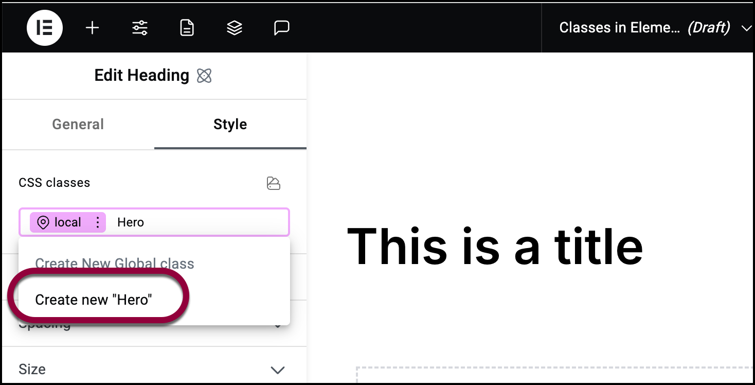
- Select the class name under Add New Global Class.
Editing a class
After you create a class, you need to edit it to establish its properties.
To edit a class:
- Create the class.
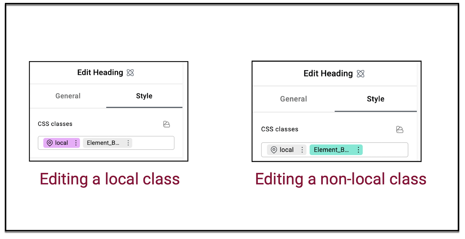
- Check the CSS classes field. The class you’re editing will be pink if it’s a local class. Otherwise it will be green. When the class is pink or green, you’re editing that class.
What is a class?
A class is basically a collection of shared style characteristics. For instance, if you’re building a website and you want the standard text across the site to use Arial 12 point font, you can create a class called Main text with these characteristics. That way, every element that had the class Main text, would use Arial 12 point as their font.
The local class
In Elementor, every element has at least one class – the local class. This class defines the particular element that you’re working with. It’s important to note that even though all elements have a local class, the local class can be different for each element. For instance, you can have one Text widget that uses Arial font in its local class and another Text widget that uses Calibri in its local class. 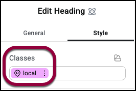
Class hierarchy
The other important thing to note about classes, is that they work by hierarchies. f classes contradict one another, the Editor knows what characteristics have priority. For instance, if an element contains two classes, one that sets the font to Arial and another that sets the class to Calibri, the editor needs to determine which gets priority. This priority is set in the class manager. However the local class always has top priority. So, in the above case, if the local class set the font to New Time Roman, the element would use New Times Roman font.
Example of building classes
In this example, we’ll look at building a website that will include several buttons. In order to save time and boost performance, we’ll create two classes – one to define important buttons and another to define secondary buttons.
- Create a page in the Elementor Editor.
- Drag a Button widget to the canvas.
The options appear in the panel.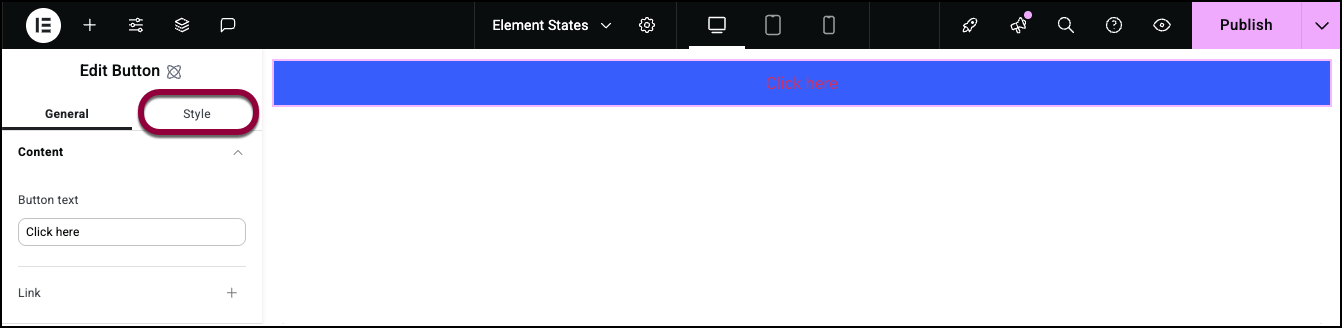
- In the panel, click the Style tab.
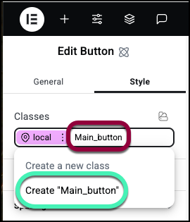
- In the Classes text box, next to local, enter Main_button.
- In the dropdown menu, select Create new “Main_button”.
Main button appears in the Classes text box.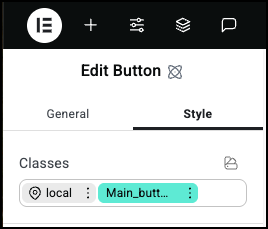
Note that the text Main_button is in green. That means you’re editing that class.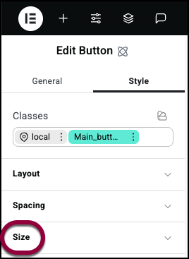
- Open the Size field.
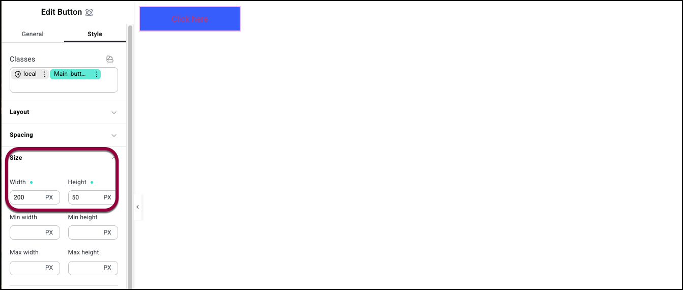
- Give the button a width of 200 PX and a Height of 50 PX.
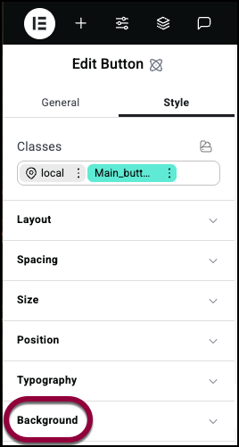
- Open the Background field.
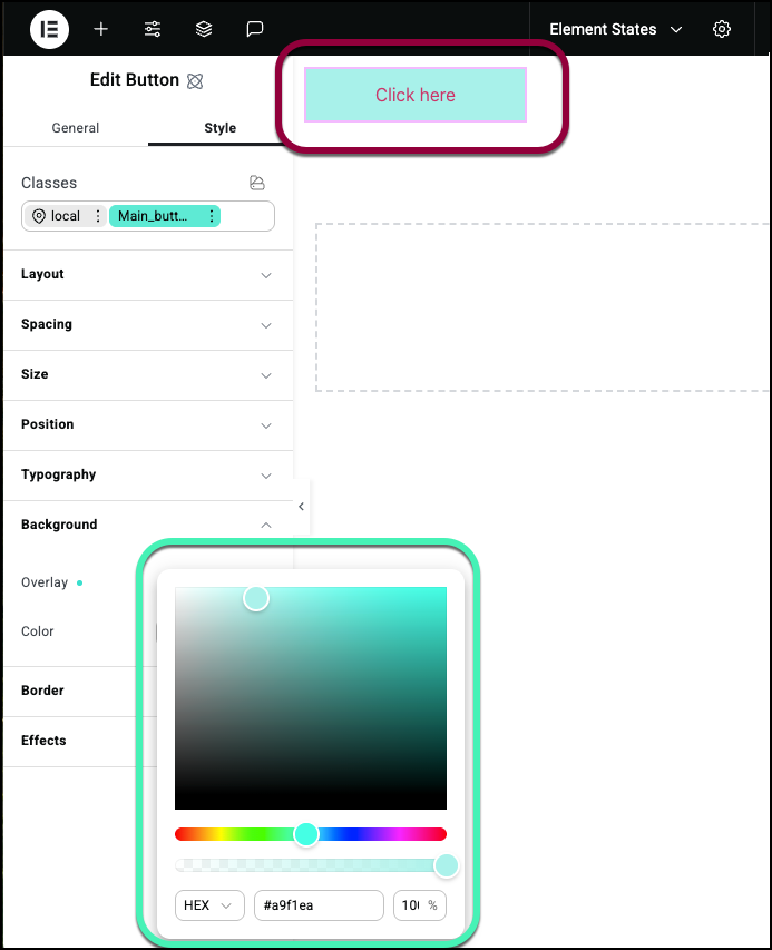
- Select a color for the button. For details, see Style tab – Background.
Now let’s create a class for secondary buttons.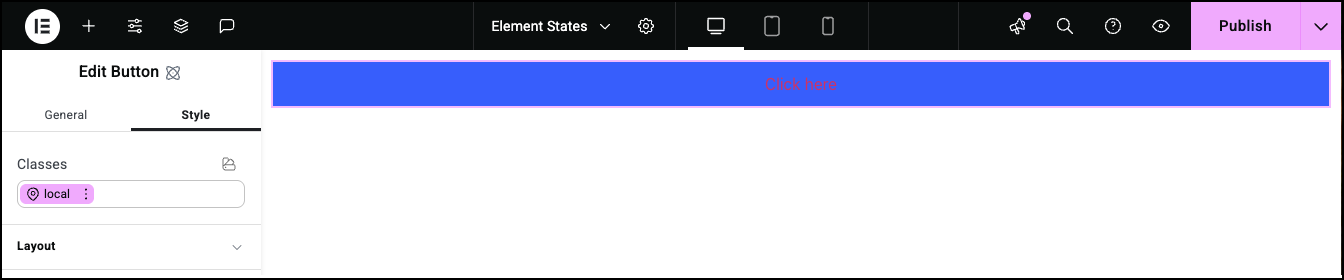
- In the Classes text box, delete Main_button.
Note that the button returns to its default settings.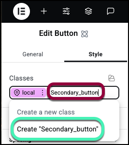
- In the Classes text box, enter Secondary_button.
- In the dropdown menu, select Create new “Secondary_button”.
Note the text is in green meaning you’re editing the class.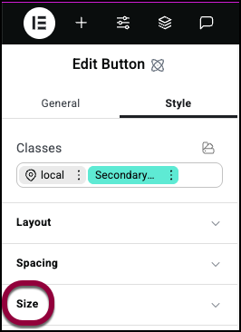
- Open the Size field.
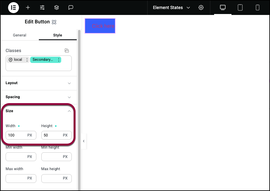
- Give the button a width of 100 PX and a Height of 50 PX.
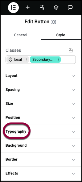
- Open the Typography field.
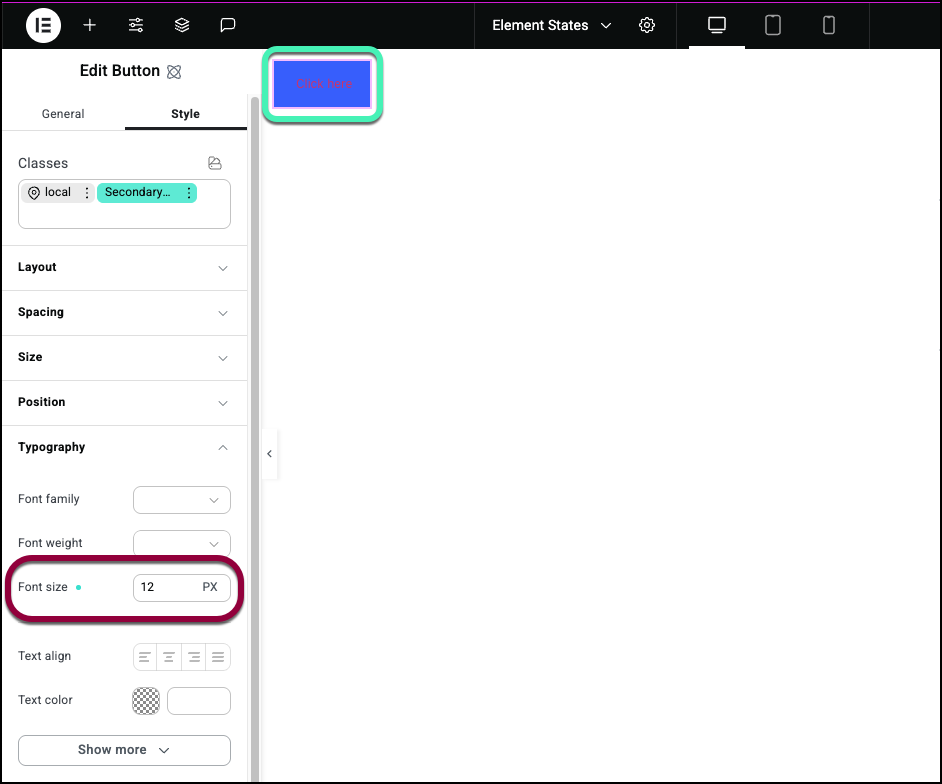
- Set the Font Size to 12.
- Open the Background field.
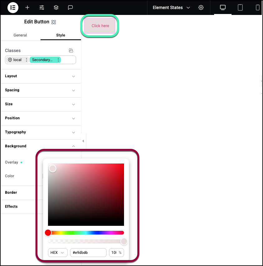
- Select a color for the background. Make sure it’s different than the Main_button background.
Now test the results. - Add a new Button element to the canvas.
- Open the Style tab.

- Click the Classes text box and select Main_button from the dropdown menu.

The button should take on the characteristics of the Main_button class.
- Click the Classes box and select Secondary button from the dropdown menu.
The button will have most of the characteristics of the Main button class. That is because the Main button class is higher on the class hierarchy. However, the font on the button takes on the style of the Secondary button class. That is because we never defined the typography of the Main button, so the Secondary button class determines the font style.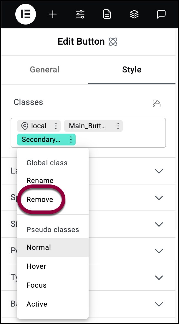
- In the Classes box, click on the three dots next Secondary_button.
- Select Remove from the dropdown menu.
The CSS Classes box should now contain just the local and Main_button classes. Notice that the font size returns to the default size because the Secondary_button class is no longer there.
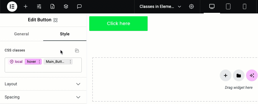
Now let’s say that we want to customize this one button so that it looks like a main button but has one additional feature – it changes color when visitors hover over it.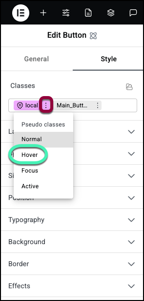
- Click the three dots next to the local class and select Hover from the dropdown menu.
By editing the local class, we can change the style of this button without changing other buttons with the Main button class.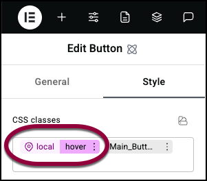
Hover is what is called a state. When you select it, you determine how the button will look when visitors mouse over it. For details, see Element States.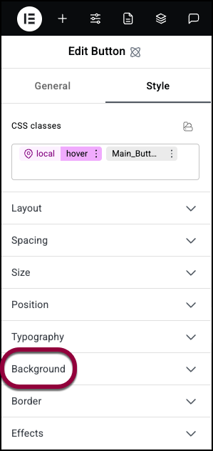
- Open the Background field.
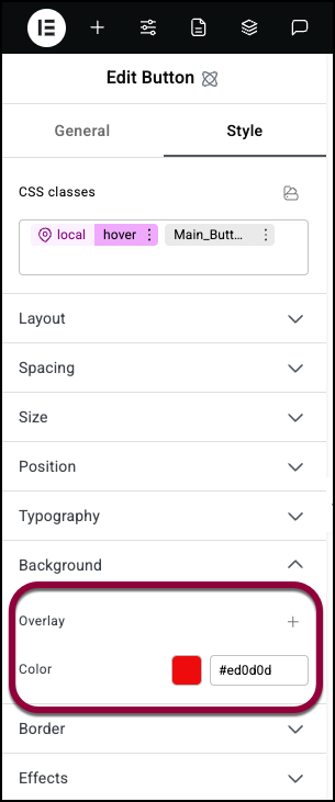
- Select a different background color.
Notice that when you move the cursor over the button, it changes colors.

