A celebration of colors and images, outside-the-box creativity, and breaking conventions — these words came to my mind when I reviewed this month’s collection of 10 beautiful websites designed and built with Elementor.
This collection includes a nonprofit foundation from Norway, an American diner in Glasgow, an Israeli code-learning platform for kids, a Greek art festival, and an exotic hotel in Singapore.
Let’s dive in!
10
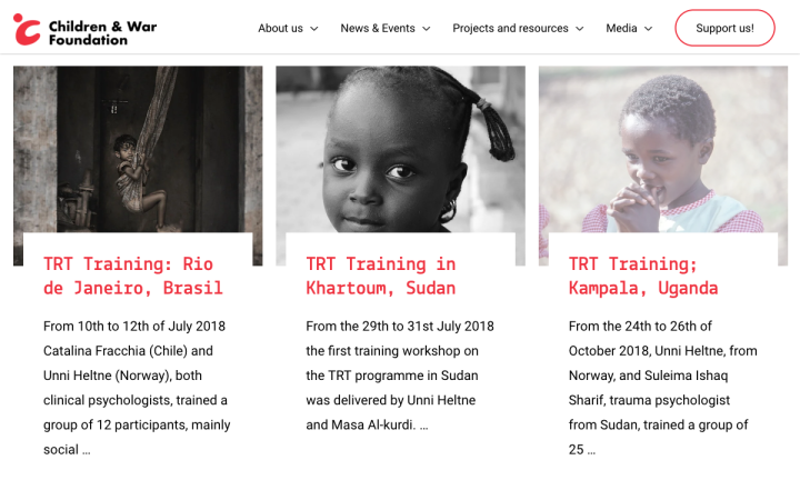
The Children and War Foundation is a nonprofit organization based in Norway, dedicated to improving children’s lives in the aftermath of wars and disasters.
Their site conveys a sense of emergency crucial to these circumstances, produced by a combination of red, black, gray and white, alongside a technical font reminiscent of mission briefs from action movies. The touching images of children evoke compassion and urge visitors to take action. The conspicuous double footer allows the visitor to either sign up for updates or take a more active approach.
Design & Development: Sommerseth Design
Theme: Astra Pro
Plugins: JetElements, ACF, Ultimate Addons for Elementor, LoginPress, iThemes Security, Yoast Seo, Elementor Extras, All in One Backup, Admin Menu Editor, Elementor Granular Control, Admin Dashboard, Google Analyticator
09
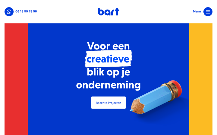
Bart Oosterveer is a Dutch graphic and web designer, offering online and offline design services.
His use of primary colors — yellow, red and blue (the latter being dominant), animated icons, and rounded fonts contribute to a light and playful atmosphere. The project pages are excellent, displaying a large full-width photo in the top section, followed by images breaking out of the grid to create movement. In addition, the background grid lines quasi-lead visitors through the content.
Theme: Hello
Plugins: Yoast SEO
08
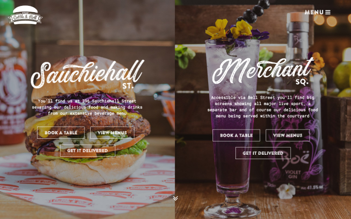
“Glasgow bred, American fed” — this is the motto of the Glasgow-based American diner Steak, Cattle and Roll Bar & Grill, with the goal of cooking up American inspired food that is sourced from local suppliers in Scotland.
Their website transports visitors to an all-American diner atmosphere. This is achieved using familiar elements from American culture: the old-school “baseball font” popular in the ’50s, the torn-paper like shape dividers that give the site an old print look, and the dominant red Coca-Cola color. All this is topped off by their iconic Elvis-inspired name. Plus, instead of testimonials, the designer chose to place a section of happy customers’ photos — swell!
Design & Development: Point & Pixel Creative
Theme: Jupiter X
Plugins: Imagify, Jet Elements, Jet Tricks, Lazy Load, Loginizer, Post Duplicator, Raven, WP Rocket, Yoast SEO
07
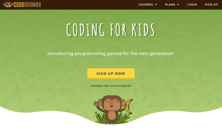
CodeMonkey is a fun and educational game environment where students learn to code in real programming languages, no previous experience needed. CodeMonkey has won several awards such as Edtech’s Best Computer Coding Education Solution, and Best Digital Program for Kids.
CodeMonkey designed a cheerful, comical website with their target audience, 8-year-old kids, in mind. The design language they shaped is based on monkey doodles and a doodle font. There’s an entire world surrounding the monkey, and it includes other animals, bananas, leaves and jungle plants, the sky and clouds — all childlike illustrations. On the one hand, it’s humoristic but on the other hand, quite sophisticated.
Theme: Custom based on Twenty Seventeen
Plugins: Add to any, Better file download, Speech Bubble
06
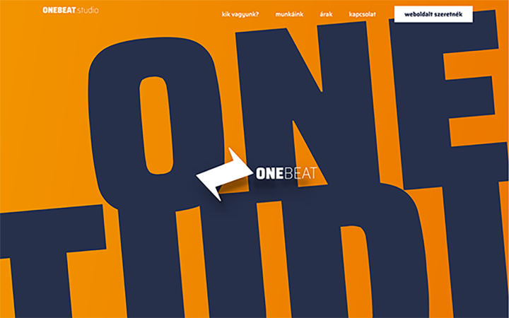
Daniel Tóth-Lőrincz is a designer from Hungary with over a decade of experience in the web design industry. His main interests are WordPress, site development, and design for entrepreneurs.
Daniel created his new website from scratch using our Hello theme, and the result is impressive: a dynamic and interactive site with lots of motion applied to the top section of each page, the icons, and other visual elements. The homepage has a dramatic look accomplished by the contrast between orange and blue. The project pages have a dark background, focusing the visitors’ attention on Daniel’s work.
Design & Development: Daniel Toth-Lorincz
Theme: Hello
Plugins: MouseWheel Smooth Scroll, Slider Revolution, Tidio Chat, Dynamic Animations for Elementor
05
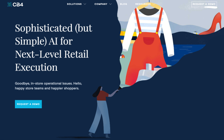
CB4 is a New York City start-up revolutionizing the way retailers tackle store execution. CB4 uses AI and machine learning technology to bring together corporate, store teams, and the customers they serve.
Their website designer created a playful experience, applying a modern approach with flat design at its best. They use motion effects to boost the illustrations, implement a serif font to support the titles, and played with the contrast between soft pastel and saturated colors. The use of SVG animation to describe CB4’s work process is another gem.
Design: Daria Boro
Development: Design and Development Minds
Theme: Hello
Plugins: ACF Pro, Custom Icons for Elementor, Disqus for WordPress, Drift, Elementor Custom Skin, Insert Headers and Footers, Redirection, Yoast SEO
04
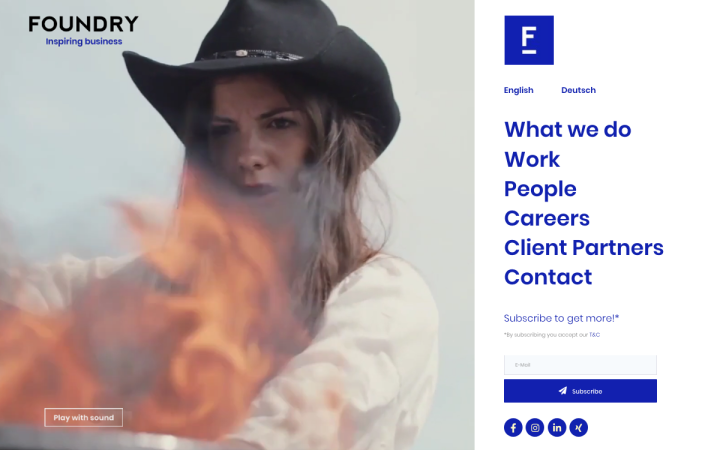
Foundry is an international creative agency based in Berlin, Zurich, and New York. A crew of designers, writers, strategists, and creative thinkers, Foundry is responsible for creating meaningful marketing and branding concepts.
The first thing that greets the visitors is a modern, fast-paced video clip showcasing Foundry’s work and clients — a collage of compelling visuals that you can’t take your eyes off.
More videos and images follow; “interrupted” by short snippets of text, leaving the visitors room to breath. There is a constant game between the intensity of the visual content and the sparse texts throughout the site. The project pages are served in a pleasant way on a white background with thin-weight and gray-colored text, making the images and videos stand out.
Design & Development: Foundry
Theme: Astra
Plugins: WPML, Yoast SEO, Elementor Extras
03
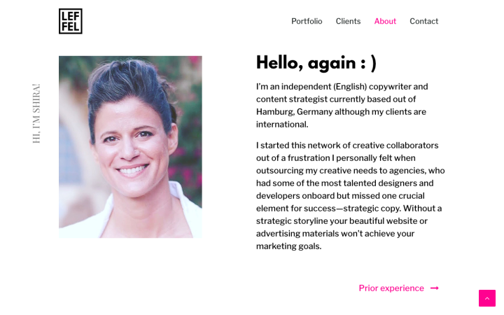
Shira Leffel is an independent copywriter and content strategist from Germany, specializing in B2B & B2C high-tech startups.
The concept of copywriting is clear and consistent throughout Shira’s website, reflected in her minimalistic design approach. It starts with the hero section that features one concise sentence: “because copy matters.” Scrolling down reveals a magazine look with different visual elements borrowed from the text world — semi-colon, ampersand, quotation marks, and tilde — and painted in pink. This serves as a delicate decoration and breaks the general black and white layout. The designer also uses entrance animation effects to create a flow. Superb!
Design: Maia Darnell
Development: Eagleray Web
Theme: OceanWP
Plugins: ACF Pro, Autoptimize, Comet Cache Pro, Contact Form 7, Ele Custom Skin, Elementor Contact Form DB,
Make Column Clickable Elementor, Ocean Extra, Page Links To, Post Types Order, Premium Addons for Elementor,
Wordfence Security, Yoast SEO
02
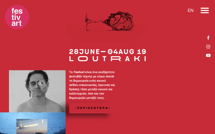
Festivart is an independent art festival based in Loutraki, Greece. Its main purpose is to create a common communication field of research and action, both for the public and artists, as well as creators. In its sixth edition, the Festivart continues its research activity, considering the public space as a place of communication and reception of contemporary art by organizing workshops, installations, and interactive projects in the city of Loutraki.
Festivart’s theme is visible throughout their website, exhibiting an experimental, outside-the-box, brutalist, and daring approach. The designer did not shy away from breaking the boundaries, literally; there is no visible grid, each section has its own design language, and images are intentionally unaligned. They use different video art works, 80’s and 90’s animations (Tetris for example), gifs, and images, as well as bold and contrasting colors. Controversial as it may be, we loved this site, and we believe it should be viewed in its entirety (the Germans actually have a word for it: “Gesamtkunstwerk”).
Design: Elsa Sturm
Development: Spyros Ntanos
Theme: Hello
Plugins: Code Snippets, Custom Feeds for Instagram, Elementor Google Map Extended, EventON, Simple CSS, TranslatePress, Yoast SEO
01
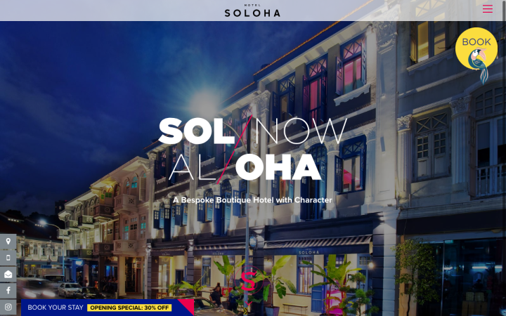
Nestled within historic shophouses in Singapore’s Chinatown, Hotel Soloha is an all-new boutique hotel where art, trendy social spaces, and quality room furnishings provide a new hospitality experience.
Soloha’s website is built like a presentation with full-width photos, illustrating the vibrant urban jungle that the hotel is located in. By combining tropical motifs such as the Toucan bird and the bamboo branch-like display font, the designer created a celebration of colors and illustrations. The fusion of freestyle background patterns, exotic high-resolution images, and a strong color palette produces an exciting atmosphere.
Design: Tripple
Development: Pixel Code
Theme: OceanWP
Plugins: Yoast SEO, Jetpack, Updraft, Essential Addons, Lenix Leads
Think your Elementor-based website or landing page should be featured in our next Top 10 Websites column? Give it a shot!
