So many beautiful sites to choose from – only 10 spots available!
Since our last showcase, we have been getting many designer submissions from all over the world. In this post, we take a look at ten gorgeous websites from this list, all made with Elementor.
This time, our criterion wasn’t just style. We also chose industry-leading websites that have been recently redesigned using Elementor.
Take a look and get inspired by what can be achieved with a bit of creativity and our page builder.
10
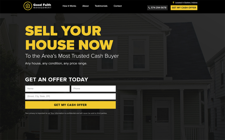
Good Faith Management is a real estate agency from Goshen, Indiana, offering homeowners the opportunity to sell their properties without having to make prior repairs or listing their home on the market for months.
This is an excellent example of a sales-oriented website. The full-width hero section features an engaging marketing message with a clear call-to-action button. The black and yellow color scheme helps highlight the marketing messages and call-to-action boxes throughout the page.
09
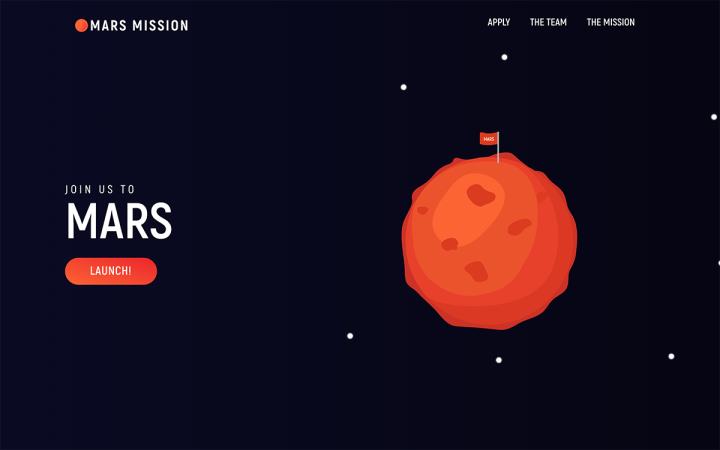
Although this website is not an actual business, we decided to include it in the list, and really loved the idea behind this project. Here is a great example of how to incorporate modern and playful illustrations in a landing page format.
The animated timeline presented in the mission page lets the visitor follow the journey to Mars in a fun and engaging way. It’s inspiring to see the different directions our users can explore using our tool, and we’d love to see more creative projects like this one.
08
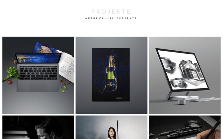
Korytko Design is a design studio owned by Patrick Korytko and based in Stuttgart, Germany. The studio specializes in high-end design, art & architecture, brand strategy, and web development.
The website Korytko built has a clean and professional look, fitting their target audience. They achieved this look by using a simple yet effective layout of a portfolio grid, and matching it with the right typography. We really liked how they implemented the call-to-action widget to create an appealing clickable project gallery.
07
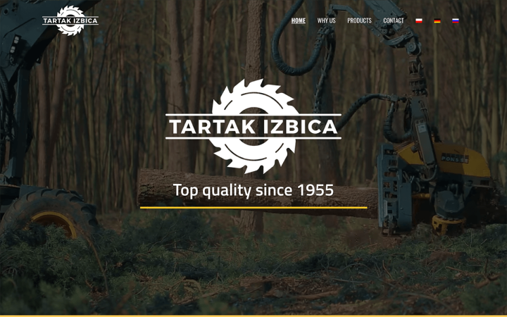
Tartak Izbica is a family owned Sawmill from Izbica in Poland, established in 1955. They produce and sell different wood products such as roof frameworks, timber wood, and floorboards.
Once you visit this page, you instantly get an impression of what the business is about, and this is no trivial matter. The hero section features a high-quality background video, showing the different stages of wood processing. The company logo complements the theme and the video perfectly. The page includes rough-edged images, along with the tree silhouettes – which both serve to complement the wood theme.
06
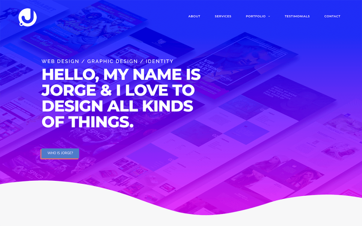
Jorge Barragan is a web and graphic designer based in Los Angeles. It’s a big challenge for designers to create their own stylish website, and Jorge accomplishes this task with great success. The site uses floating asymmetrical elements which repeat the shape divider style. These kind of repeating styles help form a unified language throughout the website.
Barragan numbered the different sections, playing with z-index and margins to create multi-layered typography combo. Add to this the vibrant poppy gradient that he chose, the straightforward marketing message and there you have it – an appealing, dynamic, and modern looking website.
05
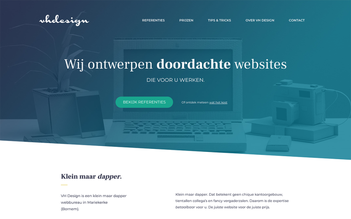
VH Design is a small web agency from Mariekerke in Belgium. They provide services like UX design, website development, copywriting, and web hosting.
We liked the solid and elegant look and feel of this website. By incorporating blend mode, a stylish logo design, and asymmetrical shape dividers, the agency managed to create an overall stylish effect. The designer also used an animated headline widget on the hero section to present various marketing messages.
04
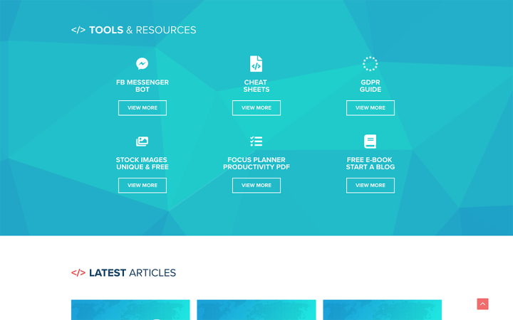
CodeinWP is a leading blog in the WordPress community, published by themeisle.com. It covers various aspects of the WordPress platform and publishes tutorials, lists, comparison posts, and articles that reach more than 150,000 visitors every month. Recently they re-designed and launched their new website, using Elementor.
In terms of design, CodeinWP kept a clean and simple layout. They borrowed HTML tags to use them as design language elements, and added turquoise gradients throughout the website, to separate between the different sections.
Want to know more about the re-building process the site underwent with Elementor? There’s an upcoming detailed case study, so stay tuned!
03
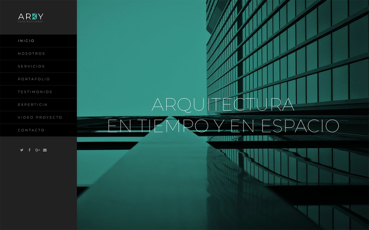
Arky is an architecture studio from Ecuador which specializes in urban design.
The smart choice and use of duotone color scheme, accompanied by modern urban architectural photography, produces a somewhat futuristic look and feel, and encourages the visitor to scroll throughout the website. The site uses a thin font reinforces this sophisticated look and also adds prestige. The sidebar menu with anchors simplifies browsing through the different sections of this one-page website.
02
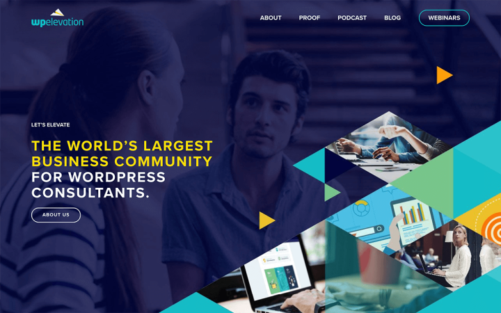
WP Elevation is an online business coaching program for WordPress consultants. Founded by the WordPress guru Troy Dean, this program teaches web freelancers, developers, and online marketers, how to develop essential business skills, practices, and techniques needed in the digital business world.
WPElevation’s website is quite big, containing a lot of content, whether it’s the blog page or the podcast page. We particularly liked the blog page layout and the parallax effect in the image when scrolling down.
Interested to hear more about WPElevation and how they can help your digital business grow? listen to our podcast interview with Troy Dean
01
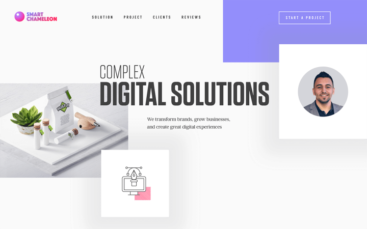
Benjamin Oberemok and Svyatoslav Liashedko are partners in a design agency based in Seattle. They specialize in Web, UI/UX, and Brand Identity. The website they built for their studio keeps up to date with the latest trends, apparent in their choice of broken grid layout, to name one example. The animation, as well as the abundant use of white space, complement this floating style.
Oberemok and Svyatoslav made an intelligent use in Elementor’s effects and widgets. They placed an animated headline widget inside the word “create,” displaying the services that the studio offers. They also implemented the Flipbox widget to create a gallery of their projects.
You think your Elementor-based website or Landing page should be featured on our next Top 10 Websites column?
