Table of Contents
A modal (also called a modal window, popup, dialog box, or lightbox) is a design element that pops up over the main content of a webpage. It demands the user’s attention by temporarily disabling interaction with the rest of the page until the user addresses the content within the modal.
The primary goal of a modal is to focus the user’s attention on a specific action or a crucial piece of information.
Common Uses for Modals in Web Design
- Forms: Collecting user information like newsletter signups, contact requests, or login details.
- Alerts and Confirmations: Important messages (“Your session is about to expire”), or confirmations (“Are you sure you want to delete this?”).
- Image/Video Lightboxes: Allowing users to view larger versions of images or play videos without leaving the page.
- Welcome Messages: Offering helpful hints or first-time offers to new visitors.
- Announcements: Sharing crucial information or promotions.
Key Elements of Modal Design
Size and Placement
Modals strike a delicate balance: they need to be prominent enough to capture attention but not so large that they overwhelm the underlying page. Size your modals proportionally to the importance of the content they hold.
A smaller modal is often suitable for simple alerts or confirmations. Forms or image galleries may necessitate a slightly larger size to accommodate necessary elements comfortably.
As for placement, centering the modal both horizontally and vertically is a safe, standard approach. However, carefully consider the content when making this decision. Is alignment with other specific elements on your page more visually harmonious? Experiment to find the ideal placement that guides the user’s eye without clashing with the overall design.
Background Dimming
Dimming the background behind a modal is a common design technique that helps to isolate the modal content visually. This dimming effect reinforces the notion that the modal is a separate layer on top of the main page. The ideal level of dimming will depend on your website’s design. Subtle dimming allows some of the original content to show through, while a more opaque effect creates a stronger sense of separation.
Content Styles (typography, colors, etc.)
The styling of the modal’s content should align with your website’s overall branding. Consistent fonts, colors, and a clear visual hierarchy create a sense of cohesion. Use headings and subheadings to organize text logically within the modal. Make buttons and links visually distinct with contrasting colors and ample white space to improve readability and usability.
The goal is to keep the content concise and easy to scan. When using images or videos, ensure they are optimized for web performance to avoid slowing down the modal’s loading time.
Clear Close Mechanisms
Providing a clear way to close a modal is essential for a smooth user experience. The traditional “X” icon in the top corner is a universally recognized symbol for closing. Ensure this icon is prominent and easy to click or tap.
Additionally, consider allowing users to close the modal by clicking outside its boundaries on the dimmed background. This provides flexibility and caters to different user preferences. However, exercise caution with this feature, make sure it doesn’t interfere with any interactive elements on the underlying page.
Finally, the Escape (Esc) key is another expected method of closing modals. Implement the necessary JavaScript functionality to achieve this behavior.
Interactivity
A well-designed modal guides the user’s interaction with its content. Ideally, the user’s focus should remain confined within the modal until they complete the intended action or explicitly close it. This means temporarily disabling scrolling on the main page and preventing clicks outside the modal from having any effect.
Within the modal, ensure that interactive elements like buttons, links, and form fields are visually distinct and respond clearly to user input. Provide visual cues on hover and focus states to enhance usability. If your modal includes a form, incorporate clear error messages and input validation to guide users toward successful submission.
Content Prioritization
The purpose of a modal is to focus the user’s attention on a specific element. Overloading the modal with excessive information defeats this purpose. Keep the content concise and directly relevant to the modal’s function.
Use a clear heading to convey the main message or purpose of the modal. Employ a visual hierarchy by using subheadings and bullet points to organize longer text passages, improving readability. If the modal’s goal is to collect user input through a form, keep the number of fields to a minimum, requesting only essential information.
Accessibility
Modals have the potential to create barriers for users with disabilities if not designed with accessibility in mind. Here are key considerations:
- Keyboard Navigation: Ensure users can navigate within the modal, tab through elements (buttons, links, form fields), and close the modal using only their keyboard.
- Screen Reader Compatibility: Properly structure your modal’s HTML with semantic elements and ARIA attributes (e.g., ARIA labels and roles) to provide context for screen reader users. Announce the appearance of the modal to assistive technologies and manage focus appropriately.
- Sufficient Contrast: Choose color combinations with sufficient contrast for users with visual impairments.
Note: Adhering to web accessibility guidelines (WCAG) benefits all users and creates a more inclusive experience.
When to Use Modals (and When Not To)
Let’s start by examining the most typical scenarios where modals offer value:
Forms (signup, login, contact)
Modals are a natural fit for forms. They provide a dedicated space for collecting user information without navigating away from the current page. Use them for newsletter signups, login/registration forms, contact forms, or even complex multi-step surveys.
Keep your forms as streamlined as possible. Ask only for the information you truly need, and consider features like autofill to speed up the process for users. Label fields clearly, provide inline error messages for incorrect input, and offer a clear confirmation message upon successful submission.
Image and Video Galleries
When a user clicks on a thumbnail image or a video preview, a modal is an excellent way to display the media in a larger format without leaving the page. This creates a more immersive viewing experience.
Inside the image gallery modal, consider including navigation arrows or swipe functionality to allow users to cycle through multiple images easily. For videos, provide playback controls (play, pause, volume, etc.). Optimize images and videos for fast loading times, especially if your modal gallery hosts multiple items.
Alerts and Notifications
Modals are well-suited for grabbing the user’s attention and displaying important messages. Use them for confirmations (“Your message has been sent!”), error notifications (“Incorrect password”), or critical system updates a user needs to acknowledge.
Keep these alert modals simple and focused. The message should be concise, and any required actions (e.g., “OK”, “Retry”) should be clear. Choose colors that visually convey the nature of the alert (green for success, red for errors, etc.).
Cookie Consent and Age Verification
Due to privacy regulations like GDPR and age restrictions for certain content, modals are often used to obtain user consent or verify a user’s age before granting access to a website.
These modals should present clear and concise information about the data being collected or the reason for age verification. They should also provide straightforward options for the user to consent or deny.
Promotional Offers
Modals can be a powerful tool for showcasing limited-time offers, discounts, or exclusive content. A well-timed modal can capture attention and incentivize users to take action. For example, you could offer a discount code to first-time visitors or promote a seasonal sale.
To maximize engagement, use strong visuals, a compelling headline, and clear calls to action (e.g., “Shop Now”, “Claim Your Discount”). Experiment with timing triggers to find the optimal point for displaying your promotional modals (more on this later!).
Potential Downsides of Modals
When used excessively or without careful consideration, modals risk interrupting the user’s flow and causing annoyance. Overly aggressive modals that appear too early or block essential content can lead to negative user experiences. It’s important to be mindful of how often you use modals and the context.
Alternatives
Inline Content
For less critical information that doesn’t necessitate the full focus of a modal, consider displaying it directly within the page. Tooltips, expandable sections, or subtle slide-in panels can provide helpful context or additional information without a jarring interruption.
Less Intrusive Notifications
If the goal is to simply alert the user without requiring immediate action, opt for unobtrusive slide-in notifications at the top or bottom of the screen. These notifications can convey success messages, non-critical updates, or hints, minimizing their disruptive potential.
Note: Even with alternatives available, there are still many situations where a well-designed modal is the most suitable solution. The key is to be discerning in their use.
Modal Design Best Practices
Timing and Triggers
The timing of when a modal appears can significantly impact the user experience. Here are some common trigger options:
- Immediate: The modal displays as soon as the page loads. Use this sparingly, as it can be perceived as intrusive. Reserve it for truly urgent alerts or time-sensitive offers.
- Delayed: The modal appears after a set amount of time has elapsed. This allows the user to engage with the page before the interruption.
- Behavior-Based: The modal is triggered by specific user actions, such as scrolling to a certain point on the page or demonstrating intent to leave (exit-intent modals). These offer a more contextual and, therefore, potentially less disruptive experience.
Exit Intent Modals
Exit-intent modals detect when a user is about to leave your website, often by tracking their mouse movements toward the browser’s close button. This technology offers a unique opportunity to re-engage users when they are considering leaving.
Pros: Exit-intent modals can be effective for reducing bounce rates, capturing email leads with a last-minute offer, or directing users to other relevant content on your site.
Cons: If poorly implemented, exit-intent modals can be perceived as overly aggressive. Ensure the timing is precise to avoid triggering the modal prematurely. Provide value to the user in the offer; a generic “Don’t leave!” message is unlikely to be successful.
Animation
Subtle animations make modals feel more dynamic and visually appealing. Consider fade-in/fade-out effects or a gentle slide-in motion for your modal’s entrance. These transitions should be smooth and quick to avoid slowing down the user experience.
Use animation purposefully. It should complement the overall tone of your website and the content within the modal. Avoid overly flashy or distracting animations that detract from the modal’s primary message.
UX Considerations
The most important aspect of modal design is prioritizing a positive user experience. Here’s how to ensure your modals don’t disrupt the user’s flow:
- Focus vs. Ease of Dismissal: While the modal commands attention, it should still be effortless for the user to close it when they are ready. Maintain a clear close button and enable clicking outside the modal area or using the Escape key.
- Avoid User Frustration: Overusing modals, especially those that appear aggressively or repeatedly, can quickly become a major source of annoyance. Use timing and triggers strategically, and be mindful of the overall frequency of modals on your site.
- Test Thoroughly: Test your modals on different devices and browsers to ensure proper display and functionality. Nothing hurts UX more than a broken or misaligned modal.
- Gather Feedback: Use website analytics, heatmaps, or even simple user surveys to understand how your visitors perceive your modals. Use this feedback to fine-tune your modal implementation.
Strategic Use for Conversions
When thoughtfully implemented, modals can be a powerful conversion tool. Here’s how to optimize them for success:
- Lead Generation: Use modals to collect email addresses in exchange for valuable content, such as ebooks, exclusive discounts, or early access to product launches. Keep your signup forms short and sweet.
- Guiding User Journeys: Present modals at key points in the user journey to offer assistance, promote related content, or nudge users towards specific actions like completing a purchase.
- Creating a Sense of Urgency: Utilize limited-time offers or countdown timers within your modals to drive a sense of urgency and encourage immediate action. Pair this with strong social proof (e.g., “X people recently purchased this item”).
Mobile Responsiveness
With an increasing number of users browsing the web on smartphones and tablets, it is essential that your modals adapt flawlessly to various screen sizes.
- Sizing and Layout: Design your modals to scale proportionally on smaller screens. Avoid fixed widths that might cause content to overflow or become unreadable.
- Touch Interactions: Make sure buttons, links, and close icons are large enough and spaced adequately to be easily tappable with fingers.
- Scrolling: If a modal contains a significant amount of content, allow for scrolling within the modal itself rather than forcing the entire page to scroll.
- Viewport Considerations: Be mindful of how the modal interacts with the viewport on smaller screens. Ensure it doesn’t cover critical content or navigation elements.
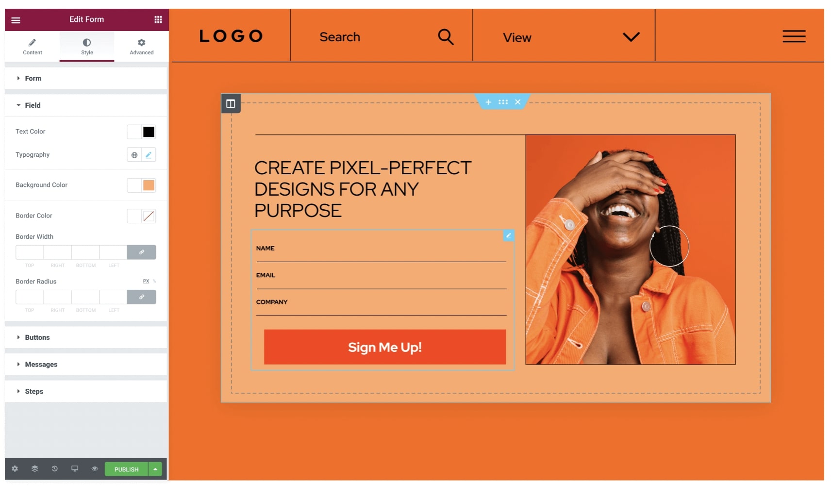
Using Elementor Website Builder for Modal Design
Elementor’s intuitive drag-and-drop interface makes designing and customizing modals incredibly user-friendly, even for those without extensive coding knowledge.
- Popup Builder: Elementor’s dedicated Popup Builder provides a visual workspace for designing your modals. Easily control styling elements like backgrounds, typography, borders, and shadows.
- Pre-designed Templates: Speed up the process by starting with one of Elementor’s many professionally designed modal templates. Customize these templates to match your branding and specific needs.
- Responsive Controls: Fine-tune the appearance of your modals on different screen sizes (desktop, tablet, mobile) directly within the Elementor editor.
- Advanced Triggers and Targeting: Set precise rules for when and how your modals are displayed, including time-based, scroll-based, exit-intent, and other behavioral triggers. Target specific pages or user segments for maximum relevance.
Technical Implementation
HTML, CSS, and JavaScript Fundamentals
At their core, modals are constructed with a combination of these essential web technologies:
- HTML: HTML provides the basic structure of the modal, the container, content elements (headings, text, images), buttons, and a close icon.
- CSS: CSS is used to style the modal visually, controlling its appearance, positioning, background dimming, and any animations.
- JavaScript: JavaScript adds interactivity. It handles the logic of showing and hiding the modal in response to triggers (clicks, timeouts, etc.) and any form submissions or data processing within the modal.
Pre-Built Libraries
Several popular JavaScript libraries offer pre-packaged modal solutions, saving you development time and effort. These libraries often provide a range of features and customization options.
- Popular Options: Some well-known libraries include Bootstrap Modals, SweetAlert2, and various lightweight modal scripts.
- Advantages: Pre-built libraries often handle cross-browser compatibility, accessibility considerations, and responsive design, simplifying your implementation process.
- Considerations: When choosing a library, consider its size (impact on website speed), flexibility for customization, ease of use, and how well it integrates with your existing website technologies.
Frameworks (React, Angular, Vue.js)
Frameworks like React, Angular, and Vue.js offer structured approaches to web development and provide their own ways to manage modals.
- Component-Based Architecture: These frameworks excel at creating reusable components, making them well-suited for building modular modals that can be integrated throughout your application.
- State Management: Frameworks often have built-in mechanisms for managing the visibility state of your modals, ensuring a streamlined and organized approach to showing and hiding them.
- Integration: Modal components built within these frameworks naturally integrate with the rest of your application’s logic and data flow.
Customization for Advanced Needs
While pre-built libraries and framework components offer excellent solutions, sometimes your project demands unique features or highly specific styling. In these cases, building custom modals from scratch with HTML, CSS, and JavaScript provides maximum control. Here’s where this approach shines:
- Complex Interactions: If your modal needs to include multi-step processes, dynamic content loading, or intricate user interactions, a custom solution offers the flexibility to architect it exactly as needed.
- Bespoke Design: When your modals must adhere to highly specific brand guidelines or require unconventional visual elements, building from the ground up allows pixel-perfect customization.
- Unique Animations: If subtle transitions don’t suffice, create elaborate and eye-catching entrance and exit animations for your modals with fine-grained control over timing and effects using JavaScript.
- Advanced Accessibility: While many libraries consider accessibility, a custom modal allows you to tailor every aspect to meet specialized accessibility needs, ensuring an inclusive experience for all users.
Trends and the Future of Modals
Evolving Design Patterns
Expect to see modals move away from the traditional boxy, centered pop-up style. We may witness more organic shapes, integration with page elements, and subtle slide-in modals that feel less intrusive while still capturing attention.
Micro-modals: These ultra-concise modals could become popular for brief confirmations, tooltips, or minimalist notifications, placing even less demand on the user’s attention.
Increased Focus on Accessibility and UX
Accessibility will remain paramount. Designing with keyboard navigation, screen readers, and diverse user needs in mind will become non-negotiable. Expect a greater emphasis on ensuring modals are both functional and inclusive for everyone.
Prioritizing Seamless Experiences: We’re likely to see a continued movement towards modals that integrate effortlessly with the overall website design and user flow, avoiding jarring disruptions whenever possible.
Smarter and More Personalized
Advancements in data collection and analysis could lead to modals becoming more personalized and contextually aware. Imagine modals tailored to a user’s browsing behavior, location, or past interactions with your website.
The Potential Impact of AI
As AI technology matures, it could play a significant role in modal design. We’ve already touched upon possibilities like AI-generated designs and intelligent triggers, but the potential extends further. The AI could analyze user behavior to suggest real-time modal adjustments for optimal conversion rates.
Conclusion
Modals, when employed strategically, are a powerful tool for enhancing your website. They can streamline user interactions, promote conversions, and convey crucial information. The key lies in a user-centric approach. Always consider the impact of your modals on the overall user experience.
Looking for fresh content?
By entering your email, you agree to receive Elementor emails, including marketing emails,
and agree to our Terms & Conditions and Privacy Policy.


