During a recent Elementor workshop we coined “Kit Accelerator”, 30 web creators from around the globe joined our virtual get-together to learn how to bring Website Kits to their full potential. The program included deep-dive sessions on best practices for customizing the 100+ Elementor Website Kits. Similar to themes, Kits include all the website parts and pages needed to create a professional online presence and are the fastest way to kickstart any new website.
Participants got hands-on training from Elementor experts and learned how to turn a client’s brief into an impressive website on Elementor Cloud. Each participant chose one out of the hundreds in Elementor Pro’s Kit library to create their website with their original copy, imagery, brand colors, typography, and style.
The workshop ended with competition and we chose the three projects that deserved special recognition and their creators won some awesome prizes. Without further adieu here are our winners and the reasons we just loved the websites they created with Elementor Pro’s exclusive Kit library.
And the Winners Are…
03
Cathleen Heimes
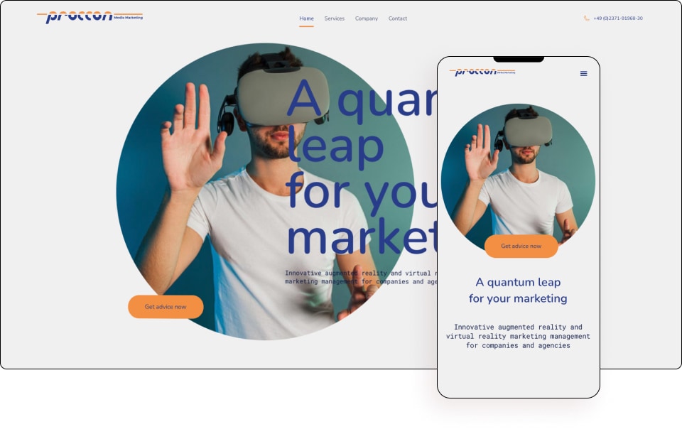
by Proccon-Media
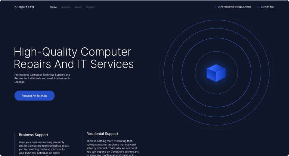
Based on Website Kit: “Computer Technician”
What we loved about Cathleen’s submission
Cathleen’s website engages visitors with an elegant design and clear messaging while a charming touch of creativity conceals that the site is based on a Kit. The brand styling is further proof of the high level of customization possible while creating with Elementor’s professional kit library. Her choice to leverage global typography and colors settings allowed her to create a coherent design system that authentically matched the client’s brand. The clever use of SVGs for icons and illustrations fits the client’s vision and helps communicate it. Alongside the beautiful design, her website is also optimized for speed and seamless performance.
Cathleen shares her thoughts on Elementor Kits
Q. Why did you choose the Computer Technician” Kit?
A. “Looking at the client brief, I searched for a kit that would have a more “technical” look with some sophisticated graphical elements. The sleek look, the typography, and visual elements (icons, Lottie animations) of the ‘computer technician’ kit caught me immediately and were the perfect match.”
Q. Would you build your next client website with kits?
A. “Yes! Using a kit really speeds up the whole process of designing a structure, visual elements, and interactive ideas. A kit is a kind of “statement”, a starting point from which one can subtract or add your own “opinion” in terms of a style guide and look. My kit felt like a friendly and grown-up “buddy” that guided me through this project and the workflow.”
02
Amanda Wolfe
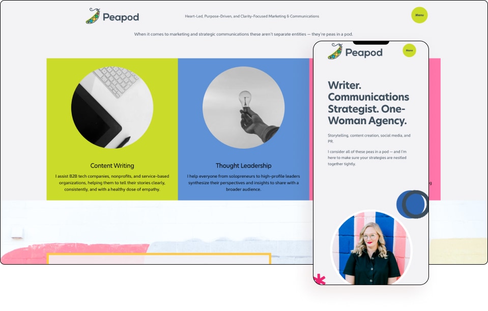
by Peapod Marketing & Communications
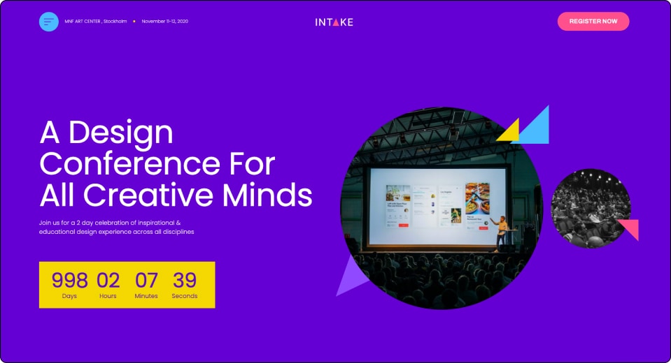
Based on Website Kit: “Design Conference”
What we loved about Amanda’s submission
Amanda chose a Kit meant for a different type of business than her client’s and used it to create a well-curated mix of content and interaction. Her creative thinking delivered on the client’s request for a happy and energetic vibe full of pictures from professional photoshoots.
We were also impressed by some of Amanda’s technical decisions like her SEO-savvy choice to include an additional menu in the footer. Amanda also used SVGs instead of PNGs or other heavy image formats. Bottom line – an excellent outcome for an eye-catching website!
Amanda shares her thoughts on Elementor Kits
Q. Why did you choose the “Design Conference” Kit?
A. “I was looking for lots of room to pull in a bright bold color palette; A little whimsical and fun; Circular / softer shapes were a bonus. The Design Conference Kit had bright colors and circular images, but the menu really caught my attention first. To use a circular pop-up as a menu is something I have not really seen nor done before and didn’t know how!, and I knew this would be one feature my client would get excited about.”
Q. Would you build your next client website with Kits?
A. “Something that was really cool about this process was letting the client in a little earlier. …To be able to use kits unashamedly in conversations about what was important to them or what stuck out, or framing up content needs, clearly right away without necessarily wireframing… I think it helped the possibilities feel more alive to my client and we had a lot of great collaboration.”
“My client felt more confident about asking for things instead of feeling like any change could be a huge mess or a bunch of extra work… That level of freedom in this case actually allowed for an even greater wow factor in the end! Both in being able to deliver on their wildest dreams, and how fun it was for my client to see where we started and how we landed. She is now a champion for my business and wants to send others my way… Kit-work is expanding my reach, not limiting it!”
01
Melissa Zarda
by Hollyststudio
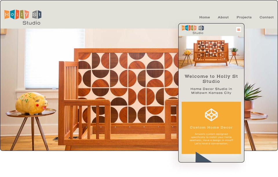
Based on Website Kit: The Trekker (trekking-tour-company)
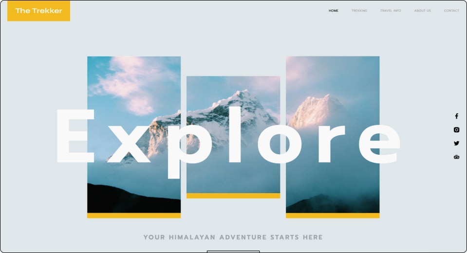
What we loved about Melissa’s submission
Melissas’s website is a great example of successfully choosing a Kit based on the client’s design preferences rather than the industry associated with it. Her website stands out because of its creativity and masterful use of her Kit’s features while also including added popup and new sections that weren’t included in the original Kit.
We were impressed by the clever use of SVGs, spaces, borders, and masks to create unique shapes that were lightweight in terms of size and efficient in terms of loading time. We ranked this website highest because of the excellent craftsmanship and customization work that was done. Its responsive style tells a visual story with global colors & typography, and a good balance of white space and content.
Melissa shares her thoughts on Elementor Kits
Q. Why did you choose the “Trekker” Kit?
A. “Looking at the client brief, I was searching for artsy, fun, pop of color, unique and creative, not corporate – a relaxed Kit. After reviewing them all I narrowed it down to 3 choices, but in the end, chose Trekker, which wasn’t even on my original list. It just felt right and had the mid-century mod appeal my customer was going for.”
Q. Would you build your next client website with Kits?
A. “I like that it’s a complete kit – not just a few pages, but even comes with the 404, popup, single post template, etc. I think it’s ideal for smaller sites and can help me hit the ground running for larger sites that require more features (like CPT / ACF, for example) too. I have actually already started using Kits for 3 new sites I’ve started since this project began!”
Key takeaways from the kit accelerator winning submissions
We all want to level up our game and deliver higher-quality websites, that do not just look beautiful but also solve our clients’ problems. Providing more value to your customers isn’t always easy on a deadline, that’s exactly when Elementor Kit Library and Elementor Cloud can give you that extra push you need.
All of our winners used Kits as guidelines that reminded them of essential parts of their client’s sites while enjoying the freedom to add more features to meet their client’s needs. The fact that creators don’t need to start from scratch allows them to pay more attention to their designs’ aesthetic and functionality and create more value for their customers. Elementor Cloud frees up even more of our creators energy by allowing them to skip setting up WordPress and installing Elementor Pro.
Kits aren’t about shortcuts, they’re about efficiency. Our winners have extra time to focus on the important things like preparing themselves for their projects. They all maximized their results by collecting quality images and carefully selecting colors and fonts to match the customer’s brand. This time it was preparation, not practice, that made perfect.
I want to take this opportunity to thank everyone who took part in the accelerator. Roni Ezra-Friedman, Sivan Kotek, Maayan Lazarovich, Rachel Skiba, Tali Vasilevsky, and anyone else who helped this great project happen
Ready to level up your game? You can easily upgrade your subscription and start creating websites on Elementor Cloud with our extensive Kit library.
Do you also use the Elementor kit in your work process?
Please let us know in the comments! we would be thrilled to see your results in the comments