Table of Contents
The Ultimate Font Pairing Chart for Web Design
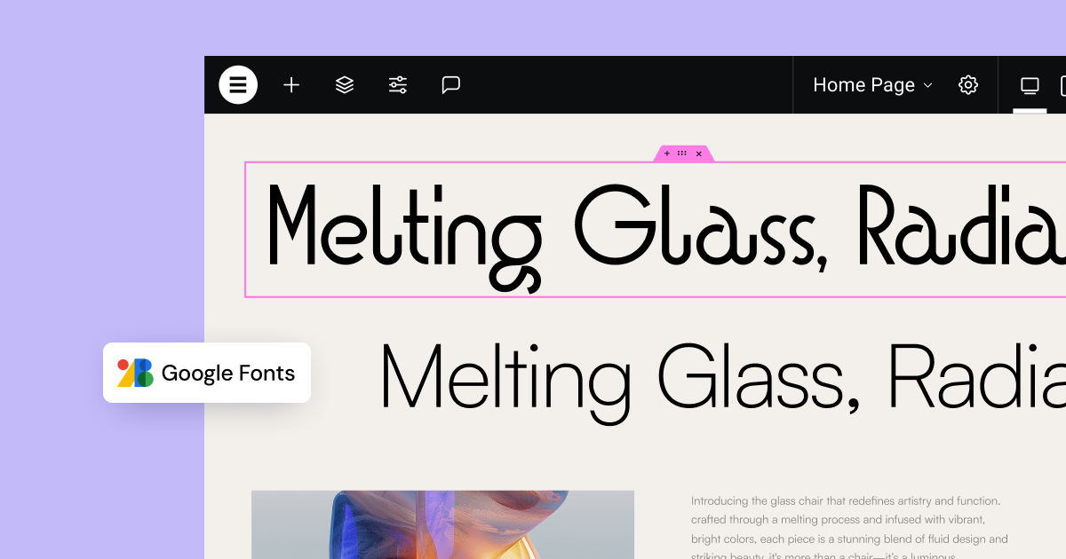
Now, let’s dive into the heart of the article – the Font Pairing Chart. This chart provides you with a curated selection of font pairings, ready to be implemented on your Elementor website. All fonts listed are available on Google Fonts, ensuring easy access and seamless integration with Elementor’s font library.
| Pairing Name | Heading Font | Body Font | Style/Description | Get Font Links (Google Fonts) |
| Classic Elegance | Playfair Display | Merriweather | Timeless and sophisticated. Serif heading and body fonts create a refined and readable experience. Ideal for blogs, magazines, and elegant brands. | Playfair Display / Merriweather |
| Modern Clarity | Montserrat | Roboto | Clean and contemporary. Sans-serif pairing for a modern and approachable look. Versatile for various website types, especially tech, business, and portfolios. | Montserrat / Roboto |
| Minimalist Bold | Oswald | Open Sans | Striking yet simple. Bold sans-serif heading with a highly readable and neutral body font. Great for impactful headlines and clean content presentation. | Oswald / Open Sans |
| Creative Contrast | Abril Fatface | Lato | Bold and friendly. Display serif heading with a warm and approachable sans-serif body font. Perfect for creative agencies, blogs, and brands with personality. | Abril Fatface / Lato |
| Elegant Script Touch | Sacramento | Poppins | Playful elegance. Script heading adds a touch of personality, balanced by a modern and clean sans-serif body font. Suitable for lifestyle blogs, boutiques, and creative businesses. | Sacramento / Poppins |
| Strong & Structured | League Spartan | Libre Baskerville | Geometric strength meets serif elegance. Bold sans-serif heading with a refined serif body font. Conveys professionalism and sophistication. Ideal for corporate websites and portfolios. | League Spartan / Libre Baskerville |
| Harmonious Family | PT Sans (Bold) | PT Serif (Regular) | Cohesive and readable. Pairing within the PT font superfamily for a harmonious look. Versatile and suitable for content-heavy websites and publications. | PT Sans / PT Serif |
| Friendly Serif | Lora | Open Sans | Warm and inviting. Serif heading with a clean and universally readable sans-serif body font. Creates a friendly and approachable atmosphere. Great for blogs and personal websites. | Lora / Open Sans |
| Bold & Modern Sans | Bebas Neue | Roboto | Striking and contemporary. Condensed sans-serif heading for a bold statement, paired with an approachable sans-serif body font. Ideal for modern businesses and tech websites. | Bebas Neue / Roboto |
| Geometric & Readable | Raleway | Source Sans Pro | Elegant and highly readable. Refined sans-serif heading with a clean and versatile sans-serif body font. Suitable for a wide range of websites, emphasizing clarity and sophistication. | Raleway / Source Sans Pro |
| Classic & Functional | Georgia | Arial | Universally recognized and highly functional. Web-safe fonts that ensure consistency across devices. Best for maximum readability and accessibility, especially for simple websites. | Georgia (Web-safe, often pre-installed) / Arial (Web-safe, often pre-installed – generally use system default sans-serif if possible for better performance) |
| Elegant & Modern | Playfair Display | Inter | Combines classic serif elegance with modern sans-serif clarity. Playfair Display for headings brings sophistication, while Inter ensures body text is clean and highly readable, especially on screens. | Playfair Display / Inter |
| Friendly & Approachable | Nunito | Source Sans Pro | Nunito’s rounded sans-serif for headings creates a friendly and inviting tone, perfectly complemented by the highly legible and versatile Source Sans Pro for body text. Ideal for blogs, personal websites, and businesses aiming for a welcoming feel. | Nunito / Source Sans Pro |
| Luxury & Minimalism | Cormorant Garamond | Montserrat | Cormorant Garamond offers a touch of luxury and classic serif style to headings, while Montserrat provides a clean and minimalist sans-serif for body text, creating a sophisticated and modern aesthetic. | Cormorant Garamond / Montserrat |
| Contemporary & Readable | Fira Sans | Merriweather Sans | Fira Sans, designed for Mozilla, is a highly readable and contemporary sans-serif for headings. Paired with Merriweather Sans, another screen-optimized sans-serif, it creates a clean and modern reading experience. | Fira Sans / Merriweather Sans |
Note: Web-safe fonts like Georgia and Arial are included for scenarios where maximum compatibility and performance are prioritized. However, for richer design and more diverse options, Google Fonts are highly recommended and seamlessly integrated with Elementor.
Why Font Pairing Matters for Your Website
Imagine reading a book where every paragraph is written in a different, jarring font. Confusing, right? The same principle applies to websites. Poor font pairing can lead to a disjointed visual experience, making your website look unprofessional and difficult to read. Conversely, effective font pairing can:
- Enhance Readability and Legibility: Well-paired fonts ensure your content is easy to read, improving user experience and engagement. A legible body font paired with a clear heading font guides the reader through the text effortlessly.
- Establish Visual Hierarchy: Font pairing helps create a clear visual hierarchy, guiding the user’s eye to the most important elements on the page. Headings, subheadings, and body text should be visually distinct yet harmonious.
- Communicate Brand Personality: Fonts have distinct personalities. Serif fonts often convey tradition and authority, while sans-serif fonts can project modernity and clarity. Script fonts evoke elegance and creativity. Strategic font pairing allows you to subtly communicate your brand’s values and tone.
- Create Visual Interest and Harmony: A well-chosen font pair adds visual interest to your website without being distracting. It creates a sense of balance and harmony, making the design more aesthetically pleasing and professional.
- Improve User Experience: Ultimately, effective font pairing contributes to a better user experience. A website that is visually appealing and easy to navigate keeps visitors engaged and encourages them to explore further.
Understanding the Principles of Font Pairing
Font pairing isn’t just about picking two fonts that you personally like. It’s a strategic design decision based on certain principles. Here are the key concepts to understand:
1. Contrast is Key, Conflict is a No-Go:
The most fundamental principle of font pairing is contrast. You want your chosen fonts to be different enough to create visual distinction and hierarchy. Contrast can be achieved through various font characteristics:
- Serif vs. Sans-serif: This is the most common and often safest approach. Pairing a serif font for headings with a sans-serif font for body text (or vice versa) creates a classic and readable contrast.
- Font Weight: Using different weights within the same font family or across different fonts can create contrast. For example, a bold heading font paired with a lighter body font.
- Font Style: Combining fonts with different styles, such as a decorative display font with a simple, clean font, can create visual interest, but requires careful consideration to avoid conflict.
- Font Size and Spacing: Adjusting font size and letter-spacing/line-height is crucial for creating hierarchy and readability within your font pairings.
However, conflict is what you want to avoid. Font conflict occurs when fonts are too similar, creating a sense of visual tension rather than harmony. They might compete for attention or simply look like a mistake. The goal is to find fonts that complement each other, not compete.
2. Establish a Visual Hierarchy:
Your font pairing should clearly define the visual hierarchy of your content. Typically, websites use different fonts for:
- Headings (H1-H6): These are the most prominent text elements, demanding attention. Heading fonts can be more decorative or bolder to stand out.
- Body Text: This is the bulk of your content and needs to be highly readable for extended periods. Body fonts should prioritize legibility and comfort.
- Subheadings, Captions, and Navigation: These elements require fonts that are distinct from both headings and body text, creating a clear structure and guiding users through the website.
3. Readability and Legibility are Paramount:
No matter how stylish a font is, readability and legibility should always be your top priorities, especially for body text.
- Legibility refers to the ability to distinguish individual letterforms. Clear letter shapes, adequate spacing, and distinct characteristics contribute to legibility.
- Readability is the ease with which text can be read in blocks or paragraphs. Factors like line height, letter spacing, and font size affect readability.
Choose body fonts that are designed for comfortable reading on screens, especially for longer content sections. Decorative or overly stylized fonts might be suitable for headings or short, impactful text, but should generally be avoided for body text.
4. Consider Your Brand and Style:
Fonts are powerful tools for conveying your brand’s personality. Think about the overall style and tone you want to project:
- Modern and Minimalist: Clean sans-serif fonts like Montserrat, Roboto, and Lato are excellent choices.
- Classic and Elegant: Serif fonts like Playfair Display, Merriweather, and Georgia evoke a sense of tradition and sophistication.
- Creative and Playful: Script fonts or unique display fonts can add personality, but use them sparingly and pair them with highly readable fonts for body text.
- Professional and Authoritative: Pairing a strong serif font with a clean sans-serif can convey professionalism and reliability.
5. Stick to a Limited Number of Fonts:
The general rule of thumb is to use no more than three fonts on your website, and often, two well-chosen fonts are sufficient. Too many fonts can create a cluttered and confusing visual experience, diluting your brand message and hindering readability. It’s better to explore different weights and styles within a font family than to introduce too many different typefaces.
Implementing Font Pairings in Elementor
Elementor makes it incredibly easy to implement these font pairings on your website. Here’s how:
- Access Typography Settings: In the Elementor editor, select the element you want to style (e.g., Heading widget, Text Editor widget). Navigate to the “Style” tab and then open the “Typography” section.
- Choose Your Fonts: In the “Typography” settings, you’ll find the “Family” dropdown. Click on it to access Elementor’s extensive font library, which includes Google Fonts. Search for the fonts listed in the chart (e.g., Playfair Display, Merriweather) and select them for the respective elements (Heading Font for headings, Body Font for body text).
- Customize Further: Beyond font family, Elementor’s Typography settings allow you to fine-tune your font pairings. Adjust:
- Size: Set appropriate font sizes for headings and body text to establish visual hierarchy and readability. For body text, 16px to 18px is generally recommended for optimal readability on screens.
- Weight: Use different font weights (e.g., bold for headings, regular or light for body text) to create contrast and emphasis.
- Line Height: Adjust line height for body text to improve readability, especially for longer paragraphs.
- Letter Spacing: Fine-tune letter spacing for headings to enhance their visual impact.
- Transform & Style: Explore options like uppercase for headings or italics for emphasis, used sparingly to maintain clarity.
Tips for Elementor Font Pairing:
- Global Styles: Leverage Elementor’s Global Styles feature to set your base typography for headings and body text across your entire website. This ensures consistency and saves you time.
- Theme Styles: Explore your Elementor theme’s typography settings. Many themes offer pre-defined font pairings or options to customize base fonts, providing a starting point for your design.
- Custom Fonts: If you need fonts beyond Google Fonts, Elementor allows you to upload custom fonts, expanding your typographic possibilities even further.
- Test and Refine: Always preview your font pairings on different screen sizes and devices. Read through your content to ensure readability and visual appeal. Don’t hesitate to experiment and refine your choices until you achieve the desired look and feel.
Conclusion: Typography as a Design Superpower
Font pairing is a critical aspect of web design that often goes unnoticed, yet it significantly impacts user experience and brand perception. By understanding the principles of font pairing and utilizing resources like the Ultimate Font Pairing Chart, you can elevate your Elementor website from visually appealing to truly impactful.
Experiment with the font pairings provided, adapt them to your brand’s unique style, and always prioritize readability and legibility. With Elementor’s powerful typography tools and a thoughtful approach to font pairing, you can unlock the full potential of typography and create websites that are not only beautiful but also highly effective in communicating your message and engaging your audience. Start exploring, experimenting, and transforming your Elementor website with the power of perfect font pairings today!
Looking for fresh content?
By entering your email, you agree to receive Elementor emails, including marketing emails,
and agree to our Terms & Conditions and Privacy Policy.
