As web design has evolved over the years, so have the demands on Web Creators, with many of you facing similar challenges:
- Consistency issues when styling multiple elements across your site
- Repetitive work updating the same styles in multiple places
- Limited responsiveness forcing you to use custom CSS or hide elements
- Slower performance with complex layouts
- Varied interfaces across different widgets
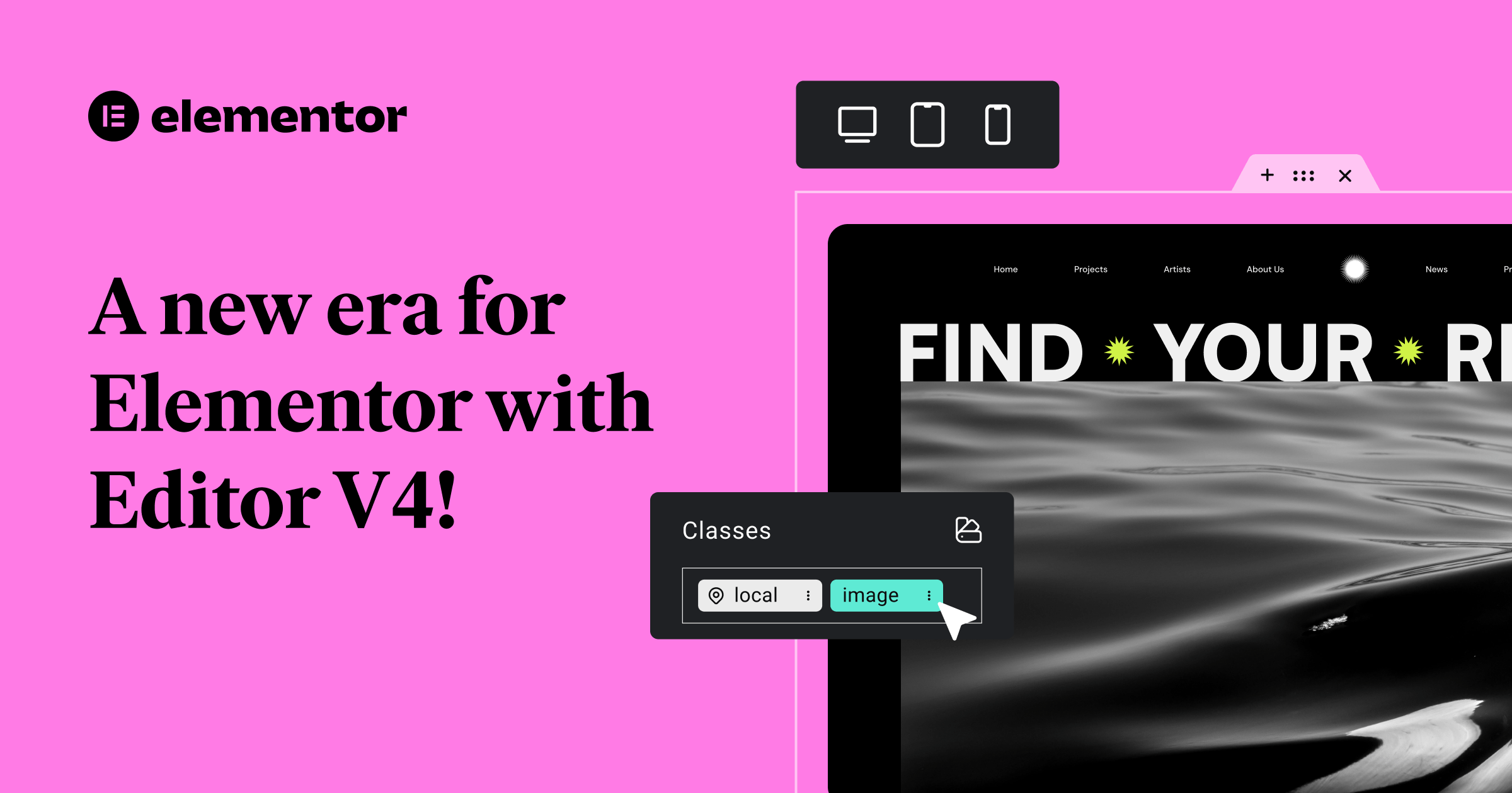
Editor V4 addresses these pain points with a powerful CSS-first framework that brings you professional-grade capabilities, without requiring you to write a single line of code.
The alpha of Editor V4 is now available as an opt-in experience, giving you the opportunity to explore the new capabilities at your own pace. You can test the new features, provide feedback, and continue using familiar V3 features, while we continue to extend and improve the V4 experience.
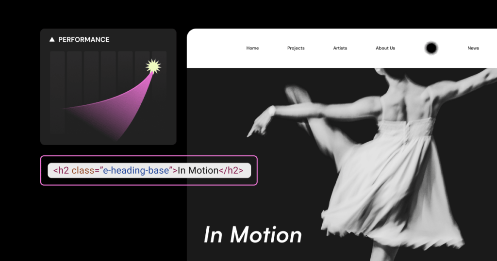
Set styles once, and apply them anywhere with Classes
Imagine building a website with dozens of buttons that should share the same design. In the past, you’d need to style each one individually or rely on workarounds. With Editor V4’s new Classes system, you can:
- Create reusable style collections that can be applied to multiple elements
- Update styles in one place and see changes reflected everywhere
- Maintain design consistency throughout your entire site
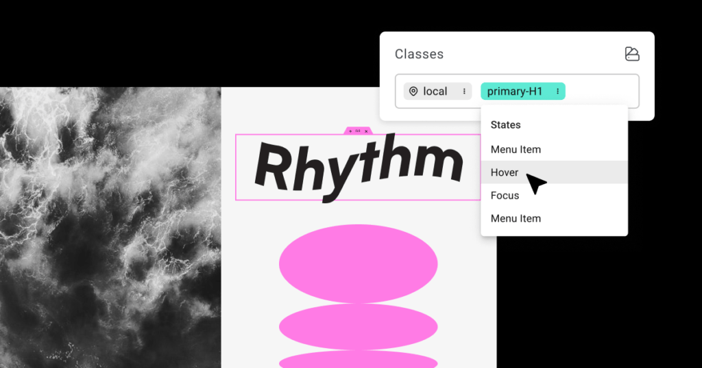
Define interactive styles without coding using States
Bring your site to life with interactive elements using States (Pseudo-Classes). Define exactly how elements look when visitors interact with them by creating hover, focus, and active states for any class. This allows you to design engaging interactive experiences without writing a single line of code.
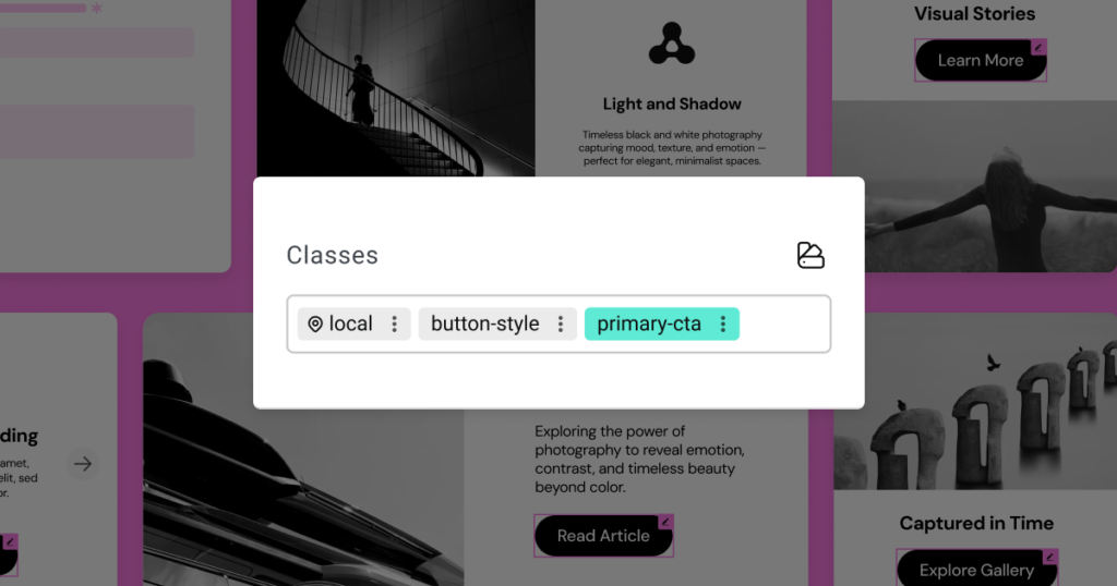
Control and organize your classes with the Class Manager
The Class Manager provides a command center for maintaining consistent styling across your site by allowing you to:
- Delete or rename classes from a central location
- Change class priority and hierarchy by dragging and dropping
- See all your Global Classes in one organized view
Get started with Elementor now
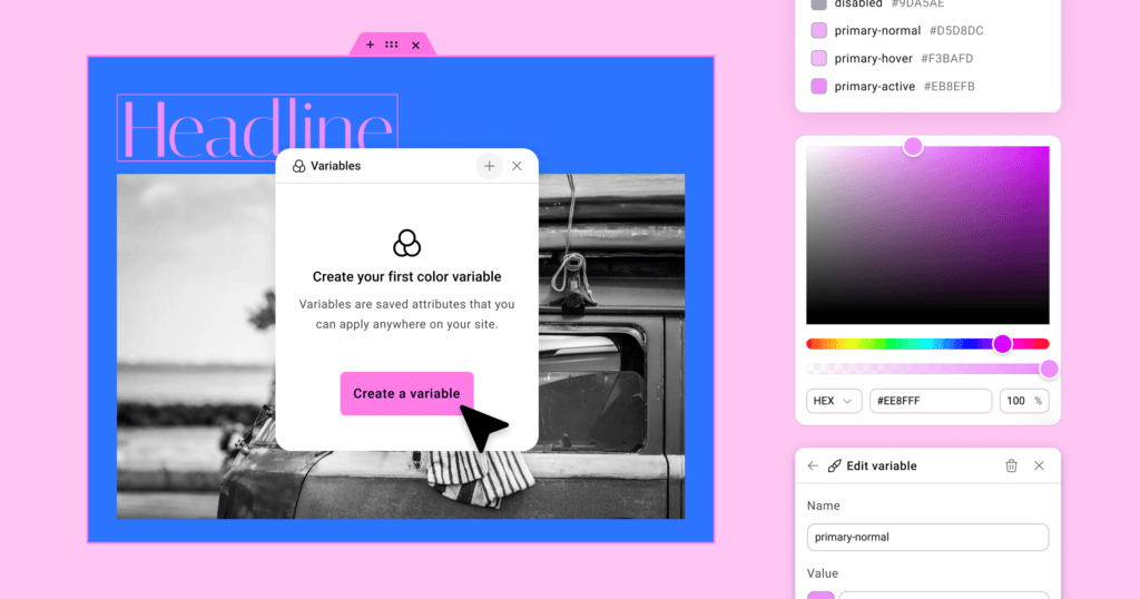
Build consistent design systems with Variables
Designing at scale becomes significantly easier with the introduction of Variables. Rather than assigning styles manually element by element, Variables allow you to define once and apply consistently across your site.
Let’s say you use the same colors, sizes and fonts across multiple Global Classes and across different sections of your site. Instead of manually setting the background, text color, text size and font family each time, you connect those properties to Variables like primary-color, button-font, and accent-text. Now, if your brand palette changes, a single Variable update will cascade throughout every component styled across all those Classes and Elements.
Work consistently and streamline your workflow with the unified Style Tab
Editor V4 introduces a unified Style Tab that is shared for all elements, in comparison to the panel in V3 where each widget has its own styling options and structure.
Top advantages of the new unified Style Tab:
- Content and functionality settings remain in the General Tab
- All visual styling options are available in the Style Tab
- Learn the system once and apply it everywhere
- Access powerful styling features consistently across all elements
Get started with Elementor now
Improve your site performance with single div wrappers
Editor V4 introduces a significantly cleaner DOM structure that directly impacts your website’s performance. Now, each element uses just a single DIV wrapper, compared to the multiple nested DIVs in previous versions. The simplified structure produces cleaner HTML output, reduces overall page size, and decreases the complexity that browsers need to process when rendering your pages, resulting in:
- Cleaner code and faster rendering
- Improved SEO rankings
- A better experience for your visitors
Control every style property per device
Editor V4 transforms responsive design with a comprehensive approach that gives you unprecedented control, eliminating the limitation of V3 widgets, where only specific controls have responsive options.
In Editor V4 every single style property can be adjusted per device—with no exceptions. Simply switch between devices in the Top Bar to make targeted adjustments that only affect the specific screen size you’re editing. There are no exceptions. This means you can have completely different styling on mobile than on desktop without writing a single line of CSS.
The implementation is both powerful and intuitive. When you switch between devices using the Top Bar selector, you’re not just previewing how your site looks, you’re entering a device-specific editing context. Any changes you make will only generate CSS for that specific device, keeping your site’s code lean and efficient.


