Table of Contents
Think of colors like opposing forces – red and green, blue and orange, yellow and purple. When placed next to each other, something magical happens – they pop! This makes them perfect for attention-grabbing elements like logos, buttons, or key sections of your website.
Mastering complementary colors starts with a basic understanding of color theory, but that’s just the start. To truly make them work for your website, you’ll need the right tools and environment to bring your visions to life. This is where a robust website builder and reliable hosting come into play, which we’ll explore throughout this guide.
Understanding the Color Wheel and Complementary Basics
The Color Wheel
Picture the color wheel – a vibrant circle that logically organizes colors. It’s the foundation for understanding color relationships, the key to unlocking the magic of complementary schemes. Here’s a quick breakdown:
- Primary Colors: The stars of the show – red, yellow, and blue. These can’t be created by mixing other colors.
- Secondary Colors: They were born from mixing two primaries: orange (red + yellow), green (yellow + blue), and purple (red + blue).
- Tertiary Colors are the result of mixing primary and secondary colors. There are six: yellow-orange, red-orange, red-purple, blue-purple, blue-green, and yellow-green.
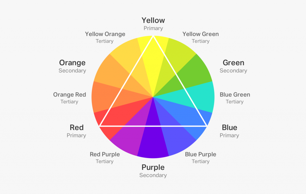
The color wheel is our visual roadmap, helping us visualize how colors interact and choose combinations that work flawlessly together. Now, let’s zero in on those powerful complementary pairs.
Defining Complementary Pairs
Complementary colors are those directly opposite each other on the color wheel. The classic pairings are red and green, yellow and purple, and blue and orange. These pairings create the maximum amount of contrast, making them incredibly eye-catching and dynamic.
Here’s why they work so well together:
- Visual Contrast: The stark difference in hue (color type) provides intense visual stimulation.
- Natural Harmony: Even though they contrast, they also balance each other. Think of the coolness of blue against the warmth of orange – it feels instinctively right.
- Vibrancy: When placed side-by-side, complementary colors amplify each other’s intensity.
Variations
While the classic pairs pack a punch, complementary schemes are flexible:
- Split Complementary: Instead of the direct opposite, choose two colors adjacent to the complement. This softens the contrast slightly while still retaining the benefits.
- Analogous: These involve colors next to each other on the color wheel, creating a more harmonious and less intense palette than traditional complementaries.
The Psychology and Impact of Complementary Colors
Warmth vs. Coolness
Complementary colors often fall into warm and cool categories, which evoke different emotions:
- Warm Colors: Reds, oranges, and yellows. These are associated with energy, excitement, and sometimes even a touch of aggression. They are great for bold calls to action or adding a sense of urgency.
- Cool Colors: Blues, greens, and purples. These colors are linked to calmness, tranquility, and professionalism, making them perfect for creating a sense of trust and reliability on your website.
By strategically using warm vs. cool complementary pairings, you subtly guide how visitors feel while browsing your site.

Creating Contrast and Energy
The inherent opposition of complementary colors creates a natural tension. This is a design superpower! Think of a vibrant red button amidst cool blue tones – it instantly demands attention. Here’s why it’s so effective:
- Focal Points: Complementary colors help you establish a visual hierarchy, directing the eye to important elements you want to emphasize on your website.
- Breaking Monotony: A touch of complementarity can revitalize designs dominated by a single color, adding interest without becoming overwhelming.
- Emotional Impact: The dynamic contrasts can evoke excitement, a sense of urgency, or even a touch of playfulness, depending on the color combinations and how they are used.
Symbolism and Cultural Significance
Colors carry meaning beyond their visual impact. Be aware of potential associations:
- Holidays: Red and green are Christmas classics, so that this combo might feel seasonally specific.
- Sports Teams: Many team logos use complementary colors for fierce rivalry vibes.
- Global Variations: Certain colors have different meanings in different cultures. If you have an international audience, do your research!
Understanding these nuances helps you harness complementary colors most effectively.
Mastering Complementary Colors in Web Design
Strategic Color Choices
Knowing when to use complementary schemes is crucial. Here are some scenarios where they truly shine:
- High-Impact Elements: Think calls-to-action (buttons, banners), logos, and hero image accents.
- Contrasting Information: Use them to differentiate sections, highlight important text, or create a visual separation between elements on your pages.
- Sparingly for Maximum Effect: Too much of a good thing can be overwhelming. Complementary colors are best in strategic bursts!
Design Principles
To avoid visual chaos, consider the following when implementing complementary colors in your web design:
- Dominant and Accent: Decide on one dominant color, using its complementary counterpart sparingly for emphasis.
- Tints, Shades, and Tones: Incorporating lighter (tints) and darker (shades) variations, along with neutral tones, softens the intensity and adds depth.
- Hierarchy: Use complementary colors to guide the eye through your design, emphasizing the most important content.
- White Space: Ample negative space around complementary elements helps them stand out without being overwhelming.
Elementor Website Builder Advantages: Unleashing the Power of Complementary Colors
Elementor, a powerful website builder, makes working with complementary colors a breeze. Its intuitive tools streamline the process, allowing you to create visually stunning designs effortlessly.
- Drag-and-Drop Interface:
- Experiment with complementary combinations in real time.
- See exactly how your color choices will appear on your site.
- Drag and drop elements to create a harmonious layout.
- Color Pickers and Palettes:
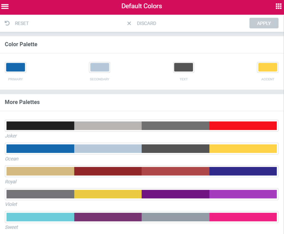
- Easily select perfect complements using the advanced color picker.
- Save custom color palettes for future use.
- Ensure consistency across your entire site with a unified color scheme.
- Theme Builder:
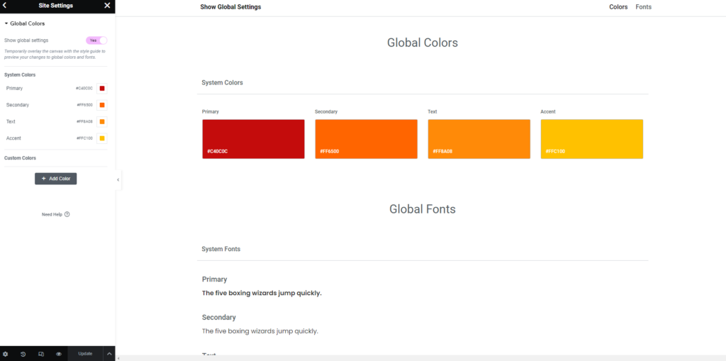
- Create global color schemes that incorporate complementary pairings.
- Apply your color schemes seamlessly across your entire website.
- Customize the look and feel of your site with a cohesive color palette.
Additional advantages of using Elementor for complementary color schemes:
- Pre-designed Templates: Choose from a library of professionally designed templates that utilize complementary colors effectively.
- Live Editing: Preview your changes in real-time as you work, ensuring your color choices perfectly align with your vision.
- Responsive Design: Create websites that look great on all devices and screen sizes, maintaining the integrity of your color scheme.
- Collaboration: Collaborate with team members and clients, allowing multiple users to work on the same project simultaneously.
- SEO Optimization: Elementor helps you optimize your website for search engines, ensuring your site ranks well in search results.
With Elementor, you can harness the power of complementary colors to create a visually appealing and cohesive website. Its user-friendly interface and advanced features make it easy for beginners and professionals alike to achieve exceptional results.
Practical Applications and Best Practices
Logos and Branding
Bold and memorable complementary color combinations are perfect for logos and establishing a strong brand identity. Here’s how to make it work:
- Brand Personality: Which complementary pair aligns with your brand? Energetic red/green? Cool and professional blue/orange?
- Memorability: The contrasting colors make your logo instantly stand out from the crowd.
- Versatility: Use your complementary logo colors as a thread throughout your website design for a cohesive brand feel.
UI/UX Elements
A complementary color scheme for UI/UX elements involves using two colors that are opposite each other on the color wheel. This creates high contrast and visual impact, making the elements stand out.
Benefits of using a complementary color scheme in UI/UX design:
- Improved Readability: The high contrast between the colors makes text and other elements easier to read and distinguish.
- Visual Interest: Complementary colors are visually stimulating and help to draw attention to important elements.
- Call to Action: The contrasting colors can be used to highlight call-to-action buttons, making them more noticeable.
Examples of complementary color pairs commonly used in UI/UX design:
- Blue and Orange: Often used for tech and creative applications.
- Red and Green: Commonly used for warnings and errors.
- Purple and Yellow Can create a playful or luxurious feel.
Accessibility Considerations
Inclusive design means ensuring your complementary color choices work for everyone:
- Color Blindness: Test your designs with color blindness simulators to check sufficient contrast and avoid reliance on problematic combinations (often red/green).
- Text Overlay: Always make sure there’s enough contrast between text and background colors, regardless of their complementary relationship, for readability.
- Tools: Various web accessibility tools analyze your color choices and help identify potential issues for different disabilities.
Inspiration
Need a starting point? Here are some places to seek out examples of complementary colors in action:
- Award-Winning Websites: Explore sites recognized for their design excellence, such as Awwwards (https://www.awwwards.com/), for inspiration on how they deploy complementary colors strategically.
- Color Palette Websites: Resources like Coolors (https://coolors.co/) or Adobe Color (https://color.adobe.com/) offer a wide array of complementary palettes and tools to help you create your own.
- Elementor Resources: Elementor’s blog and community often feature design tips and examples where complementary color choices play a key role.
Enhancing Your Color Palette: Tints, Shades, and Tones
Expand your complementary color palette for more nuanced designs:
- Tints: By adding white to a base color, you can create a lighter tint, which softens the complementary effect and provides a broader range of options.
- Shades: Mixing in black with a base color produces darker shades, adding depth and visual intrigue while maintaining the complementary relationship.
- Tones: Introducing gray into the mix creates a muted tone, ideal for background accents that still leverage the power of complementary colors, albeit in a less intense manner.
Advanced Color Harmonies
While classic complementary pairs are powerful, there’s room to explore:
- Triadic: Choose three colors evenly spaced on the color wheel, offering more variety while retaining balance.
- Tetradic: Four colors form two complementary pairs, providing the highest level of complexity and potential for dynamic combinations.
The Role of Black, White, and Neutrals in Design
Black, white, and neutral colors are like the building blocks of any color scheme. They can be used to create a variety of different effects, from bold and vibrant to soft.
1. Balancing Act:
- Neutrals can be used to balance out the intensity of complementary colors.
- For example, if you’re using a bright blue and orange color scheme, adding some black or white can help to tone down the brightness and make the colors easier on the eyes.
2. Text and Backgrounds:
- Black or white text on a complementary background is a classic combination that ensures readability.
- This is because the high contrast between the text and the background makes it easy to read the text.
3. Visual Texture:
- Gray textures can add depth and sophistication to your designs.
- For example, adding a gray background to a white text box can make the text look more elegant and professional.
Elementor Tools for Mastering Complementary Schemes
Color Pickers and Palettes
Elementor’s intuitive color tools make finding and applying those perfect complementary pairs seamless:
- Precision Selection: Color pickers let you pinpoint the exact hues you need, either with direct color codes or visual selection directly from your website.
- Custom Palettes: You can save your favorite complementary combinations as custom palettes within Elementor, making them instantly accessible for future projects.
- Global Styling: Define complementary color schemes globally, ensuring consistency across your entire website. Any changes you make automatically update everything!
Conclusion
Complementary color schemes, when used thoughtfully, elevate your website from ordinary to extraordinary. They evoke emotion, guide the eye, and leave a lasting impression on visitors. Remember that the color wheel is the foundation for understanding complementary relationships and offers endless potential combinations. Use these colors strategically for bursts of high-impact elements rather than overwhelming your entire design.
Consider color blindness and ensure proper contrast for a universally accessible website. And finally, don’t be afraid to experiment! Play with complementary pairings, tints, shades, and tones to uncover the perfect palette that reflects your unique website’s personality. The right design tools, combined with a hosting platform that prioritizes speed and security, will streamline the process and allow you to focus on creating stunning designs that leave a lasting impression.
Looking for fresh content?
By entering your email, you agree to receive Elementor emails, including marketing emails,
and agree to our Terms & Conditions and Privacy Policy.
